

|
educational blogs |
|
Where on earth does the time go? It must be about 3 weeks since I started this Series of Blogs - I expected to nail them in a few days !! Today I want to cover a simple concept - Long Term Moving Averages and a couple of much more complicated ideas - MACD and Bollinger Bands - however, the latter 2 are probably the BEST Indicators in my Toolkit (although RSI is pretty good as well). As ever, it is probably advisable to read the earlier Parts 1 to 4 before you delve into this one. 200 Day Moving Average If you look at the Chart below (remember these charts were Screen-Shotted several weeks ago), you will see a sort of Light Blue Line underneath the Price Line which I have marked “200 Day Moving Average”. I think I might have mentioned this Moving Average in an earlier Part of the Series - so apologies if this is repeating stuff but it doesn’t hurt to reinforce as the concept is very powerful. The point I am trying to stress here is that the 200 Day MA is a Very Strong area of Support for any Stock (or Price Chart of any asset for that matter, e.g. Gold, oil, forex etc.) and it is very likely that any short term moves downwards will find support around this Key Line. In the case of OPAY, prior to my Buy Decision, the Price had moved above the 200 Day MA for about a year and it had tested the line a couple of times and gone a bit below, only to recover afterwards. In combination with my other Technical Indicators, this gave a high level of probability that the Price would recover from below this line at the time of my Buying Decision. It is also worth me reiterating the idea that a rising 200 Day MA shows the stock is in an UPTREND. I always try to buy into Long Term Uptrends. A quick aside - look at the bottom of the chart in the Big Window at the top. You should see a sort of blue wavy and fairly flat line that is kind of dotted - this shows the Price Line for the FTSE350 Support Services Sector (as per the Title at the top of the Chart.) It would be easy to say, “wow, what a cracking stock OPAY must be - look at how it is thrashing the pants off its Sector !!”. However, this would most likely be a false conclusion to draw. In reality, I suspect it is more the case that OPAY just does not fit well against this Sector. The Sector is probably made up of a lot of dull and boring established businesses, whereas OPAY is a gung-ho Tech Growth Stock - quite different beasts. Worth appreciating this kind of idea - often things are not quite what they might appear at first. In addition, OPAY is AIM listed and much smaller than the stocks in the FTSE350 (which includes the FTSE100 and the FTSE250 by the way). 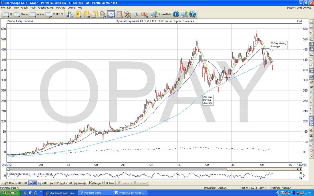
Bollinger Bands Now look at the Chart below, particularly at the Top Window. You should see the Price Line as usual and 2 sort of Enclosing Blue Lines that wave around with the Price above and below (if you can’t see it, try Pinch and Zoom or ’Ctrl +’. If you still can’t see it - then “Should’ve gone to SpecSavers“… ;-) From memory I think these Bands were invented by a chap called John Bollinger (but I am probably wrong) and they are very helpful at Indicating Buying Points and Selling Points - and clearly help with Short Term targets. They are not perfect but work pretty well on the whole. They are often called ‘Bollie Bands’ - often by me !! As you can probably see from looking at the Chart, it is a good time to Buy when the Price is touching or Below the Bottom Bollinger Line and a good time to Sell when the Price is touching or Above the Upper Bollinger Line. It is worth noting however, that this does not always work well. Look at the early part of the Chart, which is roughly between March and April. In this instance, the Price moved down in a ‘wave’ for about 6 days (you should be able to see 6 Down Red Candles), and then we got a White Candle with a Long Tail downwards - you would expect the Price to rise from here. However, in this case, it did not. So both the Candle and the Bollinger Band failed to predict the next move accurately. Remember, all this Technical Analysis stuff is Probabilistic - all Indicators have a % Chance of Working and a corresponding % Chance of Not Working - and these % vary across Indicators and Assets. Nothing works 100% and many Indicators have considerably worse than 60% Success Rates. So, in the case of OPAY just prior to my Buy Decision, the Price had moved down to the Bottom Bollinger Band and was starting to move up - so this seemed a good time to Buy. I have marked with a gaudy Black Arrow where the Price touched the Bottom Bollinger Band and Overshot a little. Another general point on Bollinger Bands - look for instances where they squeeze together tightly and move sort of sideways - you often see this on charts. When this happens, you tend to find that the Squeeze does not last for too long (it can be a few weeks or so) and it usually comes before an explosive move - either Up or Down !! 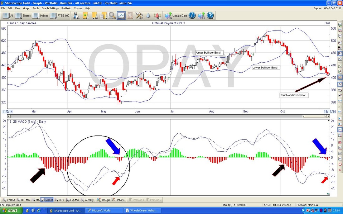
MACD
MACD is Moving Average Convergence and Divergence - but that is a bit of a mouthful so the world and his dog, seem to call it MACD……..and I am not gonna argue with that Pitbull. He can call it whatever he likes with teeth like that……. This might take some imagination - or, failing that, some alcohol might do the trick. Firstly, look at the Blue Lines in the Bottom Window - you should see a Continuous Blue Line and a Dotted Blue Line. I cannot remember (if I ever knew !!) how these lines are derived or which one is which - but, like many of these Indicators, the derivations don’t really matter. What counts is what it can do for us in a Simple and Clear way. KEY POINT - WheelieDealer’s Golden Rule of Technical Analysis is KEEP IT SIMPLE - it something is complex, it probably will not work reliably. Don’t bother with ever more complex Indicators or Patterns or Derivations - they tend to be unreliable and confusing. For Propeller Heads only. OK, we need to concentrate. Look at the Left Hand Side of the Chart - in the same place where we were looking for the 6 Down Red Candles when I was describing Bollinger Bands. Look particularly at the start of the Move Down - this is sort of just above the writing “Mar” on the Date Axis. Now cast your eyes downwards in a Straight Line and look at the way the Continuous Blue Line moved down through the Dotted Blue Line as the Price moved downwards. It should be Apparent that the Cross of the Lines Indicated the Start of the Down move - you gotta admit that is pretty damned cool. Now follow the Price Line down through to Half Way between April and May in the Top Window. If you then cast your eyes down to the MACD Window, you will see that the Continuous Blue Line has stayed below the Dotted Blue Line until around Mid April where the Continuous Blue Line crosses the Dotted Blue Line from underneath and moves above it. Note how the Downmove ended at this point and the Price moved up for about 2 weeks. I hope from this you have twigged how the Interplay of the 2 Blue Lines gives a superb and very timely Indicator. OK, let’s make it clearer. Now look at the Red and Green ‘Histogram’ Bars that sort of form ‘humps’ all over the MACD Window. I am not going to explain this in detail - if you understood how the Lines Interplay, then you should see that when the Bars turn Red the Price tends to move down and when the Bars turn Green, the Price tends to move up. I love this - highly accurate and very, very Simple and Clear to see on the Chart. A curious Repeat Pattern on the OPAY MACD Chart Now look at the Fat Red, Blue and Black Arrows I have shoved on the chart. Note there are 2 ‘groups’ of them. Now look at what I have pointed to on each Arrow and look at the similarities between the 2 groups. It is quite amazing I think - and I do not often see such closely corresponding patterns. Anyway, it is probably a wild extrapolation but at the time of my Buying Decision, it seemed very likely that the run up in Price that occurred after the First Group of Arrows would occur after the Second Group……..of course, as it happens, we all know that was not the case - BUT REMEMBER WE DID NOT KNOW THAT AT THE TIME OF MY BUY. Hindsight is the Best and most Useless Investment Tool available…. Conclusion and HOT I have to say Bollinger Bands and MACD are probably my 2 favourite Indicators - If you only allowed me 2 on my Desert Island, then I would pick these (I hope the coconut tree has a 4g Base Station in it). Since I introduced my Hierarchy of Timeliness (HOT) in an earlier Part of this Series, I feel obliged to add MACD and Bollinger Bands into the list - so here it is - remember the Indicator that gives the earliest warning is at the top:
Phew, that was a long one. But we got there. Well done to all. Go and lie down - I am going to……. wd
1 Comment
15/12/2014 10:01:52 pm
If you look at the Chart below (remember these charts were Screen-Shotted several weeks ago), you will see a sort of Light Blue Line underneath the Price Line which I have marked “200 Day Moving Average”. Leave a Reply. |
'Educational' WheelieBlogsWelcome to my Educational Blog Page - I have another 'Stocks & Markets' Blog Page which you can access via a Button on the top of the Homepage. Archives
January 2021
Categories
All
Please see the Full Range of Book Ideas in Wheelie's Bookshop.
|
