WheelieDealer Share trading diary blog with Portfolio and Education
  • Home
  • Trades
  • Educational Blogs
  • Wheelie's Bookshop
  • M3 Manifesto
  • Portfolios
  • WheelieBin / WheelieWatchlist
  • Non-Finance Books
  • Beginners
  • Monthly Performance
Picture

educational blogs

OPAY Technical Buy Signals - Part 4 of probably going to be about 6 maybe

1/12/2014

1 Comment

 
OK, in Part 3 I promised you Relative Strength Index (RSI) and that’s what I am going to give you - but this is delayed gratification - I am gonna tease you with Moving Averages first - you lucky people…..hmmmm. 

I love the RSI Indicator - it works really very well - and gives great Signals whether to Buy or Sell.

Moving Averages
Look at the Chart below. In the Top Window we have the normal Share Price Line with a few coloured meandering lines. The sort of nearly Flat Light Blue Line is the 200 day Simple Moving Average (200 day ma). The Darker Blue Line is the 50 day Simple Moving Average (50 day ma).
The Green Line is the 20 day Simple Moving Average (20 day ma) and the Red Line is the 10 day Simple Moving Average (10 day ma). I am only mentioning these lines so you know what they are - but in this Part of the Series I am not intending to dwell on them. However, please just note how the longer the period (number of days) of the MA, the flatter the line is - an often used expression is to say the flatter, longer period, MAs are ‘Slower’. 

In the same way, the Shorter Period MA lines tend to wiggly around more - they are ‘Faster’. So the 10 day MA is the Fastest and the 200 day MA is the Slowest.

I am not much of an expert on MAs - in practice I tend to pay more attention to MACD (Moving Average Convergence Divergence) which I will cover in another Part of the Series. However, there are a few things from this Chart I will point out:
  • The 200 day MA (Light Blue) is moving upwards - this shows the Share Price is in an Uptrend over a sustained period of time (and remember that Longer Term trends dominate over Shorter Term trends).
  • Look at what happened around June on the chart. The 10 day MA (Red) and the 20 day MA (Green) both crossed the 50 day MA from underneath and then continued ABOVE the 50 day MA. This act of crossing is a ‘Golden Cross’ (that may not be the Strict Definition, but good enough for our purposes) and you can see it had pretty good Predictive Power in this case - and the Bulls were happy.
  • On the flipside, look at what happened in mid March ish. Here the 10 day MA (Red) and the 20 day MA (Green) crossed DOWN through the 50 day MA (Dark Blue) and the price moved BELOW the 50 day MA (Dark Blue). This act of Crossing is called a ‘Dead Cross’ (again, probably not a strict definition, but this is my Blog and I will call it what I like - ha ha).  So in this case, the Predictive Power was bad for Bulls of the share.
  • Right, now look at just after October on the Chart - we got another Dead Cross - “Ooops, that’s bad isn’t it WD?”  It certainly was, and the Price has continued a move downwards ever since.
  • Indicators like Dead Crosses and Golden Crosses using 20 day MA and 50 day MA are quite a late warning Indicator - by the time they Flash Buy or Sell, the Price has probably moved a fair few % which you will have missed if you only use these as your Timing Indicators.
  • Now for something a bit more relevant to why I decided to buy. If you look at the 200 day MA (Light Blue), note how the Share Price tends to move down to this line and perhaps dip a bit below it (you can see this better on a longer term chart if you look at one - www.advfn.com should enable you to do such Indicators as MAs), but most of the time in recent years it has then turned around and started moving up again - so this Indicates to me that it was a good time to buy.

Picture

Relative Strength Index (RSI)
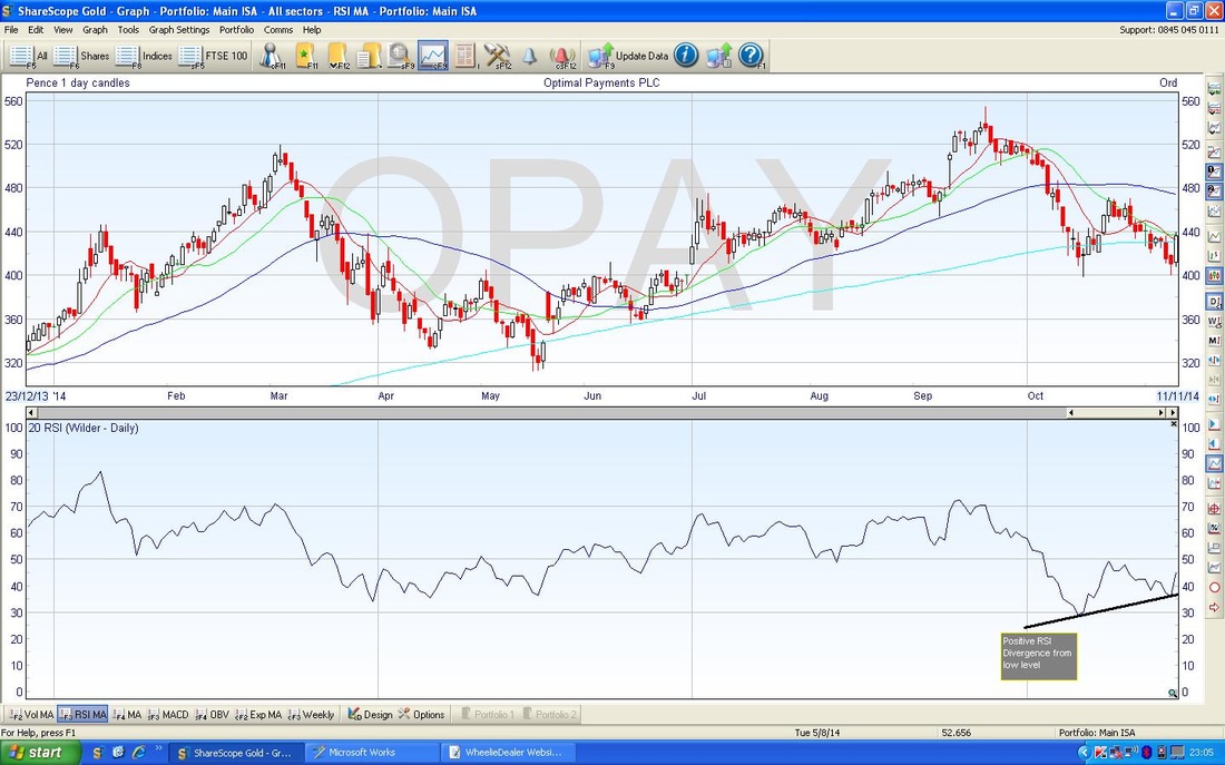
The wait is over, you have endured MAs and now I give you your RSI reward………

I love this Indicator - it is just truly brilliant. It is sort of similar to the Momentum Indicator I covered in Part 3. Which reminds me, something I forgot to mention is that a good way of looking at the Momentum Indicator and the RSI is that they both measure the ‘Speed’ of a move. In other words, when we get a bit of an Up Wave (not Elliott’s !!), the Momentum and RSI tells us how Fast it is moving - the ‘Power’ of the Wave or maybe the ‘Force’ of the Wave. Sorry, if that makes no sense, it is hard to explain, but hopefully you will get a sense of what I am saying.

Look at the bottom window of the Chart above. Unfortunately it doesn’t really do RSI justice - if you can dig out a Chart elsewhere ( www.advfn.com is a good one) and look at a longer timeframe, you will see that the RSI line tends to move Up and Down (like the Momentum Indicator) between about 30 and 70 according to the Scale on the Right Hand Side.

The simple and beautiful logic of RSI is:
  • When the RSI hits 70 it is getting OverBOUGHT.
  • When the RSI hits 30 it is getting OverSOLD.


The extent of a move will vary from Stock to Stock - I generally find that larger and more liquid stocks and Indexes move quite tightly between 30 and 70 over long periods of time, oscillating up and down.

On smaller stocks, with lower liquidity and more extreme moves, you often see them oscillate between as low as 10 and as high as 90. But overall it is a magical indicator and very predictive.

So, in light of the above, on the Chart, the RSI had moved down to about 35 and had started to move up when I did my Buy. It was not perfect in that I would prefer to buy on a lower reading (30 or below) but other indicators were flashing ‘BUY’. Remember, I use a combination of Indicators - and not all will perfectly align.

RSI Divergence
Something rather cool I want to bring your attention to (god, Wheelie, you are such a Geek if you think that is ‘cool’) is the concept of RSI Divergence.

It should be quite clear from the Chart - if you look at the Short Thick Black Line I have drawn below the RSI line from the start of October, you will see it slopes quite sharply upwards. If you can enlarge your view of the Chart (Pinch and Expand on Tablet, Fone, or if on PC try pressing ’Ctrl and +’ at same time) you will see the little note I added in Dark Grey.

The ‘Positive Divergence’ (or Bullish Divergence would be a better name) arises because although the RSI is sloping upwards (as per the Black Line), the Price Line in the Window above is going sideways - so the RSI Line and the Price Line are moving differently, they are not in Sync. They are Diverging.

The beauty here is that such a Bullish Divergence is an Indicator that the Price is about to move up. In this case, there clearly was a Bullish Divergence. Sweet.

Hierarchy of Timeliness (HOT - new acronym, I just made it up !!)
In our Hierarchy of timeliness that I hinted at in Part 3 I think, RSI comes behind the Momentum Indicator. So the Hierarchy in order of Earliest Warning First so far is:
  • Candlestick pattern
  • Momentum Indicator
  • RSI Line
  • RSI Bullish Divergence (arguably this could be higher up)
  • Moving Averages (I am talking about 20 day MA and 50 day MA here really).

OK, let’s knock in on the head there.

Food time for Wheelie,

Bye for now,

wd
1 Comment
JonH
16/12/2014 01:54:33 pm

Good article especially on the RSIs. If you have money to invest it is a good indicator to watch to know when to buy

Reply


Leave a Reply.

    'Educational' WheelieBlogs

    Welcome to my Educational Blog Page - I have another 'Stocks & Markets' Blog Page which you can access via a Button on the top of the Homepage.

    I hope you find the Entries here thought provoking and valuable. There is a sizeable Archive starting to build - use the Filters below to take the full benefit. If you have just Landed on this Page, feel free to have a poke around at the rest of my Website (s)....WD

    Blog Index List  now sits on the WD2 Website - click the Button below:


    BLOG INDEX LIST

    Archives

    January 2021
    December 2020
    November 2020
    October 2020
    September 2020
    August 2020
    July 2020
    June 2020
    May 2020
    April 2020
    March 2020
    February 2020
    January 2020
    December 2019
    November 2019
    October 2019
    September 2019
    August 2019
    July 2019
    June 2019
    May 2019
    April 2019
    March 2019
    February 2019
    January 2019
    December 2018
    November 2018
    October 2018
    September 2018
    August 2018
    July 2018
    June 2018
    May 2018
    April 2018
    March 2018
    February 2018
    January 2018
    December 2017
    November 2017
    October 2017
    September 2017
    August 2017
    July 2017
    June 2017
    May 2017
    April 2017
    March 2017
    February 2017
    January 2017
    December 2016
    November 2016
    October 2016
    September 2016
    August 2016
    July 2016
    June 2016
    May 2016
    April 2016
    March 2016
    February 2016
    January 2016
    December 2015
    November 2015
    October 2015
    September 2015
    August 2015
    July 2015
    June 2015
    May 2015
    April 2015
    March 2015
    February 2015
    January 2015
    December 2014
    November 2014
    October 2014

    Categories

    All
    Accounting
    Beginners
    Bonds
    Book Reviews
    Business Information
    Commodities
    Conference Reports
    Danger
    Events
    FOREX
    Fundamental Analysis
    Funds
    Getting Started With Stocks
    Guest Blogs
    Hedging
    Income Portfolios
    Information Sources
    Interviews
    Investment Strategy
    IPO
    Macroeconomics
    Manifesto For Making Money
    Market History
    Market Structure
    Non-Finance Books
    Peer 2 Peer Lending
    Politics
    Portfolio Management
    Psychology
    Retirement/Freedom
    Scores On The Doors
    Selling Rationale
    Short Term Trading
    Social Media
    Spreadbetting
    Stock Buy Rationale
    Stock Ideas
    Technical Analysis
    Templates
    Tools And Techniques
    Trades
    Trading Products
    WD Messages
    Week Ahead Indexes


    Please see the Full Range of Book Ideas in Wheelie's Bookshop.

Powered by Create your own unique website with customizable templates.
  • Home
  • Trades
  • Educational Blogs
  • Wheelie's Bookshop
  • M3 Manifesto
  • Portfolios
  • WheelieBin / WheelieWatchlist
  • Non-Finance Books
  • Beginners
  • Monthly Performance