

|
educational blogs |
|
I guess, like many of you reading this, I have nearly had enough of OPAY - seems to be all I ever think or Tweet or Email or BB Post about these days. The irony of this Blog is not lost on me - trying to write a Blog about how I use my wonderful timing Indicators to get me in at a good price just as it turns upwards, merely a day after the Share Price has tanked 22%, seems rather paradoxical. Clearly my Timing could not have been much worse…. Hey, you gotta look at the positives - in this Share Investing game if you do not have a positive (optimistic) outlook then I really wonder why you bother. This is all about the future and if all you see is Doom and Gloom, then I guess you should have a Portfolio of Short Positions !! Where was I, oh yes, the positives - well, this has deftly enabled me to stress a key point that I hinted at in Part 1of this Seminal* Series; All Technical Indicators are Probabilistic - they Will not Work for much of the time - they all have a % Likelihood and it is about Stacking the Odds in our favour. Where OPAY is concerned, clearly the Odds did not go my way. But that is how the Oreo Crumbles……..gosh, it’s nearly like I planned the whole thing….yeah, right, course you did Wheelie……. Right, I propose in light of the craziness of Friday, we now all pretend nothing ever happened and I will carry on in that vein and I will write this Blog more from an angle of being an education in Technical Analysis rather than the real world of how OPAY turned out. 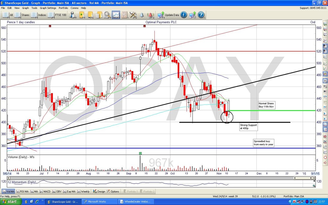
Candlepower
Right, what on earth is this graph showing me? I took these Screenshots several days ago and I have done them merely in the exact order in which I have them setup within my ShareScope software. To be fair, the sequence of these might not be entirely logical but I have just tended to Customise the charts with the Indicators and stuff that I like and I have not put much thought into the Order within my software. I think my intention here when I took the Screenshot was to highlight the Candle that I have circled in Black. To me, this is a powerful indication that the Share Price was about to turn up. I think you could arguably call this Candle a ‘Hammer’ - although in strict terms a Hammer would have a thinner ‘body’ and obviously look a bit more like a Hammer. Body is explained below. Right, Back to Basics (oh, god, now Wheelie thinks he’s John Major - bored already of the grey man), I better explain more about what a ‘Candle’ is and how it is created. Clearly this will be a longer Blog than I expected but otherwise it won’t make any sense. The Candles I show on my Graph are all ‘Daily’ Candles - this means that at the end of each trading day, a Candle is generated. As you will understand as I go through this, each Candle contains an amazing amount of really useful information for us Share Buyers and Sellers. Candles can be pretty much any timeframe - for instance, igindex has graphs which include 5 minute Candles and I also use Weekly Candles with my Daily ones. Here are the key points of how a Daily Candle is formed:
I hope that last bit is understandable - I have tried to write as clearly as I can but it is not easy. I use Candles all the time and it is a subject you will often see me mention on Tweets and in my Blogs. Again, it amazes me that people do not use these techniques - as per a recent Blog, understanding them can give you a real ‘Edge’. Please bear with me and I will slowly take you through Candles in as simple a way as I can as WheelieDealer evolves. Just as an aside, before I forget, the history of Candlestick Charting is amazing - surprisingly the idea was developed by Japanese Rice Traders something like 500 years ago - no computers then, lucky if they had an abacus. They used to draw the Candles by hand and they figured out the patterns and it gave them a big advantage - truly amazing. There are 2 main types of Individual Candles - Continuation Candles and Reversal (Turning Point) Candles. There are also Continuation and Reversal Candle Combinations - I will introduce these as required over time:
As ever with these things, there are seemingly hundreds of these Candles and Patterns - I will only talk about the ones I use and try to keep things as simple as I can. Note, some people use Open, High, Low, Close representations (OHLC Bars) on Charts instead of Candles - I hate these as the Candles are far easier to understand and they do not seem as clear on Patterns which are formed by several Candles in combination. Why is Wheelie so excited about that Hammery thing on OPAY chart which isn’t really even a proper Hammer? Ah, now we get to the crux and a great Real World example - you know Wheelie - Keep it Real. If you want Theoretical BS then there are gazillions of websites catering for your fetishes….. Look closely at the roughly 11 days PRECEEDING my Hammery Thing. Clearly for these 11 days the Share Price was falling - it was in a Downtrend. Note this Downtrend followed 3 Big White Candles which were a part of a 5 day Uptrend. The Beauty of Hammers is that they are a ‘Context Sensitive’ Reversal Candle. In other words, if you are in a Downtrend (that is the Context bit), if you get a Hammer, you are probably about to see the Downtrend end and the Share Price will start to move up again - it will Reverse. Think about what happened with my Hammer on the day. The Price opened at 418p and probably rose to the high of 418.75p (little tiny wick at top) and it most likely fell down to a low of 399p and then it recovered during the day (intraday) to close at 410p. So in simple terms, the Price opened, fell a lot where the Bears were clearly in control and then the Bulls came back in at the low point and started buying to push the price back up at the close. So a ‘Reversal’ took place during the day - this signalled the end of the 11 day Downtrend. The sharp eyed amongst you will spot a Candle which occurred on Monday 3rd November - about 5 days before my Hammer. And if you have a sharp brain to go with your sharp eyes, you will say (probably via your sharp tongue): “hey, Wheelie, the price had been in a bit of a downtrend for about 6 days and did this Candle which seems to have similar Intraday behaviour to your Hammer - why didn’t the price move up then?” The Bald Truth is I have no idea why it did not move up. But what I do know is that Candles never work 100% - and Hammers etc. work best after sustained Downtrends of a long duration. I find the best way to use a Hammer is to combine with other Indicators which I will cover in my next Blog on OPAY Technical Analysis. In addition, the rule on a Hammer is that you only Buy if the price opens higher than the Close of the Hammer day. In the example on the 3rd November, the Price clearly opened Lower on the next day so you would have known not to do the Buy Trade (clever sh*t this ain’t it?) For your information, but don’t get overly concerned about it, the Candle on the 3rd November was a ‘Dragonfly Doji’ - my utterly favourite Candle (that's why I did it in BOLD, love them so much). For a superb example, cast your eyes to the left of the chart a little bit and look at the Black Candle that was formed at the end of the Downtrend on Thursday 16th October - a truly beautiful Dragonfly which resulted in an 11% move up. See why I like these now? Oh god, another aside, but I gotta say this now its in my brain - by now you will realise I have a bit of a Tourettes Syndrome going on when I write my Blogs. Remember I said in a recent Blog on ‘Are you an Investor or a Trader?’ that I combined aspects of a Trader with really being an Investor - use of these Candles is a clear example of this. Anyone who thinks they are a Daytrader and does not use Candles or at least OHLC Bars, is deluded - maybe that is why they keep losing money. Candlestick Charting for Dummies If you have been intrigued by my writings on Candlesticks and wish to know more, then pop over to my Bookshop at www.wheeliedealer2.weebly.com and you can order ‘Candlestick Charting for Dummies’ by Russell Rhoads which is the simplest and best book I have ever read on the subject, and to be frank, is the only Candle book you ever need to read. It is brilliant and I refer to it everyday. The ’Cheat Sheet’ Guide inside the front cover is worth the cover price on its own. The last bit of the book covers use of Candle techniques in combination with other Indicators like MACD, RSI, etc. It is very good. Key Support Level I really want to finish this Blog as I know I am going on a bit - but I want to just make sure all aspects of the Chart that matter have been covered. The next bit to look at is the Thick Black Line that I have drawn at the bottom of the Wick of my Hammer and coinciding with the bottom of the Wick on the Beautiful Dragonfly. This is clearly very Strong Support at 400p where Buyers come in heavily and drive the price back up. Think about it, it makes sense - round numbers like 400p, 300p, 500p, 200p,150p etc. have a sort of magnetic mental attraction. People say things like “I will buy if they drop to 400p” and if they fail to get at their beloved 400p, once they see the price moving up they will rush in and buy at higher levels - like 408p, 412p, etc. They missed their 400p but they are happy cos they got a good price really in anticipation of a good run up. Stock Charts have a ‘Memory’. You read all the guff about “Past Performance is not a guide to the Future” but in reality this is Regulator inspired untruth. For our purposes, the Past is all we have to go on to peer into the near Future. In this case, the price fell on the Dragonfly day to 400p and the Market (think market participants - both buyers and sellers) remembers this. So when the price headed down that way on Hammer day (Hammer Time !!), Buyers remembered to get in and buy where it had dropped down to before. Sellers also remembered that the price reversed and they held out for better Sell Prices rather than letting the price fall below 400p. So, the Hammer in combination with the 400p Strong Support Level, gave a good indicator that the Price was about to turn up. Volume Just a quick comment here. Note on the Dragonfly day that there was a bit of a Spike in the Volume of Shares traded during that day. You can see this in the window below marked “Volume (Daily) - M’s” - although I realise it’s a bit small to see clearly. You often find a Spike in Volume on these Dragonfly and Hammer reversal days - it’s a ‘Capitulation’ when the final disillusioned Bulls finally sell out in disgust after the Downtrend - they always sell out just at the Bottom before it turns up again. Be aware of this on all your stocks and try not to do this yourself. In a similar way, you often get a Volume Spike at the Top of an Uptrend when the final Buyers come in full of euphoria and excitement - just as the Price turns around and tanks……. If you fancy it, have a look at Peaks and Bottoms on various charts across ANY asset - e.g. Forex, Stocks, Gold, Oil, blah, blah… - you will see similar Candles and Spikes. Amazing isn’t it? I suspect you will think about Charts very differently in future…………….assuming you got this far in the Blog of course !!! That’ll do for now, I need a brew. wd * I have no idea what this means, but they seem to use it on all ‘Ground breaking’ TV series trailers….sounds like Semolina…..
3 Comments
Imran
17/11/2014 08:47:40 am
Great article Wheelie. 17/11/2014 02:34:26 pm
Hi Imran, glad you liked it - more Parts to come. Regarding the Chart, I am not too hot technically (looking at the state of this Website you probably realised that !), however, I think you can Pinch & Stretch on a Tablet or Fone and on PC you should be able to 'Ctrl +' if you see what I mean. I hope this sorts it. Leave a Reply. |
'Educational' WheelieBlogsWelcome to my Educational Blog Page - I have another 'Stocks & Markets' Blog Page which you can access via a Button on the top of the Homepage. Archives
January 2021
Categories
All
Please see the Full Range of Book Ideas in Wheelie's Bookshop.
|
