

|
educational blogs |
|
It never ceases to amaze me how quickly things can change and from a period of continual and rapid falls in the Markets, we had a strong rebound last Week as we picked our battered bodies up off the canvas.
This was a very welcome relief cos I really was getting fed up of being punched hard in the face and the whole tone of the Market just seemed to almost instantly do an about-turn and things bounced back very strongly. From a situation in the Week before where my Portfolio had got well and truly spanked and gone deep into Negative Territory for 2018, last Week I recovered 4% which is a really big Gain and this got me back into Profit for the Year - I am extremely relieved about this but of course things can change fast as we all know although my sense is that the Major Bull Run is still very much intact - both for the Fundamental Reasons which I outlined in some depth in my Blog from last Weekend and for the Technical Reasons which we will go onto in a bit when I have finished waffling on.
The bounce-back in my Portfolio was aided by two Long Spreadbets I have running on the FTSE100 and also one I have on the S&P500 - these probably contributed around 0.5% to the Week although that is just a rough estimate and it might be a little more. This brings me on to my latest thinking around Hedging of my Portfolio to try to reduce ‘Market Risk’ (as opposed to Stock-Specific Risk which I try to contain by Diversification, Position Sizing to Volatility, Sticking to Quality, In-depth Research etc. etc.) - my past attempts have tried to create a ‘Perfect’ Hedge whereby the Value of my Portfolio would in effect Rise when Markets were good and going up and then when we had Down Legs, I would use Index Shorts to Hedge out the impact and this would mean that in effect my Portfolio would ‘Flat-line’ for that bit before resuming an Upwards path once the Market Turmoil had subsided and I had removed the Shorts.
Another way to visualise this is to think of a Staircase - my Portfolio Value (some would call this the ’Equity Line’) would move up in the Good Markets and then go Sideways in the Bad Markets (which was the Tread of the Stair rather than the Riser), before going up again. However, that was the Theory and I have been trying to get to this situation for several Years in real life and finding it pretty much impossible - and I now realise that this attempt to achieve Hedging ‘Perfection’ was probably self-defeating and was leading me to go about things the wrong way in practice and now I am viewing the whole thing in a different way and I believe I might be finally on to something. In essence what I am saying is that instead of trying to get the ‘Perfect’ Hedge my Approach now is to Short the Indexes in a small way for the Down Leg of a Market Pullback but then when things look to have Bottomed, I close the Index Short and I open an Index Long - if not straightway, then very soon afterwards. So rather than making a Profit on my Shorts on the way Down which is exactly covering my Losses on my Long Portfolio, I am making a Small Gain on the Shorts but then when the Markets turn up again, I am going Long and when things go my way I should be able to make another Small Gain on the way back up (in addition to the Gains my Long Portfolio will be making as it bounces back anyway.) So although I won’t have the ‘Perfect’ Hedge (which in practice appears to be very difficult to actually achieve), in the Real World I will actually be taking advantage of the Opportunities for Profit that such Falls in the Market provide - both on the Down Leg and on the Up Leg. Anyway, that’s the Theory and so far with my current Index Trades it has worked although on the Down Leg with my S&P500 Short it fell so fast that I did not get around to Adding to my Initial Small Position so my Gain on the way down was not as big as I would have liked (see my ‘Trades’ page - all my Index Trades are on there). Thankfully on the way back up the Markets move a lot slower and I have had plenty of time to get a reasonable size Position on with both the FTSE100 and the S&P500 so if things go my way there should be some Profit to come here. If not, I have Stoplosses in place as we will see in a bit when I get on to the Charts stuff. March Market As always I like to look ahead and anticipate what might be coming along down the track so I just want to have a look in my ‘old’ copy of the UK Stockmarket Almanac which dates from 2016 but it will still be relevant enough for my purposes. Hmmmm, it’s not all that impressive - on average, the FTSE100 has been positive for 55% of Years since 1984 and the Average Return for March has been 0.4% - this makes it the 9th Best Month which seems a polite way of saying it is the 4th Worst !!! It is interesting to note that a Typical March rises for the first 3 Weeks but then it all goes horribly wrong in the last Week and that is one of the Weakest of the Year - so if we see a similar pattern this year, then it sounds like there could be some fun on the way !! S&P500 I’m gonna start with the US today because I noticed a pretty smelly looking Candle had formed on Friday and this suggests to me we might get a Pullback on Monday and early in the coming Week - although of course very little can be said with 100% precision and anything the Charts tell us is just the most likely path of least Resistance and very much a Probabilitic view. Before showing that I will just step out to the ‘Big Picture’ so we can have a reminder of where we are - remember, it is the Major Trends that dominate over the Shorter Term Trends and this is a vital Charting concept. As always, any Charts in here are from the marvellous ShareScope Software I use and if you click on them they should get bigger so you can see a bit more detail. There is not much to add to the Picture below - this goes back to the 2009 Low Point of the Credit Crunch and the Trend is clearly Up and very Strong. 
On the Chart below I have just moved the ‘Slider’ at the bottom of the Screen to reduce the Timescale so we go back to about the Start of 2016. The 2 Black Lines are exactly the same as on my previous Chart but I have added the Black Arrow to make the point that I think this Line could act as Support if we do get a Pullback in coming Days - at the moment you might be able to see we are above this Line and it could easily drop back to it before turning up again. However, it must be appreciated that this Line is a Long Term Line and therefore it was very much drawn with me using my best judgement of exactly where to place it and the precise positioning of it could be out quite a bit - it is the principle that I am stressing though of how there is good Support down below where we are now.
My Blue Arrow is pointing to where the S&P500 dropped down to the Blue 200 Day Moving Average Line before rebounding in the Selloff of recent Weeks - this Moving Average had acted as a strong Support Area for quite a time now and is worth remembering for any future Falls. 
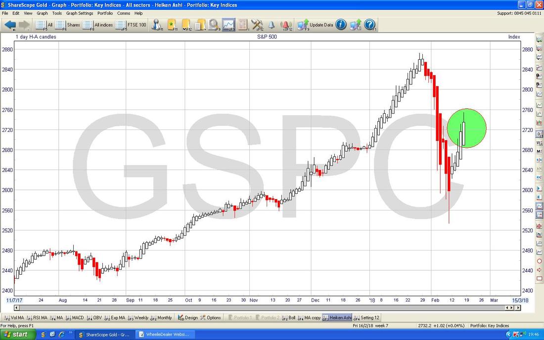
The Screen below is my actual ‘Working’ Chart with which I am managing my S&P500 Long Spreadbet Trade. My Blue Arrow is pointing to a Blue Line I have drawn in which marks where my Long Trade was Opened and the Pink Arrow is pointing to the Pink Line which marks my Stoploss Level - if this is breached to the Downside, then I will close my Position.
My Yellow Circle is highlighting an ‘Inverted Hammer’ or ‘Shooting Star’ Candle that we were ‘treated’ to on Friday. In the context of quite a good run up in previous Days, this looks to me like it might mark a Reversal and we could see the S&P500 drop back a bit now - although I suspect it won’t fall much and it will just be taking out some ‘Heat’ after the strong push up. However, we need to be on our guard - if it starts to fall in a sustained way again we need to be watching that 200 Day Moving Average Line and seeing if that holds - a Failure of Support down there would be troublesome for Bulls. We often get a situation where ‘Monday Reverses Friday’ so I would not be surprised if the Markets were weak tomorrow in light of this Inverted Hammer. For now I am keeping my Long Trade on but I will be monitoring the situation as we go through the Week. 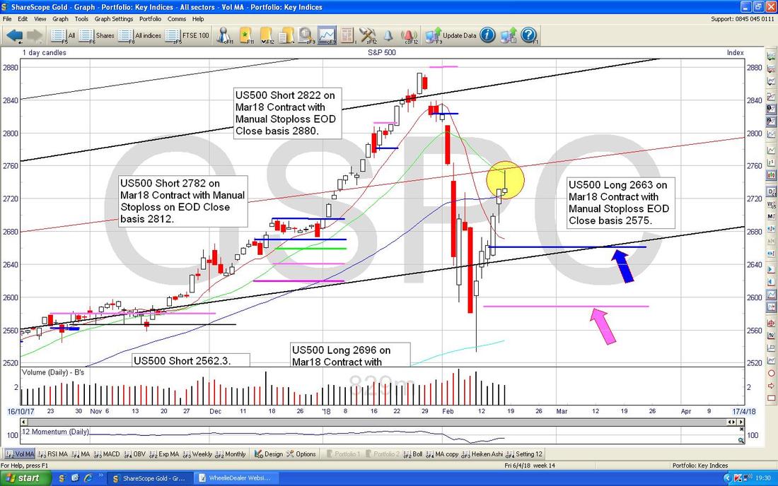
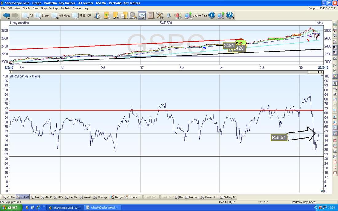
In the bottom window on the Screenshot below we have the RSI (Relative Strength Index) for the S&P500 Daily and on a Reading of RSI 51 this is quite ‘Neutral’ and doesn’t suggest Overbought or Oversold in any way.
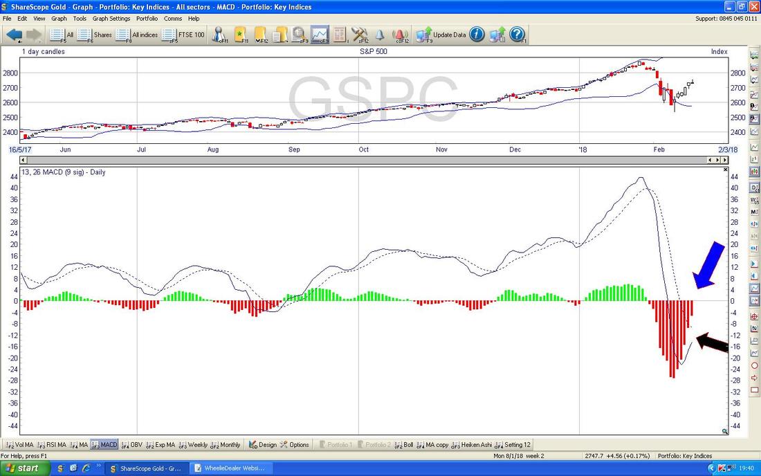
In the bottom window below we have the MACD (Moving Average Convergence Divergence) for the S&P500 Daily - my Blue Arrow is trying to show how we are pretty close to a Bullish MACD Cross in the Coloured Histogram Format - this would happen when the Histogram Bars turn Green. My Black Arrow is trying to point at the same thing in the Signal Lines format. It we get a Bullish MACD Cross, that is obviously a positive thing.
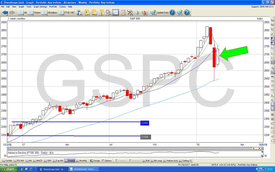
Something could be shaping up here. The Chart below has the Weekly Candles for the S&P500 and my Green Arrow is pointing at the White Up Candle we got Last Week and note how this is ‘Inside’ the Red Down Candle from the nasty Week before - this gives us 2 Parts of a 3 Candlestick Pattern - we need the Candle from the coming Week to complete it and Bulls need an Up Candle this Week - if we get a Down Candle, that would be a negative sign - I am sure we will look at this Next Weekend !!
Obviously by this stage we need some Heiken Ashi (ok, if you are desperate you can get some Heineken from the Fridge……..) and the Chart below has the Daily HA Candles for the S&P500 and my Green Arrow is highlighting how they are Big and White and going up and that is all good.
Nasdaq Composite (US Tech)
This is pretty much identical to the S&P500 in all aspects - just to demonstrate, the Chart below has a Yellow Circle highlighting an almost exactly the same ‘Inverted Hammer’ or ‘Shooting Star’ as to that we had on the S&P. The DOW is the same as well but I won’t bother showing that one. 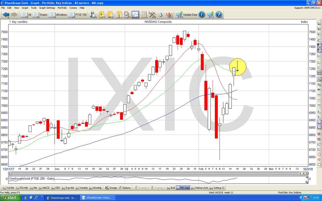
FTSE100
This is the other Index I have a Long Spreadbet on so I am particularly interested in how things are shaping up here. As I did on the S&P500, I have decided to start with ‘The Big Picture’ and to then go to the detail because I am aware that in recent Weeks I have only shown the Short Timescale stuff and it is so important to keep the larger Timeframe in mind as that is the Dominant Factor over all shorter term moves. My Chart below goes back to the 2009 Credit Crunch Lows and there is clearly a Channel as marked by my Black and Red Lines. The Black Line (marked by my Black Arrow) is particularly important if we get some serious Turmoil in the Markets and get a really nasty Pullback - this Line suggests that there is very Strong Support at around 6100 and I guess allowing for the inaccuracies in my Line drawing, we can safely say 6000 is a very important Area of Support - if this were to fail, that could be pretty nasty and maybe a very strong indication that a proper Full-on Bear Market is taking place. To the Upside now, my Red Line (Red Arrow) is capping any moves up and this suggests that just above 7800 there is pretty strong Resistance - and of course the 8000 Level will be very Strong Resistance as it is a psychological number. 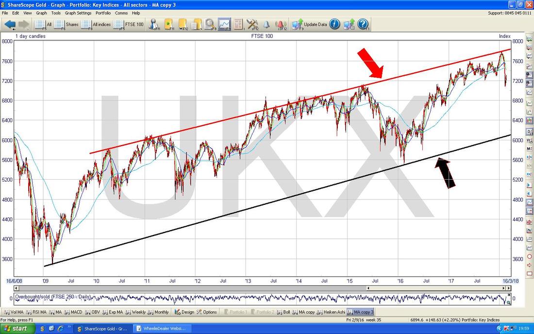
Regular Readers (don’t worry, I won’t do the All-Bran quip again), might remember me shoving in a Chart very similar to the one below probably three Weekends back - but I noticed there is something quite important here that I wanted to point out.
My Red Arrow is pointing to the Bottom Red Line which was ‘matched’ by a sort of Parallel Upper Red Line to form an Uptrend Channel which was containing the FTSE100 Price Action quite well for about a Year or so. Anyway, the Key Point now is that with the Price currently below this Bottom Red Line (where my Yellow Circle is) it means that the Red Line is Resistance and there is a risk that the Price could move up to it and then bounce back down - so this is something to watch for. The Red Line is in that 7350 to 7400 Area and really if the Price can get cleanly above 7400 then we would be able to relax a bit. Having said that, once clear of that 7400 Area, we would then come up to the 200 Day Moving Average which I am pointing at with my Blue Arrow. 
The Screenshot below is the ‘Working’ Chart for my FTSE100 Long Spreadbets and the Blue Arrow is pointing to 2 Blue Lines which mark the Levels where I opened the Trades and the Pink Arrow is pointing to my Stoploss Line at 7070. The Yellow Circle is capturing a nice Big White Up Candle from Friday and this is a Bullish looking Candle suggesting more Gains. However, with the potential negative from the US that the Inverted Hammers/Shooting Stars are suggesting, we might find things difficult for the FTSE100 at the start of the coming Week.
My Big Green Circle is highlighting a big Area of Resistance from around 7300 to 7450 and this will be tough to wade through and even if that can be achieved, there is much Resistance above even that. Clearly moves up from here will be tough going. 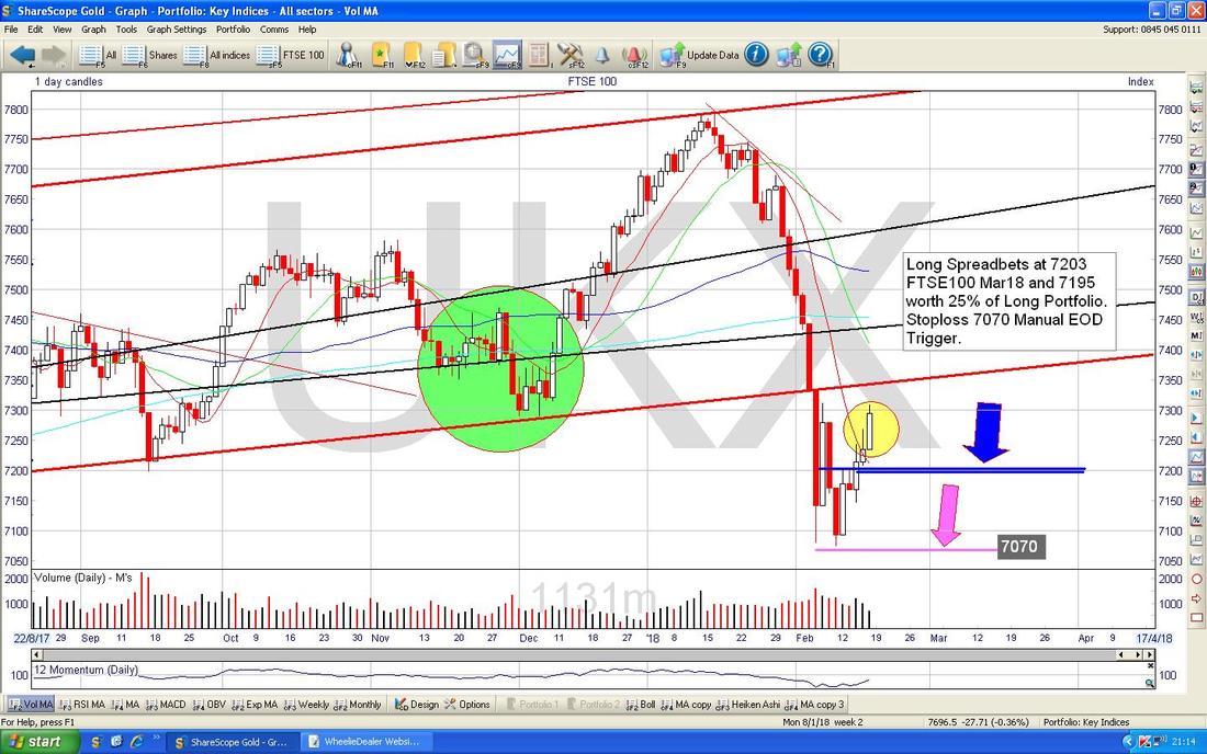
In the bottom window on the ScreenShot below we have the RSI for the FTSE100 Daily. On a Reading of RSI 42 this is still on the low side and it has been moving up which I would expect to continue.

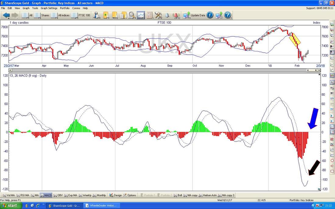
In the bottom window on the ScreenShot below we have the MACD for the FTSE100 Daily. My Blue Arrow is pointing to where we are very near a Bullish MACD Cross on the Histogram Bars format and my Black Arrow lower down is pointing to the same thing but in the Signal Lines format. A Bullish MACD Cross would be positive as the name implies.
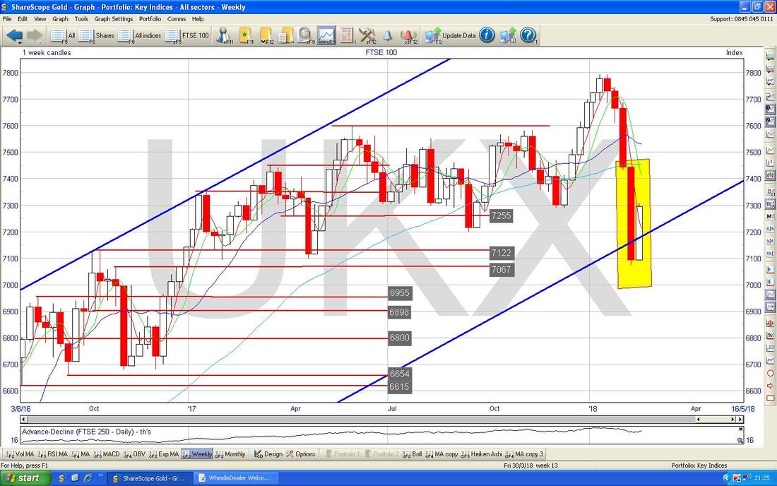
Ignore all the ‘Noise’ on the Weekly FTSE100 Chart below and just focus on the Yellow Box which is capturing the 2 Candles from the last 2 Weeks. This combination is a nice example of a Bullish Harami and suggests we will see gains ahead.
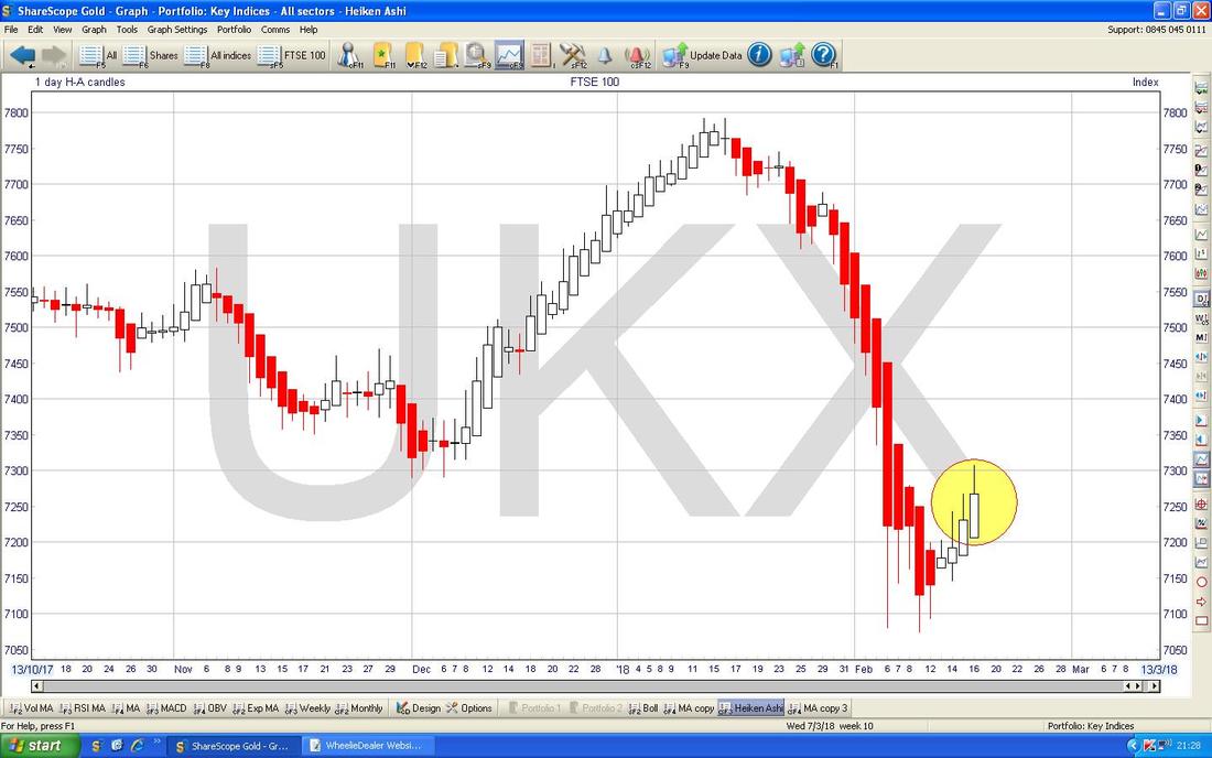
The Chart below has the Daily Heiken Ashi Candles for the FTSE100 - my Yellow Circle is highlighting nice Big White Up Candles and these suggest more Gains to come.
I won’t show it but the FTSE250 is almost identical to the FTSE100. This is also the case on the FTSE SmallCaps and on the AIM All-Share. It is particularly noticeable just how Correlated all the UK and US Indexes are at the moment.
Somero Enterprises SOM I’m gonna wind this up in a bit but I just wanted to lob this one in as it is a Stock which I know many Readers hold and I hold some myself. The Chart looks really good and I wanted to explain why this is so. First off my Red Arrow is marking the Downtrend Line which was capping any moves up until about the change of 2017 into 2018 when the Price broke out through the Red Line where my Yellow Circle is - this was a very Bullish Event and following this we had a superb and strong run up as is highlighted with my elongated Green Rectangle. Following this we had a ‘Consolidation’ period when the Price eased back which is contained in my Pink Box and then we had a Hammer Candle on Tuesday 6th February and this was the Turning Point from which the Price started moving up again (the Hammer can just be made on out this Chart and I have pointed at it with my Black Arrow). My Green Circle is highlighting a nice Big White Up Candle from Friday and this suggests more gains are on the way - a Breakout over the Recent High at 380p would be extremely bullish. My Blue Arrow is pointing to where we got a Bullish ‘Golden Cross’ between the Darker Blue Wavy Line which is the 50 Day Moving Average and the Lighter Blue Wavy Line which is the 200 Day MA - these have a lot of predictive power I find. I am a big fan of SOM and I think we will see it go a lot higher - on a Forward P/E of 13.7 and a Forward Dividend Yield of 2.4% along with potential for Special Dividends, there is a lot to like on the Valuation front. 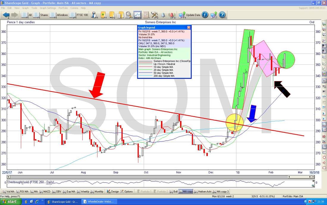
It’s such a nice Hammer Candle I have decided to show it in the Chart below - it is in that Yellow Box and note how it marked the turn - makes me smile when people say TA stuff like this doesn’t work……..
OK, I need to Proof Read this and upload it to the Website - have a great Week everyone !! Cheers, WD. 
4 Comments
Jean black
19/2/2018 09:35:33 am
As usual very helpfull
WheelieDealer
20/2/2018 09:09:43 pm
Thanks Jean - great you liked it, Pete
Damo
19/2/2018 10:27:29 am
Nice one Pete.😀👍
WheelieDealer
20/2/2018 09:10:35 pm
Hi Damo, Leave a Reply. |
'Educational' WheelieBlogsWelcome to my Educational Blog Page - I have another 'Stocks & Markets' Blog Page which you can access via a Button on the top of the Homepage. Archives
January 2021
Categories
All
Please see the Full Range of Book Ideas in Wheelie's Bookshop.
|
