

|
educational blogs |
|
Time to have a sniff around the Indexes as usual. I was in the marvellous ‘Zaman’ Curry Emporium in Datchet late on Friday night and I had a quick shuftie at my ADVFN app on my Fone to see how the US had closed - and the DOW was down a chunk and had made a new 1 month Low - so a Downtrend Channel is starting to make itself clear. For this reason, I will look at the US first, when I get onto the Charts bit.
According to the UK Stockmarket Almanac 2016, the coming Week (w/c 16th July 2016) is Up historically for 63% of Weeks BUT the average Return is MINUS 0.1% - so another week where we shouldn’t expect too much maybe. As we all know, May is a weak month (3rd weakest) and with the Brexit Vote now about 5 weeks away expect a constant Drumbeat of ‘Project Fear’ messages (although how Cameron can go higher than World War 3 is beyond me - maybe Interstellar War against the Galactic Federation - gulp).
S&P500 I’m starting off with the Daily Candles for the US S&P500 going back for most of 2016 so far. I have used some Technical ‘Poetic Licence’ here and drawn in what I think could be the start of a Downtrend Channel which I have drawn as the Parallel Red Lines and marked with the 2 little Red Arrows. To make the significance of any such possible Downtrend Channel more obvious, I have also drawn in a sort of Uptrend Channel which was in force and I have marked this with Black Parallel Lines and pointed at them with 2 small Black Arrows. If you visualise it in this way, it really looks like we have been in an Uptrend and now we are in a Downtrend. However, care is needed with this theory - I have jumped the gun a bit and my Red Parallel Lines could be totally wrong - I have based them on the 5 ‘Lower Highs’ that we put in since 20th April. I then drew in the Bottom Red Line as a ‘best fit’ that was parallel. I have also extrapolated a bit from the Dow Jones Industrial Average where the Downtrend Channel is clearer - as I will show in a minute. In coming Days, we should see whether or not my Theory is even remotely close. My Blue Arrow is pointing to an ugly Big Red Down Candle from Friday 13th May - the key thing here is that Support at 2040 (one of the Green Horizontal Lines) must hold - if that fails, then we go to test the next Support which is at 2022 and then the 200 Day Moving Average (the faint Blue Wavy Line) at about 2022. I would say 2000 is a very important level, if that fails, then there is big trouble. On the other hand, for things to get more bullish, we need the Price to get up over 2088 first off and then 2085 (which was the high from Tuesday 10th May 2016 - the Big White Up Candle from 4 days back.) 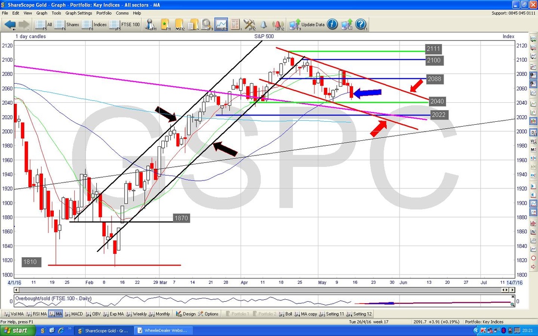
The Chart below has the Weekly Candles for the S&P500. My Black Arrow is pointing to an ‘Inverted Hammer’ Candle that was formed last week - however, before you get excited, in this context (i.e. there has not been much of a move Down or Up prior to this Inverted Hammer), it is probably not a Reversal Signal and if anything it just shows how weak the Market is because the Price was unable to hold the High Points of the Week and fell back to its Lows.
I have put in the important Support Levels here. 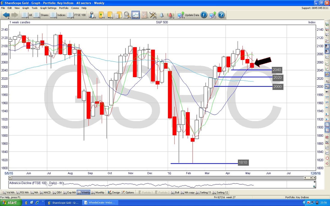
On the Chart below, I have had to zoom in to an extremely short Time Period to show how the Red Wavy Line, the 13 Day Exponential Moving Average (EMA) has just crossed down under the Green Wavy Line 21 Day EMA. I have pointed at it with my Black Arrow but it is not all that easy to see. Anyway, it is bad news and usually means the Price will drop for a few weeks now.
I am not seeing much Good News on the S&P500 - none in fact. Which is interesting in itself, because up until this Week I felt that the US Indexes were holding up much better than the FTSE100 and were in fact just off their All Time Highs - however, last week changed all that and now US looks a bit pants. 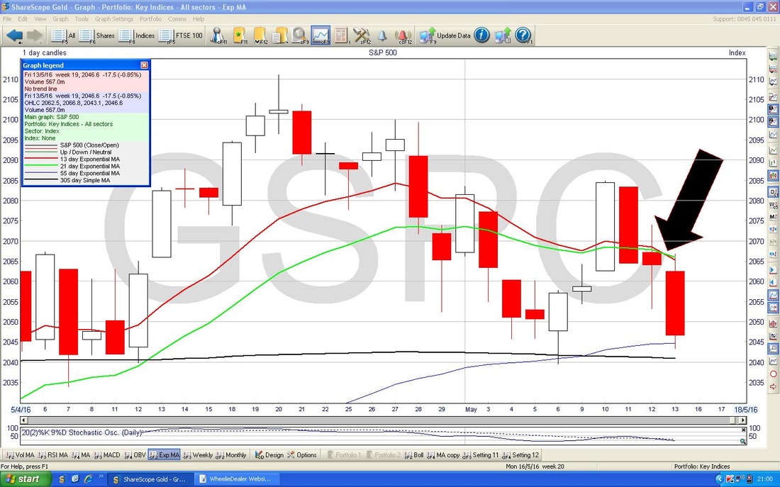
DOW (Dow Jones Industrial Index - 30 MegaStocks)
I always say that we must look at the ‘Big Picture’ first and then drill down. This is really relevant here on the DOW because I had intended to just show you one zoomed-in Chart but then I realised that in the wider view there was an important thing to note - so let’s take a peep at it. The Chart below has the Daily Candles for the DOW going back a couple of Years ish. What matters here is my Purple/Pink (whatever) Line which I have marked with a similarly coloured Arrow (regular Readers with amazing memories might recall that this Line was on a DOW Chart I showed many months ago), and the point is that up until the start of April 2016 this Line had acted as Resistance to the Price but in April the Price Line ‘broke-out’ and the Price went on to the High at 18167 on Wednesday 20th April. Since then, the Price has been dropping back towards that Purple/Pink Line and on Friday 13th April it pretty much touched it - the point is that it may now act as Support (basic Technical Analysis theory - Former Resistance becomes Support and vicey versy). I have marked this with my Black Arrow and if Support fails here, then it is not good. 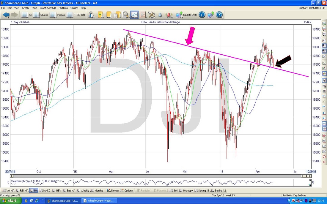
On the Chart below, I have zoomed in to about the last 2 Months of Daily Candlesticks. I have drawn in the Parallel Red Lines Downtrend Channel as I did on the S&P500 and you may notice that this one is arguably more valid because I have had to do less guess-work with the Bottom Line - this one has more ‘touch points’ because of the New Low made on Friday 13th May.
Let me explain this better as it is where I came in and it links nicely with the Zaman Tandoori and Tarka Dall (no, that has nowt to do with Otters). When I said I looked at the 1 Month Chart on my Fone and it had “made a new Low” - this is what I meant - my Blue Arrow points to where the Dow Price closed on Friday 13th. My Black Arrow points to the previous ‘Low’ which was made on Friday 6th May (the exact Week before), note the new Low is therefore Lower than the previous Low. I hope that makes some sense - it is a very important concept to understand - particularly because it shows a lot of Weakness when the Price is unable to find Support at previous Low Points, and we are clearly getting a succession of ‘Lower Lows’. 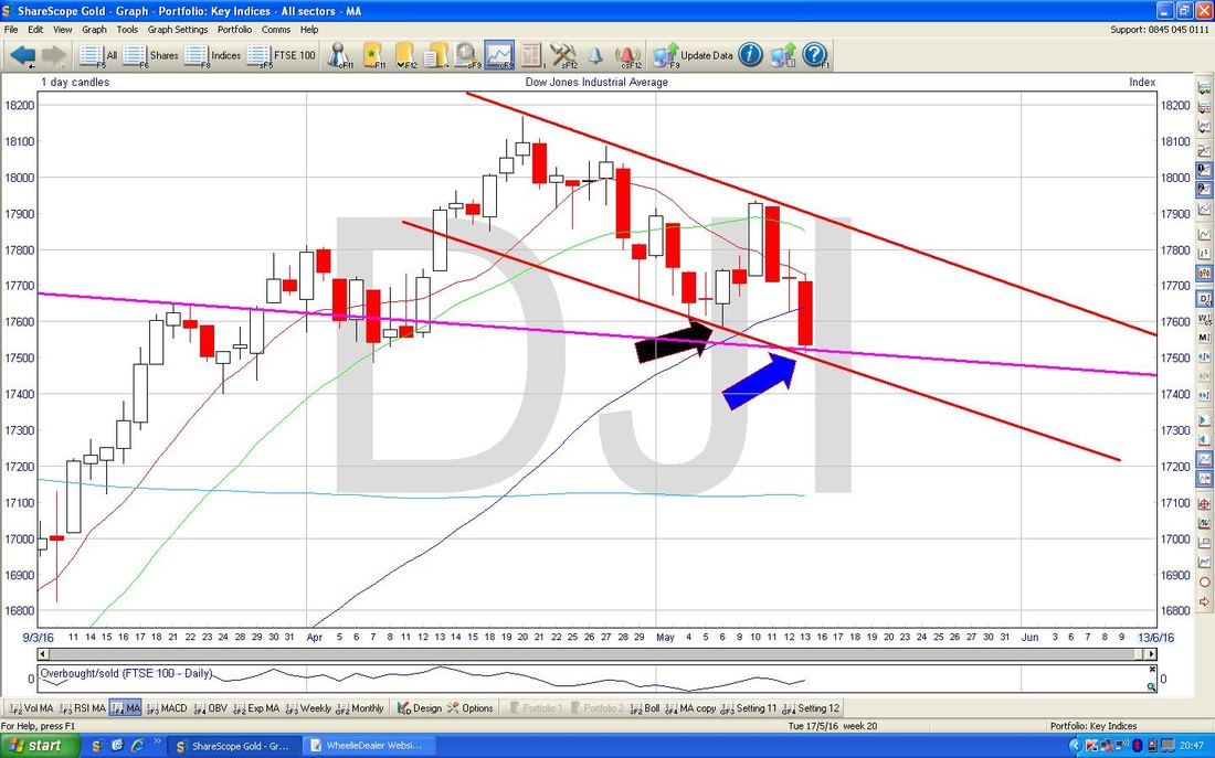
FTSE100
Now we’re talking, this is what I really want to look at !! The Chart below has the Daily Candles for much of 2016. My Red Arrow points to a sort of Hammer Candle which formed up on Friday 13th May and the key thing here is that the Low of that Day, which is 6060, needs to hold. However, more importantly, the Low of Friday 6th May at 6054 must hold - I have marked this with the Black Arrow. There is not a huge amount of evidence here to suggest where we are going - although some other Indicators might give some clues. However, the US continued to fall after the Close of the UK Markets so maybe we are in for some negative catch up early in the coming week - however, Oil still looks pretty good so this could help the FTSE100 (and obviously the Brexit Vote is casting a wide shadow over everything at the moment). It is quite possible that we are in a Sideways Range now - from about 6050 to 6200. It was really noticeable Intraday last week how the FTSE100 fell back after getting near 6200 a few times (you can see this on the Charts with the ‘Wicks‘ of the Candles). Note 6200 is pretty much where both the 50 and 200 Day Simple Moving Averages are - so it is not all that surprising that 6200 is acting as a Resistance Level. For Daytraders and longer term Shorters and Hedgers, it could be a good idea to Short near 6200 ish. You wouldn’t know this if I hadn’t typed it, but hey, I like to add some drama into my Blogs………The original Chart here did not have those 2 Blue Parallel Downtrend Channel Lines - I had nearly written this section when I realised that there was a Channel like in the US Charts so I decided to draw it in. Again, it is early Days but we could be in a Downtrend Channel here - something to monitor. 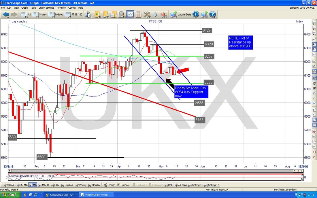
At last !!! Something that could be seen as a bit positive - poor Old Bulls must be starving and need some Fodder from this Blog, while the Bears have been gorging from the Honey Pot.
The Chart below has the Weekly Candles for the FTSE100. My Blue Arrow is pointing to a ‘Doji’ Candle which was bashed out last Week and after 3 Down Weeks it might be suggesting that the push Down is faltering and the Bulls are trying their best to fight back. Such Dojis (and this is a beauty because it has a nice slim Body [didn’t we all once upon a time] and equal size ‘Wicks’ or ‘Tails’ above and below - textbook example of a Doji), can be Reversal Signals but tend not to be; however, they can give early warning that a Trend is waning. Note again the importance of the 6035 Level. 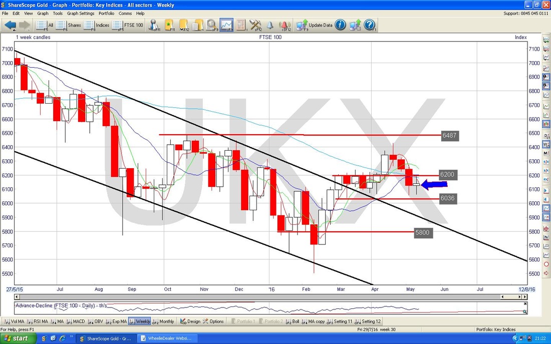
Brent Crude Oil
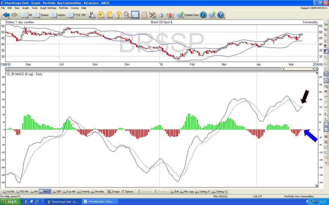
Not much to say here. The Chart below shows Daily Candles for Brent going back about 9 months or so. The key thing is that we are still nicely within the Blue Parallel Lines Uptrend Channel and as long as we stay in those confines then things are bullish. The Price is currently flirting with $48 and needs to get over this and then we have $50 which will be tough and I think $54 will be extremely hard. My Black Circle in the Top Left Hand Corner shows a big area of Resistance that will be difficult for the Price to wade through - although we have already made progress here. On the Downside, Support around $45 looks important as failure here would take us outside the Blue Uptrend Channel Bottom Line. Also, $43 looks an important Horizontal Line of Support. The 200 Day Moving Average at about $42 is yet more important Support. 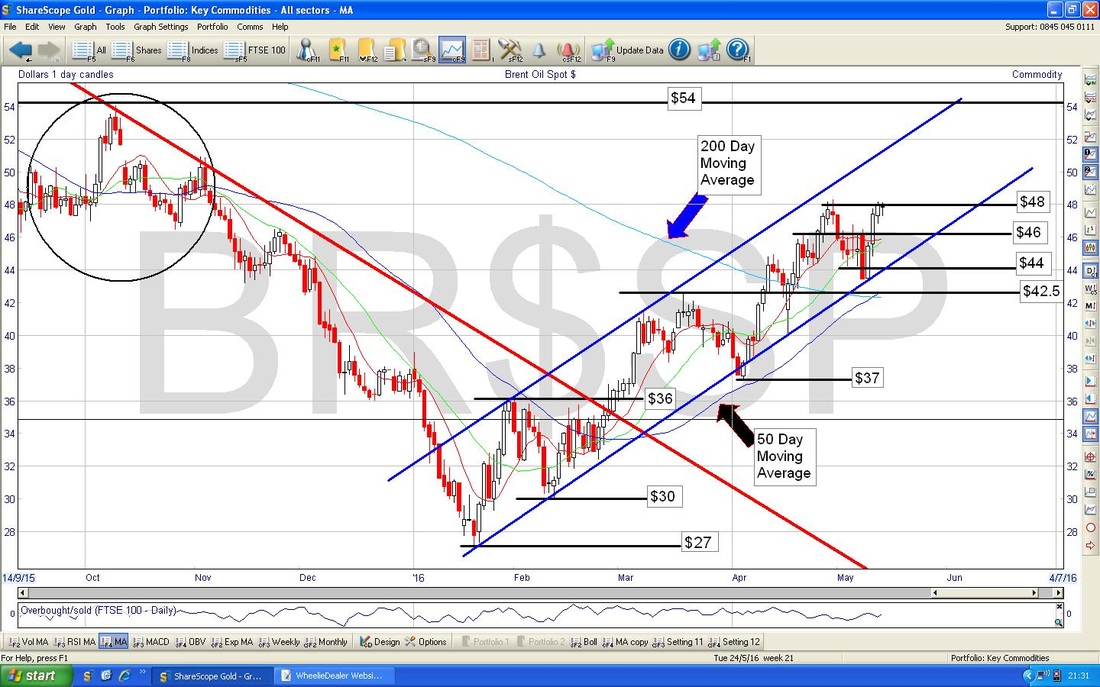
The Bottom Window on the Chart below has the MACD ‘Humps’ and the Signal Lines. My Black Arrow and Blue Arrow are both pointing to how we are about to get a Bullish MACD Cross on Brent Daily Candles - if it follows this, then I suspect Brent Oil will soon be at $50.
Gold
The Chart below has the Daily Candles for Gold going back 8 months or something. While I was ‘Analysing’ (LOL, don’t make me laugh, Wheelie, Analysing…pah….whatever next?!!) the Gold Chart I thought I could see some Trendlines so I have drawn them in and they should help give us a steer on what to expect next. My Black Line marked with the Black Arrow is a Downtrend Line that has formed up over the last few Weeks and we need the Price to break out of this Line. My Red Line marked with the Red Arrow, is an Uptrend Line and is acting as Support to the Gold Price - we need this to hold and not be broken below. If it does break to the downside, then that is bad news. I guess this Red Line gives important Support around $1250. Anyway, the Black and Red Lines give us a cool Dairylea Triangle to watch (don’t eat it for heaven’s sake !!). In very simple terms, Bulls need the Price over $1304 and Bears need the Price below $1200 I reckon. Right, that enough Cow/Milk related words for one week, I hope things go your way………….(and mine, obviously), Cheers, WD. 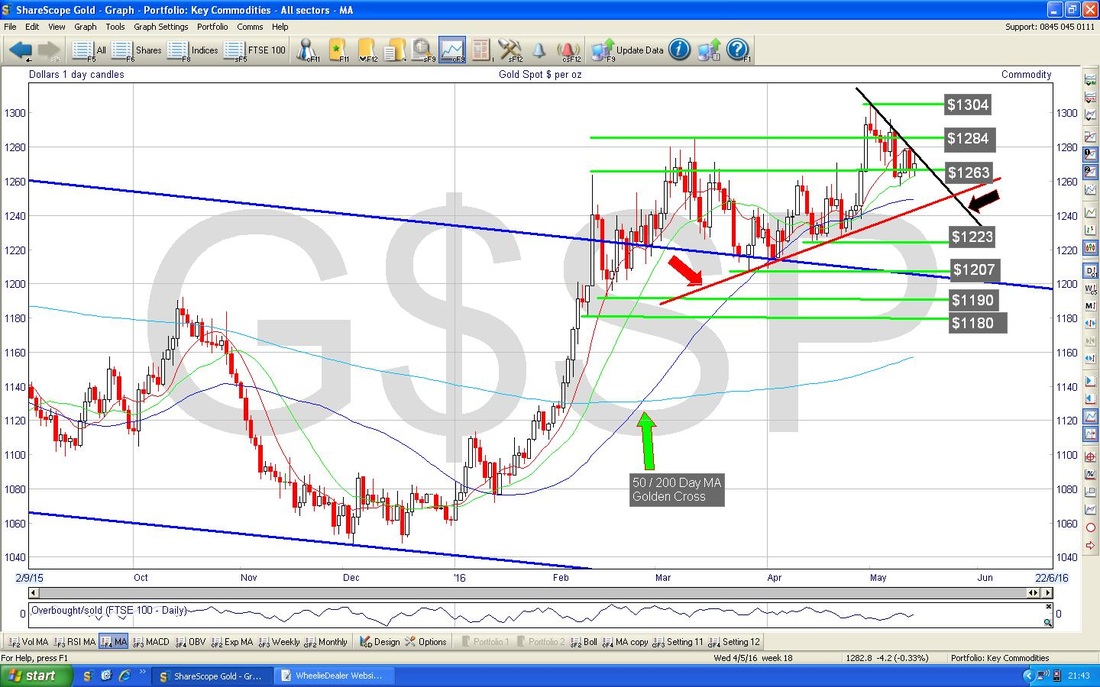
0 Comments
Leave a Reply. |
'Educational' WheelieBlogsWelcome to my Educational Blog Page - I have another 'Stocks & Markets' Blog Page which you can access via a Button on the top of the Homepage. Archives
January 2021
Categories
All
Please see the Full Range of Book Ideas in Wheelie's Bookshop.
|
