

|
educational blogs |
|
Finally the Bears have come out for their Honey………
I have been saying for a long time that the Markets were very overstretched to the upside, especially in the US and this was of course best shown by the RSI Readings which were quite frankly insane. The crack in the Bull Run had to come and finally it is upon us. I don’t see this as ‘The End of the World’ and it is far more likely to be just a healthy Pullback within a Major Uptrend - in my experience, Markets always tend to do ok when the Global Economy is decent, and that is clearly the case with more strong Economic Data expected next week. There is a lot of talk/worry/Noise about higher Inflation and higher Interest Rates but I think such concerns are utterly overblown - firstly because it is highly unlikely that Central Banks will raise Rate quickly and secondly because Chris Dillow in the Investors Chronicle has pointed out a few times that the historical evidence of how Markets perform in a Rising Rate environment is that Stocks can rise while Rates move up to about 5% or 6% - and we are a long way off such levels. The simple fact is that the Faster Economic Growth that goes along with Rising Rates ‘Trumps’ (sorry !!) the drag of higher Borrowing Costs (of course it is not a uniform thing across sectors - for example Banks can make a lot more Profit in a Higher Rate scenario because their Net Interest Margin [the ‘gap’ between their Funding Rate and their Lending Rate] gets larger).
In addition, in terms of the Technical Picture, Indexes are overstretched in the very Short Term (not so much with the FTSE100 now) but there is a lot of Support just down below and this is highly likely to kick in and do its job to keep Markets nice and buoyant.
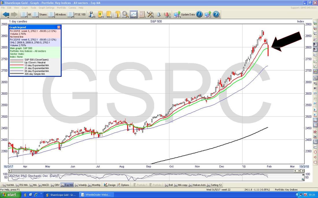
Winter tends to be the best time for Stocks and I am more worried about what will happen around April/May as we head into Summer. Last Week January had a ropey finish for me (and for most other Investors I see) and last week was pretty painful but no big deal in the big scheme of things. If you skip over to my Homepage and look under ‘Weekly Performance’ you will see the Numbers for last Week and I have put all my Weekly Numbers there for January - in the end I was up a bit when January ended so I guess I should be pleased about that - in £ Note terms it was a good month for me despite a cruddy ending. I also wrote a fair bit of text around my thinking and Strategy going forwards and I also amended much of the Text that has been getting a bit stale in that section. In the past I have often written about particular Stocks in that chunk of text but for time reasons, I might not do that so much in future. I am heading towards an update of that ‘Weekly Performance’ section at the End of each Month and with regards to the Stocks themselves I put out shed loads of information on Twitter about them and I also flag interesting ones in these Weekend ‘Charts’ Blogs (which seem to be evolving into something a bit wider than just the Charts !! I guess after 3 years of doing this WD silliness, it is still very much a ‘Work in Progress‘.) A few weeks back I did 2 Blogs specifically looking at every Stock I hold and a short Paragraph on each one with my current thinking. This went down really well with Readers and I have had requests for this to be repeated on a fairly regular basis - I think that is an excellent idea (and also has the luxury/benefit of meaning I don’t need to think of an interesting/enthralling/exciting/unusual/innovative Subject for a Blog in a particular week !!). And whilst doing the Proof Read I have realised that I can copy much of the Text from the previous one and just tweak it as appropriate so that might even save a lot of time. If you don’t follow me on Twitter or have a Twitter Account, apart from the obvious of opening such an Account (it’s FREE and easy), you can just do a Google Search on ‘Tweets by @WheelieDealer’ and the garbage I send out should just appear on your screen. If you go to the bottom of my Homepage, there is also a Twitter Feed there which you can look at. I recommend you get access to my Tweets because it is a key part of the whole WD Experience. If you do set up an Account, you could just follow me so your ‘Feed’ is nice and clean but it would probably make sense to add a few of the really excellent People who are on Twitter onto your Feed. While talking about the Website etc., I also updated the ‘Little Black Book’ section with several ideas for further Research that Readers might find useful - I am convinced that the Stocks I highlight in this List tend to do far better than the actual Stocks I buy !!! (typical !!). There was also a ‘Stock Idea’ Blog about FairFX FFX which Readers might find useful - it is not a full ‘Buy Rationale’ type blog but it covers the main stuff and I think FFX is a very interesting opportunity - and the Valuation looks pretty appealing. Forthcoming Attractions I have been promising a Blog on EU Supply EUSP and I have made a very tentative start on writing this but it might not come out as fast as I intended for the main reason that I am working on that ‘Evolution of an Investor’ Blog and that has become a bit of a ‘Project’ for me which I am getting very stuck into. In essence I am explaining my History as an Investor over about 5 specific Periods (both of Time and of Approach) and I think this should be extremely useful for newer Investors (and hopefully more experienced Investors can learn something and also see the parallels with their own journeys) and to give it some context I am seeing this as what would appear for myself if I was ever written into a book like ‘Free Capital’ by Guy Thomas (before you start I am in no way comparing myself to the truly brilliant Investors in that book but I hope that what I am producing will be of very high value). ‘Free Capital’ is a truly inspiring read and if you pop over to Wheelie’s Bookshop you can read more about it and if you fancy you can buy the Book - in doing so I will get a Beer out of it !! Cheers !!! I am making good progress and wrote another few pages last night but I think this will become quite an epic and it might even stretch over 3 Blogs once it is finished - I have written up about 3 of the Stages which takes me to the end of the Credit Crunch in 2009 and the next Stage will cover the 5 years up to about 2015 when I started the WD Website and the final Stage covers the WD period (which has been surprisingly productive for me in terms of my own Personal Learning and Development - as the Blog should explain). Once I have written the Draft Text for all the Stages, I can then think about re-jigging the Structure a bit and making it clearer and then I will probably start releasing it in Weekly Parts as I proof read each section and get them in a fit state to publish. I hope Readers will be as enthusiastic about this Project once I start publishing it as I am in the process of writing it !! So the chances are that the EUSP Blog might follow this but let’s see how it goes because I might be able to do them in parallel a bit. With all these things going on, I can’t promise which Blogs might appear when and there might not be a new Blog this week although I will of course do a Charts Blog next weekend. Mello Derby I am sure many Readers will be aware of this upcoming Investor Show which is due to take place on Thursday 26th April and Friday 27th April at the Derby Conference Centre (DE24 8UX). This has been organised by David Stredder (@carmensfella on the Tweets) and this follows an extremely successful Event he organised a few Years ago which was widely praised by Private Investors because it got together a huge number of Quality Small Companies and also had lots of interesting Speakers at the Conference side of things. It is also a rare opportunity to meet with loads of Private Investors who are in the same boat as you are and if my experience of recent Shows/Events is any guide, if you hunt me down then I am sure I can help introduce you to loads of the great People who I now there - many will be people who are well know on Twitter as important Members of the ‘Twitterati’. This is particular useful for Investors based in the North of the UK because so many of the Shows that are put on are based in London, and I will be attending it on the Friday 27th April and I have booked my Hotels and everything. I think it costs £99 for the 2 Days and it is £69 for 1 day - I would love to do both (that’s the Value Investor side of me coming out !!) but sadly Health constraints make this impossible. You can get more details and book your Ticket here: http://www.mello2018.com/index.html If you are a Member of ShareSoc, then you can book a Discounted Ticket - the details are here: https://www.sharesoc.org/events/mello-2018/ As always time is tight so I will focus on the Indexes and probably won’t include any Individual Stocks this week - as you will see when we go through them, I think Markets could remain soggy for a bit so personally I wouldn’t be rushing to buy Individual Stocks in any size - it is of course a different thing to start Stake-building if there is a particular Stock that is desired - but buying heavily now might be a mistake. Of course there might be individual Stories that have appeal but it was certainly the case for my Portfolio last week that pretty much everything was struggling - it was probably only MPAC (the old Molins MLIN) which jumped and that was because it as one of Simon Thompson’s ‘Bargain Shares’ in Investors Chronicle - and I am sure Readers know that I think this is an outstanding buy and I have a Target in the region of 300p at least. S&P500 I’m starting off with the US Indexes because I have a small Short Position on the S&P500 (see my ‘Trades’ page) and this had been not doing much until Friday when the US Markets tanked which of course meant my Short suddenly is doing rather well !! If I can I would like to add to this Short but I will be driven by how things play out early in the coming Week - I am expecting some sort of attempt at Recovery on Monday (‘Monday Reverses Friday’) but it will not surprise me at all if a move up early in the day is then waning by the Close - if that happens, I will most likely Short more on Monday Night - watch out for my Tweets….. I am obsessed with using Index Shorts to ‘Hedge’ my Long Portfolio - this is so that I can make money when the Markets are falling (which obviously means I can make money in whatever conditions the Markets throw at me) but also because it means I can employ slightly more Long Leverage than I would normally be safely able to do. If you look at the Blog Category ‘Hedging’ I have written loads on this subject and I am planning another Blog on this in coming Weeks. The Chart below is my actual ‘Working’ Screen from ShareScope (as always these wonderful pics come from the excellent ShareScope software that I use - if you click on them, they should grow larger on your Screen) and I am just throwing this in to follow the pattern I have done in recent Weeks of showing how my thinking is developing and you should be able to see the Text which describes the Short Position I have running. The Blue Horizontal Line is where my Short was opened and the Pinky Horizontal Line right at the top is my Stoploss Level - I will probably be moving this Stoploss down early next week to lock in Gains and lower Risk. My Black Arrow is pointing to a huge Red Down Candle from Friday and note how it Closed pretty much at the bottom (there is no real ‘Tail’ or ‘Wick’ to speak of) and this in itself suggests more falls to come. Higher up the Yellow Circular ‘Halo’ around those 2 Candles at the top was on the Chart from last Week I think and note how this was an ‘Inside Day’ 2 Day Setup and then on the third Day we got a gap down and a small Down Candle - this completed a Bearish ‘3 Inside Down’ pattern and that has played out (look at your ‘Candlesticks for Birdbrains’ book to find this Pattern - it‘s the Yellow and Black Book on your Shelf dumbo). 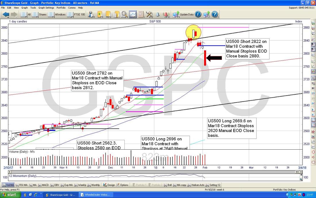
My working Screen above is a bit ‘messy’ and I don’t want to make it even messier by shoving more Arrows and Boxes and such paraphernalia on it so I have switched to the Screen below.
Again we have the Black Arrow pointing to Friday’s big Red Down Candle and then I have put in some Shapes to highlight Zones of Support. The most immediate one is the Yellow Box which runs between about 2700 down to 2670 (although please note there are patches of Support just up above this which might arrest the declines - particularly at 2736 which is the Bottom of the ‘Handle’ on that little Hammer in my small Yellow Circle. If you then go down further we have the Green Box which is a nice Zone of Support between about 2600 to 2550, and then between my 2 kaleidoscopic Boxes there is the Pink Circle which shows another area of Support - so the key message is that there is a lot of Support not too far below. If that is not enough for you, then my Blue Arrow is pointing to the Darker Blue Wavy Line 50 Day Moving Average which could kick in as Support around 2720 and then further down we have the Lighter Blue Wiggler which is the 200 Day MA marked by my Red Arrow and this should give very Strong Support at about 2540. All this Support is a key reason behind my thinking that this is not at the moment looking like a Disaster in the making and it is merely a Healthy easing back after a very Overbought run up. 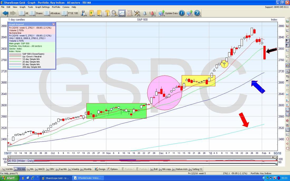
Yet again the RSI (Relative Strength Index) has proven its worth as a Predictor - I have been flagging for Weeks how Overbought this was and it must have been at a pretty much Historical High last Weekend when it was reading RSI 84 where my Blue Arrow is. You can see clearly how this RSI Indicator (some would call it an Oscillator I am sure) is such a great Predictor - High Readings lead to Falls and Low Readings lead to Gains.
Note that on Individual Stock Charts (most notably on Small illiquid Stocks) you can get silly high RSI Readings which persist for some time. But on Liquid stuff like an Index or a Big Cap Stock, the RSI is a superb predictor. We now have a reading of RSI 52 which has come back a lot but I think it can still go lower - if you look to the left in recent history the S&P500 Daily has risen once the RSI gets down to about RSI 40 and at an extreme it has been getting down to about RSI 35 - so this is a great Indicator to watch. If you don’t believe me, you can look back over the Charts Blogs I have been writing in previous Weeks and you can see how the RSI has evolved and my comments on it. 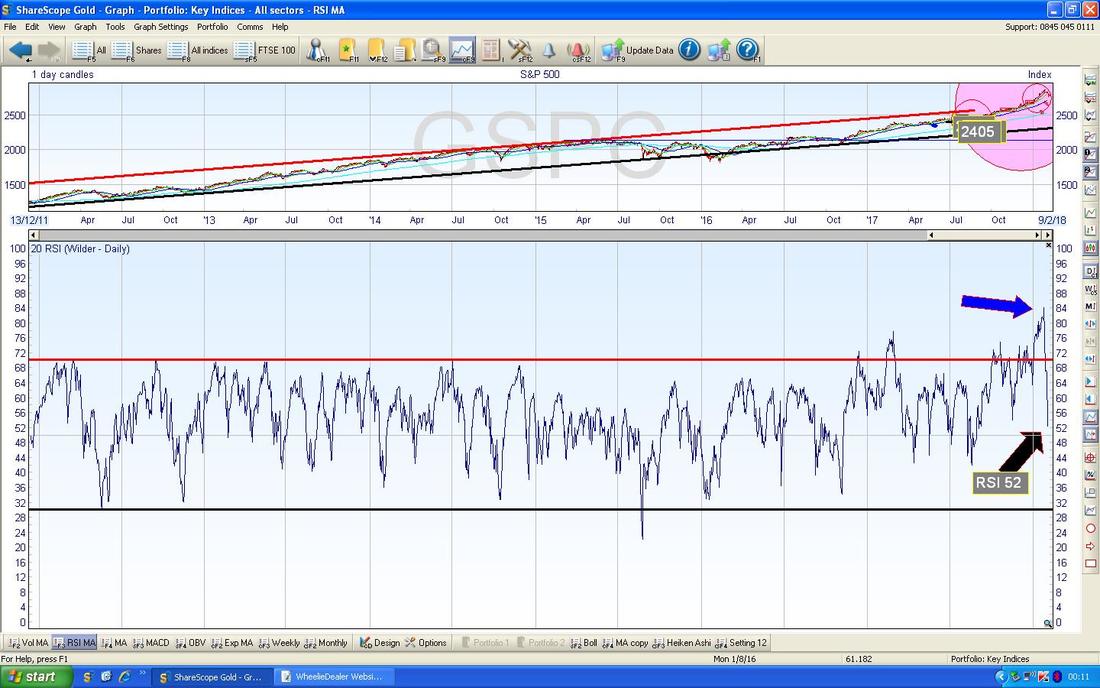
The Chart below has the Daily Candles with the Blue Wiggling Bollinger Bands above and below. My Black Arrow is pointing to the Lower BB and at around 2720 it could cut in as Support - this is not guaranteed and the Price can easily drop below the Bottom BB but when this does happen it tends to mean that a Bounce is needed or a bit of Sideways just to calm any move down a bit (this works on the Upwards Moves as well) - so this is something to keep an eye on in coming Days.
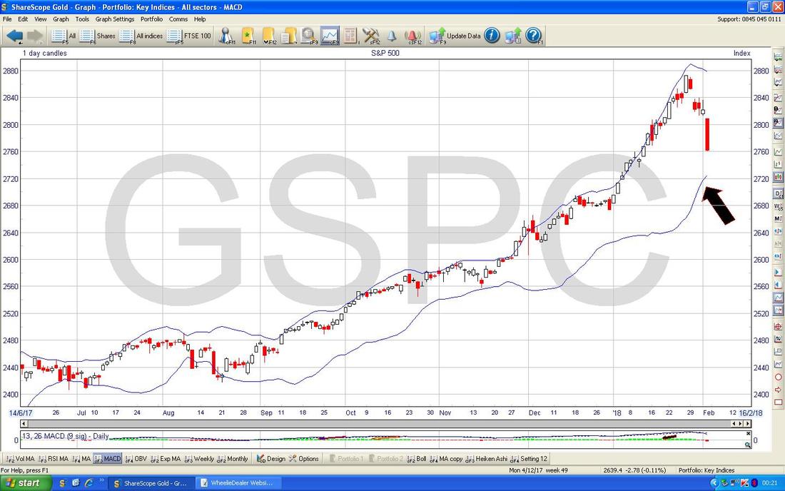
What we have below is one of my most Favourite Indicators but as yet it is not telling us much - but we must keep an eye on this one. What I am going on about are the 13 and 21 Day Exponential Moving Averages which are the Red and Green wobbly Lines. Where my Black Arrow is I am pointing to how the Red Line is moving towards the Green Line and if these Cross over we get a ‘Death Cross’ and I find this is a superb Indicator that there would be more falls in the coming Weeks after the Cross - so it is important to watch this.
With January out of the way we now have a Full Candlestick for that Month which I am showing on the Chart below with my Blue Arrow pointing at it. The Little Red Candle that comes next is the start of the February one but it is not really valid until we get a Full Month or perhaps a few Days before (although really we should wait for February to pay out in its entirety before making much judgement).
I take this Candle from January as nothing much to worry about - it Closed down off the High which is shown on the ‘Wick’ or ‘Tail’ where my little Green Arrow is but a Candle like this is not particularly Bearish. If we had had a proper ‘Inverted Hammer’ where we got a tiny ‘Head’ to the Hammer and a long ‘Handle’ part to the Hammer, that might be suggesting that a Reversal Point has arisen on the Monthly Chart (and remember the Monthly is a predictor of longer term moves) - but without such a Candle, I see little to panic about. 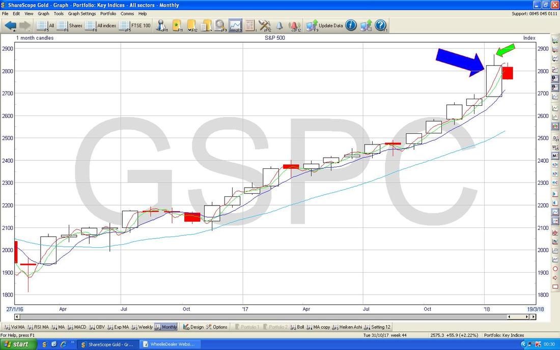
On the Chart below we have the wonderful Daily ‘Heiken Ashi’ Candlesticks. Note where my Green Circle is that the long run of White Up Candles that I highlighted in last week’s Charts Blog changed colour from White to Red and this was a Bearish occurrence - that has played out and where my Black Arrow is we got a Big Red Down Candle which with the way these things work, means more falls are likely.

I won’t show the DOW (Dow Jones Industrials Index) because it is almost identical. However, I must point out that on Friday it fell 666 Points which is rather Devilish. Funnily enough Nicole Elliott in Investors Chronicle this Week on Page 18 wrote the following about Nymex Crude Oil:
“The rally from $50 to the high so far at $66.66 (spooky number - Bitcoin’s high last year was $19,666 and the S&P 500’s low in 2009 was 666) represents a 32 per cent increase in price.” Did amuse me that………must be my fandom of Black Sabbath sneaking out !! (and with typical irony from ‘The Prince of Darkness’, while doing this Proof Read I have actually got Ozzy Osborne on my TellyBox in ‘Ozzy and Jack’s World Detour’ on History Channel…….) The Nasdaq Compositive Index (US Tech) is also pretty much identical to the S&P500 and the DOW. FTSE100 This must be the most colourful Chart I have ever shown in a Charts Blog !! (full on Psychedelia - turned up to Eleven !!). The Chart below has the FTSE100 Daily Candles going back about just over a Year and the main thing to see here first is that Uptrend Channel which is marked by my ‘not too far off Parallel’ Red Lines and if the Price stays disciplined within this Channel, then I would expect the Price to get down near the Bottom Red Line where my Red Arrow is and this would be at about 7350 where Support would kick in. My Yellow Circle is highlighting a Big Red Down Candle from Friday and this in itself suggests more falls - but note how it is just below the 200 Day Moving Average Line marked by my Blue Arrow so we are getting into the kind of Zone where Support should kick in. This is enhanced by a lot of other Areas of Support on this Chart. First off we have the Level around 7300 where my Green Circle is and then we have the Level of 7200 where my Pink Circle is and then we have the Level of 7100 where my Blue Circle is. We also have a Band of Support where my Yellow Box is which is pointing out a lot of ‘Congestion’ between about 7450 down to 7300. All this Support again suggests that we really shouldn’t panic with a longer term view. Whilst doing the Proof Read it has occurred to me that perhaps part of the reason why the FTSE100 has been so much weaker than the US Indexes is because many of the really Big Weighting Stocks in the FTSE100 are big Dividend Payers and lately these have been really out of fashion - I suspect it is something to do with Bond Yields starting to creep up and making Bonds a bit more viable for those seeking Income (US 10 Year Treasury Bills are paying near 2.75% Coupon now and with their perceived Lower Risk than Equities this means the latter need to Yield more in Dividends - so the Prices must fall. Having said that, I think we must be near the Bottom on such moves.) 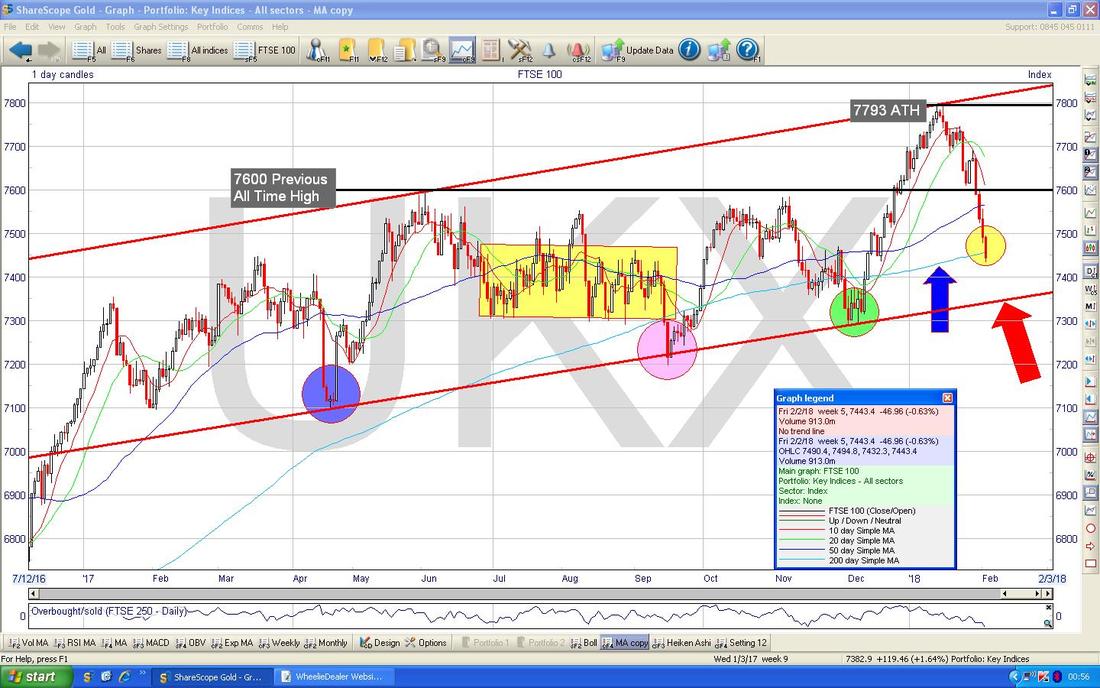
In the bottom window on the Screen below we have the RSI for the FTSE100 Daily. With a Reading of RSI 38 it is getting pretty low but can go a little bit further - which is consistent with my Chart above with all that Support.
Note again how the High Reading on the RSI up around 69 from a Week ago predicted the Falls. 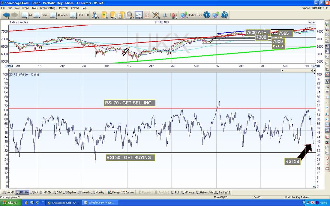
My Chart below has the Daily Candles for the FTSE100 with the Blue Wavy Bollinger Bands above and below. Where my Yellow Box is note how the Price has ‘hugged’ the Bottom BB on the way down - this is unusual and I tend to find it does not get sustained for long and I would soon expect the Price to move away from the Bottom Band - in other words we should get some stability in the Price soon (this would make sense with all that Support I have talked about).
I must add that if all this Support fails, especially down to 7000 or so, then we really could be in trouble so this would be a good sign to keep your eyes on. I think this is extremely unlikely to happen. 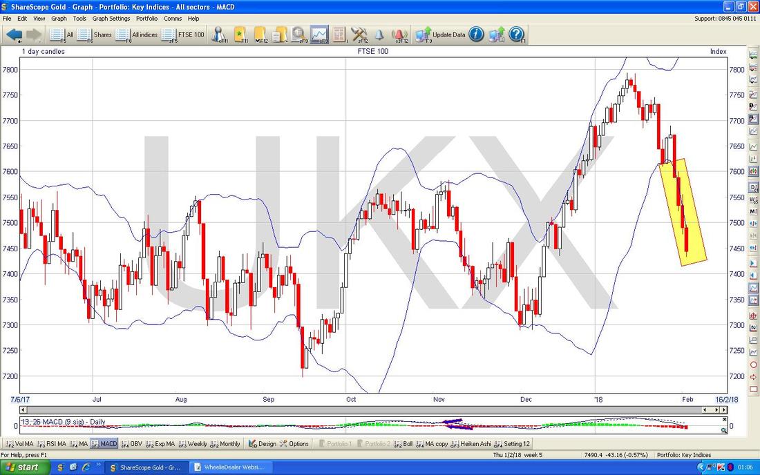
My Chart below has that divine 13/21 Day EMA ‘Death Cross’ Indicator which is shown by my Black Arrow where the Red 13 Day EMA has crossed down through the Green 21 Day EMA. This suggests more weakness to come - note we could bounce up a little bit but still this would be consistent with the Death Cross - it does not mean it will keep falling but merely that it will be weak. Note however that it is a ‘Slow’ Indicator compared to things like the Daily Candles and the RSI and the HA Candles - they are quicker at giving signals.
But remember, the Quicker the Indicator, the more Noisy it is. For this reason, Slower Indicators are often much better (what I mean is that they are more Practically Useful in ‘The Real World‘) and this is what makes the HA Candles such a Winner. 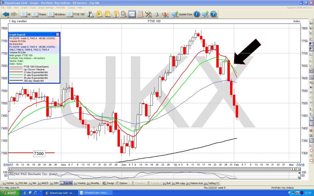
My Chart below has the Monthly Candles for the FTSE100. Like with the S&P500 we ignore the little Red one at the end because it is February so it is nonsense as yet - what we need to look at is where my Blue Arrow is and you should be able to see that this is pretty much identical to the S&P500 so the same comments I made then would apply.
Isn’t it amazing how correlated all these Indexes are? Of course the most likely answer is that the US Markets move first and the others follow - although this time the sell-off in the FTSE100 came early and has been sharper - but that could be the Big Divvy Payers as I mentioned earlier. 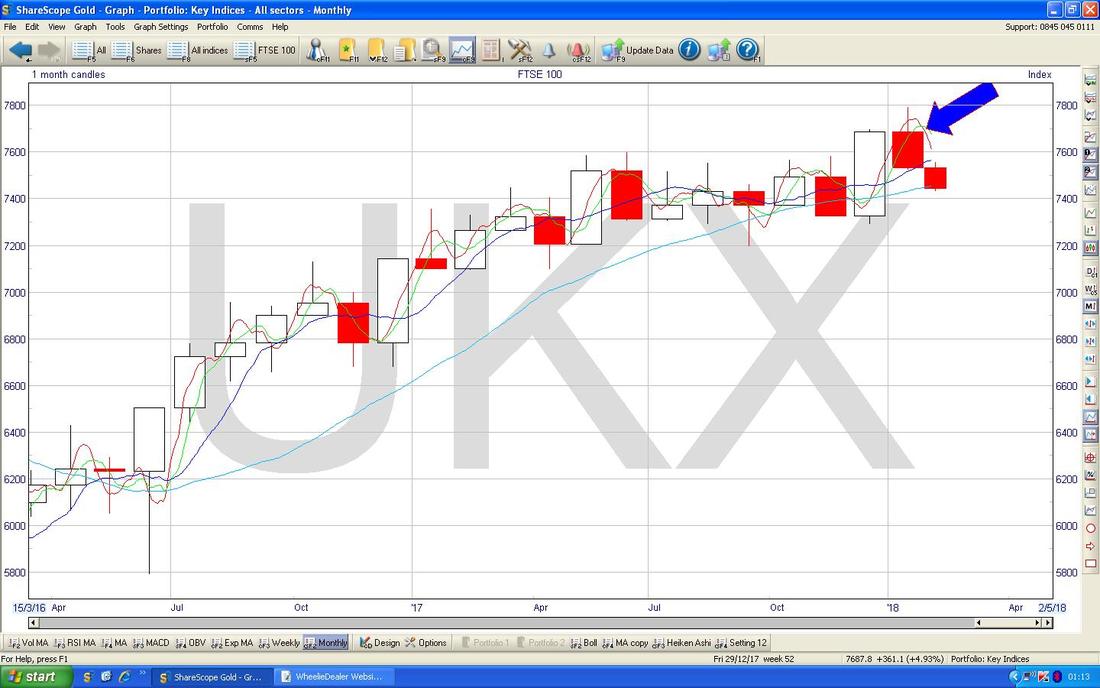
The Chart below has the HA Candles for the FTSE100. First off my Yellow Circle is highlighting a Big Red Down Candle from Friday and this suggests more weakness. Next look back up above at my Green Circle - I think I showed this last Weekend and the point is that the Long Run of nice White Up Candles narrowed and then turned Red and Down Pointing - this shows how the HA Candles work.
Bearing that in mind, if you now look at my Pink Circle down the bottom this shows the kind of Pattern we should expect to see pretty soon when the FTSE100 starts to ‘Base out’ - so look for this Narrowing and then turning White again in coming Days. 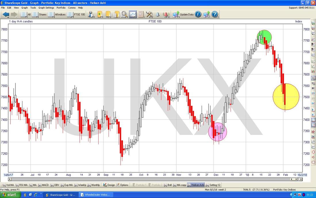
FTSE250 (but it might not be !!)
In the bottom window on the Screen below we have some sort of weird Oscillator which ShareScope enables me to set up but I have no real certainty about what it actually is !! Several Years ago I used to look at it because I thought it was related to the FTSE100 and seemed to be very predictive in the very Short Term but after some time I noticed that the Heading on the Oscillator had changed to ‘Overbought/sold (FTSE250 - Daily)’ which you might be able to see in the Top Left Hand Corner of the Oscillator Window. So it looks like this is something to do with the FTSE250. Anyway, whatever it is, this seems to be suggesting that in the very Short Term something is very Oversold - so a Bounce is likely. The Oscillator has gone a bit lower in the past but this is almost as low as it goes. With it being a really ‘fast’ Oscillator, it would just take a small Bounce for this Reading to suddenly change to the higher Readings and towards the Overbought Level - so this needs to be appreciated. Apart from that, the FTSE250 is almost identical to the FTSE100. 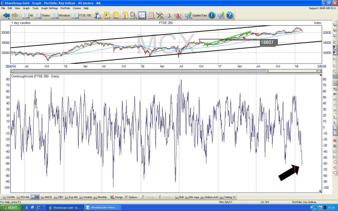
FTSE AIM All-Share
I have mentioned this on the Tweets quite a bit this Week and I wanted to show it in Graph form. The strange thing is that the AIM All-Share has held up remarkably well compared to the FTSE100 and FTSE250 - my Yellow Circle is trying to highlight this. It is very unusual. Having said that, there is this thing called ‘The January Effect’ which is the idea that Smaller Cap Companies outperform Larger Cap Companies in January - maybe it is partly that idea playing out. 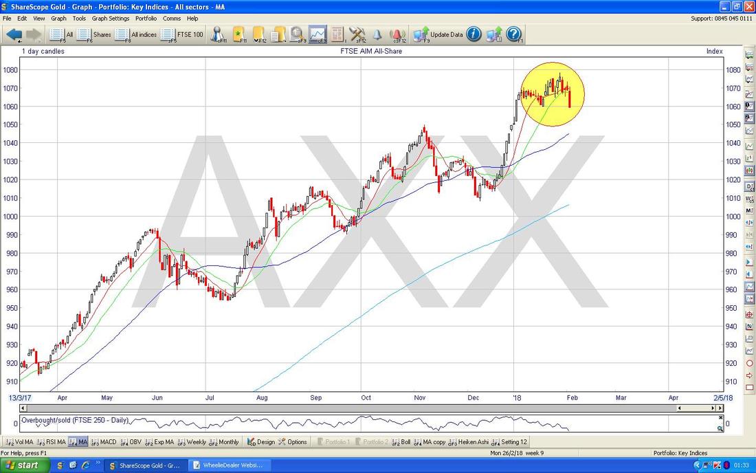
FTSE SmallCap
But just to confuse things even more, the FTSE SmallCap Index shown below doesn’t seem to have heard about ‘The January Effect’ !! My Green Box is showing how it has tanked pretty much like the FTSE100 and FTSE250. In fact, I would expect the Smaller Indexes to follow the FTSE250 - to illustrate this, when you read that a particular Fund is a ‘UK Smaller Companies Fund’ it often means they are invested in the FTSE250 - this is how Fund Managers see Small Caps. Right, it is now 1.30am so I better get on with the Proof Read and Upload !! I hope you can survive the Storms ok next week and above all don’t panic - if the Markets are freaking you out, then just move away from your Screen and go off and do something else (some Research into possible Stocks to buy when things calm down might make sense). If you keep looking at your Screen when Markets are grumpy it just feeds your Fears and your Anxiety - neither of which help you with successful Investing. Cheers, WD. 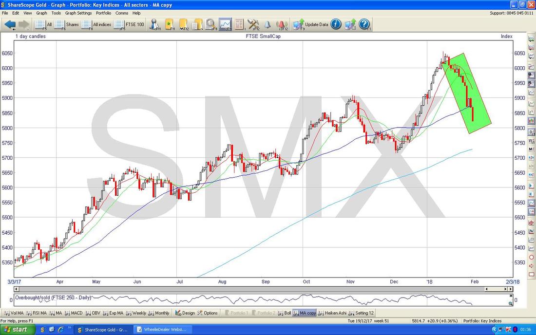
0 Comments
Leave a Reply. |
'Educational' WheelieBlogsWelcome to my Educational Blog Page - I have another 'Stocks & Markets' Blog Page which you can access via a Button on the top of the Homepage. Archives
January 2021
Categories
All
Please see the Full Range of Book Ideas in Wheelie's Bookshop.
|
