

|
educational blogs |
|
It really feels to me now that we are in full swing of Summer and Markets are pretty dull as everyone is off at the beach. For a pleasant change we actually have been receiving some decent weather in Windsor and I am very keen to keep away from the Markets and enjoy it. As per the spiel in my ‘Weekly Performance’ piece I wrote last week on the Homepage, I think we could see a few OK weeks but I expect more Falls in the Autumn - September and October are notoriously bad months and this year we have so many Macro things to cause lots of worry. I guess the factor that might mitigate against such Falls is that more Monetary and Fiscal Stimulus by Central Banks and Governments looks very likely.
On the flipside, the US Indexes (apart from the Nasdaq Tech Indexes) made new All Time Highs last week which is really Bullish but the FTSE100 is coming up against strong Resistance and Gold has had a pullback but doesn’t look too unhealthy and Oil looks pretty bad and may go lower. I got a real sense towards the end of last week that the strong bounce off the Brexit Vote Lows by many constituents of the FTSE250 like the Housebuilders and some Retailers was waning already - I expect these kind of things could easily make new Lows soon.
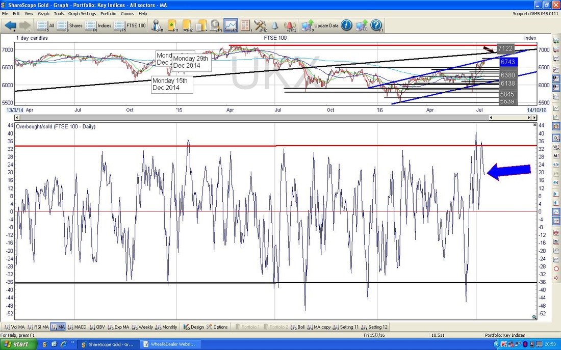
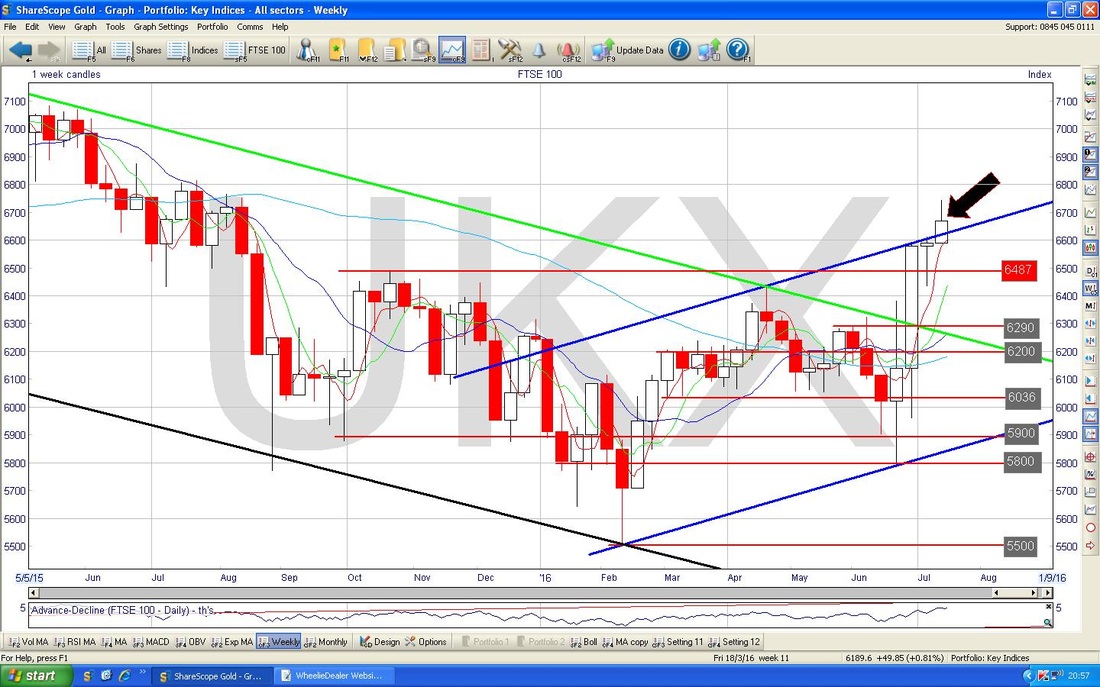
As usual, let’s have a look at the Historical Precedents from the UK Stockmarket Almanac 2016. According to the book, for the Week Ahead (w/c 18th July 2016), the FTSE100 tends to be Up for 52% of Years with an Average Return of MINUS 0.2%. In other words, the past suggests this is a very flat week and I expect that is what we will get this year. I note that there are not many Trading Statements, AGMs or Results etc. due this week - this in itself probably limits any jumps (Up or Down) for specific Stocks resulting from such News and will thus add to the ‘flatness’. FTSE100 As ever my Charts are ScreenShots from the sublime ShareScope Software that I use as my ‘Workbench’. I will start off with some ‘Bigger Picture’ stuff and look at the FTSE100 Daily Chart going back about just over a year. The thing I want to highlight here is how at the 6699 Close on Friday 15th July 2016, we are very near the All Time High (ATH) for the FTSE100 at 7122. In fact, we are 6.3% below it at the moment. Obviously if the FTSE100 can get over 7122, then that would be a very Bullish ‘Breakout’ situation. My Green Arrow points to where we closed on Friday and the Red Horizontal Line across the top of the Chart shows the 7122 ATH Resistance Line. However, before we get to 7122 (not to mention actually breaking above it which will be extremely difficult I would think), there is a load of Strong Resistance up above that I suspect will be hard work for the Market to wade through. The immediate Resistance Level to get over is at 6743 which was the Intraday High at the top of the Inverted Hammer Candle which was created on Thursday 14th July - I will show this closer in a mo. The next Resistance Level is 6800 and then we have Resistance from the Black Line (marked by my Black Arrow) which marks the Bottom Line of the 6 Year Uptrend Channel which I have shown in previous Blogs. This Resistance will come in to play at around 6950 to 7000 ish I would think. Note, if my Blue Parallel Lines Uptrend Channel which I put on my Charts recently holds true, then I suspect we may see some weakness in the Short Term while the Chart consolidates a bit after such a strong move up since the Brexit Vote. 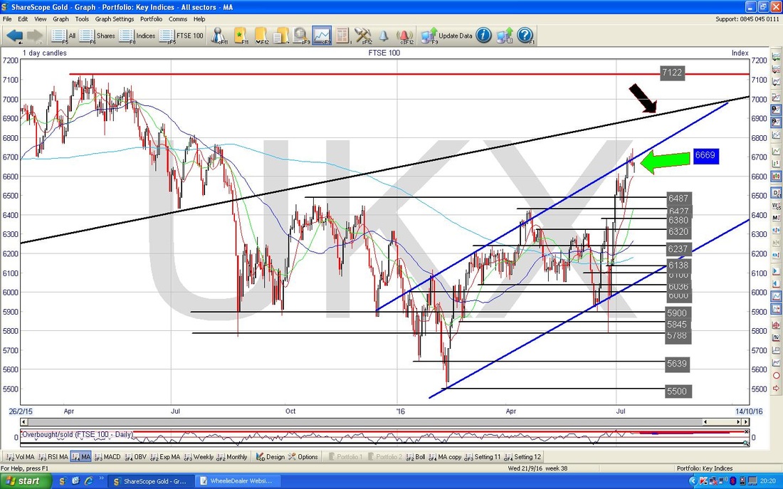
On the Chart below I have zoomed in on the Daily Candles to about the last 4 Months or so. My Blue Text Box highlights the 6743 Intraday High from Thursday and I have pointed to the ‘Inverted Hammer’ from that day with the Green Arrow. It is highly likely that this Inverted Hammer will mark a ‘Pivot’ where the Price will turn down from for a bit - although on the following Day (Friday 15th July) we got a Hammer Candle which suggests that the Bulls aren’t prepared to let the Market drop yet. There is good Support just below at 6600 and I wonder if we will go into a Sideways Consolidation Move for a bit before maybe moving up again. If 6600 fails as Support, then there is plenty of Support below down to 6427 in particular.

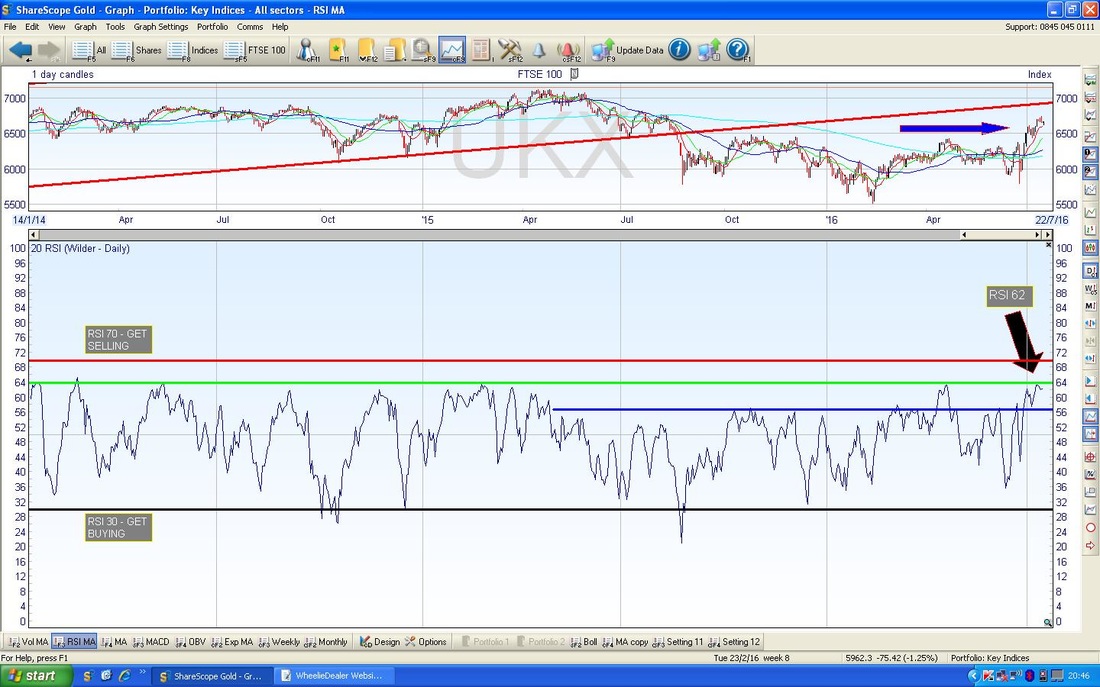
In the bottom window on the Chart below we have the Relative Strength Index (RSI) for the FTSE100 Daily going back about 2 years. The current reading is RSI 62 and it has turned down from about RSI 64. The really interesting thing here is that my Green Horizontal Line marks where the RSI has turned down for all of the last 2 years and I also note that once the RSI starts falling from the Peak in the recent past, it tends to gradually fall away (and this obviously means that the Price Line falls with it). If you look across to the Left on the Chart you can see where this falling away has happened.
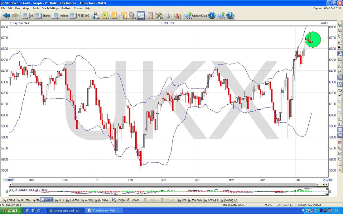
My Chart below has the Bollinger Bands for the FTSE100 Daily - my Green Circle encompasses the Candlestick action for the last 4 days or so where the Price has moved away from the Upper Bollinger Band - this may lead to more Falls or perhaps it means we will go Sideways.
In the bottom window on the Screen below, we have the ‘Overbought/Oversold’ Indicator for the FTSE100 Daily - this is a very Short Term Oscillator and at the moment we look Overbought still as the Reading is still near the Peaks - my Blue Arrow points to where it is now. This is a very ‘Fast’ signal and it just takes a couple of weak days for the reading to fall quickly to Oversold.
The Screen below has the Weekly Candles for the FTSE100. My Black Arrow points to the Candle created last week and it sort of looks a bit like an ‘Inverted Hammer’ which would be Bearish in the context of the recent run-up and to be honest this lines up with pretty much most of the other Indicators. However, this is not a ‘Textbook’ Inverted Hammer - I would really like to see a thinner ‘Body’ to the Candle (this is the Bit below the ‘Wick’ which is the bit that sticks out of the top).
FTSE250
It is certainly the case for me (and I suspect many Readers are in the same situation) that most of my Stocks are FTSE250 or Smaller and therefore I fancied a quick look at the FTSE250. My Chart below has the Weekly Candles going back about 2 years and my Black Arrow is pointing to an Up Candle that was generated last week but note how this has got a long ‘Wick’ sticking up above the Body - this hints that we might find things hard going in the Short Term - like the FTSE100, we many need to pullback a bit or perhaps go Sideways for a while. Note also how we are in a Triangle between the Green Downtrend Line at the top and the Blue Long Term Uptrend Line at the bottom - how this resolves (in other words, whether it Breaks-out to the Upside or Downside) will tell us a lot about where this Index is going in coming months. 
NIKKEI 225 (Japan)
I think I have commented on this one a few times during the week when I do a quick Summary of the key Technical Things on the Indexes at the bottom of the ‘M3 Manifesto’ page on the Website. I wanted to just show exactly why this is such an awful Chart. My Screen below has the Daily Candles going back about 3 Years. My Blue Parallel Lines denote an Uptrend Channel which was firmly in place for much of this Chart but note how the Price fell out of the Uptrend Channel and we are now in a Downtrend Channel which I have marked with the Red Parallel Lines. My Green Arrow points to the Blue Wiggly Line which is the 50 Day Moving Average and my Black Arrow points to the Lighter Blue Line which is the 200 Day Moving Average - note how both of these are falling which is pretty darned ugly. 
On the Screen below I have zoomed in to about the last 9 Months or so on the Nikkei 225 - my Yellow Circle highlights an ‘Inverted Hammer’ which was created on Friday 15th July 2016 - this looks very bearish in the context of the recent strong move up and it coincides quite well with the Upper Red Line of the Downtrend Channel.

S&P500
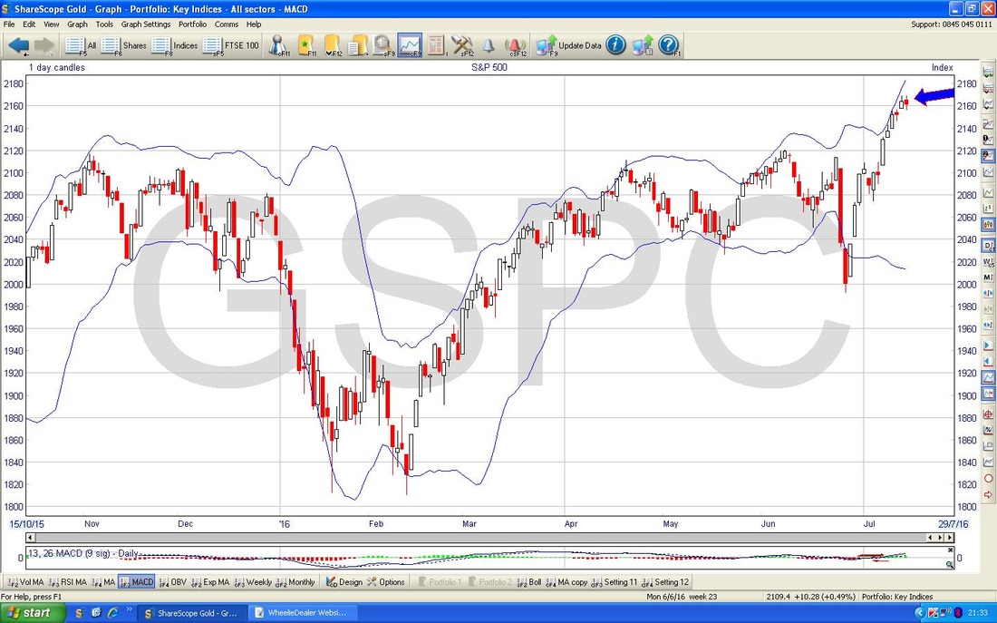
Starting off we have a ‘Big Picture’ Chart showing the Daily Candles going back about 4 years - the timeframe is less important here, I just want to set the Context and bring your attention fo the Uptrend Channel and in particular my Blue Horizontal Line which marks what was the All Time High at 2135 until it was broken over just recently. 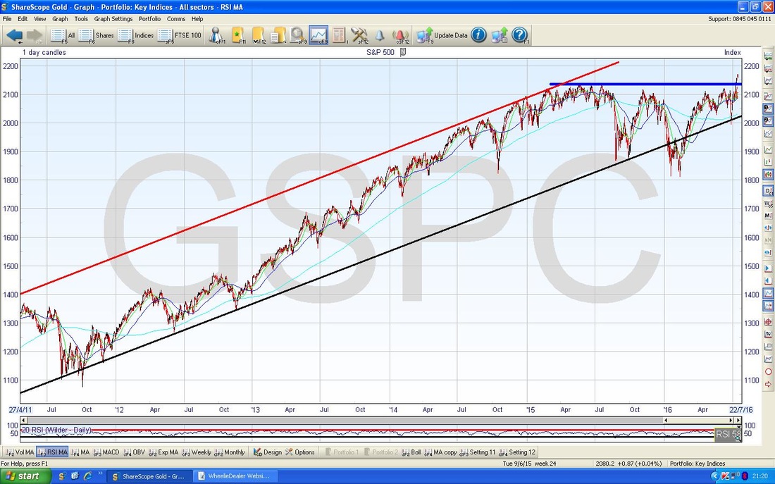
On the Chart below we have the Daily Candles going back about 4 Months - I have zoomed in from the Chart above and my Green Circle highlights where the Price ‘Broke-out’ over the Blue Horizontal Line at 2135 which was the previous ATH - this is an extremely Bullish development.
My Black Arrow is pointing to an ‘Inverted Hammer’ which was generated on Thursday 14th July 2016 and followed by a Down Candle on Friday (although that was a bit of a ‘Doji’ which showed a lack of clear direction). If we do get a pullback now, it is likely that we move down and ‘Test’ the Blue Horizontal Line to act as Support now (it is a basic principle of Technical Analysis that former Resistance becomes Support and vice-versa). If the Price falls below the Blue Horizontal Line significantly, then this might be quite Bearish because of the failure to ‘follow through’ on a Bullish development. 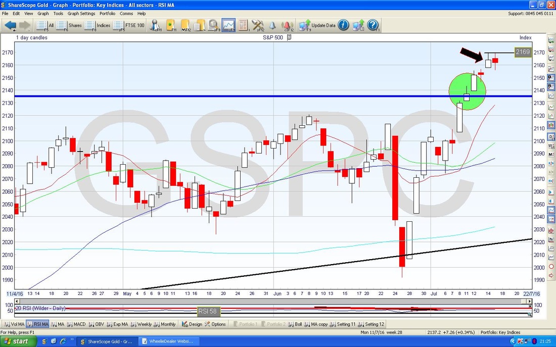
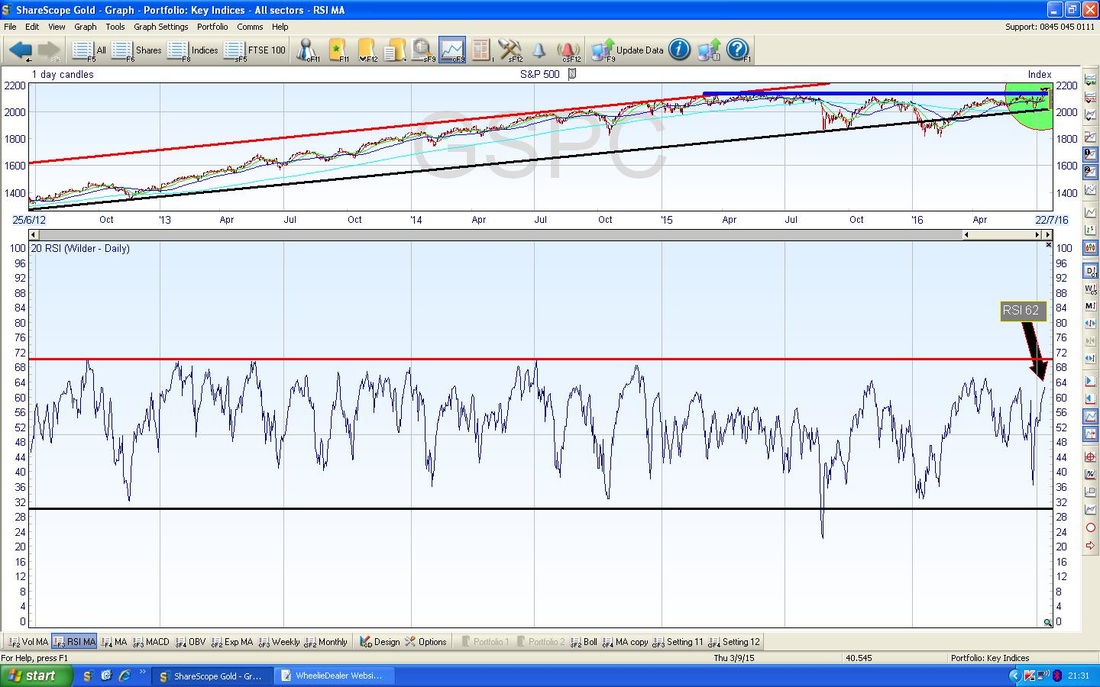
The Chart below has the RSI in the bottom window - note the current reading of about RSI 62 which is on the high side but note how the RSI has regularly moved up to the Red Horizontal Line at RSI 70 so it could move up more I suspect. However, it is notable that for most of the last 1.5 Years it has not been able to go much higher than where it is now.
The Screen Below has the Bollinger Bands (the Blue Wavy Lines above and below the Daily Candles) for the S&P500 - my Blue Arrow shows where the Price has started to come away from the Upper Bollinger Band - this means we might fall or we might go Sideways (we could of course continue on Upwards - but that is the thing about TA - it is really about Probabilities and what is most likely or not to happen).
Nasdaq 100 (US Tech)
I put a small Short on this last week - I wanted to put a Chart in to show how it is looking now. The Chart below shows the Daily Candles going back about 4 months. What I wanted to show here is the 2 sort of ‘Star Dojis’ which I have marked with the Black Arrows - in the context of a strong move up (which we have had) these show that the force of the move up is weakening. My Blue Arrow points to a Down Candle which was created on Friday 15th July - maybe it is starting to turn down. However, note we got a Down Candle the day after the first Star Doji but it carried on up. Something less nice for my Short Position is marked by my Green Arrow - this is a 50 / 200 Day ‘Golden Cross’ - this suggests that even if we get a short term pullback, the Nasdaq 100 is likely to rise in coming Weeks. I will need to keep an eye on this. 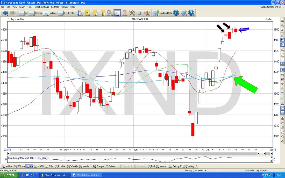
Brent Crude Oil
The Chart below has the Daily Candles for Brent going back about 5 months - note the Blue Parallel Lines which mark a nice Uptrend Channel but now I have introduced some Green Parallel Lines which suggest a Downtrend Channel to me - it is early days and I might be reading too much into it, but I could well be right. However we cut it, Brent Oil needs to break-out over the Upper Green Line (marked with my Green Arrow) to avoid getting stuck in the Downtrend - this means a move over $51 really. My Red Arrow points to a ‘Doji’ Candle which was bashed out on Friday 15th July 2016 - this suggests uncertainty after turning up the day before - on Friday the price was struggling at $48. Note how the Dark Blue Wavy Line which is the 50 Day Moving Average is now up above the current Price and it will act as Resistance now - this kicks in at about $49. 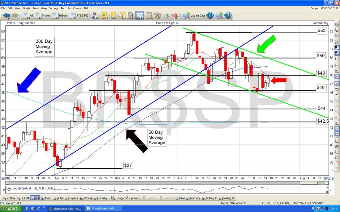
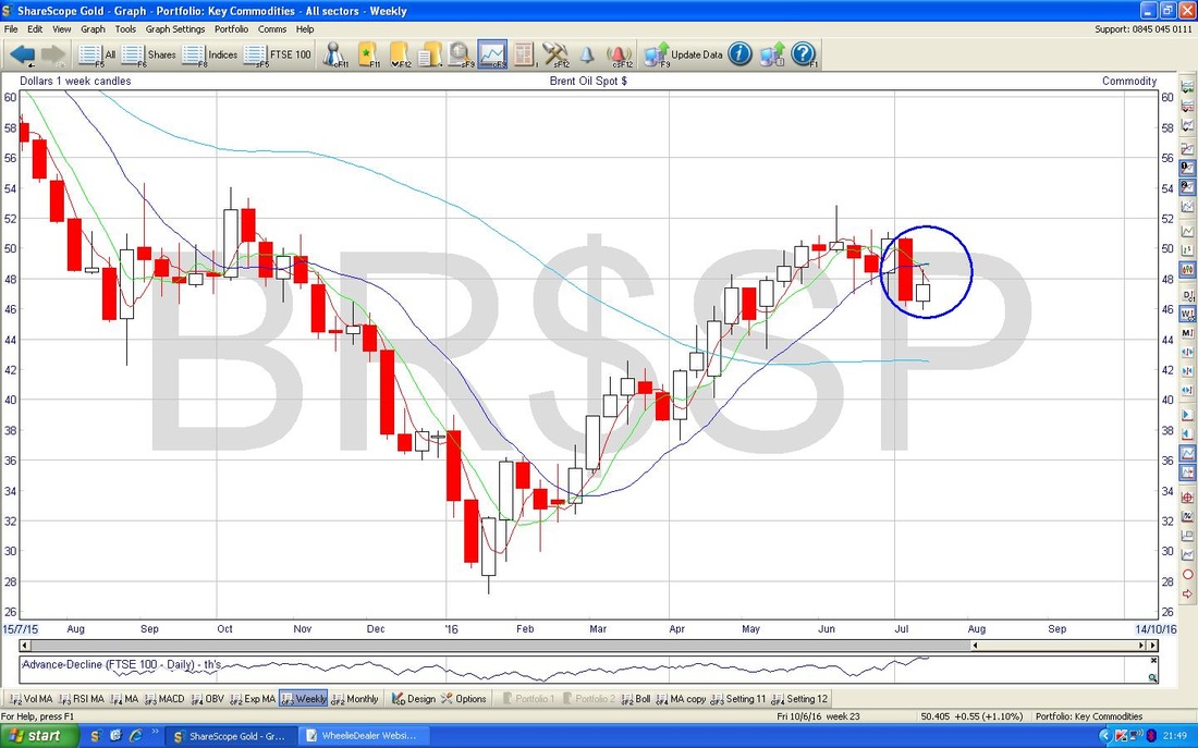
This is by no means perfect, but maybe the Chart below has some hope for Brent Oil bulls - this shows the Weekly Candles and my Blue Circle is encompassing 2 Candles which make up a Bullish Harami pattern - the ‘Preggers Lady viewed from the side’ one. However, the problem is that these kind of Reversal Signals tend to work much better after a significant move Down - in this case, the down move has not really been all that long so we might get a bit of a move up, but I doubt it will amount to much.
Gold
Will I be upsetting the Gold Bugs today or will they be cheering big time? My Chart below has Gold Daily Candles going back about all of 2016. My Black Arrow is pointing to a small Hammer Candle which was created on Friday 15th July and note how we also got a Hammer on the day before. After more than a Week of falls, I suspect these Hammers are telling us that the power of the Downmove is weakening - it is very likely we find Support around $1320 and turn up again. If $1320 fails to hold as Support, then I suspect we will find Support at the $1304 Level - I have marked this with the Red Text Box. Hopefully the Gold Bugs like that !! Have a great week everyone and try to get out and enjoy the Sun if you get some !!, Cheers WD. 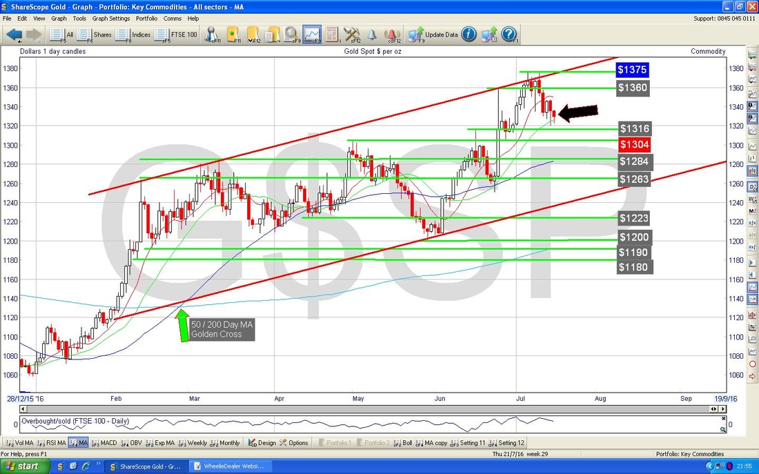
0 Comments
Leave a Reply. |
'Educational' WheelieBlogsWelcome to my Educational Blog Page - I have another 'Stocks & Markets' Blog Page which you can access via a Button on the top of the Homepage. Archives
January 2021
Categories
All
Please see the Full Range of Book Ideas in Wheelie's Bookshop.
|
