

|
educational blogs |
|
After the momentous Events of last week and with continuing Political Chaos over this Weekend, I think we are likely to see more Downside in the coming Week - I wanted to run through the Charts and see what clues they throw up - particularly with regard to Support Levels.
I scribbled a ‘Weekly Performance’ update last night at the top of my Homepage which covers my thoughts about what has transpired and what I think is likely to hit us in coming Weeks/Months - I also gave my current thinking on my Strategy. I recommend you read this.
Historical Backdrop
Like last week, this is probably of limited value but I am including it for completeness. According to the UK Stockmarket Almanac 2016, the coming Week (w/c 27th June 2016) has been Up on average for only 44% of Years and the Average Return has been MINUS 0.2% - so it is pretty poor usually. FTSE100 I want to start with a fairly close up view because the Support Levels are of paramount importance. The Screen below from the wickedly superb ShareScope Software shows the Daily Candlesticks for the FTSE100 going back about 8 months or so. My Blue Arrow is pointing to the Candle which was formed on Friday 24th June 2016, which was the day after the Brexit Vote Result and of course was crazily choppy and extreme in many ways. Those with a very sunny disposition (probably deluded in this case I suspect) will take heart from the Intraday recovery of the FTSE100 with it plunging to a Low of 5788 (marked with one of the Red Boxes) and then moving up again to Close at 6138. I am sure people would argue that this is a Hammer Candle and therefore Bullish but I take the view that it is not in the right context for this - it needs to come at the Bottom of a Down move - this is more like a move at the Top of an Up move. If anything, I think this shows the Price is likely to pivot down now off the High at 6380 from Thursday which I have marked with the Green Box (this will be Strong Resistance I think). Note that the Close on Friday was bang on the 200 Day Moving Average which is the Light Blue Wavy Line - and also look at the Darker Blue Wavy Line which is the 50 Day Moving Average - it will tell us a lot about the Weeks ahead if we get a ‘Death Cross’ where the 50 Day MA drops down through the 200 Day MA. Note my Green Line from the Blog I did last week and which I said marked a worrying Downtrend - it is interesting that we actually broke above this line back on Thursday but it now looks to me like an ‘Overshoot’ and I think we will fall more. The Important Support Levels I see here are firstly the Round Number of 6000, then 5900 and then 5788. If these fail, then we are looking at 5700 then 5639 and 5500. 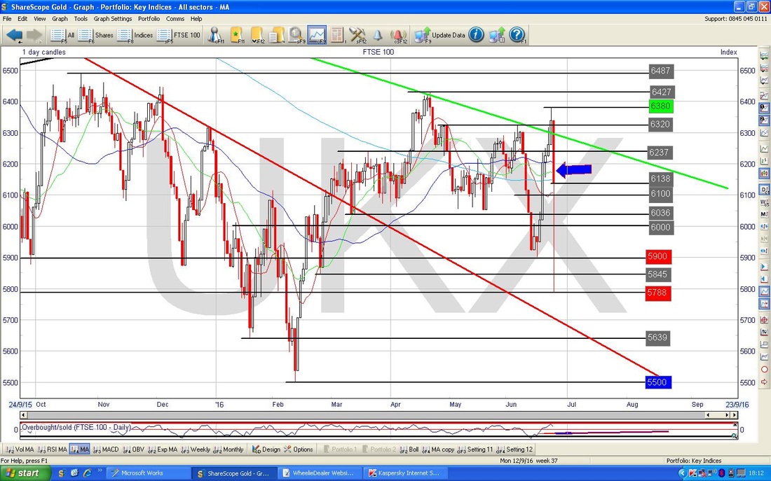
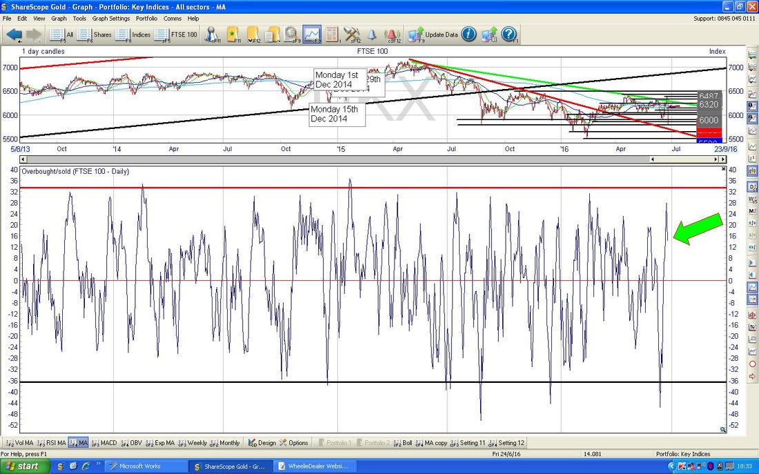
The Chart below has the ‘Overbought / Oversold’ Indicator - this is a very Short Term ‘Oscillator’ kind of thing and I like it as it tends to be highly accurate. My Green Arrow shows how the current Reading is right at the Top of the Range and this suggests it will fall - taking the Price down with it.
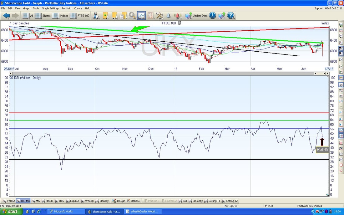
The Chart below in the Bottom Window shows the Relative Strength Index (RSI) for the FTSE100 Daily. It is clear the RSI at 49 now has turned down from the Blue Horizontal Line that has been a difficult Level for the FTSE100 for most of the last 2 years.
The Screen below has the Bollinger Bands for the FTSE100 - my Green Arrow is pointing to where the Lower Band is around 5925 ish - this could act as Support. Note the Price has turned down off the Upper Bollie Band.
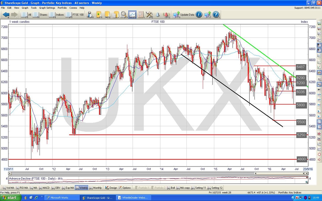
The Screen below has the Weekly Candles for the FTSE100 going back about 4 years - my intention here is to show the Support Levels lower down - in other words, if 5500 fails then we are looking at 5250, 5000, 4800 as the Important Support Levels.
S&P500
The screen below has the Weekly Candles for the S&P500 (the main US Index in my view). My Black Arrow points to a Down Candle which was created last week and this is a continuation of a move down which was pivoted off of the Inverted Hammer which is in my Yellow Circle. 2135 is the All Time High so it can be no surprise that the S&P500 has been finding things difficult up at these dizzy heights. 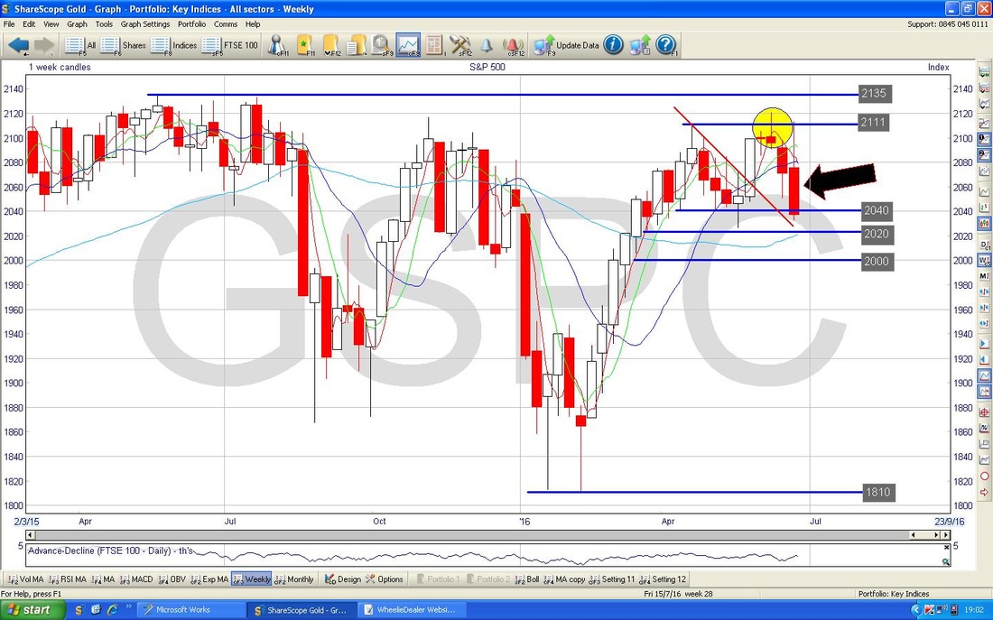
Brent Oil
The screen below shows the Daily Candles for Brent Crude Oil going back about 9 months. Note my Green Arrow which points to the Down Candle which was created on Friday but bear in mind it did manage to close up from the Lows. It is clear that the Price has fallen out of my Parallel Blue Lines Uptrend Channel but at this point it is not so certain if this is the start of a large drop (it could well be) or if it is an ‘Overshoot’. Note how it has found Support at the 50 Day Moving Average - it is important for Bulls that this remains the case. Note my Black Circle which has appeared in Blogs from previous Weeks - as expected, this has turned out to mark difficult Resistance for the Price to get up through. 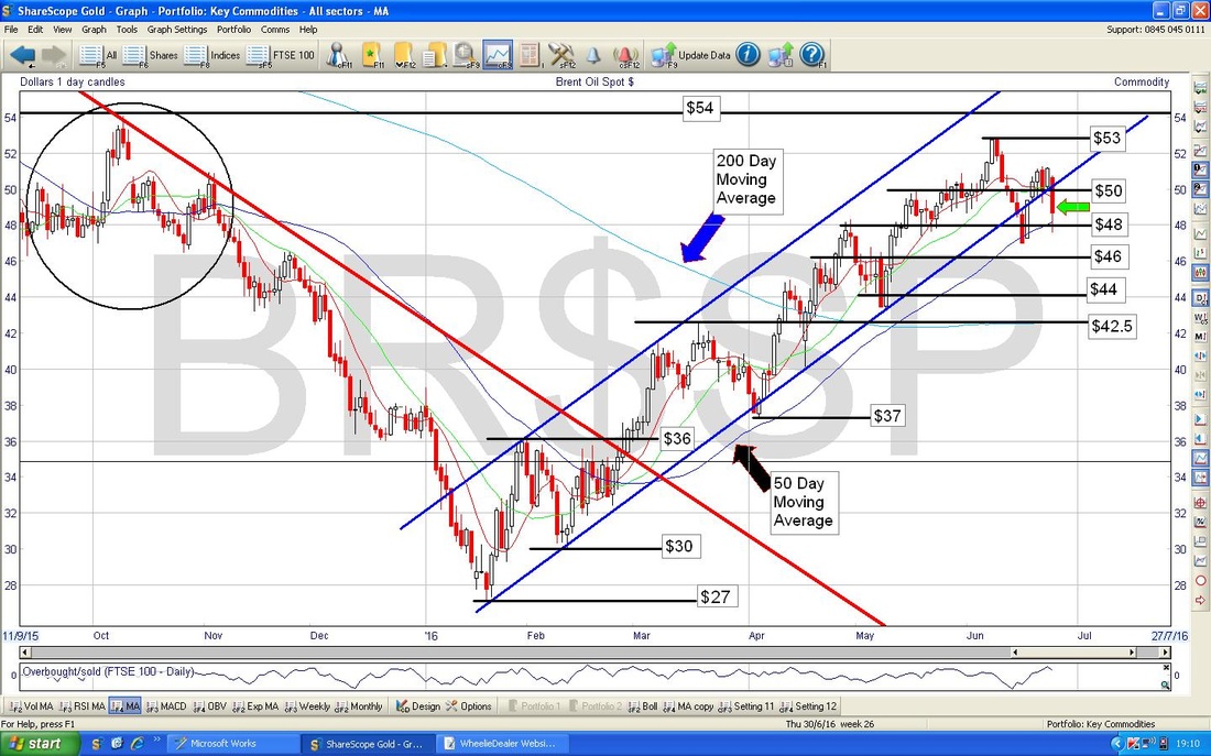
Gold
The Chart below has the Daily Candles for Gold. Note how we got a big Up Candle from Friday and Gold pretty much moved in an Inverse Manner to the Major Indexes and where they recovered during the Day, Gold pulled back from its Highs. $1360 is now the Main Resistance Level to crack through and this seems quite likely to me. My big Red Arrow marks a possible Uptrend Line - it will be interesting to see if this holds true. Ok, that’s enough for now, I think we will have a fun week - I hope everyone gets through in reasonable shape, Regards, WD. 
0 Comments
Leave a Reply. |
'Educational' WheelieBlogsWelcome to my Educational Blog Page - I have another 'Stocks & Markets' Blog Page which you can access via a Button on the top of the Homepage. Archives
January 2021
Categories
All
Please see the Full Range of Book Ideas in Wheelie's Bookshop.
|
