

|
educational blogs |
|
It’s Sunday Night again and I feel a need to check out the Charts and get a feel of where the Markets are going. It was pretty clear to me by the end of last week that another push down looks very likely and I am happy to have some chunky Short Positions in place to Hedge out the majority of any downside if it comes.
I won’t stand on ceremonies, let’s crack on with the Charts - loads to get through as I am particularly intrigued by developments on the Gold Chart.
FTSE100
The Chart below might be familiar to Readers who have been exposed to my Chart stuff in recent weeks. Much of it is the same as before but I have done a few amendments to mark out what is of importance now. This is a Chart showing about the last 6 months. The big recent development is marked by the Black Arrow where we got a Doji Candle (pretty narrow Candlestick Body and long Tails) and the Market then turned down off the Darker Blue Wavy Line which is the 50 Day Moving Average. My Red Arrow points to a Downtrend Line which is dominating the Chart. My Green Arrow is pointing out the 200 Day Moving Average (the Faint Blue Wavy Line) which is falling and denotes that the FTSE100 is in a Major Downtrend (this is the essence of the Bear Market to my mind). Note the 50 Day MA is falling as well an ugly combo. My Blue Circle highlights how in the last few days the Market has struggled at about 5950 - this is a Resistance Area to watch in the very Short Term. On the Downside, we need to watch the Green Horizontal Line at 5768 and of course the Recent Low at 5639. If the Latter fails, we’re big time in the merde and I think we will see at least 5200 and maybe even 4800 (apologies to all French Readers for my language). 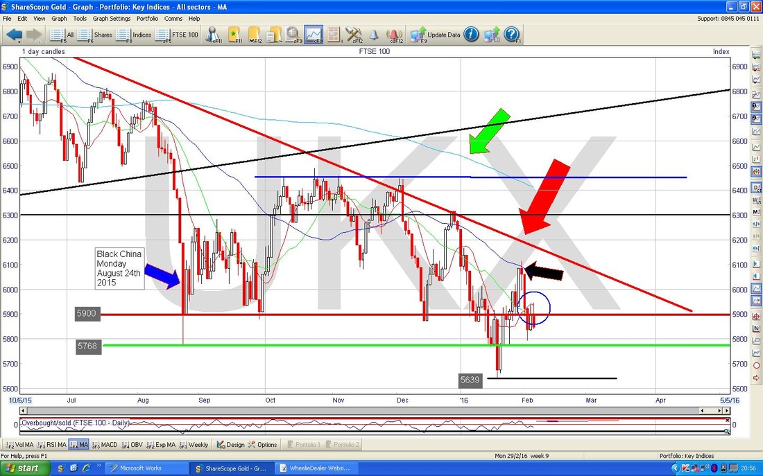
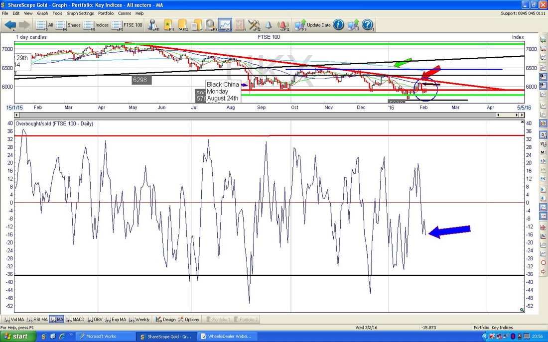
The Chart Below has the ‘Overbought/Oversold’ Oscillator in the bottom window. My Blue Arrow points out how it is quite low but can go a lot lower in the short term - this is a very short term indicator. Note how this Indicator predicted the downturn this week - I think if you look back at my Blog from last Sunday you will see this but you can infer it from this chart anyway.
The Chart below has the Bollinger Bands in the top window and my Black Arrow points out how there is a ‘gap’ which can easily be filled by the Price dropping to the lower Bollie Band - there is plenty or room to fall in the short term.
My Blue Arrow in the bottom window points to where the ‘Green Hump’ of the MACD Histograms is about to go Red - bearish. 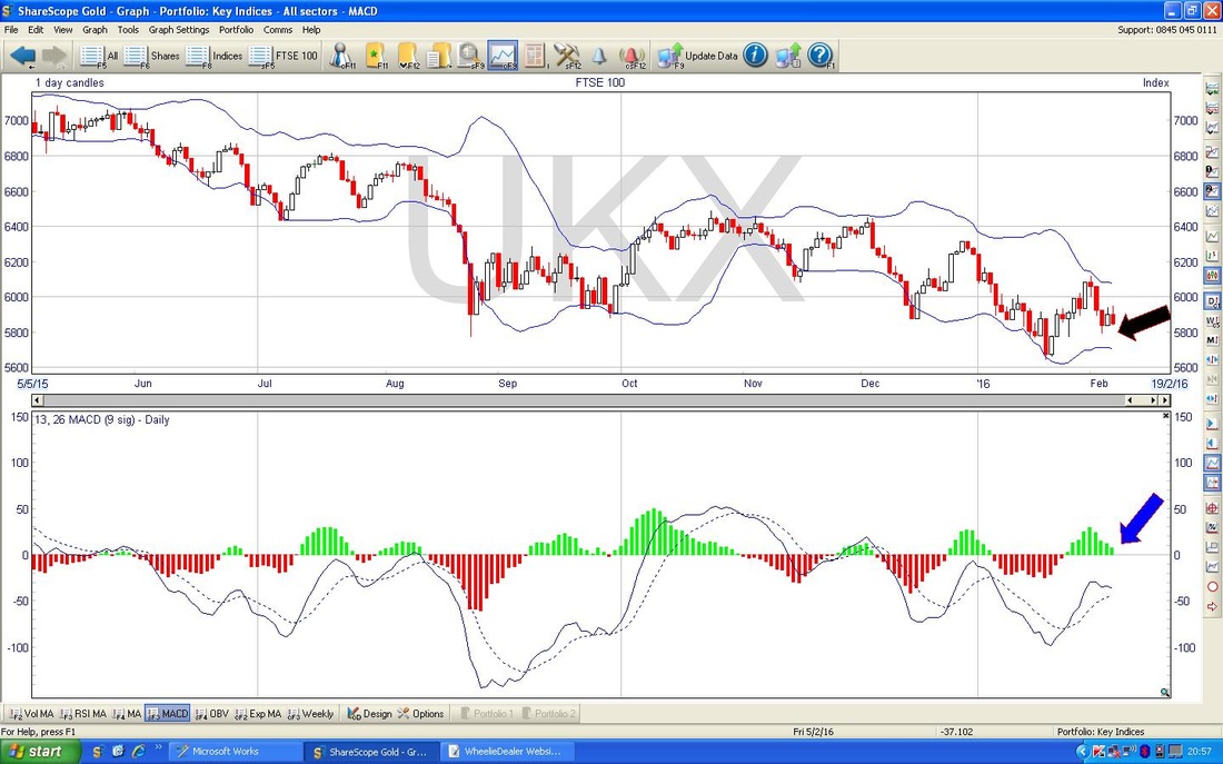
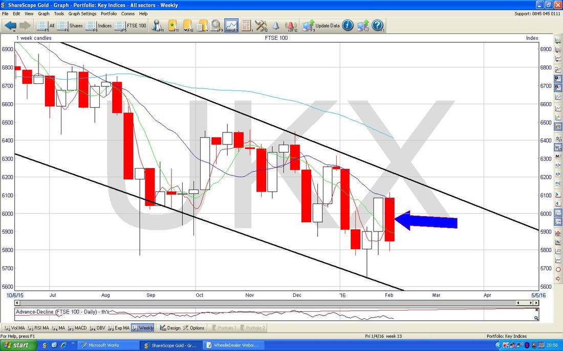
The Screen below shows the Weekly Candles for the FTSE100. My Blue Arrow points to the big Red Candle we had last week - this is bad especially as the setup from the previous 2 weeks looked good for the Bulls. Failure of good setups is never a positive thing and shows considerable weakness in the Market. Such a failure of Bullish Setups has really been the flavour of 2016 so far.
DAX
Recently I have got out of the habit of looking at the German DAX because I sold my European Unit Trust and I have little direct exposure here now. However, I recently noticed that it seems to be weaker than the FTSE100 and the US Indexes - so I wanted to check it out. The ShareScope screenshot below shows the Uptrend Channel in the DAX since 2009 - you should be able to see that the Price has dropped below my lower Black Line but an ‘overshoot’ is always possible without necessarily meaning that the dominant Trend is over. 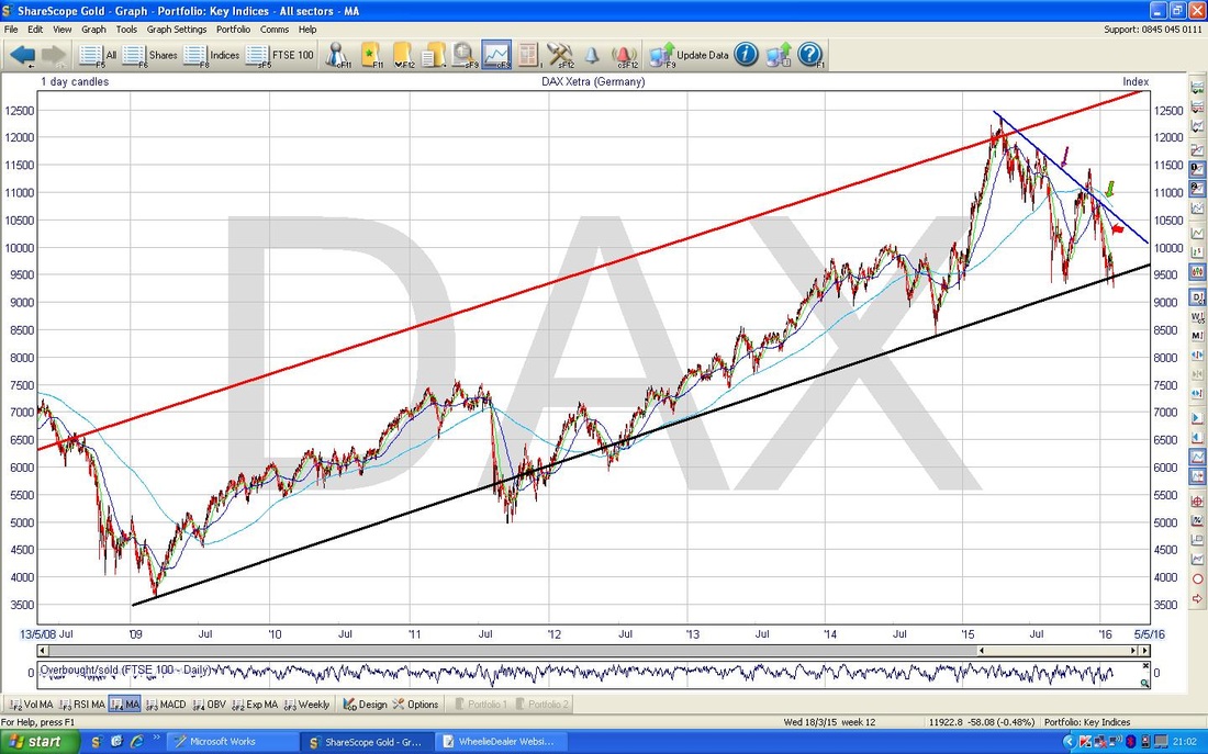
OK, on the ScreenGrab below, I have zoomed in to about the last year or so. First thing to note is my Blue Arrow which points to a Downtrend Line which seems to be dominating the Chart as a Resistance Line.
My Green Arrow points to the falling 200 Day Moving Average - bad. My red Arrow points to the falling 50 Day Moving Average - this is also bearish. 
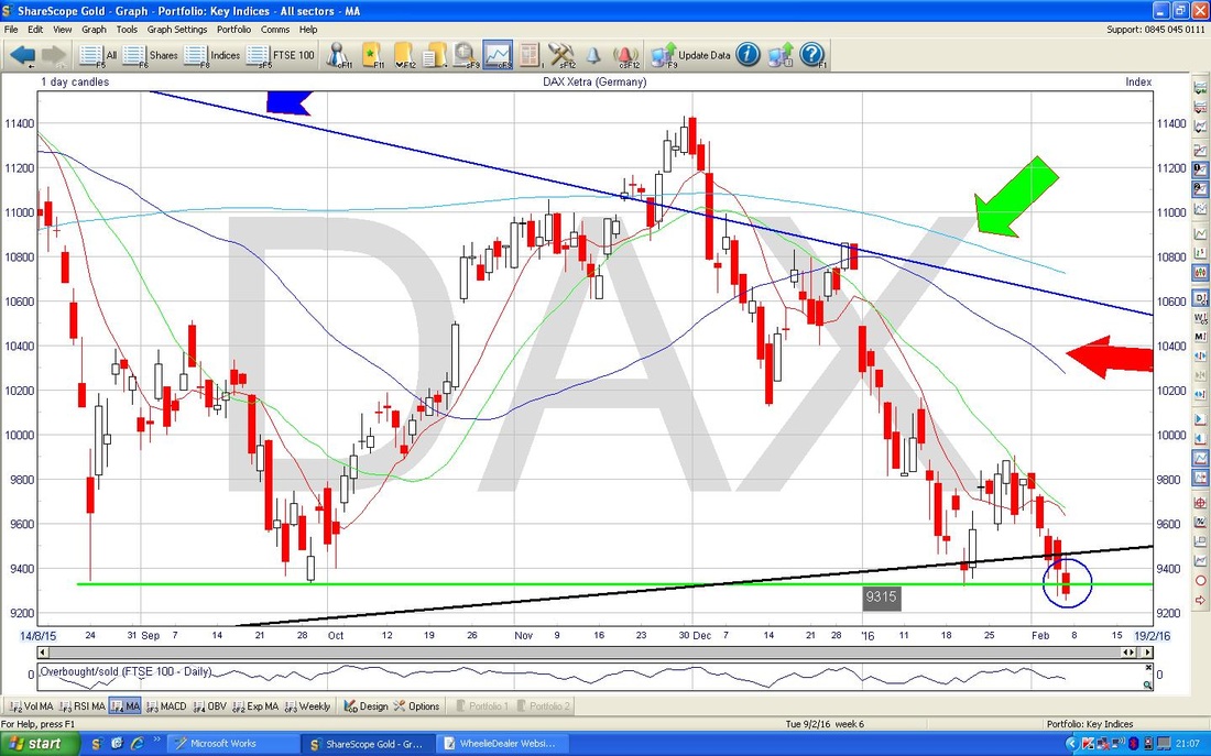
On the screen below, I have zoomed in even more so we can get a better view of what is happening now. My Blue Circle covers the Down Candle that was created on Friday and note how it has dropped below my Green Support Line at 9315. It is possible that we have merely done an ‘overshoot’ of the Black Uptrend Line from my first longer term chart, but with these ugly looking Moving Averages I think the most likely probability is that we are going much lower.
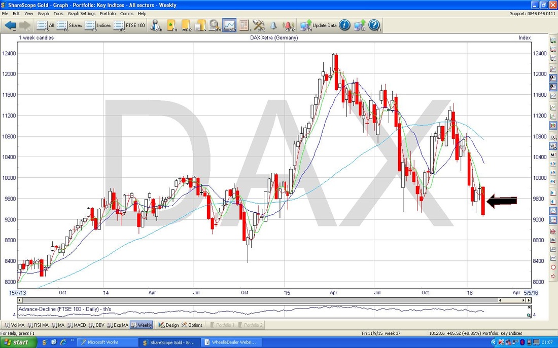
The screen below supports my Bearish DAX view - this is the Weekly Candles and my Black Arrow points to a pretty ugly Down Candle after a Doji from the week before which was clearly a Reversal Candle.
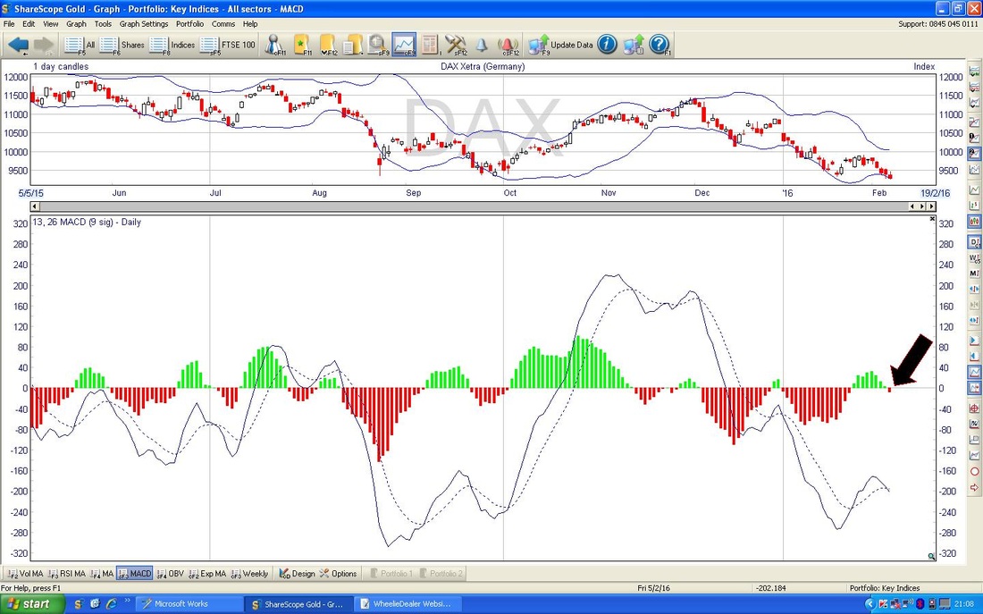
The Bottom Window below shows how the MACD has just gone into the Red Zone - bearish.
S&P500
Right, time to see what the Yanks are up to. The screen below shows the S&P500 over the last 6 months ish. First thing to notice is my Green Arrow which is pointing to the level of 1950 which I have marked with the Green Horizontal Line and this was a Resistance Line at which the Market turned down after the recent attempt to rally. Note how the Doji Candle marked the Reversal - this is why Candles are worth understanding. My Blue Arrow points to the Big Down Candle from Friday - this is rough. Support at the base of this Candle is at about 1870 and this is the Level to watch early next week for a break to the Downside. If it fails, then the next meaningful Support Level is down at 1812 down the bottom of the Chart and marked with the Red Horizontal Line. If 1812 fails, you won’t be hearing no Overtures……… 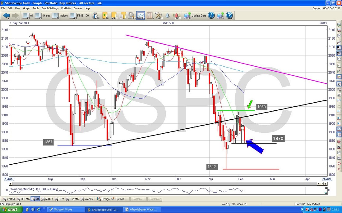
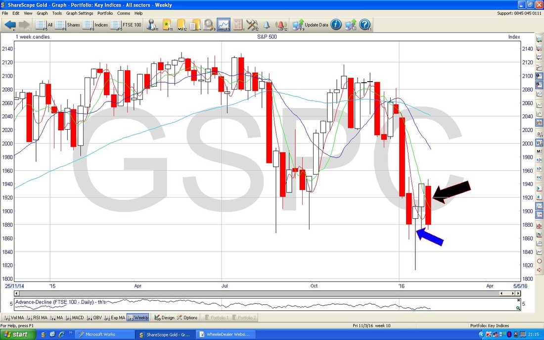
The Screen below has the Weekly Candles for the S&P500 - my Black Arrow shows last week’s Big Down Candle and it is notable that this marks a failure of a decent Bullish Setup from the Hammer Candle a couple of weeks ago (as marked by the Blue Arrow) and the Candle from the week after.
Brent Oil
OK, now Oil. The Chart below shows the Red Downtrend Line marked with the Red Arrow - this is a strong Resistance Line on the Chart - obviously Bulls need the Price over this line. By Blue Arrow points to a few things - firstly the Darker Blue Wavy Line which is the 50 Day Moving Average which has acted as Resistance last week and it also points to the $36 Level where there is clearly Resistance. My Black Arrow points to the Doji Candle from Friday - this might give some hope to the Bulls as it suggests the move down from Thursday has met Buyers. To the Downside, it is clear that $32 is a Support Area. My Blue Circle marks an area of Strong Resistance around $36 to £39 - this will be difficult for the Price to get over. 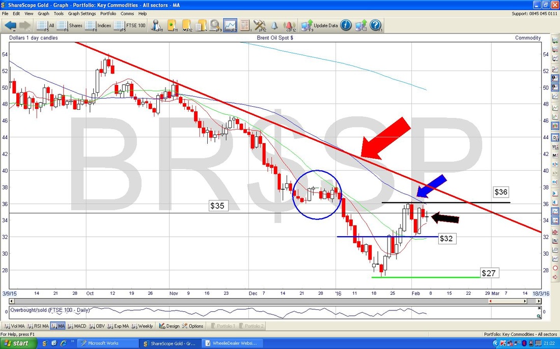
Gold
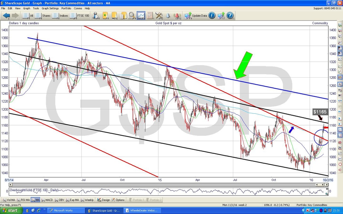
Right, we finally have reached the one I really want to look at closely. As is best practice in Charting, let’s check out a Bigger Picture first. The Chart below shows about 7 years or so on the Gold Price and you should see the Blue Line marking the Uptrend Channel and then the Red Lines marking the Downtrend Channel. I have then added a New shallower Downtrend Channel which is marked with the Black Lines and is pretty important I think. Note the Price has broken out of the Red Downtrend Lines (which is good) but is still constrained by the Black Channel. 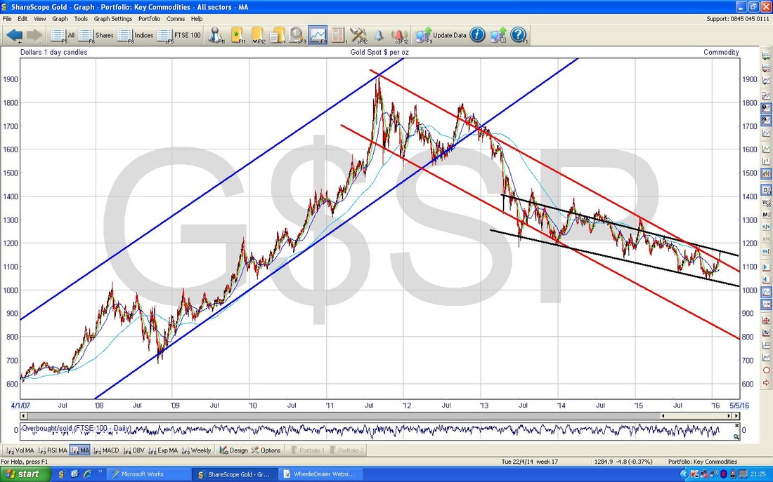
Zooming in to just under a year away, my Red Arrow points to a Doji Candle from Friday and this suggests that the strong move up in the last few weeks may be running out of puff.
Note how the Doji struggled and turned down Intraday at the Black Downtrend Channel Line around $1165 - obviously this is an important Resistance Level for the Price to get over. My Blue Circle marks how the Price broke-out of the steeper Long Term Downtrend which was marked by the Red Channel Lines - this was a positive development. My Blue Arrow points to the falling 200 day Moving Average line - this is a bad feature as it denotes a Major Downtrend. 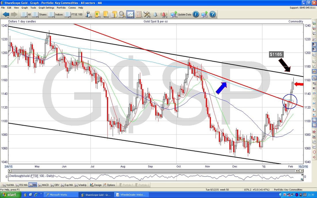
On the Screen below I have added a New Line which needs watching - this is the Blue Line which I have marked with the Green Arrow. This is a different interpretation of the shallower Downtrend Channel which I marked with the Black Lines - cautious Bulls (like me) might want to wait for a break above this Blue Line to really be sure a new Major Uptrend is going to start - this needs the price up over about $1240 I guess.
The Chart below has the RSI in the bottom window. My Red Arrow points to the current RSI reading of about 68 - you can see this is a high and ‘Overbought’ level for the Gold Price so it is likely to drop back soon.

The Chart below shows the Black 10 Month Moving Average Line as marked by my Black Arrow - this line is clearly capping the Gold Price and a move above this convincingly is needed for the Bulls.
So, Gold looks good, but I still don’t think we can quite call the start of a new Major Uptrend in Gold - it’s promising though nonetheless. That’s it, looks like some fun weeks ahead of us, See ya, WD 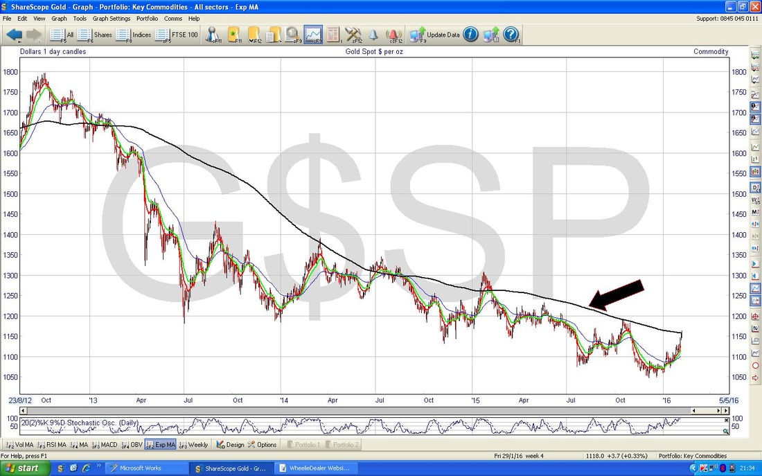
6 Comments
Ed
8/2/2016 05:01:05 pm
Doesn't look good does it? Your shorts must be a lot more comfortable now though.
WheelieDealer
8/2/2016 08:54:23 pm
Hi Ed, you're spot on - it looks a bit rough and after today (monday) it certainly looks even worse !! As you say, my large Short Position has certainly taken the pressure off but I still feel a need to increase it a little bit - I will see how things go in coming days.
Ed
8/2/2016 09:27:47 pm
Your company blogs are first class and its easy to see the effort you put into them. I think we should all write lengthy research notes on anything we invest in or are thinking of investing in. Research enough shares and you forget what attracted you to a stock in the first place. I am slowly working my way through all your blogs starting with the oldest. While the info may no longer be accurate in the older blogs it does give a very good guide to the depth of research we should do before buying any stock.
WheelieDealer
8/2/2016 11:28:02 pm
Thanks Ed, you make a great point that everyone should write down why they bought a stock - even if it is just perhaps a few Bullet Points it is better than just blindly buying stuff and forgetting your reasons. Great to hear you are ploughing through the Archive - there is a lot of material in there now that should help people think about how they do things. Totally with you that explaining things simply to people really makes me think hard about the subject matter.
Ben
11/2/2016 02:20:27 pm
Hi,
WheelieDealer
11/2/2016 11:46:06 pm
Hi Ben, Leave a Reply. |
'Educational' WheelieBlogsWelcome to my Educational Blog Page - I have another 'Stocks & Markets' Blog Page which you can access via a Button on the top of the Homepage. Archives
January 2021
Categories
All
Please see the Full Range of Book Ideas in Wheelie's Bookshop.
|
