

|
educational blogs |
|
Phew, that is September out of the way - this is historically the worst month on average so for us to have got through pretty much unscathed (apart from the odd cuts and bruises perhaps) is quite something. I covered October in last weekend’s Charts Blog (you can find it if you scroll down the Blog page in theory) but it tends to be an OK month and is ranked 5th Best of the Year. The only caveat is that some of the really nasty Biggest Falls for the Stockmarket took place in October - so this sort of taints its otherwise good record (the 1929 Wall Street Crash and the 1987 ‘Black Monday’ both transpired in October).
It is a bit of a double relief for me as I had a really pleasant turnaround for my Portfolio last week. From pretty much Monday through to Thursday I was bleeding Money every day, especially because my Biggest Holding BOO had a big drop, but by the Close on Friday I managed to eke out a small Gain of 0.25% - so I was pretty pleased about that (yet again a triumph for Diversity).
With September over and us heading into officially the best 6-month period of the Year, I am happy to be nicely ‘Long’ the Markets although I do think my Spreadbet Exposure is a little higher than I would ideally like - if I get the chance to trim more I will but with Markets in general just behaving so bullishly, I am not all that stressed about it. I put a Small Short on the S&P500 a few Days back but after an initial drop, it soon found stability and started moving up again - so I closed out the Short for a miniscule Loss before it even hit my Stoploss.
My thinking was that the Trade had started to play out as I thought it would but the Reversal after just a few Days of falling in effect cancelled out the logic of my Short Thesis so it made sense to Close it out and take the pain. I could have waited for the Stoploss to be hit, but of course that would have cost me a little more money. The beauty of getting a very Clear Entry like I did on this Trade (it was triggered by an ‘Inverted Hammer’ Candle - I will cover the S&P500 Chart later in this Blog) and getting it nice and Early, means that the Stoploss can be really tight and therefore if the Trade goes wrong, there is not too much of a Loss but if the Trade goes right, then there is a lot of potential Upside. ‘Asymetric’ Trades which are in your favour are highly desirable. I am very pleased with how I handled this Trade - after my balls ups last year on Hedging I am putting a lot more effort and focus into getting these kind of Trades right and I feel I had a good Entry, I nice small Position Size and I Exited in reasonable time. I will no doubt be keeping my eyes focused on any other opportunities but the Markets are certainly making life difficult for Short Trades. It is far easier to swim with the tide and that is clearly upwards at the moment. Looking into the coming Week, there seems to be not all that many Companies Reporting Results or anything - recent Weeks seem to have been quite busy in that respect. I am not certain about this, but I suspect it is the US Non-Farm Payrolls Jobs numbers on Friday - that can usually cause some chopping about on Friday afternoon but with the current mood of the Markets I suspect it would take a lot to derail the Bulls. Before getting into the Charts and stuff, a quick bit of admin. I keep finding that Twitter loses my ‘Notifications’ from time to time and my guess is that people are directing Tweets at me but I am not seeing them. If you want to get hold of me about something, then I suggest using the DM thing if I am Following you (if I am not Following you, then try sending a Tweet as the ‘Notifications’ sometimes work or email me and I will Follow you so we can DM), or send me an Email on [email protected] and I should respond to it - I am a bit slow so don’t expect an immediate response !! There was a funny conversation during The Bash last week - I mentioned to a few people that I had pulled back from Twitter quite a lot because it can be so demanding in terms of time and stuff and I was finding that I had little time for anything else - their response was “oh, I hadn’t noticed”…….. Fevertree FEVR Last week I published a Blog about a Simple Model for Valuing Rapid Growth Stocks and this used BOO as an example but I also mentioned that FEVR could be an interesting one to run this kind of modelling on. Anyway, simply for my own interest I have decided to cover this quickly in this Blog - so here goes. I suggest you have a look at that Blog (it should be just underneath this one on the Blog Page) if you are unclear on how I run the Model. First off we have the ShareScope ‘Details’ page for FEVR: 
If you look in the Top Right Hand Corner you should see ‘Norm EPS(p)’ for ‘Dec 2017 Forecast’ of 33.82p. I will use this Number as the Base starting point for the Model. However, as you will see from my comments further on, the Analyst Forecasts look way out to me - they are far too pedestrian on the Growth I reckon - so in reality this Base Line Number might be too low - Readers who are ‘in the know’ might want to run a Model with a slightly higher Starting Number.
Scenario 1 - 100% Growth, Straightline The last set of Results from FEVR was so impressive - they recorded over 100% Growth in everything. Obviously this will not be sustainable, but I will run the Model just for interest before trying to produce something a bit more realistic. On this basis we get the following: 2017 - 33.82p EPS - P/E Ratio 64.7 (2187p divided by 33.82p) 2018 - 67.64p EPS - P/E Ratio 32.3 (remember, this silly example is growing Earnings at 100%) 2019 - 135.28p EPS - P/E Ratio 16.2 2020 - 270.56p EPS - P/E Ratio 8.1 2021 - 541.12p EPS - P/E Ratio 4.0 This is obviously a silly example but it illustrates how super fast Growth can cause a P/E Ratio to tumble and make a Stock that seems very expensive, actually be a complete bargain. Scenario 2 - Realistic ish Assumptions I don’t know FEVR as well as many Readers who actually hold it etc. so this is pretty much ‘Finger in the Air’ stuff. Anyway, I will run the Model with the following Growth Rates: 2017 to 2018 - 60% Growth (It is notable that the Analyst Consensus Forecasts suggest just 8% Growth - this Number looks really dodgy to me and suggests a huge understatement - have a look at the recent Interim Results - is growth really going to slow that much?). 2018 to 2019 - 50% Growth (Again, the Analyst Consensus is for merely 6% growth - this must surely be a big understatement). 2019 to 2020 - 40% Growth. 2020 to 2021 - 30% Growth. On that basis, we get the following Numbers (remember, it is the same Starting Point): 2017 - 33.82p EPS - P/E Ratio 64.7 (2187p divided by 33.82p) 2018 - 54.11p EPS - P/E Ratio 40.1 (I multiplied 33.82p by 160 then divided by 100 to get the new EPS figure) 2019 - 81.16p EPS - P/E Ratio 26.9 (this P/E is now dropping into more ‘sensible’ realms for a Growth Stock). 2020 - 113.62p EPS - P/E Ratio 19.2 2021 - 147.71p EPS - P/E Ratio 14.8 (clearly a ‘cheap’ number). I suggest another interesting exercise would be to run a similar model in terms of the Growth Rates but to use a Higher Starting Number as I do in a later model here. Scenario 3 - Much more conservative The lack of Growth in the Analyst Consensus Numbers has got me spooked so I will run another Model which is more conservative. Here is the Growth profile I will use: However, I will use a slightly higher Starting Point of 36p EPS - that looks much more realistic. 2017 to 2018 - 40% Growth. 2018 to 2019 - 35% Growth. 2019 to 2020 - 30% Growth. 2020 to 2021 - 25% Growth. So the Model runs as follows: 2017 - 36p EPS - P/E Ratio 60.8 (2187p divided by 36p) 2018 - 50.40p EPS - P/E Ratio 43.4 (I multiplied 36p by 140 then divided by 100 to get the new EPS figure) 2019 - 68.04p EPS - P/E Ratio 32.1 2020 - 88.45p EPS - P/E Ratio 24.7 (this P/E now looks more sensible). 2021 - 110.56p EPS - P/E Ratio 19.8. So there we are. My main takeaway here is that Analyst Consensus EPS Figures look far too low - if this Modelling Exercise merely brings this to my attention, it is an extremely valuable exercise. It is pretty obvious that this lack of Growth in the Analyst Numbers sets up the very real possibility that we will get a few more “Ahead of Expectations” Updates from FEVR and that will drive the Share Price ever higher. The Skill as an Investor is now to ascertain if the kind of Growth I am talking about is realistic - I suspect it could well be. Another thing worth thinking about is the Dividend Forecasts (these should be visible on the ScreenShot in the Top Right Hand Corner - remember, if you click on these Pics they should get bigger in your Browser jobbies) - if the Growth is much faster than the EPS Forecasts suggest, then it is equally possible that the Dividend Forecasts are too low - I suspect they are. While on FEVR, it would be rude to ignore the Charts - so starting off we have a sort of ‘Long Term’ one - FEVR is a fairly recent IPO so we ain’t going back all that far and it has been a belter of a Stockmarket Debut for Holders (sadly not me - sob). As always, the Charts shown here are from the highly accomplished ShareScope Software which is the current Olympic Downhill Skiing Champion (bet you didn’t know that !!) This Chart is all about Support really - my Black Line (Black Arrow) is the Floor of the Uptrend that is currently in force, and this suggests that if the Price does drop back, then there should be some Support at around 2000p. Further down, we have the Light Blue Wiggling Line (marked by the Blue Arrow) - this is the 200 Day Moving Average and would be another Area of Support if the Black Line fails - this is at about 1700p. 
On the Screen below I have zoomed in a huge amount on the Daily Candles. First off note the Green Support Line marked ‘2110p’ - it is important this holds in the very near term - but if it fails, then expect the Price to drop towards that Black Line from the previous Chart.
Next look at my Yellow Rectangle that is trying to capture 2 Candles which in combination have formed a ‘Bullish Harami’ (yes, the Lady with an occupied womb one) and after recent falls, this could be a Reversal Signal suggesting gains to come. However, note on Friday that we got a Doji Candle which showed uncertainty really - a clear Buy Signal would be if we see the Price breakout through the Red Line (Red Arrow). My Blue Arrow is pointing at the 50 Day Moving Average Wiggly Line - note the Price Action at the moment is taking place around this line - that is probably a positive thing and suggests the Price won’t fall a lot more. 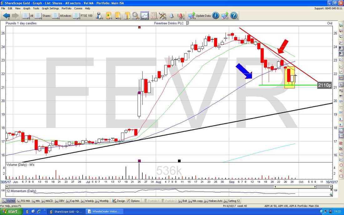
This is an interesting Screen. In the Bottom Window on the Chart below we have the RSI (Relative Strength Index) for FEVR - my Black Arrow is pointing to where it is now on a Reading of RSI 44 - this looks pretty low in the context of FEVR’s previous history (simplistically, you Sell when the RSI is very high, and you Buy when the RSI is very low).

I am really getting stuck in to FEVR now !! I know a lot of Readers are in it so I am sure they will find this Chart checking of use. The Screen below has the Daily Price Candles and then the Red 13 Day EMA Line (Exponential Moving Average) and the Green 21 Day EMA Line. My Black Arrow is pointing to where we had a ‘Death Cross’ between these 2 Lines and it has dropped since this event. What Bulls ideally want now is a ‘Golden Cross’ where the Red Line Crosses back up over the Green Line. Of course, prior to this there can be some Upside but for cautious Bulls, it might be better to wait for the Golden Cross Buy Signal.
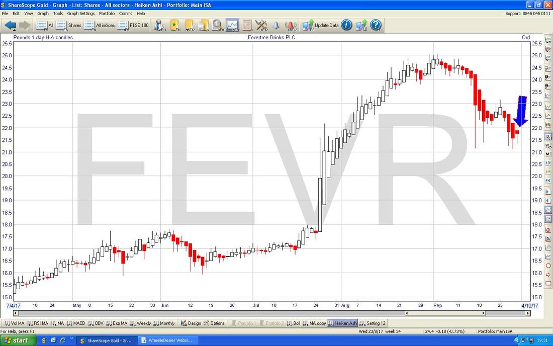
Time for some Heiken Ashi (I’ll have a pint of it please !!). The Chart below shows the Daily HA Candles and my Blue Arrow is pointing to where we got a Narrow Red Candle on Friday. After a few Red Down Candles, to see this narrowing of the Candles is a hint that a Reversal might be close - it is too early to be sure, but what we need to see next for Bulls is more Narrowing and possibly a change of colour to White and then some Big White Up Candles.
Severfield PLC SFR
This is one that a mate was asking me about a couple of Days back and it was also one of the Main Tips in Investors Chronicle this Week. I am not that close to this Business, but from what I know they do some Specialist Steel stuff which seems to involve fabrication of various Structures used in Buildings and suchlike. I have never taken much notice of SFR because I see it as a Highly Cyclical Industry and if there is a Downturn then it is likely to fall a lot - so this is something Investors need to weigh up. However, in terms of the Raw Numbers it looks pretty good value on a Forward P/E of 9.7 for 2018 and a Dividend Yield of just over 4% for that year also - they might even have some Cash. As is always the proper way to do things, we will start by looking at the Long Term - here is a Chart which goes back for Centuries and the obvious Feature here is that the Price was massively higher just before the 2007 Crash. 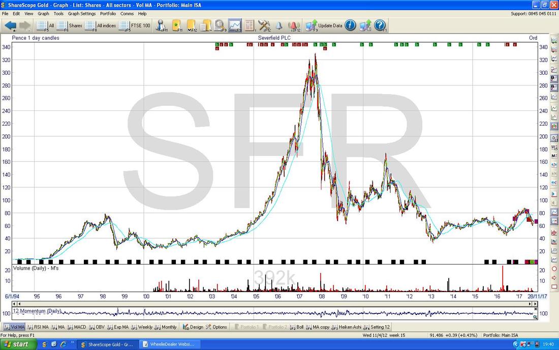
The Chart below shows a pretty unruly Uptrend Channel which has been in force since about 2013. I say “unruly” because although the Price Action has stayed within my Black Lines, it has had very wide swings.

On the Chart below I have zoomed in to point out a Downtrend Channel between my Parallel Green Lines which is holding force at the moment - although we might be about to Breakout of the Upper Green Line (marked by the Green Arrow).
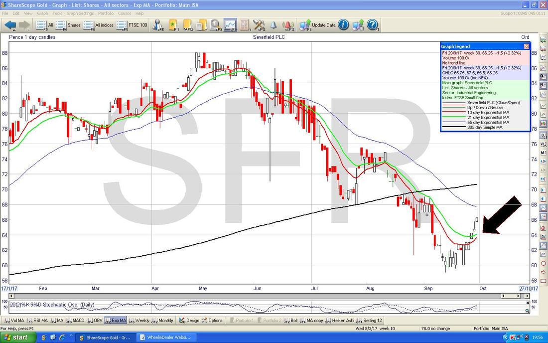
My Pink Circle is highlighting an ‘Inverted Hammer’ Candle which was created on Friday. What is interesting about this is that such a Candle in the context of the recent move up which happened over the last 3 weeks or so, hints at a Reversal and that the Price will fall again. There is however a contradiction going on here - the Price seemed to Breakout of the Green Line but then fall back towards it - however, ‘Overshoots’ are very common so it could be that the Downtrend Channel is still dominating here and the Price will keep falling now. Note how the High Point of the Inverted Hammer on Friday touched the Darker Blue Wavy Line which is the 50 Day Moving Average - so clearly this is Resistance that needs to be got over. My Black Arrow is pointing to a ‘Death Cross’ between the 50 Day Moving Average and the 200 Day MA (the lighter Blue Wavy Line) - this is a bit of a cloud over the Chart but the Price can move up before we get a Bullish ‘Golden Cross’. 
The Chart below has the Daily Candles with the Blue Wiggly Bollinger Bands above and below. My Yellow Circle is highlighting how the Candle from Friday touched the Upper BB Intraday and then fell back - so again this is a bit bearish in the very Short Term.
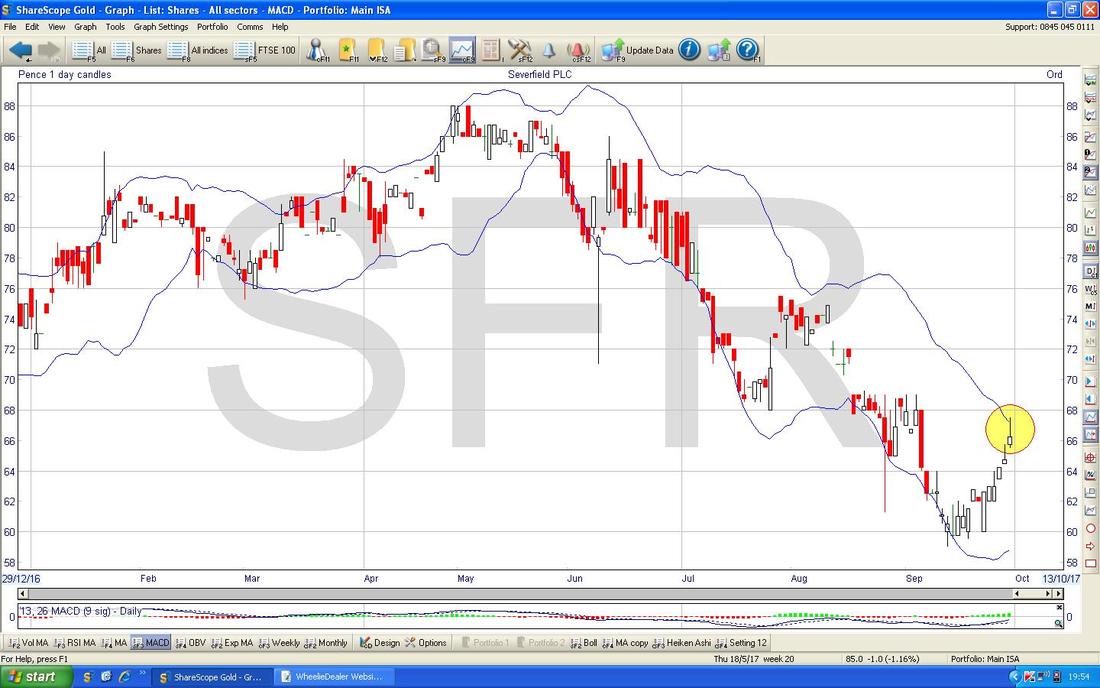
This is a lot more promising for SFR Bulls - on the Chart below my Black Arrow is pointing to where we are approaching a 13 Day EMA and 21 Day EMA ‘Golden Cross’ - if we get this Crossover, then Bulls can expect a few Weeks of gains.
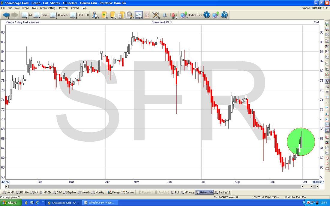
On the Chart below we have the HA Candles for SFR Daily - note where my Green Circle is that we have nice Big White Up Candles - there is no sign of Narrowing here yet and this suggests we will see more Gains. However, remember that the clarity HA Candles gives comes with the price of being a bit ‘slow’ - so the stuff we have seen on the previous Charts might be signalling the near future before the HA Candles have picked up on this.
St. Ives SIV
Sorry to keep banging on about this one but I see it as one of the best opportunities around at the moment on a crazy low Forward P/E of 6.1 and also very low looking Analyst Forecasts - so I am expecting Upgrades in coming Months. The other driver for me to include it in the Blog this week is that it has Results on Tuesday and if these are decent, then it could help reassure the Market that a Recovery is in place here and minds may focus on the Value. Something worth considering is that about a week ago SIV came out with some apparently bad news because they had lost a Printing Contract with Sainsburys SBRY but at the bottom of the Statement they said it wouldn’t affect their expected Full Year Results because the Online Marketing bit is trading so well that it will make up the shortfall. This is exactly what I want to hear because I am very much of the view that the Strategic Shift here from dull old Printing to Online Marketing is a very astute move. The Statement obviously implies that Tuesday’s Results should be ok. Oh, and I bought more SIV about a Week ago at about 74p (see ‘Trades‘ page). SIV has a fair bit of debt but it is highly Cash Generating and the debt is under control - it also has a large Pension Deficit but personally I don’t get over-stressed about these. Anyway, a Forward P/E of 6.1 on low looking Forecasts suggests plenty of Margin of Safety here. On the Chart below we have the Daily Candles and there is a pretty well-defined and obeyed Uptrend Channel marked by my Parallel Black Lines. Note how the Price dropped back recently then where my Black Box is there was a Hammer Candle and this marked the Turning Point from which the Price has then continued to move up. My Yellow Circle is pointing out a Small Up Candle from Friday but clearly the Price is moving up. My Green Arrow is pointing to a Bullish ‘Golden Cross’ between the 50 Day and 200 Day Moving Averages - regular sufferers of my Waffle will know that this is one of my favourite Longer Term Indicators and suggests we will see Gains in the weeks/months ahead. 
In the bottom window on the Chart below we have the MACD (Moving Average Convergence Divergence) for SIV on the Daily. My Black Arrow is pointing towards where we are moving in the direction of a Bullish MACD Cross - this is shown as both the ‘Humps’ and as the Signal Lines format. Of course a Bullish Cross is not guaranteed, but clearly things are looking promising.
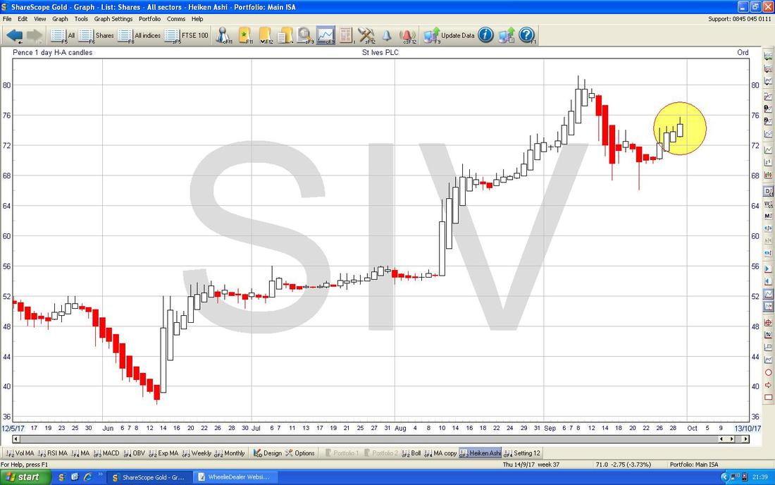
Below we have the Daily HA Candles - my Yellow Circle is flagging up how we have a succession of nice Big White Up Candles and no sign of Narrowing yet.
Boohoo.com BOO
Come on Peeps, how could I have covered a load of Stock Charts in my Blog and not included BOO? This is my biggest holding so obviously it is one I am very fixated on. First off here is a fairly Long Term Chart - ok, not all that long but BOO doesn’t have much history and in recent times it has been all in one rather pleasant direction for Holders. A few things to spot here - First off look at those 2 sort of Pinky Blobs at the top - this looks very much like a Bearish ‘Double Top’ sort of Pattern. For proper progress to be made here, the Price needs to get above these Peaks which means getting over the All Time High at 273p. Next look at my Black Uptrend Line marked by the Black Arrow - note where my Green Circle is that the Price has broken below this Black Line, and that is not good. Next look at the Blue Arrow - this marks the 200 Day Moving Average Line - look at how the Price in the panic last week fell down and touched this Line - this is obviously important Support and a failure downwards here would be bad. 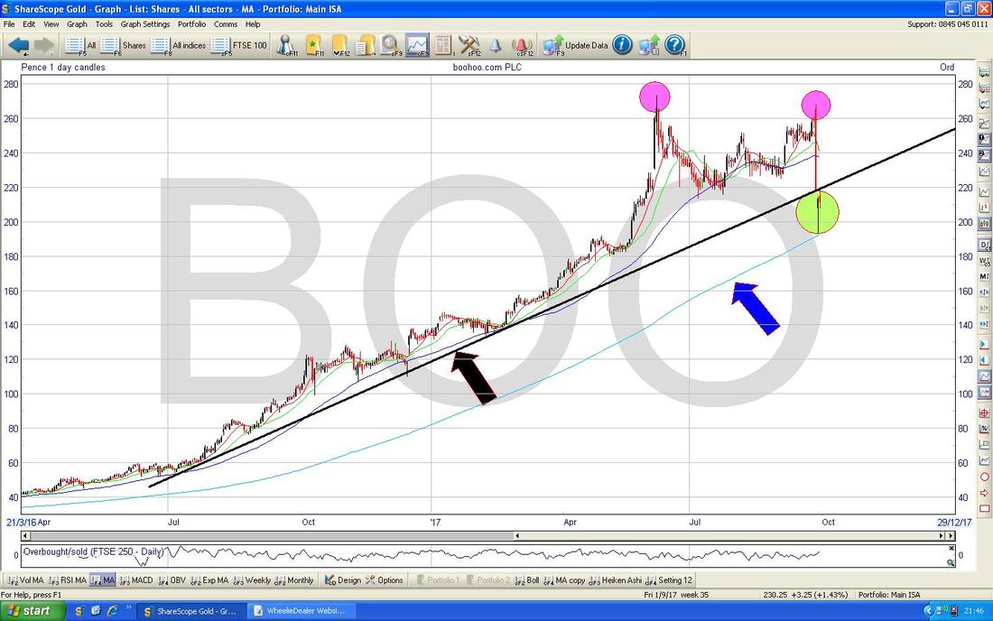
On the Chart below, I have zoomed in and the thing to notice here is the Yellow Box which contains a Hammer Reversal Candle from Thursday - note how it touched the 200 Day Moving Average pointed at with my Blue Arrow, as per the previous Chart. On Friday, we got a ‘Cotton Reel’ Doji kind of thing (that is my name for it, you won’t find that in the books !!) which shows some hesitation by both Bulls and Bears. For Bulls now we need to see more moves up and at least the Price must stay above that critical Support at 193p which was the Intraday Low on Thursday. In addition, we need the Price to get back up above that Black Line (Black Arrow) and clearly there is a lot of Resistance to wade through up above.
The valuation on BOO is clearly red hot (see my recent Blog !!) and I suspect we will need a period of Consolidation now before we can see any more proper Upside - on the flipside, it things get generally bad for the Markets, then BOO would probably get dragged down. 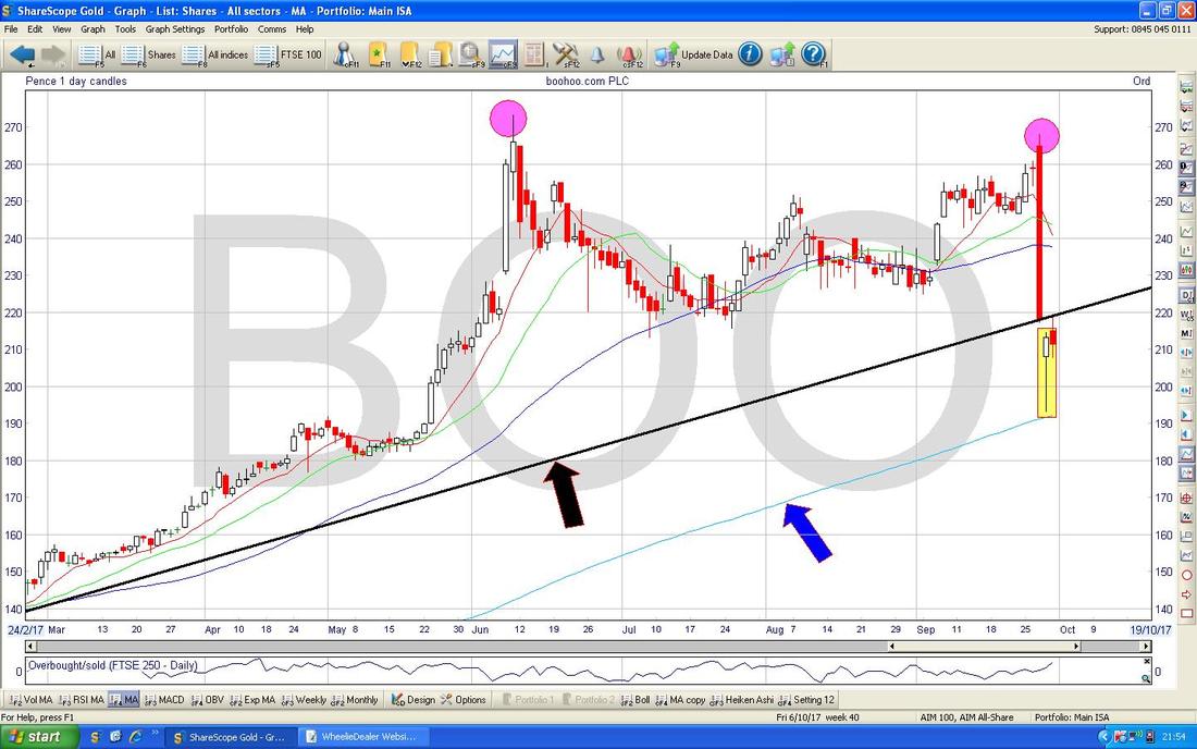
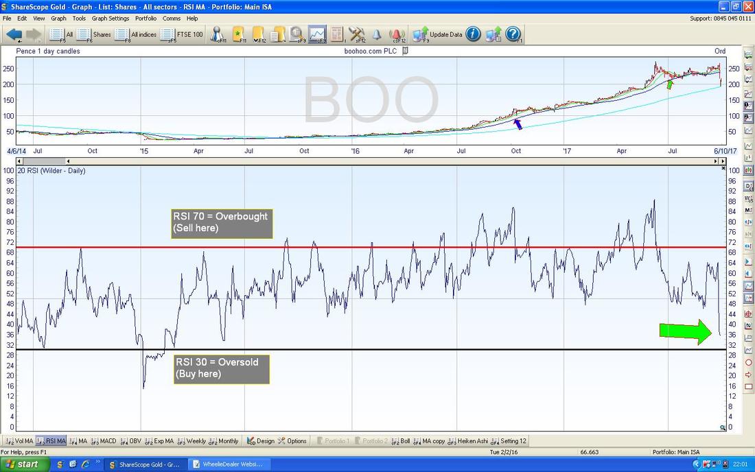
In the bottom window on the ScreenShot below we have the RSI (Relative Strength Index) for BOO on the Daily. With a Reading of RSI 36 where my Green Arrow is, the RSI has rarely been lower.
On the Chart below we have the Daily Candles with the Squiggly Blue Bollinger Bands above and below. Where my Black Arrow is we had the big Hammer from Thursday and note how it was formed up outside the Bottom Band - this is unstable and note how on Friday the Candle made a move back inside the Band. I expect to see more Sideways moves here most likely as the Bulls and Bears fight it out before a clear direction takes hold again.

On the Chart below, my Black Arrow is pointing to where we have a Bearish 13/21 Day EMA ‘Death Cross’ - this suggests weakness for a while yet. We need to see a ‘Golden Cross’ between these EMAs for things to perk up with any sustainability.

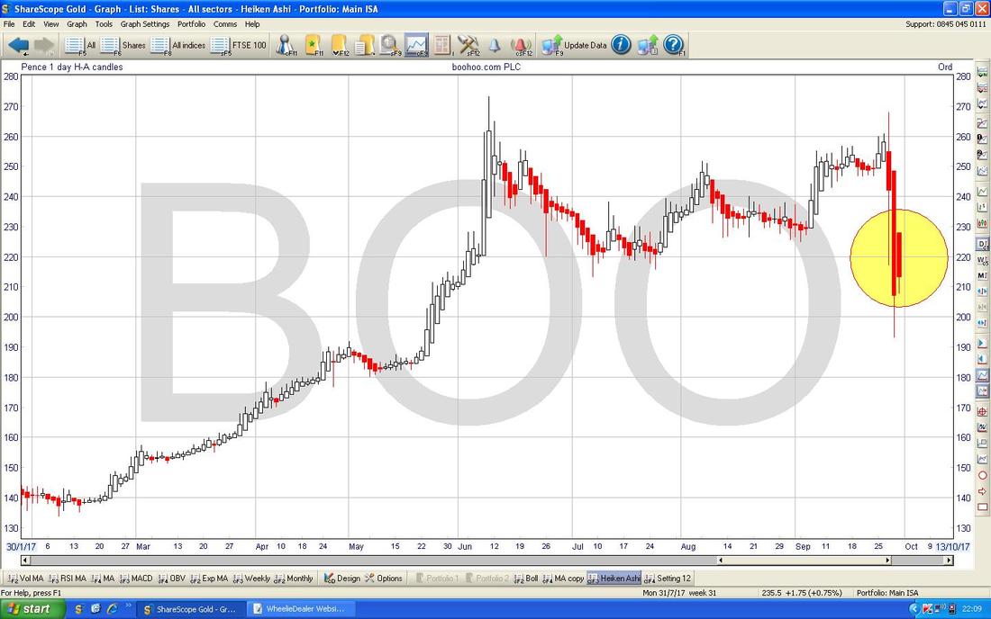
Next we have the HA Daily Candles for BOO - my Yellow Circle is spotlighting Big Red Down Candles - until we get a narrowing and a change of colour to White, these HA Candles are still hinting at more Downside - but remember they are a delayed Indicator.
S&P500 (US)
There isn’t really a lot to say here - as per the Chart below, my Yellow Circle is pointing out a White Up Candle from Friday and yet another push to a New All Time High - this is super bullish. 
THE POLITICAL SLOT - as a total diversion, Ruth Davidson from the Scottish Tories just appeared on my TV on Sky News as I am typing. This must be the 19th time I have seen her today. Everyone says Boris is “on manoevres” but it doesn’t take a genius to notice that Ruth D is hardly keeping a Low Profile. It would take some engineering, but if the Tories can get her down to Westminster in good time, she perhaps could make a very strong Leader - and I suspect the Cult of Corbyn might find her quite a formidable opponent.
Back on the Charts after that interlude…….. In the bottom window below we have the RSI for the S&P500 Daily - on a reading of RSI 65 it is certainly high but it has scope to go up a bit more before getting seriously Overbought. 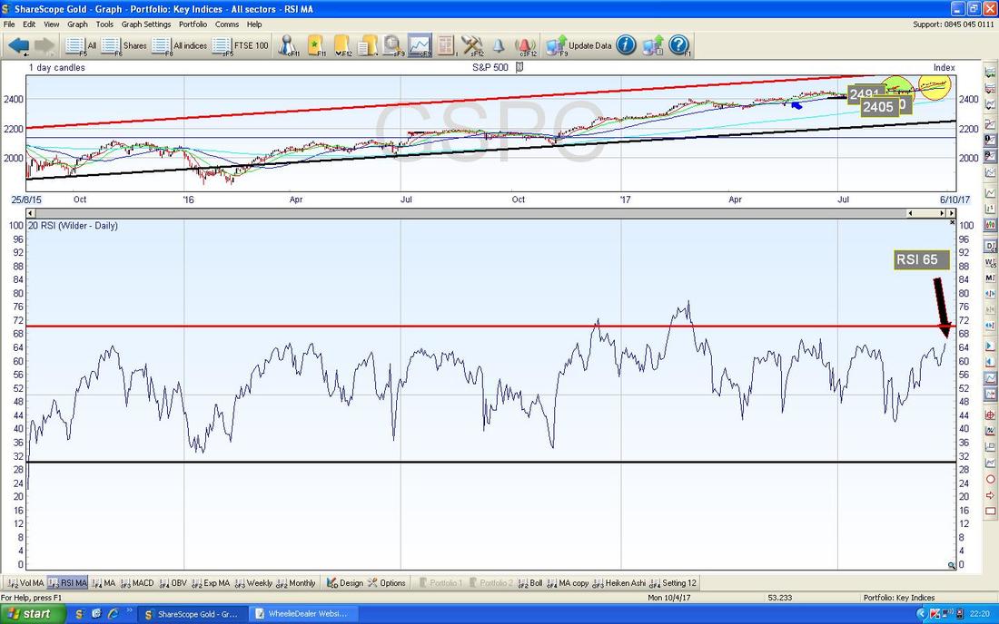
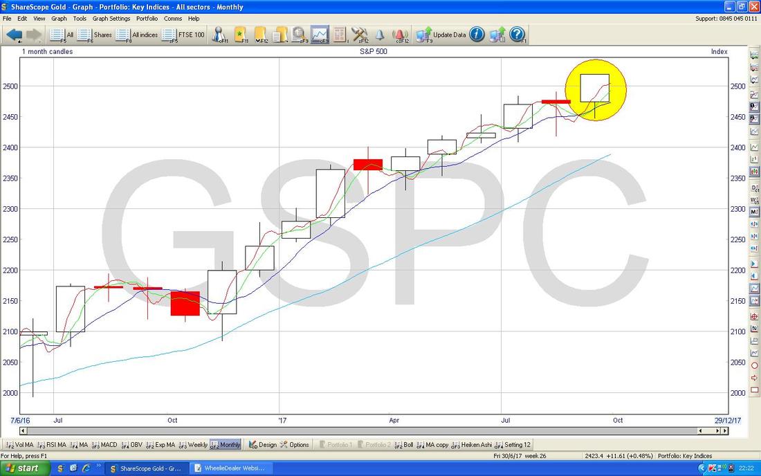
The Chart below has the Monthly Candles for the S&P500 - my Yellow Circle is highlighting how September, despite its reputation, managed to produce a nice White Up Candle - looks bullish.
FTSE100
Starting off we have a Long Term Chart - I am so sorry it is rather messy in the Top Right Hand Corner but we don’t need to look at that bit - this is just scene-setting for the next Chart. Note here the Long Term Uptrend Line marked by my Red Arrow - we will see this again in a tad. 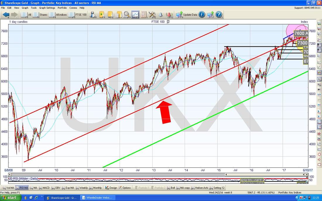
On the Chart below I have zoomed right in to recent times. First off note where my Red Arrow is and the Red Line it is pointing at - this is the Red Line from the previous Chart and the key point I am trying to make is that the Price needs to get back up above this Line for Bulls to really be happy. At the moment we are still below this Line.
Next look at the Yellow Circle which captures a Big White Up Candle from Friday - this looks promising but note there is loads of Resistance not far up above - around 7400 to 7550. Note also that the Price stopped at the 50 Day Moving Average Line on Friday (this Line is marked by my Blue Arrow). There is another important reason why we need to see some strength here - the 50 Day Moving Average Line (Blue Arrow) is heading down towards the Lighter Blue 200 Day Moving Average which I have marked with the Black Arrow - this could bring about a Bearish ‘Death Cross’ soon. That would not be good. To the downside there is good Support at 7300 and 7200 in particular. 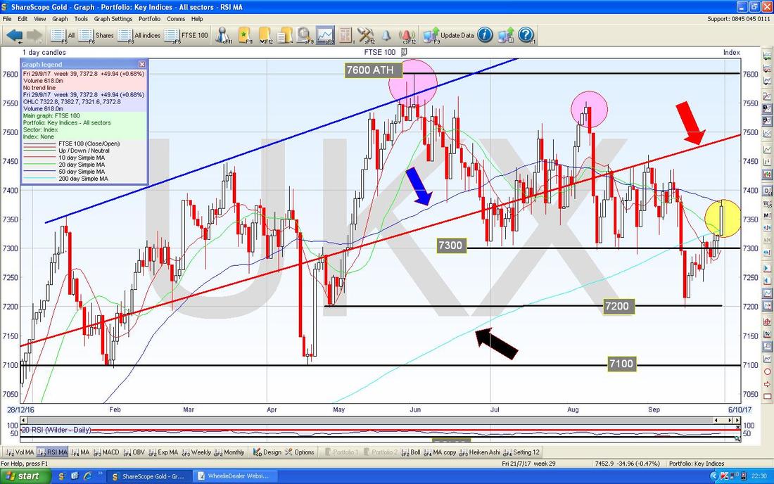
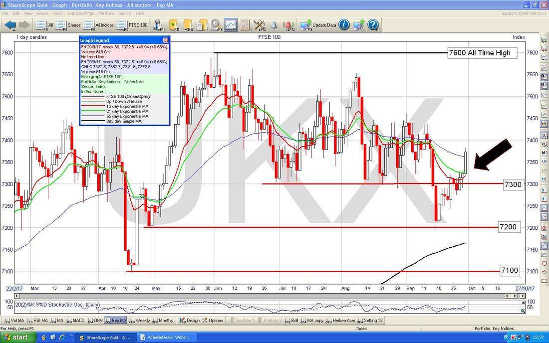
On the Chart below, my Black Arrow is pointing to where we are very near a Bullish ‘Golden Cross’ on the 13/21 Day EMAs (Red and Green Wigglers) - if this happens, then expect more Gains in coming Weeks.
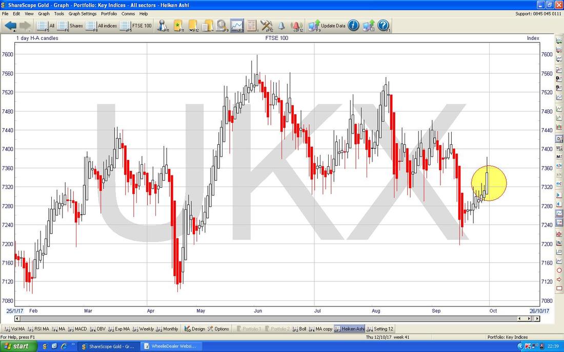
Below we have the Daily HAs for FTSE100 - my Yellow Circle is floodlighting some nice Big White Up Candles - that’s bullish.
Nasdaq Composite (US Tech)
This one looks bullish as well - as per my Green Circle on the Daily Candles below, we have a New All Time High and this one is very like the S&P500. Right, I am timing out and I need to do the upload so I will leave it there. Good luck for the coming week and make sure you err on the Long Tack, Cheers, WD. 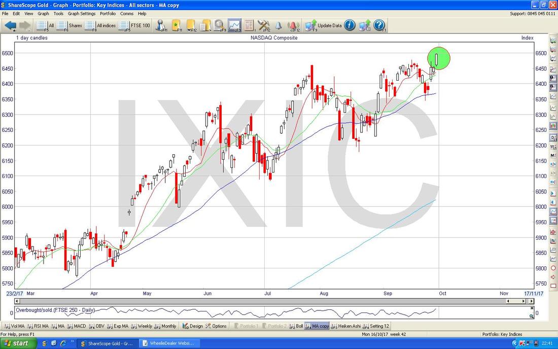
0 Comments
Leave a Reply. |
'Educational' WheelieBlogsWelcome to my Educational Blog Page - I have another 'Stocks & Markets' Blog Page which you can access via a Button on the top of the Homepage. Archives
January 2021
Categories
All
Please see the Full Range of Book Ideas in Wheelie's Bookshop.
|
