

|
educational blogs |
|
Looks like another disjointed and choppy week in the offing - first off we have Phil Hammond’s first Budget as Chancellor on Wednesday (will he Ham it up or make a Ham-Fisted job of it?……where’s that coat?) and then the US Markets are closed on Thursday for Thanksgiving and on Friday the US Markets are only open until 1pm (according to the Almanac).
The Budget could be an interesting one - to an extent it might be quite Business and Lower Tax friendly as an attempt (I doubt it will work) to head off any downwards pressure on Economic Growth with Brexit still assumed to be a drag on Activity. On that basis, it seems likely to me that the UK Markets could do ok leading up to Wednesday and on Budget Day itself perhaps there will be some Sector-Specific surprises that can cause some large Intraday moves - although many of the measures have probably been trailed already. Among those I have noticed are more Government Investment in Infrastructure (Roads, Tunnels, Bridges, Railway Lines, etc.) and there is a lot of talk about reducing Air Passenger Duty (APD) which might be popular for holders of Airline Stocks like EZJ, DTG, FLYB, IAG, RYA, etc. and perhaps even some Travel Companies (TCG, SMWH, TUI etc.). Housebuilding is ‘Political Football of the Decade’ and it seems highly likely there will be measures to help more Homes get built - this and the Infrastructure Boost are a big part of why I bought more GFRD recently as this covers both angles (and looks pretty decent Value anyway).
However, I’m not convinced we should get too over-excited about the Budget - chances are there will be mucho Smoky Mirrors and Hammy will probably be repeating Projects that are already announced and of course there is always the problem that these things take years and years to get from the Budget Speech Stage to actually being anywhere near being built. However you cut it, Government Finances are still in a total mess and it looks like Government Borrowing this year will massively exceed the Target - which is a bit pathetic really. Throw in any Brexit (or whatever reason you want to blame) Slowdown and the Government Finances get even worse - it is fine and dandy for ‘The Left’ to bleat about more borrowing but the simple reality is that any borrowing is constrained by what the Markets will allow the UK Government to borrow - and the nature of these things is that the level of borrowing is fine until it isn’t. The argument from those extolling more ‘Investment Spending’ is that the Government should “take advantage of the lowest Interest Rates ever” - the reality is it doesn’t work like this; as soon as a Government reaches a certain (pretty much unknown and unknowable) level of Borrowing and constantly changing Economic Conditions, Interest Rates suddenly go parabolic and all of a sudden the Government gets itself in a right mess. You only need to think back to the Eurozone Crisis just after 2008 to see how Interest Rates spiked until SuperMario said he would “do whatever it takes” - which as usual was just sticking plaster on a very broken system.
It also is worth appreciating that any increase in borrowing is merely deferred Taxation and this in itself puts downwards pressure on Economic Growth as Businesses and Individuals fear Tax Rises in future. In fact, this lack of Demand is the nub of the problems facing Western Economies - it is very doubtful to me that an increase in Government Spending at the Margins will make any real difference to Economies that are fighting a vast Demographic Change and technological challenges that are fuelling Deflation. There has been much talk about how Monetary Policy from Central Banks around the World has reached the end of its effectiveness and how Interest Rates now need to rise and such stupidity as QE (Quantitative Easing - Money Printing) needs to end and Governments now need to take up the Action. The problem here is that ‘the Action’ is always seen by commentators, ‘experts’ and Politicians etc. as an increase in Government Spending - i.e. use of Fiscal Policy. My own view is that this is just going to cause another disaster - already Government Borrowing around the World is utterly out of hand (look at the US for goodness sake) and I suspect this over indebtedness and aging demographics (as the Baby Boomers become Pensioners) is a major cause of the Economic Malaise showing up as Low Growth across the Western World. The bit that never gets mentioned is Regulation. Government action is highly abundant when it comes to creating new Laws but utterly useless at removing old Laws - as a result, the burden on Businesses and People in general becomes increasing onerous to the point that the dreaded ‘Red Tape’ utterly stifles an Economy (the EU has been particularly disgraceful in this regard). There seems to be a never-ending wringing of hands and muttering about how bad Productivity has been since 2008 and I suspect part of this is caused by Regulation entrenching low quality Big Businesses (and some smaller ones) and making it far harder for New Business to launch and to get traction. Added to this, Central Bank Policies of Low and Zero Interest Rates has enable ‘Zombie Companies’ which are highly indebted and inefficient to survive at the expense of New Businesses and with a negative impact on Productivity. The trend towards Zero-Hours type Contracts and ‘McJobs’ has exacerbated the Productivity problem as new Jobs are created (thus hitting Productivity) at extremely low wages (and of course a consequence of this is the rise of Right Wing Parties across the World). There might though be a sadly distant glimmer of hope around this Over-Regulation problem - Donald Trump appears to be of a similar pro-business outlook to Ronnie Reagan and perhaps we will see a reduction of Regulation in the US - look at it as a Laboratory to see if this can revive the US Economy (although to be fair, the US is coming from a far better Starting Point as it has had a much freer Economy even after many years of Left-leaning Government Policy - whoever was in the White House). If we see some success from Trump Policies then there must be hope that a similar Political Ethos can gain ground over here and in Europe - the catch is however that it will be maybe 5 years at least before we will have any idea if Trump’s Policy prescriptions are working. I could go on and on about this Macro stuff - but I will save that for coming Weeks !! Let’s check out the Charts etc. The View from the Almanac First thing to keep in mind is that we are very near the Strongest Month of the Year - December (shut down your browser and turn off your Computer if you thought next month was not December) and I have been positioning my Portfolio to be almost 100% Long as we close out the Year. We might see some turbulence in coming Weeks but I suspect it will be limited in nature and the general Trend will be Up. According to the UK Stockmarket Almanac 2016, for the Coming Week (w/c 21st November), the FTSE100 has been Up for 52% of Years with an Average Return of MINUS 0.1% - so it is usually a fairly flat week which is no big surprise with the US Markets closed for much of it. FTSE100 As normal, all Charts are screen-scrapes from the brilliant ShareScope Software I use (if you click on them, they get bigger on your screen) - this first one is the Daily Candles of the FTSE100 going back around a year. This is really a ‘scene-setter’ - note my Red Arrow which points to the Red Line which is the Bottom Line of the 6 Year Uptrend Channel I have mentioned for weeks and weeks; the key point here is that we are still under the Resistance created by this Line and if we are to make real progress to attack the All Time Highs and breakout like the US Markets are threatening to, then this Resistance Line must be cracked. Also note the Green Parallel Lines which are marking an Uptrend Channel which has been running for much of 2016 - it will be instructive to see how this holds in coming Weeks/Months. 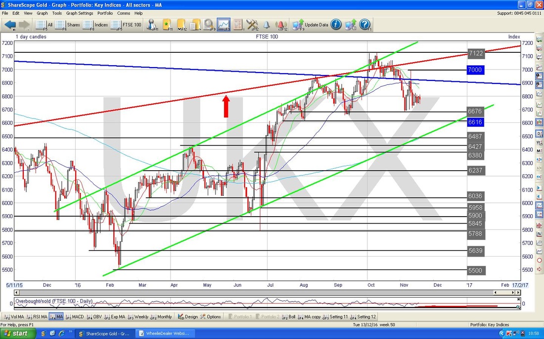
This chart is getting a bit ‘busy’ - I must clean it up at some point. Anyway, I was ‘scene-setting’ because I wanted to show this Triangle thing and I thought some context was required. Note my Thick Black Lines and Black Arrows which are showing a Triangle that has formed over the last couple of weeks - how this resolves will give us the direction the FTSE100 is likely to take in coming weeks. If it breaks out of the Upper Triangle Line then expect it to go higher and if it breaks down out of the Lower Triangle Line then expect it to keep going lower (we don’t really want that although I do have a small Short on the FTSE100 still so I wouldn’t be too gutted).
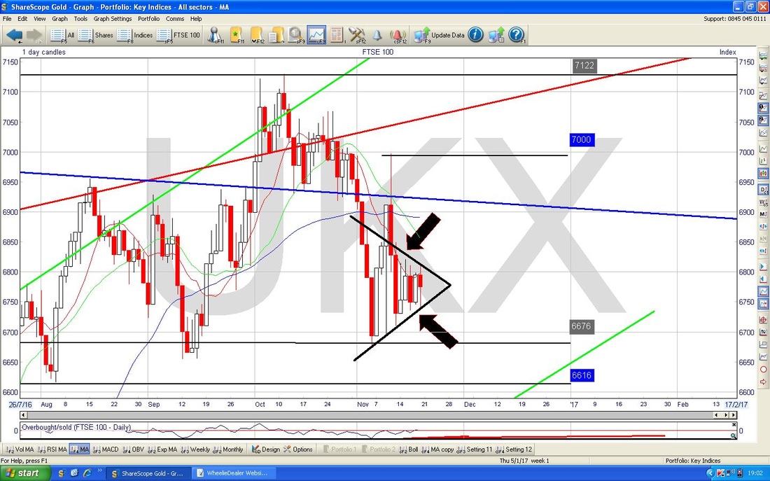
In the bottom window on the Chart below we have the MACD (Moving Average Convergence Divergence) for the FTSE100 Daily. My Yellow Circle is highlighting how the Red MACD Histogram ‘Hump’ is sort of curving round towards positive - it is a bit early but maybe we can see a Bullish MACD Cross soon (this is when it goes from Red ‘Negative’ to Green ‘Positive’). If that Triangle I was on about resolves higher, then I would expect to see a Bullish MACD Cross around the same time.
The Chart below has the Monthly Candles for the FTSE100. First off we need to appreciate that we do not have a full Month for November yet - so the picture could change in the next 8 Days, but there are things to be aware of here that could have a negative tinge.
My Blue Arrow is pointing to a Red Down Candle which has been produced for November so far - on its own this would not be necessarily a big worry, but the catch is that in the context of the ‘Inverted Hammer’ Candle from October which I have marked with the Yellow Circle, it looks like the Candles are pivoting down from the IH. The Support Level at 6676 could be very important in coming Weeks. I suppose when you think about the fundamentals, the fears over Brexit Article 50 being triggered by March 2017 would be a good ‘reason’ for the FTSE100 to lose some steam. I don’t think we should be panicking yet, but it is something to be aware of. 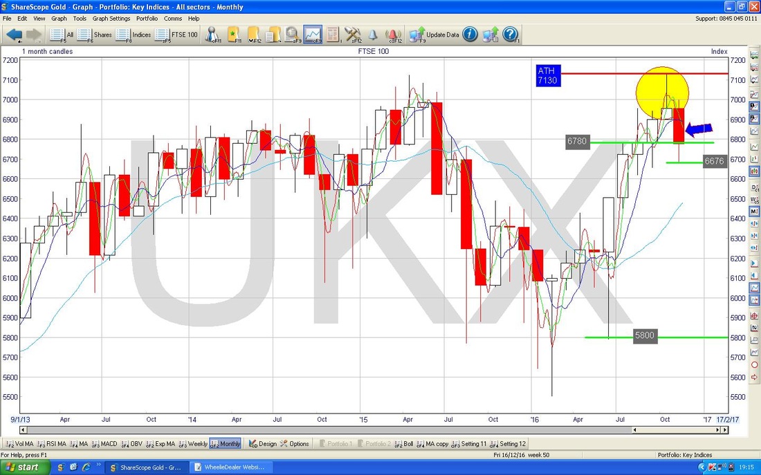
Dow Jones Industrials Index (US - only 30 Megacap Stocks)
I don’t often comment on this one but it is quite interesting so I thought I would chuck some Charts in. After Trumpy was elected, the Dow rallied hard and this is shown on my Chart of the Daily Candlesticks with the Blue Arrows - note this could be the ‘Flagpole’ of a possible ‘Bull Flag’ - this would be very good if it breaks to the upside because the Market should in theory move up by a distance equivalent to the height of the Flagpole. My Yellow Circle shows the ‘Flag’ bit. However, this could be viewed as the Market getting too hot after Trumpy and perhaps a pullback is likely - with Thanksgiving later this week maybe we will see some softness and an easing back. 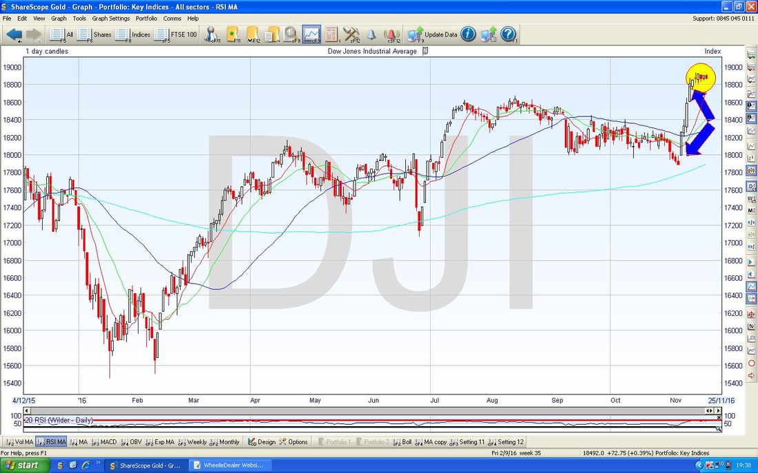
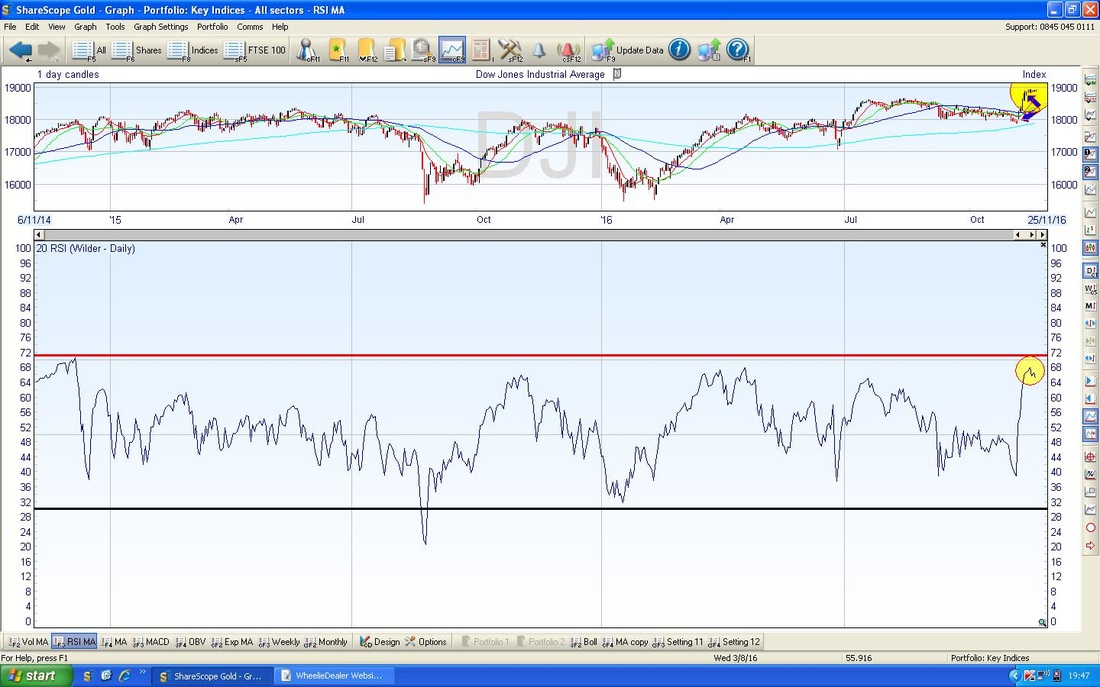
If you look at the bottom window in the Chart below, we have the RSI (Relative Strength Index) for the Dow. My Yellow Circle is highlighting how the RSI is very high relative to where it usually moves up to and it does look like it is turning down - this supports the idea that we might see a bit of a pullback this week.
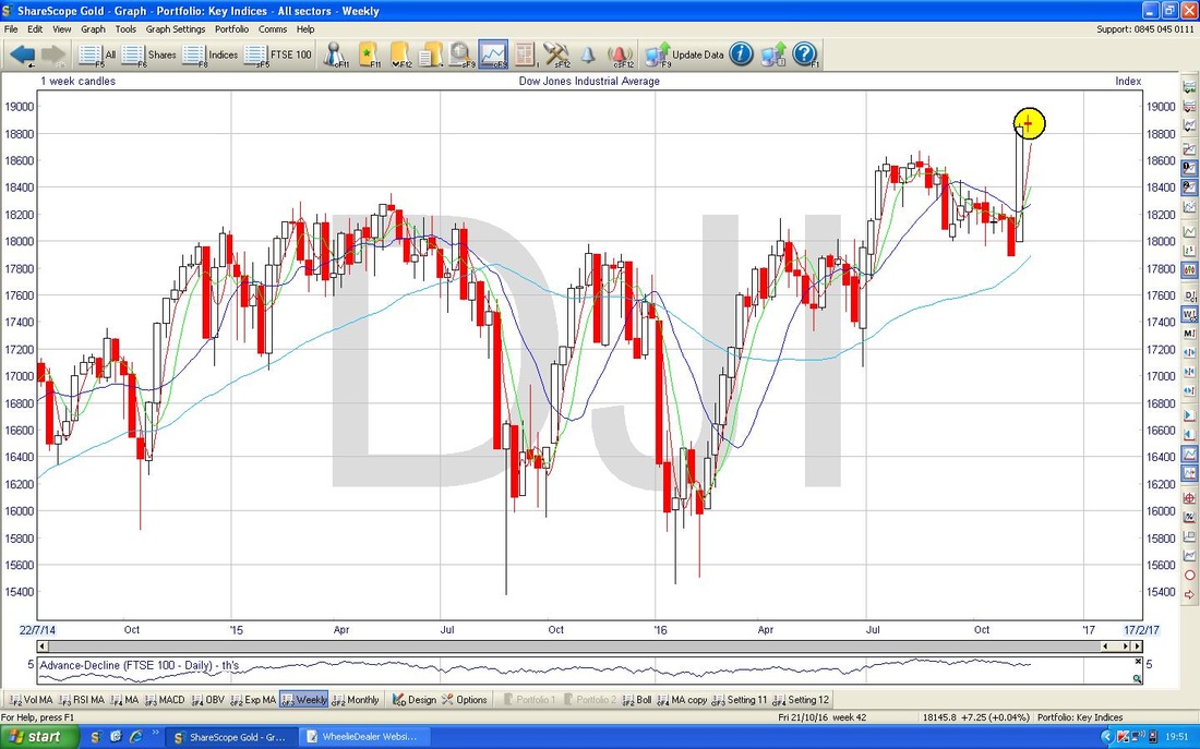
The Chart below has the Weekly Candles for the Dow - my Yellow Circle highlights a ‘Doji’ Candle which was generated last week - this could mark a turning point downwards after the run up or it might be showing that the force of the move up has waned and a pullback may be coming but not immediately.
FTSE250
Various Charts on the FTSE250 look quite promising - I have chosen the one below which shows the Weekly Candles. My Black Arrow shows an Up Candle which was created last week and this built on the Candle from the previous week (marked with my Green Arrow) which acted as a Pivot Point after the down moves of the 3 previous weeks. Note also how it reversed up off the 200 Day Moving Average which is the Faint Blue Wavy Line which I have marked with my Blue Arrow. Note there is a lot of Resistance just up above around 18000. 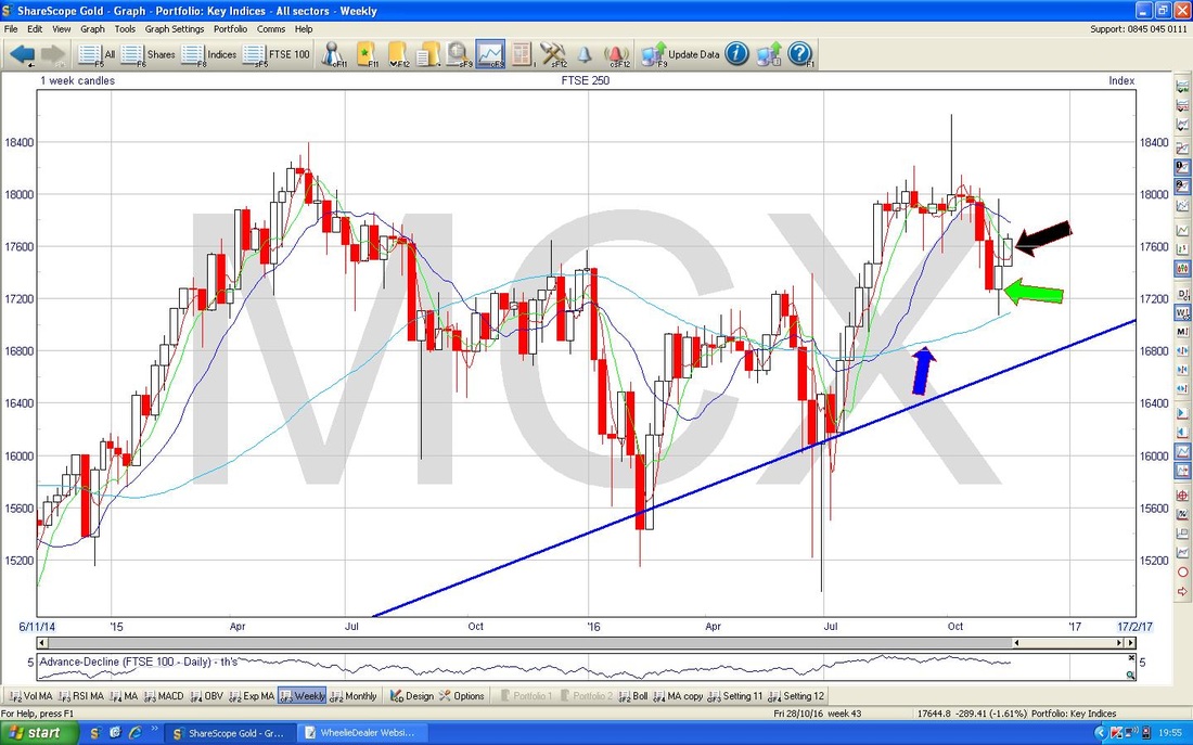
Pound/Dollar
The Chart below has the Daily Candles for £/$ - note the weakness with 5 down days after the Inverted Hammer (marked with my Yellow Circle) and after such a move it could well be that it finds Support soon - we shall see. Note the Candle from Friday, marked with my Blue Arrow, has quite a long ‘Tail’ pointing downwards - maybe that was an Intraday Reversal but it is not particularly clear - ideally we want to see a proper ‘Hammer’ which would be much more ‘textbook’. Note it found Support at about 1.23 - maybe this can hold although if it fails there is a lot of Support below. 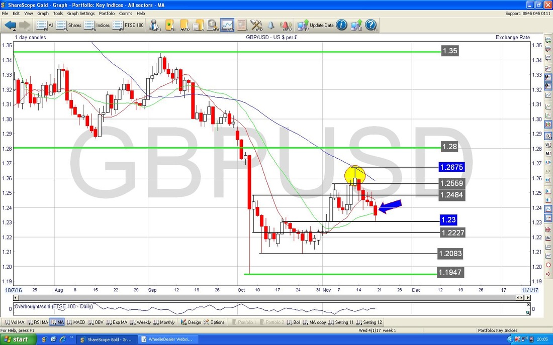
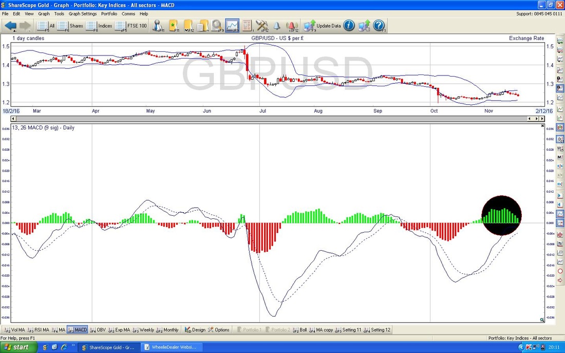
In the bottom window on the Chart below we have the MACD for the £/$ - my Black Circle highlights how the Green Histograms are moving towards a Bearish MACD Cross - this suggests we could see more downside although such a Bearish Cross could still be avoided. I won’t show any other charts (the 13/21 Day EMA suggests a ‘Death Cross’ although it is very unclear) but overall I would say more £ weakness is the most likely scenario. If we do see more £ weakness, then this could help the FTSE100 go up.
Euro vs. Dollar
I don’t normally look at these Charts but I just wanted to highlight how Dollar Strength after Trump’s Victory has caused some big moves in Global Currency Markets - strangely, Sterling has been one of the Strongest Currencies against the Dollar over this time (but that is probably because it had got quite beaten up already over the Brexit Affair). My Green Arrows are showing how the Euro has collapsed against the Dollar (these are Daily Candles) - this is a huge move and obviously has had implications for other Assets. I haven’t thought much about any of this but one Currency Move that has had clear ramifications is Yen weakness against the Dollar which has helped the Nikkei Stockmarket Index move higher. I won’t spend any time on this but just looking at the Candles, there is not much sign of a Reversal Upwards here yet - so there could be more Euro weakness against the Dollar in the near term. Ultimately perhaps this could put more pressure on Mario Draghi to raise Rates and/or tighten up on Policies such as the QE stuff in an effort to support the Euro. 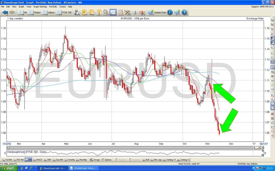
S&P500
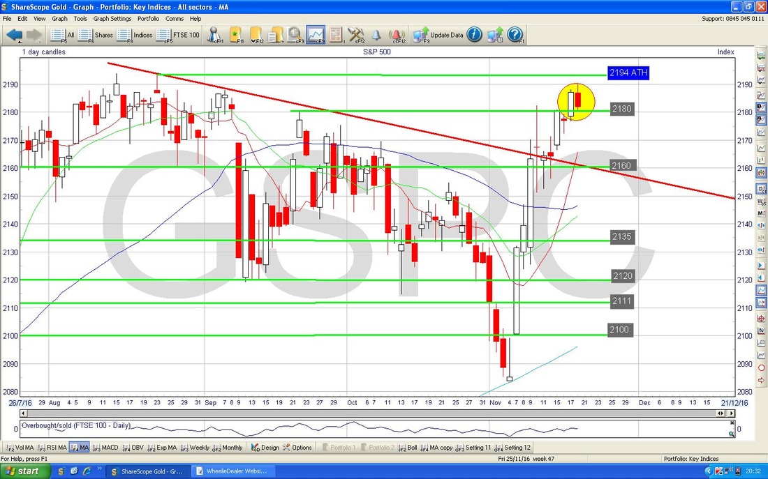
Whereas the Dow hit new All Time Highs after Trump, the S&P500 has not managed to repeat the feat and it is showing signs of struggling in the very short term. The chart below has the Weekly Candles for the S&P500 and my Yellow Circle is highlighting what I like to call a ‘Cotton Reel Doji’ that was the output from last week’s trading - in the context of the strong move up from the previous week and as we approach All Time Highs at 2194 (not to mention Thanksgiving Week), we might see a Reversal Downwards here soon, although my Cotton Reel is not really a Reversal Signal in itself. 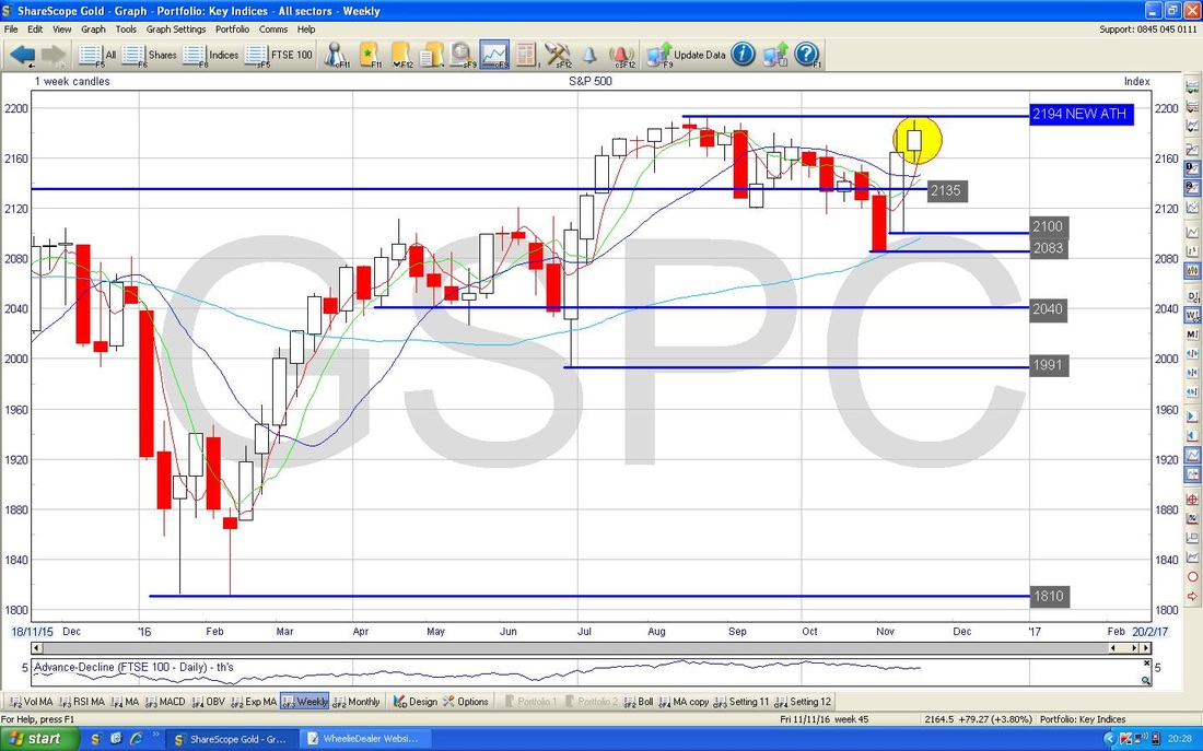
The chart below has the Daily Candles for the S&P500 - my Yellow Circle is highlighting a 2-Day Candle Pattern which looks like a ‘Dark Cloud Cover’ or ‘Bearish Piercing Line‘ - it you have ‘Candlestick Charting for Dumbos’ then go to page 173 (although you might have a newer copy than me !!). It’s not exactly the same as the Book but the fact it was unable to hold the Intraday High Point and reversed down supports a Bearish argument.
Brent Crude Oil (Spot)
The Chart below has the Daily Candles for Brent Oil Spot - first thing to note is how the action is currently pretty much around the 200 Day Moving Average (the Green Arrow is pointing at this Faint Blue Wavy Line). My Blue Arrow is pointing to a beautiful Hammer Candle which was produced on Monday 14th November and this marked a Reversal Upwards after a fairly sustained Down move. The Low Point of the Hammer at $43.575 is Key Support that must hold now. Resistance in the short term around $47.50 looks quite strong. Note how the Darker Blue Wavy Line which is the 50 Day Moving Average is heading towards the 200 Day MA and there is a risk we could get a ‘Death Cross’ in coming Weeks - this is something to watch for as it would not be good for Oil Bulls. It might also impact the FTSE100 if Oil does drop. 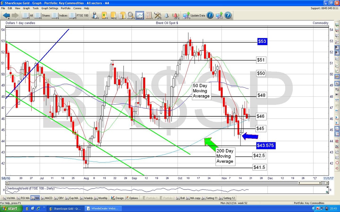
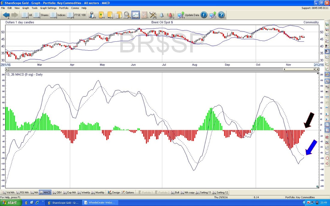
In the Bottom Window on the Chart below we have the MACD for Brent Oil Spot Daily. My Black Arrow is pointing to how we are bang on the verge of a Bullish MACD Cross on the Histogram representation and my Blue Arrow is showing the same phenomenon (“doo doo, doo doo doo“) in the Signal Lines manner.
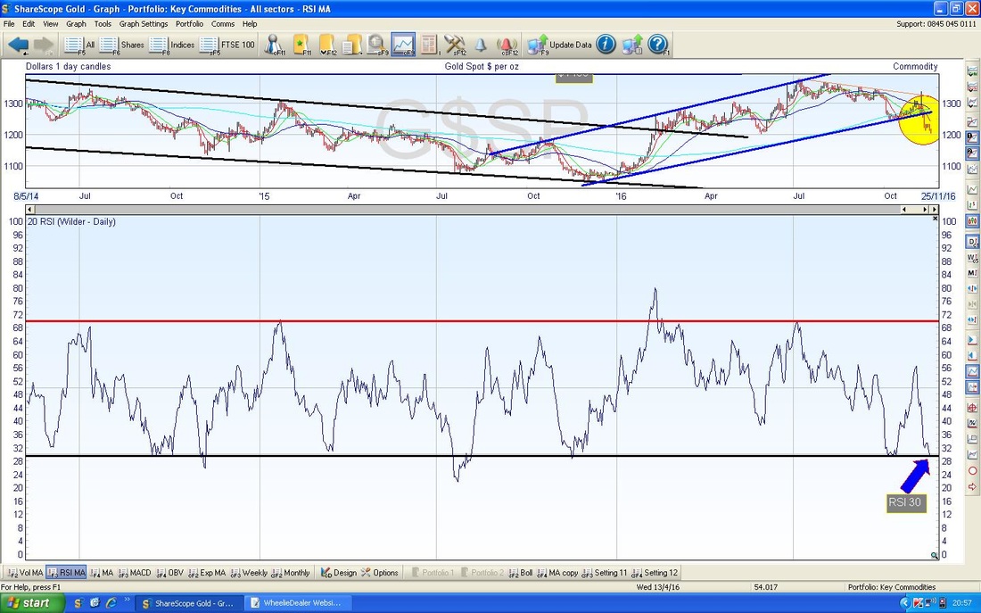
Gold (Spot)
This chart still looks pretty Bearish. There is Support just below around $1200 and just below but I won’t be surprised if we head lower. It has just done a 50 / 200 Day MA ‘Death Cross’ - I will show this on another Chart, but it is not good. 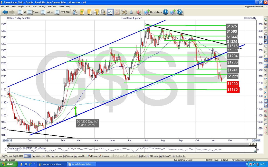
The bottom window on the Chart below has the RSI for Gold Spot Daily - with a reading of RSI 30 this is very low but can go lower - although not a lot I suspect.
The Chart below shows the 50 / 200 Day MA ‘Death Cross’ (this is on the Weekly Chart but the MAs are Daily based obviously) marked with my Green Arrow.
OK, that’s it for this week, Happy Thanksgiving !! Cheers, WD. 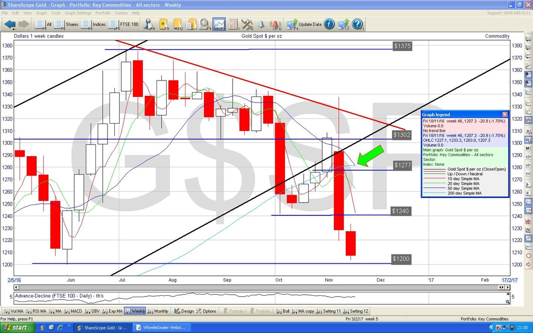
1 Comment
16/11/2017 08:18:22 am
Leave a Reply. |
'Educational' WheelieBlogsWelcome to my Educational Blog Page - I have another 'Stocks & Markets' Blog Page which you can access via a Button on the top of the Homepage. Archives
January 2021
Categories
All
Please see the Full Range of Book Ideas in Wheelie's Bookshop.
|
