

|
educational blogs |
|
I‘ve been out in the PUB all afternoon and when I got home I was just in time for the first MotoGP of the new season - sadly the race was a tad dull but it always cheers me up to know that Bike Racing is back on the telly and Summer is on the way !!
We have a couple of interesting weeks ahead - god knows what will happen. Because of Easter we have 2 ‘Short’ weeks with Good Friday at the end of this week (I am off to see Ellie Goulding at the O2 in London) and Easter Monday chopping short next week. This tends to mean lower Trading Volumes and with how Markets have been of late, it might all be very tedious !!
According to the wunderbar UK Stockmarket Almanac 2016, the coming Week is not a great one - the FTSE100 is up for 42% of Years with an average Return of 0.0% (yes, nothing, nowt, sod all, zilch, nada). This is one of the weakest Weeks of the Year and the Charts suggest that we might see a faltering of the Up move this week. However, the US Indexes look better really - but I would caveat that by saying you must look closely at my VIX chart lower down - that is sending a Warning Signal I reckon.
Of course, this difference between UK and US might be explained by our April 5th Tax Year thing - I suspect that is part of the reason the coming Week is so poor historically - people are ‘Bed and Breakfasting’ their Investments for Tax reduction purposes. FTSE100 The Chart below from the wickedly brilliant ShareScope Software is of the FTSE100 Daily Candlesticks which I tend to show every week. My Green Arrow is pointing to the 200 Day Moving Average - still falling which denotes a Downtrend - we need this to level out and turn up before we can get excited on the Buy Side. My Black Arrow points to the 50 Day Moving Average - after the recent Rally this has started to level out and this is a positive development - but we need it to ideally curve up and cut through the 200 Day Moving Average line from beneath - this would give us a ‘Golden Cross’ and then we can start getting excited and taking off the Bear Boots. My Red Arrow points to a Downtrend Line which was broken over about 3 weeks ago - this was a Bullish development but we need to stay above this line. Note the Price is getting up near the 200 Day Moving Average Line at about 6270 - this might act as Resistance and be a level the Price struggles to get over - we need to watch this. 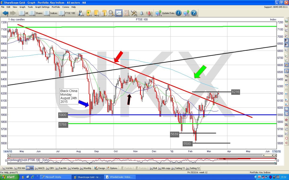
The Chart below shows the Daily Candles on a tighter timeframe of about 4 months or so. The Key thing here is marked by my Blue Arrow which points to an ‘Inverted Hammer’ Candle which was generated on Friday 18th March 2016 - this is mildly bearish but in the context of a Market which has been sort of going sideways for a couple of weeks, it might not be too bad. Inverted Hammers tend to be really Bearish after a sort of strong straight up move over many days - the recent sideways movement might take the sting out of it.
Note the Black Lines I have drawn in which sort of create a Triangle with its top line at about 6216 - we need to break over this again and get over the Intraday High from Friday of 6237. 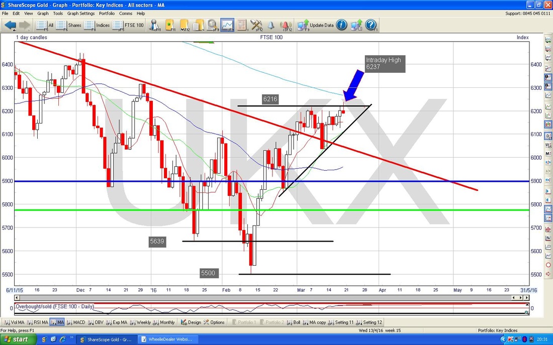
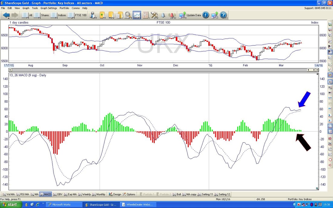
In the bottom window below, we have the MACD (Moving Average Convergence Divergence) for the FTSE100 Daily. My Blue Arrow is pointing to the MACD represented as Lines and the Black Arrow shows this in Histogram form - note it has sort of tried to go Bearish but is sort of hanging on - it might turn up from here, but it would be very unusual really. It is more likely that it will drop down now.
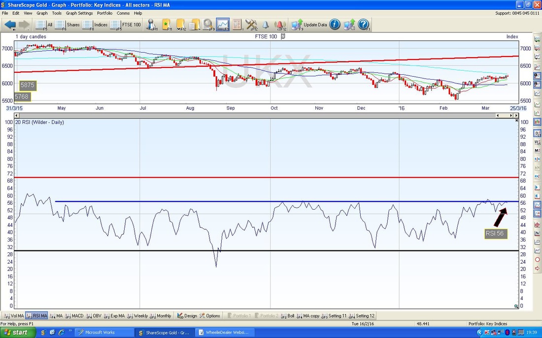
The Bottom Window below shows the RSI (Relative Strength Index) for the FTSE100 Daily - my Black Arrow points to where we ended up on Friday at a reading of RSI 56 - which is not high really but in the context of the recent history of the FTSE100, it tends to peak out around these levels as my Blue Horizontal Line shows.
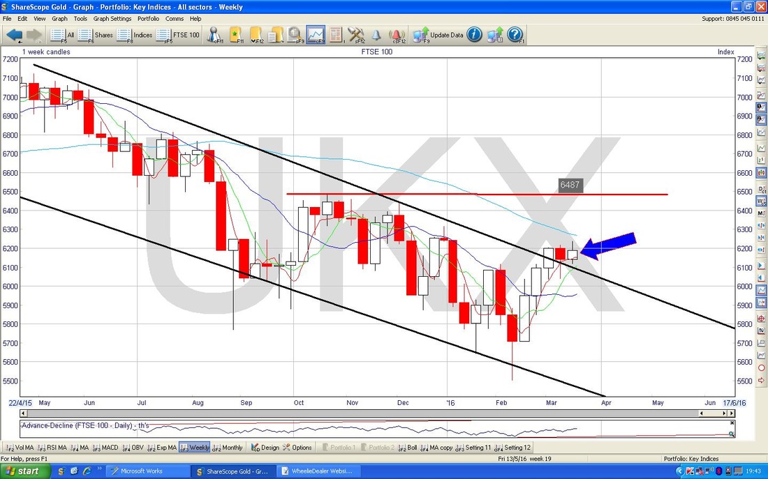
The Chart below has the Weekly Candles for the FTSE100. Note the Strong Resistance at 6487 where I have drawn the Red Horizontal Line. My Blue Arrow points to a ‘Doji’ Candle from last week - this could indicate that we will turn down now, especially after the Hammer Candle from the previous week.
FTSE All Share
A few weeks ago I wrote something in a Blog about an article from Simon Thompson that I had read in the Investors Chronicle. I can’t remember the details (if you look back through my ‘Week Ahead’ Blogs you might find it) but as per the text on my Chart below, if the FTSE All Share closes below 3186 at the end of March, then we could be in big trouble (based on historical trends) - however, so far, things look pretty good - it would need a chunky collapse over the next couple of weeks to bring this about. It is something to keep an eye on but if we can avoid falling into the 3186 trap, it might mean the rest of the year can be more bearable and perhaps the Lows are in - but I still think the Brexit Vote will cause trouble soon and this is why I am letting my chunky FTSE100 Short Hedges run. 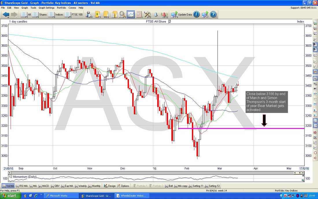
S&P500
The Screen below shows the Daily Candles for the S&P500 - the main US Index. Note my sort of Purple/Pink line with the similar colour Arrow which we have broken over last week - this is positive. Standing back, note how the Price has run up for about 5 weeks on the trot now with very few Pullbacks - this is unusual and looks a bit precarious - we may not be in for a Big Drop, but we are certainly due more Pullbacks. Remember a little earlier I was talking about context for an Inverted Hammer?, well this is the kind of Chart where an Inverted Hammer now would be a superb indicator of a Trend Reversal - watch the Daily Candles for such a development. My Red Circle encompasses an Area of Resistance covering about 2000 to 2120 - we are already over much of this, but there is still quite a lot of Resistance above the current Price level. Note also my Red Horizontal Line right at the Top of the Screen at 2135 - this is the All Time High and I do find it quite amazing that after the dire start to the year we are now not far off the All Time Highs. Are things really that good for the Global Economy? It’s even more weird when you look at the Moving Averages. My Green Arrow marks the 200 day Moving Average and this is falling - although it is a positive development that the Price has got over this level. My Red Arrow points to the 50 Day Moving Average - this has been falling and it is now just about starting to level out - but we are a long way away from a Golden Cross. We had a bit of an Up Candle on Friday but it pulled back from the Intraday High - overall this looks bullish enough. 
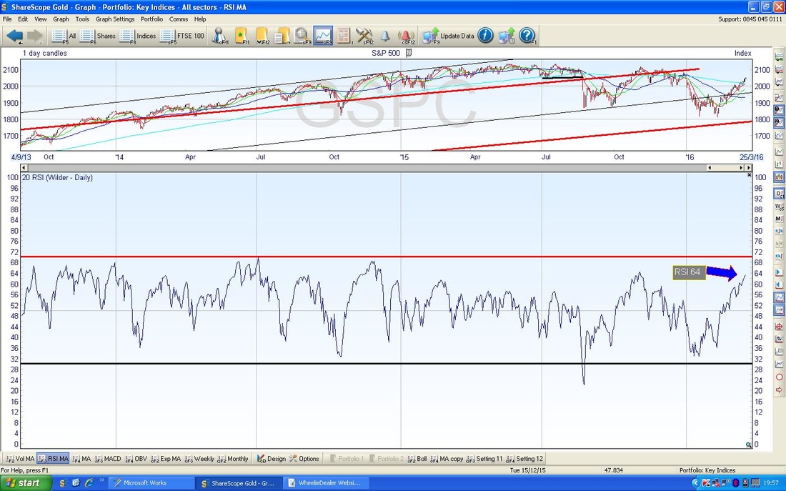
In the bottom window below, we have the RSI for the S&P500 Daily - my Blue Arrow is pointing to the current level around RSI 64 - this is starting to get high but can still go a bit higher.
I have included the Chart below because it is a bit weird. My Blue Arrow is pointing to a huge spike in Trading Volume from Friday which is in the Bottom Window on the Chart. My guess is this is due to ‘Triple Witching’ or whatever it was - when Options expire and stuff. If it is not this, then Huge Spikes in Volume can often indicate Turning Points - either ‘Capitulation’ at the bottom of a move down or ‘Euphoria’ after a move up. I will let Readers draw your own conclusions !!
Note there are similar Volume Spikes on the UK Indexes. 
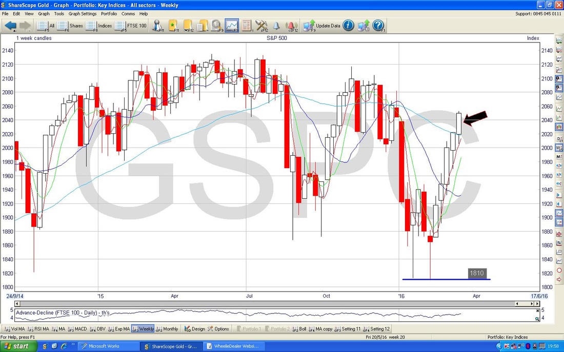
The Chart below has the Weekly Candles for the S&P500. My Black Arrow is pointing to a decent Up Candle from last week - this looks bullish but look how many good weeks we have had - very out of character.
VIX
In the Bottom Window on the Screen below, we have the RSI for the VIX Volatility Index - this moves Inverse to the S&P500, i.e. if the VIX rises, then the S&P500 usually falls. This is really interesting because my Red Arrow points to a level of RSI 38 and this is pretty much the lowest it has been for nearly 10 years !!! The implication is obvious - a low VIX tends to lead to a high VIX. 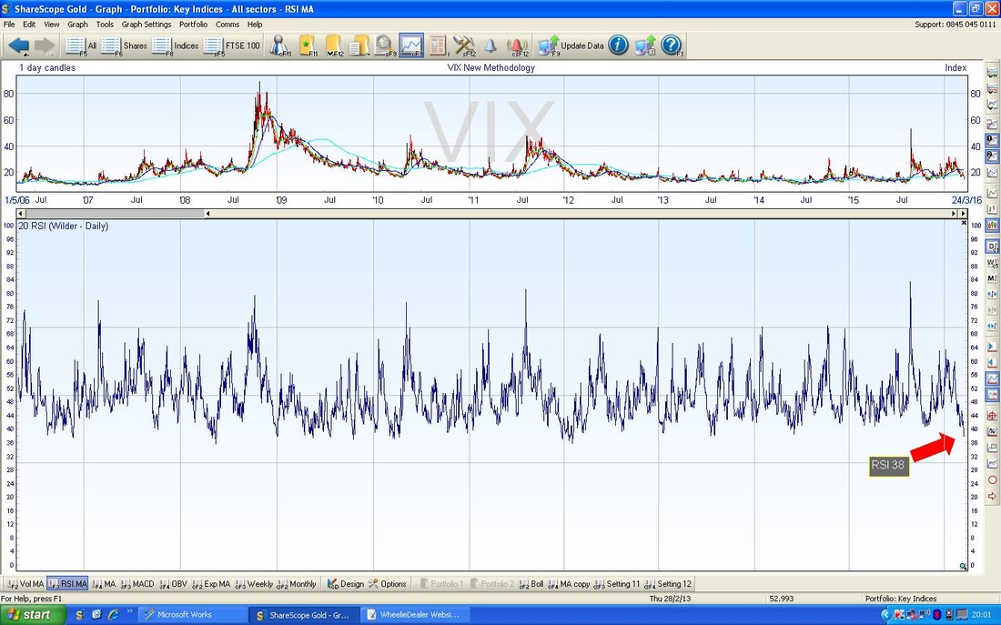
Brent Oil
The Chart below has the Daily Candles on Brent Crude Oil for the last 5 months ish. My Blue Arrow points to the falling 200 Day Moving Average - and note the Price is still a bit below this level. My Black Arrow points to the 50 Day Moving Average - note this is starting to curve upwards which is a good thing for Bulls. However, the 50 Day MA must do a lot of work for us to get a Golden Cross. Last week I drew a tentative Uptrend Channel with the Blue Line as the bottom line and the Green Line as the top line of the Channel - so far this is looking like it might be capturing the Price Action quite nicely. My Red Arrow is pointing to an ‘Inverted Hammer’ Candle from Friday or it might be a ‘Shooting Star’ - whatever we call it, it is Bearish. 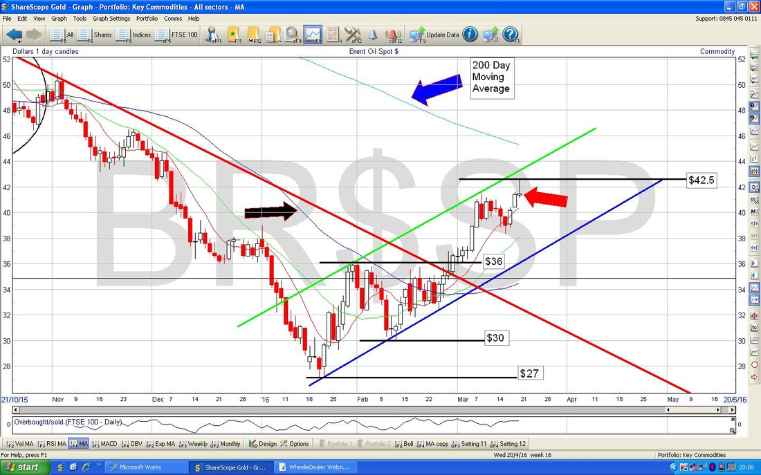
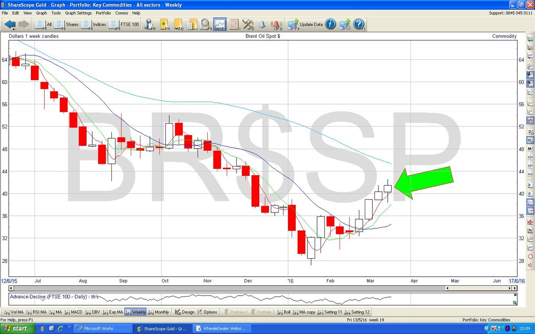
The Chart below has the Weekly Candles for Brent Oil - my Green Arrow is pointing to a ‘Doji’ Candle from last week - this might be a Reversal Candle but it may just indicate that the Uptrend is weakening now - which is quite realistic after the good move up off the Lows and now we are getting near the 200 Day MA at about $45.
Gold
Strange old week for Gold - we broke out of the top of the Triangle at $1263 but it has failed to keep it going. After Friday, it looks like it might fall a bit more but that is pretty unclear really. In simple terms, if it is going higher it needs to get over $1284. The Support Levels are shown on my Chart really. 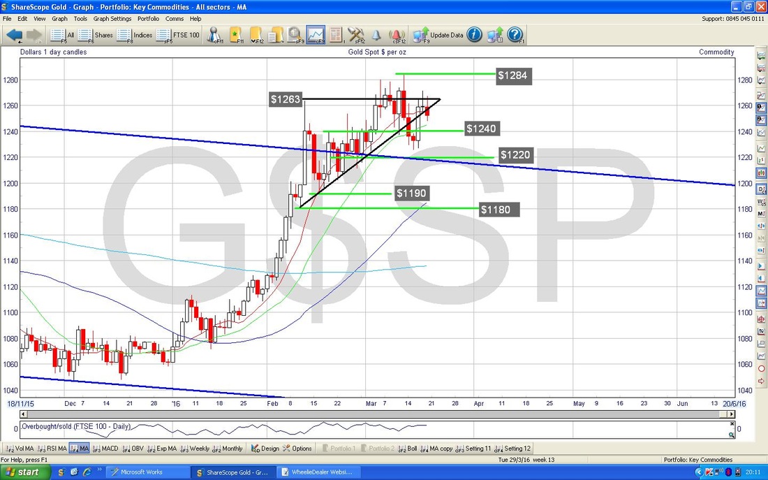
The Chart below has the RSI in the bottom window which is currently reading about RSI 60 which is highish but not extreme. However, it is falling and look at the ‘Divergence’ between how my Blue Line in the Bottom Window on the RSI is sloping Downwards but the Blue Line in the Upper Window (the Price Line) is sloping Upwards - this is Bearish Divergence.
Right, that’s it - I hope everyone has a good week and make sure you make the most of the Easter Break - it is important to take time out and away from the stresses of the Markets. Cheers, WD. 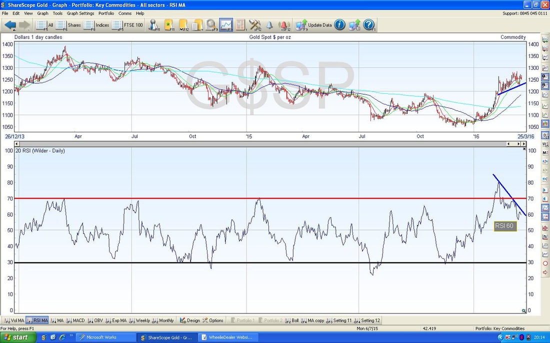
7 Comments
Ed
21/3/2016 08:23:03 pm
The markets seem at odds with reality at the moment and the FTSE 100 seems to have formed a triangle over the last month which suggests a break one way or the other in the next week or so. As you mentioned, the last week in March is not known as a brilliant one for the markets so maybe a bit more downside than upside. New ISA allowance in a couple of weeks which might see a bit of buying by PIs. Never understood why they don’t wait to June or September to get better prices.
WheelieDealer
21/3/2016 11:26:46 pm
Hi Ed, I think you are spot on with your "at odds with reality" comment and it is quite puzzling that the US Indexes are only a fraction off their All Time Highs. You are so right about ISA allowance - why don't people wait a bit? I guess the Industry comes out with the "time in the market" mantra to suck them all in - big mistake !!
catflap
22/3/2016 07:43:45 am
Hi Wheelie.
WheelieDealer
22/3/2016 09:55:48 pm
Thanks catflap - funnily enough I was thinking the same thing today. Not only are the Indexes 'toppy' from a Charting viewpoint, the Valuation on a P/E and/or Divvy Yield basis look pretty high - it is hard to see much upside being possible. However, as you say, Markets can be very irrational and keep motoring up whatever we think - although I have not seen that sort of silliness since the Dotcom Boom when things got utterly daft. I guess all this Negative Interest Rates and QE might cause the sort of crazy distortions that do enable things to keep rocking higher !!
Steve Holdsworth
22/3/2016 12:57:03 pm
Hi wd,
WheelieDealer
22/3/2016 09:59:24 pm
Hi Steve, thanks for the feedback and great to hear you have finally caught up with your Pub reading !! I can see where the confusion has come from, but what I am getting at is that the VIX does not tend to stay 'low' for long - in other words whenever we have a low VIX, we will most likely get a 'high' VIX not long after.
Steve Holdsworth
23/3/2016 08:34:31 am
Ah, I see. Many thanks for the clarification! Leave a Reply. |
'Educational' WheelieBlogsWelcome to my Educational Blog Page - I have another 'Stocks & Markets' Blog Page which you can access via a Button on the top of the Homepage. Archives
January 2021
Categories
All
Please see the Full Range of Book Ideas in Wheelie's Bookshop.
|
