

|
educational blogs |
|
Usually when scribbling these Chart Blogs I have Absolute Radio in the background which if turned down low enough doesn’t seem to distract me too much from the job in hand. Tonight things are a bit different though because I sort of want to be distracted because I am desperately trying to learn some Amy MacDonald Tunes as I am off to see her next Saturday Night in Reading - and I have made the unforgivable error of not getting her latest Album and I only have an old one called ‘Life in a Beautiful Light’ which I have owned for perhaps a couple of years but not really played it enough to know it. The upshot being that as much as I want to concentrate on these Charts I really must multi-task (hey, I’m a Bloke, it ain’t easy for us !!) and learn the Songs as well.
Last week was a bit disappointing for me on the Markets - with Indexes climbing new Highs almost everywhere (although the FTSE100 has not really kept up) it is upsetting when my Portfolio is still unable to ‘Breakout’ and get over the High Point it racked up in May - I keep getting within touching distance and then it drops back - it is driving me to Drink (well, Coffee anyway). My Portfolio dropped last week by about 0.75% - ok, this is no big deal but it is grating on me. Part of this was a Short I had on the S&P500 misbehaving (more in a bit) and that hit me for about 0.3% of my Portfolio Value - so we are only really talking limited damage here but I just so want my Portfolio to crack on properly.
I have mentioned this on Twitter a bit but maybe not so explicitly as I a going to here and now. If you are keeping a close eye on what I am up to you should have seen that I published the second Blog in the Income Portfolio Series and I did some sterling work (even if I say so myself !!) on Part 3 last night so that should go live later in the coming week. So all this is timing together nicely - what I want to stress here is that the kind of Stocks which would sit nicely in an Income Portfolio really are lagging at the moment, despite the strength we are seeing in the Markets in general.
Some of the classic ‘Defensives’ like GlaxoSmithkline GSK, National Grid NG., United Utilities UU., Pennon Group PNN, Imperial Brands IMB, and many others are at 3 year Lows and at these Levels they are likely to pay out some pretty juicy Dividends (5% or more is not uncommon) AND have the added bonus prospect of some very tasty potential Capital upside. So People contemplating an Income Portfolio along the lines of what I do myself might be able to take advantage of this situation and ‘lock-in’ some nice High Yielders while the Stockmarket is having an Autumn Sale - remember the old adage, “Sell when others are Greedy and buy when others are Fearful” (that‘s probably a Buffetism) - I am not totally sure that these Big Yielders are beat up due to ‘Fear’ as such but certainly they are very unpopular at the moment and Buyers are much more excited about Growth Stocks and Tech plays in particular. Of course we can never truly know the motives of Market Participants - Individuals (be they Retail Punters or Institutional Investors) all have their own Reasons and Drivers for Buys and Sells - which are so often very little to do with Company Valuations or Prospects etc. but more to do with things like Portfolio Rebalancing needs, requirements for Cash, Emotional Factors etc. etc., but I would guess that much of the weakness is down to the expected rises in Interest Rates that are likely to come very soon. Personally I think this is massively overdone. The theory is that with Interest Rates on an Upwards Path (‘The Rising Interest Rate Cycle’), Investors will leave High Yield Defensive Stocks like those I mentioned as they can get ‘Risk-free’ (yeah, right) Returns from Higher Yields on US Government Bonds and on High Grade Corporate Debt, whereas with Stocks there is a perception of Higher Risk which is compensated by the Higher Dividends. To an extent the logic of this is sound - it is quite sensible but where I think it falls down is that the Sell-off we have seen on Defensive Stocks suggests that Rate Rises are going to be plentiful and result in a big hike in coming Years - my personal view is that this will not be the case and that any Rate Rises will be extremely slow and of tiny proportions - so quite soon I expect Investors in general will twig what is going on and they will be buying these Defensives again - all these things rotate in and out in cycles. For a Punter interested in these Divvy Stocks, the main thing to focus on is the Quality of the Company and its Track Record and the Dividend you can get off it and the likely trajectory of that in coming years. If you can buy some of these with Yields up near 5% then that is a very good return when Savings Rates in the UK are likely to stay utterly pathetic. The Bank of England is very likely to increase Rates on Thursday by a Quarter of a Percentage Point but I suspect we won’t see another Rise for a long, long time - with Brexit kicking around and a very fragile Economy, the Risks are far to great for Mark Carney etc. to start pushing Rates up aggressively. In Europe things are even more bizarre - despite Economic Growth picking up in the Eurozone, it must not be forgotten that there is still huge ‘Life Support’ being administered by the European Central Bank (ECB) which is still doing Quantitative Easing (QE) and Interest Rates are on the floor. I can’t remember where but I think I read somewhere that one of these Central Banks (maybe it was The Fed) was due to be reducing their ‘Asset Purchases’ (shrinking the Bank Balance Sheet) but it turned out that they actually bought more last Quarter !! Japan is even more nuts - they are even printing Money there to buy Stocks - it is insane and I just cannot see this ending well. There are a lot of happy people who have got exposure to the Japanese Market but I suggest caution is needed as something is very wrong here and when things collapse (they always do at some point) it will probably be very messy. It might be prudent for Japan Investors to steadily lower their Exposure as the Bubble pumps up. To a purist like myself Investing is not about buying something because it is going up - that is Speculation and/or Trading (or even Gambling). An Investor weighs up Risks and Rewards and Valuations and does not get involved in situations where the Risk is impossible to know/judge - to me Japan is just far too surreal to invest my money in - especially when there are plenty of decent Alternatives where the Risks are far clearer. I caught a bit of that wacky ‘Keiser Report’ on RT Channel last night, and apart from being good entertainment (most of it is very dubious) there was a comment from the ‘Expert’ they had on that actually made some sense. He suggested that the Yen is likely to fall a lot more in coming Years and at some point Inflation in Japan will go ballistic because it imports pretty much everything it uses (especially Oil which is priced in Dollars). This is similar to what has happened in the UK after the Brexit Vote when the Pound tanked - but the difference is that the Pound is recovering whereas the Yen is likely to keep falling as the JCB Prints and Prints and the US Economy picks up which supports the Dollar. There is clearly much sense to this and it is an obvious challenge that the Japanese Economic Experiment will face soon. I just feel sorry for the Laboratory Rats who will be caught up in it all. I got so side-tracked on that that I only just noticed Amy MacDonald has stopped singing - I better hit the ‘Start’ button again !! (none of that Streaming nonsense in Wheelie Towers !!). The Coming Week The first thing to notice is that historically the Last Trading Day of October which will be Tuesday is the Strongest ‘Last Trading Day’ of the year - so that will be something to watch for a repetition of. As I mentioned above the BOE is likely to push Rates up a tad on Thursday and then on Friday we have the US Non-Farm Payrolls Numbers which after a drop last Month due to the Hurricanes should bounce back strongly. The other story kicking around (along with the US Budget and Tax changes) is whether or not Janet Yellen will get re-appointed as the Fed Chairlady - from what I can tell she is the favourite and if she does continue I would guess the Stockmarkets would like that as it means more of the same ‘highly accommodative’ Monetary Policy. The Catalan thing is still kicking around but I can’t see that becoming a huge issue in terms of Stockmarket impact (ok, maybe the Spanish IBEX will be impacted but I will leave that to the switched on Traders to exploit), and North Korea is still about (Trumpy is going on an Asian Tour so maybe he will say something daft to spook the Markets) but if anything that seems to be fading into the background. As has been my stance for quite some time now, I am not rushing to Buy stuff and equally I do not have much firepower to do so. I might be topping up something on Monday but otherwise I can’t see myself doing much. As I will cover in a bit, my Hedging efforts in recent Months have come to nothing (although unlike Last Year they have not got me into loads of trouble) and I will be extremely careful about doing any more Shorts with a Market that is just so relentless on the upside. Enough waffle, let’s do some Chart Pics…….. S&P500 (US) As always the Charts I show here come from the ShareScope Software that I use as my ‘Workbench’ - this stuff is outstanding and has won many Awards and was in fact the first Financial Software to be used on the Space Station - they often send Traders up because they can make more money in the weightless environment of Space - not a lot of people know that. It is probably because Gravity on the Earth pulls Stock Prices down (apart from the US which must have no gravitas). The Screen below is my actual ‘working’ screen that I use to track my Short Trades on the S&P500. My Yellow Circle is highlighting the Big White Up Candle from Friday and this Closed over my Stoploss Level at 2580 and this means that I must now close my Short. In the igIndex Platform you can Trade from 10pm on Sunday Night I think but this Market can be rather distorted by Low Volumes so I will probably see what Price I can get later and I might just wait to close it on Monday. The whole point is that I do not use ‘Hard-coded’ Stops with my Broker because these just get taken out and I prefer to just have Stops which are a Level at which I manually execute a Trade to close the position. It brings in the danger of me not obeying the Rules (and some slippage) but after my disaster with Shorts last year I have learnt that “The Rules are the Rules” and it is best to follow them to the letter. On the Screen below my Pink Horizontal Line at 2580 marks the Stoploss Level and the Blue Lines are where I opened my Short Positions - I added a bit more on Thursday Night because the signs for falls were very good - however, with the current strength in the Markets it was no shock to see it hit my Stoploss. What I am finding is that I am getting some good signals that have worked well for me in the past but they are only predicting Falls for a few days and then the Drop is reversing fast and the Market is moving up. In order to avoid this problem, I will now wait for a clear ‘Sell’ Signal from a 13/21 Day EMA (Exponential Moving Average) ‘Death Cross’ which I find is a very good Indicator of weakness for a period of a few Weeks. In addition, away from the Technical Factors I will put more emphasis on the Fundamental Situation - in the case of my Shorts last Week, there wasn’t really a bad Fundamental Story - if anything, with Trump’s Tax Plans there was more Upside Risk than Downside Risk - I should have taken more notice of this. Needless to say I do find this is a very strange Market and I do not remember any similar relentless strength in my whole 17 Years or so of Investing - this is most like the Dotcom Boom I suspect but I only came in to the tail end of that. In addition, the disdain for Defensives is very similar. 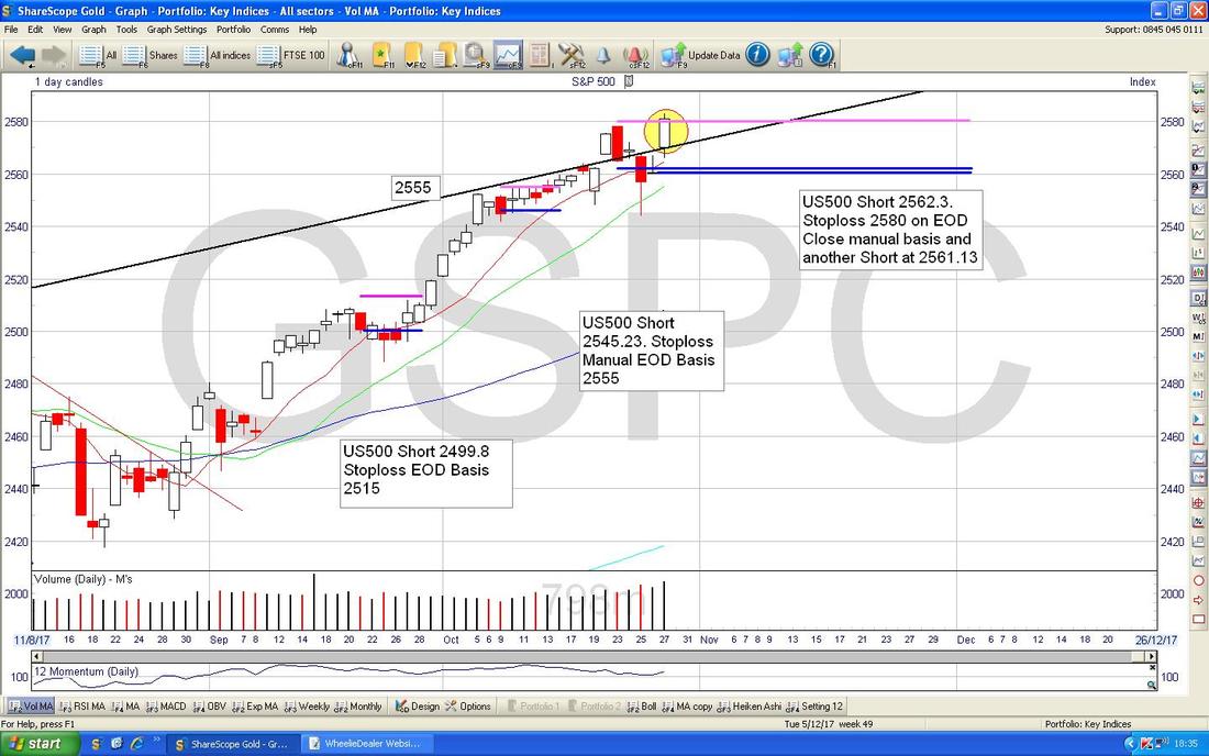
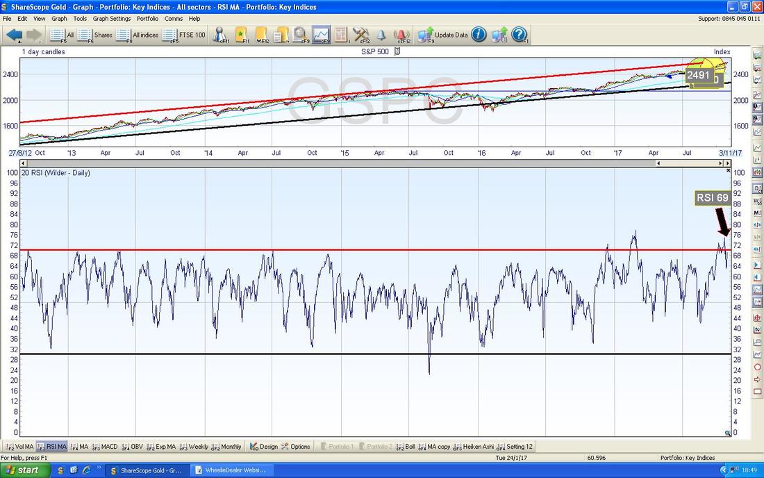
In the bottom window on the ScreenScrape below we have the RSI (Relative Strength Index) for the S&P500 Daily. On a Reading of RSI 69 this is still very high and arguably ‘overbought’ - but with how this Market has behaved recently, I won’t be shocked if the RSI goes a bit higher now.
OK, Amy, you can shut up now because it is time for the repeat of the Andrew Marr Show.
The ScreenGrab below has the Weekly Candles for the S&P500 - my Green Rectangle is highlighting a Hammer Candle from Last Week and in the context of the strong moves up, this could be seen as a Reversal Candle - something to watch as it could be telling us the S&P500 is due a drop. 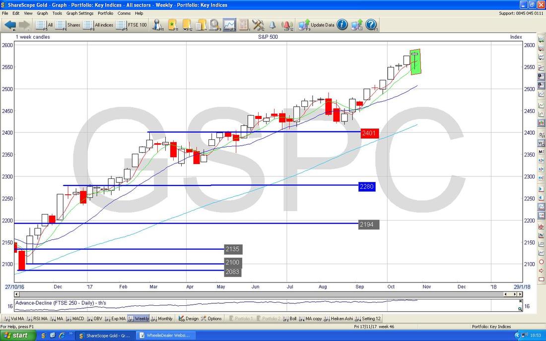
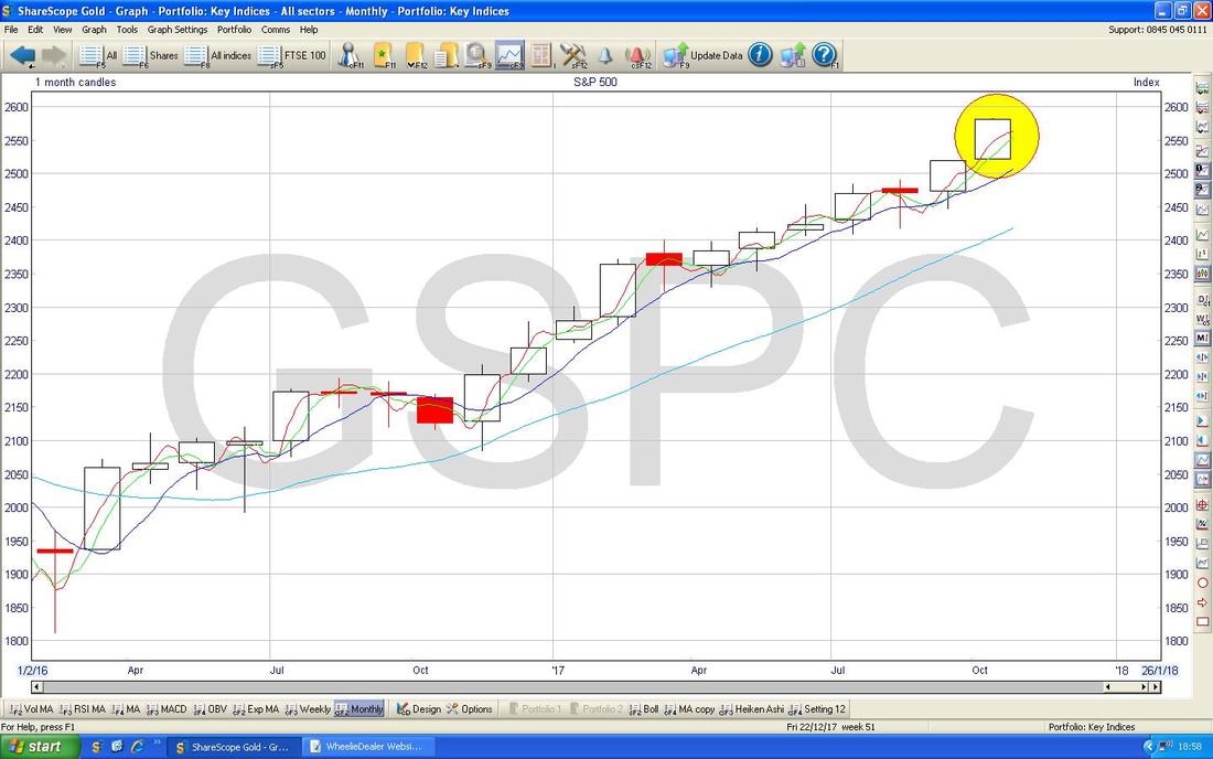
The ScreenCapture below has the Monthly Candles for the S&P500 - with October nearly finished it seems valid to show this but of course we have 2 Days left so this picture could change. Anyway, as it stands, October has produced a big White Up Candle and this suggests more Gains to come in the months ahead.
Barclays Bank BARC
This particular Stock got spanked last week after disappointing Results, particularly with the Investment Banking bit I think (I don’t hold BARC so haven’t taken all that much notice of it - but I wanted to look at the Chart) and as usual let’s start off with the Long Term Chart. The Chart below goes back about 23 Years and the clear Story here is an Uptrend which was in place (this is shown by my Blue Lines, Blue Arrows) until the Credit Crunch in 2008 and then the Price Broke-down and has been in another Downtrend mainly since that, despite some intermittent periods of recovery. The main thing of interest now is a Triangle that is formed between my Red Line (Red Arrow) at the Top and the Black Line (Black Arrow) at the bottom - the direction in which the Price ‘pops-out’ of this Triangle will dictate how the Price is likely to move after the Triangle is broken. 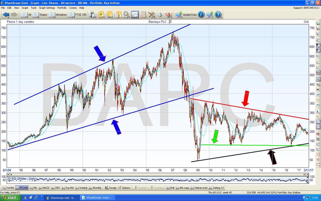
On the Chart below I have zoomed in to just the period since the Credit Crunch really. The thing I want to point out here is that there is Support from the Green Line (Green Arrow) at about 120p and also there is Support from the Black Line (Black Arrow) at about 135p ish.
To the Upside, the Price needs to breakout over my Red Resistance Line (Red Arrow) at about 260p ish if things are to get dramatically better. 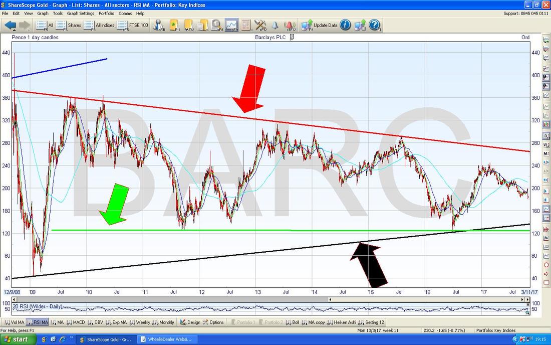
On the Chart below I have zoomed in to about the last Year really, the key thing here is the Downtrend Channel which is marked by my Green Lines (Green Arrows) and the Price needs to breakout of the Upper Green Line if the Price is going to start to Recover properly. We are clearly a long way off this and a move above about 200p is what Bulls of BARC really need to see if there is going to be a decent move up over a longer Period - at the moment any moves up are likely to stay within the confines of the Downtrend Lines - this is not a pretty chart.
My Yellow Circle is highlighting a possible ‘Bullish Harami’ 2-day Candle Pattern - however, the ‘Context’ is not great here - ideally there would have been a longer move down before the Harami. Anyway, it is likely that the Price tries to recover a bit from here but I suspect it will struggle to get over Resistance just above 190p. To the immediate Downside, there is Support at just above 180p which must hold. My Blue Arrow is pointing out a 50/200 Day Moving Average ‘Death Cross’ which was formed when the Dark Blue Wiggly 50 Day MA Line crossed the Lighter Blue Wiggle 200 Day MA Line - clearly this ‘Death Cross’ predicted the subsequent falls. 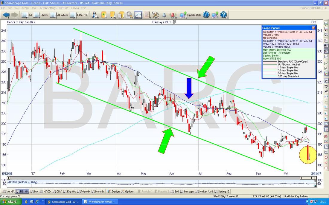
Bearing in mind my comments about the 13/21 Day EMA in relation to the S&P500, the Chart below is showing how these are behaving for BARC. My Blue Arrow is pointing to a 13/21 Day EMA ‘Death Cross’ which is just happening and if you look back a bit to where my Black Arrow is, we had a similar ‘Death Cross’ - and look what happened afterwards !!
United Utilities UU.
I mentioned this one in passing earlier and it is worth adding that the fear of Jeremy Corbyn and potential Nationalisation (State Theft) could be weighing here also - although my own view is that we have hit ‘Peak Corbyn’ and I doubt very much that he will get anywhere near No.10 - although with the current stupidity of the Tory Government they are doing their best to let him in !! I just had a quick look at the ShareScope ‘Details’ Screen and at the Current Price of 830p, UU. is forecasted to pay a Dividend Yield of 4.95% - not bad that. The Screen below shows the UU. Chart since about 2009 and the key thing here is the Uptrend Support Line drawn in Red (with the Red Arrow - clearly flying out of Formation on its own) and note where my Small Green Circle is that this Support Line was breached just recently. I am now proof reading this and that awful Chakrabatty woman is on the Peston Show repeat - she makes The Abbott look sensible !! It is unfair that I have to work under these conditions. 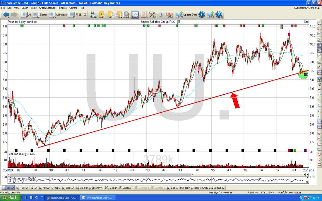
On the Chart below I have shown just under 5 years or so but the main thing to note here are the Green Horizontal Lines which show the various Support Levels down below which are likely to be where the Price can turn up from - obviously if it falls through these Levels then things are really ugly. There is immediate Support at about 784p, then 750p, etc.
You can see the Breach of the Red Support Line better here and it is possible that the Price can turn up soon and this failure of Support will merely be an ‘Overshoot’ - that is something to watch for particularly because UU. is due to put out Interim Results on Wednesday 22nd November. 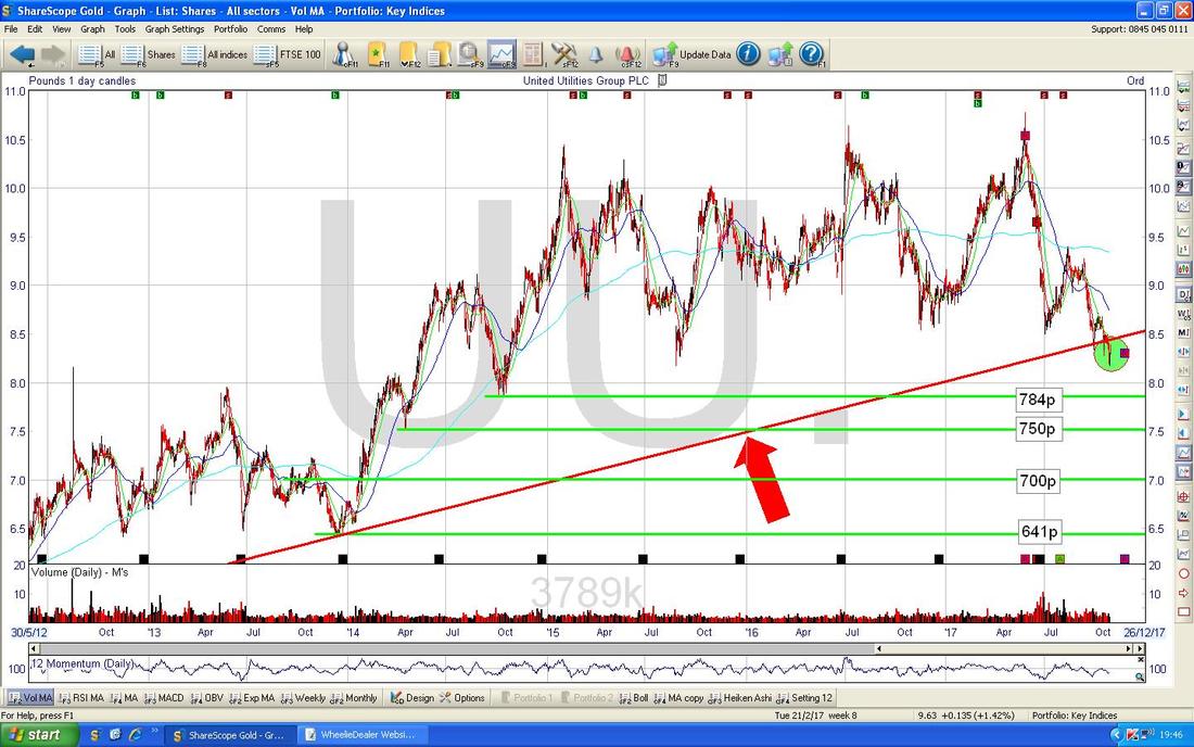
On the Chart below I have zoomed in a lot more to about the last 8 Months or so. This gives much clearer indications of when this would be a Stock to Buy - the main thing here is that a Buy Signal would be given when the Price breaks-out of the Black Downtrend Line (marked by my Black Arrow).
To the immediate Downside now we have the Green Line (Green Arrow) at 817p and this must hold now - if it fails, then we could fall a lot more. My Huge sort of Pinky/Purple/Mauve Arrow is pointing at a little ‘R’ in a Box - this is marking the Interim Results date on 22nd Nov - I would expect this to be a crucial event now - if the Results are taken well then that could cause the Breakout of the Black Line and it could help support a Buy Case - alternatively if the Results disappoint then it could go a lot lower and start testing the Support Levels I have shown on this and previous charts. 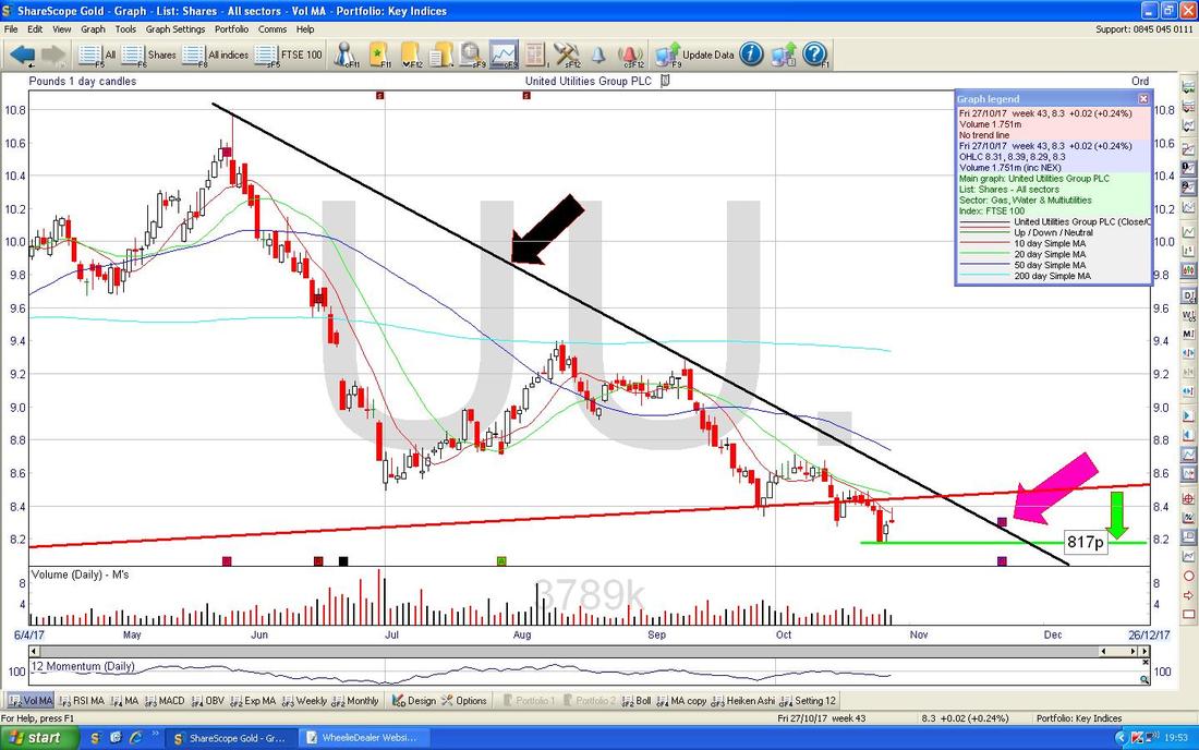
Aviva PLC AV.
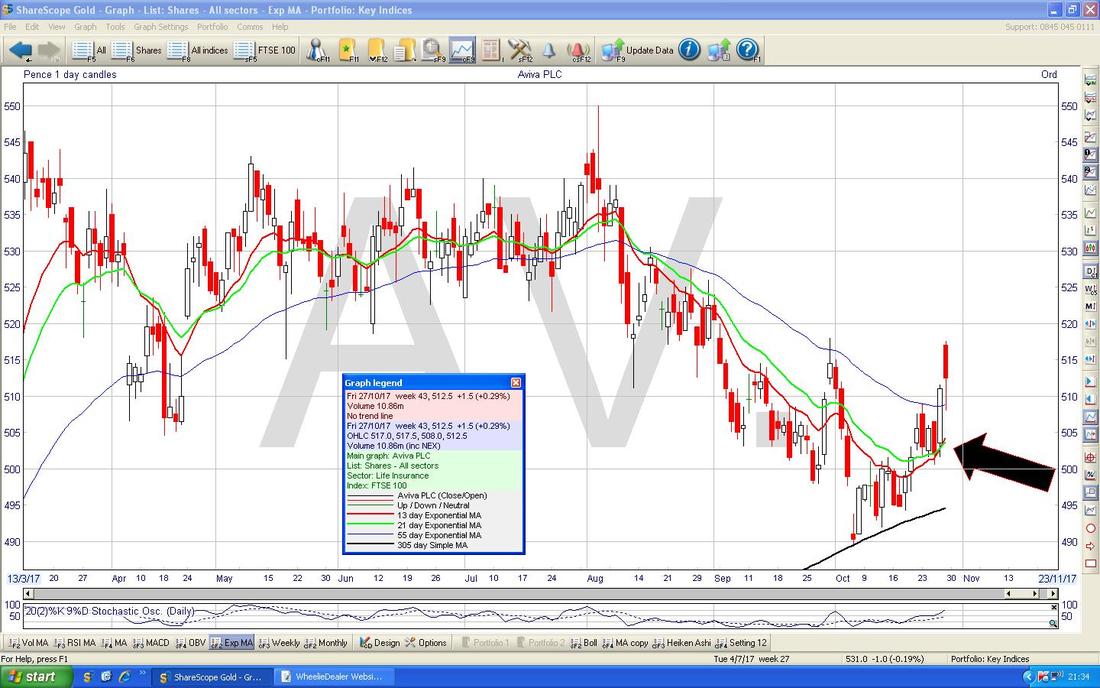
I’m pretty sure I talked about this one a few weeks ago and it has been perplexing me for ages because it just kept falling and there was no obvious ‘reason’ and it looks pretty good value on a Forward P/E of 11.4 and a Forward Divvy Yield of 5.5%. Anyway, since then it has started to perk up again and is looking a lot healthier - the Chart below goes back about 9 months and the main feature here is the Downtrend Channel which was in force between my Black Lines (Black Arrows). Note where my Green Circle is that the Price has managed to ‘Breakout’ of the Upper Downtrend Channel Line and is now moving up but has hit Resistance at the 200 Day Moving Average at about 518p (shown by my Blue Arrow). Note that on Friday we got a Big Red Down Candle but in this Context I think that is a ‘Continuation’ Pattern and does not mean it cannot rise more. It might hesitate now at that 200 Day MA Line but it seems likely to me that we will get more gains. To the Downside my Green Line at 489p must hold as Support and my Red Arrow is pointing at a 50/200 Day MA ‘Death Cross’ which suggests we could see more falls. We need this to be over-ridden by the Price showing some upwards moves - this is very possible but the Death Cross is a concern. If the Price can make upward progress, then Resistance up at 550p will most likely be a challenge to get over. Having said that, we are now entering into the Winter Period which tends to be the best time of the year for Stocks in general - AV. and its like have a habit of doing well when the overall markets do well. To be clear I hold AV. 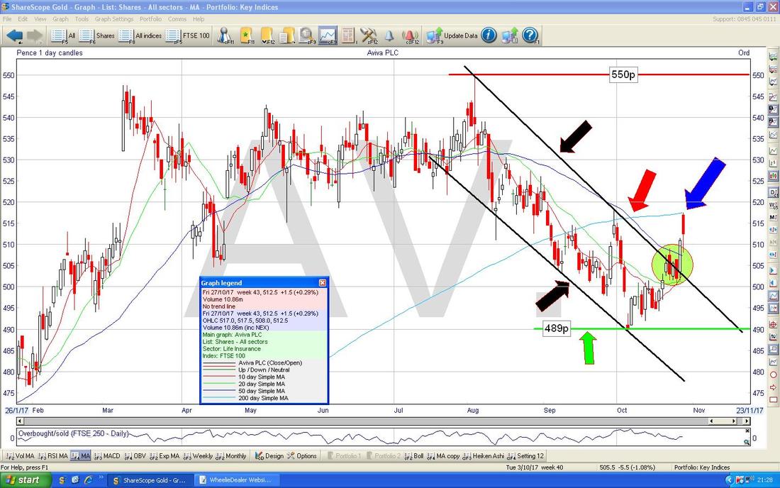
On the next Chart we have something I am always happy to see when I hold a Stock - my Black Arrow is pointing at a 13/21 Day EMA ‘Golden Cross’ (between the Green and Red squiggly Lines). Of course nothing is perfect but this suggests more gains in the coming weeks.
Seeing Machines SEE
I know a lot of Peeps on the Tweets hold these and it is quite an interesting Chart. My Chart below goes back about 5 Years and the key thing here is the Downtrend Line shown in Red with the Red Arrow. If the Price is going to make proper upwards progress then it needs to crack this Red Resistance Line which means getting over about 5p and if it can manage that, it then needs to get over the Green Line (Green Arrow) at about 6.2p. To the Downside it needs to stay above Support at 2.5p - if that fails then expect more drops. 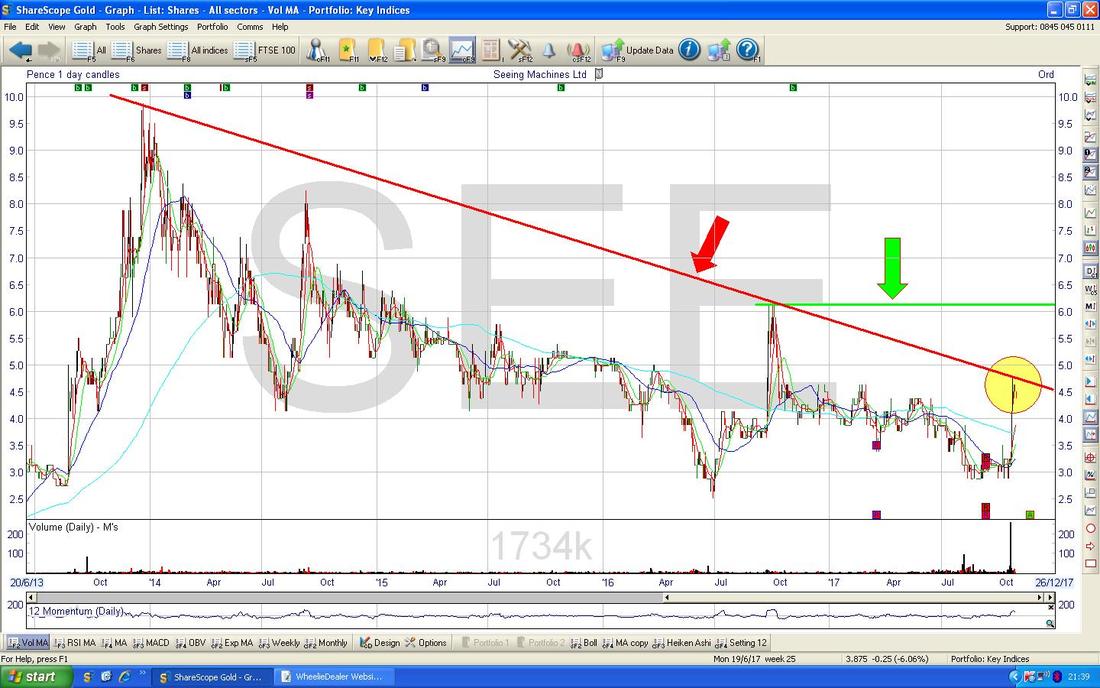
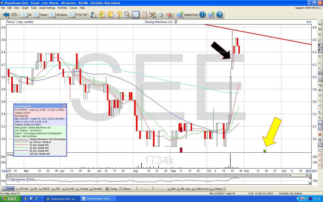
Going in much closer, my Black Arrow is pointing to an ‘Inverted Hammer’ Candle which is dominating this Chart at the moment. The Upper Tail of the Inverted Hammer stops at about 4.75p and clearly this is now Resistance. My Yellow Arrow is pointing at an ‘AGM’ Box which says there is an AGM due on Friday 17th November - I don’t know a lot about SEE but it is obvious that the AGM might focus some minds one way or another. One thing to appreciate about the 5 year Chart is that it has been much been a Story of ‘Selling the Spikes’ - it looks highly likely that the same thing is occurring now.
The Clock is ticking (having said that, after the Hour Change I have utterly no idea what time it is now !!), and I need to proof read this and upload it to the system so I will just do a couple more Charts and then close off the writing.
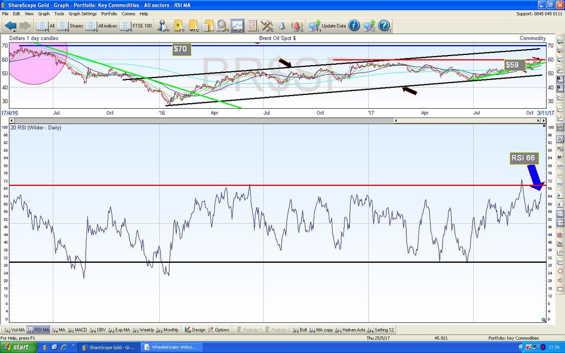
Brent Oil (Spot) I guess like most people I don’t have direct exposure to Oil but I do hold a couple of Oil Stocks and I wanted to check out what was happening. I noticed in my Nightly Checks last week that Brent Oil was looking perky and this has been borne out as we will see in a moment. If you don’t follow me on Twitter, you might not be aware that pretty much every Night at about 10.30pm onwards I am Tweeting out various observations on the Charts - you don’t need a Twitter Account to see these - you can just Google ‘@WheelieDealer Tweets’ and I think it will come up for you. Alternatively there is a Twitter Feed on my Homepage if you scroll down. I won’t dwell on this Chart but my Black Arrow is essentially showing where on Friday Brent Oil (Spot) put in a big White Up Candle and broke-over the $59 Level which had been Resistance for a very short space of time. My Green Line which is showing the Uptrend Support (Green Arrow) is still nicely in place. 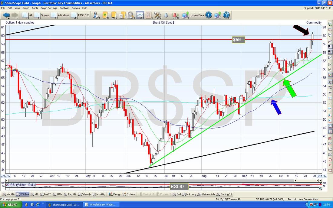
In the bottom window on the ScreenCapture below we have the RSI for Brent Oil (Spot) Daily - on a Reading of RSI 66 it has room to go higher although of course it is quite a high level.
NIKKEI 225 (Japan)
I commented on the Fundamental ‘experimental’ (or just plain ‘mental’) aspects of the Japanese Economy earlier and I just thought I would chuck this Chart in because it just demonstrates in pictorial form how crazy it all has become. In the bottom window on the Screen below we have the RSI for the Nikkei 225 Daily and on a Reading of RSI 82 this is pretty much the highest it has been for, well, ever. Amazing. 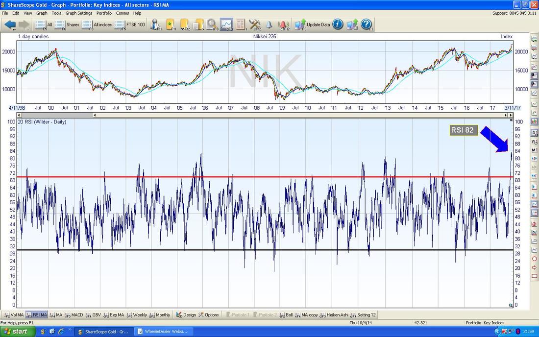
FTSE100
Unlike other Major Indexes which seem on the whole pretty rampant, the FTSE100 is hitting Resistance up at these dizzy heights and in particular it needs to Breakout over 7600 if proper progress is going to be made. On Friday it touched the Red Line (Red Arrow) which is the Bottom Uptrend Channel Line going back to 2009 - it is still struggling to keep above this Line. To the Downside, there is immediate Support at 7440. OK, I’ll finish there. I hope everyone has a belter of a Week and that the Market Gods are truly generous, Cheers, WD. 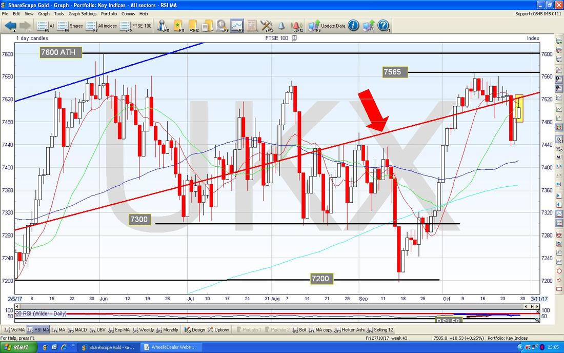
2 Comments
Mr catflap
30/10/2017 12:22:51 pm
Amazing spot there on the Nikkei. If anyone does not think the RSI cannot go higher on the S&P, just look at Japan! Investors must be excited about something or other over there, im not quite sure what.
WheelieDealer
30/10/2017 09:44:34 pm
Hi Mr catflap, Leave a Reply. |
'Educational' WheelieBlogsWelcome to my Educational Blog Page - I have another 'Stocks & Markets' Blog Page which you can access via a Button on the top of the Homepage. Archives
January 2021
Categories
All
Please see the Full Range of Book Ideas in Wheelie's Bookshop.
|
