

|
educational blogs |
|
Still the Market Gods are smiling on me and I managed to eke out a small Gain last week - but from looking at some of the Charts which I will show in a bit, I suspect it might be hard to keep adding to these Gains. Last week I looked at the August Month history and it tends to be ok but a typical August often falls in the first couple of weeks and then recovers in the second half - this would certainly line up with a lot of what the Charts are suggesting.
I mentioned last week how I was intending to lower my Leverage and to prepare for some sogginess in the Autumn (September is historically the Worst Month) - having seen these Charts, I will most likely push my plans ahead and sell some stuff early next week. I have already drawn up a List of Spreadbets I want to reduce and I will work off this list.
Next Friday we have the US Non-Farm Payrolls Numbers which normally come out around 1.30pm UK time - so that might cause some drama at the end of the Week.
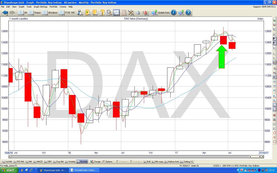
As I cover in the Charts below, the big stories that are kicking around are really around US Dollar weakness and strength in the Gold Price - these could be interesting developments. I have been particularly unimpressed by Gold recently and tempted to totally dump my Position in Golden Prospect GPM - but looking at the Charts tonight, I get the sense that I should be holding onto GPM and perhaps adding a bit more !! No harm in being highly flexible in this game - there is no point in being wedded to a particular Bullish or Bearish demeanour - we need to adapt to what is happening in the Markets. The Charts are the wrong way around this week and you’ll find some individual Stocks at the rear. Little Black Book I am sure most Readers are aware of this but I just wanted to mention this bit of the Website where I occasionally update the list of Stocks I have been looking at which could be worth further investigation. The List on the Website is an exact copy of what I write in a physical ‘Little Black Book’ and when I am after a new Stock for my Portfolio, this is one place that I have a good sniff through. The big irony here is that I am utterly convinced that the stuff in this List does better than the Stocks I actually decide to buy !! Anyway, if you go to the ‘WheelieBin’ Page and scroll down towards the bottom you should find the List. The Stock Whittler My mate Bill, (@dosh100 on Tweets) has been doing an Investment Blog for a while now and he recently started doing an RNS Log which is very good - check it out: http://stockwhittler.weebly.com/voyager-rns-log DAX (Germany) This one is of particular (and grating) interest to me. Regular Readers will know how I have totally ballsed up this Long Trade but for personal pain-tolerance reasons I won’t go into too much detail !! In essence I opened a Long Spreadbet far too high up in error (I know exactly the mistake I made) and I have been since trying to get out of it in the most efficient way possible - this entailed adding another Long Position to Average Down which is shown on the Chart below as the Blue Line with my Blue Arrow (the Blue Line at the Top is where I opened my first Long Position). Last Week the DAX moved up from a recent Low but the push up soon fizzled out and it fell back so that on Friday 28th July it did another Hammer Candle which is captured in my Yellow Circle. The interesting thing here is that it nearly triggered my Stoploss on that new Long Position which is at 12140 on an End Of Day (EOD) Close basis - it didn’t quite trigger. Such a Hammer suggests we might get a move up off of this - if it continues to fall then I will be closing this New Position if the Stoploss gets triggered. Note how the Price is obeying the confines of the Downtrend Channel which I have marked with my Parallel Green Lines (the Lower one is marked with my Green Arrow) - if the DAX is to make a significant move higher (as I suspect it should in time) then it needs to Breakout of this Downtrend Channel. At the moment the DAX seems to be very similar to the FTSE100 in that it is being driven by movements in its Home Currency - in other words as the US Dollar weakens, the Euro is strengthening and this is probably hitting the DAX. It is a pain for my Long Trade because I really don’t want to be mucking around with a Proxy FOREX Trade. 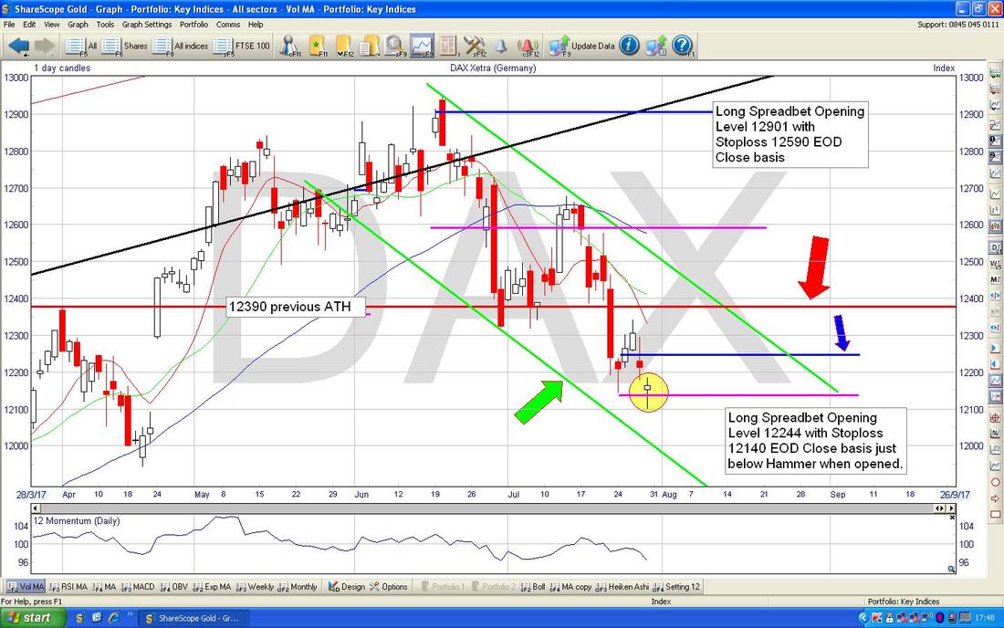
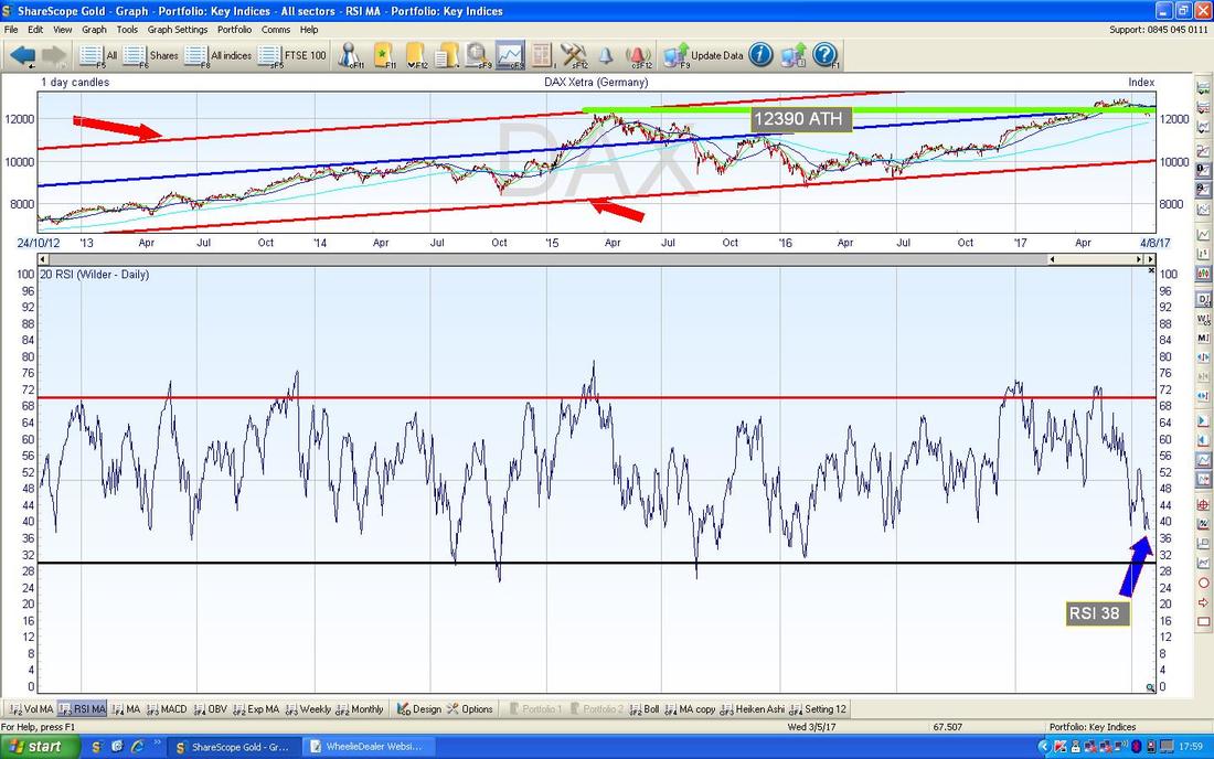
The ScreenShot below has the RSI (Relative Strength Index) for the DAX Daily - as always these piccies are from the pinnacle of reasonably priced Investment Software which is ShareScope that I use on a Daily basis. On a current reading of RSI 38 it is quite low but can go a lot lower before the DAX turns up again.
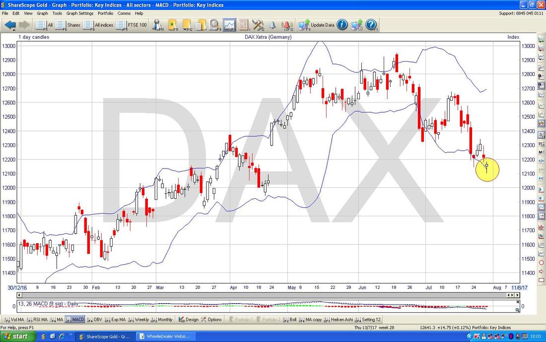
The Screen below has the Daily Candles for the DAX with the Blue Wiggly Bollinger Bands above and below. Where my Yellow Circle is, we are touching the Bottom Bollinger Band which suggests we might get a move up or sideways, but of course the Price can ‘hug’ the Band and keep falling.
The Chart below has the Weekly Candles for the DAX. My Green Circle is enclosing a Doji Candle from last week which suggests that the push down from the prior week is waning - however, these kind of Dojis have more force after a protracted move down and it could easily continue to fall. I would expect Support at around 12000 to kick in if it does fall and if that level fails to hold, then the 200 Day Moving Average which is the Light Blue Line which my Blue Arrow is pointing at, should kick in at about 11800.
Note down the bottom of the screen we have a Black Line marked with my Black Arrow - this is the Long Term Uptrend Line which goes back to the 2009 Lows and it would be extremely surprising (and worrying !!) if this Line gets tested as Support and fails. We are a long way off this though and I doubt we will be visiting that for a while - although an Autumn Sell-off (if we get one) might head that way. My Red Line marked with my Red Arrow at 12391 is an interesting Level because it was a Previous All Time High which held for some time and the fact that the Price broke above but has since failed to move back and simply ‘confirm’ that Level by finding Support there, is a sign of weakness really. If the DAX is to make proper upwards headway, then it needs to get back over this 12391 Level pronto (obviously that would help my Long Position as well !!). 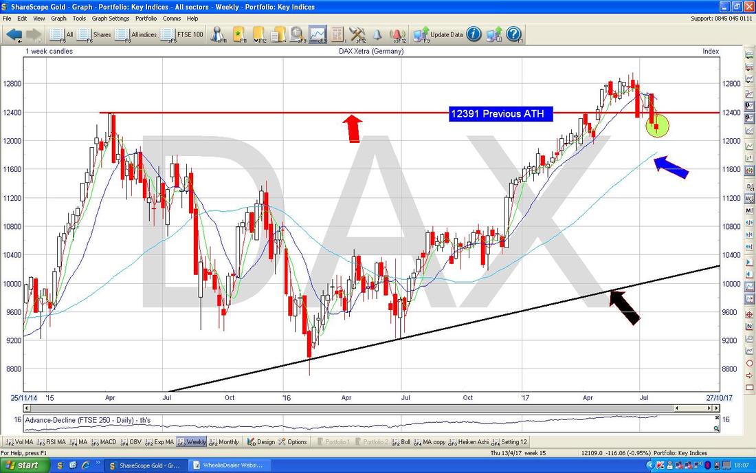
The next chart is interesting but not in a good way !! This shows the Monthly Candles although July isn’t quite finished so if something sizeable happens on Monday then it might change things (it seems unlikely). My Green Arrow is pointing to the Candle which formed up in June and this is a bit of an ’Inverted Hammer’ which is Bearish after the run up. If you look one Candle ahead at the May Candle, this is also an Inverted Hammer and that hints at trouble as well. The Candle for July so far has a similar shape and if anything it looks to be confirming the negativity that the May and June Candles are hinting at.
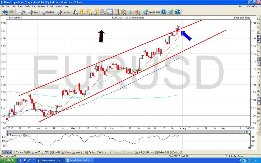
Euro vs. US Dollar
Here is a view of the Euro/Dollar over a few years - note my Black Line (Black Arrow) which is an important Resistance Level - if this breaks (and it looks like it is) then expect the Euro to go higher and therefore strengthen against the Dollar. This might hurt the DAX. 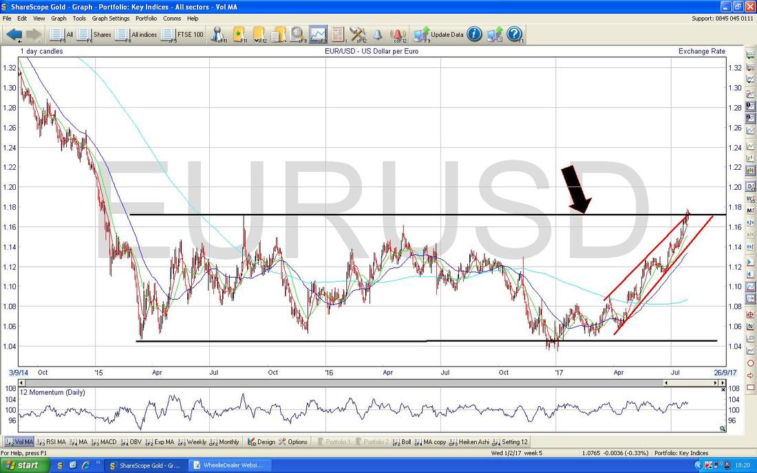
On the Chart below I have zoomed in on the Euro/Dollar and my Blue Arrow is pointing to an Up Candle from Friday which breached the Black Line (Black Arrow) from the previous Chart - this is Bullish. To be sure the Price has properly broken higher, a move over 1.18 would cement this.
Pound vs. Dollar
While we are going all Currency-like, I might as well chuck in the Quid as it is remarkably similar to the Euro and if we see more gains here, then the FTSE100 could suffer (however, it strikes me that when the FTSE100 suffers from the Pound rising, the FTSE250 seems to do better - I have not scientifically looked at this though). My Blue Arrow on the Chart below which shows the Daily Candles is very similar to the Euro/Dollar above and suggests a Break-out and more gains for the Quid (Dollar Weakness is really the story here though but it will certainly ease the Inflation worries that everyone has after the Brexit Vote). As ever nothing is simple and Dollar Weakness could be very supportive of Gold and Oil and other Commodities which could also be a positive driver for the FTSE100. 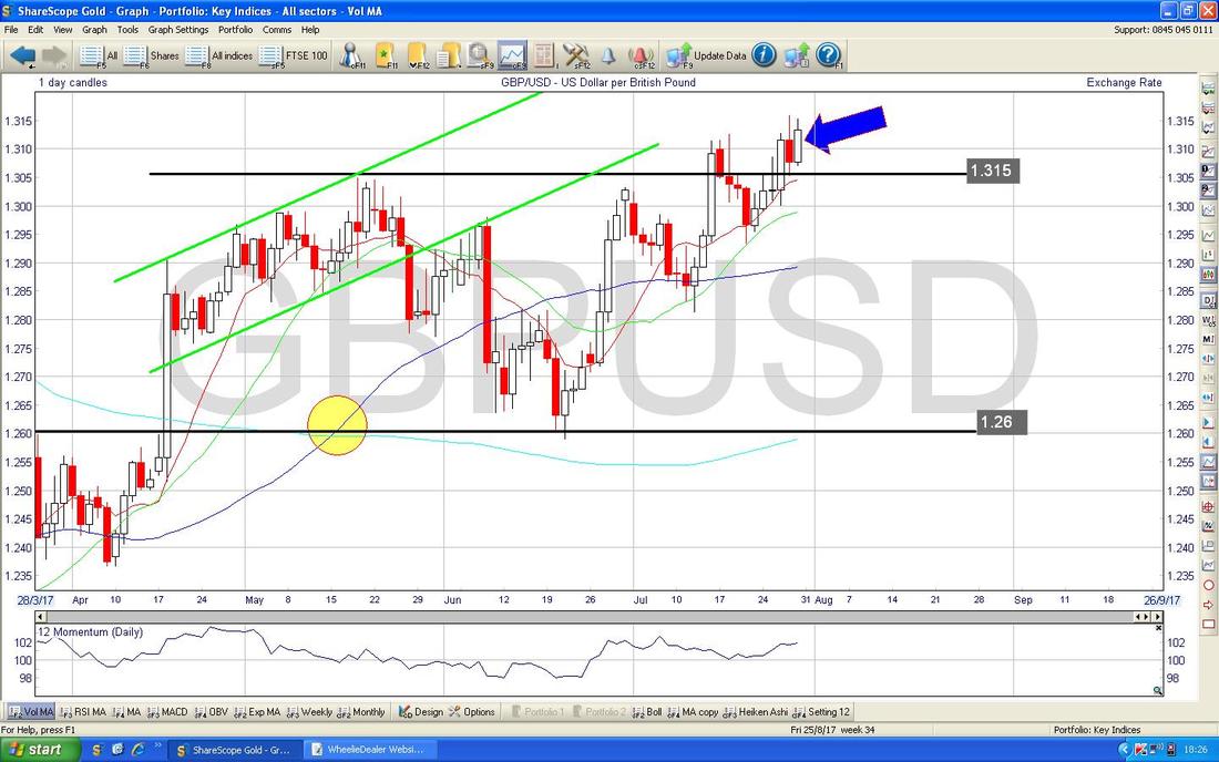
Gold (Spot)
Finally something is happening on Gold. I presume it might be down to Dollar Weakness - but as ever the ‘reasons’ are very hard to know and what really tells us something useful is the Charts. My Chart below is the Big Picture just to set the scene - I have been showing this Charts for weeks and weeks but the thing to focus on here is the Long Term Downtrend Line which is the Red Line pointed at with my Red Arrow. Gold needs to properly Breakout of this Line if it is to go higher in anything other than just for a short period. 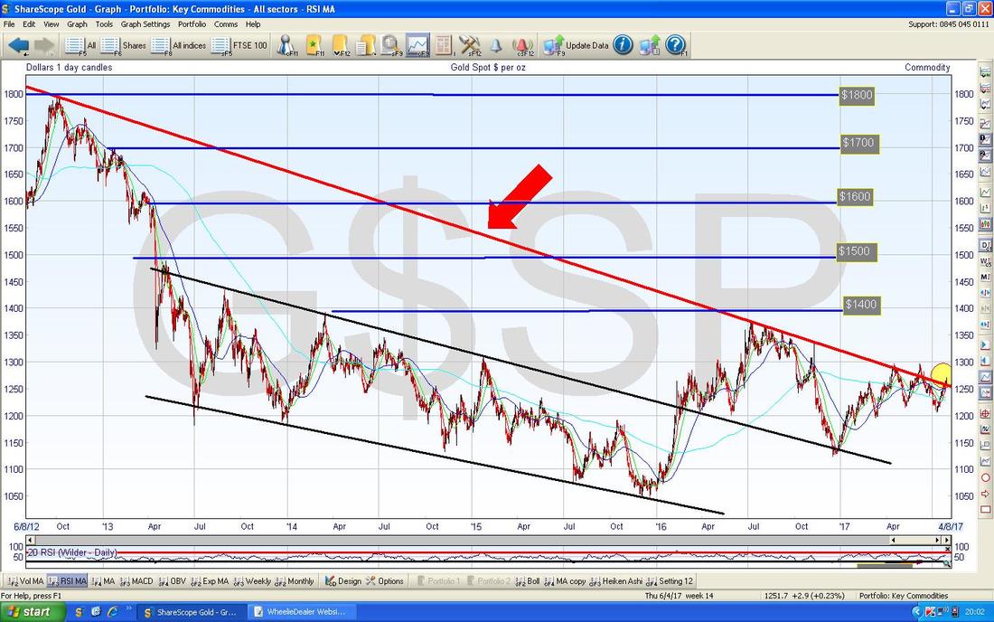
On the Chart below I have zoomed in and my Green Rectangle is capturing a White Up Candle from Friday which is just about Breaking-out of that Long Term Red Downtrend Line (marked with the Red Arrow). In order to be very sure we have properly broken out - I would like to see the Price up over $1300 which is my Blue Line just above the current Price.
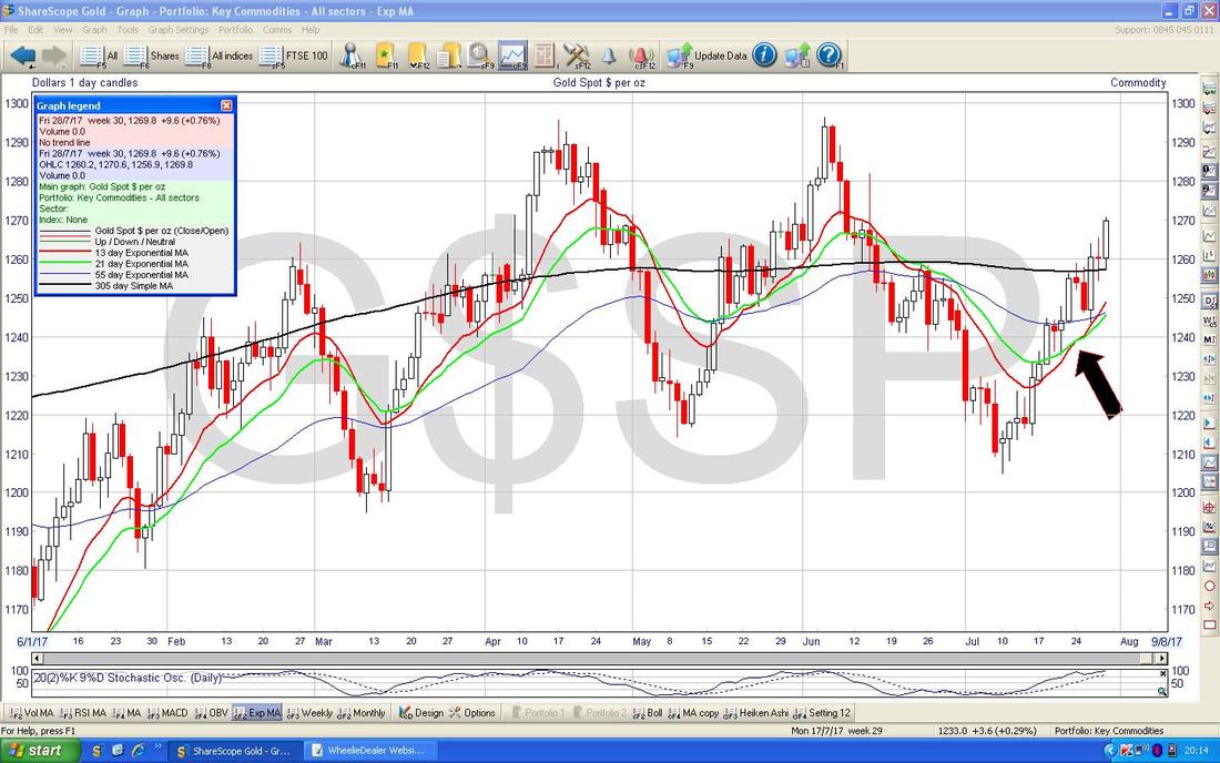
My Black Arrow is pointing to a ‘Golden Cross’ between the 50 day and 200 day Moving Averages - this predicted the current moves up but they certainly took time to happen !! 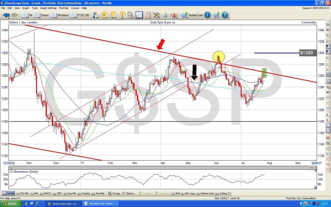
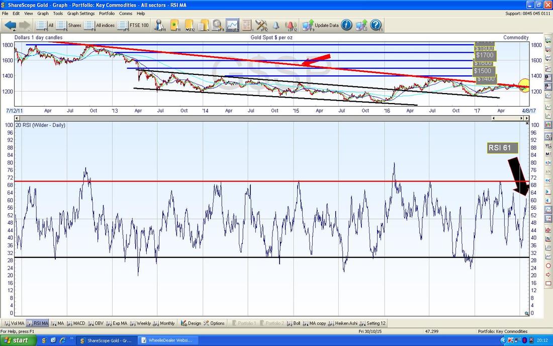
In the bottom window on the Screen below we have the Relative Strength Index for Gold (Spot) Daily. On a reading of RSI 61 this can go a lot higher which suggests that the Breakout on the Chart above has ‘room’ to push on up.
On the Chart below, the Red Wiggly Line is the 13 Day Exponential Moving Average and the Green Line is the 21 Day EMA - my Black Arrow is pointing to where they have done a ‘Golden Cross’ and this suggests more gains to come - if you look back to the left, you can see where this kind of thing has occurred before.
The Chart below has the Daily Heiken Ashi Candles for Gold (Spot). My Green Circle is highlighting how we still have nice big White Up Candles and on these things, that is Bullish. Remember, they are totally different to normal Japanese Candlesticks but give really clear and easy to understand signals.

Brent Oil (Spot)
This one like Gold has moved up a lot as well. On the Chart of the Daily Candles below, my Green Circle is catching a Big White Up Candle and this looks pretty Bullish - note it is also up over the 200 Day Moving Average line which is the Faint Blue Wiggly Line at $52. It looks highly likely that this can go higher but the thing that really stands out here is how there is so much Resistance up above - in particular the Area marked by my Green Arrows between about $54 and $58 looks a really tough zone to wade through. As always, these Charts are full of conflicts. It was clear from the earlier Currency Charts that the FTSE100 (and probably the DAX) could come under pressure with the Pound (and Euro) strengthening but the strength of the Oil Chart could easily be supporting of the FTSE100 (and DAX). 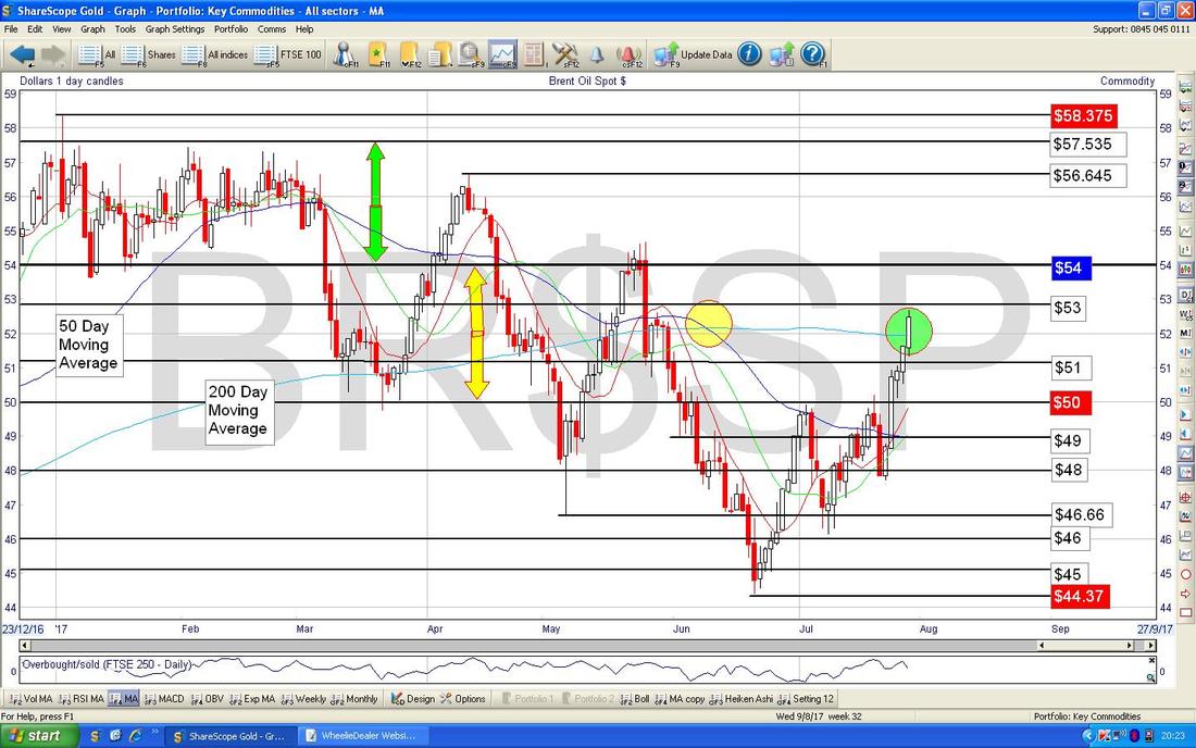
In the bottom window on the Chart below we have the RSI for Brent Oil (Spot) Daily - on a Reading of RSI 62 this can go a lot higher. Remarkably similar to Gold and shows how Dollar Weakness is a factor here.
Dow Jones Industrials (US)
I won’t do much on this as time is tight and there is a lot more I want to cover. Anyway, here are the Weekly Candles for the DOW and with a Big White Up Candle making new All Time Highs (pointed at with my Green Arrow) this looks Bullish. 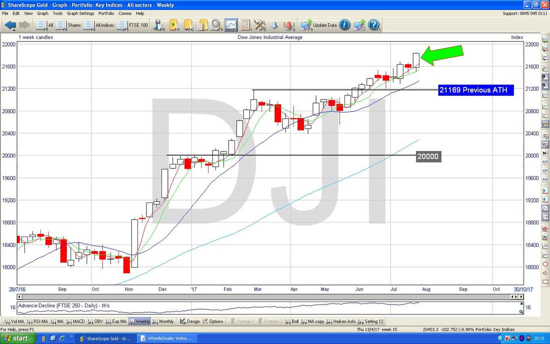
Nasdaq Composite
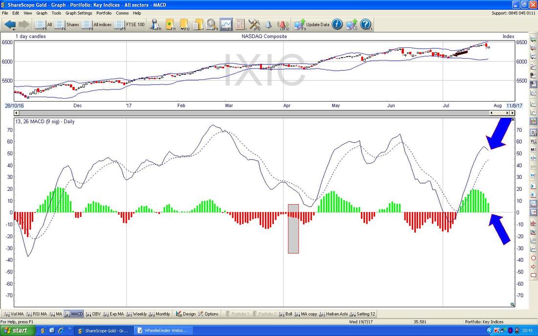
Unlike the DOW which looks really bullish still, this one is showing some weakness - I guess with Tech Valuations so hot it is not a huge surprise that some Sellers are creeping in. On the Chart below, first off note how the Blue Wiggly Line (pointed at with my Blue Arrow) which is the 50 Day Moving Average has acted as decent Support on the Nasdaq Comp for some time - in other words, if it falls back to around 6200 there is a good chance it can turn up again. Other than that, my Black Arrow is pointing to a Big Red Down Candle from Thursday 27th July and note how this ‘Engulfed’ a tiny Red Doji Candle from the Day before (Wednesday). That Big Red Down Candle recovered intraday after getting down near 6300 - this is now important Support in the very near term but it seems likely it will get tested soon. 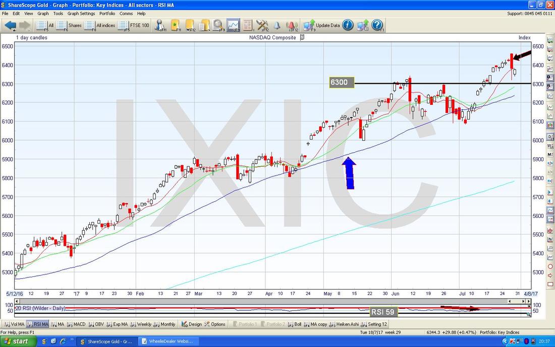
In the bottom window on the ScreenShot below we have the MACD (Moving Average Convergence Divergence) for the Nasdaq Composite Index - my Blue Arrows are pointing to how we are nearing a Bearish MACD Cross - this is not certain, but it looks most likely and implies short term downside if the Cross happens. The easiest way to visualise this is to look at the Green Humps and how they curl round.
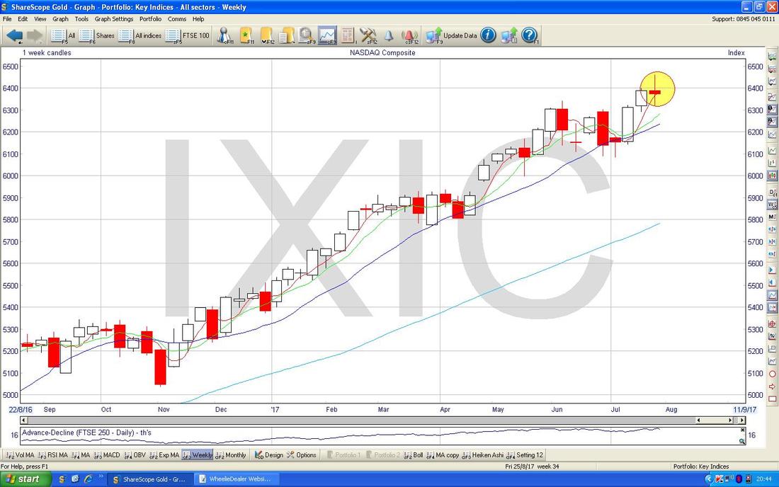
Here are the Weekly Candles for the Nasdaq Comp - my Yellow Circle is capturing a ‘Spinning Top’ Doji (this is my name !!) and this suggests that after the strong run up, there could be weakness ahead. It is not 100% guaranteed but with the other indicators we have looked at, this supports the Bearish short term outlook.
Here is more evidence - this is the Daily Heiken Ashi Candles for Nasdaq Comp and my Green Circle is highlighting a Big Red Down Candle and note how it followed a Narrow Red Candle from the Day before - after all those White Up Candles, this suggests we are turning down.
I won’t show it this week, but the S&P500 looks more like the Nasdaq than it does the DOW !! 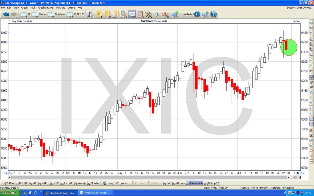
FTSE100
With the Pound looking beefy against the Dollar, it would make sense for the FTSE100 to be showing some weakness and that seems to be the case. On the Chart below we have the Daily Candles for the FTSE100 and note how the Price moved up to where my Yellow Circle is recently and now seems to have turned down again as per my Black Arrow. It got up to 7515 and then turned down - so this will be difficult Resistance even if we do actually start to move up again. There is good Support just below at 7300, 7200, 7100 as I have marked. Note also how the Price is still mucking around at the Red Line (marked with Red Arrow) which is that Long Term Uptrend Channel Bottom Line from back at the 2009 Lows. It would be really positive if we could stay above this Line but at the moment it is failing to do so. The 200 Day Moving Average is perhaps just visible as the Faint Blue Wiggly Line at around 7225 - this could act as Support. 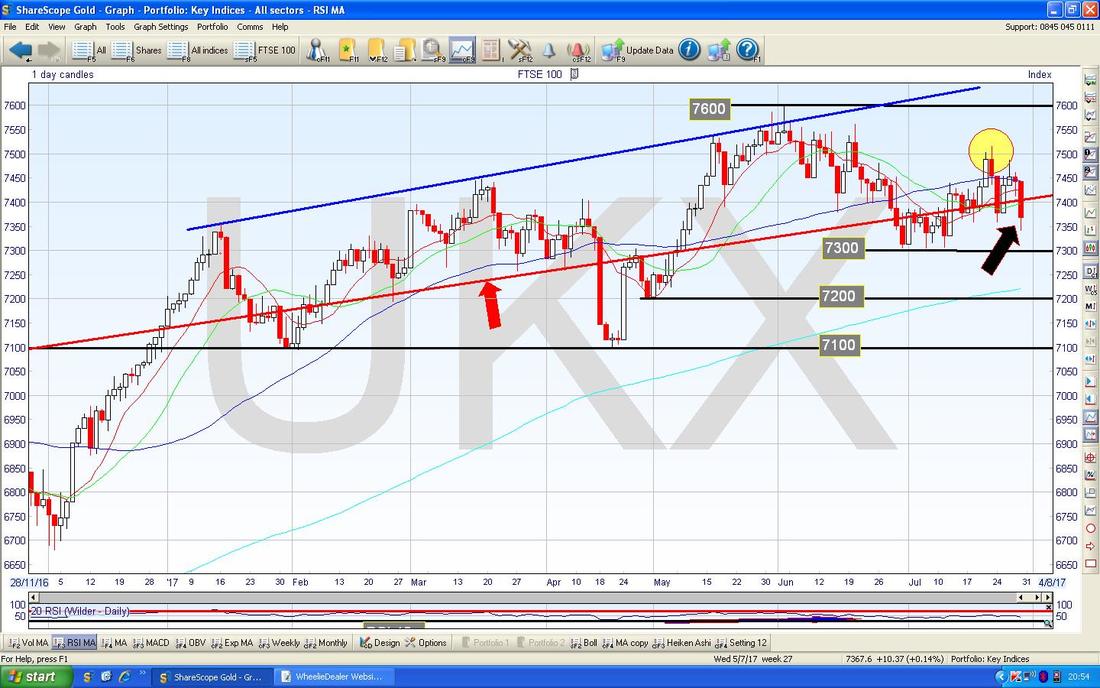
In the bottom window on the ScreenShot below we have the MACD for the FTSE100 Daily - my Blue Arrow is pointing to where we are on the verge of a Bearish MACD Cross.

AstraZeneca AZN
This one was a huge Story last week after the failure of the Mystic Trial and a big drop in the Share Price. Of course the key question now is whether or not this makes it a buy. From a Fundamentals point of view Mystic was a very important Trial but AZN also has something like another 100 Drug Trials going on and it is fairly likely some of these will go ok - but of course the Issue is around current Blockbuster Drugs going off-patent protection and new Drugs are needed to fill the void. The nub of the issue is whether or not you think AZN will have success with the Pipeline and this is partly an article of faith. But of course, Healthcare is clearly a Sector that should have plenty of ‘golden years’ ahead of it and AZN’s tilt towards Oncology (Cancer Drugs) is clearly the right place to be. Another consideration is whether or not AZN will become a Takeover Target again - from memory I think the previous attempt by Pfizer to Buy AZN was pitched at around 5200p so with a current price of 4481p this looks favourable. There are also concerns about the CEO Pascal Soriot because he is rumoured to be leaving but again this is unclear and a change of Leadership might actually make a Takeover more likely as he put up a very strong defence to avoid such an outcome previously. Of course the weak Quid has helped make AZN look more attractive to Overseas Buyers and with the Dollar seeming to be weakening, perhaps this attraction will reduce. In terms of numbers, AZN is forecast to have a Dividend Yield of 4.8% for 2018 rising to 5% for 2019 - obviously there is risk around these forecasts but I would expect that Analysts have considered the Pipeline and its likelihood of success in these numbers. The Forward P/E is 14.9 which seems a fair Valuation for a stock with such potential from the Pipeline. The Chart below shows a very Long Term Picture going back to 1994. I have used the ShareScope ‘Toggle the trend lines’ feature which I have setup as a Button on the Right Hand Side of the Screen. I rarely use this function but sometimes when the Chart is a bit ‘messy’ and I am struggling to decide where to draw my Trendlines, this Function can be really useful (you can actually see the Button on the far Right Hand Side of the Screen slightly above the top of the Yellow Circle). My Yellow Circle is highlighting where the Price is now and note how it is pretty near the Middle Trendline which could be Support. 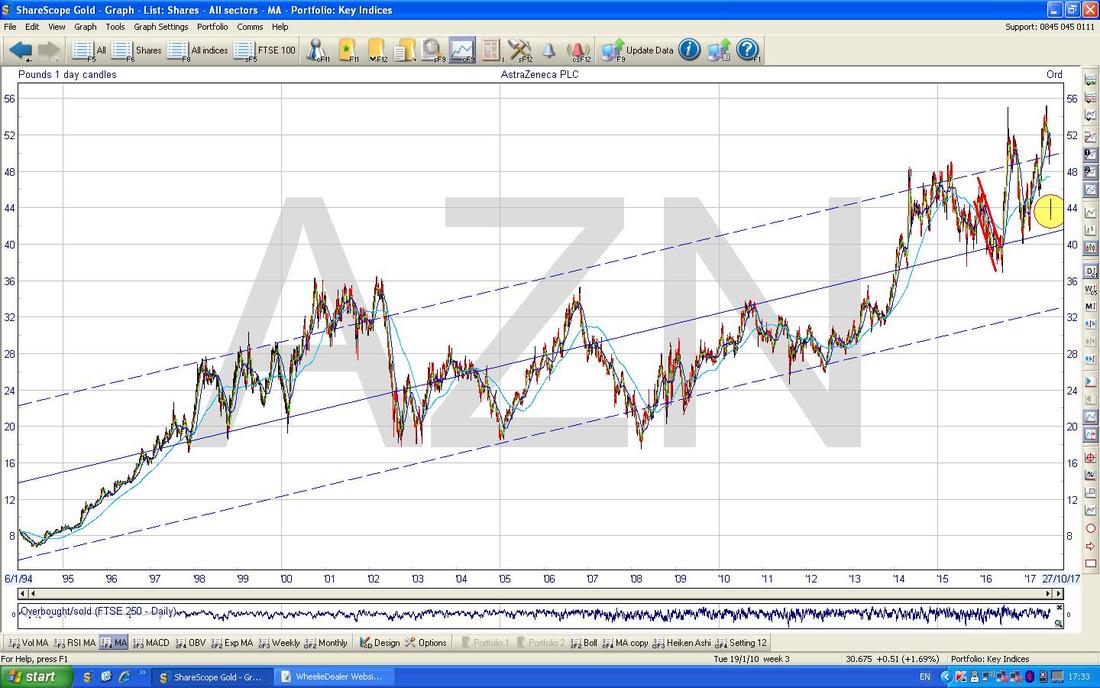
On the Screen below I have drawn in a Uptrend Line which is the Black Line at the bottom (Black Arrow) and note this goes back to the 2009 Lows so I think it has a lot of relevance. The Yellow Circle is marking the current Price as before and note it is some way above my Black Line - so perhaps it will drift back to that Line before really getting stability.
However, I have put in a big Pink Rectangle and the point of this is that this represents a Zone of Support between around 3700p to 4200p and any drops will most likely be bought in this area. 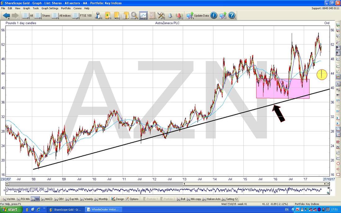
I’ve now zoomed in close and my Blue Arrow is marking the Up Candle from Friday 28th July after the big drop on Thursday which caused the ‘Long Tails Doji’ to be formed up. The Low of that Doji is 4260p and the obvious Trade here is to go Long and to have a Stoploss just under 4260p.
For people looking to build a Position in chunks, it would make sense to buy some around these Levels and then to add in the future when Opportunities arise - taking this approach, any further Drops can be averaged down into. For an Income Portfolio, this would probably be a nice Stock to hold. Indeed, I hold AZN myself for this very purpose !! 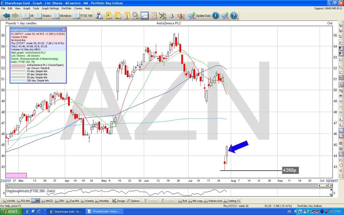
Sprue Aegis SPRP
I hold a lot of SPRP and despite the recent problems, it seems to be back on song now and the Chart is looking good. They specialise in Fire Alarms and after the recent Tower Block disaster, it would not surprise me if they see an uptick in demand. In valuation terms they don’t look particularly cheap on a Forward P/E of 20 (based on 2018 Forecasts) but it is worth noting that Forecasts for 2019 mean that the Forward P/E drops to just 13 - but of course there is risk around the Forecasts (although it could be that the Risk is to the upside if they can beat these Forecasts). SPRP also has a nice Cash Pile and is expected to pay 4.1% Divvy this year and 4.6% next. SPRP sources a lot of stuff in Dollars so weakness in this Currency could mean SPRP’s costs reduce. On the Chart below there is a very Clear Uptrend Channel as captured by my Parallel Black Lines and the Price is now up at the Top Line as marked by my Black Arrow. To go higher, SPRP must now breakout over this Top Line and such a Breakout would be a Buy Signal. Note my Red Arrow which is pointing to a Bullish ‘Golden Cross’ between the 50 Day Moving Average and the 200 Day Moving Average - regular Readers will know that such Golden Crosses are very much something I approve of !! 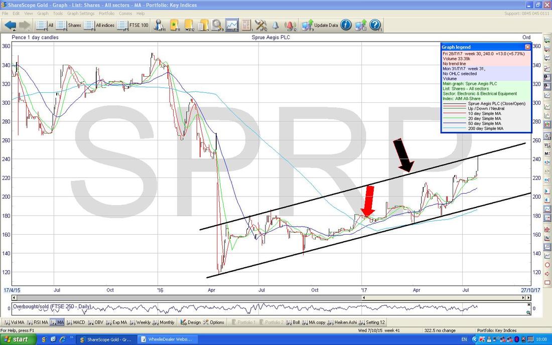
Accrol ACRL
I don’t hold these but I like the Business. They do Bog Rolls and of course even in the worst possible Recession there will still be demand for these !! They are the largest Supplier of Loo Roll and Kitchen Towels etc. to the Discounters (Aldi, Lidl, B&M Value etc.) and they source Paper Pulp in Dollars so it is another one that might be helped by a falling Dollar. On a forward P/E of 8.8 and a forward Divvy of 3.3% this looks pretty damned cheap as well. The Chart has some concerns though - in other words, it might drop a bit more before the Buyers take control again. You should be able to see my Parallel Black Uptrend Lines and note where my Yellow Circle is how the Price has fallen below the Bottom Uptrend Channel Line (marked by my Black Arrow) - it needs now to get quickly back up inside this Channel. Note also that the Faint Blue Wiggly Line which is the 200 Day Moving Average is pretty much hidden by my Black Line - this should be a decent area of Support. Again, if I was really keen to buy this Stock, I would perhaps be buying a Position pretty soon and then adding if it drops a lot or if it shows some good upwards movement. 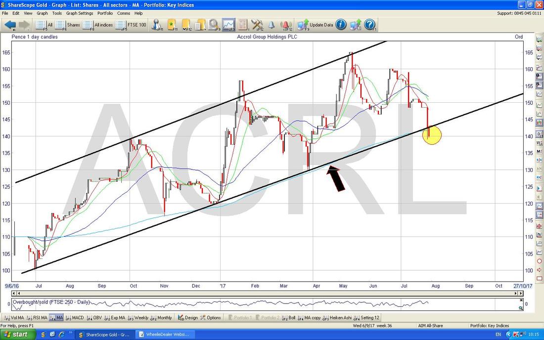
Dominos Pizza DOM
I noticed this one the other day and thought it was an interesting Chart. I like the DOM business (I don’t hold DOM) but clearly it has started to hit the buffers in terms of the scope for expansion in the UK although it is doing more in Europe which could be its salvation. What really interests me here is that if it falls a lot more (which is very possible) then it could become a really nice Income Stock. At the moment, it is on a Forward Divvy of 3.5% which is reasonably attractive but if it was up around 5%, that would be much more like it. It is on a Forward P/E of 16.7 which is not particularly cheap for a Stock with issues so it could easily fall a chunk more. On the Chart, you should be able to see the previous Uptrend as denoted by my Black Line and more recently we have got into a Downtrend Channel (more of a Wedge at the moment) as marked by my Blue Lines. For this to become a Buy, we would first of all need the Price to Breakout through that Upper Blue Line as pointed at with my Blue Arrow. My Red Arrow is highlighting where there was a 50/200 Day Moving Average ‘Death Cross’ - this was a good warning that there was trouble ahead. Note also how both Moving Average Lines are now falling (it is worth appreciating that a Death Cross is the opposite of a more desirable Golden Cross). 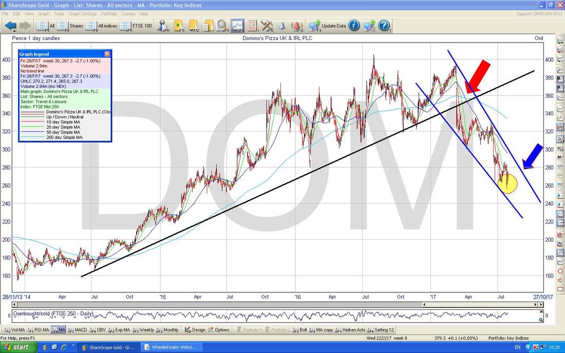
BT BT.A
I am sure loads of Readers have this Stock (I don’t and I prefer VOD although I don’t hold that either !!) and when you see the Chart the similarity to DOM will be really noticeable. I have deliberately used the same Colours and stuff as on the DOM Chart and this heightens the similarity. BT.A is seen as a Divvy Stock with a Forward Divvy of nearly 5.3% but it clearly has a lot of problems in the business ranging from constant Regulator hassle, Pension issues, Cost of Football Rights, big Debt Mountain etc. and the Chart cements this negative outlook. As with DOM, there is a very clear Downtrend Channel and my Red Arrow is marking a 50/200 Day MA ‘Death Cross’. Again, we need the Price to Breakout of the Upper Blue Downtrend Line as marked by my Blue Arrow as the earliest sign that things are improving. OK, let’s wrap it here - I think that is a lot of ground covered. I hope the Markets are suitably generous to us all next week !! Cheers, WD. 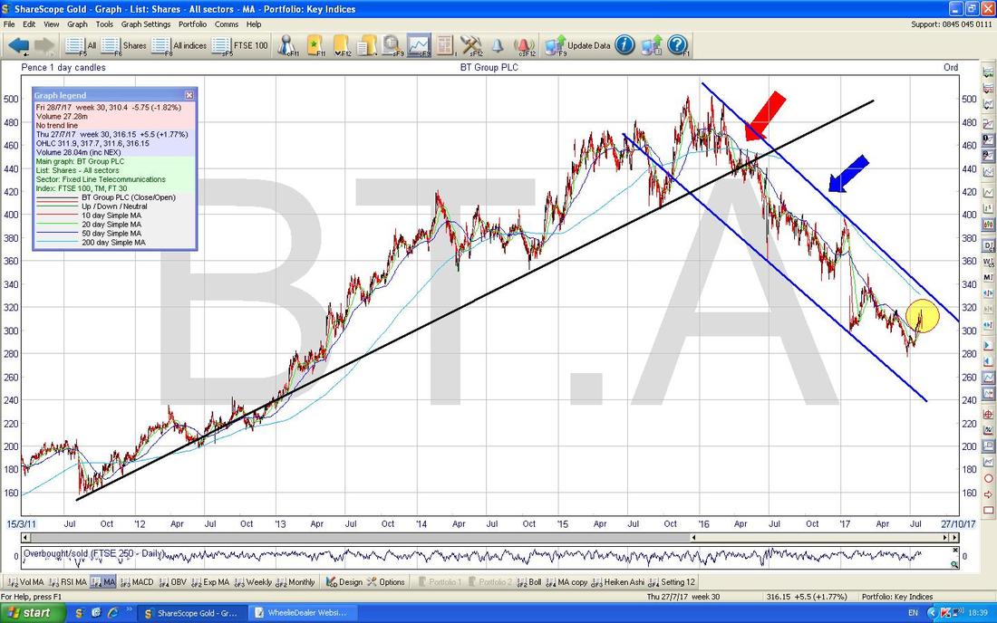
2 Comments
Had a proper read of this blog today. This must take you many hours to go through as I know from experience the time it takes to draw and analyse charts. Great read .. thoroughly enjoyed it. Regarding Gold and in that respect it's cheaper cousin silver.. I would be long term bullish on this. This is a manipulated market by JPM. Record shorts by speculators on Gold and JPM holding the other side of the contract will want to flush them out. Hence you are seeing Gold rising ... to do that JPM (banks) will want to get the price up to key moving averages 50sma) so speculators cover their shorts. Regarding Dollar ... thats being managed down to create inflation through depreciation of currency .... all in my own opinion. Keep up the good work and p.s I came across ACRL recently and it was also featured in this weeks Share Magazine - yet I can't get myself to invest in a big roll company
WheelieDealer
2/8/2017 11:38:08 pm
Hi Borgy74 - I guessed it was you and you confirmed that on Twitter - thanks for the comments. You're right, it takes a while to produce but I find the discipline it instils and the methodical structure it demands are very useful for making me think about my Stocks and what I am doing. Leave a Reply. |
'Educational' WheelieBlogsWelcome to my Educational Blog Page - I have another 'Stocks & Markets' Blog Page which you can access via a Button on the top of the Homepage. Archives
January 2021
Categories
All
Please see the Full Range of Book Ideas in Wheelie's Bookshop.
|
