

|
educational blogs |
|
Apart from Friday and Saturday Nights (usually), I tend to look at the Charts of all the Major Indexes that I see as relevant to my Holdings - stuff like FTSE100, FTSE250, FTSE Small Cap, FTSE AIM, DAX, CAC40, DOW, S&P500, Nasdaq Composite, Brent Oil and Gold (to be honest, I look at Gold more out of interest and because it winds the Gold Bugs up when I tell them how pants it is !!). I also look at the Stock Charts of all my Holdings and a few others that I monitor for other people (my Mum for one).
Often on a Sunday Night when I have more time I will do a quick Summary of the Technical Situation of the Indexes and I slam this onto the Homepage of WD2. However, I am aware that it is a bit ‘dry’ without Charts to give real depth and colour to what I am saying - the reason for this is that it takes quite a bit of time to do and especially loading the Charts into the Website. I am aware that many Readers are Amateur Chartists like myself and hopefully the Information I splash out on WD2 and Nightly via Tweets can enable these Readers to interpret their Charts in a meaningful way - or at least they can see my view and disregard it is they think it is bollox.
The reason I look at the Indexes each night is because I use a fairly aggressive Hedging Strategy and often have a FTSE100 Short in place to act as a Hedge to my usual Long Portfolio. I threw out a Tweet about this just a few days ago - the idea is that the Total Value of my Portfolio (the ‘Equity Line’) goes up nicely during Good Times for the Markets and when things get Rocky, I Hedge my Portfolio so that effectively the Equity Line goes sideways - in other words, I capture the Ups and avoid the Downs with my Portfolio effectively flat-lining.
That’s the theory anyway but it is very hard to do in practice. Ideally, if you plotted a Graph of my Equity Line, you would get a Step Pattern that is literally like a Staircase moving up. In practice, it is probably more Up moves with shallow Down moves followed by more Up moves - but realistically this is not a problem and is far superior to an Equity Line which has good Up moves followed by Sharp Down moves - we don’t want none of that. I want Retracements to my Equity Line to be fairly minimal. The reason I hedge a lot rather than selling Stocks is that I have learnt over the Years that this works best. In the past, I used to reduce my holdings dramatically as we moved into Summer, but then I found that I had sold loads of great Momentum Stocks and it actually hurt my Returns. In theory, you can buy back in but it is quite a complicated process to Sell maybe 10 Stocks and then Buy Back 10 a few months later - it is far easier to keep the Stocks and to use Hedging to reduce the hassle and the Dealing Costs of lots of ‘In and Out’ can add up hugely (sounds quite fun though !!). In terms of individual Stock Charts, I look at these so I can get a feel of what a Stock is likely to do in the coming Days / Weeks - this enables me to plan ahead and think about adding to a Winning Position or maybe cutting a Loser down to size. It helps me adjust my Targets in terms of Chart Resistance Levels and I also look at the Broker Forecasts and stuff in ShareScope and constantly re-evaluate my Targets. Regular Sufferers of my ’Buy Rationale’ Blogs will have seen how I calculate Targets and I use exactly these methods with Text Boxes used on the ShareScope Charts to write in what my Target is but also to put little instructions to myself like “Buy more via a Spreadbet if the Price breaks through 120p” or similar. I hope that makes sense. Right, onto the Charts for this week. FTSE100 As ever, I have used exactly the same few Indicators that I always use - I haven’t included all of them here - just the ones that I think are relevant. The ShareScope ScreenShot below shows the FTSE100 Chart for a long Period of time - maybe 35 years or something - wow, that is long term !! What this shows is the Uptrend Line at the bottom in Blue and marked with the Blue Arrow - this is interesting because it suggests that if we were to get a horrific Meltdown in the Markets (seems unlikely for a while, but it could happen), then the area I have marked with the Red Arrow suggests we might see 4000 - 4500 hit - that is a long way down !! The Green Line marked with a Green Arrow is a Resistance Line and sort of Caps upside to around maybe a bit over 7100 or something - I expect this to be extremely Strong Resistance and all these ‘Experts’ who were predicting 7500 by Year End etc. must be feeling a bit sheepish now (baa). The Black and Red lines mark the Uptrend Channel since 2009 ish. 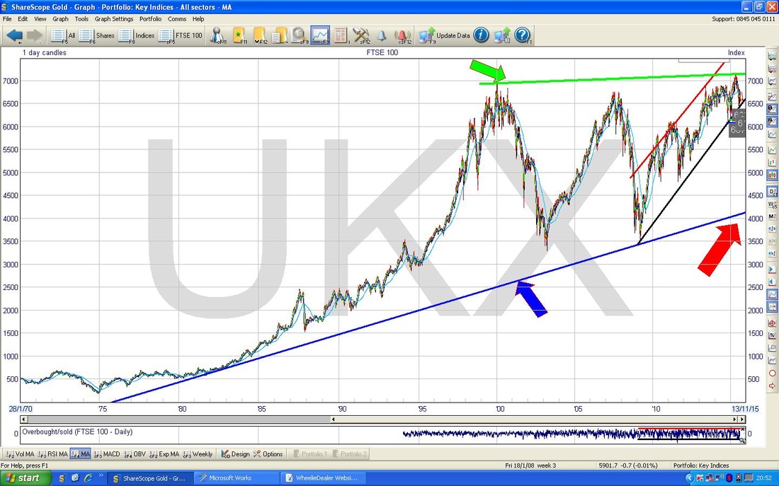
The Screen below shows that very 2009 Uptrend Channel but in a much tighter timeframe (as I have said over and over, it is always correct Technical Analysis behaviour to start with the Longer View and then drill down), which goes back to 2009.
Here you can clearly see the Uptrend Channel with the Red Line at the Top (Red Arrow) and the Black Line at the bottom (Black Arrow). All I want to point out here is that the Price is currently down at the bottom of the Uptrend Channel but it has not broken out to the Downside - i.e. below the Black Line. It it were to break below this line, then that would be a bad sign although you can get ‘False Breakouts’ where it is like an overshoot that sort of goes wrong. But if that Black Line is broken to the Downside, we should all be very nervous until the Break is confirmed as false or if it clearly shows we are in trouble and more falls are likely. Be warned - I am still of the view that Autumn (September and/or October) could be very bad and that might see this line breached to the downside. If it does happen, then the Horizontal Lines with Numbered Labels against them should give an idea of how far down we are likely to go - the worst being around 6072 and I would not be shocked if we touch 6000. 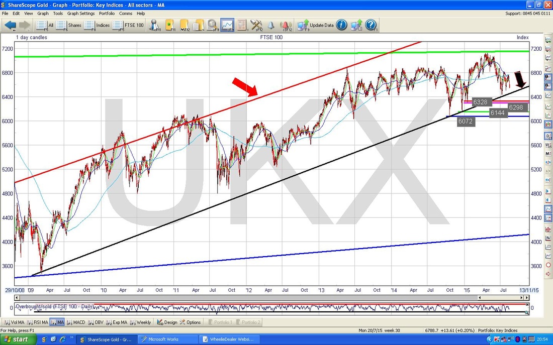
You may have seen me going on about a ‘Triangle’ on the FTSE100 and some helpful people have Tweeted out Charts which show this Triangle but you may not have seen those. So, the Chart below has the Triangle clearly drawn in and I want to explain why and how it is important.
What I have done here is zoomed in again from the Charts above and we are now looking at about a Year past. The Triangle is marked with the Blue Lines with a ‘Triangle Top Line’ and a ‘Triangle Bottom Line’ and you should be able to see that this Triangle encapsulates about 6 or 7 Weeks of Price Action - so it is not just a silly short term thing - it has been building for a while. The significance is dead easy to understand and this simple little Pattern is driving my actions with regard to my FTSE100 Hedging Strategy. I seriously thought about adding more Shorts on Thursday Night but I came to the conclusion that the Triangle was still being ‘obeyed’ and that I should act as per what the Triangle says. To explain, it is actually dead simple. If the Price breaks out of the Triangle Top Line, then it is hugely likely that the Price will continue to rise and probably quite strongly. If the Price breaks down out of the Triangle Bottom Line, then it is most likely that we are going lower - and it could be a fast move down. So, in other words, I will add to my Shorts if the Price Breaks down out of the Triangle and I will either close some Shorts or at least keep them the same if the Triangle breaks to the Upside. Simples. Trader types love these Triangles as they create Explosive Opportunities for a fast Buck or two. 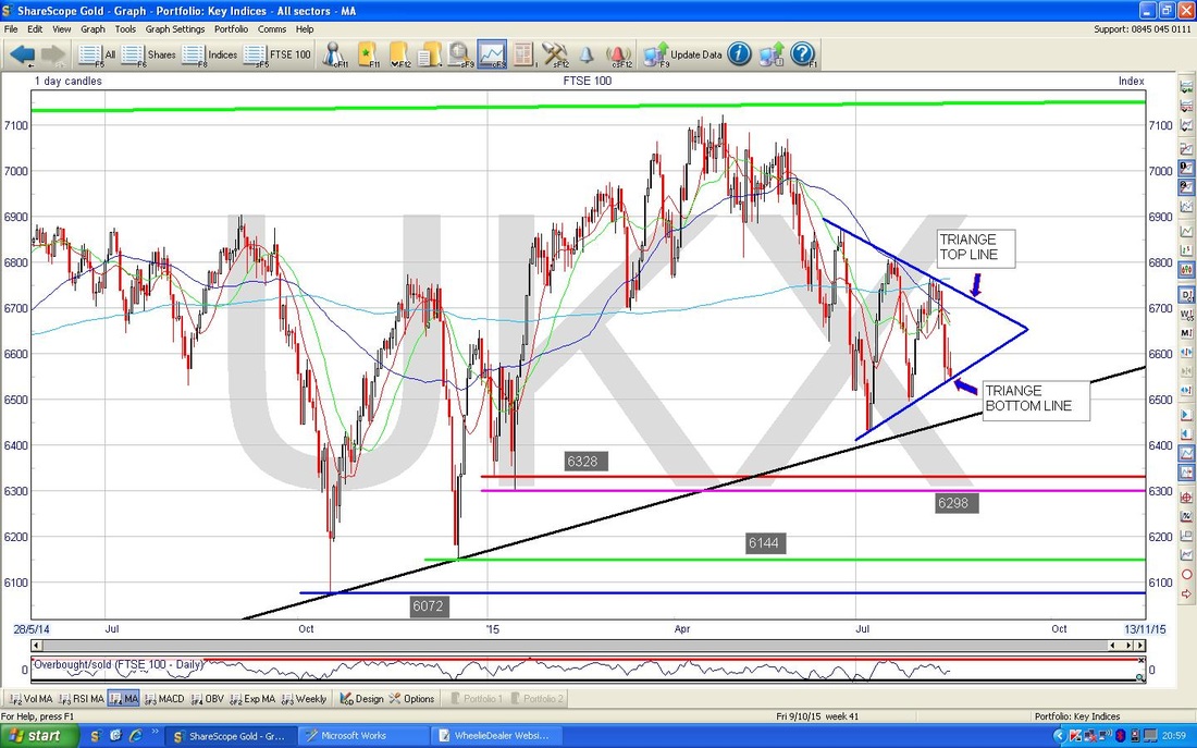
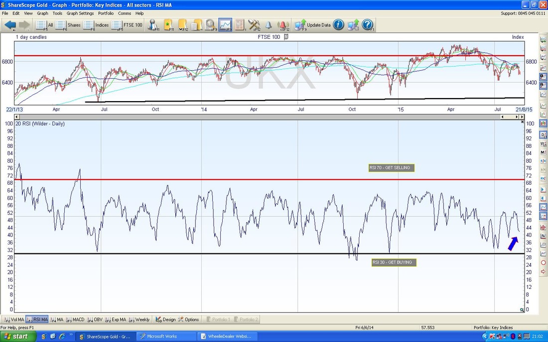
The Chart below shows the RSI (Relative Strength Index) in the Bottom Window - I have included this to show that the RSI line is down around 42 or something and that it is low really - this does not mean it cannot go lower, it could go a lot lower, but it does mean that the odds are on a bounce up soon.
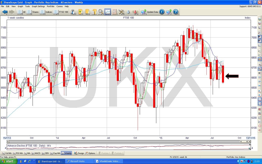
The Chart below is less encouraging for the Bully Beefs. This shows the Weekly Candles (you just gotta love Candles - one beauty of them is that they are ‘fractal’ - i.e. they work on pretty much any time period - from as little as 5 minutes to Months or even Yearly Quarters - crazy stuff), and the Black Arrow points to the Candle generated from last Week’s Price Action - this is bad news, it is a ‘Bearish Engulfing Candle’ and suggests more drops in coming weeks. Food for thinking……….
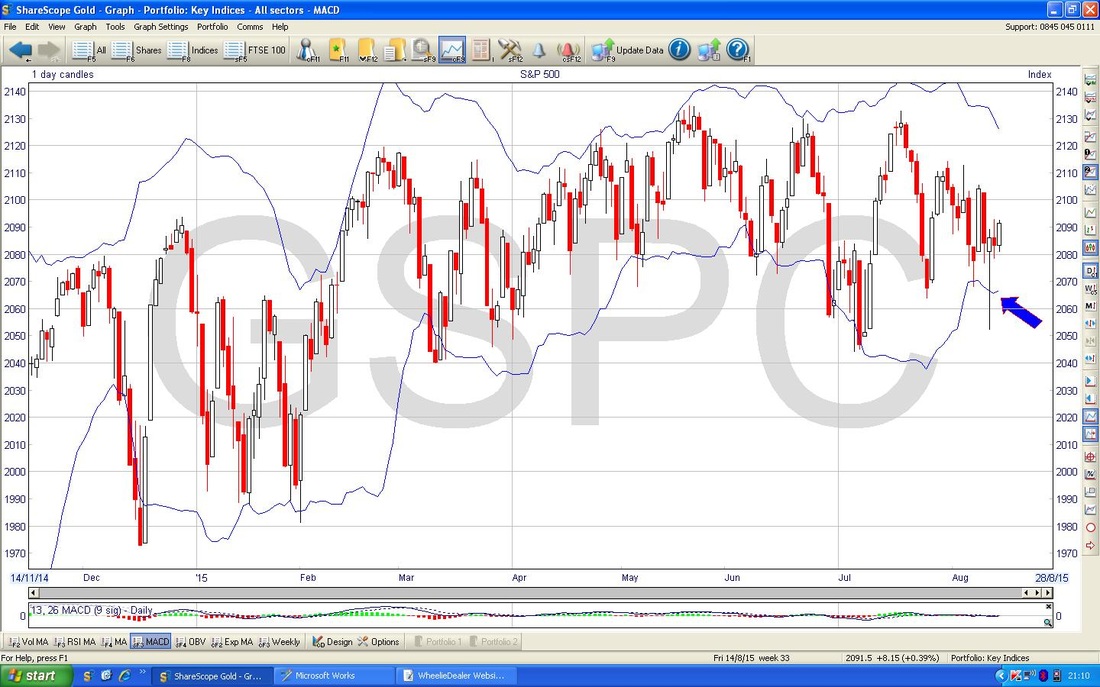
S&P500
The Chart below shows the broadest US Index (the DOW only has 30 components so it is a bit rubbish really) over the last 6 years and you can see a lovely Uptrend Channel. The only thing to add here is that the Price is at the top of the Channel and maybe it is turning down to head towards the bottom of the Channel. This is particularly the case with regard to the Moving Averages which I will come on to in a mo. 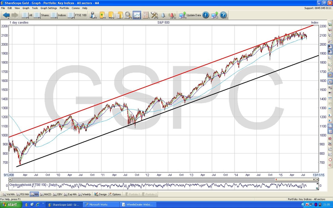
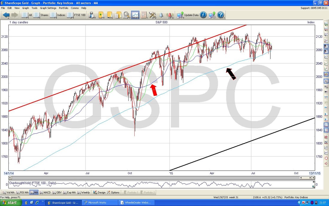
Right, here’s your Moving Averages (MAs). On this Chart, I have drilled in to about the last Year and a Half - please look at the Red Arrow which points out the 50 Day MA and the Black Arrow which points out the 200 Day MA. If you look to the Top Right, you should see that the 50 Day MA is dropping down and looks like it will cross down through the 200 Day MA - if it does this (it may avoid it, but it looks very likely) then we get a ‘Dead Cross’ and this is bad news as it probably means a period of going down, maybe for several Months at least - although that is in no way set in stone.
On the Chart below, I have zoomed in to about 4 months ish. The Red Arrow points to a Black Line I have drawn in which is a Resistance Line that we need the Price to break through - it should do it, but there are no guarantees. If it fails to break through this line, then that would be pretty bad I think and mean the Index is going down. My hope (note my choice of words, this is pure guesswork) is that the Line is broken and the Index can rise for maybe the remainder of August and into September and then maybe we will get the Big Autumn Drop that we usually get.
Anyway, to cheer everyone up after that, my Blue Arrow marks a lovely Hammer Candle what we had generated on Wednesday when there was a superb ‘Intraday Reversal’ where the Price had dropped sharply during the morning and then the Bulls came charging in and forced the Price back up in the afternoon - superb work by the Beefy Ones. The Long Tail downwards shows the significance of the move. Sadly on Thursday we got some rather weedy Price Action where the Bulls were unable to take control over the Grizzlies - this generated the Red Doji Candle. Then on Friday, we got a decent Up Candle which I have marked with the Black Arrow - again the Bulls took charge and it is a very nice Bullish 3 Day Candle Setup (I think it is called ’3 Inside Up’) - we should see more gains in coming days. 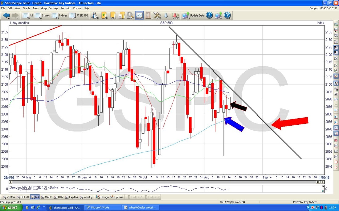
The Screen below shows the Bollinger Bands - these are the Blue Wiggly Lines above and below the Price Candles. In this case, look at my Blue Arrow and how the Hammer Candle from Wednesday pierced the bottom Bollie Band and how the Price has now moved up away from the bottom BB - this is good behaviour for Bulls. Cast your eyes to the left and look how this has happened in the past.
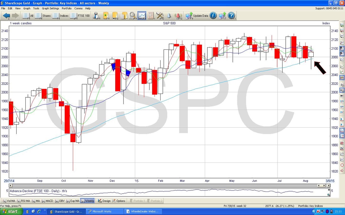
The Chart below shows the Weekly Candles. In this case, we have quite a nice ‘Doji’ with a Long Tail down which I have marked with the Black Arrow. In the context of a move down in recent weeks, this is relatively Bullish but not amazing.
Brent Oil
The chart below shows the last 6 years or so. The Black Line at the bottom marked with the Black Arrow is the Support Line and it is vital this holds or we are going lower. The Red Line with the Red Arrow is a Resistance Line that seems to be dominating the Price Action and we will not see Oil move up or even stabilise properly until this Line is broken - this is a line to watch closely. 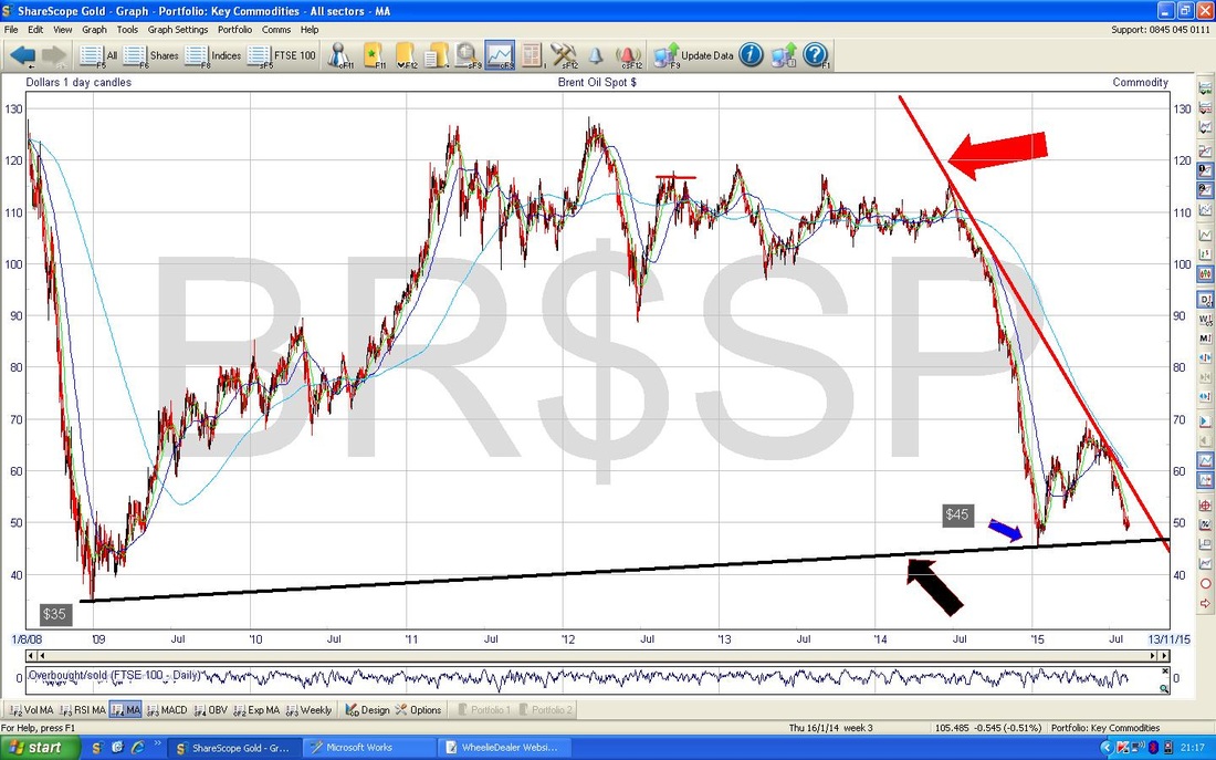
Gold
The chart below shows the Bollinger Bands for Gold. Note my Red Arrow which shows how the Price has touched the Top Bollie Band and looks to now be moving down again - interesting times and you wouldn’t want to be Long Gold !! OK, that’s shallot, wd 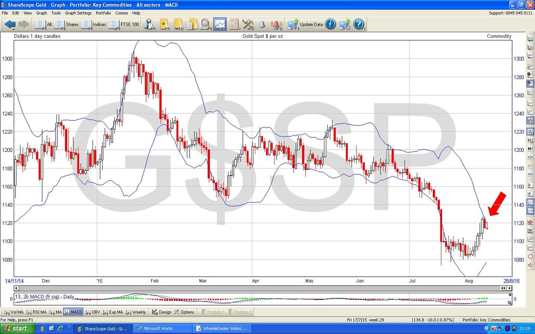
10 Comments
Theabbey
16/8/2015 05:17:27 am
Thanks for spending the time - always interesting to read such analysis and study the charts and their respective formats.
WheelieDealer
17/8/2015 02:42:01 pm
Hi Theabbey - chuffed you found the Charts interesting - I always like to get a feel of how things look at an Index level for the week ahead. Judging by the performance of the US today, you will be doing well to be Long - you may have seen my Tweet also that this is on average the 3rd Strongest Week of the Year - so the Stars are aligning nicely !!
Phil Sloan
19/8/2015 03:57:39 am
Hi Wheelie
WheelieDealer
19/8/2015 04:37:08 pm
Hi Phil, glad you found the Website and glad you like it !! I have tried to create the kind of Website I would have liked a few years back and I am trying to pitch it towards people who have jobs and are busy - but hopefully it is relevant and useful for people of varying Skill / Experience levels. As you say, the FTSE100 Triangle broke down and we may see a little more downside - although I feel we are reaching the turn very soon. Cheers, WD
Phil Sloan
20/8/2015 02:56:21 am
Hi Wheelie
catflap
19/8/2015 08:58:53 am
You are bearish on everything. Even the shiny yellow stuff. Isnt there anything to be bullish on in your world?
WheelieDealer
19/8/2015 04:34:06 pm
Hi Catflap, yeah, I know what you mean, I am a right old grumpy Bear with a Sore Head at the moment. Mind you, I sent out some Tweets tonight (if not on Tweeter you can see them on my Homepage) and Gold actually looks quite good at the moment - although I doubt it can keep this up long term. I expect bit more downside on FTSE100 DAX US etc. but we must be nearing a turn up.
WheelieDealer
20/8/2015 05:00:22 pm
Hi Phil, Thanks for your comments, great to hear you escaped the Dailly Grind - I promise you will never regret that decision !! I guess you have seen my Blogs on 'Retirement' but if not make sure you hunt them down - click on the 'Category' on the Blog Page.
Phil Sloan
21/8/2015 03:39:04 am
Thanks for your comments, Wheelie.
WheelieDealer
24/8/2015 04:22:02 pm
Hi Phil, yes it's great being able to enjoy the Markets - although today's turmoil (monday 24th August Crash) was perhaps more than my heart can take !! The Retirement Blogs have been a huge hit with Readers - I must have accidently hit the spot this time. Today was a great example of the danger in Leverage - you need to set Expousre Limits and stick to them and manage things very carefully. Feel free to email me if you have any queries on it, cheers, WD Leave a Reply. |
'Educational' WheelieBlogsWelcome to my Educational Blog Page - I have another 'Stocks & Markets' Blog Page which you can access via a Button on the top of the Homepage. Archives
January 2021
Categories
All
Please see the Full Range of Book Ideas in Wheelie's Bookshop.
|
