

|
educational blogs |
|
Finally I got a bit of decent Luck last week - things were looking a bit iffy but right at the last minute Cape CIU received a Takeover Bid kicking the Stock up 46% and this saved my Week with the Portfolio gaining 0.8% overall.
I am so pleased about this because June was a really grotty Month for me - the main culprit was UTW and its collapse which hit me for 2.6% last Week on the Portfolio after a certain amount of “Death by a thousand Cuts” in the earlier Weeks of June. With Markets in a bit of a mood and the Portfolio getting hit I always find it is best to take a breather and stand back and look at things from a longer perspective. Although my Trading ISA is down about 4% from the Peak it hit just before June started, overall it is up 15% so far in 2017 which is not too bad at all - if I can repeat this in the 2nd Half of the Year then I will close out the Year in a very good mood - we shall see no doubt but I am happy with my Stocks in the main and a lot of them look very undervalued.
A lot of the Pain was caused by BOO coming off a lot - due to the great run up it has had, it has become a very big Position in my Portfolio (probably the biggest in fact) and its slow steady decline over recent Weeks has taken quite a bit of Value out of my Portfolio - however, I am pretty sure BOO will be much, much higher in a few Years from where it is today so I am not going to sell any and I am stubbornly sticking in - I suspect that once we get a turn back up again, a lot of Buyers who have missed out before will come flooding in.
With July and August tending on average to be much better Months, I am hoping things will be a bit easier for the coming Weeks - but I am very wary about September (historically the Worst Month of the Year for Markets) and for this reason I am happy to pretty much stick with the Long Exposure I have and I am not over keen on buying much and equally I have no great inclination to Sell much. If we get a run up in the next 7 Weeks then I might be looking to Short an Index prior to September but I will let the Charts dictate what I should do and I will keep my Position small and use a Stoploss. There are a couple of Stocks I want to buy more of but I will bide my time and only buy if I see a good Opportunity in terms of the Technicals and there are a couple of New Stocks that I quite fancy but again I will not be rushing in. Perhaps I will do a bit more research on one in particular but with a view to committing in September if we get a proper Drop. For now I am very happy to have a lazy Summer and to get out and enjoy the Weather while it lasts. I am off to Wimbledon on Thursday and then on Saturday I have a James Gig in Kew Gardens which should be pretty cool - unless of course the weather decides otherwise. I feel that if Markets go up then I am massively Long anyway and if Markets drop from here, I have a little bit of Cash so I could exploit any Bargain Prices and because CIU is being Taken-over, I might get the chance to Sell that Stock in the Market, grab the Cash and deploy it on some Bargains. The great thing about such Takeover situations is that when Markets tank they tend to barely move - so the Value is retained in there even though the rest of the Market is facing Armageddon. I will not sell CIU straightaway (I usually give them a few Weeks) because there is a small possibility that another competing Bid might emerge - fingers crossed and I would whole-heartedly welcome a Bidding War !!! Enough of this WheelieWaffle - I got a Formula 1 Race to endure in a bit (great for doing Charts because the Charts are often far more exciting) and then I have Race 2 of the World Superbikes from Laguna Seca (The ‘Corkscrew’ one) which of course takes my full attention later tonight. During the Week I tend to scribble down the TIDM Codes of some Stocks that I have looked at during the Week and thought they were interesting ones to chuck in the Weekend Charts Blog - this Week quite a few came up !! Entertainment One ETO I hold Peppa Pig (my goodness she can squeal) and I take the view that it is very undervalued with particular reference to the Content Library which is valued in excess of $1.5bn. It has been dogged by an extremely aggressive Acquisition Strategy in the past and the usual accusations about “Dodgy Accounting” and I suspect that is why the Market continues to overlook the Value here - and bear in mind that ITV offered 236p a Share for them a while back. It’s an interesting Chart though. First off the Bad News - my Yellow Circle on the Chart below is highlighting a 50/200 Day Moving Average ‘Death Cross’ which is obviously not what we want to see - although it is worth bearing in mind that when a Stock is moving Sideways in a Range as ETO seems to be doing, you can get such Death Crosses (and equally ‘Golden Crosses’) and they do not necessarily mean that the Stock will fall a lot afterwards - we shall see. In terms of the Range, my Green Parallel Lines (marked by the Green Arrows) at about 210p to 250p are the kind of Range ETO has been trading in over the last year or so. In order for the Price to move substantially higher, we need a Breakout over the 250p Level and then the 260p Level - chances are that unless something exciting like another Takeover Bid happens it will be hard to breakout of this Range. To the Downside, it is critical that the Bottom of the Range holds around 210p and down to my Red Line (Red Arrow) at about 200p - if that fails it will probably drop a lot more. As always the Charts I show are ScreenScrapes from the magnificent ShareScope Software that I subscribe to. 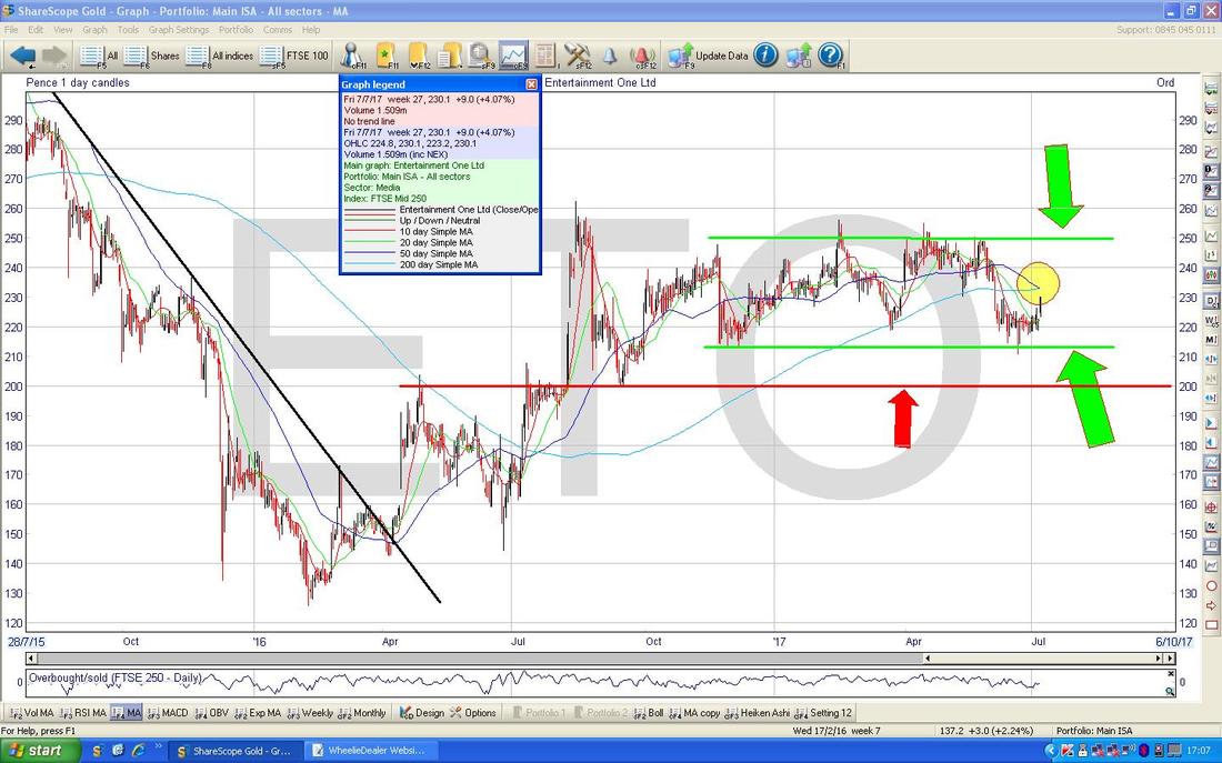
BooHoo.com BOO
Seeing as I was on about BOO earlier, I thought the Chart might fit rather sweetly in here - I know a lot of Readers hold it so I am sure it will be a popular addition to this week’s collection of pictures !! The Chart below goes back just a Year really but what I want to show here is how the Price has tended to find Support at or around the 50 Day Moving Average Line which I have pointed at with my Blue Arrow. My Green Arrow is pointing at a Hammer Candle from Friday which reversed up off an Intraday Low at about 213p and this might be the low point - note that was around the 50 Day MA so it would all add up nicely. The ’Confirmation’ would be if we now get an Up Day (White Up Candle) on Monday - that would suggest we are on the next Leg up. Hammers are one of my favourite Charts things because they often mark the end of a Down Move and where a Reversal starts. 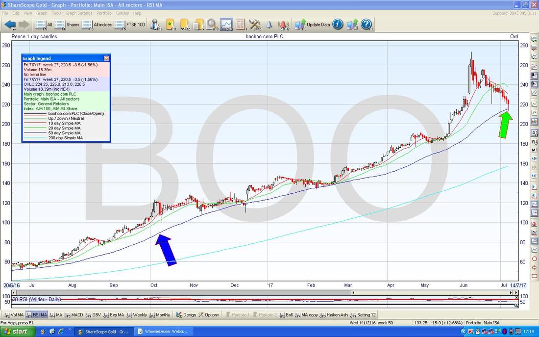
On The Beach OTB
This is one I bought into recently (as ever, all my Trades are recorded in full detail on the ‘Trades’ page of this Website) and I was really pleased to see this Week’s Investors Chronicle tipping it. As my Chart below shows, it has been in a strong Uptrend for quite some time and the key thing now is that we need the Price to Breakout over my Black Line (marked with Black Arrow) at about 415p - if it can crack this, then I would guess 450p is on the cards in a reasonable time. I think there is a Trading Update due in August or something so that might spur some interest here. The other thing I wanted to point out was how the Price has tended to find Support at around the Blue 50 Day Moving Average Line as with BOO above. My Blue Arrow is pointing to this Line and you should be able to see how the recent Sideways action of OTB over the last 4 Weeks or so has moved the Price to the 50 Day MA and we are nearing the point where it moves up again usually. By the way, this sort of Sideways Movement after a Strong run up is very common - it is a way of ‘time’ unwinding an ‘Overbought’ condition rather than the Price dropping back to take the ‘Heat’ out of the Price Chart - it is perfectly healthy and normal behaviour of a Price in an Uptrend. 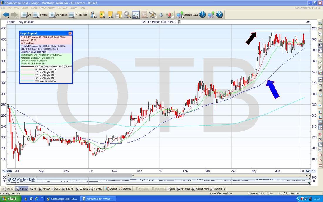
N.Brown BWNG
This is one I don’t hold and it has been a Fundamentally pretty ropey Stock for some time but the Chart is interesting because it showed where things started to improve in terms of the Price action. My Chart below has the Daily Candles for BWNG going back about 3 Years and the key feature here has been the Black Downtrend Line (marked by my Black Arrow) that capped the Price for a lot of that time but note how back in about May this Year it Broke-out of that Downtrend Line and has been rising ever since. My Green Arrow is pointing to where there was a 50/200 Day MA Golden Cross and this was the first proper clue that this Stock was coming out of Rehab. 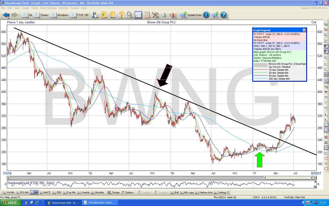
Taptica TAP
This is a really sweet Uptrend Channel - I don’t hold TAP unfortunately. The Uptrend is obvious with my Parallel Red Lines and my Green Arrow is pointing to where the Price is now - it looks a bit hot in the very Short Term and we may see it drop back a bit or go Sideways to get more towards the Bottom Line of the Channel - but it looks very good for more gains with patience. 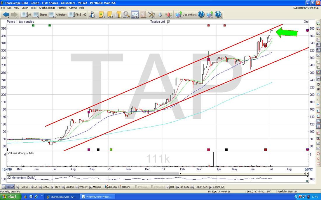
WhitBread WTB
I don’t hold WTB although I have done in the past. I know a lot of Readers have these so I am sure this will be interesting for those of such a persuasion. The Chart below goes back about 2.5 Years and first off we have the Downtrend Channel which is roughly marked by my Parallel Red Lines (Red Arrows) and more recently we seem to be in a bit of a Sideways Range as marked by my Black Parallel Lines (Black Arrows). As usual, for WTB to go properly higher it needs to Breakout above the Upper Black Line at about 4300p and 4400p and to the Downside it needs to keep above 3800p but note there is a lot of Support below this and in particular my Green Line (Green Arrow) at 3300p really must hold. I better get on with the Indexes or this Blog will never get finished……. 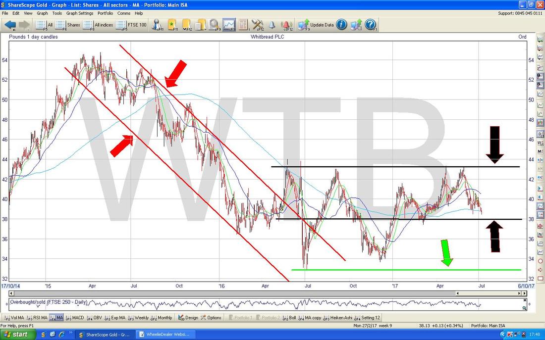
DAX (Germany)
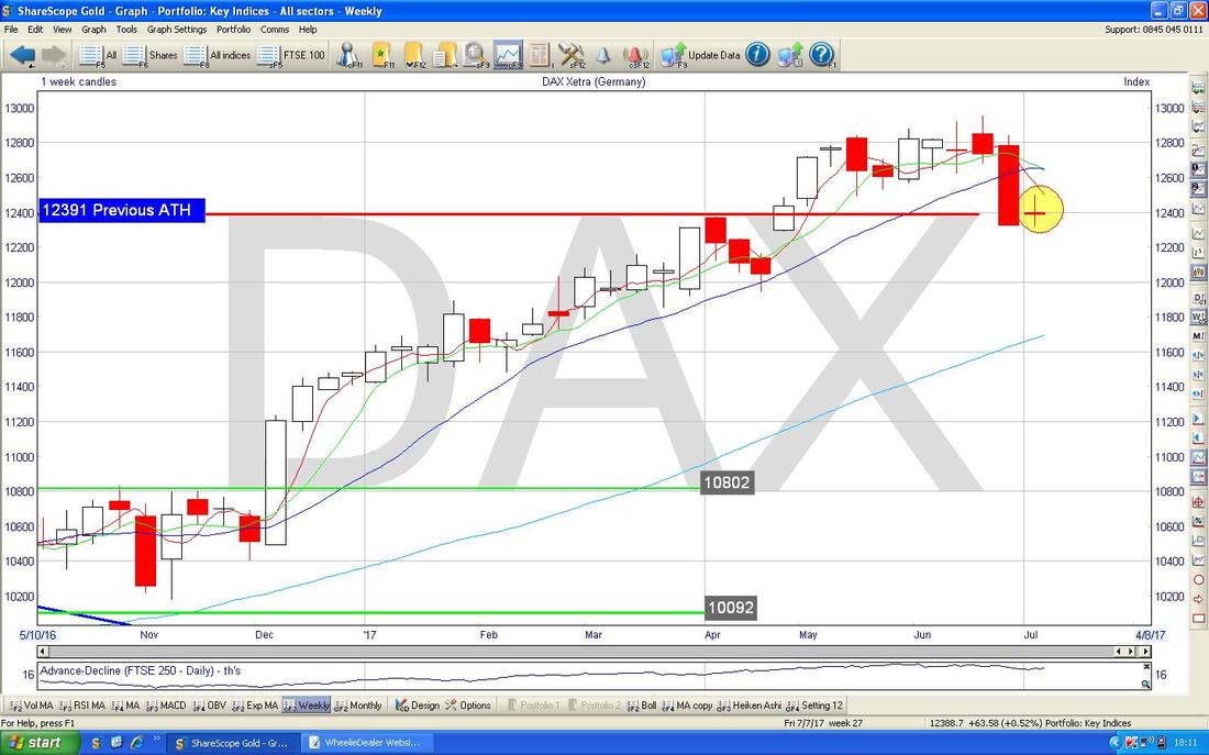
This one is of particular interest to me because I have a Long Spreadbet on it which I have royally cocked up (I don’t want to go through the pain again here - if you look at last week’s Charts Blog I think it is well explained in there). Anyway, I am nursing this at the moment and I would be very happy to get out of this Position with very little damage and I have half an eye on being a bit sneaky and adding to my Long Position to ‘Average Down’ - that is risky and I will use a very tight Stoploss if I do decide to do it so that I do not compound the screw up. My hunch is that if I can time another Small Long very well, then I might be able to turn a Disaster into a Glorious Triumph !! The DAX tends to follow the US Indexes and pretty much all the other Major Global ones and this will probably be the big driver of where it goes in coming Days/Weeks. The important thing here is still the 12390 Level which is clearly shown on my Chart below which was the Previous All Time High and this previous Resistance should act as Support - and it seems to be roughly doing this at the moment. My Green Arrow is pointing to a Small Hammer Candle which we got treated to on Friday and this looks like another sign of a Price that is trying to find Support so it can move up again. 12316 was the Low Point on Thursday last week and this is a Key Support Line that must hold in the very Short Term. 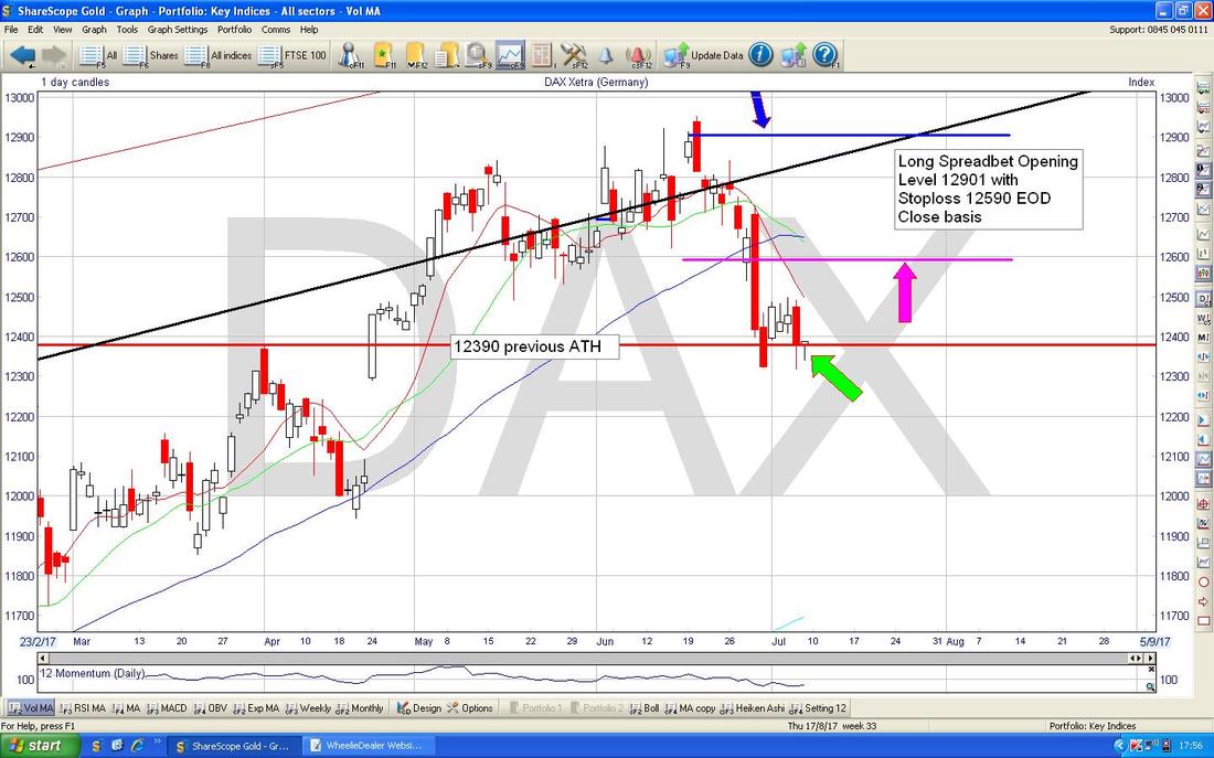
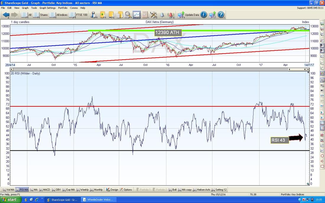
In the bottom window on the Screen below we have the Relative Strength Index (RSI) for the DAX Daily. On a reading of RSI 43 it is not particularly low and can drop a lot lower but it could however stage a recovery from this Level.
The Chart below has the Weekly Candles for the DAX and my Yellow Circle is capturing a ‘Doji’ Candle from last Week which after the big Drop from the Week before (Big Red Down Candle) could hint at a Turn back up coming. Doji’s like this are not perfect at predicting Turning Points but they often do mark them.
CAC40 (France)
I don’t often show this one but it tends to move quite closely with the DAX (and all other Major Global Indexes for that matter) but I noticed how on Friday where my Blue Arrow is below we got a much more impressive Hammer than on the DAX. Note also where my Black Arrow is that we got a good Intraday Reversal on Thursday as well. The key thing here now is to get above the Green Line (Green Arrow) at 5200 - such a Breakout would probably be a good Buy Signal to go Long. 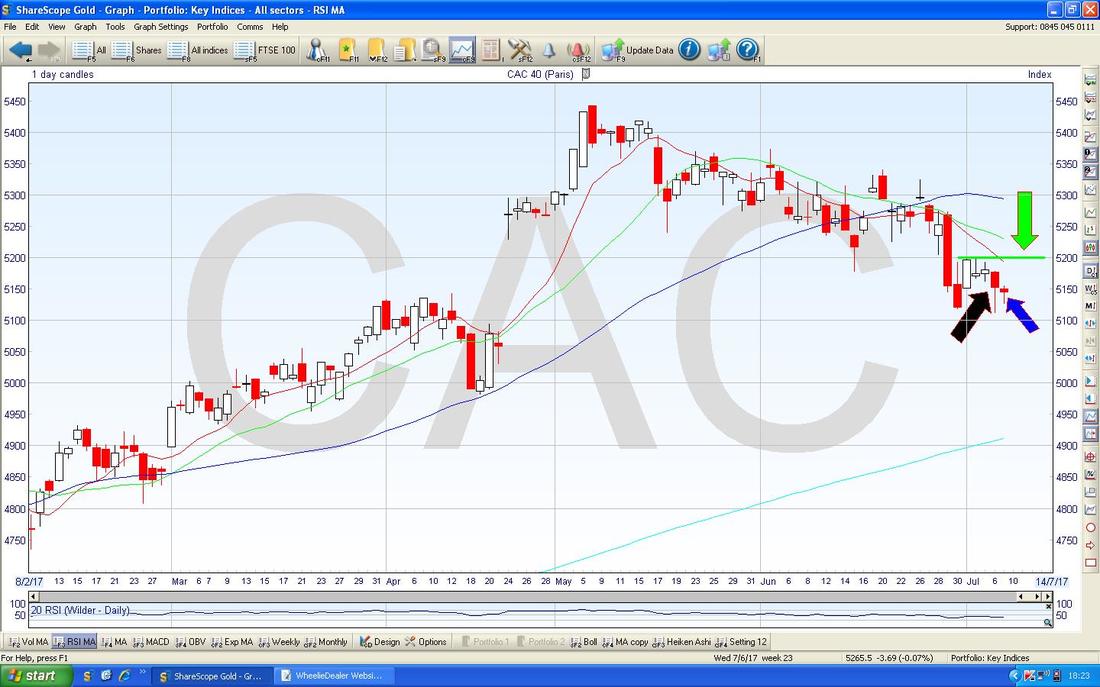
FTSE100
This one is remarkably similar to both the CAC40 and the DAX. My Chart below shows the Daily Candles going back for about all of 2017 so far - my Yellow Circle is highlighting a Hammer Candle from Friday and a Reversal Candle from Thursday which is very similar to those we have seen on the other Indexes. In the immediate future, it is important that my Green Line at 7300 (Green Arrow) holds and note how the Price Action for all of last Week has taken place just below the Red Line (Red Arrow) which is the bottom Line of the Uptrend Channel which has been running since the 2009 Low Point (I won’t include it this Week, but if you look back at Last Week’s Charts Blog I am sure it is in there). If it can move up from here that is very good but if it falls more now I would start to get concerned that the Price is unable to stay inside the Long Term Uptrend Channel for a sustained period of time. My Black Line with the Black Arrow down below at 7100 is a Long Term Support Level which must hold - however, a dip down to 7000 or 6900 might still be something the Bulls can recover from. I wonder if we will see such an Event in September?………. 
FTSE250
I won’t dwell on this, but as you can see where my Green Arrow is below, the FTSE250 is doing very similar stuff to the FTSE100 and the other Major Indexes. 
AIM All-Share
There’s a nice Candle Pattern here - my Yellow Circle is highlighting the Daily Candles from Thursday and Friday Last Week - in combination they are forming a ‘Bullish Harami’ which is the preggers Lady one we all love so much. After the sustained Down Move here, this might mark the Point where it turns up again. 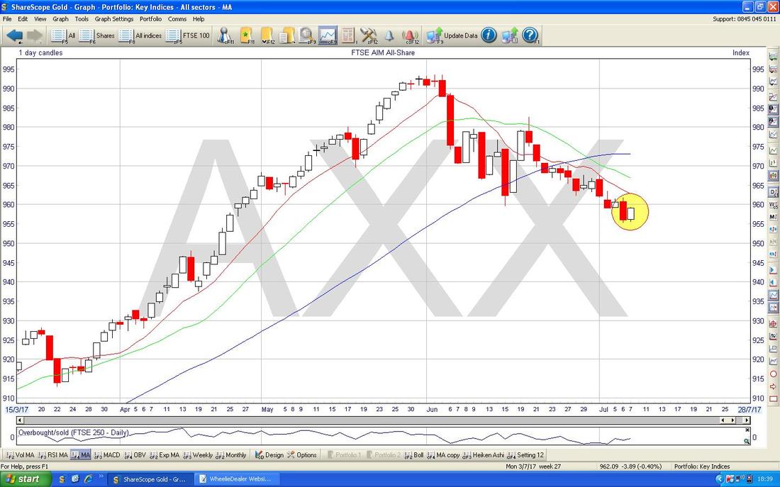
S&P500 (US)
I’m not sure the Daily Candles are telling me much on this one but the Weekly Candles are more clear. The Chart below has these and my Yellow Circle is capturing the Candles from the last 2 Weeks and the thing to note here is how there is good Support at about 2405 - note also that 2401 just below was a Previous All Time High and there is a good chance that this will continue to be decent Support as “Previous Resistance becomes Support” as we all know so well. Note also how the Price Action seems to be all around the 50 Day Moving Average Blue Line which is pointed at with my Blue Arrow. 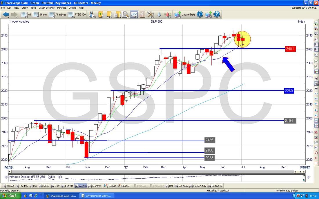
S&P500
The Chart below has the Daily Candles for the S&P500 with the Blue Wiggly Bollinger Bands above and below. Note where my Green Arrow is that on Friday the Price moved up away from the Bottom Bollinger Band - this suggests a move up is on the cards. 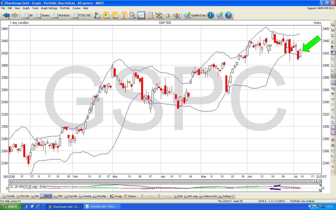
Nasdaq Composite (US Tech)
This one interests me because I have been mulling over selling part of my Henderson Technology Unit Trust. In many ways it is similar to the S&P500 and the Chart below has the Daily Candles for the Nasdaq Comp with the Bollinger Bands above and below. My Black Arrow points to a nice White Up Candle from Friday and note it has moved up from the Bottom Bollinger Band. Note also that the Candle from Thursday was a Tiny ‘Doji’ which can often mark a Reversal Point as it seems to have done here. It strikes me that with all these Indexes moving in such a similar way (although that is quite normal) it could be partly about how the Dollar has weakened against other Currencies lately. Stuff does just have a habit of wiggling around though. 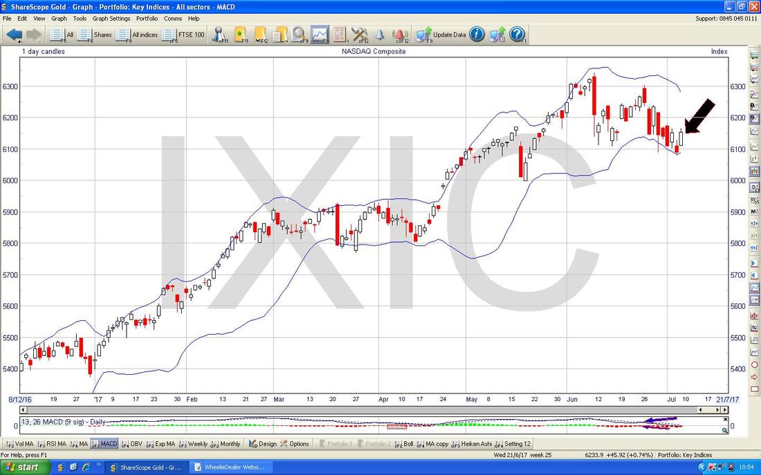
Pound vs. US Dollar
My Black Arrow on the Chart of the £/$ Daily Candles below is marking a Big Red Down Candle from Friday and if you look back a few Days you can see a ‘Hammer’ Candle in my Green Rectangle which has marked the Turning Point from which the Pound has fallen. On Friday it found Support at the Blue Wavy Line 50 Day Moving Average and this could be Support going forwards. However, I suspect we will see the Pound fall back now and the 1.28 down to 1.26 Area is a Zone of Support. My Yellow Circle marks a 50/200 Day MA ‘Golden Cross’ and this is an important Event on this Chart. I suspect we will see the Pound stuck in the Range between about 1.26 and 1.315 for some time now. 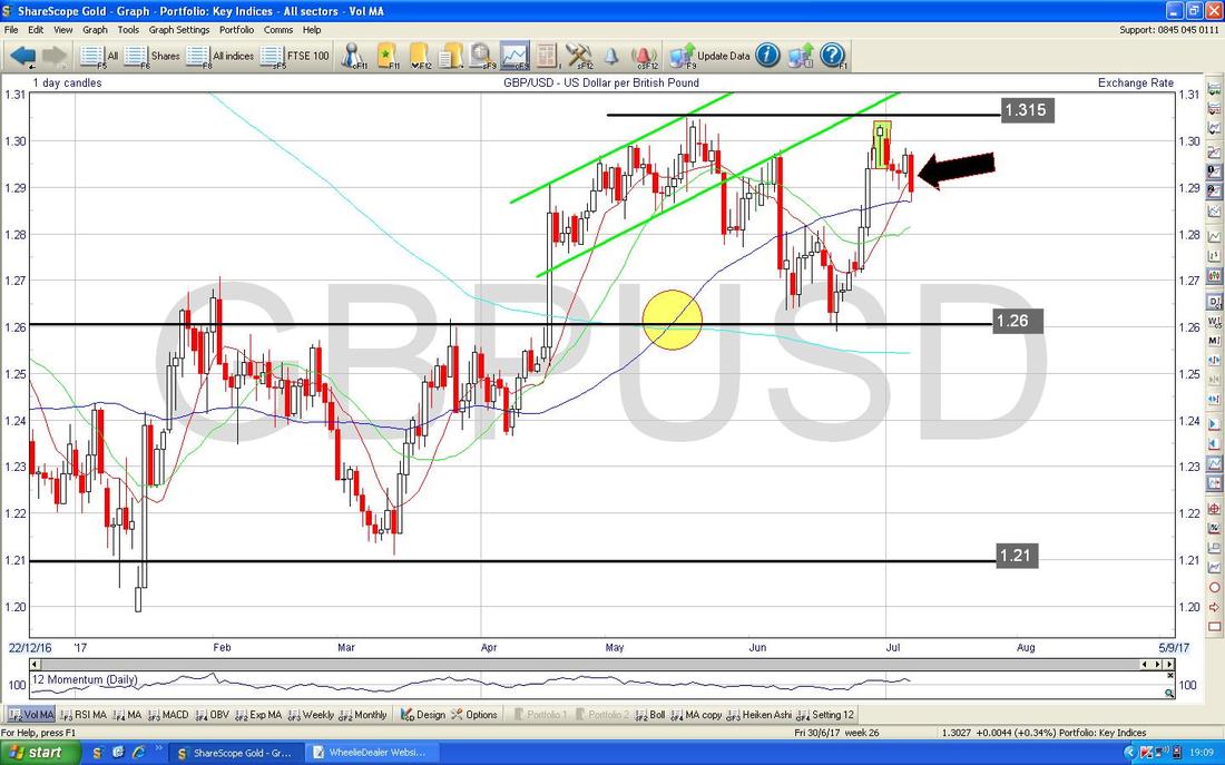
The Chart below has the Daily Candles for the £/$ and my Green Circle should draw your eyes to where the Price has been dropping back from the Upper Bollinger Band.
As always, weakness in the Quid probably means the FTSE100 can do ok. 
Brent Oil (Spot)
The Chart below has the Daily Candles for Brent Oil (Spot). My Black Arrow is pointing to a Big Red Down Candle from Friday but note how it managed to Close up off the Low Point at about just over $46. It looks to me like this Price is captured within a Range with $50 at the Top and $44.37 at the Bottom. 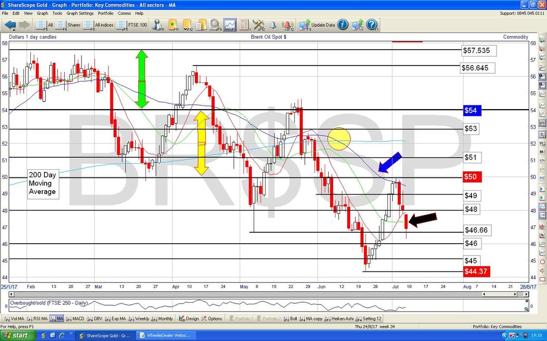
Gold (Spot)
First off a reminder of the Red Downtrend Line which has been in place since 2011 and is extremely dominant on this Price Action. It is only once the Gold (Spot) Price can properly Breakout of this Downtrend Line that we will be seeing Gold sustainably moving higher. 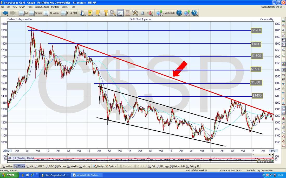
Sorry this Chart is so messy. Anyway, ignore all the ‘Noise’ here and look for the Yellow Circle - within it you will find a Big Red Down Candle - this doesn’t look good at all. Even if the Price can recover a bit, there is a lot of Resistance up above now.
Any hope of Breaking-out of that Long Term Downtrend Line (marked by my Red Arrow) looks pretty forlorn……. 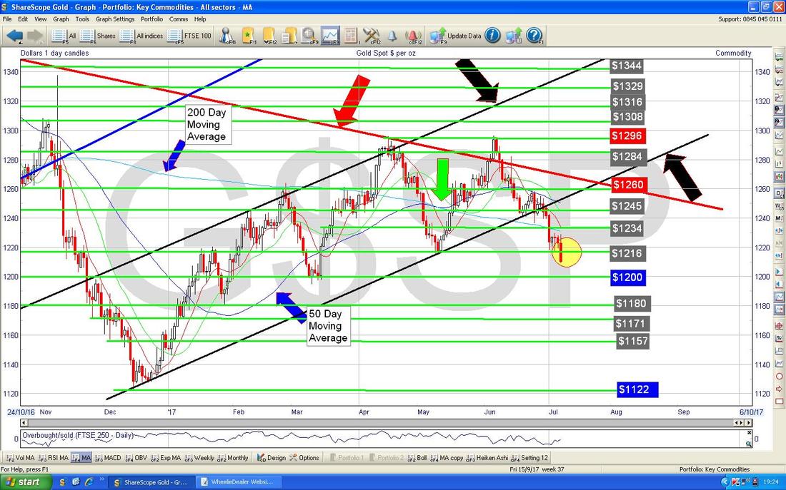
In the bottom window on the ScreenShot below we have the RSI for Gold (Spot). On a reading of RSI 34 it is very low but can go lower.
That’s it for this Week - I hope things go well for all WD Readers !! Cheers, WD. 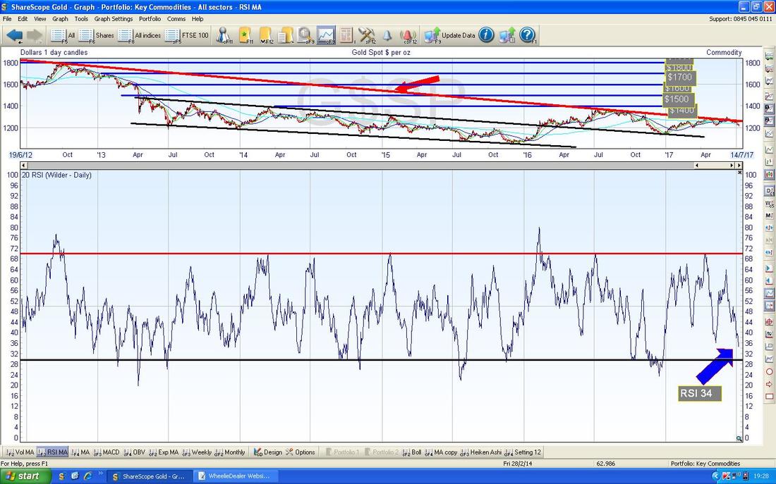
1 Comment
13/7/2023 12:06:00 pm
Great article! I thoroughly enjoyed reading it and found the insights shared to be incredibly valuable. Well done! Leave a Reply. |
'Educational' WheelieBlogsWelcome to my Educational Blog Page - I have another 'Stocks & Markets' Blog Page which you can access via a Button on the top of the Homepage. Archives
January 2021
Categories
All
Please see the Full Range of Book Ideas in Wheelie's Bookshop.
|
