

|
educational blogs |
|
Well, I imagine many Readers feel a little Shell-shocked after last week’s battering. It was clearly the worst week we have had this year but to be honest it probably wasn’t as painful as last October when Greece was a huge concern and of course we nearly always get an Autumn Seasonal Sell-off.
My view now is that Markets are looking quite Oversold (as I will show in the Charts below) and even though they might fall a little more, we are due a bounce in the Short Term. How strong that bounce is likely to be and if it can last is of course something we cannot know. However, I have indicated some Technical Scenarios where things could get very bad indeed - so these need to be monitored.
I currently have a FTSE100 Short Spreadbet Position to Hedge my Long Portfolio of Stocks a bit and that has worked quite well - my only slight error was failing to add to the Short when the ‘Triangle Pattern’ that I highlighted last week on the FTSE100 broke to the Downside. My feeling was that we were fairly near the bottom but I forgot that these Triangle Breakouts can be powerful moves and I was naïve to just stick with what I had. OK, there is an element of ‘Hindsight Bias’ here but it is something I need to register in the Brain Cells and try to trade it better next time.
I have thought hard about this and it seems to me that once the Triangle had broken down, I should have put on more Short Position and used a Tight Stoploss just above to avoid getting caught out if the Markets Rallied. With the Markets looking Oversold and most likely to bounce soon, I want to Close my Short Position or perhaps Close half of it. The danger in closing too soon is that if the Markets continue to fall, then I have no protection from a Hedge - this would add to the Stress and Worry of falling Markets. As I mention further on, I will be watching the Candle Patterns with a view to Closing the Shorts and will then be planning to Short again once we bounce - this is not easy, and I will have to be very careful. It seems to me that the most likely path forward for the Markets is a rally soon and possibly for much of September but then another Big Fall in the Autumn - maybe later in September or in October. The recent Low on the FTSE100 at 6072 is critical here - if we go below this level, I think things could be very serious and maybe we will be entering a Bear Market………. Until there are clear Technical Signals like the one above or one I mention in the text below, I will assume we are still in the Bull Market and trade on that basis. If the facts change, then I will change my view if I need to and go into ‘Wheelie Grizzly Bear Market Mode’ (which basically means Shorting everything !!). There is lots of chatter and Noise about China Slowdown and stuff - we can never know what is going on here and the News Narrative is playing with our Emotions. The best antidote is to ignore the Doom Mongers and look at the Objective Facts provided by the Charts. “Trade what you see, not what you feel”……….. FTSE100 First up is the Longer Term Chart going back to just after the Credit Crunch at the point where Markets started their amazing 6 year Bull Run. The thing to note here is the Black Uptrend Line that I have drawn in has been ‘violated’ by the latest Price Action as I have marked with the Red Arrow. This is not a good sign. Let’s be clear, this is potentially a very dangerous situation - however it is possible for Prices to ‘Overshoot’ a Trend Line and it not mean that we are now entering a Downtrend. We need this Price to quickly get back inside the Uptrend Line for things to be ok. In addition, we need the FTSE100 to stay above that 6072 Low. The thing to watch out for here is if the Price Bounces very soon (probably over the next few days) and then moves up but hits the Black Line which then starts to act as Resistance rather than Support (Remember - it is a principle of Charting that ‘Former Support becomes Resistance’ and vice versa) and then bounces down again. If this happens, it is what is called a ‘Confirmation’ that the Black Uptrend Line has now become Resistance and it means we are probably entering a Downtrend. This would have me concerned and would need a Major Rethink on Strategy - being Long would not be ideal and Shorting would become the order of the day. People say that Charts cannot indicate Down Markets - that is wrong - they can and this is an example of how that can happen. 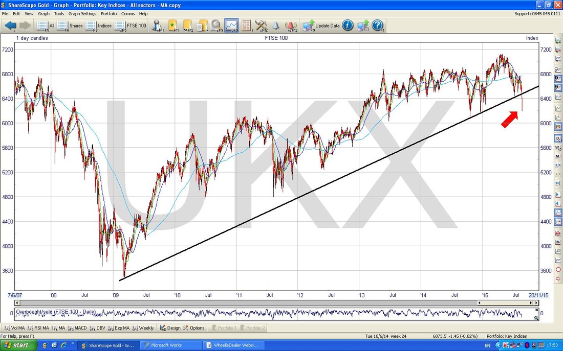
The next ShareScope ScreenShot below has zeroed in to the last year ish. This shows more clearly the ‘Violation’ of the Black Uptrend Line and I have marked the failure of Support with the Green Arrow. Note also the Horizontal Support from below at 6144 and 6072 I have marked with the Green and Mauvey kind of lines - if 6072 Fails to hold as Support then we have a Big Problem and a Bear Market is probably in the offing.
The Red Arrow marks where we have had a ‘Dead Cross’ between the 50 and 200 day Moving Averages - this sounds bad and it is not good at all. However, look back to the left of the Screen at the Blue Arrow - a similar Dead Cross happened here but we pulled through. Another Bear Market thing to watch is if the 200 Day Moving Average and 50 Day Moving Average both turn down together and are falling. This is not necessarily the End of the World but it’s a good sign things could be betting ugly. At the moment the 200 day MA is sort of flat to slightly up (the 200 Day MA is the lighter Blue Line and it’s less wiggly than the 50.) 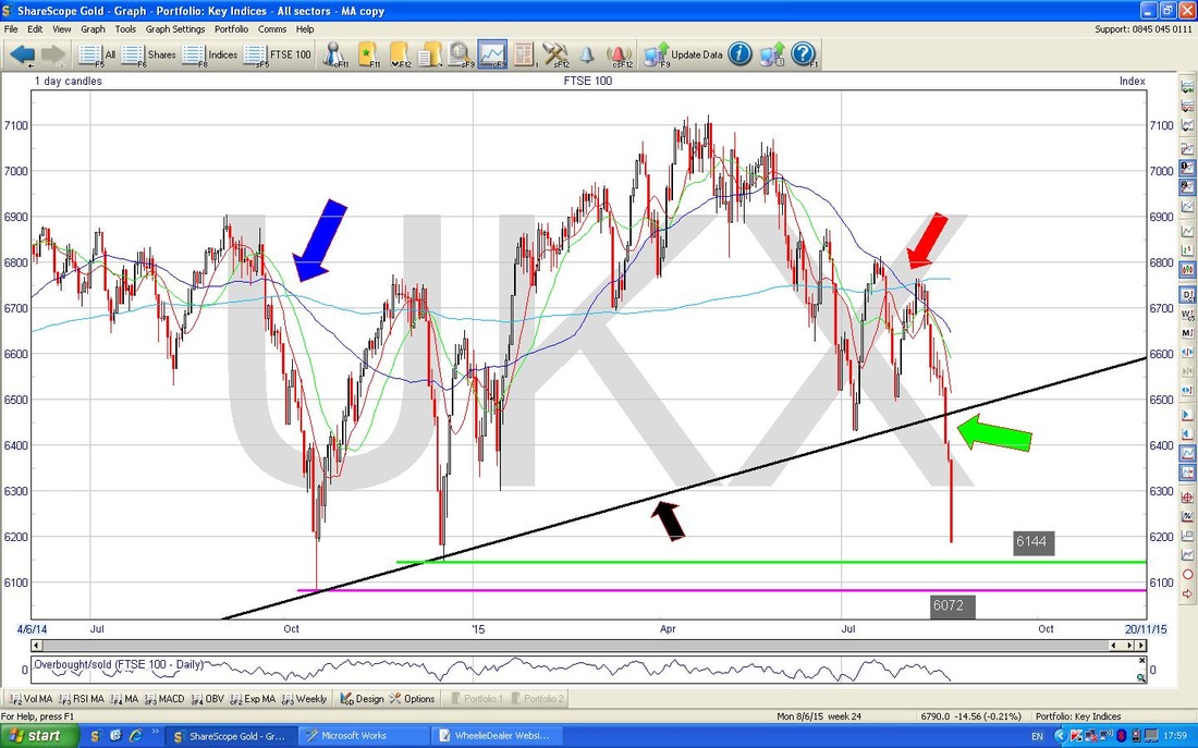
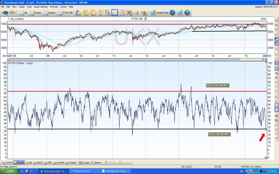
The Screen below in the Bottom Window shows the Relative Strength Indicator (RSI). Note my Red Arrow where the FTSE100 is currently reading an RSI of 28 - that is very low as you can see if you look to the left - it is Oversold and suggests a bounce is due imminently. This is one of my favourite Indicators and it measures the force of the move (acceleration) - what this is telling us is that the force of the move down is waning.
The Indicator below is the ‘Overbought/Oversold’ oscillator - I have utterly no idea how it is calculated but that is irrelevant anyway - what matters is that it is a brilliant indicator of very short term moves - in this case, my Red Arrow marks that we are very low compared to the last 6 years and only where my Green Arrow is did it go lower - so maybe we can go lower but it is unlikely to be much more downside from here before a bounce.
Putting my ‘Cock on the Block’, I would guess at a bit more Selling tomorrow and maybe Tuesday and then a bounce will start on Wednesday. However, of course the bounce could start tomorrow - things look very Oversold. I will follow what the Charts / Candles tell me. What I would like to see is one of the following:
If we get the Harami or Hammer Candles, then I might be very tempted to take my Short Position off or maybe to halve it. The danger with taking the Short off is that any bounce might not be long lived - maybe just a couple of days before it turns down again - so I would need to be nimble. 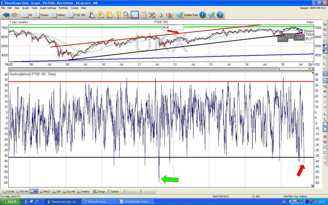
DAX
The Chart below is the German DAX Index over 6 years - this is the best Proxy for ‘Europe’. Note the Price is still nicely within the Uptrend Channel, unlike the FTSE100 - I suspect the FTSE100 has suffered due to its Oil and Miners. Note my Blue Arrow marks a line of Horizontal Support which may hold. 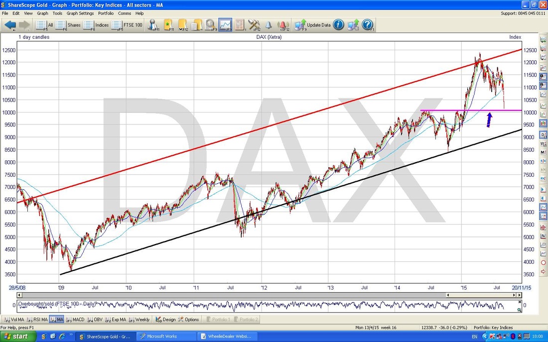
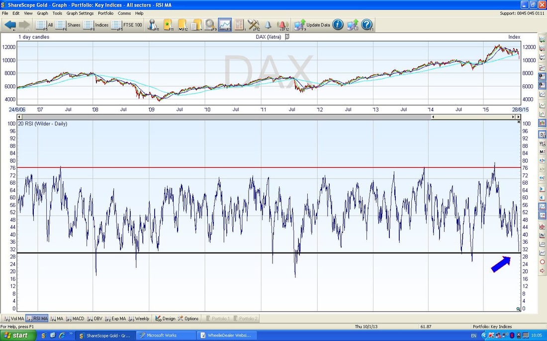
The ScreenShot below in the Bottom Window shows the RSI. As you can see from my Blue Arrow, it is a low reading at RSI 30 and is now Oversold but could go a little lower before a bounce.
S&P500
Many people look at the DOW but I tend to skip it really - with just 30 Companies it is not a great Indicator of the health of the US Markets - and it is worth appreciating that the US Markets are THE DOMINANT FORCE IN MAJOR INDEXES - “if the US sneezes, Europe catches a cold”. This could be a big driver for the FTSE100 - if the US avoids a Bear Market (and there is no sign it is entering one) then the FTSE100 will probably follow it. The S&P500 has 500 Companies in it - I bet you didn’t realise that !! On this Chart, we have the Long Term view - still in a nice Uptrend and a lot of room to move down before the Black Uptrend Lower Line fails (marked with my Black Arrow) - nothing to worry about here yet. My Blue Arrow marks where we are now. 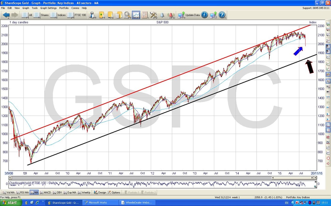
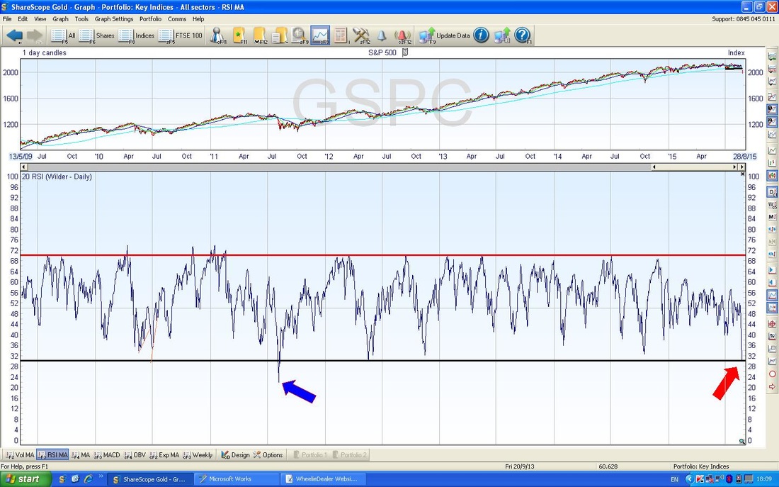
The Bottom Window in the Screen below shows the RSI for the S&P500. As you can see from my Red Arrow, it is at RSI 30 which is Oversold. Note my Blue Arrow from 2011 where the RSI went down as low as RSI 22 - so we could fall a bit more (but not much).
The Chart below is the Weekly Candles for the S&P500. I have put this in because it shows a common situation on the Weekly Candles for the Charts on ALL major Indexes. If you look at my Red Arrow, you can see a Big Ugly Red Down Candle - this is bearish and not nice.
If you now cast your eyes left to the Blue Arrow, note the Hammer Candle that I have marked. It seems likely to me that we need a Hammer on the Weekly Candles to enable the Market to Rally. This suggests more Selling and then a Reversal during the coming Week. This is the same on all Major Indexes - should be interesting to watch for. It is possible that we get a Harami - the Preggers Woman one - if so, we could rally from that. 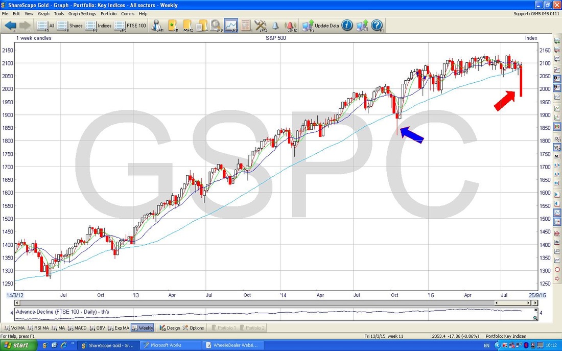
Nasdaq Composite
Pretty much same as S&P500 in most respects. RSI 30 also and therefore Oversold but could go a bit lower before a turn up. 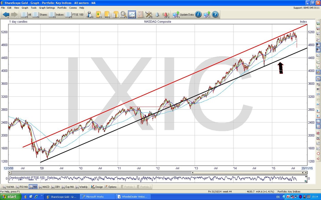
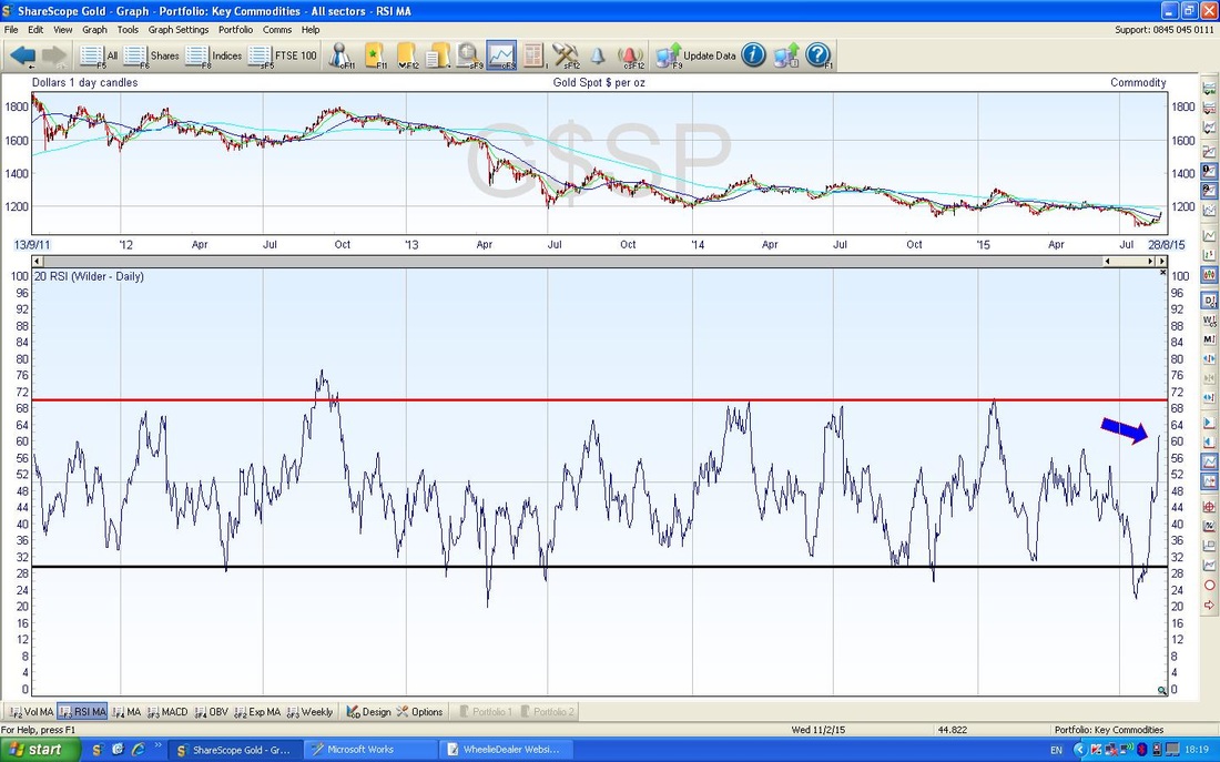
Gold
Ha Ha, time to wind up the Goldbugs again - my favourite bit of the Week. This is a very Long Term Graph of Gold. Note the Blue Lines mark the Uptrend and my Black Line and Red Line mark the new DOWNTREND. 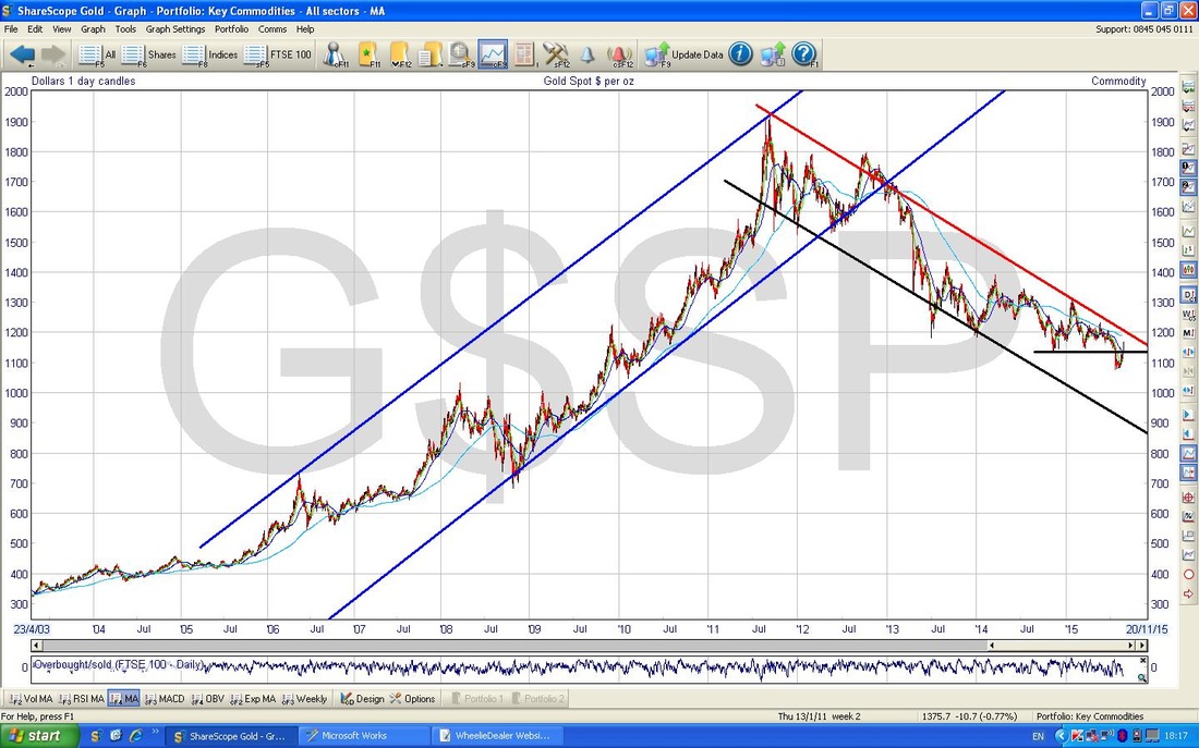
The Chart below shows Gold for most of 2015. Note the Red Lines top and bottom indicate the DOWNTREND. My Green Lines denote an UPTREND within the wider DOWNTREND - this is a ‘Retracement’ within the prevailing DOWNTREND.
My Blue Arrow points to a Doji Candle - this suggests the Upmove is running out of puff. The Red Arrow marks the Topline of the Downtrend - this will be hard for the Price to breakout of - however, if it does break out of this Downtrend, then Goldbugs would finally have something to really be cheering about. Just to dampen the spirits again, the Black Arrow marks the 200 day Moving Average line - this will be Resistance for the Price to get over and may cap further gains in the short term. 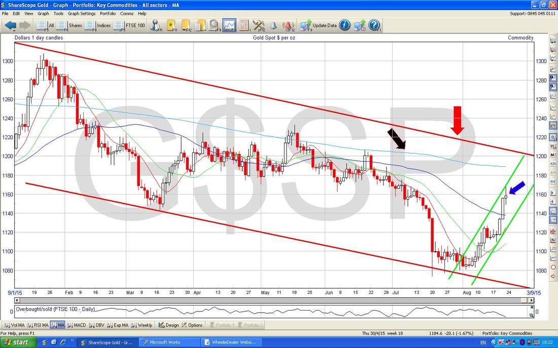
The Bottom Window of the ScreenShot below shows the RSI for Gold. Note the Blue Arrow where the RSI is up around 62 - it can go higher, but not too much.
Brent Oil
God knows what Oil is going to do - it has been an amazing Downtrend with no real signs of a break in the almost relentless move down. My Chart below in the Bottom Window has the RSI readings - note my Blue Arrow shows the RSI is very Oversold but look to the Left at my Red Circle - this shows that even though the RSI is low now, it can and does go lower - it is also worth bearing this in mind when looking at RSI on any Charts - No Indicators are foolproof and perfect - they are just the best Indications you can get. That’s it for tonight - it’s gonna be an interesting week I am sure !! wd 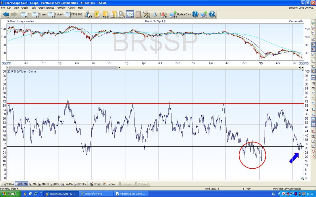
6 Comments
Phil Sloan
25/8/2015 04:40:59 am
Hi Wheelie
WheelieDealer
25/8/2015 02:52:00 pm
Hi Phil, Funnily enough I have been working on a Blog Draft tonight about my experience of yesterday - it felt truly Historic (in a bad way) and I am trying to capture the essence of it and the Lessons we can learn. It will most likely go live in about a week.
Jon H
25/8/2015 02:51:56 pm
Well done - Good to predict what is going to happen before it does rather than explaining the chart after. The bounce came today even though on Monday it sunk below 6072 (your bear point). Could you not argue that it was the Chinese bank intervention that caused it to bounce rather than being oversold? Surely if China had not intervened there would have been no bounce and the market would have sunk further.
WheelieDealer
25/8/2015 02:57:22 pm
Hi Jon, Great to hear from you. As usual it's a case of trying to figure out what is most likely to happen next - I have got it roughly right so far but I have just seen how the US has reversed to the Downside so that may cloud the picture. Crazy times.
catflap
29/8/2015 11:38:50 am
Interesting post. This is great commentary for inexperienced investors, like myself, who understand a little about charts, but not enough. Ive only just found your blog. I appreciate the exfort it takes to create the charts and write these essays.
WheelieDealer
29/8/2015 02:08:30 pm
Hi catflap, thanks for your supportive comments. I hope my Website and stuff can appeal across a wide spectrum of Skill Levels but I particularly want to help the people starting out. I find doing the whole WD thing (Twitter especially) hugely helps my discipline and I am learning so much from some truly great investors who I interact with a lot. Good Luck for the coming week !! cheers, WD Leave a Reply. |
'Educational' WheelieBlogsWelcome to my Educational Blog Page - I have another 'Stocks & Markets' Blog Page which you can access via a Button on the top of the Homepage. Archives
January 2021
Categories
All
Please see the Full Range of Book Ideas in Wheelie's Bookshop.
|
