

|
educational blogs |
|
I wasn’t intending to write this Blog but as I was doing the OPAY Buying Rationale one lately, I realised it was getting a bit lengthy and I decided that I could write a separate Blog on the timing of my Buy. It then occurred to me that I could flatten several flocks of feathery creatures at the same time with one almighty chuck - as well as the OPAY Buy it gives me the chance to show how I use Technical Analysis to time Buys and Sells, and also how ShareScope software helps me with this. As I have mentioned many times, I tend to use a thorough Fundamental Approach (read my OPAY Rationale and you will get a feel for how I look at companies in the round) to select stocks I want to buy and then I use Technical Analysis to time my Sells and Topslices. On a general note, I still find it surprising that so many Investors hardly use charts at all - they purely stick to Fundamentals. Equally strangely, some people just use Charts and do no Fundamental Analysis - I sort of get the logic (“all available information is in the price”) but it seems rather alien to me. Nope, for me personally, it has to be a Simple and Effective combination of the 2 techniques. The rest of this Blog will focus on the OPAY decision, no doubt with some General Snippets thrown in as they enter my brain and find their way down my arms and via my fingers to the keyboard. I will present a chart of a Technical Analysis (TA) Concept and explain what it means and how I applied it for OPAY. I did a ScreenShot for each Chart on Tuesday 11th November 2014 after market close - so remember this if you look at the charts after reading this Blog and they look different. Uptrend Channel The chart below is pretty simple and it just shows the Share Price over nearly 2 years. This kind of chart is always my Starting Point on any New Share I look at - I want to see what the ‘Trend’ is over a long period of time. A simple rule worth remembering is that Longer Term Trends are always Dominant over Shorter Trends - for example, you can have a Downtrend over several weeks within an Uptrend over many months. In this example, the likelihood is that the shorter term Downtrend will fall in line with the Longer Term Uptrend and reverse upwards. Note I used the word ‘likelihood’ in the last sentence - it is important to realise that EVERYTHING to do with TA or Charting (same thing) is Probabilistic. What this means is that nothing is a certainty (i.e. 100% guaranteed) in Charting - all TA concepts and Tools have their own Probability. For instance, a 1 year Uptrend might have an 80% Chance of continuing higher whereas a 2 week Downtrend might only have a 40% Chance of continuing. That is a simplistic example but please take onboard the concept - there are no certainties in TA - but some things are more likely than others. 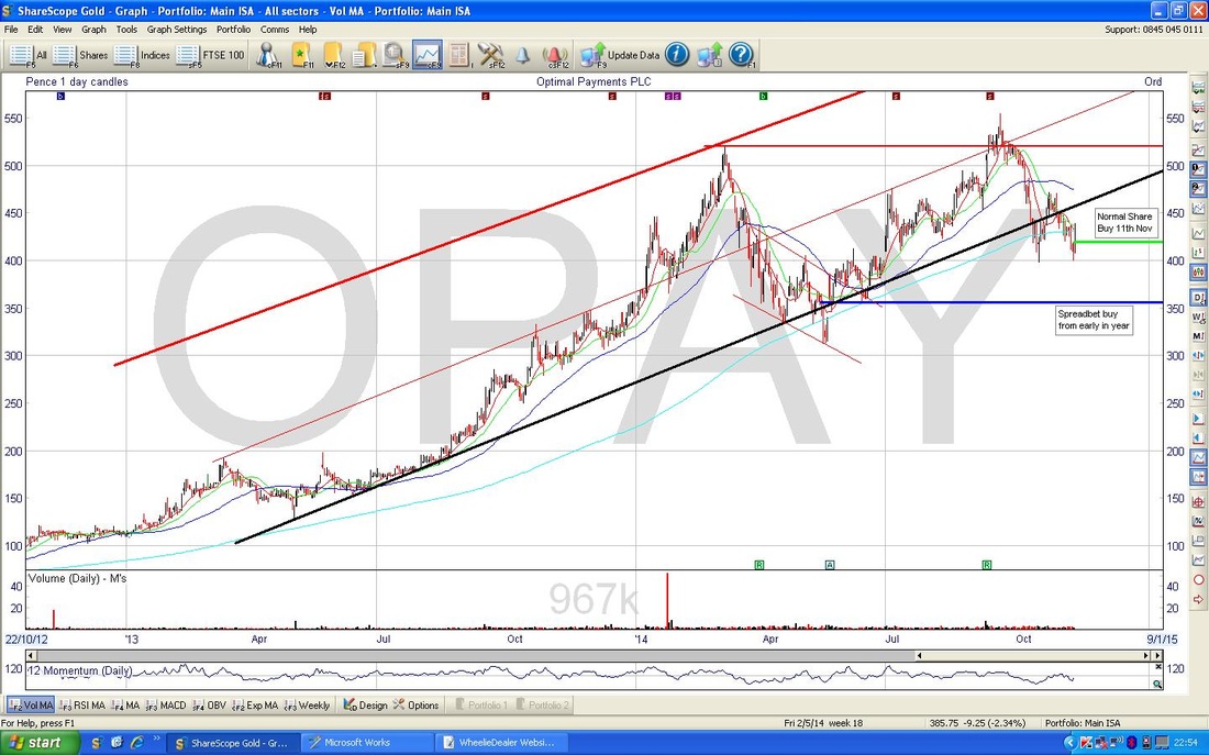 Right, where was I. Oh yes, OPAY fairly Long Term chart. As you can see, I have used ShareScope to ‘draw’ lots of silly lines in various colours. The most important ones here are the Left to Right Upward sloping Black line underneath the Share Price and the sort of Parallel thickish Red line at the top of the Chart.
These 2 lines mark my ‘Best Fit’ lines to form a Channel in which the Price has moved for nearly 2 years. When I say “Long Term Uptrend” or “Long Term Uptrend Channel” this is what I mean. I probably Tweet a lot with these kind of words. If you are ever unsure whether or not a Price is in an Uptrend or Downtrend (don’t worry, with practice you will see it instantly) the best way to see it is to look at the 200 day Moving Average (MA). On this chart, the 200 day MA is the very faint sort of wavy Blue line underneath the thick Black line, that sort of follows it quite well. Sorry I did not point it out more clearly but I only just thought of this aspect. The Black Line at the bottom of the Uptrend Channel represents a line of ‘Support’ - this is where the price moves down to and finds ‘Support’ as the buyers come in and drive the price back up - i.e. it gets so cheap that buyers flock in to pick stock up. My convention is to draw Support lines in Black. The Red Line at the top of the Uptrend Channel is a ‘Resistance’ line. This is the opposite of Support - in this case, the Buyers drive the price up and at the Resistance Level, the Sellers take the upper hand and start selling to get a relatively High Price for their stock. You will see a Horizontal Blue line and a short Horizontal Green line - as per the Text Boxes, these are lines I put on the chart to show when and at what price I entered my Buys. I always follow my own little convention of doing Normal Shares in Green and Spreadbets in Blue. Please ignore the ‘Momentum’ window right at the bottom of the Screen - maybe another Blog at another time - but to be honest I don’t really use it much - I have other similar tricks that I will show you in time. Waves I am slightly going off the thread, but worth a quick word here on the concept of ‘Waves’. I am a great believer in the idea that Buyers and Sellers move in Waves - I don’t mean that Elliott Wave Boll*cks you may have heard about - I don‘t understand a word of that. No, I just mean that Prices wiggle around in a sort of Wave. When the price gets down towards the Black Support line, the buyers come in like a Wave and gradually push the Price back up to the Red Resistance line where the Energy of the Wave dissipates and the Sellers come in and start a new Wave that this time goes downwards - I hope that makes some sense. You can see it clearly on this chart, or on the beach at Brighton……. Here I go again, another tangent. I just mentioned ‘Elliott Waves’ - it brings me to another important idea in TA. My contention is that TA only works well if you keep it simple - complexity just gets you in a confused pickle. If you ask me, Elliott Waves are a classic example of utter unnecessary complexity that is best avoided - think “Simples” like the Meerkats…….. What does this Chart mean for OPAY? Not a huge amount but what it does mean is vital - OPAY is in a lovely Long Term Uptrend and has momentum in that direction. A very simple idea to take on board is that you want to buy shares in Long Term Uptrends and avoid shares in Long Term Downtrends - unless of course you Short them. The Chart also clearly shows where the Price finds Buyer Support and where it hits Selling Resistance. Remember I said that TA is always Probabilistic? Well, what this means for the OPAY Long Term Uptrend is that it could fail - i.e. the Price could fall below the bottom Black Support line and a Downtrend could develop. This is a clear risk and it must be understood as a Probability. Experience tells me that these sort of well established Uptrends are pretty strong and there is a high likelihood this will continue - probably about 70%, with obviously a 30% chance that a New Downtrend will form. So the Odds are stacked in my favour. It is important to understand that in Investment there are no certainties. Be it Fundamental Analysis or TA, we are always trying to stack the odds in our favour but Plane Crashes are always possible - we are just trying to reduce such an Outcome. As a Long Term Investor, if the Uptrend fails I will be disappointed, but it probably means I will be able to buy more stock at an even better price in time. But you need to be careful as a Downtrend can form long before a News item is issued announcing a Profit Warning……. Just for information, someone with a Trader approach would most likely Sell a position if the Bottom Support Line of the Uptrend Channel were to fail - even if it means taking a loss. Simples…….er, not really. Change of Plan Right, as is my usual trick, I have changed my mind about how I am writing this Blog. It has now officially become a Series of Blogs (ooohh, I bet you are excited now - everyone loves a Cliff-hanging Serial - ok, maybe not in this case) and I will end this one here and shove it on the Website and carry on over coming days with the next bits. Give you poor (but wonderful to have got this far !!) Readers time for your overheated brains too cool down…… God my brain hurts……
3 Comments
cJ
13/11/2014 03:50:31 pm
Massively excited by this series WD, so great for relatively inexperienced investors like me to have the chance to learn the ins and outs of stock selection! Thanks
WheelieDealer
17/11/2014 02:40:37 pm
Hi CJ, Glad you like it. I am fully aware that I am not really catering enough for inexperienced and Newbie Investors - I will try and address this soon. In the meantime, for any Brand Spanking New readers - I suggest the best thing you can do is nip over to Wheelie's Bookshop and buy Naked Trader 4....and keep visiting WheelieDealer. Leave a Reply. |
'Educational' WheelieBlogsWelcome to my Educational Blog Page - I have another 'Stocks & Markets' Blog Page which you can access via a Button on the top of the Homepage. Archives
January 2021
Categories
All
Please see the Full Range of Book Ideas in Wheelie's Bookshop.
|
