

|
educational blogs |
|
I am running behind today so time is short - on that basis I will go straight into the Charts that matter.
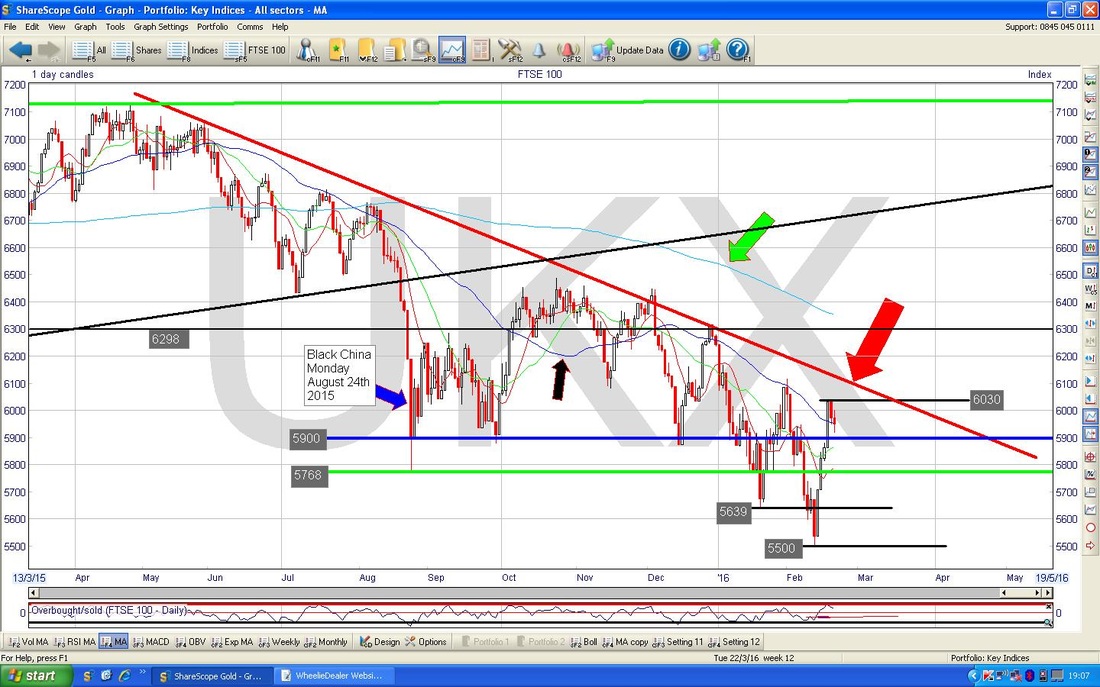
FTSE100 The ShareScope ScreenShot below shows the FTSE100 Daily Candlesticks for roughly the last year. First thing to notice is where my Big Red Arrow is pointing to the Red Downtrend Line - this is dominating this chart and acting as huge Resistance to the Price moving higher.
The next thing is marked by my Green Arrow which is pointing out that the 200 Day Moving Average (the feint Blue Line) is falling - this denotes a Downtrend in the Price. Note also the Numbers which denote Support Levels below the Current Price and Resistance Levels above.
The Screen below zooms in to the last 4 months ish. My Big Red Arrow is pointing to a level on the Red Downtrend Line where the Price needs to Breakout to beat the Downtrend - this is about 6100.
My Green Arrow is pointing to a ‘Doji’ Candle which was generated on Friday after a Red Down Candle from Thursday. It would have been expected (by me anyway !!) that the FTSE100 would have dropped more on Friday because the Setup was there - but in reality Friday was a day of uncertainty where neither the Bulls or the Bears were really in command. This hints that maybe the Market will not fall further in coming days, but there are other Charts which conflict with this and the Oil Price looks weak as we will see later - obviously a falling Oil Price could drag the FTSE100 down as several of the largest FTSE100 Stocks are Oil Companies (RDSB, BP. etc.). Note my Green Arrow also points to the Blue Wavy Line which is the 50 Day Moving Average - it is possible that the FTSE100 finds Support here. Note however that the 50 and the 200 Day Moving Averages are both falling - this is not good. 6030 is clearly Resistance that needs to be got over soon. 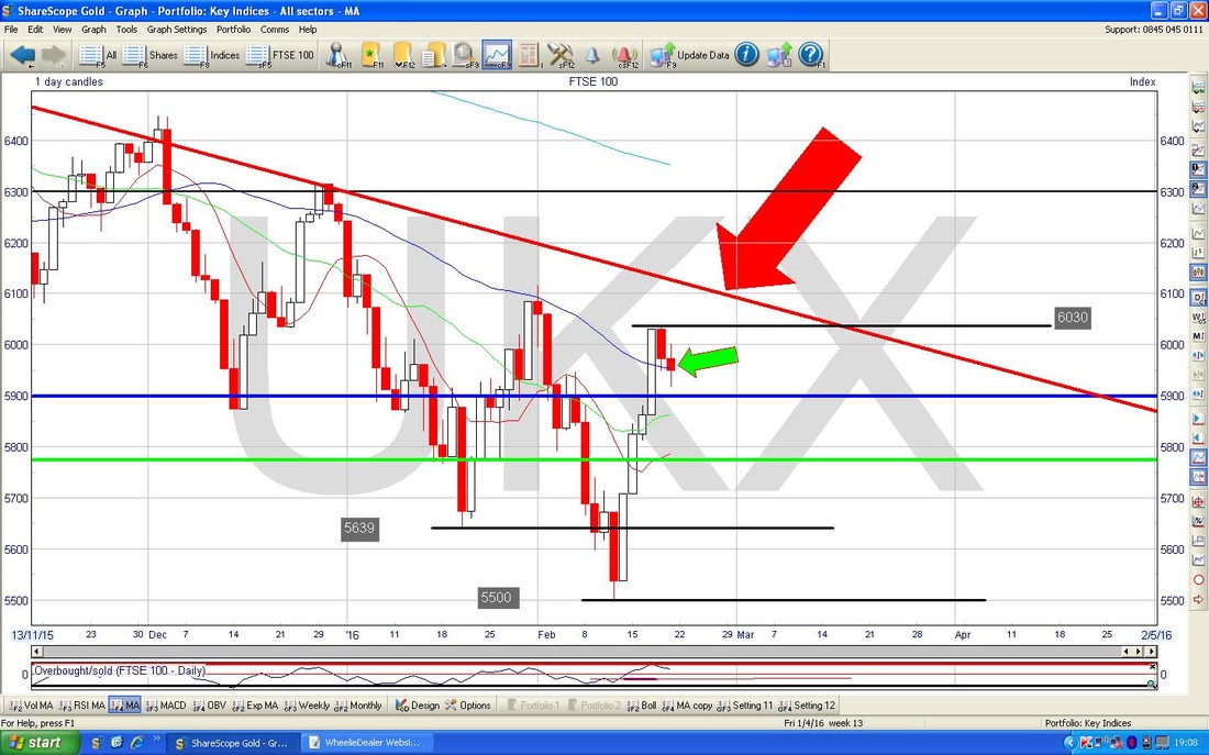
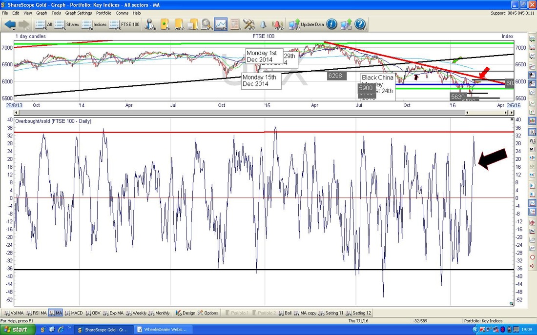
The Screen below shows in the Bottom Window the Overbought/Oversold Indicator for the FTSE100. You should be able to see with my Black Arrow that this is very high and has dropped off from the recent peak. This suggests the FTSE100 needs to fall a bit.
The Bottom Window of the Screen below shows the Relative Strength Index (RSI) for the FTSE100. Note where my Black Arrow is pointing that there is a reading of about 51 and it has dropped from the recent Peak. Normally RSI 70 (where my Red Horizontal Line is) would be an Overbought level, but note my Blue Horizontal Line around RSI 62 which is the level as which the FTSE100 has turned down over most of the last year.

The Screen below has the Bollinger Bands for the FTSE100 - my Black Arrow is pointing out how there is a ‘gap’ between the Top Bollie Band and the current Price level - maybe the Price will try to rise to fill the gap. However, look back to the left a bit, and you will see my Blue Arrow which points to where we had a similar gap before - so maybe it is not gonna get filled. However you cut it, the Price is near the Upper Band.

The Chart below has the Weekly Candles for the FTSE100 - note the very clear Downtrend Channel marked by my Black Lines. My Blue Arrow points to the ‘Wick’ on the Candle from Last Week which shows that the Price could not stay up at its Highs - this is a bit of a negative - but not disastrous. My Green Arrow points to a Hammer Candle from the Week before - it is good that we got a nice Up Candle this last Week, but the Wick is a concern.
You can see this on earlier Charts as well, but note how the 50 Day Moving Average (the Darker Blue Wavy Line) has acted as a Level where the Price has moved up to and fallen away from for many many Months - often it overshoots a bit but ultimately it falls back. 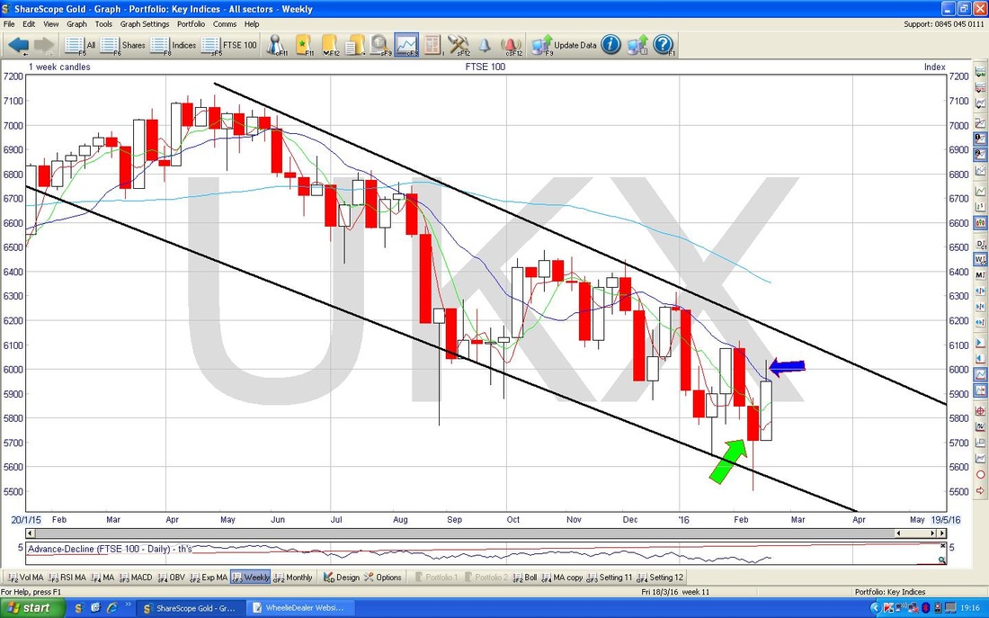
S&P500
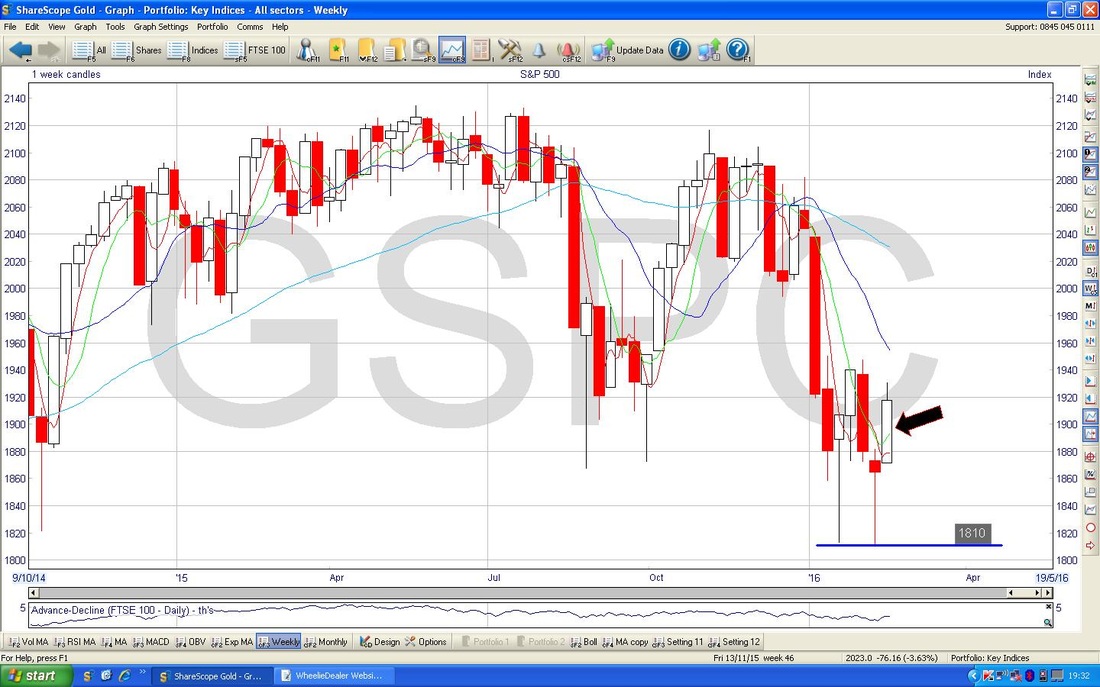
The Chart below has the S&P500 (the key US Index in my view) with the Daily Candles over about the last 9 months ish. Firstly, note my Mauve/Purple/Pink sort of Arrow pointing to a similarly horribly coloured Line. This Line marks a possible Resistance Line for the Price. My Black Arrow points to the 200 Day Moving Average, which, as with the FTSE100 is falling (but not as steeply) - which shows a Downtrend. My Blue Arrow is pointing to the 50 Day Moving Average, which is also falling. Note both of these Lines could act as Resistance. We will cover this more on the next Chart, but note the Support Level at the bottom of the Chart at 1812 (Red Horizontal Line) and the Resistance Level at 1950 (Green Horizontal Line) - could this be a Sideways Range in coming Weeks? 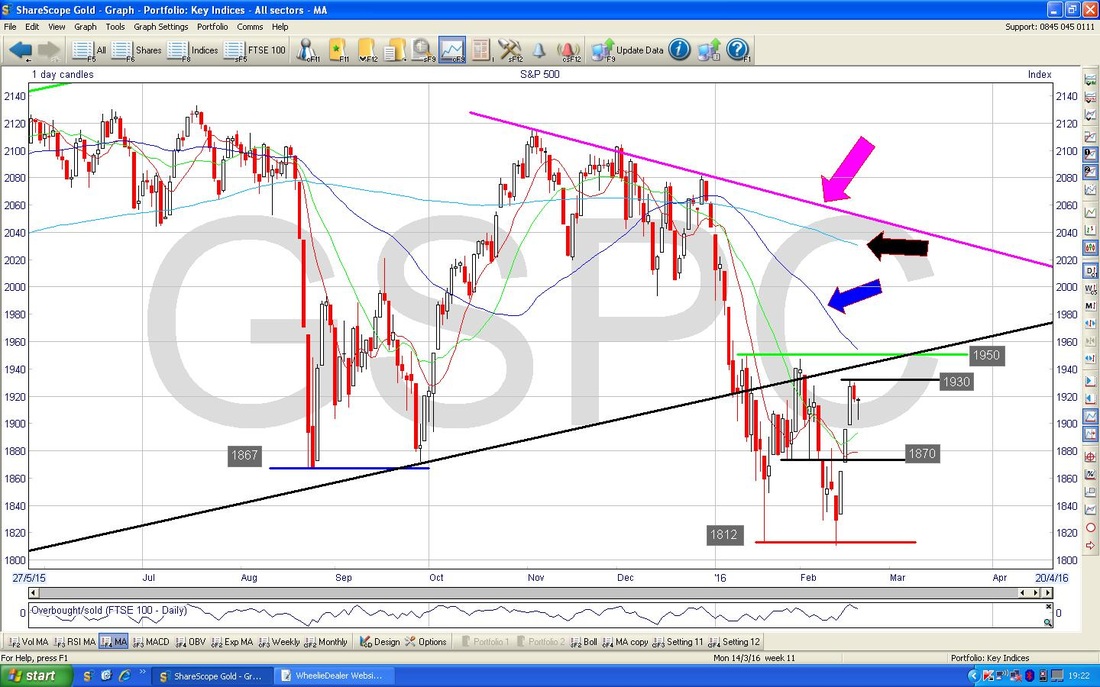
The Chart below zooms in a lot to about the last 3 Months. My Blue Arrow points to a nice Hammer Candle from Friday (almost a Dragonfly Doji - which is more like a ‘T’ shape) which is a promising sign after the Red Down Candle from Thursday - maybe it can rise from here.
My Black Arrows are pointing to Key Support Levels at 1812 and 1810 - I wonder if this is a ‘Double Bottom’ and you might be able to imagine a ‘W’ shape. I guess the test of such a Double Bottom would be if the Price can Breakout to the upside - we probably need to see it over the Green Horizontal Line at 1950. 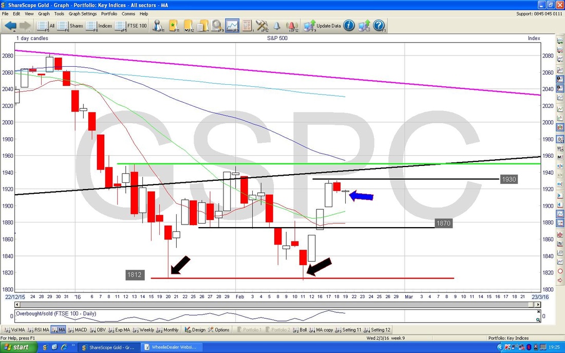
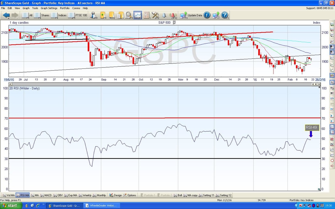
The Screen below has the RSI for the S&P500. It is currently at RSI 49 which is not all that high but it has turned down a bit - early days and not conclusive. For the Bulls, this RSI needs to get nicely over 50.
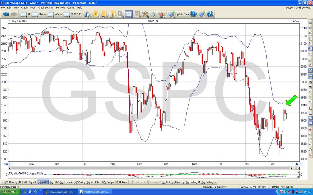
The Screen below has the Bollinger Bands for the S&P500. My Green Arrow is pointing to a gap as on the FTSE100 Charts we looked at earlier. If you look to the left, there are plenty of examples of similar gaps where it kept going down.
The Chart below shows the Weekly Candles for the S&P500 and my Black Arrow is pointing to a pretty decent Up Candle from Last Week. However, like on the FTSE100, we have a bit of a Wick which might not be so good - the Price was unable to hold its Highs. Note the Support Level at 1810, this is critical and must hold - if it breaks below, there is big trouble.
Nasdaq Composite
We start off with a Long Term Chart of the Nasdaq Composite Index - the Tech Index for the US. Note the very clearly defined Uptrend Channel and look at how my Blue Arrow is pointing to where the Price has broken out to the downside below the Bottom Black Line. This is not good. 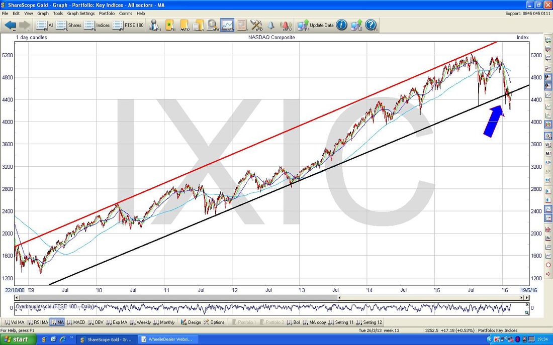
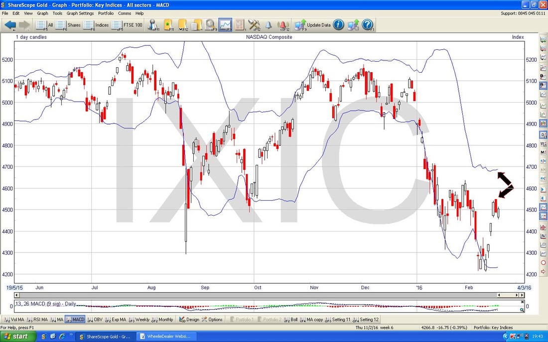
The Chart below zooms in to about the last 4 Months for the Nasdaq Comp. My Blue Arrow points to where we got a 50 / 200 Day Moving Average ‘Death Cross’ - yes, you’re no fool, you guessed right, it’s not a good thing.
Note the Lighter Blue 200 Day Moving Average Line is not falling all that much - it wouldn’t take much positive Price Action to get this level and even moving up - but I doubt that will happen. My Red Arrow points to the Darker Blue 50 Day Moving Average which is clearly falling. This will also act as Resistance - this is around 4700. My Black Arrow points to a decent White Up Candle from Friday - when I first looked at this I thought it was a good sign and then I dug through my Mental Memory Bank and had a feeling it might not be so positive. Anyway, I dug out ‘Candlestick Charting for Dummies’ (you can get a copy from Wheelie’s Bookshop) and if you look at Page 176 there is a ‘Double Stick Pattern’ called a ‘Bearish Thrusting Lines’ - I think this could be what we have here - so it’s perhaps not so good. Again, I wonder if a Sideways Range might be forming up - with the Floor at my Red Horizontal Line at 4210 and with a Ceiling at my Green Horizontal Line at 4636. 
The Screen below has the Bollinger Bands for the Nasdaq Comp - my Black Arrows are pointing to a big gap from where the Price is now to the Upper Band - maybe it will move up to fill this gap - but gaps are pretty common here.
Brent Oil
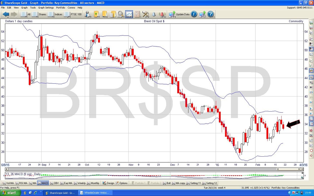
Below we have the Brent Oil Chart for the last 6 months ish. Note the Red Arrow which points to the Red Downtrend Line which is dominating this Chart - this is a Resistance Line that needs to be broken-out of. Note also the Blue Arrow which marks out the 200 Day Moving Average - this is around $48 at the moment - again, this could act as Resistance. My Blue Circle shows a strong area of Resistance between about $36 to $40 which will be tough to get over. My Black Arrow points to a Red Down Candle from Friday - after the ‘Inverted Hammer’ Candle from Thursday - which suggests the Price will drop in coming days. Note however, there is good Support at $30 where my Blue Horizontal Line is parked. $27 is Key Support which must hold where my Green Horizontal Line is. 
The Screen below has the Bollinger Bands for Brent Oil - my Black Arrow points to where the Price has fallen away from the Upper Band - this is textbook really and hints that the Price will fall to the Bottom Band around $30.
Gold
If you read my Index Update from last week, you will possibly remember I was drawing some alternative Upper Trendlines which in essence was the line marked by my Blue Arrow and Blue Line below. Anyway, I now think the Black Line and Black Arrow I have drawn in show where a very Clean Resistance Line is - although clearly I have been undertaking some ‘Line Fitting’ here which is not good practice in Charting. 
The Screen below zooms in to the last 4 months for Gold. Obviously it has had a really strong Run Up but this has faltered up around $1263. My Blue Arrow is pointing to a ‘Doji’ Candle which is a bit like a ‘Dragonfly’ but in this context it is probably more Bearish than Bullish - these Candles are Bullish after a sustained down move. I have drawn in various Support Levels and marked the Numbers.
My Black Arrows are pointing to where the 50 Day and 200 Day Moving Averages appear to be converging - we might get a ‘Golden Cross’ soon - unlike the one earlier, this would be very good news for Gold Bugs. 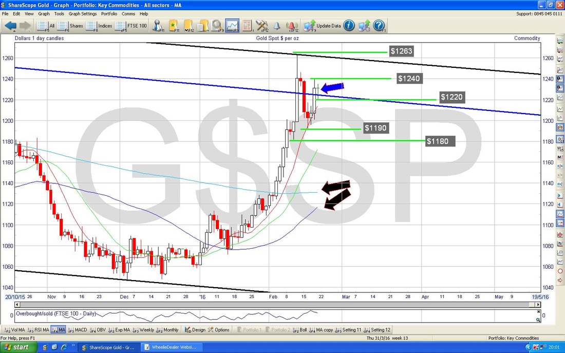
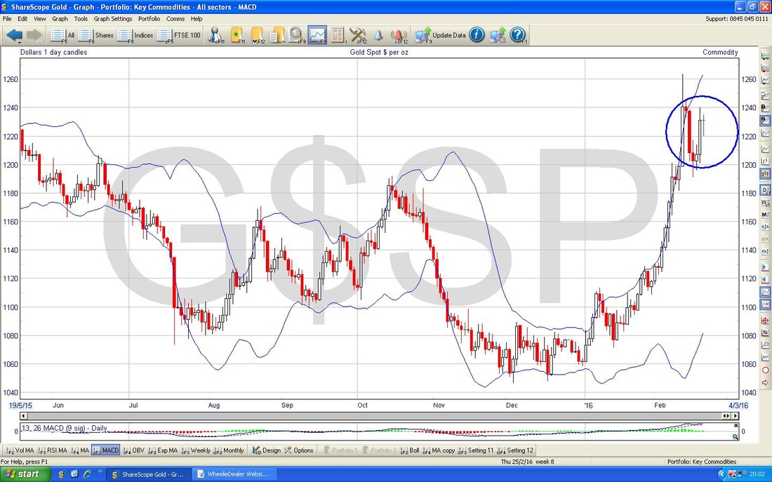
The Chart below has the Bollie Bands for Gold - my Blue Circle is highlighting how the Price has move away from the Upper Bollie Band - this is not so good and it suggests the Price will drop in the Short Term.
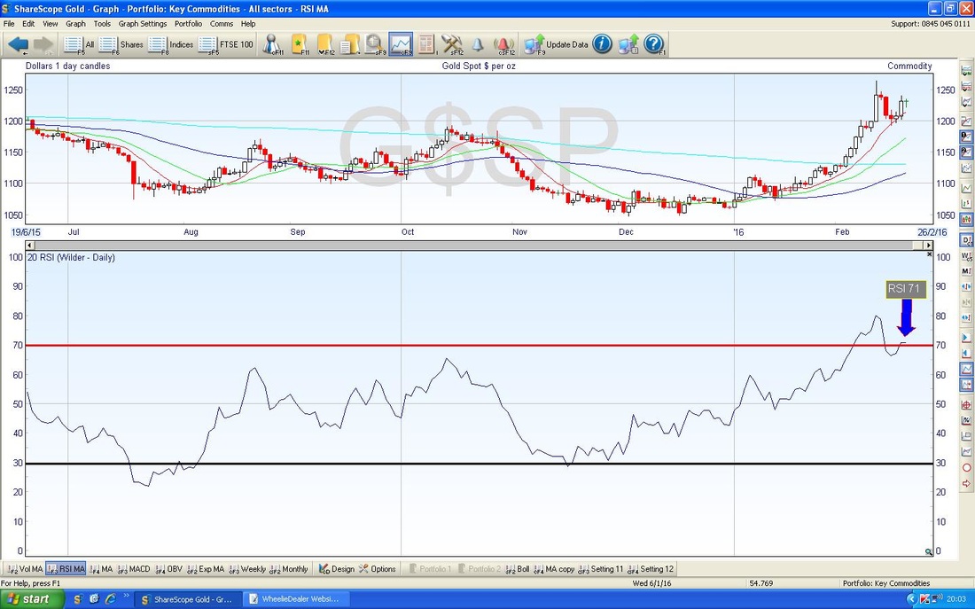
In the Bottom Window of the Screen below, you should see the RSI for Gold. At the moment it is reading RSI 71 which is extremely high - even though it has eased back a bit from the high of about RSI 80 of a few days ago.
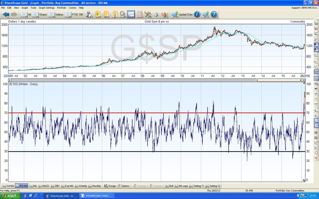
The Chart below in the Bottom Window has the RSI for Gold over loads of years - note how the RSI rarely stays up over RSI 70 for long.
My Screen below has the Weekly Candles for Gold. My Black Arrow points to a Hammer Candle from last Week - in this context, this looks Bearish.
Finito. Good luck for the coming Week, WD. 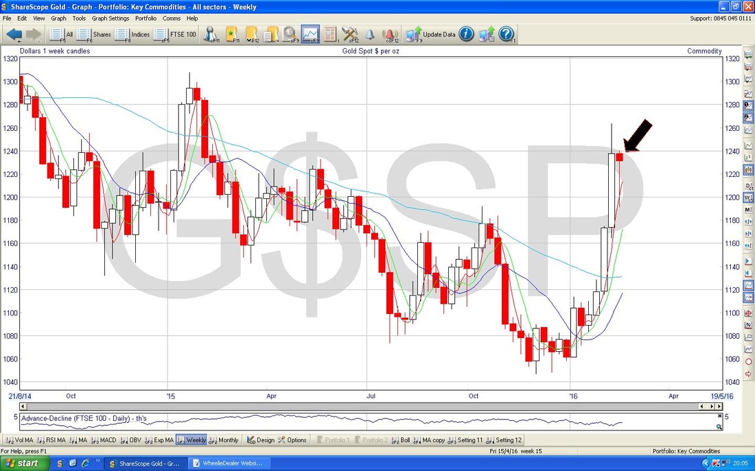
8 Comments
Anne Droid
21/2/2016 11:15:30 pm
Thanks
WheelieDealer
22/2/2016 07:32:36 pm
Hi Anne, no worries, great to hear you liked it :-)
Harry
22/2/2016 12:06:19 am
Very good WD. I know nothing about charting so very pleased to learn something from youself.
WheelieDealer
22/2/2016 07:36:22 pm
Hi Harry, thanks for your comments. Funny enough Oil seems to have totally gone against what my Charts hinted at - but that is the nature of things. In the Short Term I tend to find that Charting stuff is less precise (which is why Technical Traders need Stoplosses and Rules etc.) but the Major Trends are extremely powerful and are strongly predictive. I am not one of these people who only uses Charts but I do think it can help a lot layered on top of a Fundamental Approach. Cheers, WD
Ed
22/2/2016 09:53:40 am
Hate to think how long this blog would have been if you weren't short on time ;-)
WheelieDealer
22/2/2016 07:40:31 pm
Hi Ed, wow, I think I might have heard 'Little Arrows' by Leapy Lee (surely a made up name?) at some point in my life but that is a tad shocking - very appropriate though !!
catflap
22/2/2016 03:28:01 pm
Great post as usual.
WheelieDealer
22/2/2016 07:42:55 pm
Hi catflap - I was just typing similar in the 'Reply' box above - I reckon you are spot on, once Bulls start thinking they are off to the races again the Markets will most likely do their next leg down. It is notable that even after today's rally, the FTSE100 has still not cracked the 7100 level. Leave a Reply. |
'Educational' WheelieBlogsWelcome to my Educational Blog Page - I have another 'Stocks & Markets' Blog Page which you can access via a Button on the top of the Homepage. Archives
January 2021
Categories
All
Please see the Full Range of Book Ideas in Wheelie's Bookshop.
|
