

|
educational blogs |
|
THIS IS NOT A TIP. I AM NOT A TIPSTER. PLEASE DO YOUR OWN RESEARCH. PLEASE READ THE DISCLAIMER ON THE HOME PAGE OF MY WEBSITES. IF YOU COPY MY TRADES, YOU WILL PROBABLY LOSE MONEY.
If you follow me on Twits or have realised that on my Homepage there is a list of Changes to the Websites which also includes my Trades fairly soon after they happen, before I have got round to sticking them on the ‘Trades / Portfolios’ Page, you may have spotted that I bought more igIndex IGG Shares this morning at 743p a pop. As ever, time is limited so I will try and do this as short and punchy as I can - some Readers like this briefer style so I will probably only do Deeper Dives on smaller and unusual Stocks and when I wish to know more myself so I find the digging really helpful.
To free up the cash, I sold my AGA shares because it looks like the Takeover Bid is now a ‘done deal’ and I also ditched a load of crappy Small Miners which I had kicking around - feels great to have properly disinfected the Pigsty.
Why I bought
Risks
Valuation The Screenshot from ShareScope below shows in the Top Right Hand Corner the Historic Results - I include this to show the record of achievement in recent years. 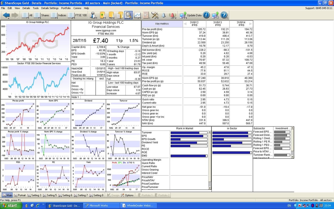
However, as nice as that is, I am much more interested in the likely Future - that is what will make me Money - the Past is gone. Finished. History (derr, obviously).
The ScreenShot below shows the Forecasts for the Next 3 Years. If you look at the ‘Norm EPS (p)’ figure for ‘May 2016 Forecast’ it is 44.19p (these are Consensus Forecasts). At my Buy Price of 743p this gives a Forward P/E of 16.8 for Next Year (743p divided by 44.19p). If we go forward a year, the EPS is 49.86p and at my Buy Price of 743p this gives a Forward P/E of 14.9, 2 years out. This really is not bad value at all for a Quality Stock with Market Dominance. In terms of Divvys, the Forecast Dividend for 2016 is 30.891p which at my Buy Price of 743p gives a Forward Divvy Yield of 4.2% (30.891p divided by 743p then expressed as a Percentage). In the Following Year, the Divvy Yield should rise to 4.7%. (at this point, your supposed to say “hey, Wheelie, that’s chunky dude !!” - go on, say it out loud, no one else is around on that Bus your sat on………) 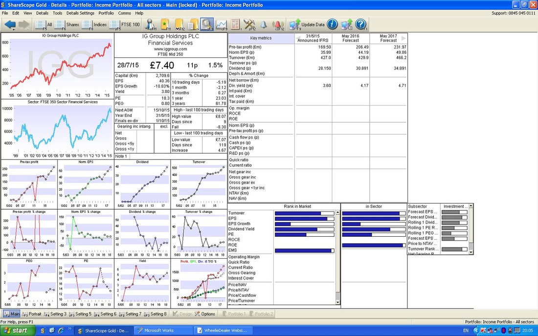
Target
For very Short Termers, I suppose a Target around 800p is on the cards. For more relaxed Investors, a Target of 900p or so probably makes sense. Taking things with a bit more of a WheelieDealer Long Term head, I see no reason why a stock of this calibre could not justify a P/E of 20. So, if we take the Forecast EPS for 2017 of 49.86p and slam it on a P/E of 20, we get near 1000p. To be honest, I sold my Shares that I had in my normal Trading ISA a few months ago and then had terrible ‘Seller’s Regret’. I shouldn’t have sold and I think that the right approach with this Stock is just to hold it forever (barring some totally unexpected disaster which radically changes the business - but this would be out of the blue). On this basis, it could be 1500p in 5 years time - who knows? It’s not hard to imagine 60p of EPS in some years, slam this on a P/E of 20 and you get 1200p. It’s not utterly daft. Technicals Right, why did I buy it now? As ever, the ScreenShots from ShareScope are as they confronted me last night when I made my Decision to buy more (Tuesday 28th July 2015). I will repeat myself for New Readers (thanks for bothering to read this all of you), but I always like to make Cool, Calm, Objective, Rational, Spock Like Decisions out of normal Market Hours. I find the Ups and Downs and shenanigans of the Market Day can hugely affect my mood and I like to make Decisions objectively from the Charts and I build up to these Decisions over many Days if not Weeks. Starting with the Long Term (as is always the correct way to view Charts) - this is a 8 year Chart or something daft - as you can see, it just goes up !! BEGINNERS TAKE NOTE - YOU WANT TO BUY STOCKS WITH CHARTS LIKE THIS !! 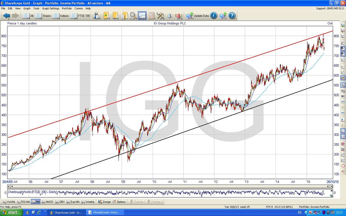
The next Chart zooms in a huge amount and looks at 2 and a half years. You still have the Upper Black and Lower Red Tramlines of the previous Chart, but I have added a new Line in Blue (I have also marked this with a Blue Arrow). The thing to note here is how the Resistance of much of 2013 and 2014 has now become Support - this is an extremely important concept in Charting.
RESISTANCE BECOMES SUPPORT and SUPPORT BECOMES RESISTANCE. Note how the Price has moved up off the Blue Line as it now acts as Support. The Green Arrow is pointing to the 200 Day Moving Average - this is a Long Term Moving Average and Prices tend to revert to this line before moving up again (unless it is in a Downtrend, when they tend to move up to the line and then fall back again.) 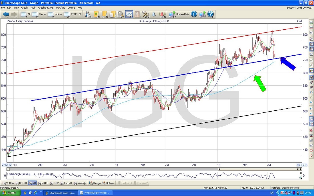
The Chart below shows the RSI (Relative Strength Index) in the Lower Window. As I have marked, RSI 30 is Oversold and RSI 70 is Overbought.
In this case, the RSI is around 43 but crucially it has moved up from around 40 - this is a good sign that the short term down move is coming to an end. 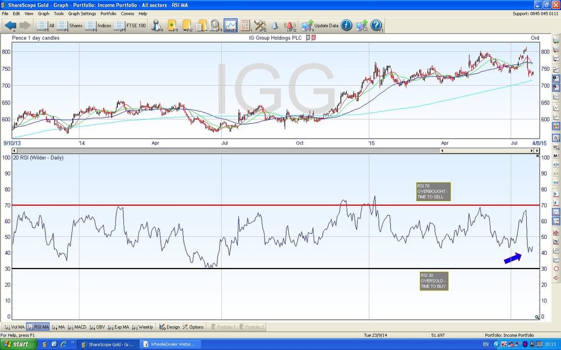
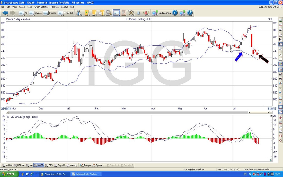
The ScreenShot below shows the Bollinger Bands in the Upper Window. The Blue Arrow marks the bottom BB - note how the Price in recent days has walked away from the bottom BB (as marked with the Black Arrow) - this is a sign the Price is moving up.
The Final Chart below shows the Weekly Candlesticks (i.e. these Candles form over 5 days) - the Blue Arrow marks the huge Down Candle from last week but note how it closed slightly up from the Lows around 725p which I have marked with the Black Horizontal Line.
The Green Arrow points to where we were as at Close of Play last night - it is too early to be definitive, but it is interesting for me as a Potential Buyer at that point in time, that 725p was clearly acting as Support this week also. Right, that’s it, laters, wd 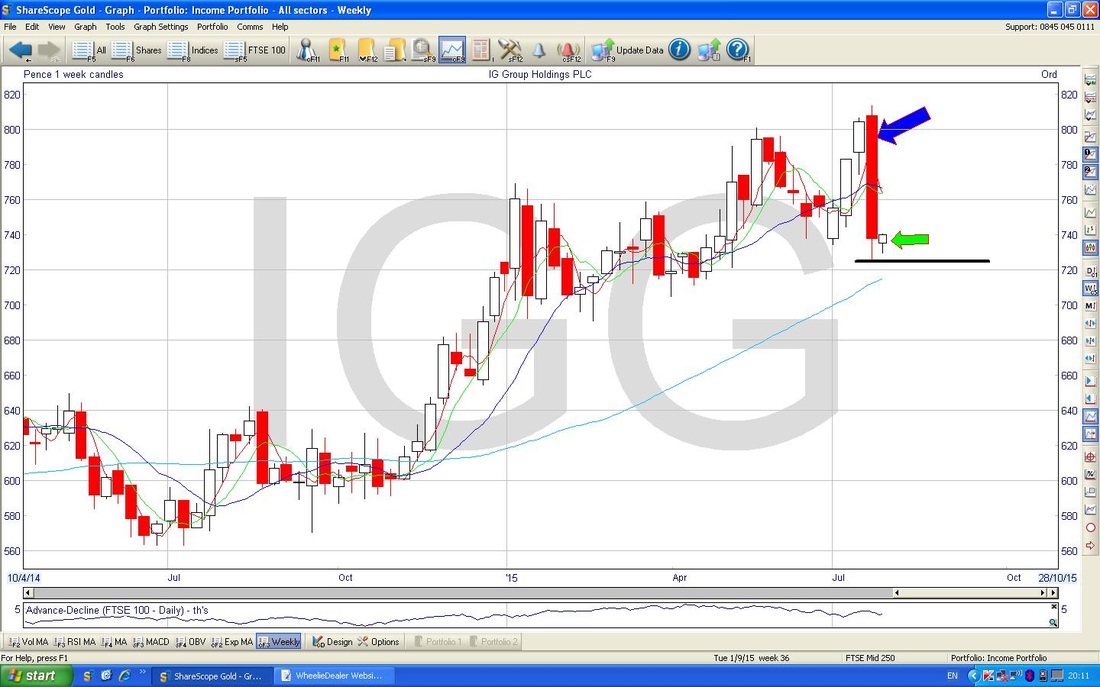
0 Comments
Leave a Reply. |
'Educational' WheelieBlogsWelcome to my Educational Blog Page - I have another 'Stocks & Markets' Blog Page which you can access via a Button on the top of the Homepage. Archives
January 2021
Categories
All
Please see the Full Range of Book Ideas in Wheelie's Bookshop.
|
