

|
educational blogs |
|
Well, after such a nasty week to start the year off, I think it is pretty crucial to look at the Indexes and get a feel for what the coming week is likely to bring us. Before we get stuck into the Charts, here are a couple of things from the UK Stockmarket Almanac 2016:
I find this latter stuff about the US Election quite interesting - there is so much Bearish talk around and of course the EU Brexit Vote could be really problematic for the UK Market, but the historical precedents are certainly favourable. This flies in the face of most of the stuff I am reading at the moment and it is not what I would expect - I think this will be a very tough year and the best we can hope for on the FTSE100 is a Range between about 5900 and 6450 maybe. Right, now the charts - overall I think we might get a little more downside early this week but then a good rebound - although there is a lot of Resistance up above nearby which will probably cap any bounce. FTSE100 OK, let’s start with the Long Term - here is a Chart of the FTSE100 from the Low in 2009. This clearly shows the Uptrend Channel marked by the 2 Red Parallel Lines and how the Price fell down through it back in the Summer of 2015. My Blue Arrow points to the Lower Uptrend Channel Line and this is probably going to limit any Upside for some time. If we are to make an assault on the All Time Highs at 7100 (I think this is very unlikely) then the Price will need to get over this Line (the Blue Arrow one). There are also 2 shorter lines below the Blue Arrow. These mark the important Support Areas that really must hold - firstly at 5875 and then at 5768 which is the Intraday Low of Black China Monday 24th August 2015 and if this latter one fails, then I think we are headed for a Bear Market and a major change of Strategy will be required - i.e. get Shorting like crazy. 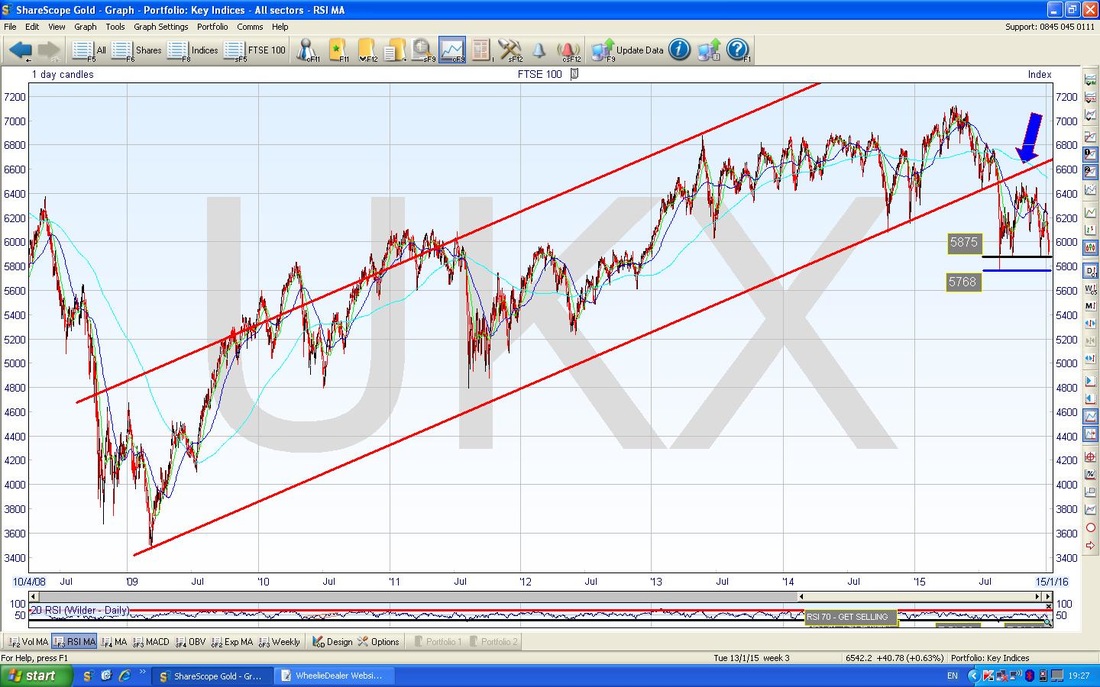
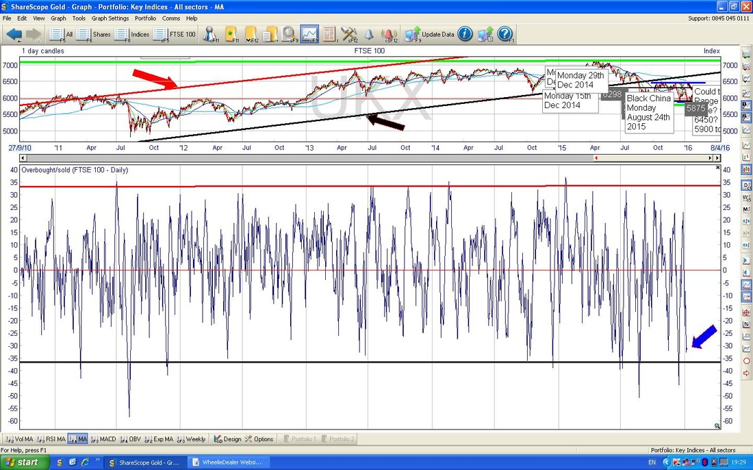
The Chart below is very similar to one I included in a WheelieBlog a few weeks ago - although I have tweaked it a bit. The Black Arrows point to a possible (and quite likely I think) Range between about 5900 and maybe 6450 ish - if we get a bounce soon, we will obviously still be in this Range.
However, the Green Arrow points to a Resistance Level at about 6300 which might be problematic - it is possible that any Range might be between 5900 and 6300. The 2 Key Support Levels of 5875 and 5768 are clearly shown. 5768 must hold at all costs !! 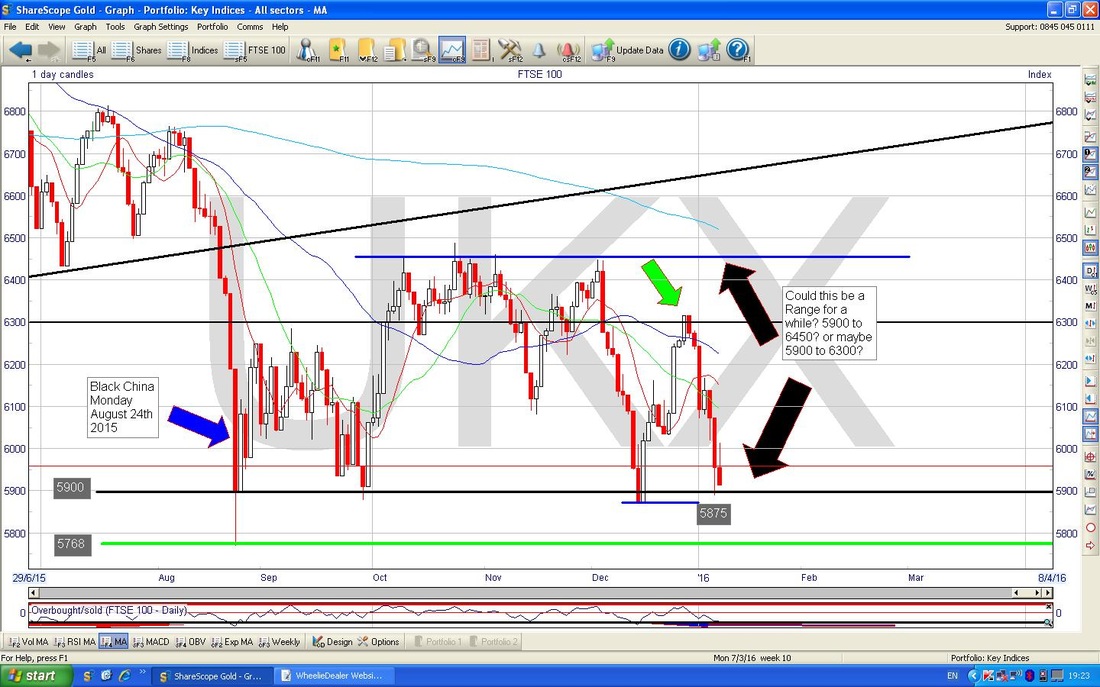
The Chart below shows the Overbought/Oversold Indicator in the Bottom Window. I find this is an excellent ‘Oscillator’ and quite predictive as an early warning of Turning Points - the Blue Arrow points to where we are now and it is obvious it is very low so a bounce is fairly likely soon.
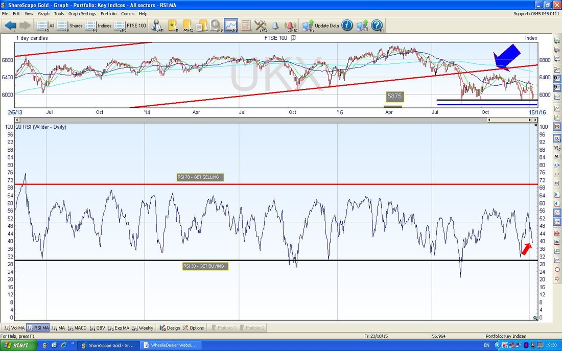
On the Chart below, the bottom window has the Relative Strength Index (RSI) in the bottom window. My Red Arrow points to where we are now which is a reading of about RSI 39. You can see from the Chart that the RSI often goes lower than this so I expect a bit more downside before we turn up. Maybe 1 or 2 rough days to start the week and then a bounce.
The Upper Window on the ShareScope Screenshot below has the Bollinger Bands. My Black Arrow points to where we are now and you should be able to see that we are very near the Bottom Bollinger Band - it seems likely we can turn up from here soon.
In the bottom window we have the MACD (Moving Average Convergence Divergence) Indicator. My Blue Arrow points to where we had a Bearish MACD Cross a couple of days ago and it would not surprise me if we go a bit lower here before turning up again. 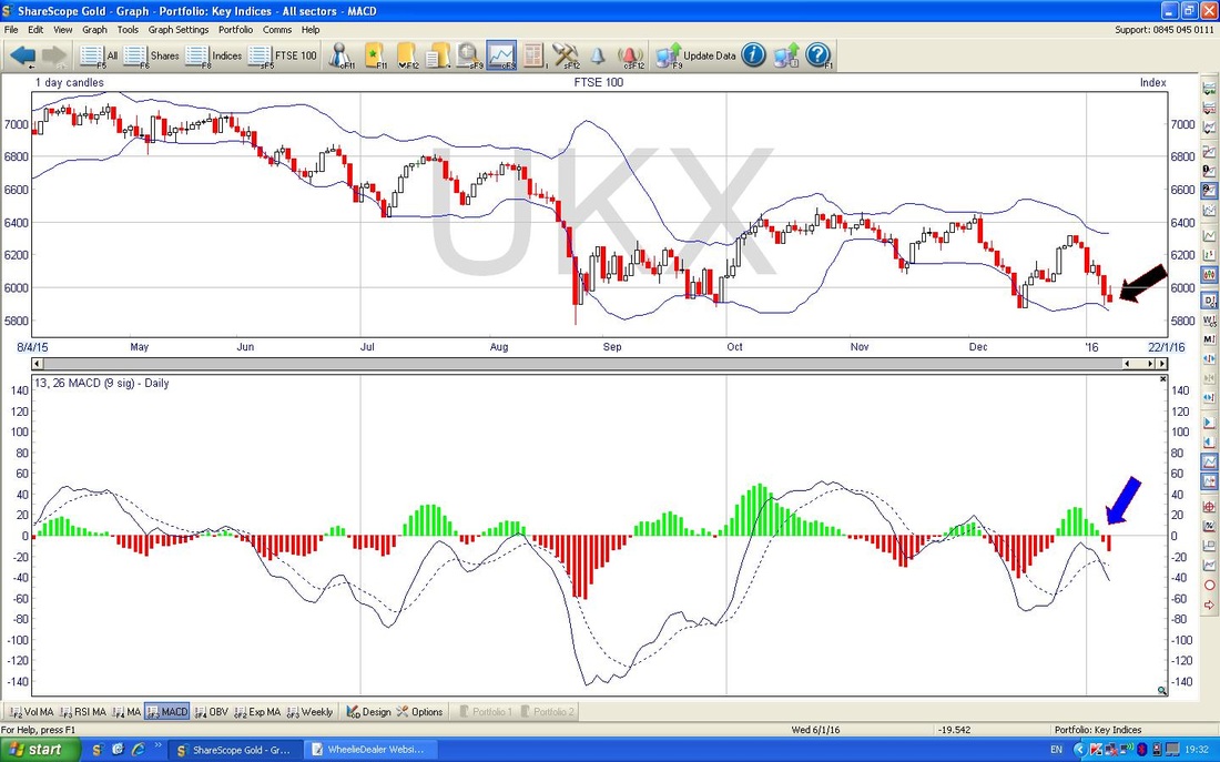
The Chart below has the Weekly Candles for the FTSE100. My Blue Arrow points to an ugly big Red Down Candle from last week which is obviously a Bearish phenomenon. The Black Circle shows a ‘Gravestone Doji’ which was formed the week before - look how predictive these things are !!
You may have seen on the Tweets that I have been annoyed with myself for not putting at least a Small Short on the FTSE100 after seeing this Gravestone Doji and other signs that the Market was going turn down. I did not put on a Short because I felt we were in a sort of surreal and strange Market after the Xmas period and things were a bit distorted. This was clearly a Cognitive Bias on my part and the lesson is that when the Charts tell you to Short you must Short. If in doubt, then do a Small Short but it is important to “Trade what you see, not what you feel”. After the Big Ugly Down Candle of last week, we now need a ‘Reversal Signal’ to be generated this week. That will be something like a Hammer Candle (the Green Arrow points to the sort of thing we need) or maybe a Harami 2-week Candle Pattern (like the ones in the Blue Circle). 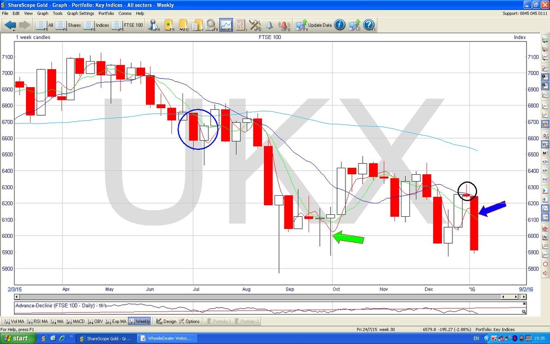
On the Chart below, we are still on the Weekly Candles but I have widened things out a bit to cover a few years. What I want to show here is a Bearish Development on the Moving Averages.
The Black Arrow points to a feint Blue Line which is the 200 day Simple Moving Average - note this is pointing down which shows a Downtrend. The Blue Arrow points to the 50 day Simple Moving Average - this is also falling and is clearly in a Downtrend. The Green Arrow points to a ‘Death Cross’ where the 50 Day Moving Average fell down through the 200 Day Moving Average. If we are going to avoid disaster (i.e. a Bear Market where the FTSE100 falls below 5768 and perhaps visits 5000 or less), then we need the Price to perk up very soon and get these Moving Averages heading upwards - it is quite a concern and something to watch in coming weeks. A Death Cross is really the opposite of a ‘Golden Cross’ - we need one of the latter pretty soon to have any hope of avoiding a nasty scenario. 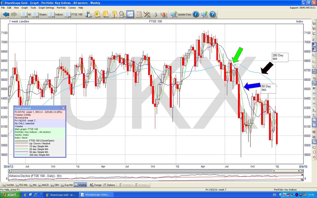
S&P500
We are gonna have some fun now. I have put in 2 Charts of the S&P500 going back to the Low point in 2009. On the first one below, I have drawn in the 2 Black Parallel Lines to show the Uptrend Channel. However, if you look closely you can see a set of alternative Red Parallel Lines which I have deliberately made quite feint. 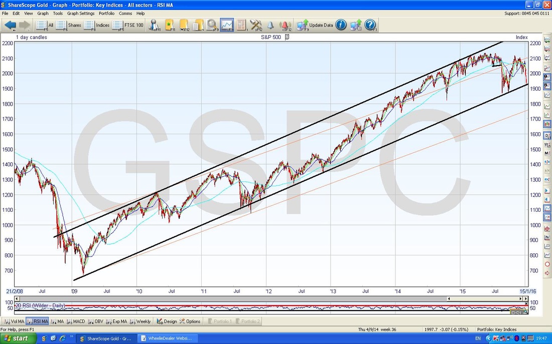
On the Chart below I have reversed this and the Red Lines are now bold and the Black Lines are feint. The Point here is that Trendlines can be subjective and it is not really an exact science - both of these sets of Parallel Lines could be valid, but obviously they have quite different implications for Support and Resistance and suchlike.
Anyway, however you cut it, the Price Line is still within both of these Uptrend Channels. 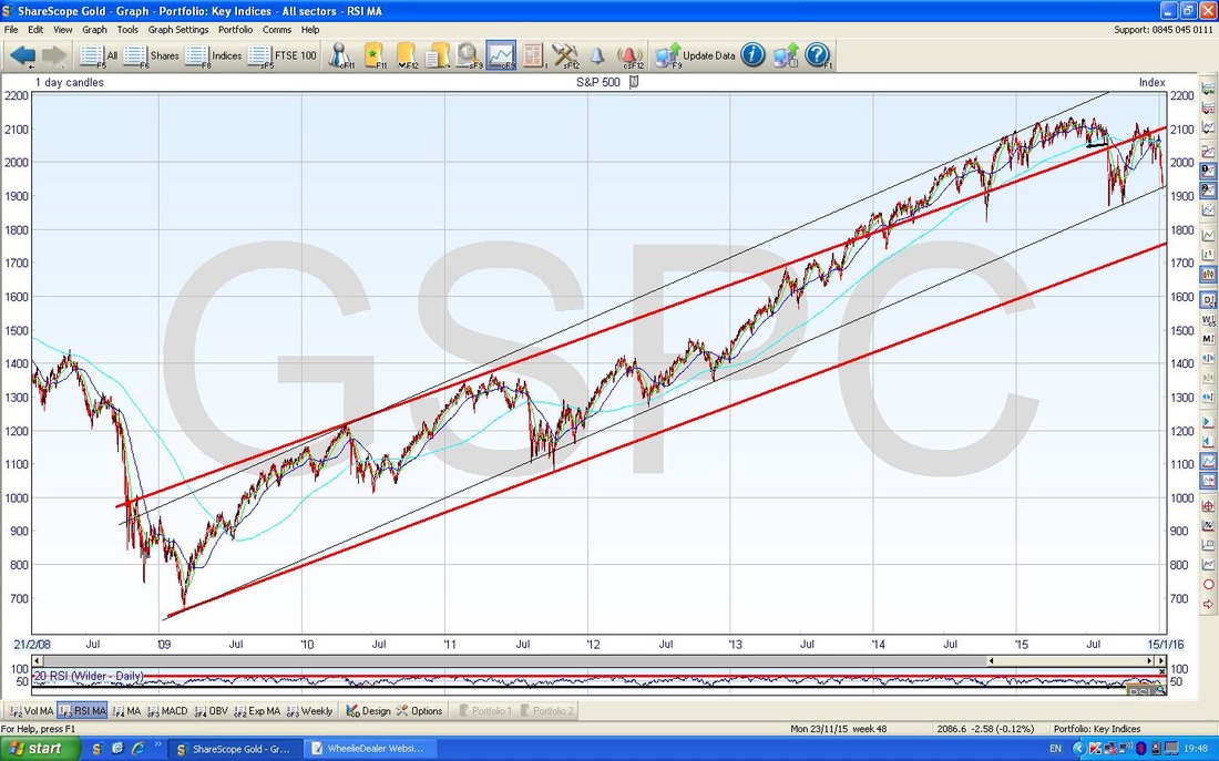
On the Chart below I have zoomed in to show about a year. You should be able to see that the Price is now sat on the Black Uptrend Line at the bottom of the screen at about 1920. This might act as Support from which the Price can move up. There is then Horizontal Support from about 1900 and 1880 with the Black China Monday low at 1867.
The Big sort of Mauve/Purple/Pink Arrow points to a similarly awfully coloured line which would probably act as Resistance if ever the Price were to get up that high - this might be problematic as Horizontal Resistance at 1990 (which I have marked) might limit any Price rise for a bit. It has just struck me as I type this (I had not really seen this before when producing the charts) that there is a sort of Triangle forming between the Black Line at the bottom and the Mauvy/Purply Line at the top. If the Black Line holds as Support (this implies a bounce Monday or Tuesday really) then the Triangle might come into play. This would mean that the Price might wiggle around inside the confines of the Triangle and either Break Up through the Mauve Line or Break Down through the Black Line - this is worth watching. Obviously we would like it to break to the upside. My small Black Arrow points to where the 50 Day Moving Average is about to do a ‘Death Cross’ by falling down through the 200 Day Moving Average (like on the FTSE100 above). Note how we had a ‘Golden Cross’ just a matter of days before but it has come to nothing. 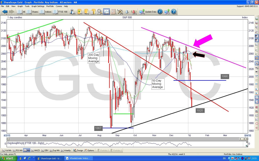
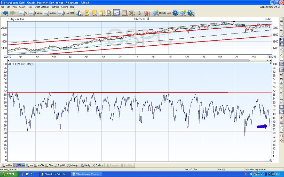
The Bottom Window on the Screen below shows the Relative Strength Index (RSI) for the S&P500 on the Daily Chart. My Blue Arrow shows that on an RSI of about 34 it is actually quite low and we should bounce soon. RSI is a very reliable Indicator I find and I love it.
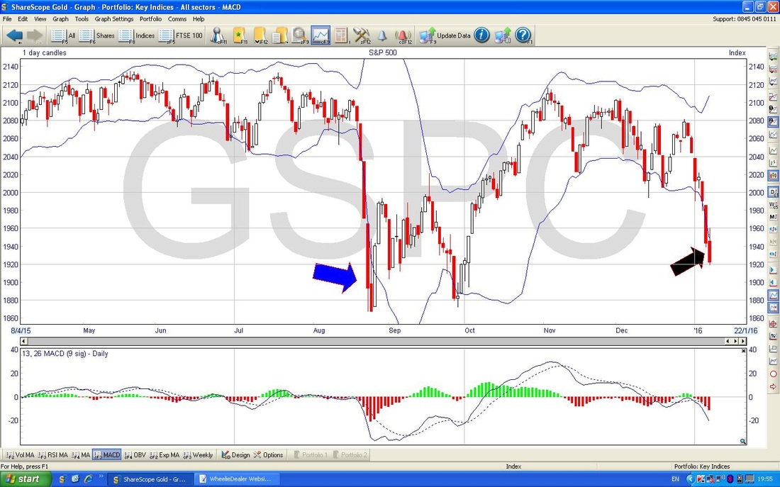
On the Chart below in the Upper Window we have the Bollinger Bands for the S&P500. My Black Arrow points to where the Candle from Friday 8th January 2016 has moved outside of the Bottom Bollinger Band - this tends to lead to the Price moving back inside the Bands - as happened in August last year as marked with the Blue Arrow. In other words, the Price will need to move up soon to get back inside the Bands.
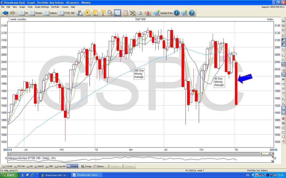
The Screen below shows the Weekly Candles for the S&P500. My Blue Arrow points to a horrible big Down Candle like we got on the FTSE100. You can see the Moving Averages on this chart quite well also.
I haven’t included the Nasdaq Composite Index - it is very similar to the S&P500 at the moment, although more choppy.
VIX The VIX is effectively the Volatility Index for the S&P500 - it works in an inverse manner - i.e. when the VIX is high, the S&P500 tends to be low and vice versa. I have no idea why but there is a quirk in ShareScope where the VIX is always one day behind. On the VIX chart below, the Black Arrow points to where the VIX was on Thursday 7th Jan 2016 and on Friday it closed at 27. The Blue Resistance Line is at 28 - it is possible that the VIX will peak out here like it has done recently and turn down. The Big Spike in the middle of the Chart is from Black China Monday on 24th August 2015 - of course it is possible that we get a repeat of this but I very much doubt it (mainly because Summer is notorious for such silly price moves, January is not). At the moment the VIX is quite high (with a low S&P500) so when the VIX turns down again, the S&P500 should rise. 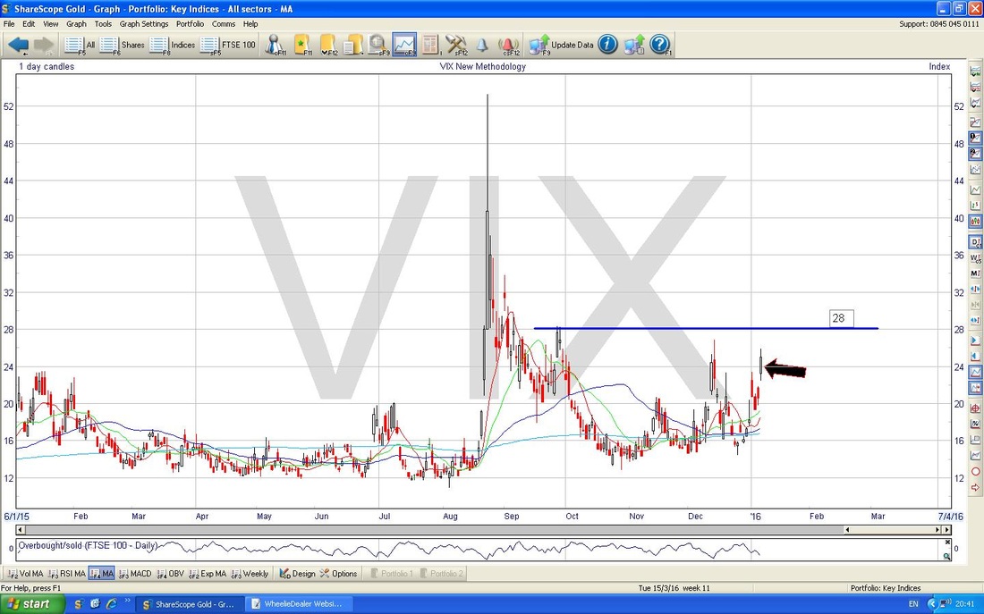
Brent Oil
The Chart below is as far back as I can go on the ShareScope data for Brent Oil. My Blue Arrow points to where the Price has dropped below Critical Support at $35 which is marked by the Black Line and pointed at by the Black Arrow. Note the Red Line to the far Right - this will cap any bounces most likely. 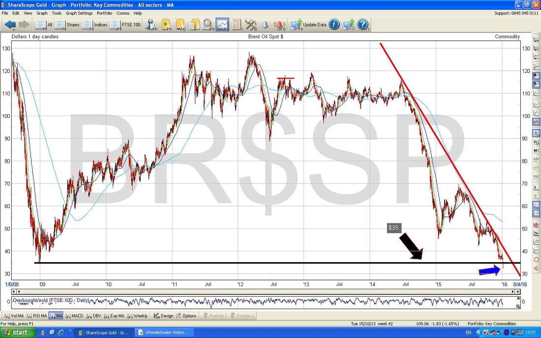
The Chart below zooms in on Brent Oil for about 8 months or so. My Red Arrow points to the Red Line that I mentioned fleetingly in connection with the Chart above. This could cap any rises and this really marks the Major Downtrend for Brent Oil - it needs to break above this line for there to be any hope for the Bulls.
My Green Arrow is pointing to a Hammer Candle which was produced on Thursday 7th January 2016 - this might be a Reversal Signal which the Price can rise off of - however you cut it, the Low of that day at $32 is now a vital Support level for the Price to hold. If this fails, then we might get into the $20’s. “Previous Support becomes Resistance, and vice versa” - this important Rule of Charting implies that the $35 level that was previously Support might now be a Resistance level and a problem for the Oil Price……… 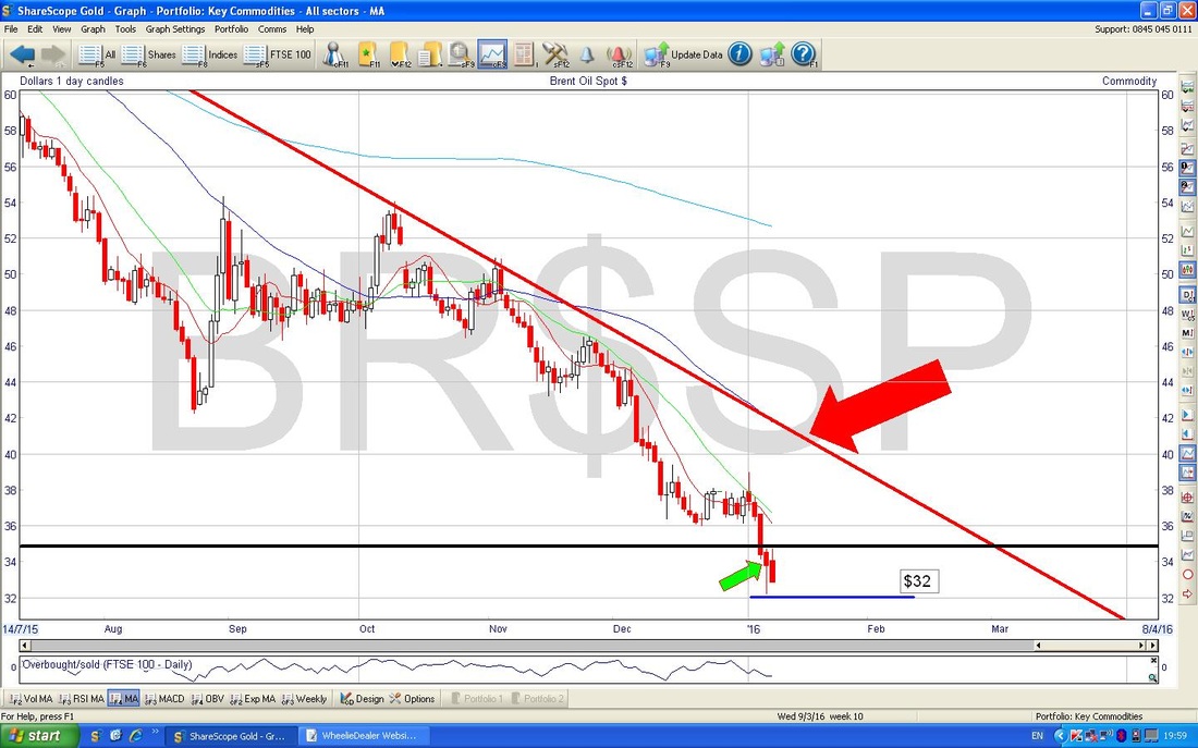
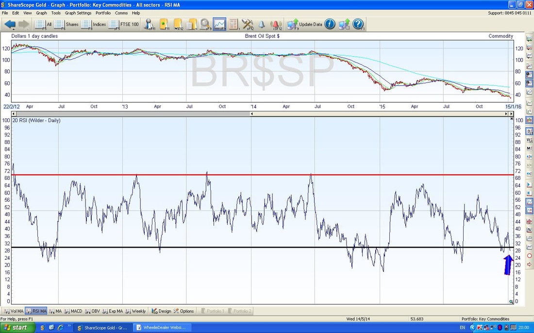
The Screen below shows the RSI for Brent Oil. My Blue Arrow marks where it is now and it is pretty low. However, it can go lower as it has done previously as you can see on the Chart.
Gold
Here is a Long Term chart - just look at that Downtrend as marked by the Red Parallel Lines…….. 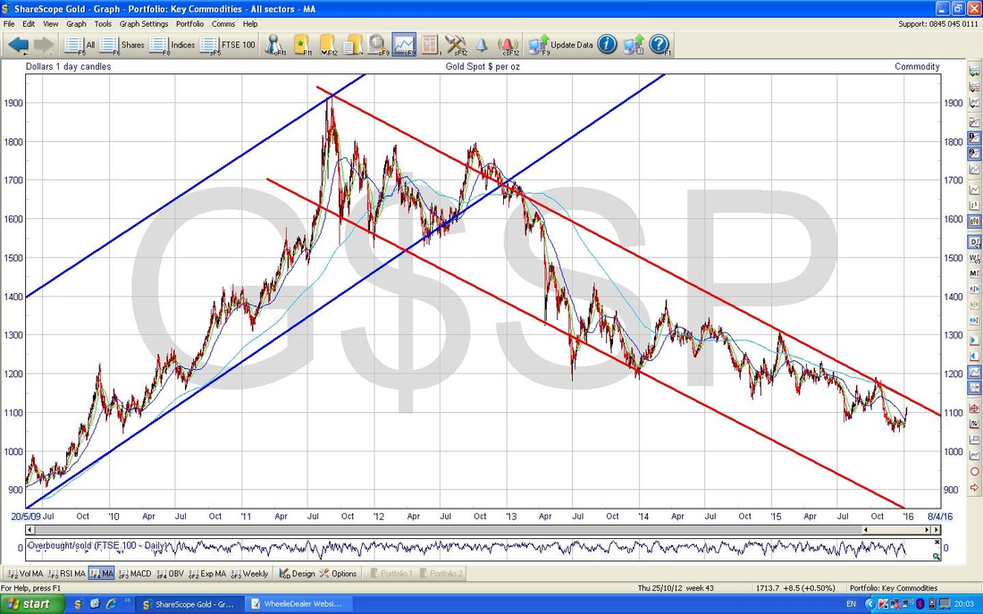
Zooming in, my Red Arrow on the Chart below shows the Downtrend Resistance Line which Gold needs to break out of - it will struggle I suspect. Note also, the Blue Arrow points to the 200 Day Moving Average - this is in a Downtrend (obviously) and it may act as a Resistance Area as well.
My Black Arrow points to a sort of Hammer Candle which was created on Friday 8th January 2016. In the context of 4 White Up Candles which preceded it, this is possibly a Reversal Signal and the Price may turn down now. 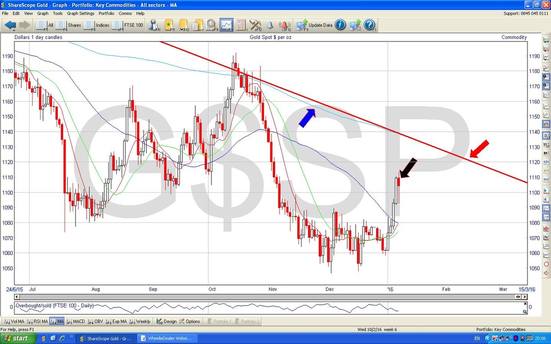
In the bottom window on the Chart below we have the RSI for Gold. My Blue Arrow points to where it is now. As you can see, there is room to rise a bit more, but it is quite high and could turn down soon.
Phew, that’s it. I hope we all have a good week (anyway, a not too scary one will be enough for me !!), cheers, WD 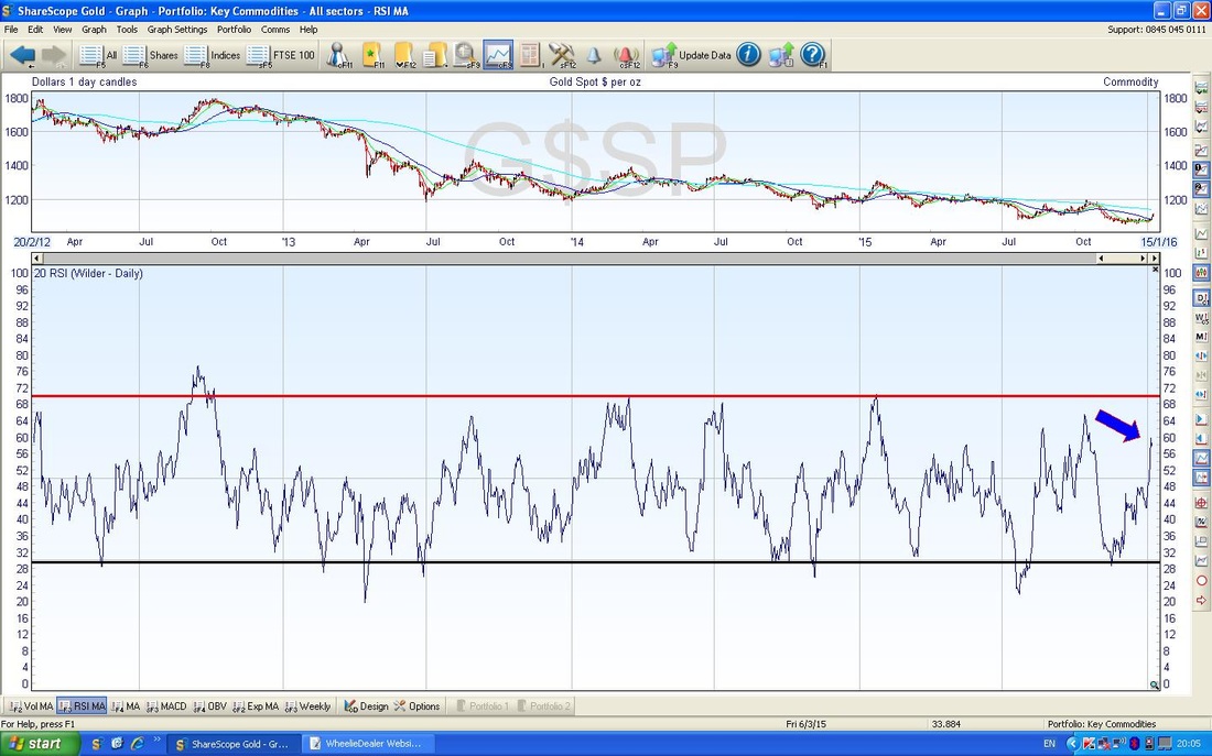
4 Comments
catflap
11/1/2016 12:32:15 pm
Pretty comprehensive analysis here. Thanks.
WheelieDealer
12/1/2016 12:26:19 am
Hi catflap - thanks for the feedback - I think I got a bit carried away with the charts - but there was so much interesting and important stuff to cover. Did my head in trying to load then into the system - if you aren't careful and organised with proper labels you get wrong Pic in wrong place !!
Jonh
16/1/2016 12:28:39 am
Great article/analysis in present times, especially after today. And now getting close to the 5768 support level. If it drops through this how far do you expect it to go?
WheelieDealer
18/1/2016 10:34:01 pm
Hi Jon, thanks for the feedback. You've probably seen it but I posted a Blog tonight (18th Jan) which addresses your question. Leave a Reply. |
'Educational' WheelieBlogsWelcome to my Educational Blog Page - I have another 'Stocks & Markets' Blog Page which you can access via a Button on the top of the Homepage. Archives
January 2021
Categories
All
Please see the Full Range of Book Ideas in Wheelie's Bookshop.
|
