

|
educational blogs |
|
Last Week turned out to be a bit of a pain for me - from Monday to Wednesday nothing much seemed to happen and then things tailed off at the end of the Week so my Portfolio took a hit of 1.2% over everything (excluding my Income Portfolio which I rarely look at). This continues my angst at failing to see my Portfolio Breakout of its All Time High which was put in back in May and I feel like much of the Year has achieved very little !!
However, as always we need to stay calm about such situations and focus on the positives and what has really been achieved - even if the Numbers are not reflecting it yet. There was an excellent TED Talk (Rory Sutherland - ’Perspective is everything’) which my mate Tom Tomsky @calvoreon sent me on Twitter which was about Psychological Framing and Perspective - the basic essence being that how we experience things that happen in our Lives etc. and how we let them affect our Emotions/Decisions, is largely down to how we set the context of whatever has happened. I am not explaining this very well, so rather than me jibbering on, check out the Talk yourself here - it is 18 minutes long and actually quite funny: https://www.youtube.com/watch?v=iueVZJVEmEs First off I am having a very good year despite the flat recent Months - this is something that obviously I should celebrate and not get too down about. In addition, I have a nice collection of Stocks and I expect to see nice upside from the majority (or at least decent Dividends) in the Months ahead - and as we will see below, several of my Stocks are in very interesting Technical Situations where they are on the verge of All Time High Breakouts (don’t switch off already, I am going to do a proper explanation of this !!).
And of course the other critical piece of Framing and Perspective is the simple realisation that we never stop learning when it comes to mucking about with the Stockmarkets and on a perhaps subconscious level every Day I spend involved with The Great Game increases my understanding and knowledge - even if it might be a tiny increment and not obvious at the time.
Hard Brexit (Oh strewth Wheelie, you are on dangerous territory here mate and you can expect buckets of hate mail for even daring to discuss this topic !!) I don’t want to dwell on this because it is an extremely emotive subject (too much emotion and too little thinking perhaps !!) but I am adjusting my views about the impact of the UK leaving the EU without a ‘Deal’ and whereas I previously thought it could be extremely painful, I am starting to understand that this is massively overblown by people with an Agenda of keeping us in the Union. I think it is all about the speed of the collapse of Talks. My thinking has always been that a Sudden and Unexpected breakdown of Discussions would cause havoc in the Markets - but actually I think I am being far too dramatic. Make no mistake, a Sudden Collapse would be the worst possible Event I think (although staying in the EU would probably be far worse !!), but in terms of the Markets I think our Monkey Brains have been taught over successive recent ‘Adverse’ Events (think the original Brexit Vote Result and the Trumpy Election) that Big Dips need to be Bought aggressively. I reckon this psychology will be in play again - initially there will be a panic Sell-off but then the Buyers would come flooding in as things calm down - yes, it is not ideal, but in reality it would create an opportunity to Buy most likely. I don’t think this will happen though - on 2 fronts. Firstly I think a Collapse of the Talks is unlikely but secondly I think any such Collapse will be clearly and slowly flagged - think about it, already most People are likely to be very pessimistic about the Talks and are warming up to the idea that there will be a Collapse (arguably the UK Market is already discounting a Hard Brexit). It is the classic Frog in a Pan thing - if a Frog is put in Hot Water it jumps out extremely fast, but if you put the Frog in Water and slowly warm it up, the poor amphibian snuffs it because it doesn’t realise the danger (Please don’t try this at home and no, I have not done it myself before you call the RSPCA on me !!). In terms of my Strategy I am just sticking to my recent stance - I am very Long the Markets and pretty happy with the Exposure I have although I would like to lower my Spreadbet Exposure a little - I will look at this more in coming Weeks and see if I can reduce some Positions - but I don’t want to rush in for the sake of it, I only want to Sell the Positions when it looks timely to do so. As always, I am looking for opportunities to Short the Indexes as a Hedge but with my experiences on this in recent Months, I am being very cautious. One Key Event to think about now is Spreadsheet Phil’s Budget which is on Wednesday 22nd November - this could of course impact Sectors like Housebuilding and I heard something about a Diesel Scrappage Scheme which might help Car Retailers. Mega Cap Divvy Stock Valuations I have mentioned this kind of thing in recent Weekend Charts Blogs and also no doubt gabbled about it on the Tweets - it is striking how beat-up some of the Big Yielding Chunky Stocks like GSK, BA., NG., SSE, etc. etc. have become in recent Weeks - to the point where anyone thinking of starting (or adding to) an Income Portfolio might be looking at a very attractive Opportunity to pick up some nice Yielders. Anyway, where I am going with this is that it reminds me of the Dotcom Boom back in 1999/2000 - we have a situation where Tech Stocks are shooting up and many are on some pretty ‘stretched’ Valuations and at the same time the Big Divvy Stocks are really getting hit. It is a bit of a mystery to me why this is happening, but the thing to note is that back in the Tech Boom/Bust, nobody was interested in ‘Value Stocks’ (I hate that term, but in essence it sort of means Low P/E Ratios and Big Divvy Yields) but once the Bust happened, People who had picked these up when the Tech stuff was all the rage, made out like Banditos. Needless to say Warren Buffett was in this camp and he took a lot of Stick from the usual Talking Heads about how he had “lost his touch” etc. - but of course he got it totally right over a longer timeframe and exploited the opportunity just like he did in the Credit Crunch in 2008/9. Is History going to rhyme again? Income Portfolio Blogs While on this subject, I just want to add that I have made decent progress on Part 5 of the Income Blog Series and I intend to issue it later in this Week. As always, my predictions on how many Parts it will be have proved to be utterly wrong, and I am now envisaging that it will become 7 Parts - don’t despair though, because I have started on Part 6 and what I am doing for these last 2 Bits is working through each Sector and saying what I think of the Sector with regard to its suitability for an Income Portfolio and also naming a few Stocks in each that might be worth considering. I am aware also that I have not updated the ‘Weekly Performance’ bit on the Homepage for ages (where does the time go?!!) and I will try to correct this unacceptable situation as soon as I can !! All Time High (ATH) Breakouts This is a concept that I regularly talk about on Tweets and stuff and it is very much something that Traders tend to look for as a way of making fast and reasonably low Risk Profits (especially if a systematic approach is taken using Stoplosses etc.) Anyway, I thought it might be useful for Readers if I went through this a tad and showed some examples - this is particularly of interest to me because I have several Stocks which are on the verge of ATH Breakouts. The name is sort of self-explanatory really - an ATH Breakout is when a Share Price ‘Breakouts’ of the Horizontal Level at which it had put in a previous ATH - this can of course apply to any Asset, e.g. Indexes, Commodities, Forex, Pineapples, etc. etc. They are of particular interest to Traders because when these phenomenon occur, they tend to result in a fairly explosive move upwards and quick Profits can be made. I will show a good example in a mo but one way to think about it is that when the Share Price continually butts up against the ATH Resistance Level, the pressure builds and builds until the Sellers are exhausted and it finally ‘Pops out’ of the top. Trifast TRI Here is a lovely example from my Portfolio which has been a huge Winner for me over recent Years and I think with an ATH Breakout the Market seems to think it can keep moving up - this is very Bullish behaviour so I will be holding tight. However, TRI is due to have Results on Tuesday so of course those need to be up to scratch. This ATH Breakout idea is clearly shown here - my Red Arrow is pointing to a Horizontal Red Line at 228p which marks the previous ATH - you can see how the Price has nudged up towards this Line for most of this Year but finally on Wednesday 8th November it Broke-out - this is where my Black Arrow is. You can see how the move up was quite spectacular on that day and I would assume many Leveraged Traders (Spreadbets, CFDs etc.) were taking advantage of this on the Long side. It really is that simple, but I will also add that my Blue Arrow is pointing to a possible 50/200 Day MA ‘Golden Cross’ (see the Graph Legend to understand the Blue Wiggly Lines), it this happens it would suggest more gains in coming Weeks and maybe Months. Being a Long Term Investor, I am less focused on trying to capture quick gains and all that but the way I use ATH Breakouts is to keep me in a Position when I can see such a Breakout is likely and also if I want to Top-up on a Position, then a Breakout can be a good Opportunity to do it. However, if I am Topping-up, then the Fundamentals need to still stack up and I would not just Buy more on the Technical Situation alone. I have talked here about ATH Breakouts but a similar effect can exist when a Previous Horizontal Resistance Level which has been touched a few times as the Share Price Consolidates after a push up, is broken-out of and good gains can be nabbed in such situations. 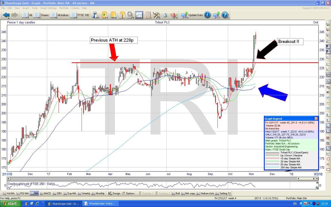
Royal Dutch Shell RDSB
I noticed this one the other day and to be honest I was really surprised. When you consider how smashed RDSB got in early 2016 (I think it went down near 1200p ish) the recovery has been spectacular and I am very pleased I kept my nerve and stuck with my Holding - and it looks like we might get a lot more Upside here soon. From a Fundamentals viewpoint, what seems to be happening is that when the Oil Price collapsed, this forced RDSB to do some serious Naval Gazing and to cut out a load of Cost Fat which had built up during the Boom Years of Oil up near $100. This lowering of the Cost Base has meant that now Oil is recovering nicely, RDSB is becoming more and more Profitable - Happy Days !! RDSB goes Ex-Dividend on Thursday for 35p a Share and despite the strong moves up, it is still on a Forward Dividend Yield of 5.8% and note it has never cut the Dividend since WW2 (that was a while back now !!). The Chart below shows the situation - as always, the ScreenScrapes come from the extremely quick ShareScope Software that I use which even managed to win the MotoGP Championships earlier today - amazing that - and this is a very simple Chart which just shows the Previous ATH where my Red Line and Red Arrow are, and my Black Arrow is showing the current Price Level. As you should be able to see (oh, by the way if you click on the pic it should grow much bigger on your Screen) we are very near the Breakout and if it happens, then I expect to see an Acceleration upwards and there would then be no natural Resistance Levels to hold it back - if Oil gets up near $100 again (anything is possible as we all know), then we might see some big Gains here. I suspect the Breakout if it happens will take a few attempts - it is unusual for a Stock to smash straight through (unless it is a Small Cap or something) and the Biggest Stock on the UK Market is very likely to have a few attempts. Having said that, if the Oil Price shoots up then RDSB might simply go with it. 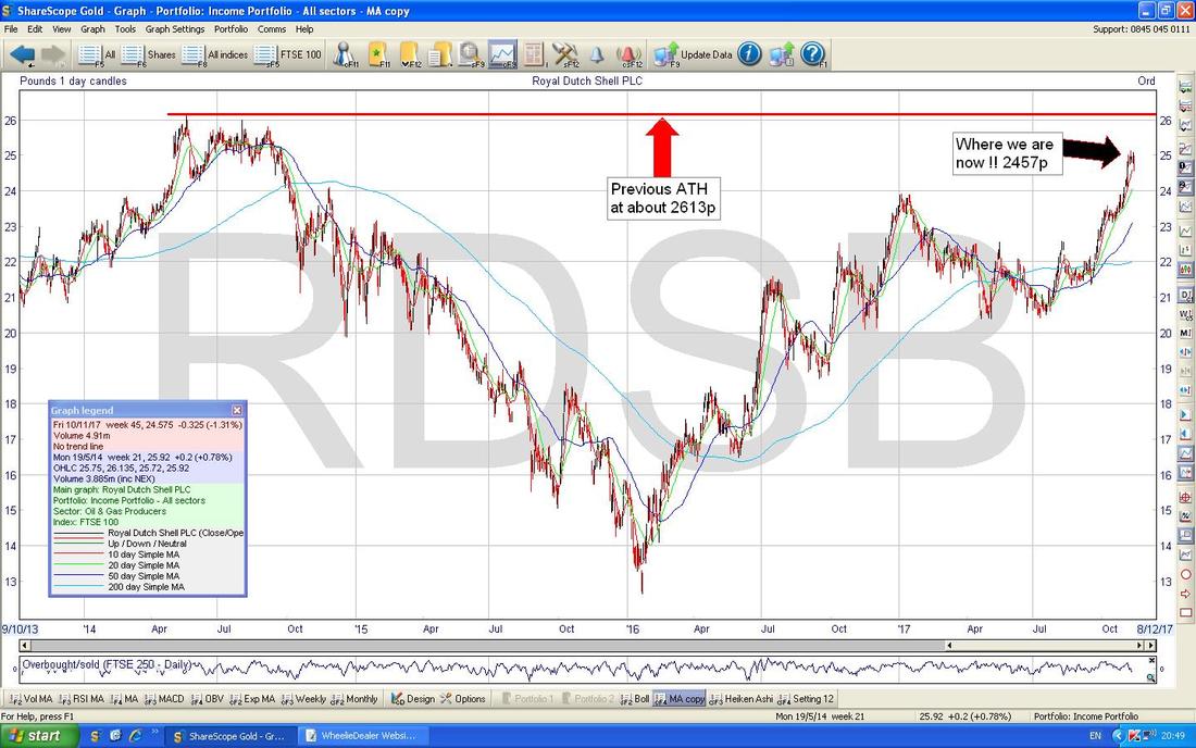
Entertainment One ETO
I am loving the fact I am including this one because a few Mates have accused me of Ramping this one because I keep going on about it - but clearly my Ramps were in order because it has risen nicely and now it is approaching an ATH Breakout Situation. Fundamentally I think it still stacks up (the Content Library alone is worth in excess of $1.5bn) and it has Results on Tuesday 21st November and it is very possible it can move up in advance of these. On the Chart below the Key ATH Level is at 324p and is marked by my Red Line and Red Arrow - if ETO can Breakout above this then I will be a very Happy Wheelie !! (and I will be able to afford the Full Peppa Pig DVD Boxset !!) I have also shown what I call a ‘Normal’ Breakout with my Green Arrow - this is where Horizontal Resistance was tested a few times and then finally Broke-out with a fairly swift move higher. 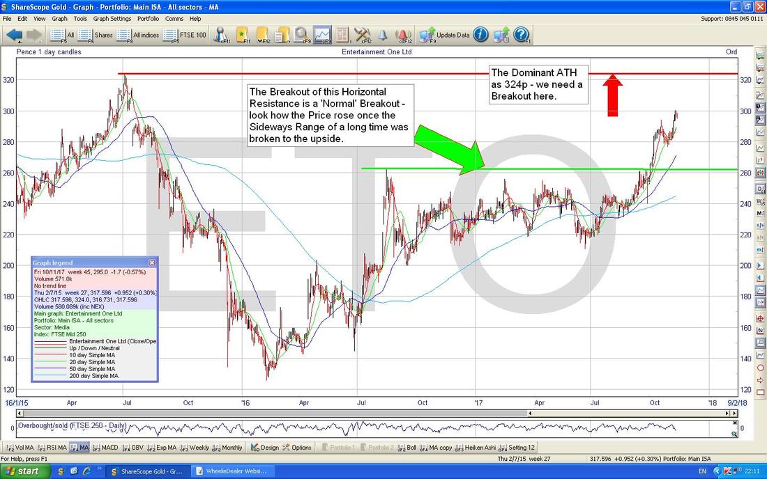
SuperGroup SGP (Soon to be renamed Superdry which makes more sense)
This is another one I hold and recently had very good Results. As you should be able to see on the Chart below we are right up near the ATH at 1893p (this is the Red Line and the Red Arrow) and it strikes me we will see a Breakout. Something else to note is that there is a sort of huge ‘Triangle Squeeze’ going on here - my Green Line (Green Arrow) forms an Upwards Pointing Triangle with the Red Line. 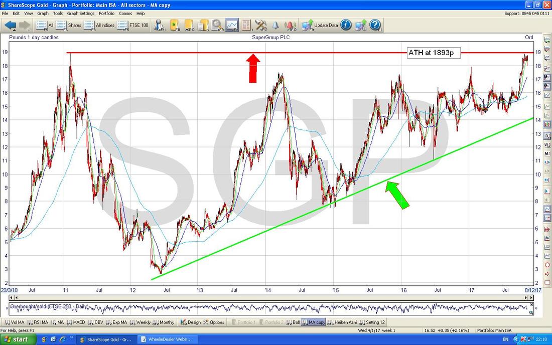
If you want to understand more about these Breakout Situations and moreover to learn how you can use a Systematic and Highly Effective Approach to exploit the fast gains available, then follow Jase Trading Bases @stealthsurf on Twitter and check out his Website which contains stacks of FREE education on how he does things:
https://www.tradingbases.co.uk/ At some point in time I intend to write a simple and clear Blog about how Jason does things - I find myself in the PUB discussing this truly brilliant Approach many a time and I think it would be helpful to Readers if I pick out the essence of it and make it simples. It’s on the Slate but the List of Future Blogs seems to grow longer and longer, much faster than I can type the wee devils !! Esure ESUR That’s enough on Breakouts so I will look at some other Charts now which have interesting things going on. This one had a decent Trading Update a few Days ago and said that Premiums would be higher than expected and their ‘Combined Ratio’ would be at the lower end of previous Guidance (this is expressed as a Percentage and the lower the better) - the funny thing is that the Shares didn’t do much afterwards and this could be an anomaly. ESUR is on a Forward P/E of 13 with 5.9% Forward Dividend Yield - so the numbers look pretty reasonable especially when we know they are trading very well. As is always ‘Best Practice’, I will start with the Long Term Picture first and the Chart below shows exactly that with the Chart since IPO back in 2013. My Black Line (marked by Black Arrow) shows important Support if the Shares do fall further and my Green Line (Green Arrow) shows where there should be pretty strong Support at about 240p. Note the Green Line was previous Resistance which was then Broken above - and remember the Old Fish Wives’ Tale, “Previous Haddock becomes Plaice and the other way around”. Actually, thinking about it, I think I have ‘mis-spoke’ there - it should be “Previous Resistance becomes Support and Vice Versa.” My Blue Arrow is pointing to the Blue Squiggly 200 Day Moving Average Line and note how the Price is currently around this so that might kick in as Support and enable the Share Price to form a ‘base’. I hold ESUR. 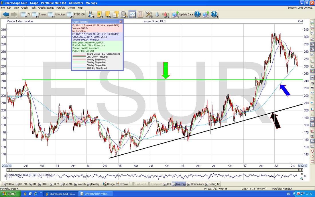
Now I have zoomed in to the very recent activity and the main thing here is that Sloping Yellow Line (marked by my Yellow Arrow) which is Resistance which needs to be broken-over. Such a move would be a Buy Signal.
To the downside note my Black Line with the Black Arrow at about 250p - this needs to hold as Support or we will be visiting the Green Horizontal Line most likely (this is the same one as on the Chart above). It is not all rosey though - my Blue Arrows are pointing to where the Blue Wiggly 50 and 200 Day Moving Averages are moving together and if the Darker Blue 50 Day MA crosses down through the 200 Day MA, then this would be a ‘Death Cross’ - clearly this is not a nice name. However, it is possible that we get a Death Cross but it then flattens out and moves up to produce a lovely Bullish Golden Cross - however, for this to happen, we need the Price to start moving up fast now. 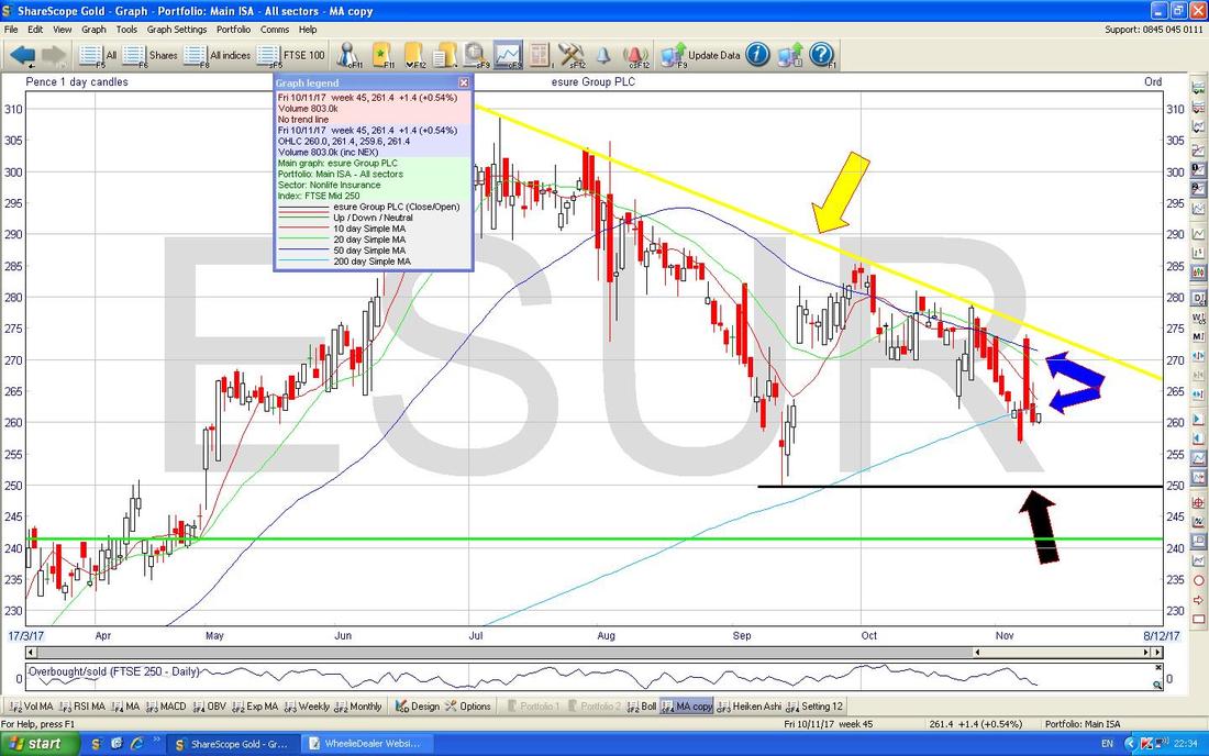
IQE Plc IQE
I don’t hold this one myself but I know many Readers do. It is interesting because we had a very unusual situation on Friday where they announced a Placing at 140p (often this kills the Share Price) and the Share leapt up on the day - this is presumably because it shows Confidence and that Institutions are prepared to pay up to be part of this Growth Story and note that at 140p they weren‘t being given much of a Discount to the prevailing Market Share Price. In terms of the Valuation, IQE is on a Forward P/E of about 44 but the important thing to understand here is that the Company has very high Operational Gearing - this means that a ramp up in Revenues translates to a disproportionately high increase in Profitability - and of course anything to do with Chips and Apple AAPL is in the Right Place at the Right Time. OK, a Forward P/E of 44 seems very high, but in the context of what Tech Stocks (especially in the US) are doing, this could go much higher I suspect. The tone of the recent Update talking about the Placing and the opportunities ahead of IQE was really positive - this alone makes me think there could be a lot more upside here. A Takeover must be a possibility as well. I don’t hold IQE because I simply cannot own everything. I am putting no Arrows or Lines or Textboxes or any other paraphernalia of the Charting Obsessives on this one - this Chart speaks for itself. Note however that we are not making new All Time Highs - back in the Dotcom Days these chaps were up at a shade over 800p but it was so long ago that I doubt it will have much impact on the Chart with regards to Resistance Levels now. This Chart clearly has Upside Momentum……. 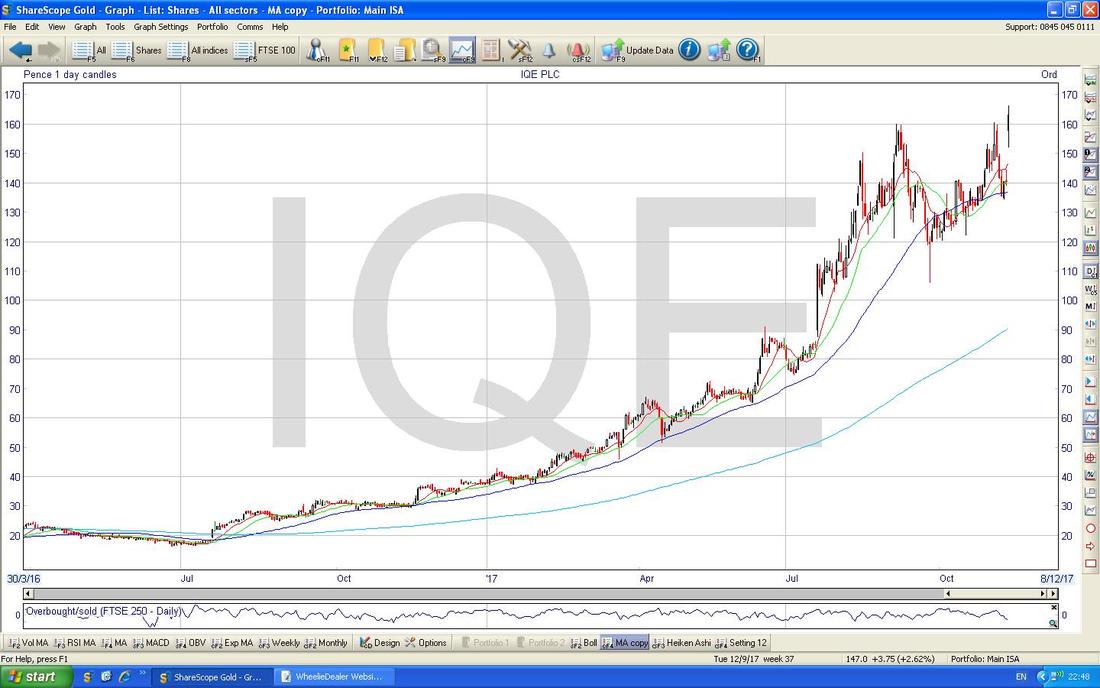
On the Chart below I have zoomed in so we are really looking at the Price Action since the jump up in Price when the Placing was announced. Note my Green Line which is the High from Friday at 166p and a move above this (especially on an End of Day [EOD] Close basis) would be a Buy Signal.
Just below that we have my Black Line at 160p and this should be good Support. However, note there is a Gap where my Black Arrows are and it is possible that the Price falls back and tries to fill this Gap - a move over 166p would negate this possibility. My narrow Yellow Rectangle is highlighting the Candlestick from Friday and this is a ‘Long Tails Doji’ which suggests that the Bulls were unable to keep it up at the Highs of the Day. However, this is quite simple in terms of how to Trade - you Buy when it Breaks above 166p. 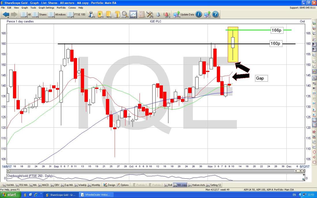
I’ve covered a lot of Stocks here and some educational garbage, so I will shorten things off here cos I need to Proof Read it (oh no, I have to read it again !!) and Upload it to the Website.
Looking at the US Indexes I don’t see much of concern as yet - they have come off a tiny bit but are still looking generally quite Strong. No doubt I will be Tweeting about any developments etc. in coming Evenings. If you don’t follow me on Twitter and don’t have (or don’t want !!) a Twitter Account, you can put “Tweets by @WheelieDealer” in a Google Search Box and you will see my Twittering anyway. Other than that, you can go on my Homepage because down the bottom there is a Twitter Line on display. The FTSE100 has been dropping back but there is a lot of good Support just below - I am not panicking about this one. It is near the 50 Day Moving Average Line now and the 200 Day MA Line is not far below and should help in terms of Support. OK, I will knock it on the Skull there, I hope everyone has a Prosperous and Exhilarating Week ahead !! Cheers, WD.
0 Comments
Leave a Reply. |
'Educational' WheelieBlogsWelcome to my Educational Blog Page - I have another 'Stocks & Markets' Blog Page which you can access via a Button on the top of the Homepage. Archives
January 2021
Categories
All
Please see the Full Range of Book Ideas in Wheelie's Bookshop.
|
