

|
educational blogs |
|
I am bashing this out on Saturday night rather than the more usual Sunday because tomorrow I am off to the MotoGP at Silverstone and dead excited about the potential for the British Riders after Cal Crutchlow gave us the first British win in the Premier Class for 35 years (since the Legendary Barry Sheene) at the last race in the Czech Republic. No doubt the weather will be entirely unpredictable but with luck it will be dry as Silverstone can be a chilly, windswept, place if the conditions are poor and it isn’t the best place to spectate when it’s like that. But of course changeable conditions make for exciting races - which you can usually catch on Monday Night on ITV4 at 8pm.
As usual I will look at the Historic backdrop, which will no doubt be pretty ugly as September has a bad reputation, and I will look at the Major Indexes that matter - I am really interested to see how things stand after that huge jump up on the FTSE100 yesterday - is it a sign of more to come or simply a Last Gasp rush of the Bulls? The inconsistency here is that the US doesn’t seem to have followed suit.
Historical Precedents
According to the UK Stockmarket Almanac 2016, for the coming Week (w/c 5th September 2016) the FTSE100 is up on Average for 45% of Years with an Average Return of MINUS 0.3%. So it tends to be a bit soggy as do all other Weeks in September, which is historically the worst Month. Note the US Markets are closed on Monday for ‘Labor Day’. There’s a great entry in the Alamanac on Tuesday 6th - it says “1989: Due to a computer error, 41,000 Parisians receive letters charging them with murder, extortion and organised prostitution instead of traffic violations.” Did make me giggle, onto the Charts……. FTSE100 As usual, we start with the ‘Big Picture’ and then drill down. I have shoved the Chart in below to set the context and show the Uptrend from the 2009 Lows - note how we are up near the Bottom Line of that Uptrend and on the next Chart we will look closer at what is happening there now. 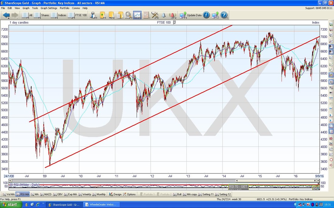
On the Chart below I have zoomed in loads and my Black Arrow points to where the FTSE100 Price Line touched the Bottom Uptrend Line about 3 weeks ago ish and then fell back but it has now turned up again and my Yellow Circle is showing where we are now, after the huge jump on Friday 2nd September. Note the Candle generated did not manage to Close right at the High of the Day and it fell back leaving a small ‘Wick’ or ‘Tail’.
This Uptrend Line is critical - it has so far acted as Resistance to the Price at about 6955 and obviously the Price needs to now get over that level. To make a proper assault on the Uptrend Line Resistance, it needs to crack through 7000 really - but of course such a Round Number will in itself be a strong Resistance area. With September being such a historically dire Month, maybe it will be a big ask - and remember we are nearing on the All Time High up around 7122. 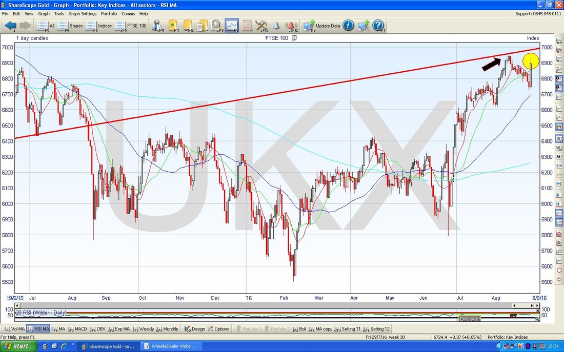
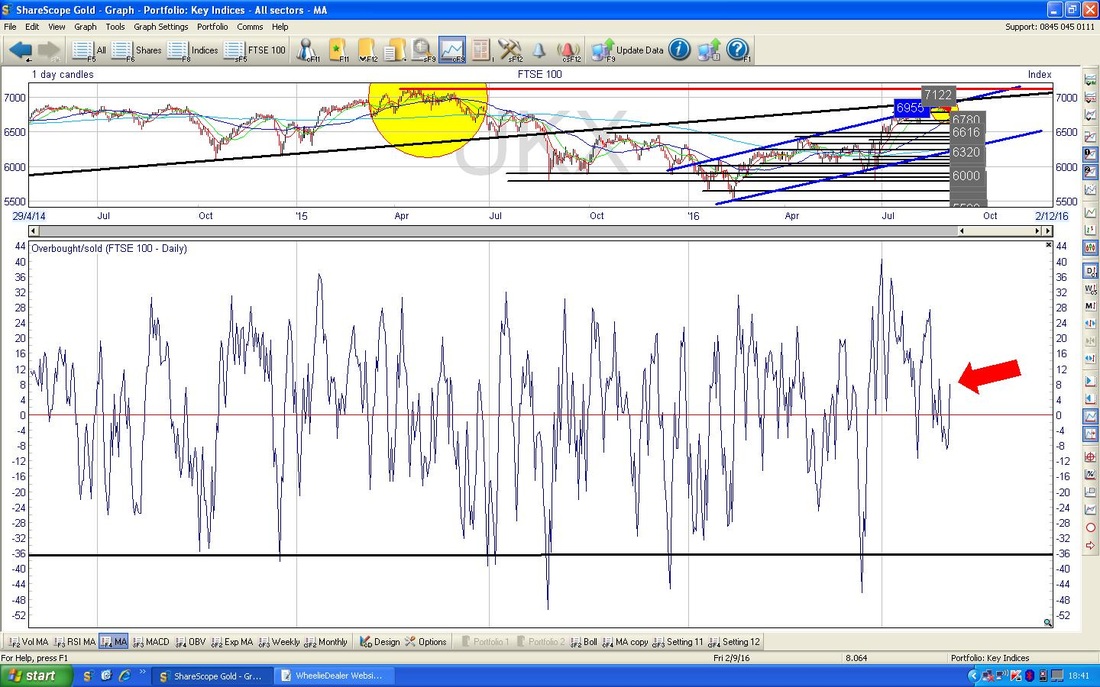
On the ScreenShot below (as ever, these are from the truly brilliant ShareScope software that I use) in the Bottom Window we have the ‘Overbought/Oversold’ Oscillator for the FTSE100 Daily. My Red Arrow is pointing to where it is now and we are only just above the Neutral Mid-point - there is plenty of room for the Price to move up but it needs to be appreciated that this is a very Short Term indicator - so we could rise for a couple of Days and then be Overbought and ready to drop again.
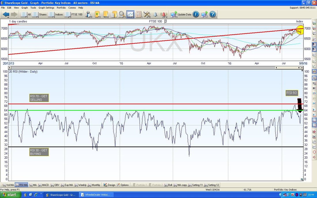
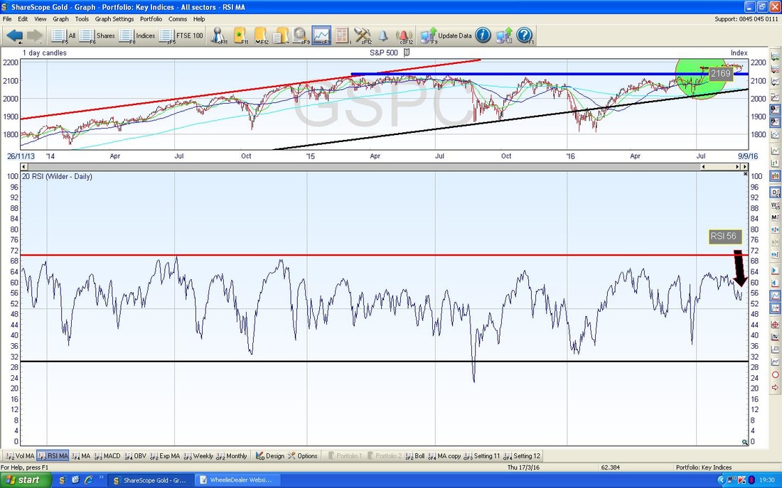
In the bottom window below, we have the RSI (Relative Strength Index) for the FTSE100 Daily. In many ways this is similar to the Overbought/Oversold jobbie but it is much ‘slower’ and I think it is far more useful and does work as a very good predictor. With a current reading of RSI 60, this is quite High by the standards of the FTSE100 - it has room to move up, but not lots. Note my Green Horizontal Line at RSI 64 - this has proved to be a strong Resistance level to the RSI reading for the last couple of years.
The screen below has the Daily Candles for the FTSE100 surrounded by the Bollinger Bands. My Black Arrow points to how we are right up near the Top Bollie Band - this might act as Resistance. You might be able to see on the ‘Graph Legend’ Box how the Price rose to a High of 6928 on Friday 2nd September and the Upper Bollie Band is probably at around 6940.
Looking at these Charts it looks quite mixed to me - there are reasons to think we can go a bit higher in the Short Term but on the flipside there is very Strong Resistance. Also it is often the case that Mondays reverse what happens on Friday - so next week might start with some fun antics. Oil looks quite good and this might help the FTSE100. 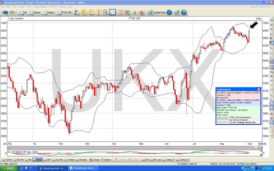
DAX (German)
The Chart below is a context setter for the ‘Big Picture’ and shows the lovely Uptrend Channel since the 2009 Credit Crunch Lows. My Yellow Circle is highlighting how the Price broke-out from the Blue Downtrend Line (marked with the Blue Arrow) in early August 2016 and this is a very bullish development. 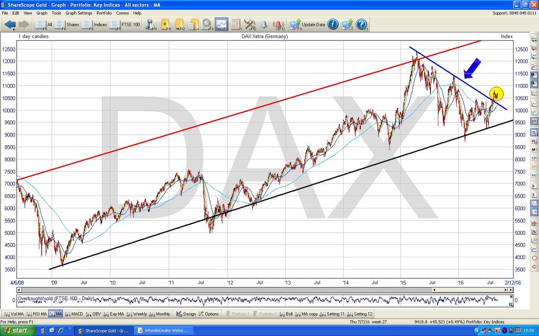
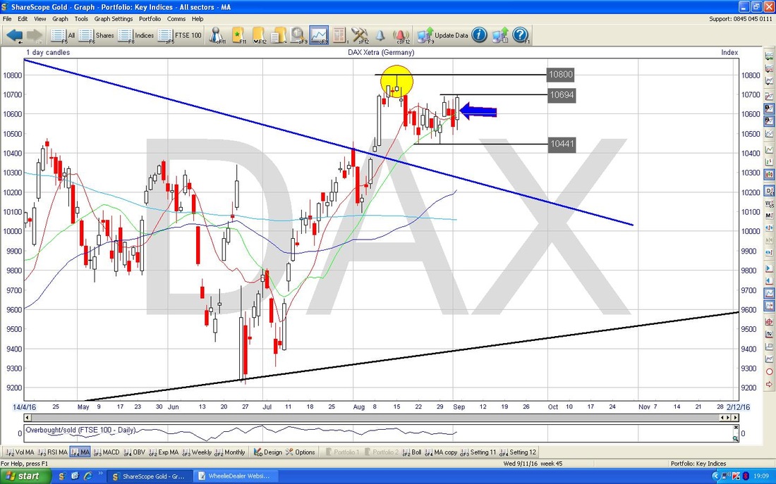
On the Chart below I have zoomed in to about the last 4 months or so. My Blue Arrow points to the Up Candle which was produced on Friday 2nd September 2016 and this is now all about Support and Resistance. My Yellow Circle is highlighting the Inverted Hammer from a few weeks ago which touched 10800 Intraday and then fell back - this is the Key Level that needs to be got over now. First of all the Price needs to get over 10694 and there is very strong Support down at 10441 if the Price drops.
S&P500
I am skipping the ‘Big Picture’ here because on my Chart below we have the Blue Horizontal Line at 2135 where the Price recently broke-out to new All Time Highs - this is a very Bullish Development and if we do get some downside, then that 2135 Level should act as Support. The important thing on the Chart at the moment is the ‘Double Top’ pattern which is marked by my 2 Blue Arrows from a couple of weeks ago. This gives Strong Resistance at 2194. My Yellow Circle is highlighting the Doji Candle which was bashed out on Friday 2nd September - it is interesting that the S&P500 (the main US Index) did not track with the FTSE100. The Doji shows uncertainty and lack of direction - and in many ways it is a bit of a failure because the Hammer Candle from 2 days before (with the ‘Tail’ dropping down to 2160) suggested that the Price should turn up - as it did, but without much conviction. The Price now needs to get over 2185. 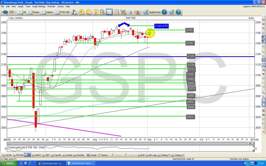
In the bottom window on the Screen below we have the RSI for the S&P500 Daily. With a current reading of RSI 56 we are by no means high and there is plenty of room to move up - but of course, on the flipside, there is plenty of room to drop as well !!
The Chart below has the Daily Candles for the S&P500 and the Red Line is the 13 Day Exponential Moving Average and the Green Line is the 21 Day EMA. These are Moving Averages where the more recent moves are given more weight than with a Simple Moving Average - so arguably they are more ‘timely’. My Yellow Circle highlight is trying to show where the Red Line has turned down towards the Green Line but at the moment they are both moving sideways and it is possible that the Red Line moves up again and does a ‘glance off’ but it is also possible that the Red Line drops down through the Green Line and we get a ‘Death Cross’.
Nasdaq100
I have a Small Short Position on this US Tech Index so I am interested to see how it is shaping up. Things look remarkably similar to the S&P500 - we have the Double Top at 4838 and my Green Circle shows a Doji Candle from Friday 2nd September. In the very Short Term the Price needs to get over 4817 and there is decent Support below at 4750 and then 4740 which was the previous All Time High that was recently broken over. 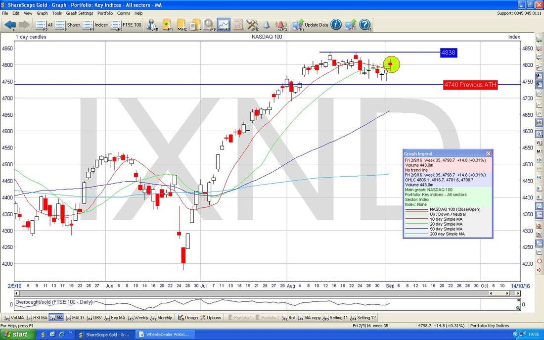
Nikkei 225 (Japan)
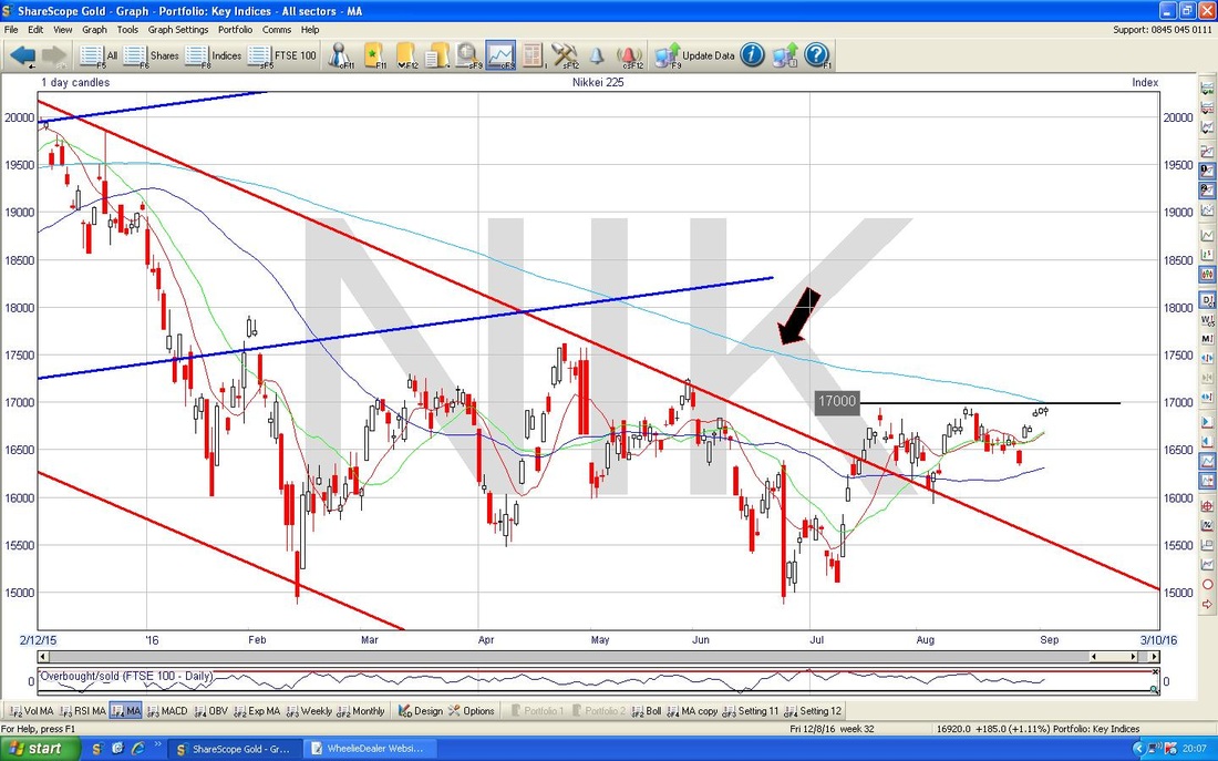
I don’t always look at the Nikkei but it is doing some interesting stuff so it is worth including here. My Chart below has the Daily Candles going back about 3 years and you should be able to discern the Uptrend inside the Blue Lines which then broke into a Downtrend Channel which is marked by my Red Lines. My Yellow Circle then marks where the Price has recently moved out of that Downtrend Channel. 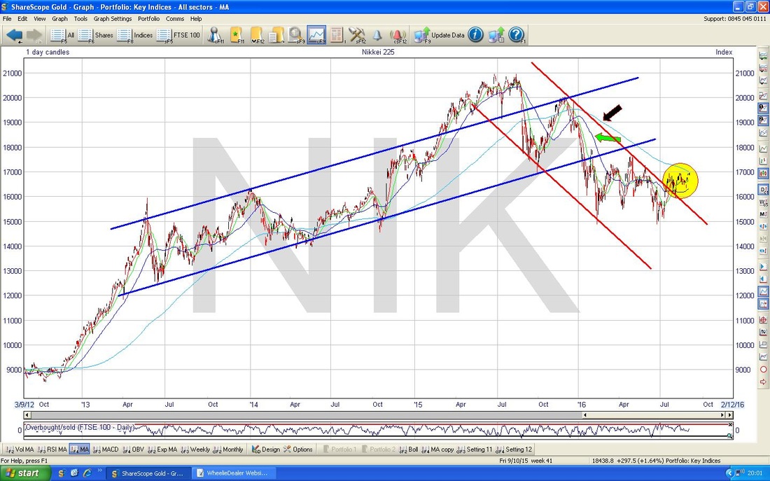
The Chart below zooms in to about most of 2016 and the key thing here is the Black Arrow which is pointing to the Light Blue 200 Day Moving Average Line which is a source of Resistance at around 17000. Also, there is strong Horizontal Resistance at 17000 as marked. The Price needs to breakout over 17000 and this would be a pretty bullish development.
VIX Volatility Index
I had a look at the Indicators and stuff for the VIX and it doesn’t really tell me much that is definitive. However, this Chart is interesting - my Blue Arrow is pointing to where we have a Crossover of the Red 13 Day EMA Line and the Green 21 Day EMA Line - this suggests that the VIX might be on the rise - if really needs to get over 15 as shown by the Short Horizontal Blue Line. Remember, the VIX is inversely correlated to the S&P500 - so a rising VIX is bad for US Stocks, and by extension, this would probably be bad for UK and European Stocks. 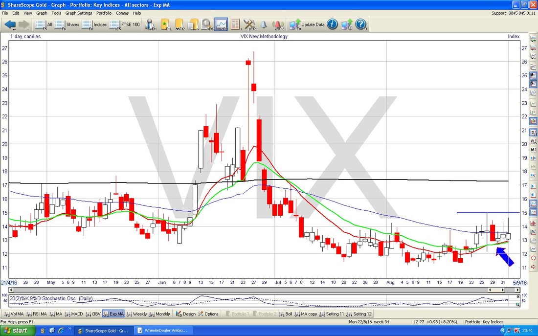
Brent Crude Oil (Spot) The Chart below has the Daily Candles for Brent Oil going back about 4 months or so. My Yellow Circle is highlighting where we had a Big Red Down Candle on Thursday 1st September and then this was followed by a White Up Candle on Friday 2nd September - these 2 Candles together could arguably be forming a Bullish Harami pattern - the Lady with Child one (ideally, a more ‘Textbook‘ Harami would have a shorter White Up Candle). In the context of the move down before, this seems quite likely and we might move up from here - this of course could be a positive for the FTSE100. The nearby Support here is just over $45 and there is a pretty solid Resistance Area from about $47 to $51. Note it also makes sense for the Price to find Support here for a move up because this is the Upper Line of the Downtrend Channel marked by my Parallel Green Lines. This line was previously Resistance when it acted as the Upper Boundary of the Downtrend Channel, and after the Breakout it is ‘right’ that it now becomes Support. 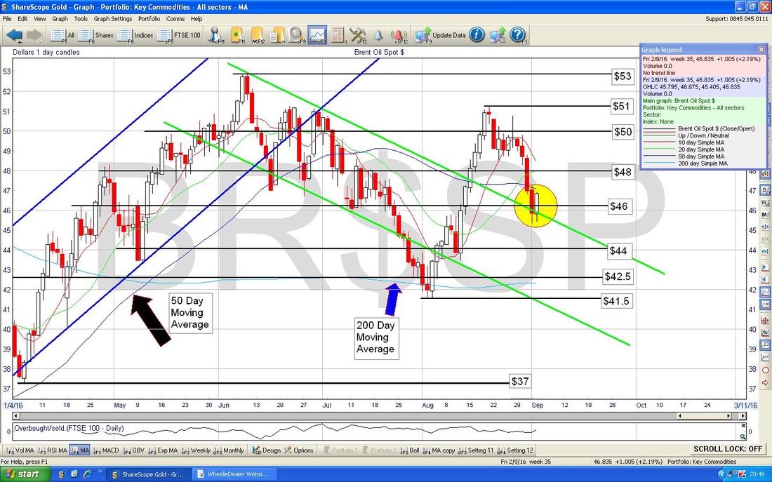
Gold (Spot)
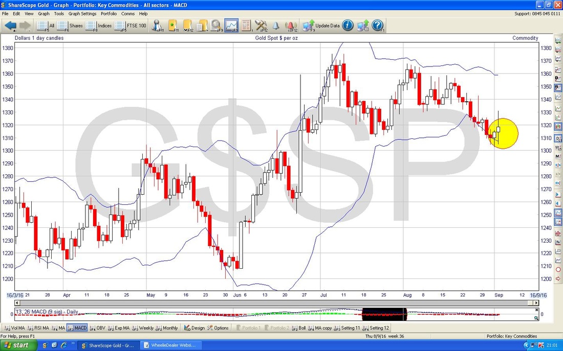
The Chart below has Spot Gold going back about 7 Months. Note we are still very nicely within the Parallel Red Lines which mark the Uptrend Channel. My Black Arrow is pointing to a ‘Long Tails’ Doji which was generated on Friday 2nd September 2016 and this shows a lot of indecision. Note the Support below at about $1302 and the Price found Resistance Intraday on Friday 2nd at $1331 - these levels might constrain the Price Action in coming days. 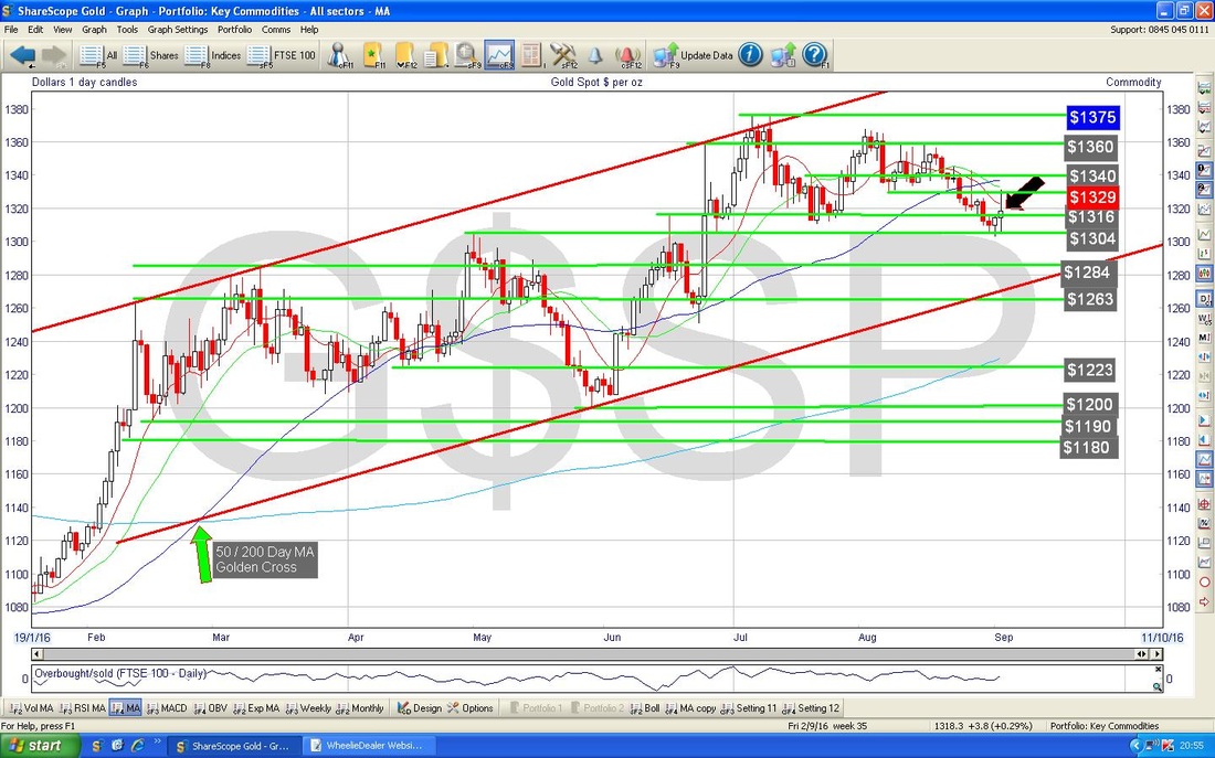
My chart below has the Daily Candles surrounded by the Bollinger Bands. The Yellow Circle is showing where the Price moved up away from the Bottom BB - this is a good sign for Gold Bugs.
The Chart below has the Weekly Candles for Gold Spot. My Green Circle is pointing out a Doji Candle from last week and in the context of the move down in recent weeks, this might be marking a Reversal and we might see a move up from here.
That’s it for tonight - nice to end on a positive note !! Best of luck for the coming week, Cheers, WD. 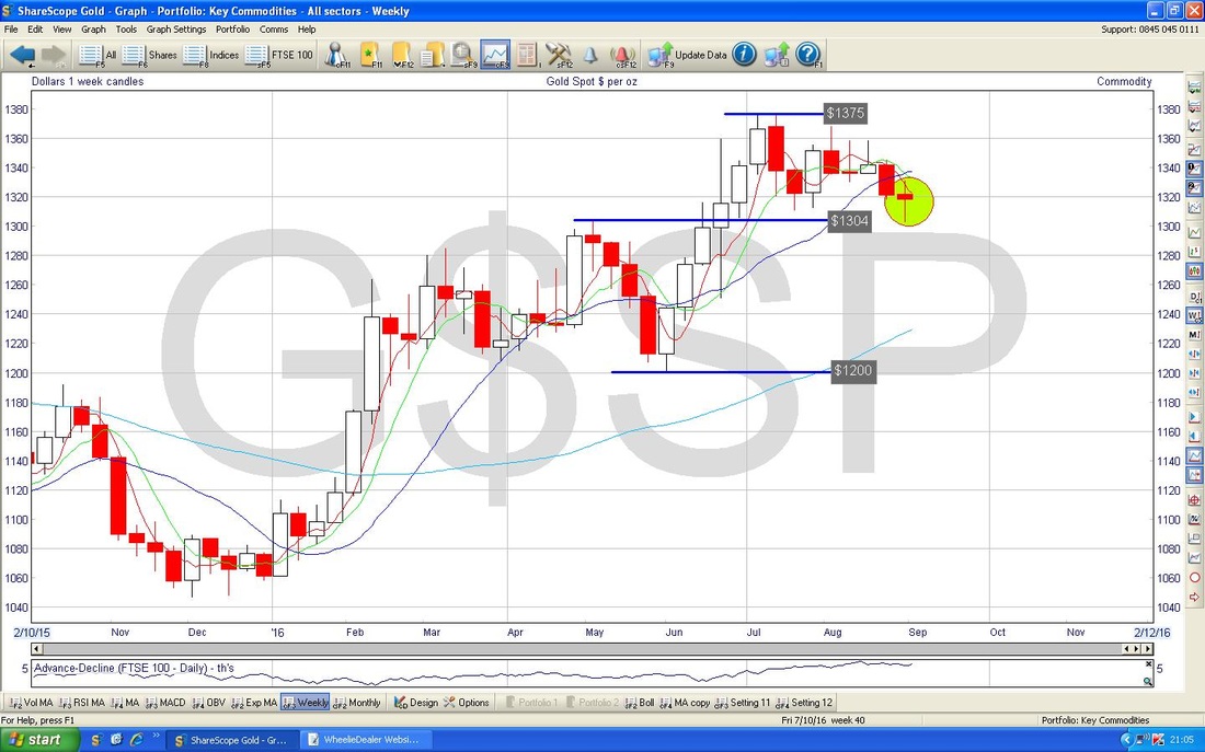
1 Comment
11/7/2023 11:52:25 am
This blog is an absolute gem! The insightful content and engaging writing style kept me hooked from start to finish. Kudos to the author for delivering such a valuable and enjoyable reading experience! Leave a Reply. |
'Educational' WheelieBlogsWelcome to my Educational Blog Page - I have another 'Stocks & Markets' Blog Page which you can access via a Button on the top of the Homepage. Archives
January 2021
Categories
All
Please see the Full Range of Book Ideas in Wheelie's Bookshop.
|
