

|
educational blogs |
|
It’s Sunday Night again and I need to getting thinking about what is going on with these Markets - particularly the FTSE100 because I have about 45% of my Long Portfolio Exposure offset by Short Hedges (please see my ‘Trades’ Page for more details).
I got a bit spooked this afternoon whilst flicking through Last Week’s Investors Chronicle because Nicole Elliott ‘The Trader’ was being right Bearish again and talking about ‘Rolling Tops’ and stuff and I think she might have a point. My concern is that if we are going into a proper Bear Market where stuff just falls and falls over maybe 6 months, then the Strategy to address making money will need to be dramatically different. In essence, Buying Stocks will be off the table and Shorting Indexes will be the name of the game and probably shorting individual Stocks as well. I might even sell a lot of Stocks and move into Cash to a large degree.
Economically it still doesn’t feel to me like we are going into a proper Bear Market but the Charts do have quite a few worrying aspects. I guess if we do avoid a Bear Market, then we might be facing some horrible Sideways stuff for a long time - maybe 2016 will be written off in this way. God I hope not - those kind of Markets really suck.
FTSE100 The Chart below goes back a long way - the Green Line (marked with the Green Arrow) at the Top marks a very Strong Resistance Area which will be almost impossible to get above I suspect and the Blue Line (marked with the Blue Arrow) marks a very Long Term Support Line - this should be Strong but it shows that in theory if we do get into a proper Bear Market, then we might be seeing the FTSE100 down near 4000 - are you prepared for such an event? (I’m not !!) The Black Line (Black Arrow) and Red Line (Red Arrow) denote an Uptrend Channel that was very significant for about 5 years or so - but recently it broke to the downside as I have covered in Blogs in recent weeks I think. 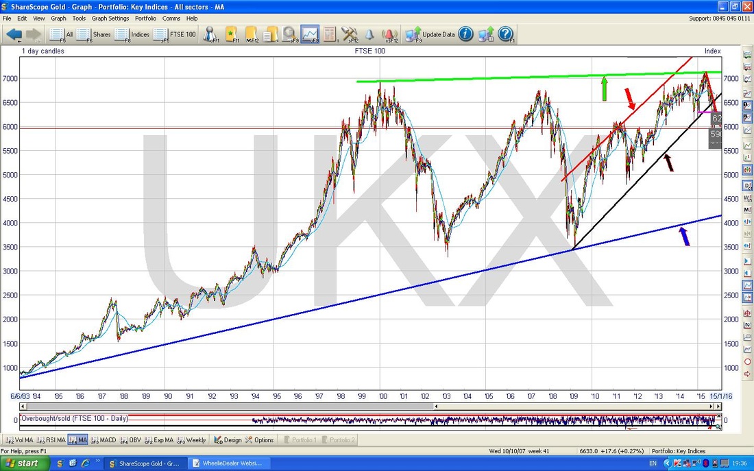
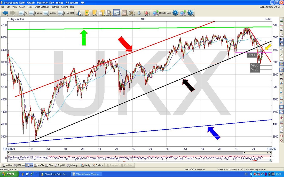
On the ShareScope screenshot below I have zoomed in a bit to just the 5 years or so Uptrend I just talked about (keep up !!). I have put in a Yellow Arrow in the Top Right which shows roughly where we are now. It is important to note that we have not as yet managed to get back up to the Black Line (marked with the Black Arrow) which was the Floor of the Uptrend Channel. Bulls need the Price to get up to this Black Line (which will now act as Resistance) and to get through it and back into the Uptrend Channel - this seems a very big ask and I am seriously wondering if this can really happen - if I had to fall down one side or the other, I would say it will not get through and it looks pretty bleak……..although we might get the horrible Sideways Market I was talking about.
The Chart below drills in more and shows the last year really. The Black Line is the same one that was in the Charts above and now I want to bring your attention to an important Red Line (marked with the Red Arrow) - look how this is joining all the Peaks in a downtrend - that is not too good. It is utterly critical that the Price gets back up above this Red Line and if it can do that, then it would be the first positive development for a while. However, even if we crack this hurdle, we then need to get through that Long Term Black Line which will act as strong Resistance.
My Blue Arrow points to the recent Peak from about a week ago - note how the Price fell back when it touched the Red Line - I suspect we are about to see a repeat of this very soon as the Price is coming back up to the Line now. That failure to go higher about a week ago was very poor behaviour from a Bulls point of view - it was a bearish development. 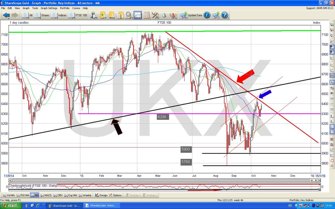
On the Chart below I have zoomed in to about 4 months or something. Note here I have put in 2 new parallel Blue Lines which I think might be a sort of attempt at an Uptrend but they are not very ‘confident’ lines in that the Top one is quite clean with 5 touches maybe, but the bottom one is really just drawn parallel and not very good. Bit of WheelieChartist Chartistic Licence.
Not really sure why I shoved a Red Arrow in there - maybe when I was mucking around with the Charts I thought that was where the Price might fall to in the very short term if we do see a drop now - around 6200 I guess. The Black Arrow is more important at this point - it is highlighting the Candle from Friday which has a White ‘Body’ but has a ‘Wick’ sticking out of the top - so it is really a sort of ‘Inverted Hammer’ but not a clean one. Cast your eyes back 5 days and we had almost exactly the same Candle and the Price fell - seems likely this could be repeated. 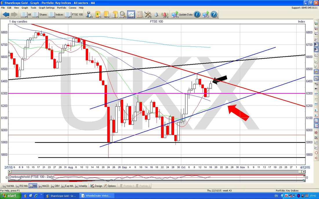
The Chart below shows the Bollinger Bands in the top window and my Black Arrow points to where we are now - you can see that the Price has come off the Top Bollinger Band (the Blue wiggly Line at the top) and usually this means the Price will fall or at best go sideways.
The Bottom Window shows the MACD (Moving Average Convergence Divergence) - my Black Circle surrounds the Green Histogram ‘Hump’. Note how these Humps tend to precede the Price falling and the MACD graph creating Red Humps. My Red Arrow is an attempt to show that the MACD line has ‘flicked up’ but I tend to find that such flicks rarely have much lasting conviction behind them. 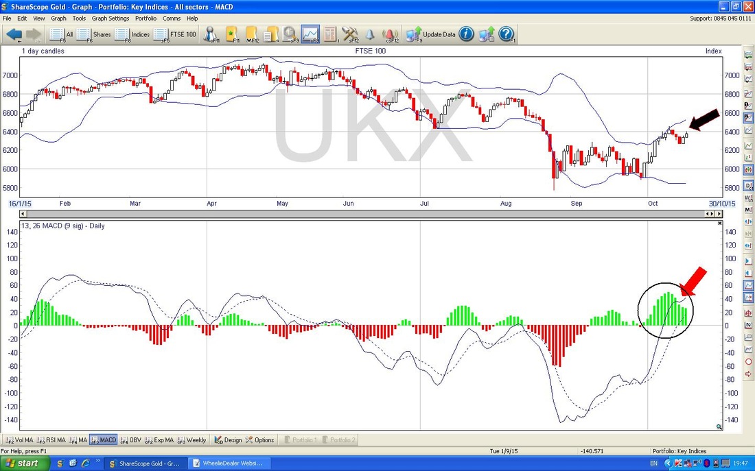
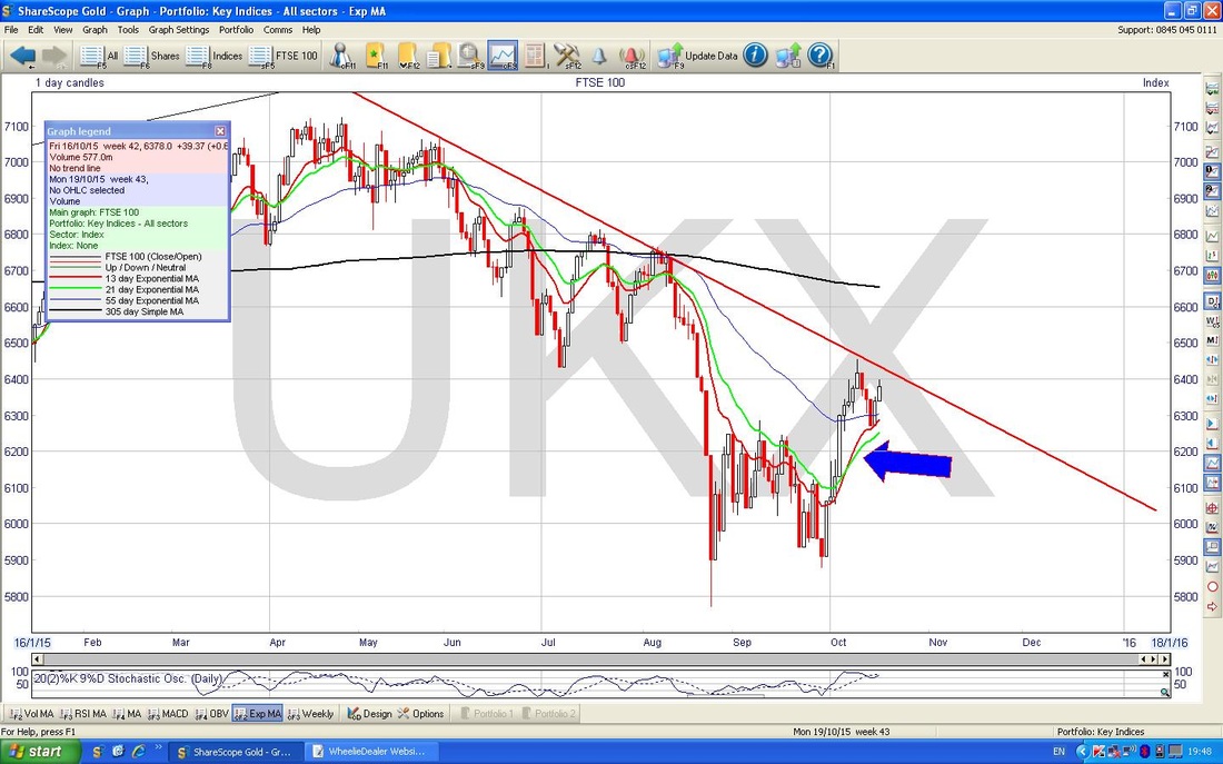
The Chart below has a Blue Arrow and the idea here is that I am trying to point out that the Red wiggly 13 day Exponential Moving Average (EMA) Line has crossed over and above the Green 21 day EMA line - this tends to be bullish for a while.
The Chart below shows the FTSE100 Weekly Candles - my Black Arrow points to a Bearish looking Hammer Candle - in the context of recent gains this is bad.
For a clear example, look at my Blue Arrow which points to pretty much the same thing. Note also the Green Arrow which points to an ‘Inverted Hammer’ - I put this in to make the point that once a Price has moved up strongly for a while, any kind of Hammer (Normal or Inverted) is usually bearish. Note a similar effect can happen after falls. 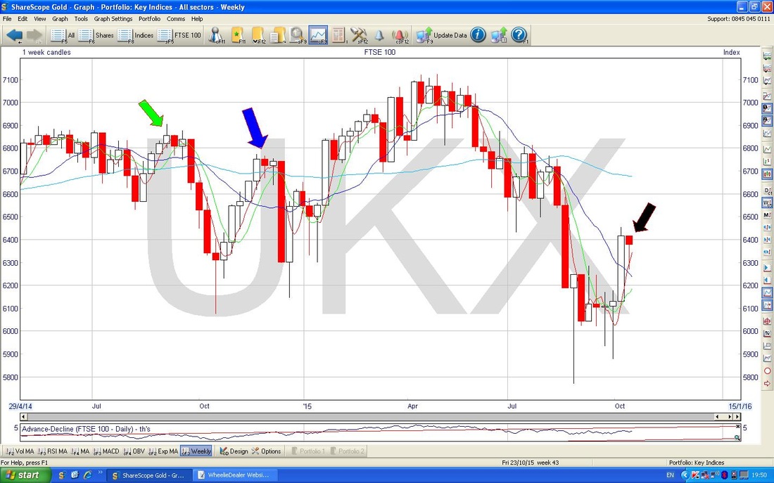
S&P500
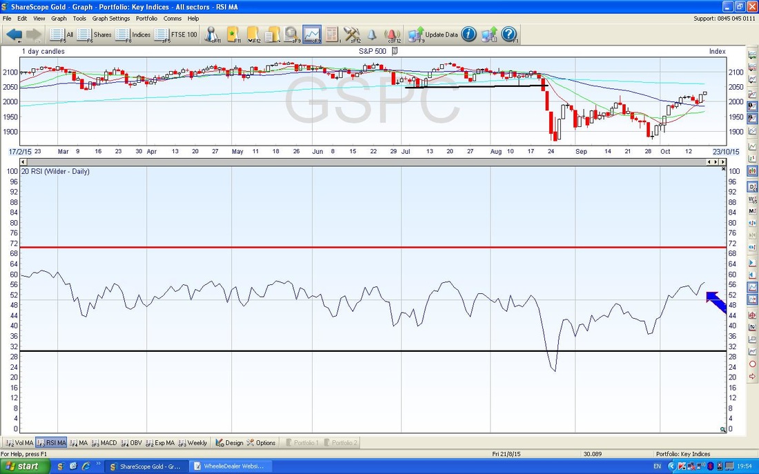
Time to whizz over the Oceans - the Chart below has the S&P500 for most of this year. The Red Line (marked with the Red Arrow) is very reminiscent of the one we talked about on the FTSE100 and the Price is now coming up towards it - it is very important for the Bulls that it can break through and keep on rising. Failure of this to occur on such a critical Global Index really could be the final nail in the coffin for the Bulls and I would start getting pretty concerned. However, the Black Line at the bottom of the screen would be the one to really worry about - if that fails we really are in the poo (and I am not talking Winnie the Pooh and Honey.) My Blue Arrow is pointing to the feint Blue meandering line - this is the 200 day Simple Moving Average - note how it might act as Resistance to the Price but also note that it has sort of started to turn down - this is not good, for an Uptrend you need the 200 day MA to be pointing up. 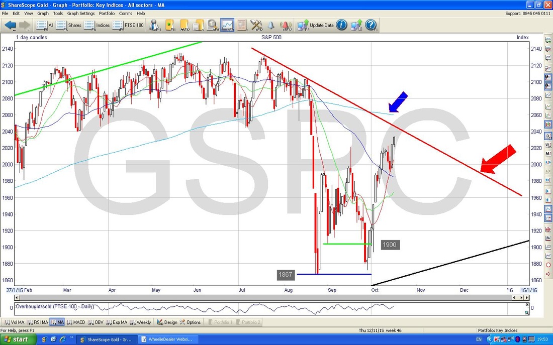
In the bottom window of the Screen below, you should see the RSI (Relative Strength Index) - my Blue Arrow points to where we are now, and you should be able to see we are reading about 57 so there is plenty of room for the Price to move up before becoming Overbought - this would be around 65 to 70.
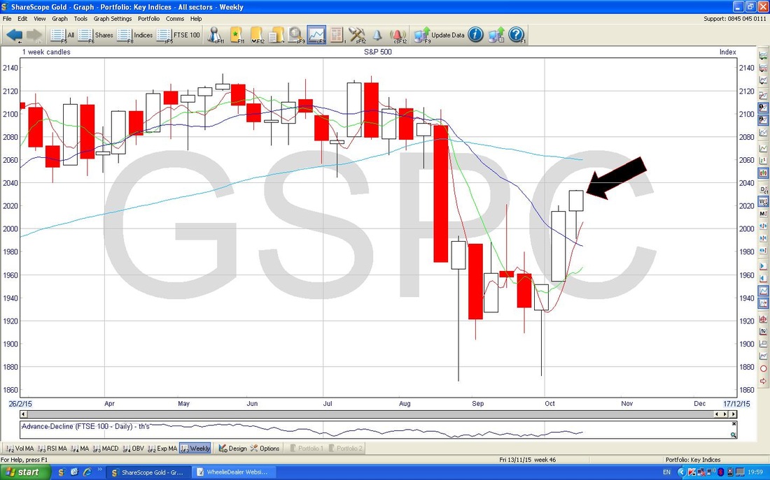
The Screen below has the Weekly Candles for the S&P500 - my Black Arrow is pointing out a Hammer Candle - where have you seen this before?
FTSE250
Seems like for weeks I have been tweeting out that the FTSE250 and some other Indexes were struggling at the 50 Day Moving Average. I just wanted to show this on a Chart - so here it is. The Blue Arrow points to the Blue Wiggly 50 Day MA line and you should be able to see that it is sort of capping the Price Line. Another Bearish development is the ‘Death Cross’ that has occurred as the 50 Day MA has dropped down through the 200 day MA - marked with the Black Circle. I note some of the other Indexes have improved but these things can overshoot so they might not be in the clear yet - the AIM Allshare springs to mind. 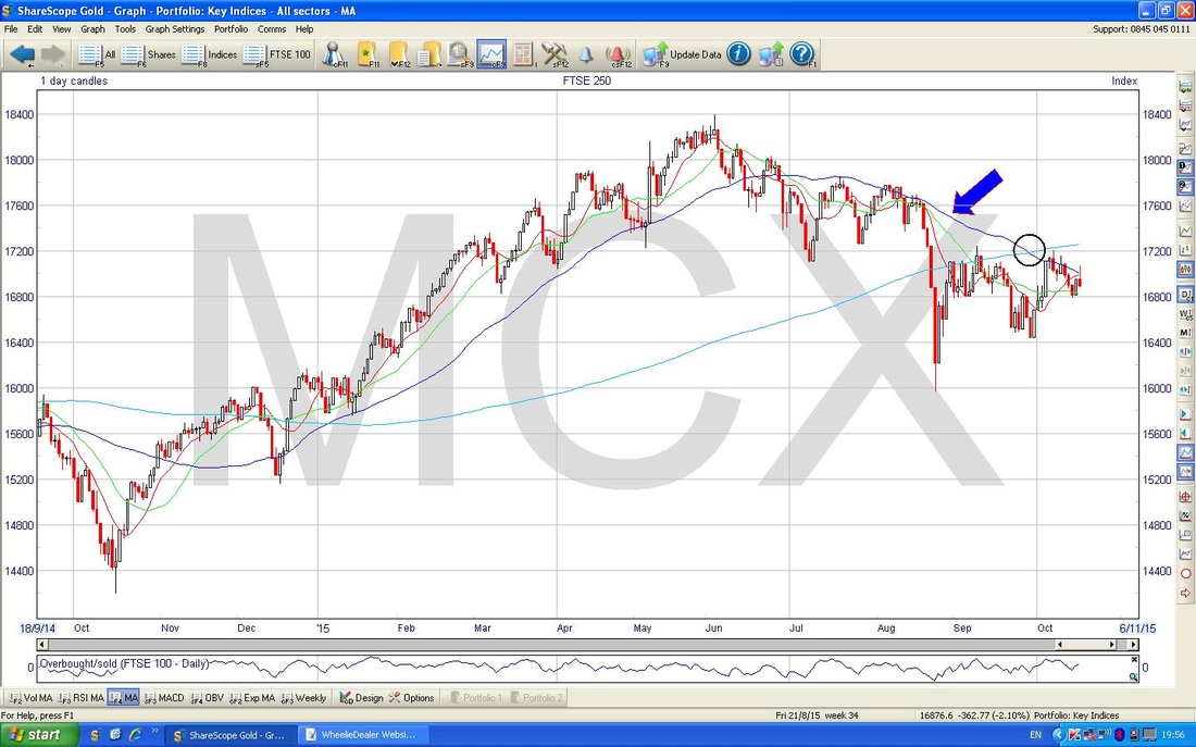
Brent Oil
We have a similar situation here with Moving Averages capping Price moves. My Blue Arrow is pointing to the 200 Day MA (wow, that has been some Downtrend !!) and note how the Price Candles are still not getting above it. Indeed, my Black Arrow sort of points to the Weekly Candle from last week and it looks pretty ugly with a Big Down Week. 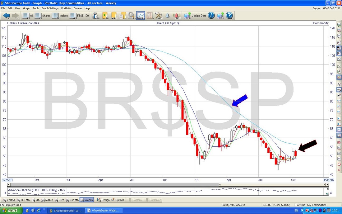
Gold
All I read about constantly is how Gold is going up. It may well be, but any such talk is premature until the Long Term Downtrend is broken. My Red Line is my best approximation of where the Top Line of the Downtrend Channel is - and we still have not broken through. 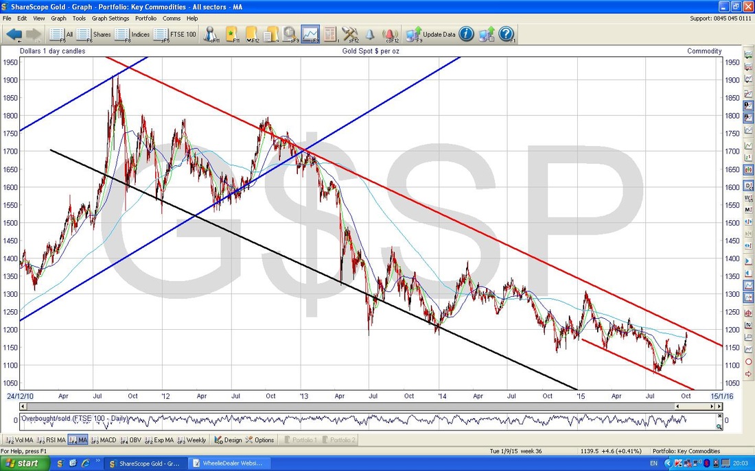
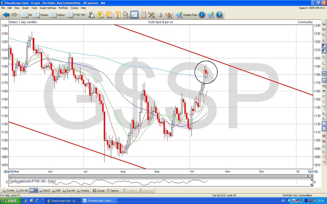
I have zoomed in on Gold in the Chart below - my Black Circle highlights the Candle Action of the last 3 days - a Strongish Up Candle followed by 2 Long Tail Doji things - looks like a Reversal Pattern setting up to me.
The Chart below in the bottom window shows the RSI on Gold. Look how high it is as marked by my Black Arrow - looks Overbought - cast your eyes to the Left and look what happens to the Price when the RSI gets this high in the recent past.
OK, I think I have scared enough People for one night, WD. 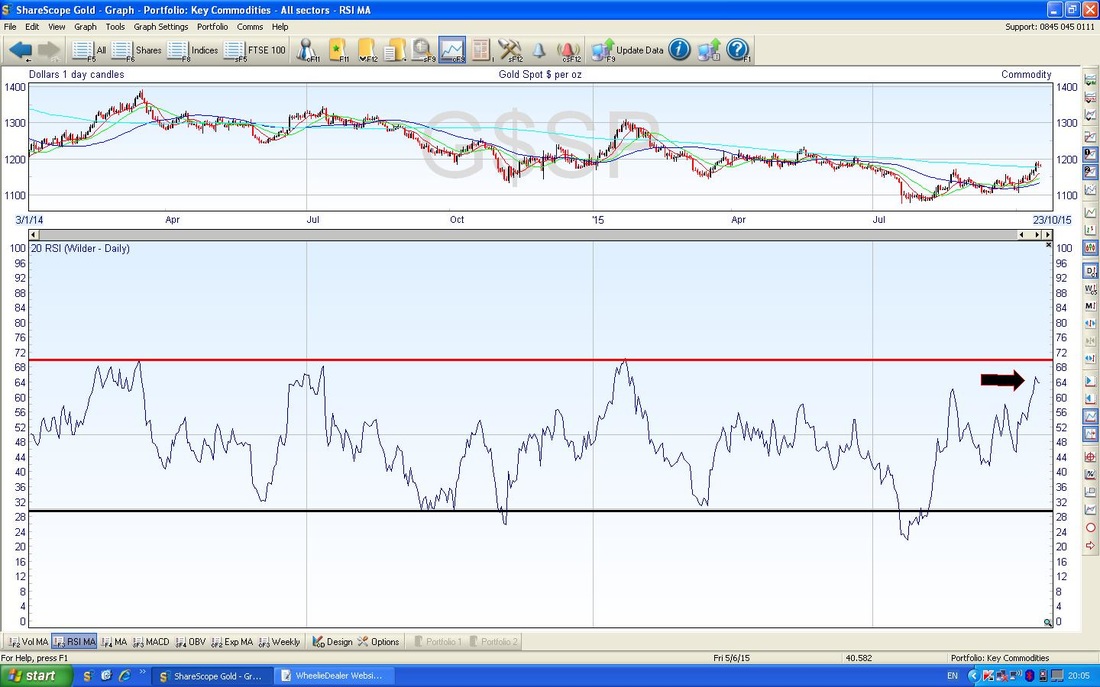
2 Comments
catflap
18/10/2015 11:02:19 pm
Hello Wheelie Doom-monger.
Wheelie Doom-monger
19/10/2015 10:02:20 pm
Hi Catflap, thanks for your feedback and confirmation of my bearish concerns !! Leave a Reply. |
'Educational' WheelieBlogsWelcome to my Educational Blog Page - I have another 'Stocks & Markets' Blog Page which you can access via a Button on the top of the Homepage. Archives
January 2021
Categories
All
Please see the Full Range of Book Ideas in Wheelie's Bookshop.
|
