

|
educational blogs |
|
Obviously any Index is just an amalgamation of its constituent Stocks and I thought it would be interesting to look at the Top 10 FTSE100 Stocks (by Market Capitalisation) this week and to see how they were shaping up - if we are to get a Pullback soon after a powerful Rally in recent Weeks, then these Top 10 will by definition have to fall also. This is even more so with the FTSE100 because it is not ‘evenly weighted’ with all constituents having the same impact on the Index - it is heavily biased towards the Bigger Stocks, as it is weighted according to Market Caps.
But before we get onto those, I will have a quick look at the usual Indexes and Oil & Gold.
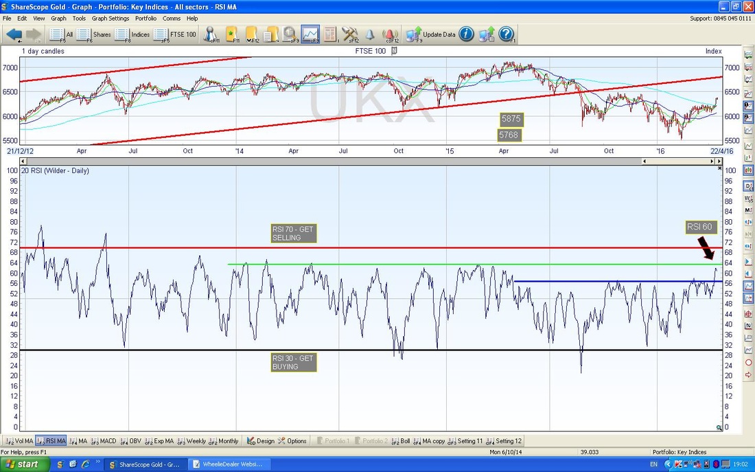
According to the UK Stockmarket Almanac, the coming week is on average up for 66% of Years with an average Return of 0.6% - so the Historical backdrop is positive and it could be a good week if this holds true. Last week was particularly strong with a big rise on Wednesday 13th April and I can’t help thinking that maybe this is a ‘Blow-off Top’ - a last hurrah for the Bulls - before the Markets fancy some downwards action again. Of course, my view is entirely biased by the fact that I am heavily Short and this would be my preferred outcome !! FTSE100 The Chart below from ShareScope goes back about a year on the FTSE100 Daily Candlesticks. It is pretty clear now that the Price is a long way away from the Red Downtrend Line and this is positive. If we do get a Pullback, then this Line could act as Support. My Black Arrow is pointing to the 200 Day Moving Average which is still falling and therefore denotes a Downtrend - so we are not out of the Bear Woods yet but my Red Arrow is pointing to the 50 Day Moving Average and look at how this is curling up and approaching the 200 Day MA. If it can cross over the 200 Day MA, then this would be a Bullish ‘Golden Cross’ and a really positive sign. However, it is possible that we get a temporary Golden Cross and it then falls back shortly afterwards - with a falling 200 Day MA, this is very possible. I have drawn in a Black Horizontal Line at 6487 (give or take that is roughly 6500) which is a very Strong Resistance Line - I suspect the Market will struggle to get over this before we get a Pullback - however, it is quite possible that we get in a Range between maybe 5900 to 6500 ish or a bit tighter. Note, before we get to the dizzy heights of 6487, there is a lot of Resistance at 6400 to wade through. It is a Bullish development seeing the Price over the 200 Day MA at around 6225 ish - this was formerly Resistance and should now act as Support - however, it is not unusual for the Price to get over the 200 Day MA and then fall back. It strikes me that the power of the recent Rally has been so strong that even if we get a deep Pullback, I would expect the Support Levels down around 5500 at the worst, to hold firm. At least on any initial Plunge down. Support is strong around 5900 so maybe this would be where a Bottom is found. 
In the bottom window on the Chart below, you should see the RSI (Relative Strength Index). At the moment we are reading about RSI 60 which is not particularly high but note how in the past the Market has turned down when the RSI has got to where my Green Horizontal Line is - around RSI 64 - and yet again we have turned down from this kind of level just this last week. Note how the RSI has very rarely got up to 70 or higher (RSI 70 is usually seen as the ‘Overbought’ level).
The Screen below is a very short timeframe on the Bollinger Bands - I have chosen this so I can show clearly what has happened in recent days. My Black Arrow is pointing to a ‘Narrow Body Doji’ Candle that was generated on Thursday 14th April 2016 - it is very possible that this could mark a Reversal and indicate that the Market it going to ease back a bit - indeed, if you look at the Red Down Candle from Friday, then it looks like this might be the case.
The other interesting thing here is that the Big White Up Candle from Wednesday 13th April 2016 actually kicked the FTSE100 Price line out of the constraints of the Upper Blue Bollinger Band - this is usually an unstable event and it is no surprise that the Price has fallen back within the Bands in the last couple of days. 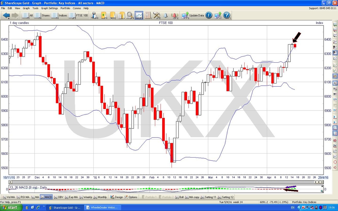
The Screen below shows the Weekly Candles going back about a year - my Blue Arrow is pointing to a lovely Up Candle that we got last week - this is Bullish and for the Markets to turn down I would expect to see some sort of Bearish Reversal Candle (or a combination of Candles) - no sign of that yet. Note the Resistance at 6487 again.
Overall the FTSE100 Chart still looks quite good although we might get a pullback for a few days - however, with “Sell in May……” and the Brexit Vote coming up soon, it is hard to really believe that the FTSE100 can make much more progress to the upside. The Resistance at 6500 ish might be the defining factor. 
S&P500
Apologies for the following Chart - it is a bit ‘busy’ but I didn’t want to put gazillions of Charts in this Blog as it is a nightmare loading them up into the Website (don’t worry, there are merely a Trillion Charts in this one……) This Chart has the Daily Candles on the S&P500 (the main US Index in my view) going back about a year. Note how we are now well clear of the Purple/Pink/Whatever Downtrend Line (marked with a similarly awfully coloured Arrow). The Green Arrow is pointing at the 200 Day Moving Average which is still falling but has sort of started to level out - the Red Arrow is pointing to the 50 Day Moving Average which has sharply turned upwards and is very near crossing the 200 MA and doing a Golden Cross. However, look back to the start of 2016 and you can see how such a Golden Cross failed to amount to much. The All Time High (ATH) on this Index is at 2135 and this will be extremely difficult Resistance to break through I would expect. Note, before we get there, it needs to break through 2100 and 2120 among other Resistance Levels. Looking at this, it is like there is an extremely strong Layer of Thick Ice on top of the S&P500 Pond and the Fishies are going to find it hard to smash through and take a Gulp of Air. My Green Circle is showing a similar string of 3 days to those experienced on the FTSE100 last week. I’m sorry it is a bit small but like the FTSE100 we had a Strong White Up Candle followed by a Doji and then a Down Day on Friday - this might be a Top but it is a bit early to know for sure. However, look back to the left and I have marked loads of Blue Circles where we got some fairly similar Candle Patterns - the main thing on all of these is one particular Day where we got a Bearish Intraday Reversal and these resulted in Long ‘Tails’ or ‘Wicks’ pointing up on the Candle for that Day - this is certainly what we saw last Thursday. 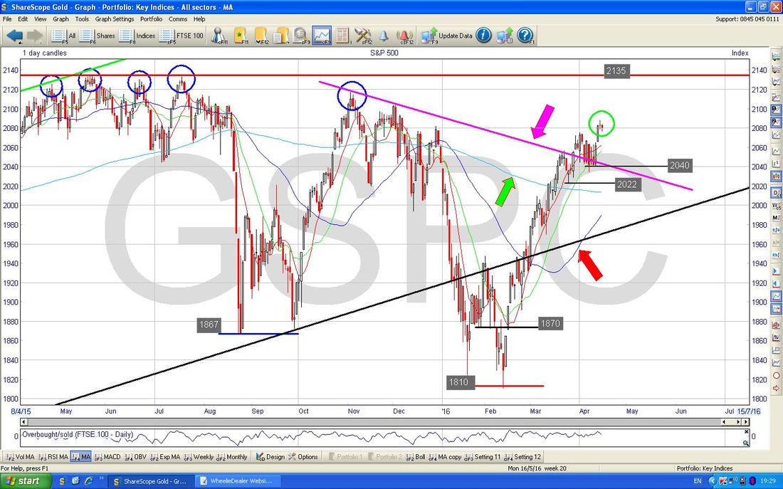
There is an interesting development on the RSI Chart below. If you look you should see a Short Blue Line on the bottom window RSI Chart and up above on the Price Candle Chart in the upper Window you should see a similar Short Blue Line - but look how they are ‘diverging’ - in other words, the one in the Upper Window is pointing Up whereas the one in the bottom window is pointing Down.
This is a Bearish RSI Divergence. 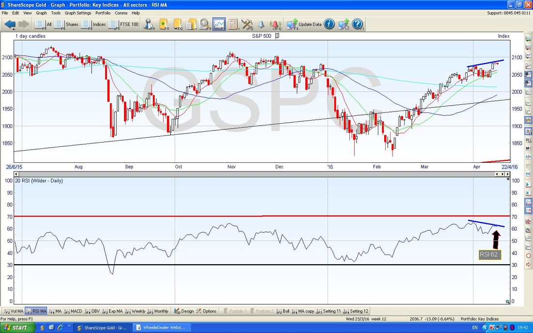
Brent Oil
The Screen below has the Daily Candles for Brent Crude Oil going back about 8 months or so. Note the 200 Day Moving Average (marked with my Blue Arrow) is still falling so we are still in a Downtrend - despite the strength of the Rally. My Black Arrow shows the 50 Day Moving Average - this is clearly moving up and we may get a Bullish Golden Cross soon. The 2 Blue Parallel Lines that I drew some weeks back to mark the Uptrend Channel are working pretty well and the Price is staying within those confines. It looks likely that the Price will fall a bit in the Short Term and maybe test the bottom of the Uptrend Channel at about $41 ish. My Green Arrow is pointing to an ‘Inverted Hammer’ Candle which was generated on Wednesday 13th April 2016 - note how this has done its predictive thing and resulted in a couple of Down Days subsequently. Like on last week’s Blog, my Big Black Circle in the Top Left Hand Corner marks an Area of Strong Resistance between about $46 to $54. 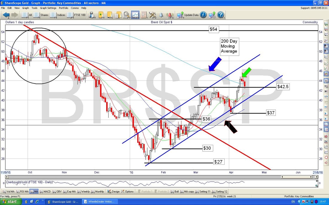
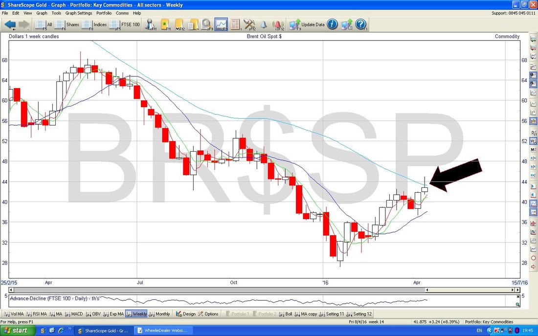
The Screen below has the Weekly Candles for Brent Oil - my Black Arrow is pointing to a very clear ‘Inverted Hammer’ - this is very bearish - I tend to find these Candles are pretty reliable.
Gold
In many ways not a lot has changed here. We still need to breakout over $1284 and there is no point being all Bullish on Gold until that has happened. At the moment, we are probably stuck in a Range between maybe $1200 to $1260 or a bit wider. Last week I was ruminating that the 3 Red Circles I had drawn might mark a Bearish ‘Head & Shoulders’ formation - this week I have moved the Right Hand Shoulder a bit but it really does look like this is possible - that would really surprise everyone if Gold has topped out. It is something to be aware of - the Danger Sign would be if Support at $1180 fails I suppose. 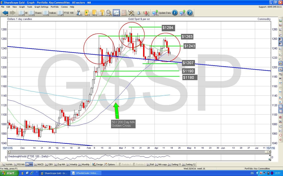
FTSE100 ‘Top 10’ Charts
I found the FTSE100 List in ShareScope and then double clicked on the ‘Capital £m’ heading to the Column and it sorted them into order from the largest Market Cap going downwards. The initial charts are the Top 10 Biggest Stocks - I thought this makes sense as they have the most impact on the FTSE100 because it is not an equally-weighted Index. Please note, there is a lot of subjectivity in the choice of Timeframes and Charts to show - I have tried to pick relevant Charts which show what is going on. Royal Dutch Shell (RDSB) RDSB has by far the largest Market Cap in the Index - £145Bn as opposed to the next Stock, HSBA, which is £89bn. This goes a long way towards explaining why the FTSE100 has been closely correlated to the Oil Price for some time. The Chart below goes back about 1.5 Years and the clear feature here is the Downtrend Channel which I have shown with the Parallel Red Lines and then we have a newer Uptrend Channel which started back in early 2016 - this is marked with the Black Parallel Lines. This Uptrend is clearly very bullish as it was a breakout from the Downtrend Channel - note there is Horizontal Resistance at 1850p, then just over 1900p and then there is a Strong Resistance Area at 2000p (it is strong because it previously had about 4 touches when it was acting as a Support Level - you can see this on the Chart around the first few months of 2015). My Blue Arrow is pointing to a Golden Cross between the 50 and 200 Day Moving Averages - it is happening right now and a clear crossover will be a Bullish Development going forward. Contrast this with the BP. Chart further below - if you want to own an Oil Major - buy RDSB not BP. !! 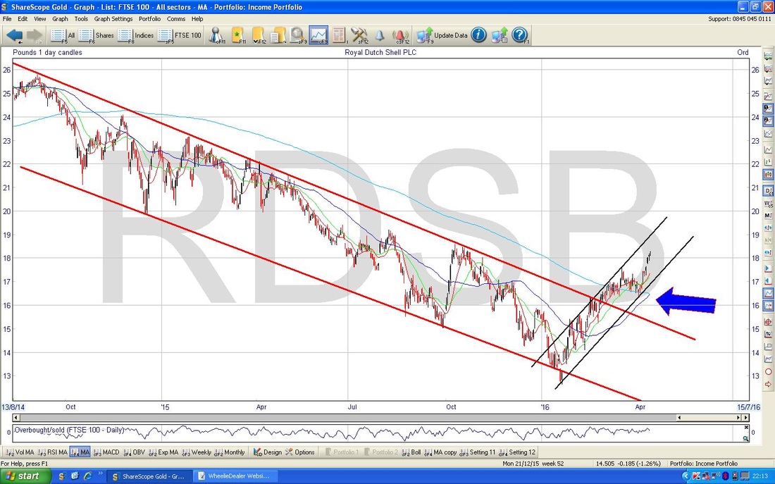
HSBC Bank (HSBA)
The Chart goes back about 3 years but however you look at it, it is poor. My Black Parallel Lines show a Downtrend Channel that went to about mid Summer 2015 and since then, my Red Parallel Lines mark a steeper (and therefore more powerful) Downtrend Channel which is still driving the Price lower. Note the falling 50 and 200 Day Moving Averages. This is a ropey chart. 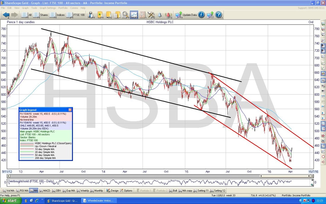
British American Tobacco (BATS)
Not much to say here - Bullish however you look at it. Arguably it is due a pullback soon within the Uptrend Channel but it may go up a bit more first. Remember, this is very much a Defensive Share so it may rise if other Stocks fall during worries prior to the Brexit Vote on June 23rd. One of the strange paradoxes at the moment is that Defensive Assets such as Government Bonds and Tobacco / Utility Stocks are doing well at the same time as ‘Risk on’ Assets like Miners etc. are rallying - something doesn’t quite add up here and I suspect it is the Bullish Stocks that are wrong. 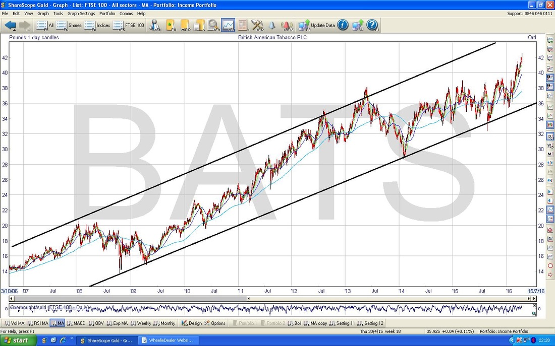
GlaxoSmithKline (GSK)
This Chart goes back about 12 years or something - note the Black Parallel Lines which show a very Long Term Uptrend Channel but then since early 2013 there is a Downtrend Channel marked with my Parallel Red Lines. Simply put, the Price needs to get over the Upper Line of my Downtrend Channel where I have put the Blue Arrow, but there is a nice little Uptrend Channel that has been running since about October 2015. The price looks a bit overstretched in the Short Term but the thing to watch for is a Breakout of that Upper Red Line - ideally we would want to see the Price over about 1650p to be pretty confident the Breakout has happened. 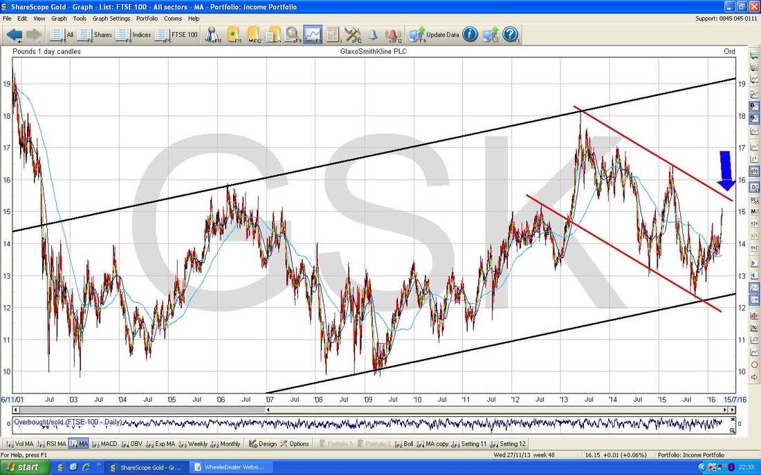
SABMiller (SAB)
The Chart here goes back for yonks - it is clearly a superb Uptrend. I have not spent any time on this one as they are in a Bid Situation I understand. Note, the Blue Parallel Lines were not drawn by me - they are from the ShareScope ‘Toggle the Trend Lines’ Button which I just clicked to save me wasting time. This Button appears on the Right Hand Side of the Screen and it is just by where the ‘36’ appears on the Chart Axis. If you are rubbish at drawing the Trend Channels yourself, you can use this function on any Timeframe you are using. It is very cool. If you can’t figure out the Trend, then you can click this Button to give you a prompt - I occasionally use this although I am pretty good at spotting the Trends these days. 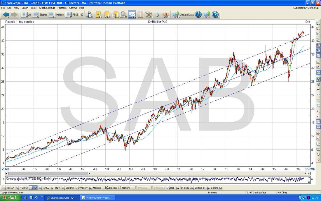
BP (BP.)
The Chart goes back about 8 years or so. Note the Downtrend Channel marked with my Blue Parallel Lines. 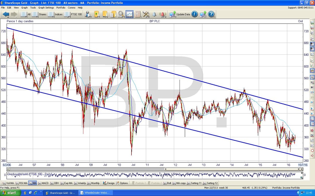
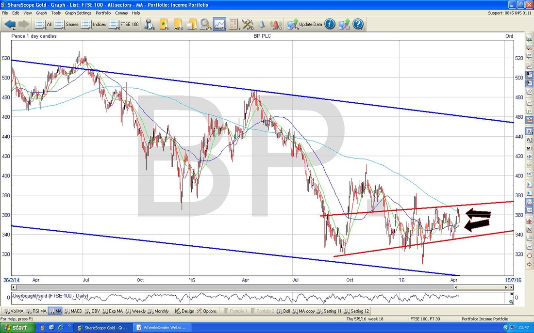
Top value on this one - you get 2 Charts !! (it’s a bit like in the old days when you would fill up with Petrol and get a Voucher towards a Free Glass….) This second Chart shows a shorter Timeframe of about 2 years ish. This keeps the same Blue Parallel Lines of the Major Downtrend Channel from the previous Chart, but I have added in a more recent sort of Uptrend Channel from about October 2015 in the Red Parallel Lines. It is not all that impressive and is sort of almost Sideways - however, my Black Arrows are pointing to the 50 and 200 Day Moving Averages that are fairly close to doing a Bullish Golden Cross - for Bulls on BP. this really needs to happen. However, that Blue Lines Downtrend Channel is the dominant feature on this Chart.
Vodafone (VOD)
The Chart below goes back about 13 years and has a very wide Uptrend Channel marked with my Parallel Blue Lines. Since the end of 2013, there has been a Downtrend Line which I have shown in Red. The Price is very near to breaking out of this Line now - my Black Arrow points to where it is now. I would say we need to see the Price over 235p to be sure it has Broken Out and this would be a Bullish Development. 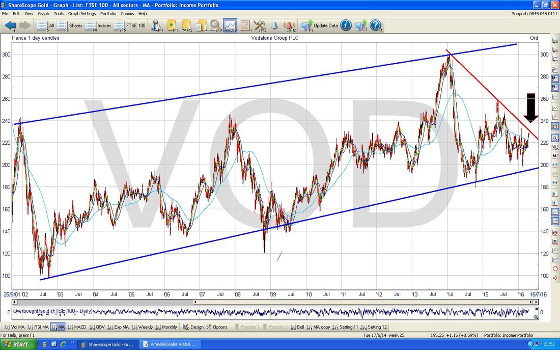
AstraZeneca (AZN)
On the Chart below, I have shown about a Year really but the key bit for me is those Red Parallel Lines which are marking a Downtrend Channel. Obviously the Price needs to breakout over the Upper Red Line - a Price over 4300p would mean this has been achieved really. Note the Moving Averages are falling also - not good. 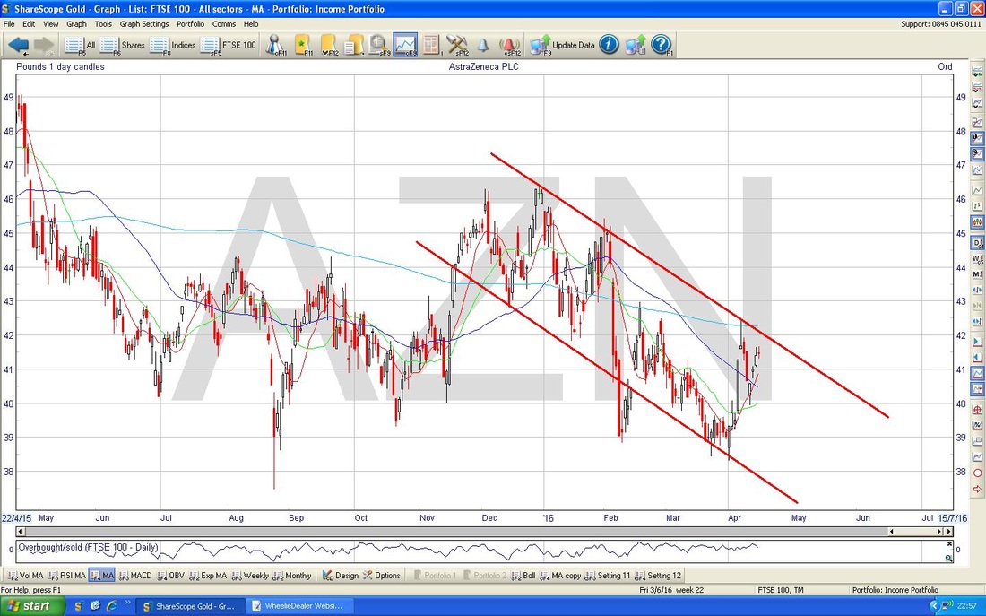
Lloyds Bank (LLOY)
The Chart below goes back about 6 years and shows a very wide Uptrend Channel with the Black Parallel Lines top and bottom of the screen. My Red Parallel Lines show a Downtrend Channel over the last year or so - obviously the Price needs to breakout of the Upper Red Line. The Moving Averages don’t look too bright either - the fainter Blue Wavy Line shows the 200 Day Moving Average which is clearly falling. The 50 Day Moving Average has turned up so maybe a Golden Cross will happen - but there is some time before this is likely. I am very surprised that LLOY qualifies for the Top 10 - its Market Cap is £48.6bn however, so it is still pretty chunky. 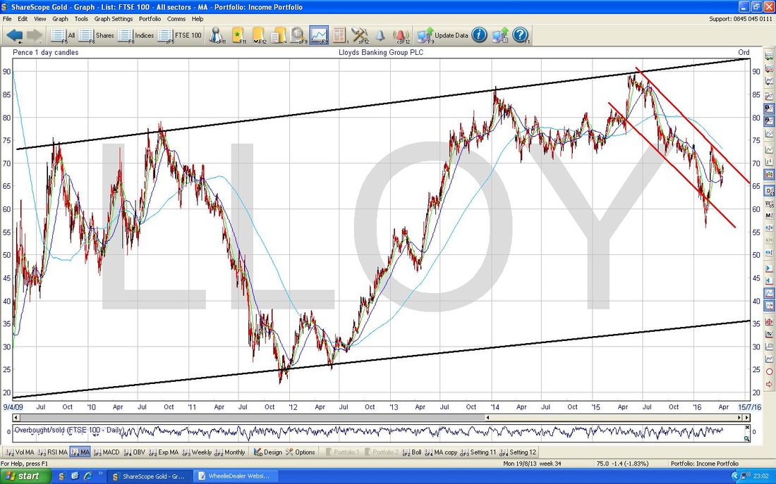
Diageo (DGE)
Time for some Guinness………The Chart goes back about 6 years and it has a great Uptrend for many Years and then in 2013 a shallow Downtrend Channel started which I have marked with the Parallel Red Lines. We are nearly at a Breakout of the Upper Red Line and this would be bullish - however, I have also drawn in an alternative Blue Line which marks 2 outliers on the Price Candle Peaks which really needs to be broken over for a proper Breakout. I note an Inverted Hammer Candle from Friday 15th April 2016 so maybe the Price will fall now and stay within the Downtrend Channel. 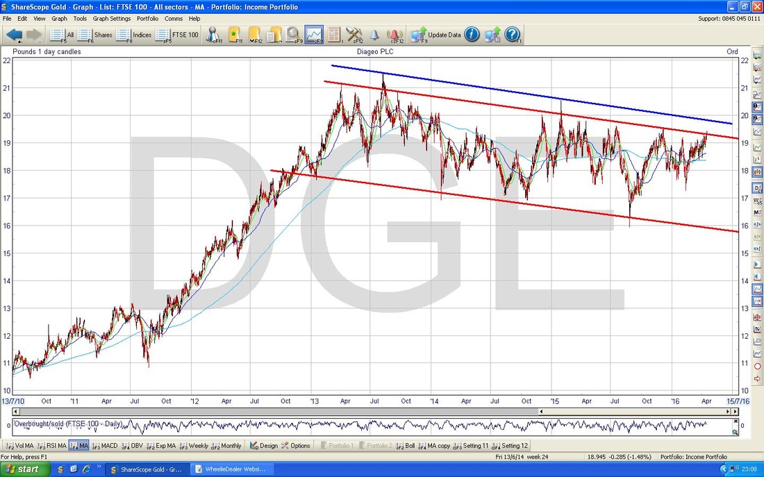
BHP Billiton (BLT)
I have looked at the Top 10 for the FTSE100 but I thought I would cover a couple more. I know many people hold BLT and I fancied looking at a Major Miner to see how the Chart is shaping up. This goes back about 3 years but the main Feature here I have marked with the Blue Parallel Lines and is a clear Downtrend Channel. Despite all the Rally of recent months, this is still in a Downtrend. The falling 200 Day Moving Average confirms this also. 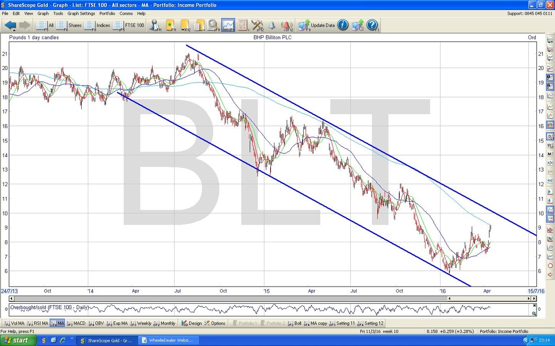
Standard Chartered (STAN)
I hold some STAN myself, and thought I would bung a Chart in. This goes back about 3 years and yes, it is flippin’ ‘orrible. I can’t bear to look at it anymore. 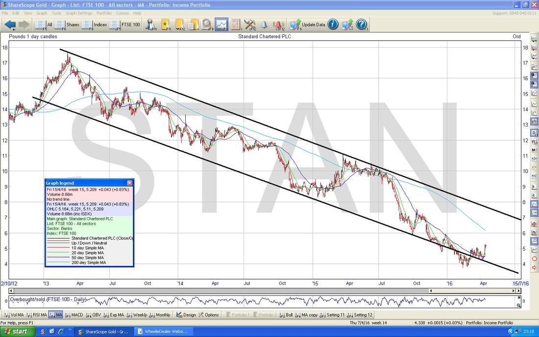
Persimmon (PSN)
Ben Sharman asked me to check this one out. The Chart goes back a couple of years and there is a reasonable Uptrend Channel which I have shown with the Blue Parallel Lines. This is quite a difficult chart to interpret - there is a lot of subjectivity in where you draw the Lines and the Timeframes to look at. This is the best compromise I can find and it looks like there has been a Breakdown through the bottom Line of the Uptrend Channel. However, due to the subjectivity in positioning the Lines, I would say a clear signal that the Chart is breaking down would be if the Price falls below the 1772p Support Level what I have drawn in. As long as it stays above this, you are probably OK being Long this Stock. 
Right, that’s it for this week. I had hoped that by looking at the Top 10 I would get a clear impression of how they were likely to move and their impact on the FTSE100. Apart from a few obviously horrible ones like STAN, BLT, BP., which all have Major Downtrend Channels, it is actually quite mixed with a few decent Charts in there also. Interesting exercise though and I am sure many Readers hold some of these Stocks or are interested in Buying them.
Anyway, whatever, I hope everyone has a decent Week, cheers, WD.
2 Comments
catflap
18/4/2016 05:04:09 pm
Free beer glasses when you fill up at BP? Perhaps they need to resurrect that to boost their stock price.
WheelieDealer
18/4/2016 09:36:27 pm
Hi catflap, thanks for the comments - I did wonder if anyone would pick up on the Free Beer Glasses at BP........ Amazing really when I think back on it - they really did give away some shocking tat, although I think I have an Album thing full of Esso Football Player 'disc' things from the 70s - I must dig it out !! Leave a Reply. |
'Educational' WheelieBlogsWelcome to my Educational Blog Page - I have another 'Stocks & Markets' Blog Page which you can access via a Button on the top of the Homepage. Archives
January 2021
Categories
All
Please see the Full Range of Book Ideas in Wheelie's Bookshop.
|
