

|
educational blogs |
|
Well, that was a pretty crazy week with yet another totally unexpected event and yet again the Polling and ‘Experts’ failed to get it right. It’s been a very strange reaction to Trumpy so far - initial panic sell-off in the Futures Markets early on Wednesday Morning but then a huge rebound. Then as the Week came to a close things all went a bit soggy again - although it may not be anything disastrous - hopefully the Charts can give us some guides with regard to what is happening.
As an aside, part of the rise of The Donald is about how the Share of Profits/Wealth of Big Corporations etc. has grown whilst the Share of GDP Growth has mostly by-passed the majority of Western Populations for the last 30 years. It looks like this will be a major theme in coming years as the Masses fight back through Political alignments that are probably more to the Far Right and to the Far Left - this is something we need to be aware of and I suspect Corporate Profits could come under pressure which would put downwards pressure on Share Prices. Nothing to panic about today, but it is something we need to wise up on - having said that, it is very possible that Elections in Europe during 2017 could see some massive changes towards these more extreme Political Parties.
The Historical Backdrop
As I have mentioned many a time, November is historically a decent Month for the FTSE100. According to the UK Stockmarket Almanac 2016, the Coming Week, (w/c 14th November 2016) tends to be Up for 52% of Years with an Average Gain of 0.1% - so the History suggests a flat week. Another thing mentioned in the Almanac is that Oil tends to do badly in October and November - so far this is playing out true to form. FTSE100 As usual, here is the ‘Big Picture’ Chart to set the scene and the key thing to note here is the 7 Year Uptrend Channel marked with the Red Parallel Lines and note the Bottom Red Line which I have marked with the enormous Red Arrow - we are still below this line and it is acting as Resistance after a brief foray above in early October. That is not good for Bulls and we need the Price to get back up inside that Uptrend Channel (I would suggest that is unlikely). 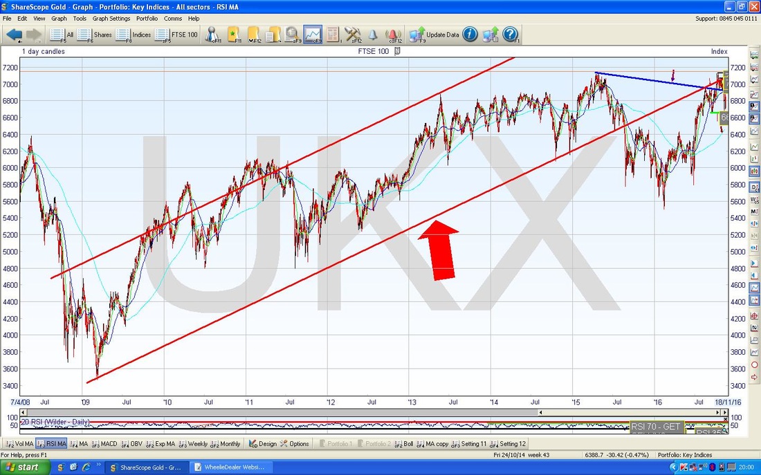
On the Chart below (as ever, all from the brilliant ShareScope software wot I use) I have added a Green Parallel Line (I have marked it with a Green Arrow but if you can’t see this you know the Opticians you should have gone to - other Opticians are available), which perhaps will act as Support if we do get some downward pressure in coming Weeks / Months.
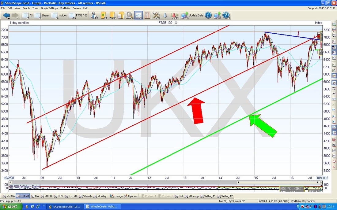
The Chart below zooms in to about most of 2016 so far and has the Daily Candles. First off note my Red Arrow which is pointing to the Red Line which is the same Line we saw on the previous Charts - you can see here how we are clearly way below it now and how back in early October the Price had a brief excursion up above it (this is marked with the Yellow Circle).
Next note the Parallel Green Lines which are forming an Uptrend Channel which has been running for much of this year - the Bottom Line of this Channel could/should act as Support for the Price and my Black Dot indicates roughly where this Support might be if we get further falls in the Short Term - it is roughly around 6500 (the Black Dot is not the dreaded lurgy……..) My Black Arrow is pointing to a pretty substantial Down Candle which was generated on Friday 11th November - this suggests we might see more downside in the Short Term but there is a lot of Support below around 6600 to 6700. On the flipside, if the Price can start moving up again, there is a lot of Resistance up above from about 6900 to 7122 (which is the New All Time High). It will be interesting to see how all this plays out - November and December are traditionally good months but this might not hold true this year of course. Having said that, it might be possible for the FTSE100 to drop down towards the Black Dot during November and then to recover through December as Santa comes to Town. 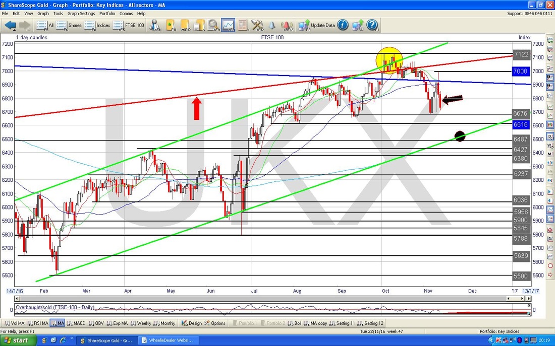
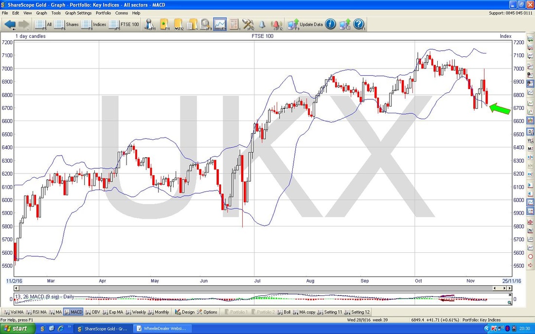
The Chart below has the Bollinger Bands above and below the Price Candles for the Daily going back about 8 months ish. My Green Arrow is pointing to how the Price is sat pretty much at the Bottom Bollie Band - these can often act as Support so it is quite possible we can see a move up off this soon.
The Red and Green Lines on the Chart below are the 13 Day and 21 Day Exponential Moving Averages (EMAs) for the FTSE100 Daily. Note where my Blue Arrow is pointing how we got a ‘Death Cross’ where the faster moving Red 13 Day EMA crossed down through the slower moving Green 21 Day EMA. This is not foolproof but is a fair Indicator that we might see some Weeks of sogginess before things start moving up again.
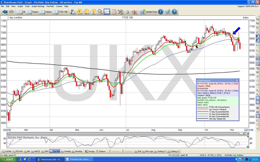
The Screen below has the Weekly Candles for the FTSE100 going back just about all of 2016 so far. My Black Arrow is pointing to an ‘Inverted Hammer’ Candle which was generated Last Week and my gut reaction is to think that this is a big negative really. However, if we were to get such an Inverted Hammer after a sustained move down, then it might mark a Bullish Reversal - I don’t think 1 Big Weekly Fall just before really sets the right context.
However, maybe this can be viewed another way - if you combine the Small White ‘Body’ of the Inverted Hammer with the Big Red Down Candle for the Week before, then maybe it forms a 2-Candle ‘Bullish Harami’ Pattern (here it is - the Bun in the Oven one) - this could mean we can see a rise off of this next week. It is certainly an ambiguous Candle Pattern and I don’t think we can really tell a lot from it. I have looked at the Monthly Chart but until we get a complete and full Candle for November, I don’t think we can read much into it. However, it does have a negative tinge to it. 
FTSE250
I’m not going to spend ages on this one - I need to crack on because I want to catch the F1 Brazil re-run at 10pm. I just had a quick look through the FTSE250 Charts and this one stood out - it is very possible that if the FTSE100 falls on the Pound getting some strength, then the FTSE250 might rise because it contains more Domestic Companies which would benefit from the less inflationary effects of a rising Pound. This Chart shows the Weekly Candles for the FTSE250. My Black Arrow is pointing to a pretty crazy Doji Candle with some Long Tails but quite a nice White ‘Body’. The reason I say it is “nice” is because if it is combined with the Big Red Down Candle of the Week before, then we could have a Bullish Harami 2 Week Candle Pattern - the context for this is quite nice here. Yes, that is the Preggers Lady again………….. 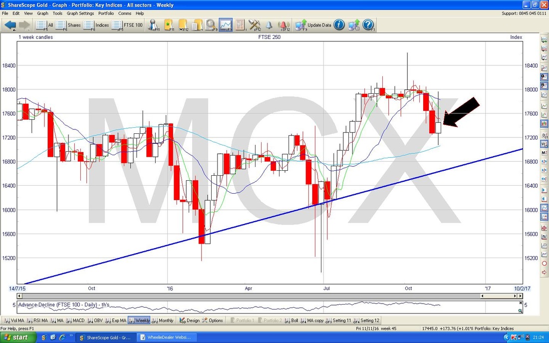
S&P500
If Trump is going to wreck havoc on Stocks then I would expect this Index to suffer - although with the perversities of Markets this year I guess the Dollar could weaken and Stocks actually go up - this is what we have seen with the FTSE100 with the Pound being so pants this year. The Chart below has the Daily Candles going back about 4 months. I quite like this because it shows how Candles can be really useful - the scenario has not played out yet but the likelihood is that we will see a Pullback here soon. My Black Arrow is pointing to a cracking ‘Long Tails Doji’ which was created on Thursday 10th November and after the 3 really Powerful Up Candles of the 3 Days before, this Doji is probably warning us that the force of the move up has waned. My Green Arrow is pointing to a Hammer Candle which was created on Friday and in the context of the strong move up, this suggests we might reverse down again soon. 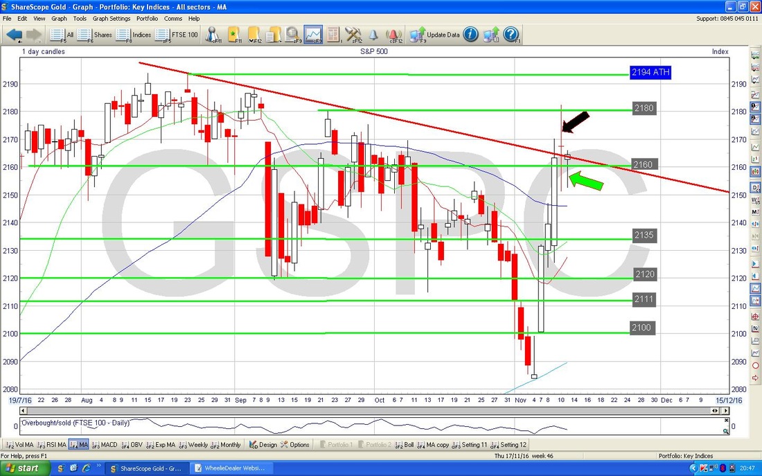
The Chart below has the Daily Candles with the Bollinger Bands - my Yellow Circle highlights we are up at the Top BB and suggests we might drop back away from it now. As with anything on Charts / TA, this is not guaranteed but is the most likely Probability.
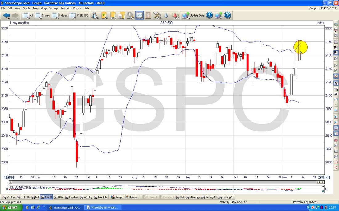
Ah, some better news from the Charts !! My Yellow Arrow on the Chart below shows a 13 / 21 Day EMA ‘Golden Cross’ (the opposite of what we saw on the FTSE100 earlier) - this suggests some gains to come in the next few weeks. This is not inconsistent with the apparent weakness in the Candles and stuff I have already shown on the S&P500 - it is possible we could have a pullback for a couple of Days and then go higher which is consistent with this Golden Cross.
Please ignore the Blue Triangle Lines. 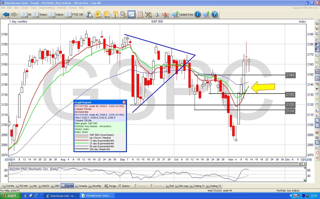
On the Weekly Candles below, my Green Arrow points to a nice Big White Up Candle - this has a Bullish tinge to it although note the Candle has a very clear ‘Wick’ - this shows it pulled back and might hint at weakness and clear Resistance at 2182.
Note how the Darker Blue Wavy Line is heading down towards the Lighter Blue Wavy Line - this means the falling 50 Day MA is heading towards the rising 200 Day MA - if they cross over, we might get a ‘Death Cross’ - something to monitor in coming Weeks. 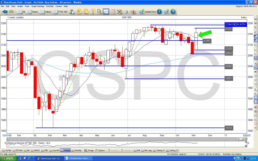
Sterling vs. Dollar
With Humpy Trumpty getting the Pres Job, the Dollar weakened which injected some rare strength into the Quid and had a downwards effect on the FTSE100. My Yellow Circle is highlighting a sort of ‘Inverted Hammer’ from Friday where the Price pushed up towards 1.27 and the Blue Line which is the 50 Day Moving Average but then pulled back Intraday. In the context of the recent run up, this suggests to me that we may see the Pound weaken a bit again - especially as the 50 Day MA seems to be acting as Resistance. However, I doubt we will see all that much in terms of falls - it looks to me like we have avoided the ‘Ledge’ scenario that I have talked about in recent Weeks and I think we could well have seen the Low at around 1.19 when we had the ‘Flash Crash’ drops. Maybe we now have a Range between 1.21 at the bottom and 1.27 at the top. 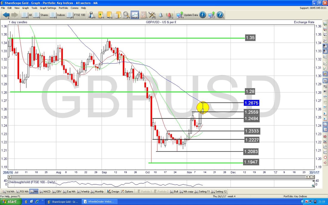
Brent Crude Oil (Spot)
The Chart below has the Weekly for Brent. Note how the Triangle that I mentioned in previous despatches between the Black Line and the Green Line has broken out TO THE DOWNSIDE - this might not be good. My Yellow Circle is highlighting the Small Red Down Candle from last week - in this context, it is not telling me much, maybe we can fall a bit further. Note the Darker Blue Wavy Line is moving down towards the Lighter Blue Wavy Line - in other words we might see a 50 / 200 Day MA ‘Death Cross’ soon - something to watch for because such an evil Cross would suggest a lot more falls to come. Support looks pretty good at $42 but that really must hold. 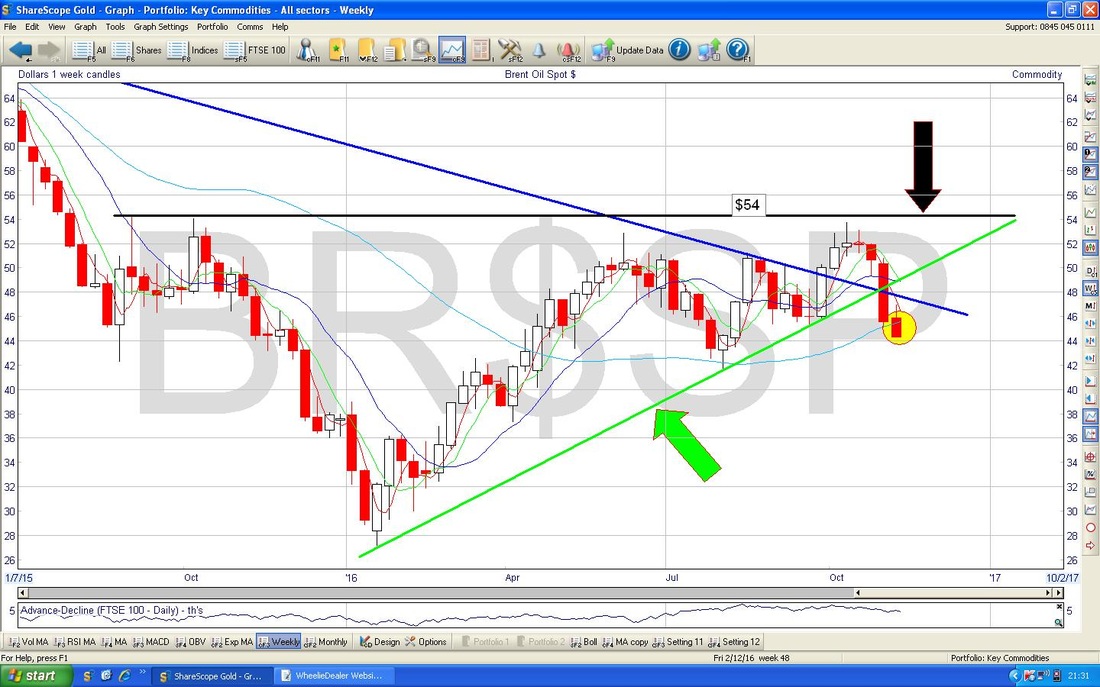
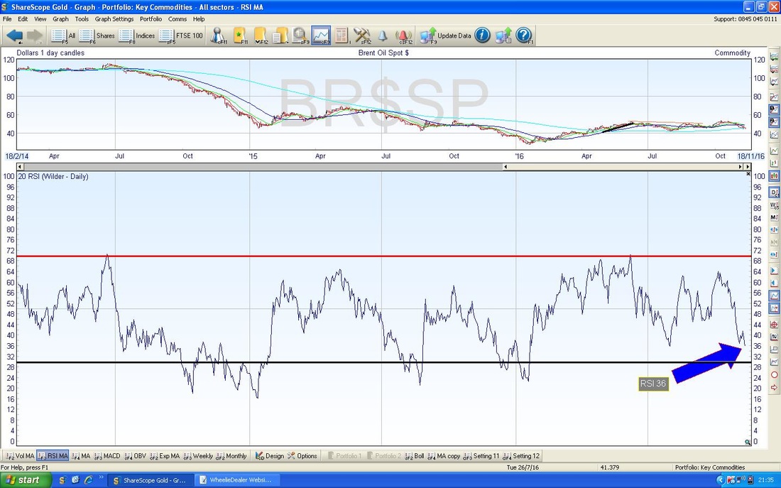
The Chart below in the bottom Window has the RSI for the Daily Brent - with a reading of RSI 36 this is quite low and suggests we might get a Reversal upwards soon.
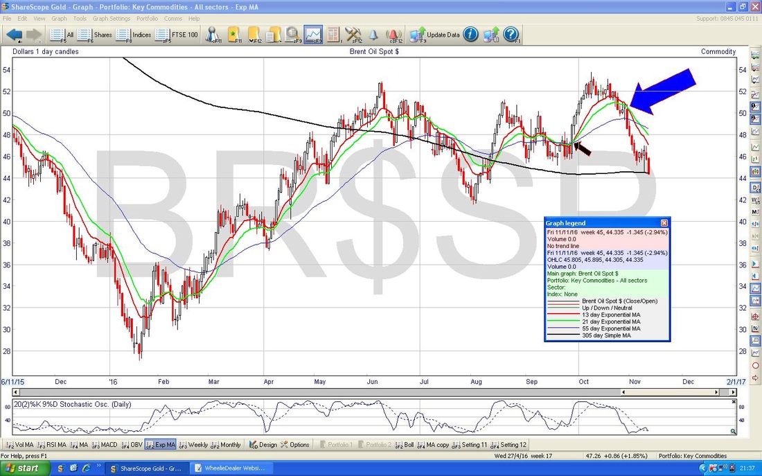
I just wanted to chuck this Chart in. My Blue Arrow is pointing to a 13/21 Day EMA ‘Death Cross’ - look how predictive this was.
Gold (Spot)
The Chart below is not good. My Yellow Circle is highlighting a Big Red Down Candle from Friday which has clearly dropped down below the Blue Lines Uptrend Channel which had been in place for much of 2016. 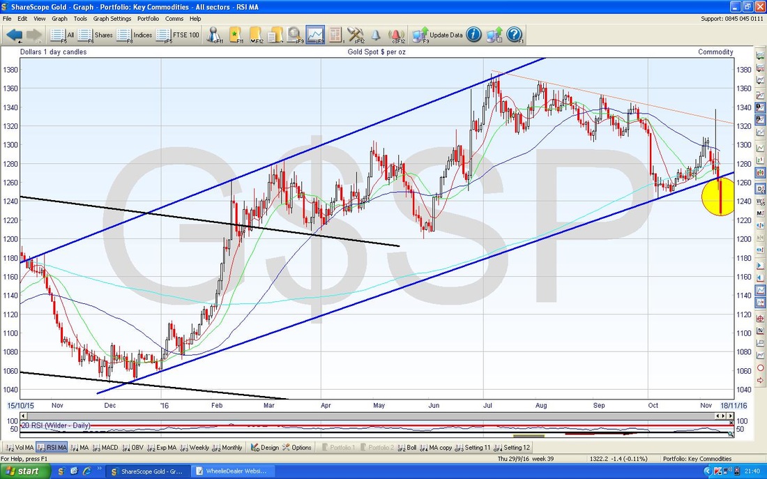
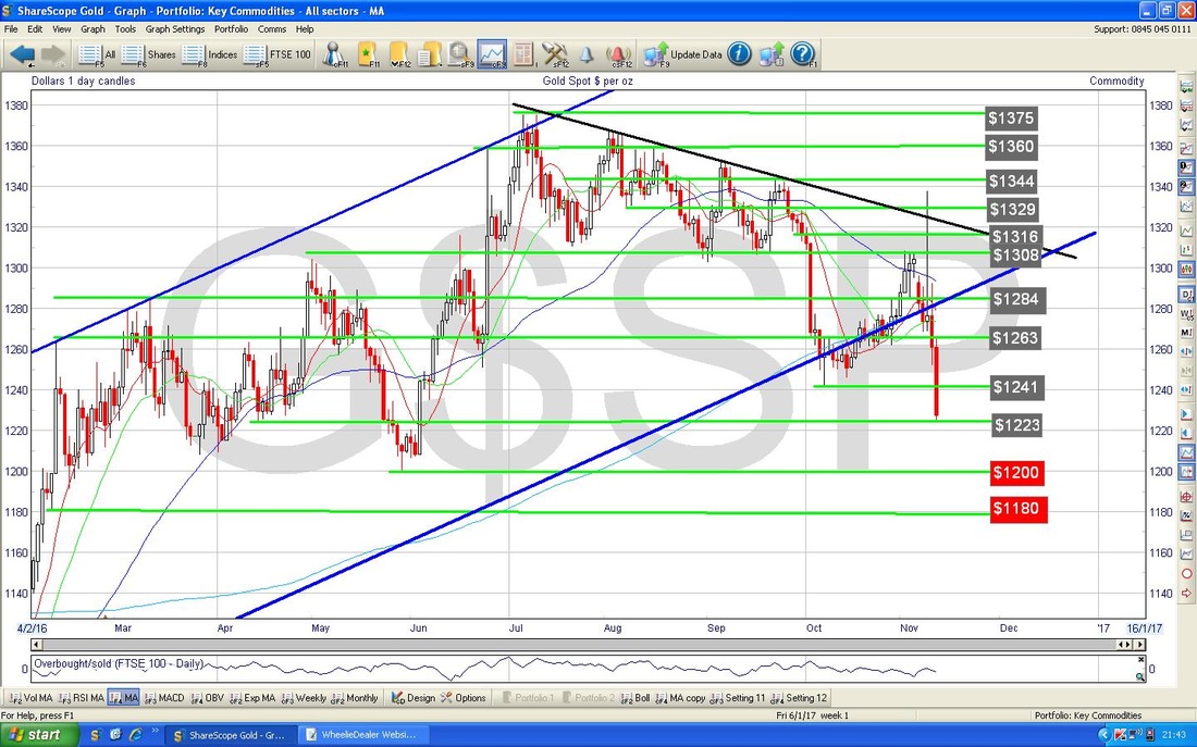
The Chart below has the Daily Candle for Spotty Gold going back around 8 months. I have highlighted in Red the Textboxes which show Support at $1200 and $1180 - this really needs to hold.
Don’t take any notice of the Candles on the Chart below - this is the Monthly Chart but what I am trying to show here is how we are approaching a 50 / 200 Day MA ‘Death Cross’ which would suggest more falls in coming Weeks / Months. This is the Dark Blue Wavy Line (50 Day MA) falling down towards the rising Lighter Blue Wavy Line (which is the 200 Day MA). So not looking too promising on the Gold front in the immediate term.
Funny how we have had so many near ‘Death Crosses’ today - is this warning us of trouble ahead? That’s all for now, Cheers, WD. 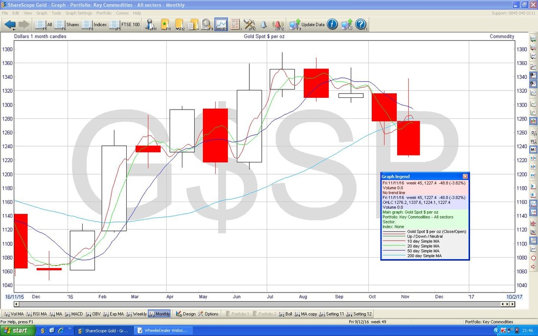
2 Comments
catflap
14/11/2016 02:49:55 pm
Thanks for this. Much more negative outlook than i thought.
WheelieDealer
15/11/2016 12:21:06 am
Hi catflap, cheers for the comments - love the 'Death Cross' count !! I guess it's still early days after the Trump Victory - perhaps a few more weeks and things can look a bit brighter. I do have a feeling 2017 will be a tough grind though. Leave a Reply. |
'Educational' WheelieBlogsWelcome to my Educational Blog Page - I have another 'Stocks & Markets' Blog Page which you can access via a Button on the top of the Homepage. Archives
January 2021
Categories
All
Please see the Full Range of Book Ideas in Wheelie's Bookshop.
|
