

|
educational blogs |
|
This Winter has been such a drag - being a Wheelchair user I really don’t get on with Cold and Wet and the best solution I find is to go into my Winter Hibernation mode and try to ride it out - but this year it is definitely been testing my resilience. The idea of a particularly Cold Snap isn’t something I find even slightly appealing and it looks like a week to hunker down and perhaps I won’t have any excuses now to not get on with reading that Robbie Burns ‘Trade like a Shark’ book……..
Last week was very uneventful for my Stocks - the UK and Spreadbet stuff was up a tiny fraction and the mainly US Unit Trusts were down a tad so the net result was a minuscule gain - but at least it paid for my Pub Lunch on Friday. So a Flat week then.
I mentioned on Twitter how I was a bit edgy about what the Major Indexes in the UK and US were doing - it strikes me as a bit of a let down that they have been unable to push on up again after the Pullback in February and we seem to be in a bit of a Sideways move that could lead to more Falls - I will discuss this on the relevant Charts in a bit so Readers can get more appreciation of what I am basing my nervousness on. Obviously if we do get another Leg down then I want to be going Short on an Index or two and a few days ago I closed my Long Positions for a reasonable Profit although I was disappointed not to squeeze more out of them (see the ‘Trades’ page for more details on this.)
It’s Showtime…… I mentioned a few Weeks back in a Weekend Charts Blog that I was planning to attend the Mello Event in Derby and that I was also thinking of doing both London Shows this year which are coming up soon. The Master Investor Show is the one in Islington at the Business Design Centre and is taking place on Saturday 17th March and you can read about it here: https://masterinvestor.co.uk/show/ The UK Investor Show is happening just before the Mello Event on Saturday 21st April 2018 and is at the Queen Elizabeth II Conference Centre right next to the Houses of Parliament, and you can read about it here: https://www.ukinvestorshow.com/ I normally find that I can get FREE Tickets for these things (the usual ‘price’ is that you end up giving them Contact Information which no doubt gets passed on to other Companies to bombard you with Marketing Blurb etc.) and if you do a Search on Google for ‘Discount Codes’ or ‘Free Tickets’ or whatever you might be lucky. If you keep your eyes open on Twitter you might see some come up. If you have no joy and you are desperate to go then get in touch with me via DMs or Email or whatever and if I can help I will. I have got my Ticket to UK Investor sorted and I must get on with sorting the Master Investor one as well. The other Big Show is the Mello one and I have Copy ‘n Pasted the text below from a Blog I did a few weeks back. Mello Derby I am sure many Readers will be aware of this upcoming Investor Show which is due to take place on Thursday 26th April and Friday 27th April at the Derby Conference Centre (DE24 8UX). This has been organised by David Stredder (@carmensfella on the Tweets) and this follows an extremely successful Event he organised a few Years ago which was widely praised by Private Investors because it got together a huge number of Quality Small Companies and also had lots of interesting Speakers at the Conference side of things. It is also a rare opportunity to meet with loads of Private Investors who are in the same boat as you are and if my experience of recent Shows/Events is any guide, if you hunt me down then I am sure I can help introduce you to loads of the great People who I now there - many will be people who are well know on Twitter as important Members of the ‘Twitterati’. This is particular useful for Investors based in the North of the UK because so many of the Shows that are put on are based in London, and I will be attending it on the Friday 27th April and I have booked my Hotels and everything. I think it costs £99 for the 2 Days and it is £69 for 1 day - I would love to do both (that’s the Value Investor side of me coming out !!) but sadly Health constraints make this impossible. You can get more details and book your Ticket here: http://www.mello2018.com/index.html If you are a Member of ShareSoc, then you can book a Discounted Ticket - the details are here: https://www.sharesoc.org/events/mello-2018/ Right, enough of that, let’s get Charting !! FTSE MIB (Italian Index) Before getting into the Major Indexes I was jibbering on about earlier, I just want to do a quick detour and flag up an idea that my mate James (@traderdiarycouk) highlighted last week on the Tweets. In a Week’s time, the Italians are going to the Polls and it is quite possible that the result is another rather unexpected shock to the EU Elites etc., and from what I am hearing it looks like Immigration is the Number One issue and this could be what drives the Result. It’s hard to believe but good old Silvio Berlusconi is back in the frame on the Right and you also have the 5 Start Movement which is the Comedian Beppe Grillo’s mob (on the Left but anti-EU) - they could cause a big upset. This uncertainty leading up to the Vote next Weekend could easily cause the Italian Stockmarket to drop back and the idea is to Short the MIB Index to take advantage of this. So let’s have a nose at the Chart. As is always ‘Best Practice’ (hey, who’s practicing? I’m a professional I will have you know !!), we start with the Big Picture and go back for as long as ShareScope will give me (as always, any Pics in this Blog are probably from the peerless ShareScope Software that I use and if you click on them they should become bigger and more readable). The Story here over about 15 Years is a nice move Up into the Credit Crunch (shown in my Green Rectangle), followed by a big Slump during the Scrunch (shown in Yellow) and then we hare really been ‘treated’ to a long Sideways move that is still in force at the time of writing this. Moving forwards, the Range is capped by my Red Resistance Line (marked by the Red Arrow) and at the bottom we have a ‘slow’ Uptrending Support Line which I have drawn in Black and pointed at with my Black Arrow. Obviously if the MIB is going to make a significant move up, then it needs to Breakout over that Red Line (such a move would be extremely Bullish and a Signal to go Long). 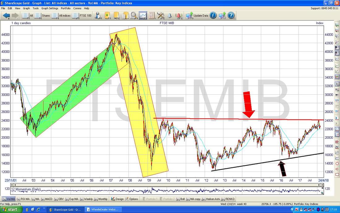
As an aside, I am not totally sure where the name MIB comes from but I am guessing it is the Milan Bourse sort of abbreviated. It’s a nice piece of trivia but like so much about Stocks and the Markets we don’t really need to know it !!
On the Chart below I have zoomed in and this time really focused on the Sideways Range bit. To the Upside the Red Line needs to be broken and because it has a slight downwards Slope to it, a prudent and cautious Trader might wait to go Long until that Level of 24157 where my Pink Circle is gets taken out or if really cautious then they would wait for a Breakout over that 24558 Level marked by my Green Circle. If is was me (it could well be !!) then I would probably wait to go Long until 24558 is breached - the Danger is that if you go too early then that 24588 Level could act as Resistance and stop you dead in your tracks just when you thought you were about to become extremely wealthy. To the Downside, that Black Support Line (Black Arrow) won’t kick in until the Price gets down to 16500 to 17000 - so there is a long way to fall until Support from that source is found, although there are a lot of Horizontal Support Levels on the way down (particularly around 21000, 20000, 19000, 18500 etc.). If the Black Line fails as Support then we could easily visit 16000 where there is a lot of ‘Congestion’ and hence good Support and if that fails then 15000 where my Yellow Circle is should hold as Support. Below this we are down to my Blue Arrow as the final saviour at about 12295 and if that fails it really is curtains. 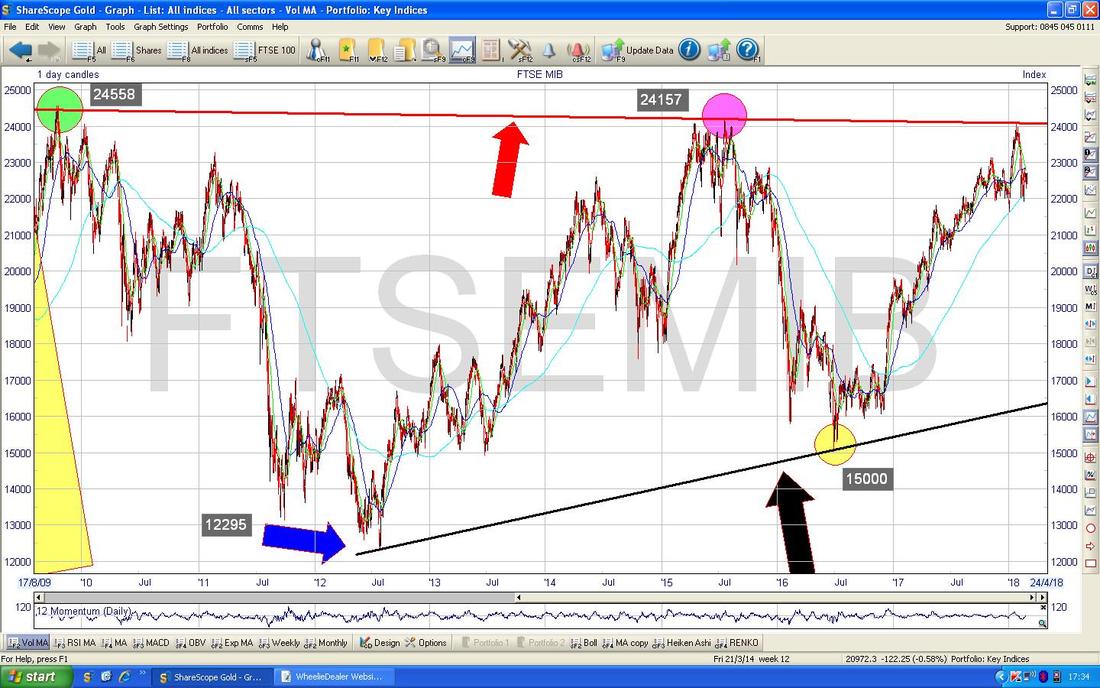
On the Chart below I have zoomed in again and this time we are only looking at about a bit under 2 Years. The key things I want to show here are the Moving Averages - my Blue Arrow is pointing to the Faint Blue Line which is the 200 Day Simple Moving Average (it seems rather insulting to call it “Simple” - it is actually quite clever) and note how back at the turn of 2018 that MA acted as Support and it might well do so again where we are now (this is at about 22000).
However, the more interesting bit is when we combine the 200 Day MA with the 50 Day MA which I have marked with my Black Arrow - the thing to note here is that they are Converging (moving together in other words - now who is being ‘Simple’?) and if the Darker Blue Wiggling Line which is the 50 Day MA crosses the 200 Day MA then we will have a ‘Death Cross’ and this usually predicts falls for Weeks or Months ahead. Indeed, if you cast your eyes over to the left of the Chart you might see my Green Arrow which is pointing to where these Moving Averages crossed in the other direction - in other words that was a ‘Golden Cross’ and predicted the huge Gains that came afterwards. So a Death Cross is the opposite of this Golden Cross. 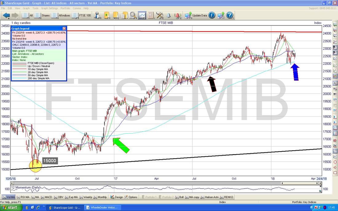
OK, now we delve right into the guts of it and look at what has been happening on the Daily Candlesticks in recent Days and what might happen in the very near future (of course this is what Traders are really focused on and any Short Trade to play the Italian Election is by definition a Short Term thing as there are only 5 Days left). It’s quite busy but I’ll try and take it step by step in a logical manner.
First off look at the Big White Up Candlestick from Friday which is in my Yellow Box - this swung up off a sort of Hammer Candle the day before and this suggests more Gains really. However, my Black Arrow is pointing to the 50 Day Moving Average Line at just over 22800 which could cap any Gains. The next critical thing is the Triangle that is formed between my Green Line at the bottom (Green Arrow) and my Blue Line at the top marked by my Blue Arrow. Triangles are fantastic things to get on a Chart because they are highly predictive of what will happen next once you get a Breakout of the Triangle. In this case, if we get a Breakout of my Blue Line to the Upside, then you can expect more Gains (Shorters will not be wanting any of this !!) and if it Breaks-out to the Downside by going through my Green Line then you can expect more Falls. To the Upside, 23000 is a Resistance Level and then 23105 as I have marked on my Chart. To the Downside, Support is at 22400 (the Low of Friday) and then 22269 (the Low from Thursday) and then perhaps the 200 Day Moving Average around 22100 and then 21907. From the information on this Chart I would not be shorting it yet - I would wait for the Breakdown of that Triangle with a move below my Green Line really. I would probably set a Stoploss for a Short at about just over 22800 but there are several good Levels to put a Stop on here and to an extent it would depend on what Level I was Opening the Short at and how much I was prepared to lose if the Stoploss gets triggered. 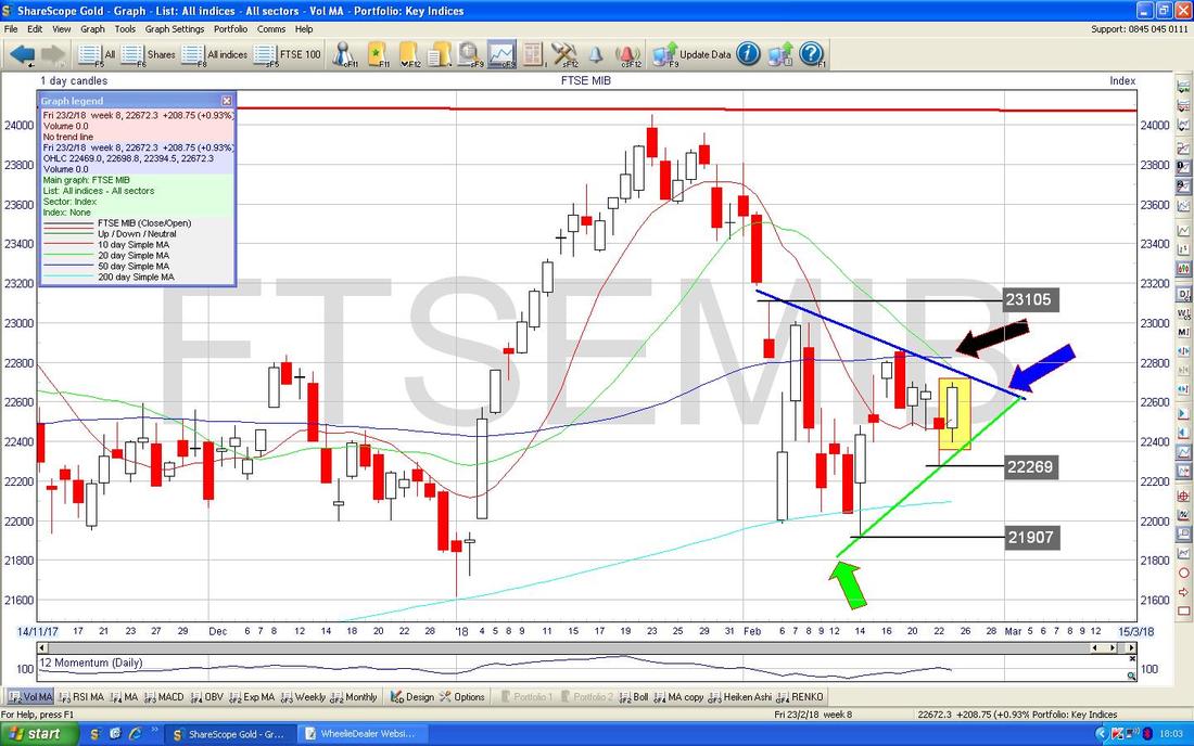
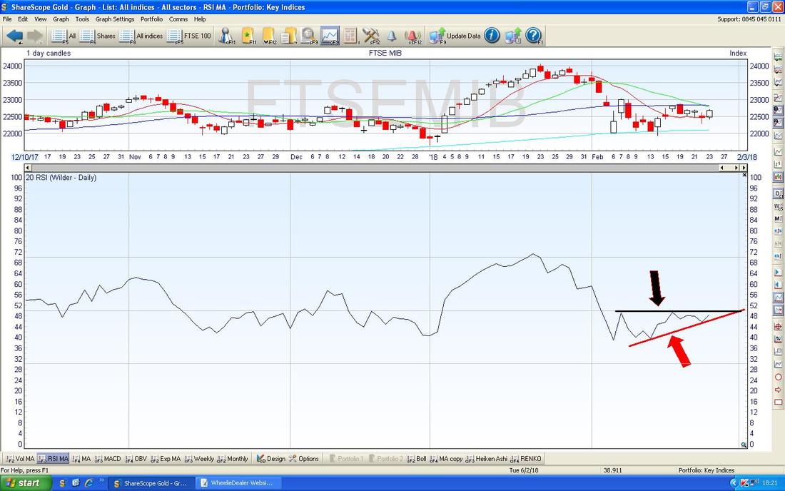
Now onto some other Indicators - In the Bottom Window on the ScreenShot below we have the RSI (Relative Strength Index) for the MIB - on a Reading of about RSI 48 it is pretty much at the Neutral Level but the interesting thing here is the ‘Flat Top Triangle’ formed between my Black Line (Black Arrow) at the Top and my Red Line (Red Arrow) at the bottom - it looks like the Red Line is squeezing the Black Line and we will see the RSI pop out of the Top - this would probably coincide with a Rise in the Price - not what a Shorter would want to see.
In the bottom window on the Screen below we have the MACD (Moving Average Convergence Divergence) for the MIB Daily Chart. My Blue Arrow is pointing to how we are on the verge of a Bullish MACD Cross in the Histogram Bar Format and my Black Arrow is pointing to the same Bullish possibility in the Signal Lines Format.
Again this is not what Bears want to see - it could perhaps be that worries over the Italian Election manifest themselves more in the Value of the Euro and a Weaker Euro might be seen as beneficial for Italian Stocks - we would need to look at the Euro Charts to ascertain if that was happening of course. 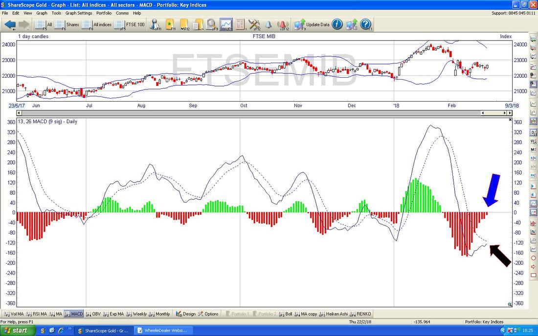
Below is one of my fave Indicators which is the 13 and 21 Day Exponential Moving Averages (EMAs) and about when they cross over. My Black Arrow is pointing to where we got a ‘Death Cross’ between the Red 13 Day EMA and the Green 21 Day EMA and this is still ‘in force’ as I am typing this and this is good for the Bears of the MIB.
However, where my Blue Arrow is it does look like the Red 13 Day EMA is getting closer to the Green 21 Day EMA and maybe we will get a ‘Golden Cross’ very soon - these happen quickly so this is something to watch over the next few Days. 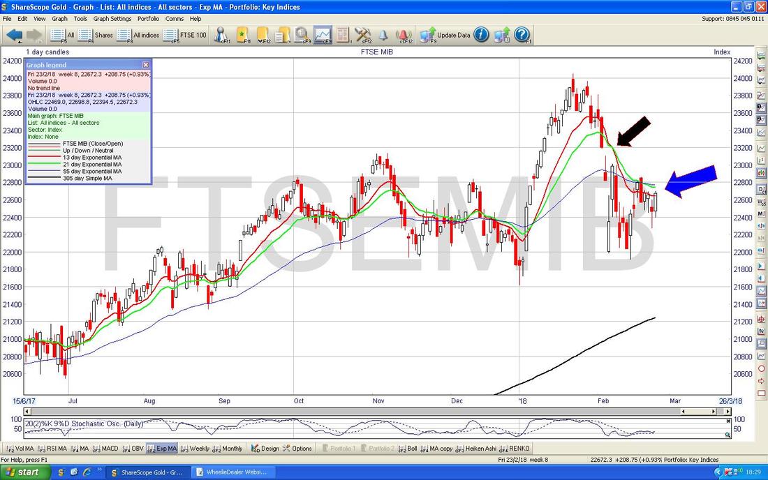
The Chart below has the Weekly Candlesticks and my Black Arrow is pointing to a Hammer Candle we got Last Week and I would say this is Bullish more than Bearish. The Red ‘Metal’ bit of the Hammer doesn’t matter too much it is more the overall Shape and it essentially shows that even though there was a Plunge down last Week the MIB recovered quite a bit and that shows the Bulls are not giving up easily.
Note Last Week’s Hammer followed the Hammer from the previous Week (that was not such a pretty one really as the Body of the Candle [the ‘Metal’ Head of the Hammer] was quite big) and in the ‘Context’ of the 2 Big Red Down Candles from the previous Fortnight, as captured in my Yellow Box, the recent Hammers look to me like the start of a Recovery from the damage. 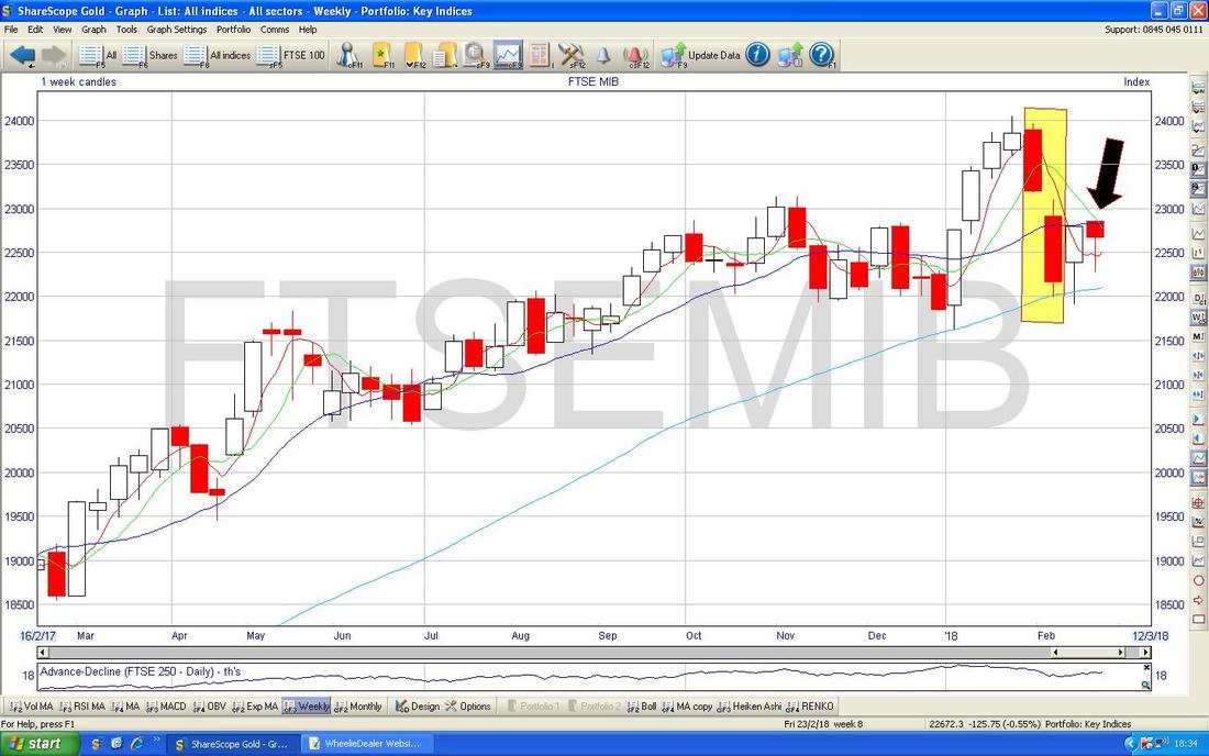
The Chart below has the Daily Heiken Ashi Candles and this one is a bit messy. Quite often these are really ‘clean’ Charts and that is why I love ‘em so much but in this case we are chopping around. My Yellow Box is marking a Narrow White Candle from Friday and with these HA Jobbies this really tells us that the move down from the 3 Days before with the small Red Candles has already been halted by the Bulls and we might be about to turn up - it is too early to tell though with such a messy Chart. A Big White Up Candle from Monday would indicate we are turning up.
Remember, HA Candles are totally different to ‘Normal’ Japanese Candlesticks and much ‘slower’ as they are based on the Average Numbers from 2 Days rather than just the one. 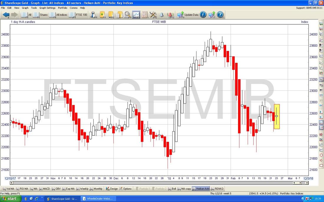
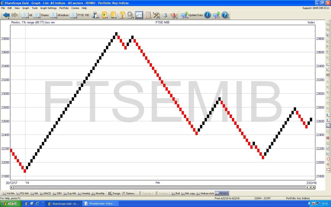
I am throwing the Chart below in for pure devilment - I have no idea what it means but it is something that my mate Noel (@Borg74) flagged to me the other day on the Tweets and I intend at some point to figure out what it all means and to see if it helps - with the way it goes Black and Red it looks like it is pretty clear and ‘clean’ and could be a huge help in ‘Cutting out Noise’ which is something I am always in favour of. This is a ‘Renko’ Chart and if I make any progress on figuring it out I will let you know in coming Weeks but the Mad Bonkers Crazy Obsessed Chartists among you might wish to look into these Renko efforts some more.
Phew, I am MIBbed out………
Let’s move on to some ‘normal’ CHarts and see what the state of play is with those and if I am worrying about nothing. FTSE100 I’m already getting nervous as I start on this one - the Chart below is one you might remember from a few Weeks ago and I have tweaked it a bit but won’t discuss everything here for time reasons. Anyway, the key thing is the Uptrend Channel which was formed by my sort of Parallel Red Lines (I have pointed at the bottom one with my Red Arrow but not the Top one) and note how where my Yellow Circle is we are below the Bottom Red Line of this Channel and that in itself is not a nice thing. Next look at how my Black Arrow is pointing to the Darker Blue Wavy Line which is the 50 Day Moving Average and note how it seems to be moving down towards the Lighter Blue Wiggling Line which is the 200 Day Moving Average - if these Cross then we get a ‘Death Cross’ and that would be pretty bad. It is not total doom because it is possible to get a Death Cross which quickly reverses with a Golden Cross but the general principle is that a Death Cross means Weeks and Months of Falls - this is obviously a worry and we need some strong Upward Moves now to wipe out such a scenario and get that 50 Day Moving Average moving upwards again. Note also were my Green Circle is this is highlighting a lot of Resistance at about 7300 - it would be very good to see the Index back up above this. My worries have been because I was hoping we would see a swift Bounce Back after the Big Falls from early February but the sluggishness we are seeing does not make me think this is necessarily an easy outcome. My other big concern is the possibility of a Bear Flag (this is obviously the opposite of a Bull Flag) and the principle is that the big fast move down we had from early February is the Flag Pole and then the Sideways sort of moves over the last couple of Weeks are the Flag - think of it the other way up if it was a Bull Flag. This is similar to a ‘Ledge’ where we have a big drop down, then go Sideways to consolidate for a bit, and then the Price drops down again sharply as it falls off the ‘Ledge’ - this is something to monitor in coming days. The scary bit is that if it is a Bear Flag, then the Drop down next could be the same ‘Height’ as the Flagpole - that could be a 500 Point drop !!!! 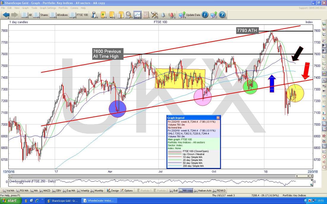
The Screen below is my actual ‘Working’ Screen where I plan and track my Longs and Shorts and the Short Blue Line and the Short Pink Line are where my recent Long Trade was (the Pink Line is the Stoploss) but that is not something we need to dwell on (if you look back at my Charts Blogs from previous Weeks I have explained this better). The key thing now is that we seem to be in a bit of a Sideways Range or perhaps even 2 of them. In the more immediate term there is a Range between about 7187 and 7312 and a Wider Range between 7073 and 7312. As usual, if it Breaks-out to the Upside (in other words over 7312) then that is Bullish and could be a good Buy Signal but if it breaks down (particularly below 7073) that would be very worrying and time to Short.
It’s actually very nice that we are in these Tight Ranges - there could be some good opportunities very soon to either go Long or Short with a nice Tight Stoploss to take advantage of whatever happens. My Black Arrow is pointing to a small Doji Candle from Friday and really this tells us nothing apart from the fact that we are going Sideways. 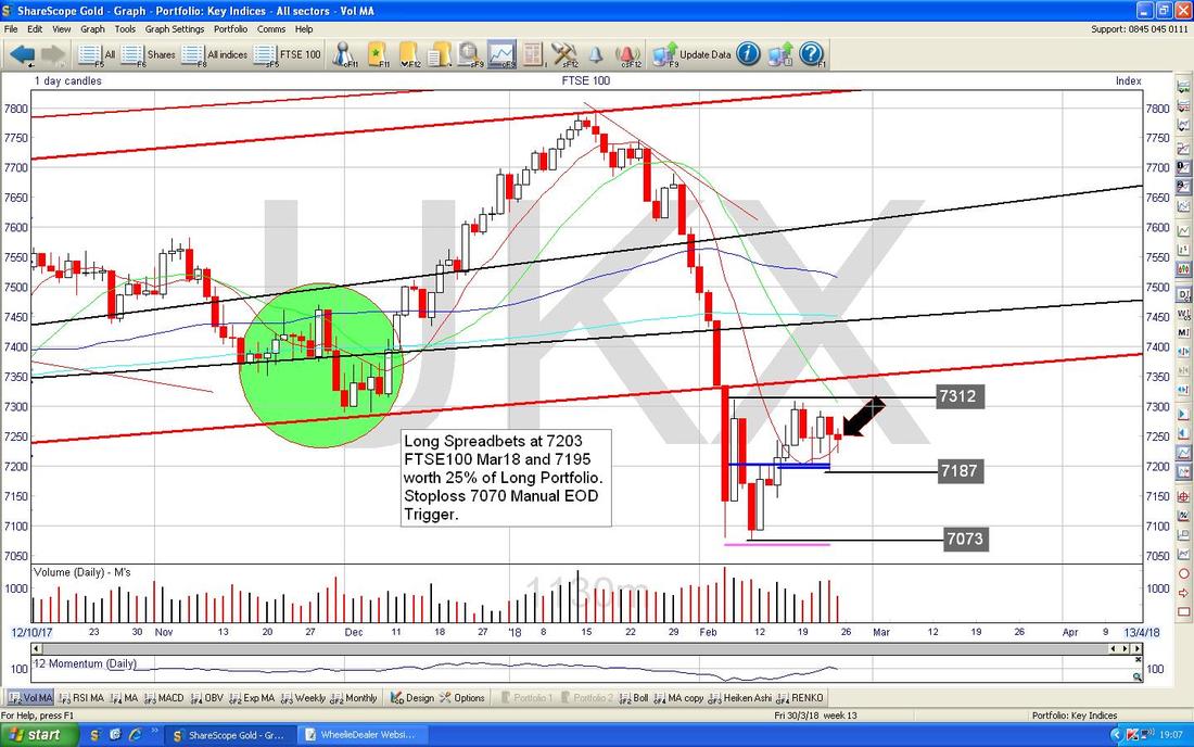
This next Chart is extremely busy but I want you to just ignore the ‘Noise’ on it and focus on my Blue Uptrend Channel Lines (marked by Blue Arrows). This shows the importance of looking at the ‘Big Picure’ and whereas my earlier Charts were suggesting we had fallen out of an Uptrend Channel, this Chart shows there could be a bigger Uptrend Channel which we are still within (where my Yellow Circle is) and this is a bit more hopeful for Bulls.
This is a Weekly Chart by the way. 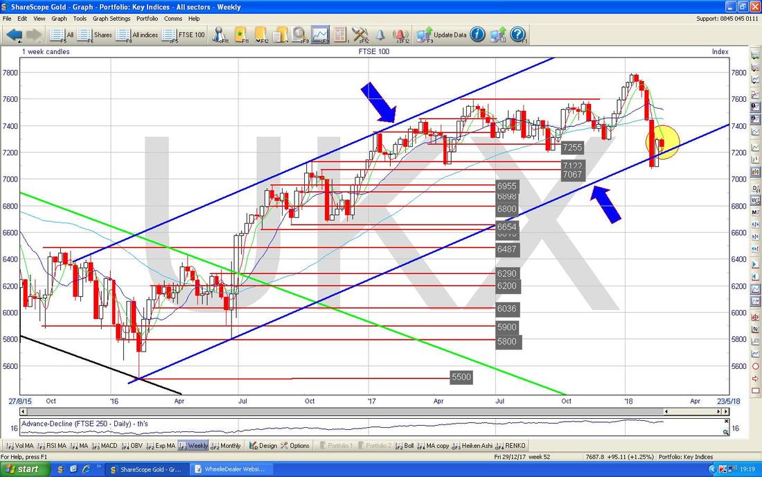
The Chart below is the Renko thingy - I am purely guessing here but where my Blue Arrow is we have Red Splodges and my assumption would be that this is not a good thing !!
The FTSE250 is largely similar to the FTSE100 so I won’t show it this week. 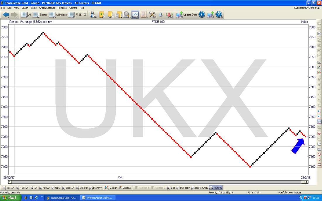
S&P500
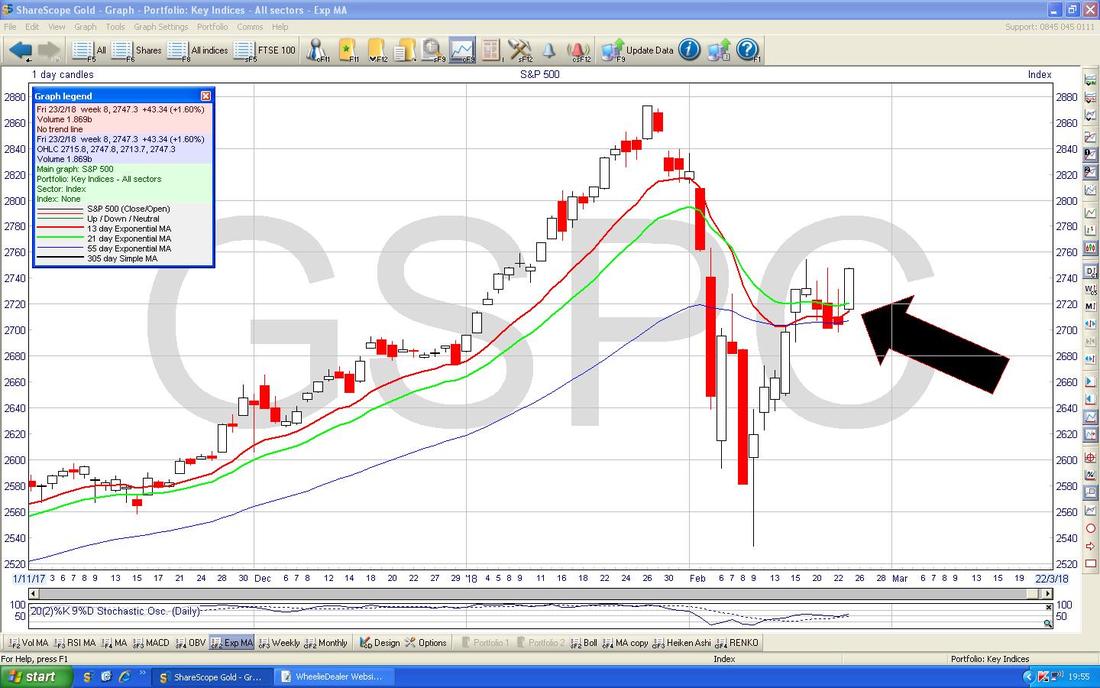
The Screen below is my Working Screen on the S&P500 so please excuse the mess on it !! As with the FTSE100 I closed my Long Trade last week and the short Blue Line and the short Pink Line are from this Trade. My Black Arrow is pointing to a Big White Up Candle from Friday and this is promising but it will only really mean anything for Bulls if we see a proper Breakout over the High of the Inverted Hammer in my Yellow Circle but in Numerical Terms a move over the Resistance I have marked at 2763 would be more positive. To the immediate Downside, a Move below the Support Level at 2689 would be a concern (although there is a lot of Support just below this). 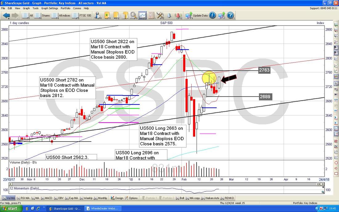
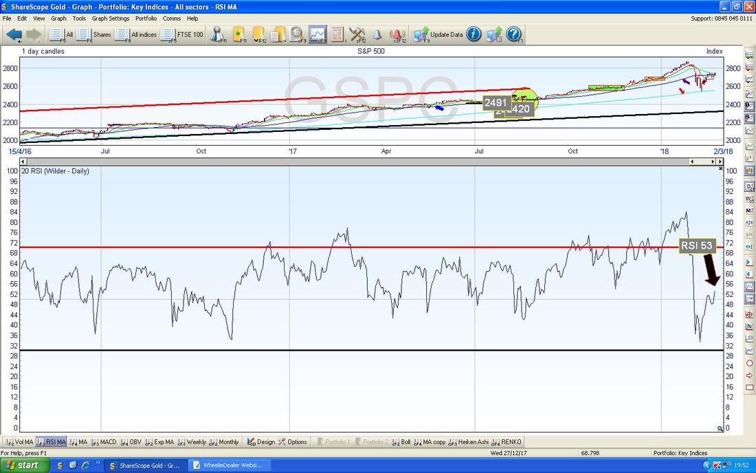
In the bottom window on the Screen below we have the RSI for the S&P500 Daily - on a Reading of RSI 53 and rising it is more Bullish than Bearish.
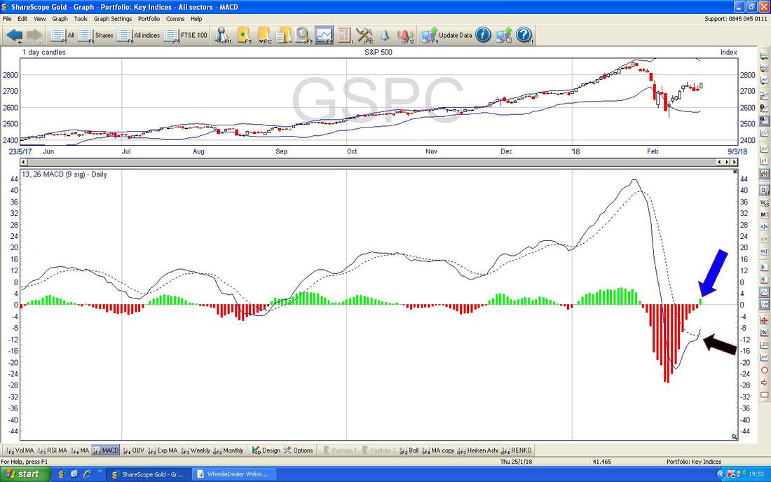
In the bottom window below we have the MACD for the S&P500 Daily - my Blue and Black Arrows are showing a Bullish MACD Cross in the Histogram and Signal Lines formats.
On the Chart below we have the 13 and 21 Day EMAs and my Black Arrow is pointing out how the ‘faster’ Red 13 Day EMA is moving in on the ‘slower’ Green 21 Day EMA and this is hinting at a Bullish ‘Golden Cross’ - it is something to watch in the next 2 Days or so and if we get the Bullish Cross then it often means Weeks of Gains to come. Could be a superb opportunity to put a Long Trade on.
The Chart below has the Renkos - at the moment we seem to be Black so I am guessing that’s Bullish !!
The DOW and Nasdaq Comp are quite similar so I will leave it there as I have Top Gear to watch and a Curry to troff and I will need to do the Proof Read and upload after that. Looking at these Charts I am still wary on the FTSE100 although the US Indexes look much better and depending on how things play out in the next few Days, I might be tempted to go Long on the S&P500 soon. As usual I will Tweet any Trades out and update the ‘Trades’ page as quick as I can. Good luck y’all, Cheers, WD. 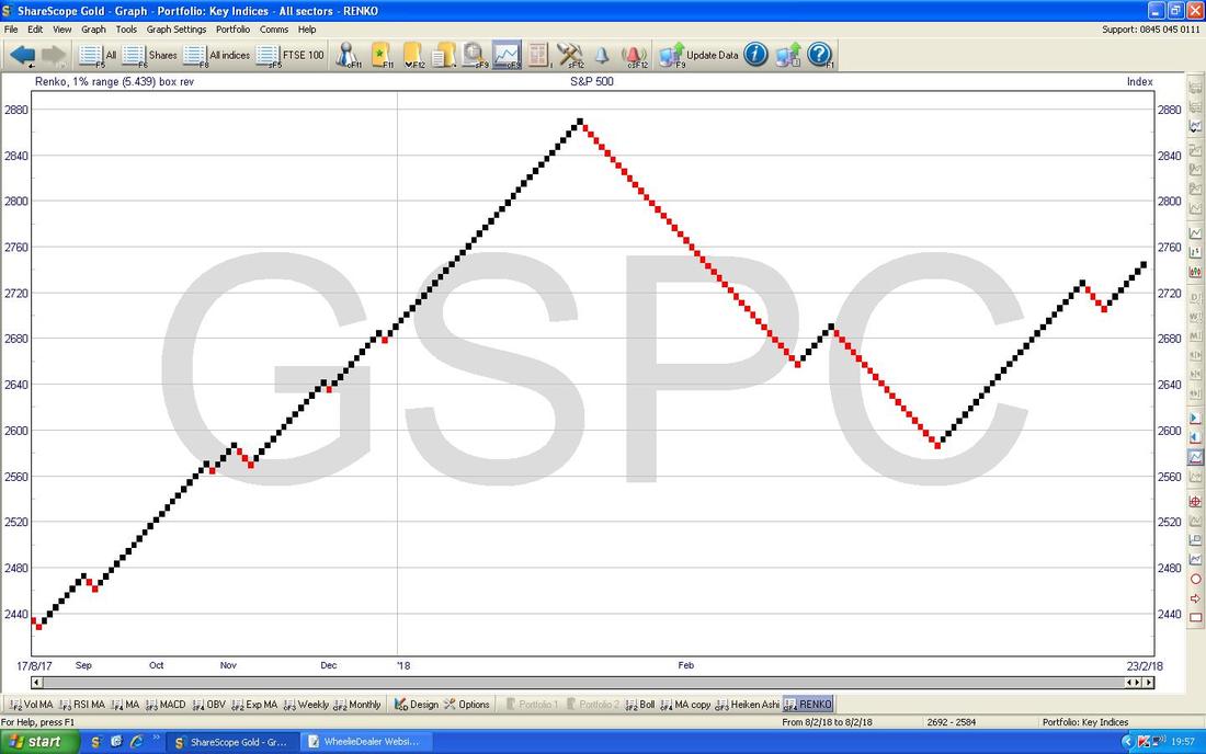
3 Comments
catflap
26/2/2018 11:28:34 am
Hard to get excited about Italian economy and thus the MIB. I read something somewhere that the Italian economy has grown in 20 years or something.....
catflap
26/2/2018 11:29:41 am
That should read : "Italian economy has NOT grown in 20 years or something....."
WheelieDealer
27/2/2018 08:29:38 pm
Hi catflap - I hope you are well and not snowed in !! I agree with you - MIB is definitely not something I would want to Buy as the Economy is a bit farcical. There could be a Short trade for the Weekend Elections but other than that it is not something I can get excited about. Leave a Reply. |
'Educational' WheelieBlogsWelcome to my Educational Blog Page - I have another 'Stocks & Markets' Blog Page which you can access via a Button on the top of the Homepage. Archives
January 2021
Categories
All
Please see the Full Range of Book Ideas in Wheelie's Bookshop.
|
