

|
educational blogs |
|
From a macro perspective the coming week is pretty darned busy - although I doubt any of it will have much impact unless there are surprises and probably the Dutch Election on Wednesday is the only event where something surprising can happen - but even here the only likely surprise is that Geert Wilders doesn’t get much of a vote and that would be a positive for Europe if anything. From what I have heard, the most likely outcome is that Wilders wins the Vote but he won’t be able to become Prime Minister because he will not have a Majority as other Parties will not join up with him.
On the same day the US Federal Reserve is due to hike Interest Rates by 0.25% - I can’t see this being a surprise and the Markets have most likely priced this in and will take it in their stride. Paradoxically, if Rates aren’t hiked, it might actually cause trouble because the Fed is only likely to do that if they see problems that the Market is not aware of. This is really unlikely. Chris Dillow in the Investors Chronicle this week (page 16) wrote quite a bit about how Rate Rises in the US could impact Stockmarkets and the £/$ rate. On Stocks he says:
“A world in which US interest rates are rising is usually one that’s good for equities, because in such circumstances economic growth is strong and Investors are willing to take on more risk.”
I remember other articles by Chris Dillow where history suggests that Stocks can do ok even if Rates get as high as 5% or 6% - so we don’t have much to worry about on this front I suspect. On currency he says: “Since 1990 changes to the Fed funds rate along with changes in UK bank rate can explain (in the statistical sense) just over a quarter of the variation in annual changes in the $/£ rate. While this is statistically significant, though, it is not massively economically significant. On average each percentage point annual rise in the Fed funds rate has been associated with only a 0.9% increase in the dollar against sterling. To put this another way, a one standard deviation rise in the funds rate is associated with only a one seventh of a standard deviation rise in the dollar. Which isn’t much. This shouldn’t be surprising. It’s simply one facet of the long-standing Meese-Rogoff puzzle: the fact that moves in exchange rates aren’t strongly linked to moves in observable economic factors.” The last parts of what Chris says here might seem strange - however, I suspect that in practice the Markets anticipate Rate Rises so much of it gets priced-in well in advance. The other big event is the Triggering of Article 50 which kicks off the 2 year process to extract the UK from the EU and is rumoured to perhaps take place on Tuesday - again, I think this is pretty much priced in even with the Pound and I doubt there will be much impact. It is possible that the Triggering of A50 gets delayed (it actually involves Theresa May writing a Letter to the EU Council of Ministers) but the Prime Minister has said she will get it done by the end of March. Later in this Blog I look at the chart of the Pound against the Dollar. Another thing to be aware of is that the Clocks have changed in the US so their Markets now open at 1.30pm UK time for the next couple of weeks or so. Thanks @InvestingMartin for that info on your txt !! Last week was a funny one - we seemed to be wading through treacle for the first 4 days but then things picked up big time on Friday - I am eager to see what the Charts are suggesting now - but my hunch is that things still look pretty bullish. FTSE100 Keep this Big Piccie chart in mind - this is the Uptrend since 2009 Lows on the FTSE100. Note the Uptrend Channel denoted in Red with the Red Arrow and also the Black Line with the Black Arrow which is horizontal Support. 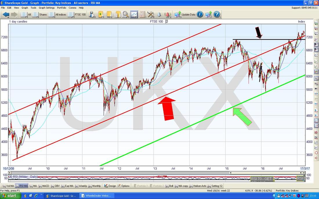
The Chart below has the Daily Candles for the FTSE100 going back about 5 months. First off note my Black Arrow which is pointing to the Horizontal Support from the previous Big Piccie chart - we are way above this. Next look at the Red Line and the Red Arrow which is from the previous Long Term chart - note we are nicely above this as well and still within the Uptrend Channel. That’s good also.
My Yellow Circle is highlighting an Up Candle from Friday but note it couldn’t sustain the Highs of the Day and it dropped back. This is not a disaster but it does hint at some weakness. Note that on the Day before we got a pretty tasty ‘Hammer Candle’ which during the Day dropped down to the 50 Day Moving Average nearly which is a good Support Area usually - this is the Blue Wavy Line pointed at with my Blue Arrow. It looks to me like we had a huge jump up which was the Big White Candle 8 Days back and then we sort of just drifted lower (which was the 6 Doji Candles which followed the Big White Up Candle) and now we could be turning back up again. 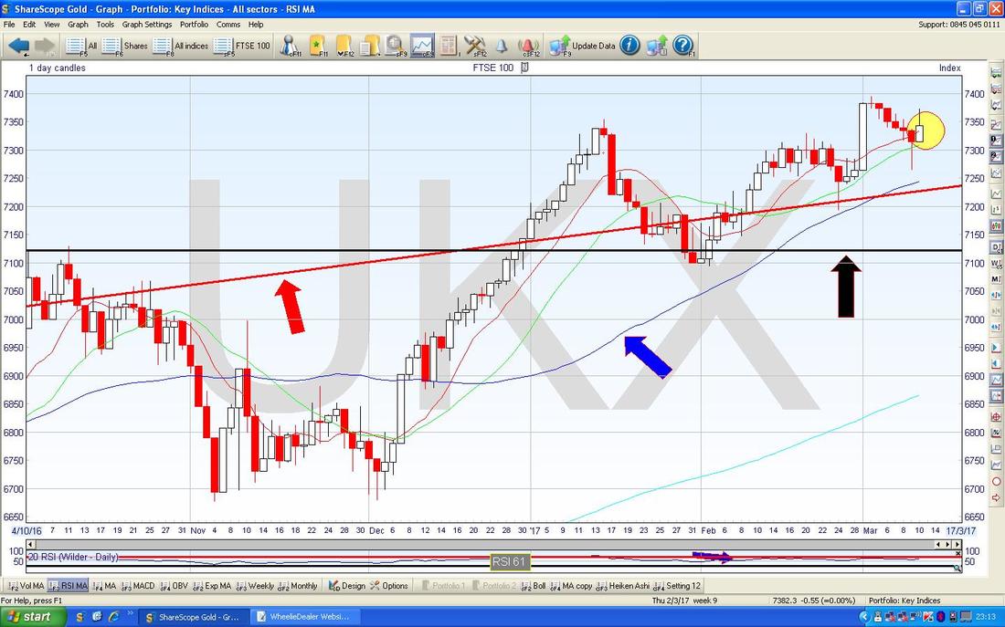
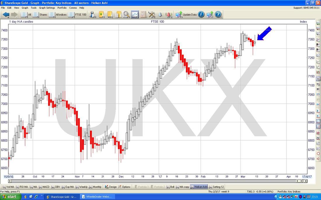
The Chart below has the Heiken Ashi Candles for the Daily - my Blue Arrow is pointing to the HA Candle from Friday (remember, these HA Candles work entirely differently to normal Japanese Candlesticks) which shows that the Candle went Narrow and turned White from Red - this suggests a move up from here is most likely.
CAC40 (France)
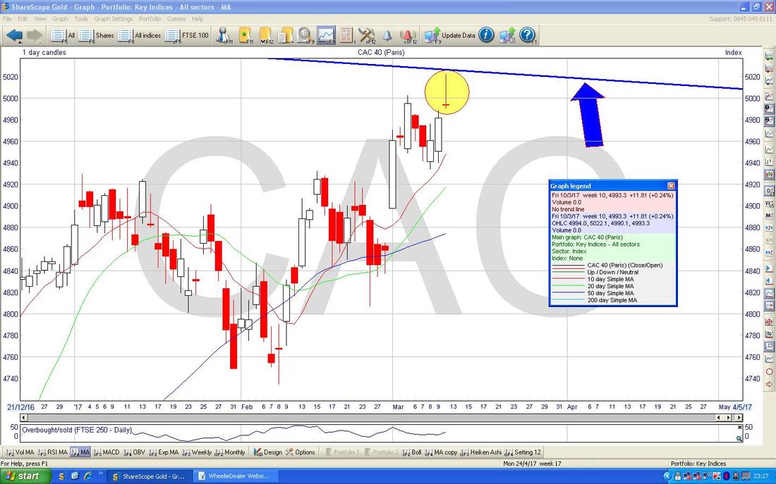
This one is quite interesting - my Chart below is the Long Term picture for the CAC40 - note the Resistance Line marked with my Blue Arrow. 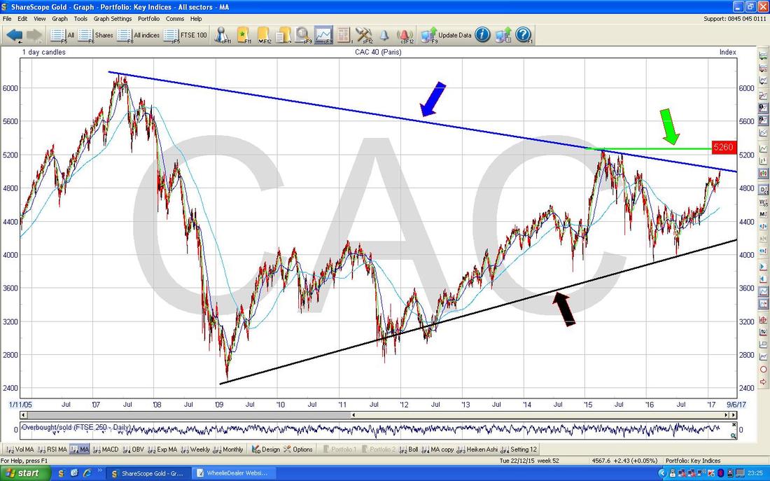
The Chart below zooms in to just the last 3 months or so on the Daily Candles for the CAC40. The Blue Line at the top (marked by the tiny Blue Arrow) is the Resistance Line from the previous Long Term Chart (remember, Long Term Chart features dominate over Short Term developments) and note my Yellow Circle which highlights a great example of an ‘Inverted Hammer’ or ‘Shooting Star’ which could easily be a Reversal Signal and likely to mean the CAC40 will drop from here now. This ties in with the Long Term Resistance line very nicely - the way to negate such a Signal would be if the Market moves up and gets over the Intraday High of the Inverted Hammer at 5022 (this looks a great set-up for a Short - a Stoploss would be placed just above the Top of the Inverted Hammer at 5022. Having said that, I am very wary of Shorting anything at the moment as there seems to be a lot of underlying Bull Strength charging around - it is far safer sticking to the Long side).
DAX30 (German)
The Chart below has the Heiken Ashi Candles for the DAX - it looks to me on the normal Candles that the DAX is turning up but this one shows it really clearly with my Black Arrow pointing to the White Up Candle from Friday after 4 Red Down Candles before that went Narrow just before they turned White - sweet. 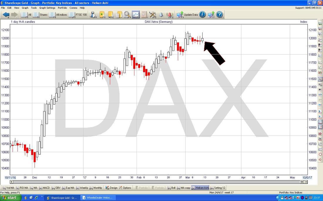
Dow Jones Industrials Index (US)
This one is unclear - the Chart below has the normal Daily Candles for the DOW and my Blue Arrow is pointing to the Doji Candle we got on Friday - this hints at the Price turning up from the Doji on the Day before but it is not clear cut at all. 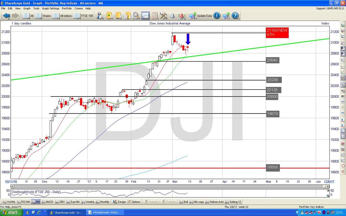
As ever, the HA Candles help with some clarity. The Chart below has the Daily Heiken Ashi Candles for the DOW and my Blue Arrow is pointing out how the latest Candle from Friday has gone really narrow and turned white after 4 Red Down Candles - this suggests we might be turning up again.
Note the S&P500 is quite similar to the DOW and the Nasdaq has similarities but if anything it looks stronger. 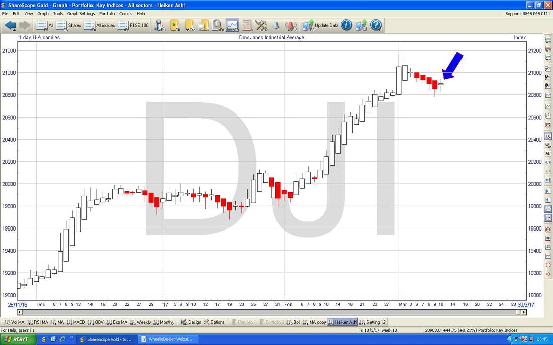
Euro vs. Dollar
It is unusual for me to show this but something clear cut is happening so I thought I would lob it in. The Chart below has the Daily Candles for Euro/$ and my Green Arrow is pointing to a big White Up Candle from Friday - this suggests the Euro is strengthening against the Dollar - it could well be more about Dollar Weakness after a period of strengthening. 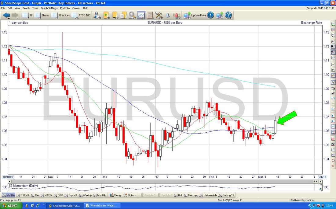
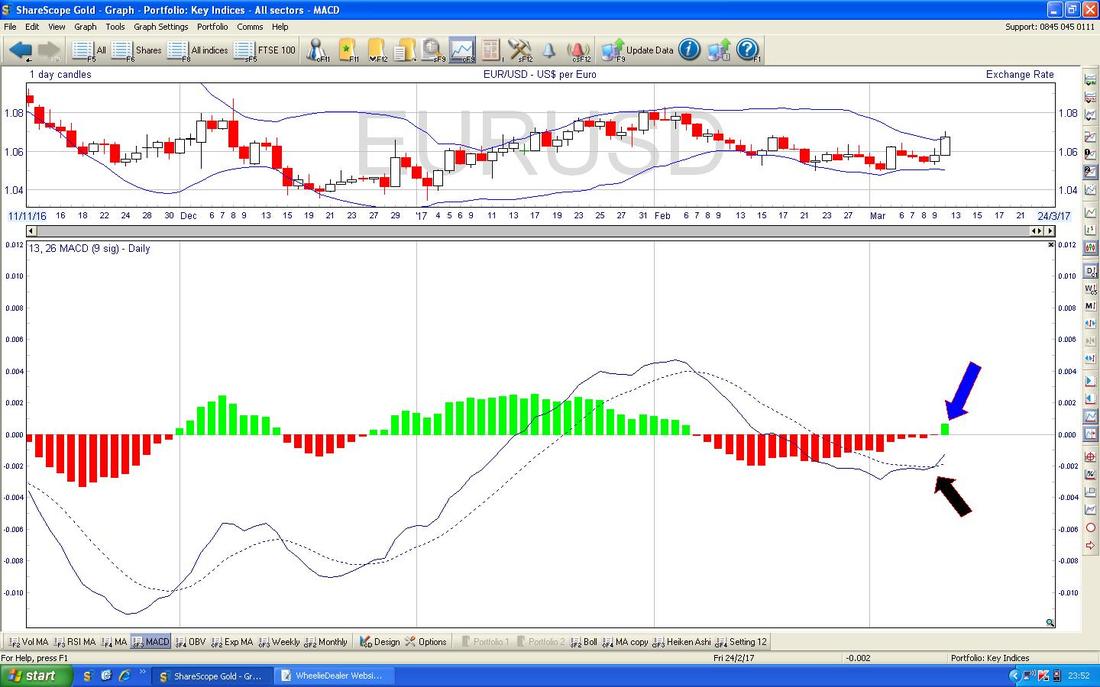
In the bottom window on the Chart below we have the MACD (Moving Average Convergence Divergence) for the Euro/$. This has done a Bullish MACD Cross as shown with my Blue Arrow in the Histogram form and with my Black Arrow in the Signal Lines form.
Pound vs. Dollar
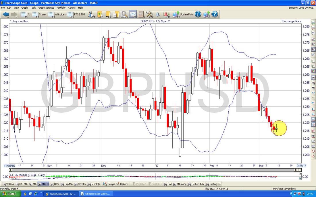
I have put in the Chart below just to remind us all of the ‘Big Picture’ here. The Key thing is how we seem to have 2 Ranges going on which I have bounded above and below with the Green Horizontal Lines - at the moment the Price seems to be in the Lower Range which I have put the Blue Textboxes on. The Key Support level which must hold is that 1.1947 Low which was put in when we had the Spike down back in October 2016 during the ‘Flash Gordon Crash’. 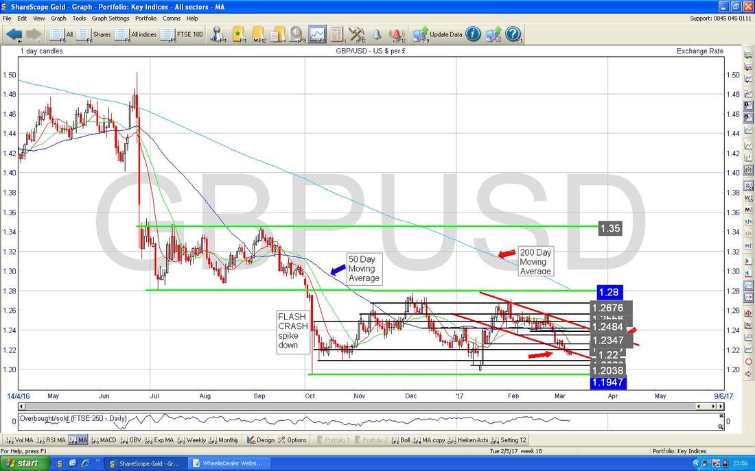
On the Chart below I have zoomed in and shown the £/$ Daily Candles going back about 4 months. My Yellow Circle is highlighting a couple of Doji Candles that we got at the end of last week and after a prolonged move down, it could well be that we are about to Reverse Up.
This may puzzle many Readers as with A50 about to be triggered, it might be reasonable to expect the Pound to fall more. However, it is often the case that “it is better to travel than to arrive” when it comes to the Markets and it could be that any Pound Weakness is already priced-in. We shall see. 1.2134 is the Low from the Thursday in my Yellow Circle and this is a Key Support Level now. 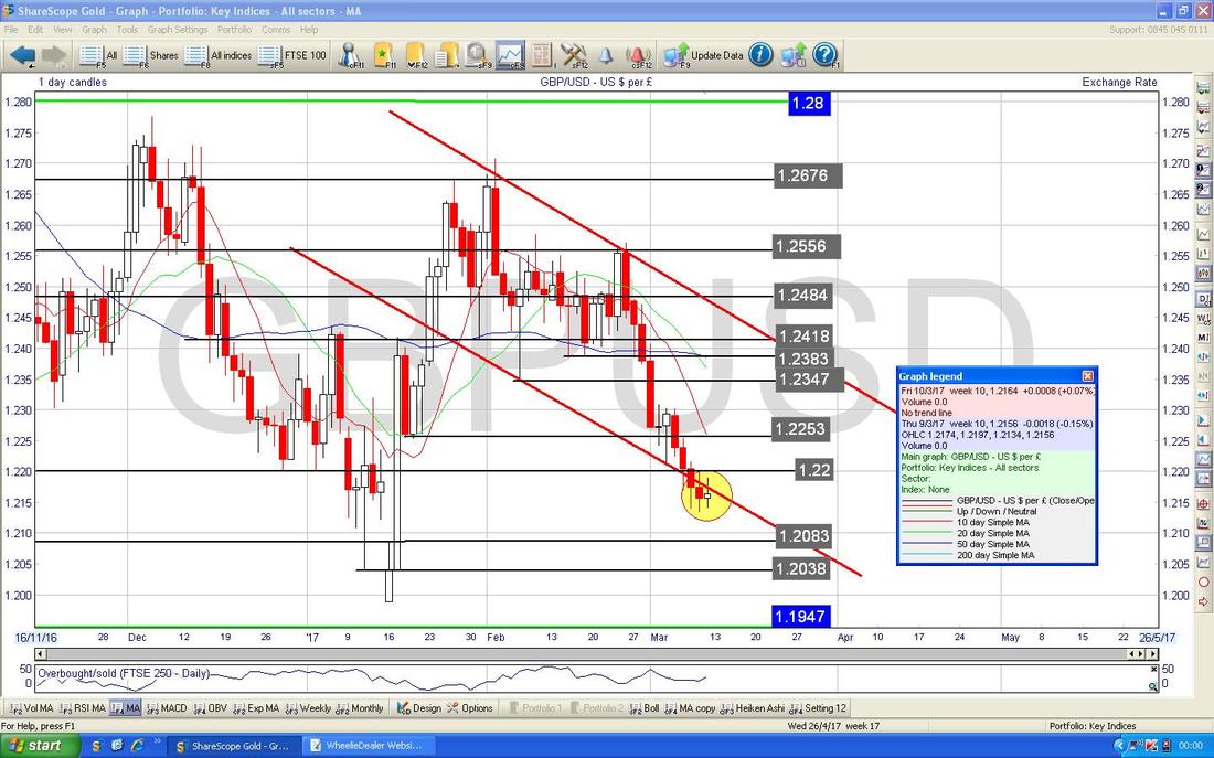
The Screen below (as always, from ShareScope which is kin brilliant) shows the Daily Candles for the £/$ with the Bollinger Bands above and below the Price Line. My Yellow Circle is highlighting how the Candles are walking away from the Bottom Bollie Band.
Brent Crude Oil (Spot)
The Chart below has the Daily Candle for Brent going back about 5 months. There has been quite a nasty development on this Chart for Oil Bulls - I was expecting the Range between $54 and $57.535 (which is marked with my Red Text Boxes and the Big Green Arrows) to have been a ‘Consolidation’ Sideways move before the Price went higher and continued the Uptrend which had been in place for many months. However, we dropped out of the Range to the Downside and this is not good at all. My Yellow Circle is highlighting where we are now and I suspect Support at $51 and especially $50 to be pretty good (the latter is a key psychological level) - however, there are no guarantees and it could easily go lower. Note the Faint Blue Wavy Line which is the 200 Day Moving Average - this should act as some sort of Support at just above $50. 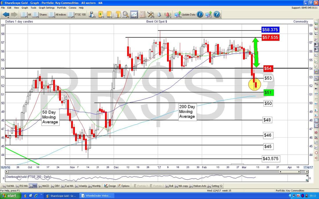
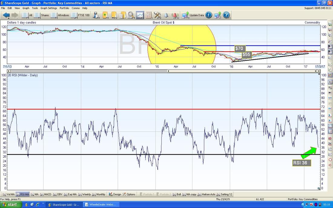
The Screen below in the bottom window has the RSI (Relative Strength Index) for Brent Oil Spot Daily. With a current Reading of RSI 36 this is pretty low and is certainly a level where the Price could happily bounce from.
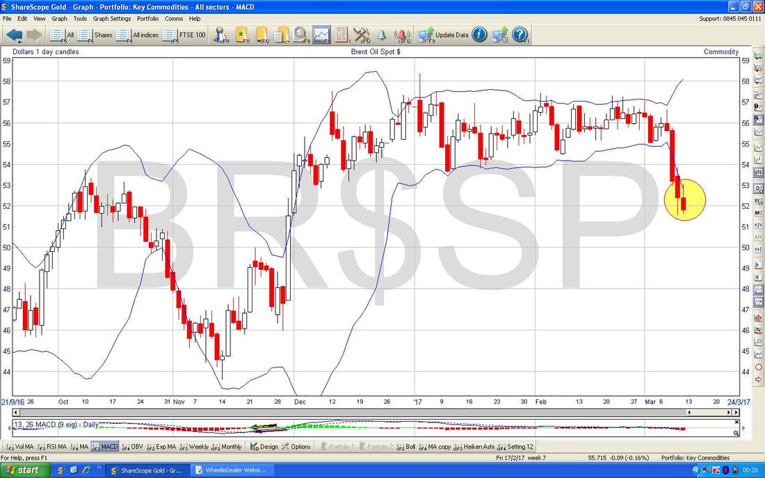
The Screen below has the Price Candles with the Blue Wavy Bollie Bands above and below. Note where my Yellow Circle is that the Candles have dropped ‘outside’ of the Bands -this is an unstable situation and the Price needs to get back inside the Bands - this means the Price goes up now or it moves Sideways (it could drop more but this would be the least likely scenario. Remember, Charting is all about Probabilities and the ‘Path of Least Resistance‘).
Gold (Spot)
The Chart below has the Daily Candles for Gold. Note we had a long run down of about 9 Days or so but on Friday we got a nice looking Doji Candle with a Narrow Body which could easily mark a Reversal Point and we turn up again (this is spotlighted by my Yellow Circle). Note this coincides with Support around the psychological level of $1200. 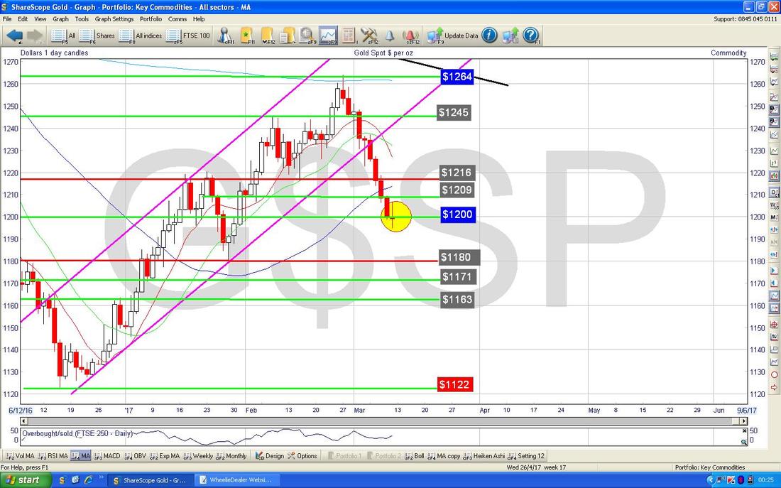
The Screen below in the bottom window has the RSI for Gold Spot Daily. With a Reading of RSI 42 it is low but could be a lot lower - so this suggests we might need to drop a little bit more yet.
OK, that’s it for this week, Good Luck everyone !! Cheers, WD. 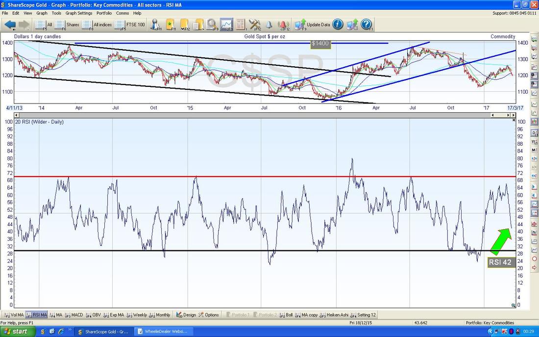
0 Comments
Leave a Reply. |
'Educational' WheelieBlogsWelcome to my Educational Blog Page - I have another 'Stocks & Markets' Blog Page which you can access via a Button on the top of the Homepage. Archives
January 2021
Categories
All
Please see the Full Range of Book Ideas in Wheelie's Bookshop.
|
