

|
educational blogs |
|
The standout thing for me at the moment is just how strong these Markets are - last week we had a momentary bit of weakness and then after perhaps a couple of days we were rallying hard again - this is a very dangerous Market to Short.
In the coming week we have Phil Hammond’s Budget on Wednesday, then an ECB Meeting on Thursday and it’s the monthly US Non-Farm Payrolls Numbers on Friday - these are more for the Traders on Friday afternoon than for anything else although they could point to further strength in the US Economy and the Stockmarkets might like that. On an Index wide basis I doubt the Budget will do a lot but for individual Sectors such as Housebuilders (especially), Insurance, Construction, Banks, Gambling, Defence etc. there might be some big moves - again the Traders will be poised over their Buy and Sell Buttons to pounce on any comments Mr Boring will make.
FTSE100
I wanna whizz through the Index Charts this week so I can show some other stuff at the end - so here is a Weekly Chart for the FTSE100 going back to the tail end of 2015. As always, my Charts are from the totally not cr*p ShareScope software that I use and the first thing to note here is the Blue Lines (marked by ridiculously oversized Blue Arrows) which designate an Uptrend Channel which has been in force for much of that time. My Black Candle is spiking a Big White Up Candle from last week and note how this broke above the previous All Time High at 7354 which was only in place for a few Weeks - this just demonstrates how powerful the Uptrend is here - making regular All Time Highs is highly bullish behaviour. The Big Up Week we have just seen suggests more gains to come and we now have a New All Time High at 7395 - I can’t imagine that holding for long before we go higher. 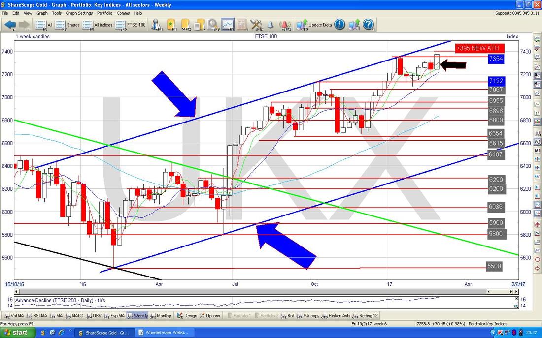
I’ve got Top Gear on in the background and just seen the bit about ‘Goat Polo’ in Kazakhstan - my goodness that is gross (the game is like the Polo we are used to with Horses and stuff but the object is to chuck a Goat Carcase into ‘Goals’ - yes, seriously - crazy people clearly. I‘m not sure it will catch on in Windsor).
Can’t say I am missing Christopher Evans either……. The Chart below has the Monthly Candles and is similar to a Chart I showed last week I think, but we now have some ‘Data’ for the current Month of March but I am not interested in that (as it is nowhere near complete obviously) and I have ‘crossed it out’ with my Black X Lines. The Key thing here is that back in January we got an Inverted Hammer Candle (marked with the Blue Arrow) and this was a warning that we might have a drop ahead. Fortunately, there was no ‘Follow through’ on this and we got a decent Up Candle in February (marked with the Yellow Arrow). This is yet more Bullish Behaviour when a Price Chart avoids a negative Set-up and keeps rising. 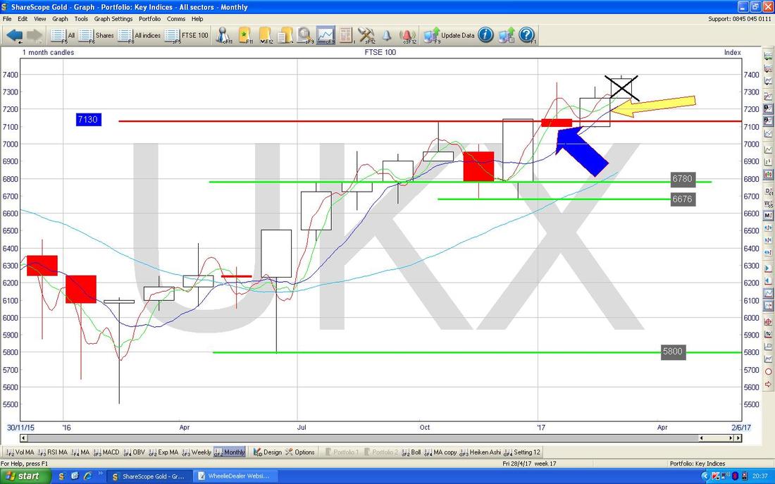
CAC40 (France)
A bit of ‘Big Picture’ stuff here. The Chart below has the CAC40 going back about 9 years or so. The thing I really want to point out here is how the Current Price of 4995 (marked with the Yellow Arrow) is getting very close to the Long Term Downtrend Line delicately coloured by myself with enormous imagination in Blue (and marked with the Blue Arrow). A Breakout over this Blue Line would be very bullish and to be really sure we are going up, a further Breakout over the Horizontal Resistance shown by the Green Line (Green Arrow) at 5260 would be good ‘confirmation’. Note also the Bottom Uptrend Line marked in Black and with the Black Arrow - this forms part of a huge Long Term Triangle Pattern and a Breakout to the Upside would be a really bullish development. If it fails to Breakout to the upside, then we might see it continue within the Triangle for a while longer as we meander towards the ‘Point’. As an aside, note how important Triangles are - I recall just recently I was Tweeting and stuff about a 1 year Triangle on TTR and it broke to the Upside and look what happened !! I am not saying France will be taken-over if it breaks upwards……..(we’re watching you Germany). 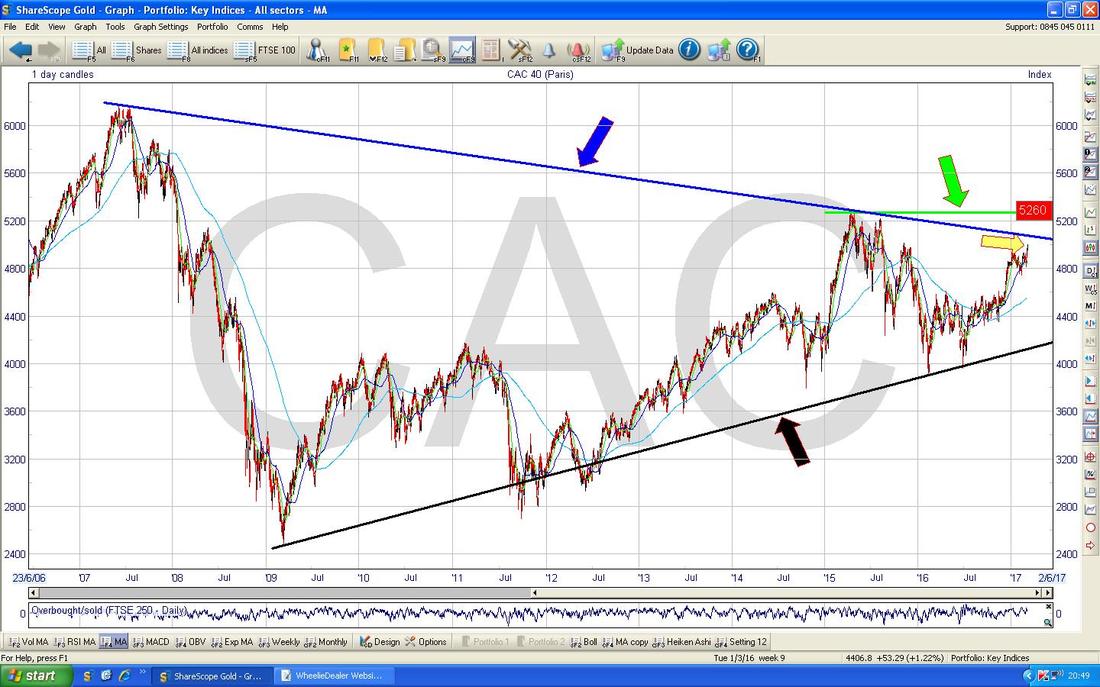
DAX 30 (Germany)
Here we have a Chart of the DAX Weekly Candles going back about a shade over 3 years. The key thing here is how we are approaching the Red Horizontal Line which marks the All Time High Resistance (Red Arrow points you at this one) and at a current Level of 12027 we are not far away from the ATH at 12391. As ever, a Breakout over this level would be hugely bullish (could be a sweet time for a Long Trade with a Stoploss to take advantage of a highly likely push higher). My Yellow Arrow is pointing to a big White Up Candle from Last Week and it looks likely that this wants to go higher so it is quite likely that we could be approaching the All Time High perhaps as early as this coming week. We have another example of a Triangle playing out here. Look at the Triangle between the Blue Line (marked with Blue Arrow) and the Black Line at the bottom (marked with the Black Arrow). Note this ‘resolved’ with a Breakout to the upside through the Blue Line back in August and rallied powerfully after this. 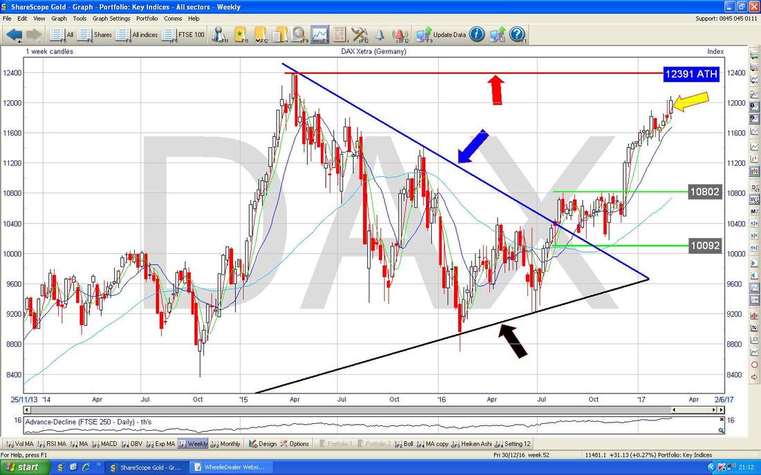
S&P500
The other US Indexes have similarities to this so I won’t show them this week. In essence, everything is Bullish but there is a need for caution here as in the Chart below, which shows the Weekly Candles, we have a bit of an Inverted Hammer from Last Week which is highlighted in my Yellow Circle. Note how the Candle has a nice White Body but the ‘Wick’ or ‘Tail’ bit up above is quite lengthy and suggests we might see a drop in coming Weeks - although this is not a great example of a nasty Bearish Inverted Hammer - for such a thing, I would expect a very narrow body and more like an upside down ‘T’ shape. Note, if we do get a drop in the near term, there is a lot of Support not far below. 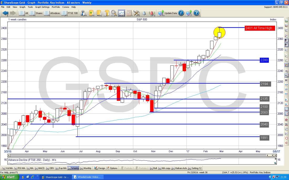
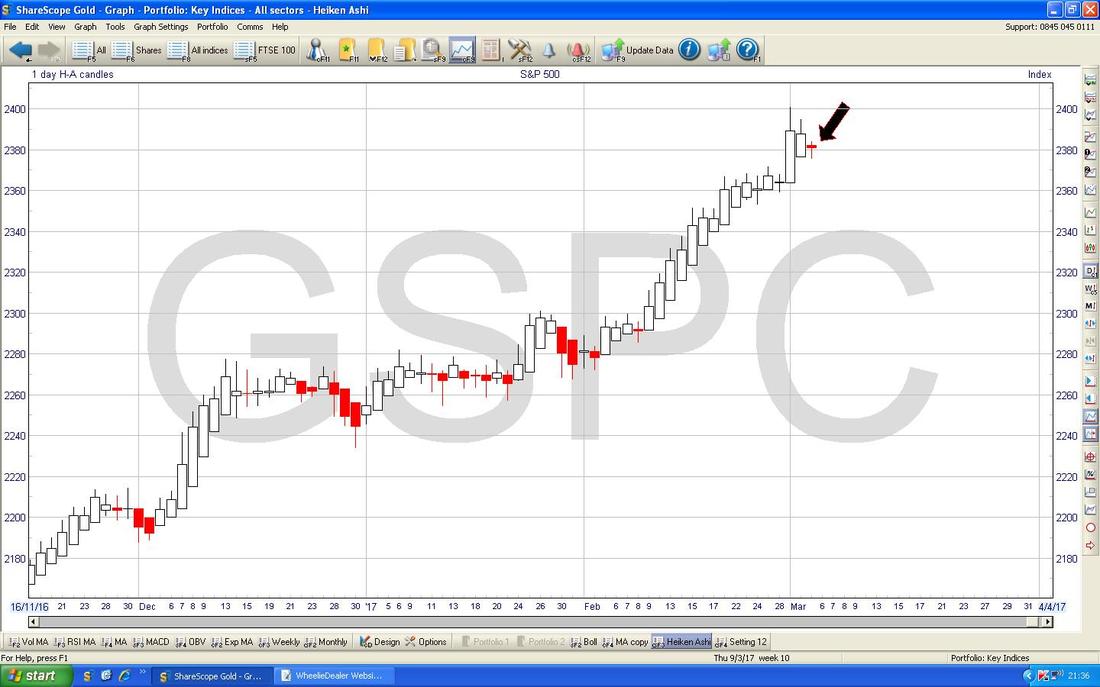
There is clearly a need to be cautious on the S&P500 in the very short term. The Chart below has the Daily Heiken Ashi Candles for the S&P500 - note where my Black Arrow is how we got a Red Narrow Candle after a run up of White Bullish Up Candles - this hints at a turn down.
Pounds vs US Dollar
The Quid dropped a lot Last Week but I suspect it was more about Dollar Strength after Trumpington’s Speech (you know, the one just before the Democrats killed any triumph by releasing yet more Russia allegations - and of course then TangoOverdoseMan decided that his Phone was being tapped - how all this stupidity helps the average American pauper I have no idea) rather than Pound weakness. My Yellow Circle is highlighting how we got a couple of nice Doji Candles after a strong move down for 4 Days (the Big Red Down Candles before the Dojis) and the last Candle here is a nice ‘Hammer’ really and suggests a Pound rebound very soon. I have used some Artistic Licence to draw a possible Downtrend Channel using the Red Lines marked with my Red Arrows. There are few ‘Touchpoints’ on these lines so they might not be particularly accurate but with how the Pound has been moving recently they probably are quite close to the reality. A rebound in the Quid might drag on the FTSE100. 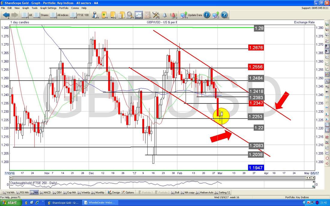
Brent Oil (Spot)
This Chart is almost identical to last Week’s - we are still in a Sideways Range between about $54 and $57.535 as per my Green Arrows. We are now waiting for a Breakout to the Upside or Downside on this Range - how it resolves will tell us the most likely future direction. 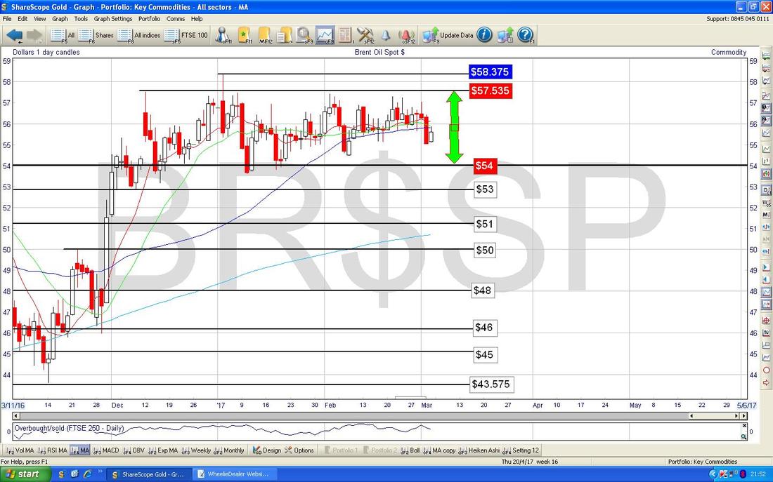
Gold (Spot)
The Chart below has the Daily Candles for Gold (Spot) and my Yellow Circle is highlighting a Big Red Down Candle that was generated on Friday. Obviously such things are never pretty but this is doubly nasty because it might have broken-out to the Downside from my Uptrend Channel which is marked by those sort of Mauvy/Purple/Pink Lines (and pointed at with a similar coloured Arrow). It is of course possible that my Uptrend Lines are not perfectly drawn and equally likely we often get ‘overshoots’ of any Support/Resistance Lines but we obviously need to be on our guard here as it looks weak for Gold unless we get a quick about turn and head upwards again. My Black Arrow is pointing to the Blue Wavy Line which is the 50 Day Moving Average and this is moving up which is good. Note it is not a millions miles away from the 200 Day Moving Average which is the Lighter Blue Wavy Line marked with my Blue Arrow - if they Cross then that would be superb as we would have a Bullish Golden Cross - which would suggest more gains in the coming months. Note also that if we continue to fall from our current level, then the 50 Day Moving Average may kick in as Support at around $1210. There’s another sweet feature on this Chart. Look at my Green Circle - this is highlighting an ‘Inverted Hammer’ Doji which was generated back on Monday 27th Feb 2017 and note how it not only marked the Turning Point downwards but it also turned off Resistance at the 200 Day Moving Average. Sweet that. 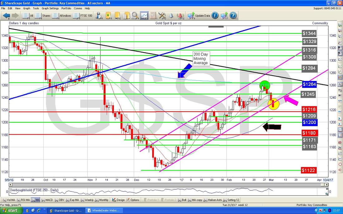
Right, I have finally got to the end of the High Level stuff and now I have some time to slam in some Charts on individual Stocks - I wanted to do this as I thought it would make a nice change and I have seen a lot of interesting Charts in recent Days that would fit in nicely.
Hunting HTG This is one that @TressieT pointed out to me during the Week. It is highly probable that HTG will benefit on the fundamentals side of things from Trump’s deregulation and focus on pumping Oil domestically as they do Valves and Pumps and suchlike as an Oil Services play. On the Technical Analysis side of things, there is a very Clear Downtrend Line here marked by my Black Line with the Black Arrow which was then Broken out of back in June 2016 and now we are in a lovely Uptrend Channel which I have marked with my Parallel Green Lines (marked with Green Arrows). This looks a pretty good Uptrend to be Buying into. My Blue Arrow is pointing to where we got a ‘Bullish Golden Cross’ between the 50 Day Moving Average and the 200 Day Moving Average (they are both Blue Wiggly Lines but the 50 is the Darker one). Note the 200 Day Line is now acting as Support (you can see it very close to the Bottom Green Uptrend Line but it takes some spotting). This is a stonkingly brilliant example of how a 50/200 Day MA GX is really good news. 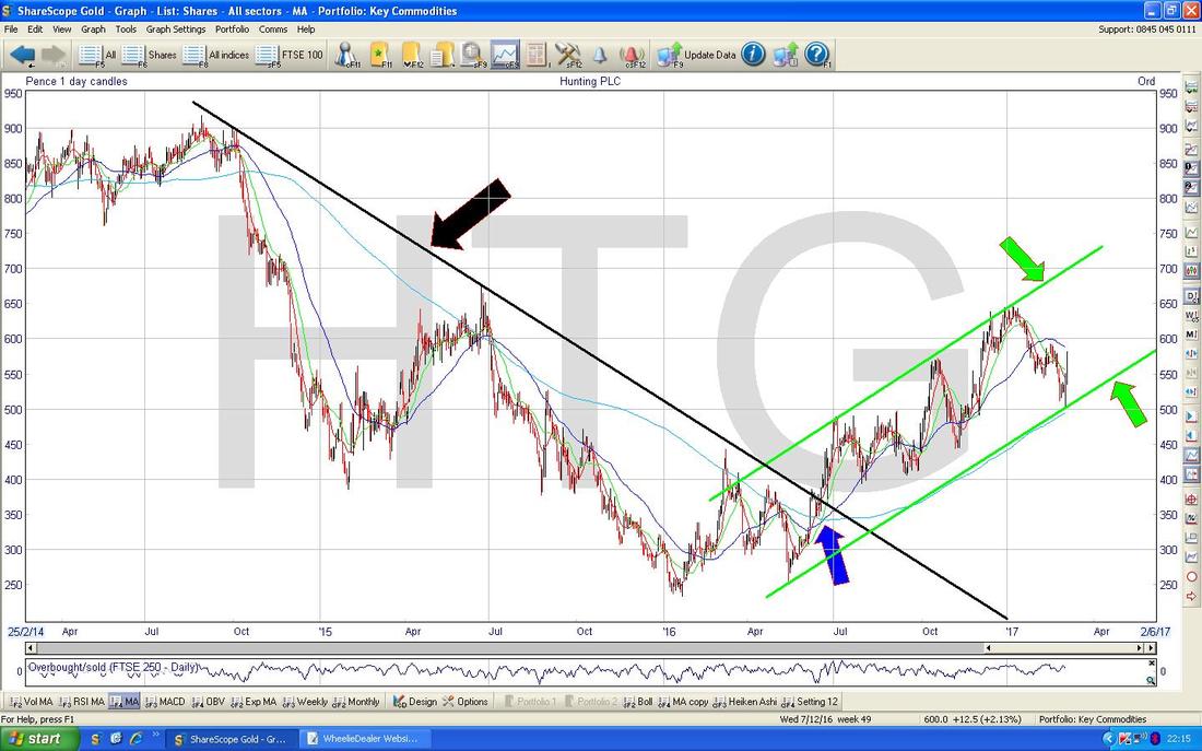
Dart DTG
Here’s another Golden Cross one I spotted recently. Dart is a bit of a hodge-podge with the Jet2 Airline and Travel business and also the Fowler Welch Lorry bit but I really like it and think it could be a good one for the Long Term although of course there is a lot of cyclicality here. I don’t hold DTG. The Chart below has the Daily Candles and my Blue Arrow is pointing to the 50 Day Moving Average Line - the other Wavy Line is the 200 Day Moving Average as normal. My Black Arrow points to a Bearish ‘Death Cross’ where the 50 Day MA crossed the 200 Day MA down from above and we then had a lot of falls afterwards. Now the situation is very different - my Green Arrow is pointing to a Bullish ‘Golden Cross’ and this suggest to me that we will see more gains here. 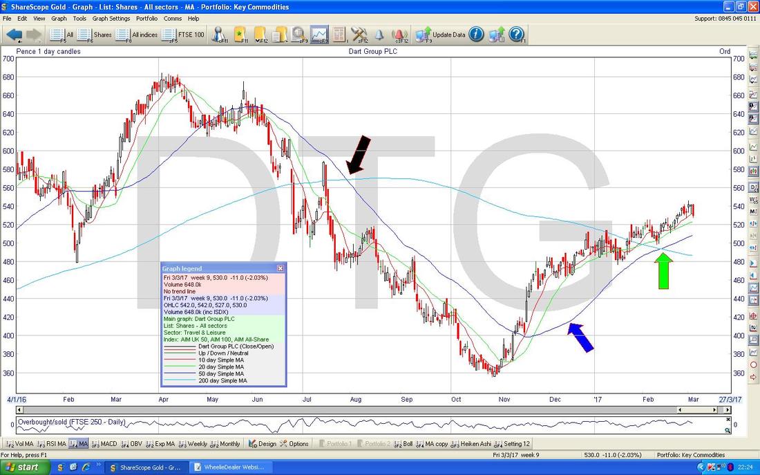
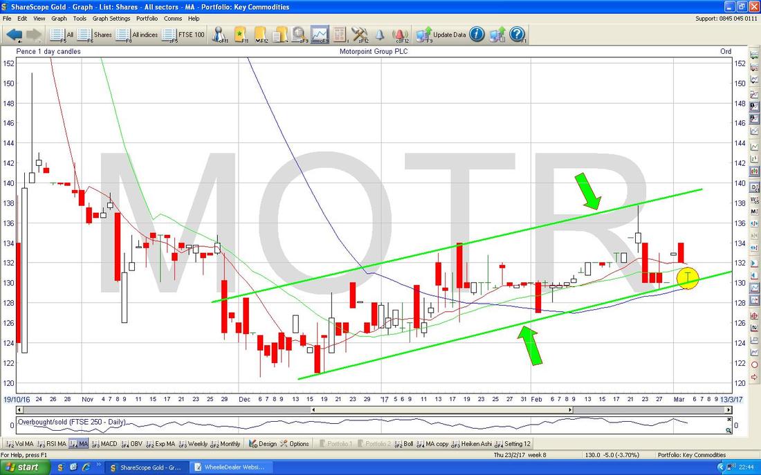
Motorpoint Group MOTR
This is a recent IPO and the situation here was shoved under my nose by @blue2_u who is the unchallenged genius when it comes to Fishing for Bottoms. We were having a general chat on the Tweets about how Car Retailers had got very beat up and I was quite shocked when I saw just how battered MOTR had got. It is clear that Car Retail faces risks from Brexit and the weak £ (tell me about it, the New Leon Cupra 300bhp 4WD Estate that I keep looking at is now £36k in the trim I fancy which is nuts - it is rapid though - 4.9 seconds to 60) is making New Motors expensive but recent Trading Updates from the likes of VTU and LOOK have been pretty good and the Servicing and Used Car bits seem to be doing well. Many people are certain that Brexit will cause an Economic Slowdown in the UK but of course the reality is that nobody can predict such a future - it is highly likely that Brexit happens to coincide with a period of strong Global Growth (there is clear evidence this is happening in the US and Europe) and this may mask any negative impacts from Brexit. If this happens, then Car Retailers might do a lot better than people expect and the new PCP way of buying Cars has an effect of cushioning any Price Rises. In addition, Car Retailers are properly exploiting their Servicing Arms these days and that is also a good support fundamentally. Anyway, on the Chart below of the Daily Candles for MOTR we have a clear Downtrend Line marked in Red (Red Arrow) and this will be a difficult Resistance Line for the Price if and when it recovers to around the 150p area - and of course if it Breaks Out of this Line then that would be really Bullish. My Blue Arrow is pointing to the Dark Blue Wavy Line 50 Day Moving Average - note how it dropped very fast and now has levelled off and is starting to turn up. 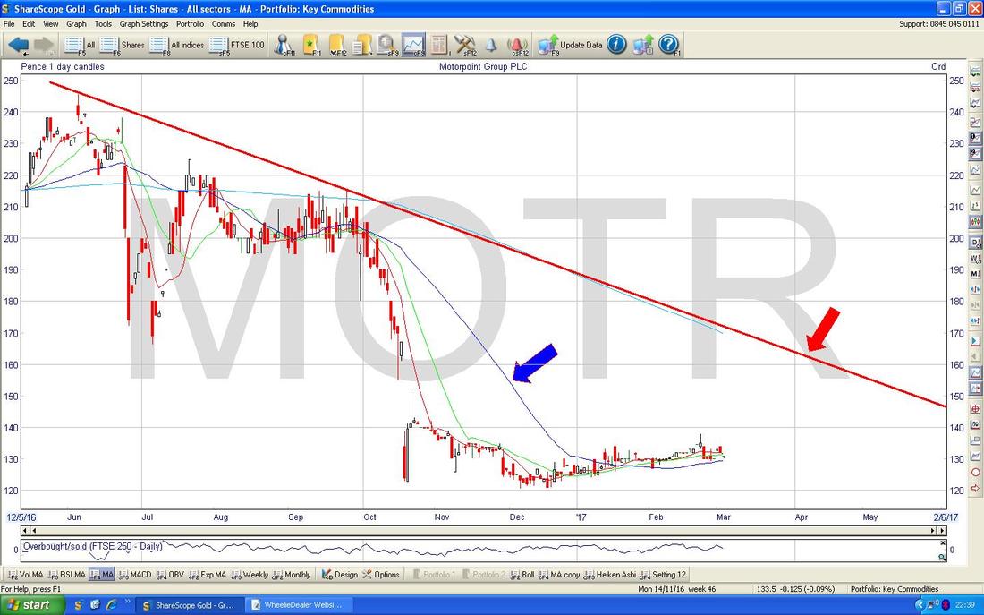
On the chart below I have zoomed in on the Daily Candles and drawn a shallow Uptrend Channel which I have marked with the Green Parallel Lines and marked them with the Green Arrows. My Yellow Circle is highlighting how we are now down at the bottom of the Uptrend Channel and this might be a good point to be Buying at although perhaps it would be best to wait for a higher Day before making a move - if you jump the gun, it could fall down out of the Uptrend Channel. This is of course very simplistic as I have only shown a couple of Charts - in practice if I was thinking of buying this I would be looking at other Indicators as well like the RSI and HA Candles and stuff.
Kromek KMK
I have bunged this one in because I know a few people who hold it and there has been a lot of discussion around it lately. They have very innovative Radiation Leak and Medical Detection technologies but as yet they are not really making Money and it is a bit of a ‘Story Stock’ which is rarely a great thing in my view. However, I do see the attraction here and it is one I will be watching in coming Months to see if it really starts to deliver the Profits and Cashflow that marks out a proper Business - I might be interested to Buy then. The Numbers in the Top Right Hand Corner on the ShareScope ‘Details’ Screen below for KMK says it all really - with ‘Apr 2018 Forecast’ figures for ‘Pre-tax Profit’ and ‘Norm EPS’ being negative and ’Turnover’ being £12.47m it is not easy to justify a Market Cap of £84.8m (this figure is in the middle near the top). 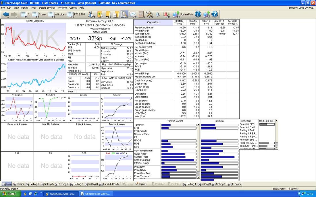
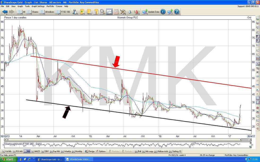
The Chart below goes back for the whole Listed life of KMK. I have drawn in the Bottom Black Line (marked with Black Arrow) and then drawn a Parallel Red Line (Red Arrow) which has few ‘Touchpoints’ and is pure guesswork - however, it will probably act as Resistance up around 40p ish. Note how both the 50 and 200 Day Moving Averages are falling - we don’t like this.
The Chart below zooms in to recent Days and there has been a huge jump up (I recall KMK won some Contracts) but I suspect it has topped out now in the very short term. My Yellow Circle highlights what looks a bit like ‘Dark Cloud Cover’ 2 Day Candles and it may drop back now. The best scenario for Bulls now is for it to go Sideways for a bit and do a ‘Bull Flag’ - this would set up further gains probably a few Months down the line. It is a positive development for the Price to be up above the 50 Day Moving Average but I note it has done this in the past and then dropped back after spiking.
The really big Bullish Development here would be a 50/200 Day MA Golden Cross - if that happens, you will probably find it coincides with KMK getting much nearer to profitability. 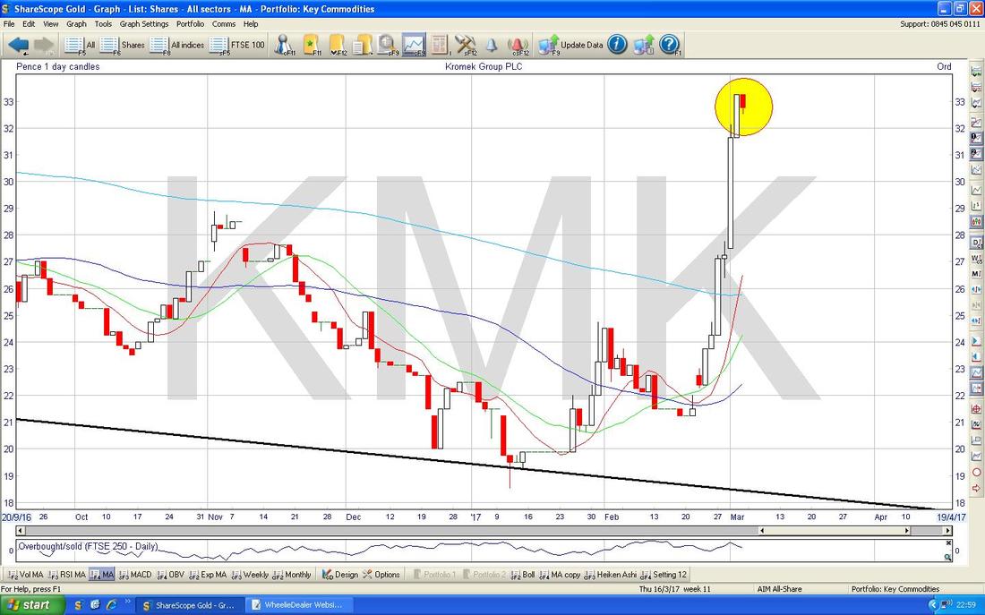
Standard Chartered STAN
Now a Stock that I hold and actually added to in just the last few days (see my ‘Trades’ page for more details). You should be able to see that STAN was in a nasty Downtrend marked by my Black Parallel Lines (Black Arrows) until a Breakout back in late September 2016 and since then it has been a lovely Uptrend marked by my Parallel Red Lines (Red Arrows). This is a very disciplined Uptrend Channel and was a major driver of my decision to buy more as we rise up off the bottom of the Channel. Note also the Bullish Golden Cross between the 50 and the 200 Day MAs as marked by my Green Arrow. 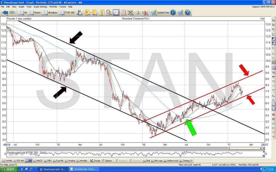
Aggreko AGK
This is another one I hold but it is one where I am not all that sure about it as it is very hard to value. On the raw numbers it doesn’t look amazing and it has had a lot of troubles in the recent past, however, with Oil and Metals rising in price we could see much more demand for their Electricity Generators and this is similar to the situation for HTG. Anyway, we should get more clarity on Tuesday as they are due to put out Results and perhaps after this I might be tempted to buy more. Technically the really interesting bit on the Chart is that we are very near a 50/200 Day MA Golden Cross - I have marked this with the Yellow Circle. If we do get the Cross, then perhaps we will see the Price Breakout from the Red Downtrend Line and this would be really Bullish. It is clearly one to watch and I think this could do really well if the Global Economy picks up strongly. AGK is very much a class act though and it would not surprise me if they get a Takeover Bid. 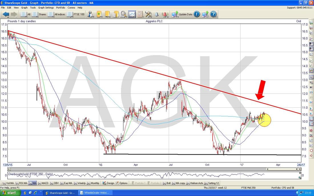
Cambria Automobiles CAMB
Here is another one I hold and it plays into the earlier discussion about MOTR. On the Chart below there is a pretty clear Downtrend Channel marked with my Parallel Red Lines (Red Arrows) and note how it Brokeout where my Green Arrow is. My Blue Arrow is pointing to the 50 Day Moving Average (Wavy Blue Line) and note how it is moving Up and is not far from the 200 Day MA which is the Lighter Blue Wavy Line - so we are nearing a Golden Cross which could be very good for holders. OK, that’s enough for now - I hope you liked the unusual diversion into some Stock Charts. Have a great week, cheers, WD. 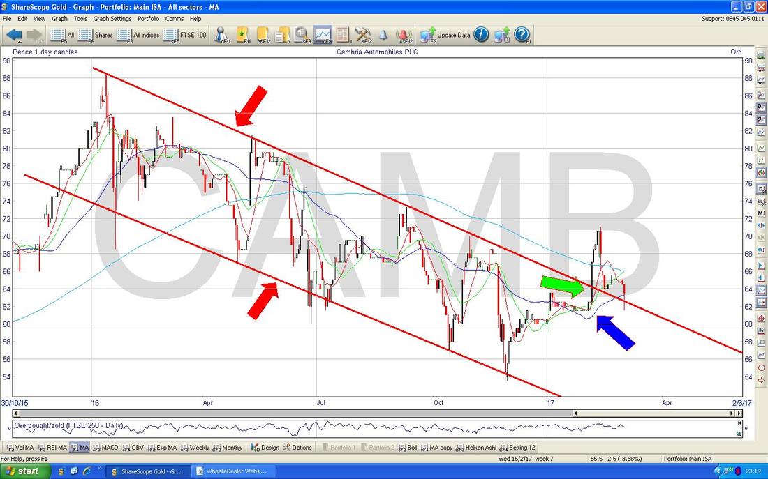
0 Comments
Leave a Reply. |
'Educational' WheelieBlogsWelcome to my Educational Blog Page - I have another 'Stocks & Markets' Blog Page which you can access via a Button on the top of the Homepage. Archives
January 2021
Categories
All
Please see the Full Range of Book Ideas in Wheelie's Bookshop.
|
