

|
educational blogs |
|
I got a bit delayed by the World Superbikes so this won’t be hugely lengthy.
I was looking at this week’s Investors Chronicle and they have 10 pages on the Bear Market etc. and in amongst this they had 7 Charts showing recent Bear Markets for the FTSE All Share - and what struck me was that in every single case they had a ‘V’ Shape between 2 distinct Price Channels - first one a Downtrend followed by an Uptrend.
The Chart below shows exactly this from the Bear Market on the FTSE All Share around 2001 - you should be able to see the Downtrend Channel (which I have marked with Red Trendlines) and then subsequent Uptrend Channel (marked with Black Trendlines).
I have also pointed out 2 other significant events on this Chart - firstly my Blue Arrow points to where the Price broke-out of the Upper Line of the Red Downtrend Channel (this would have been a magnificent time to buy with hindsight - although perhaps harder in practice for the usual psychological worry reasons - but at least it would have been a good time to start feeding some Cash into the Markets), and my Green Arrow points to a 50 / 200 Day Moving Averages ‘Golden Cross’ - interestingly this was a great Buy Signal also. 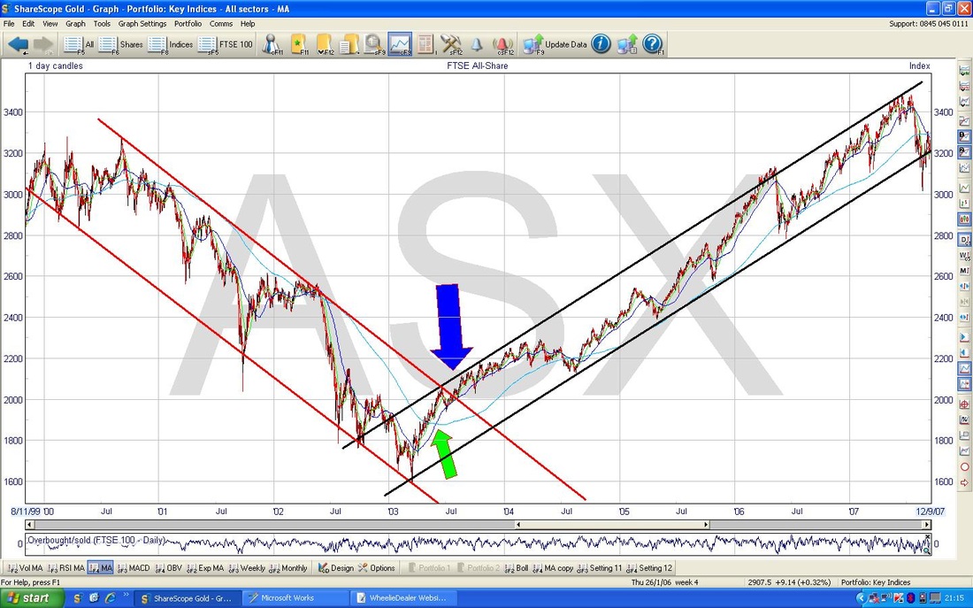
I just want to clarify what I mean by the ‘V’ shape. It should be pretty obvious but I understand that Readers might be a little confused - so if you look at the Chart below, this is a random one I picked which happens to be RDSB. It’s not a brilliant example because I found it very fast and didn’t want to spend hours looking, but in essence what happened on this chart was that you had the Downtrend Channel like on the FTSE All Share Chart above but this time, instead of going straight into an Uptrend Channel, it did a bit of ‘Sideways’ which I have marked with the Green Trendlines.
This is the normal pattern of events - you normally get Downtrends, then Sideways, then Uptrends on Stocks - so it is really worth noting that on the FTSE All Share FOR THE LAST 7 BEAR MARKETS, we have had a ‘V’ Shape. 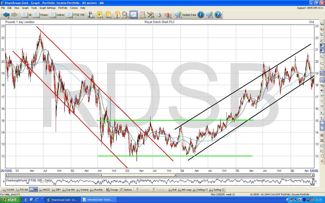
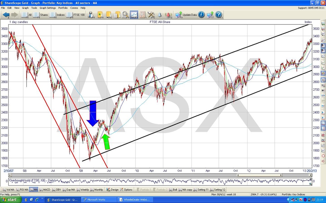
The Chart below shows the FTSE All Share Bear Market around 2008 - in this case we get the same thing - a ‘V’ shaping of the Channels. Again, my Blue Arrow marks where the Upper Trendline of the Downtrend Channel was breached and the Green Arrow marks the 50 / 200 day Moving Average Golden Cross - buy time as it turned out.
Why is this important and useful to know? Well, in simple terms, it is suggesting 2 things to me - firstly, when the Upper Line of our Current Downtrend Channel is breached, this could be a good time to Buy. Secondly, when we get a 50 / 200 Day MA Golden Cross, it could be Buy time.
The Chart below has the Downtrend Channel that is currently in place on the FTSE All Share - Note my Red Line - I think we need to breach this cleanly for it to mean it is Buy Time. Obviously any Trendline like this is a tad subjective and different people will draw then slightly differently - this is why it is important to give it a bit of time once the Red Line is breached - a bit of ‘wiggle room’. You should be able to see that the Price is currently a little bit below this Upper Line. My Black Arrows are pointing to the 50 and 200 day Moving Averages and stressing the gap between them - there is quite a lot of good upwards work that needs to be done by the 50 Day MA to get it into a Golden Cross situation - it may take a little while yet. Note both Moving Averages are falling which is not a great sign. So the implication is that we might have to wait a little longer for Buy Signals of the type I have discussed, but we are getting there. Interesting stuff huh? OK, let’s check out some of the major Charts. 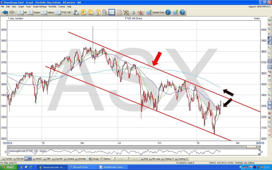
FTSE100
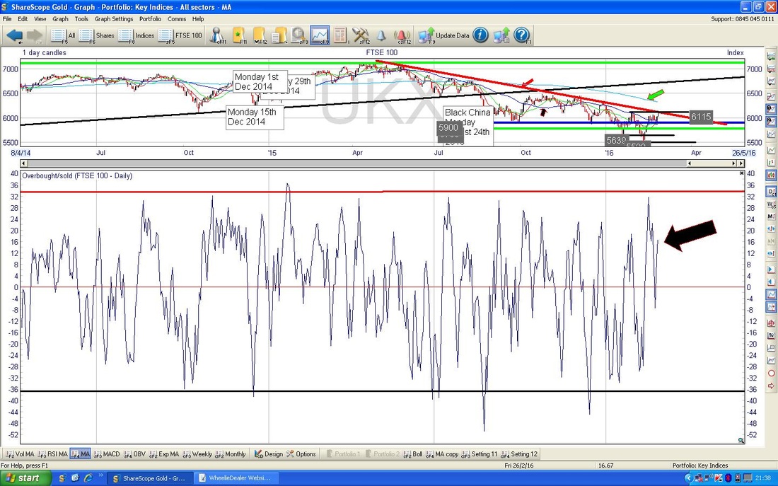
The Chart below has the FTSE100 for the last year ish. It has not changed hugely from what I have shown in recent weeks - as before the Dominant factor here is that Red Downtrend Line - marked with my Red Arrow. We need a Breach of that for things to be getting better (just like the FTSE All Share above - it is notable how closely these 2 Indexes seem to track - FTSE100 is clearly a heavy weighting in the FTSE All Share.) That 6115 Horizontal Resistance Level is important now - the FTSE100 needs to get over this - if it does, then that is a pretty good sign as it will mean the Downtrend Line has been breached. If it can achieve that, the next difficult Resistance Area will be the 200 Day Moving Average around 6300 - my Green Arrow. Note the 50 Day Moving Average (marked with my Black Arrow) is some way off the 200 Day. 
In the bottom Window on the Chart below, we have the Relative Strength Index RSI for the FTSE100 - note how my Blue Horizontal line around RSI 62 has capped any gains for the FTSE100 for the last 9 months ish - currently we are reading RSI 55 where my Black Arrow is - so if the Blue Line dominates again, then the Price will struggle to rise much now.
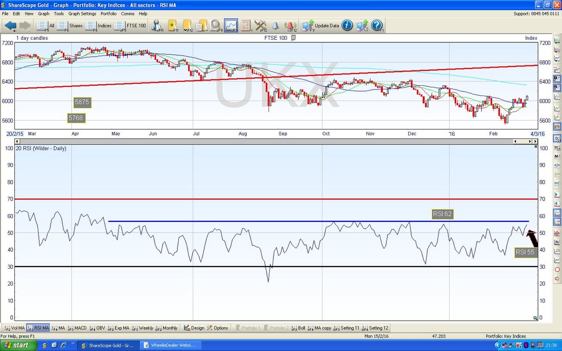
This is repeated on the Chart below with the Overbought/Oversold Indicator - this is very short term and my Black Arrow suggests it is quite toppy.
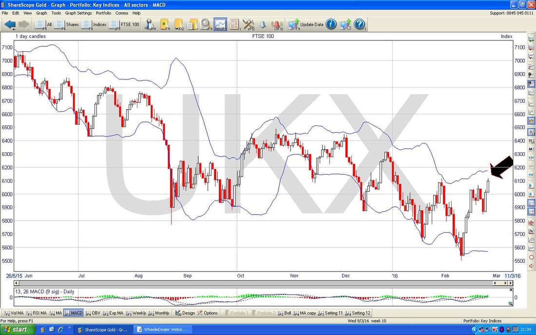
The Chart below has the Bollinger Bands for the FTSE100 - my Black Arrow points to how it is near the upper band.
S&P500
The Chart below has the S&P500 (the Main US Index) over the last couple of years. I have put this in just to set some context - note the Mauve/Pink/Purple/Cerise Line and Arrow - this is a Key Resistance Line that needs to be broken through by the Bulls. My Black Arrow points to a FALLING 200 day Moving Average - not good. 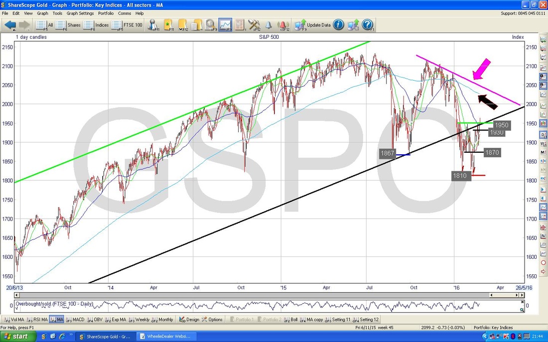
On the Chart below I have zoomed in to the last few months - my Blue Circle highlights the Candle we got on Friday 26th Feb 2016 which is really an ‘Inverted Hammer’ and this is a bit of a negative development after the recent run up in prices - I saw similar Candles on the DOW, CAC40 and DAX - it might mean a pullback in the coming week.

The Chart below has the Bollie Bands for the S&P500 - my Green Arrow shows we are near the Upper Band.
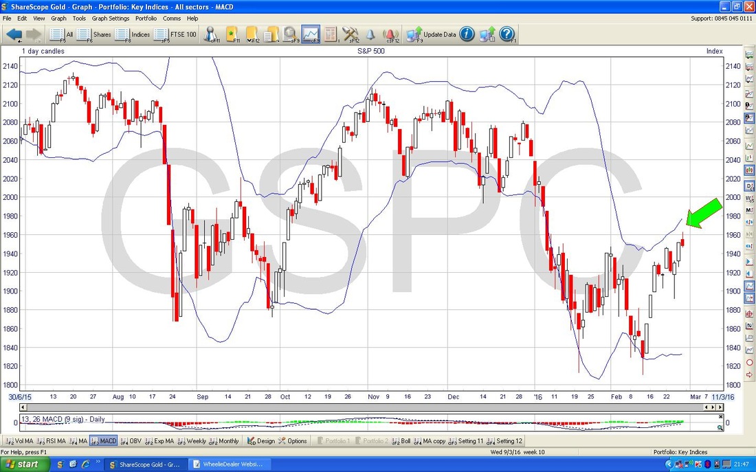
Here is some hope for the Bulls - on the Chart below for the S&P500, my Blue Arrow points to where there has been a 13 / 21 Day Exponential Moving Average ‘Golden Cross’ - this is good because it often means we can get a few weeks of upside (the 13 day is Red and the 21 day is Green). Look back at my Green Arrow and you should see where a similar event occurred and led to some strong gains. However, before we get too excited, this Signal is not great in volatile markets - it works best when things are clearly trending.

Brent Oil
Below we have Brent Crude Oil for about 7 Months ish. This Chart has been dominated by my Red Downtrend Line and is it notable that the Price has moved up above the Line - where my Black Arrow is. However, before we get too excited, as I mentioned above, the drawing of such Trendlines is by no means a precise science and we really need to see it properly move away from the Line with some aplomb. At the moment is has only just crawled over the Line - it doesn’t have a whole load of panache - yet…… Note the 200 day Moving Average marked by my Blue Arrow will most likely be Resistance for the Price - this is around $46 ish. 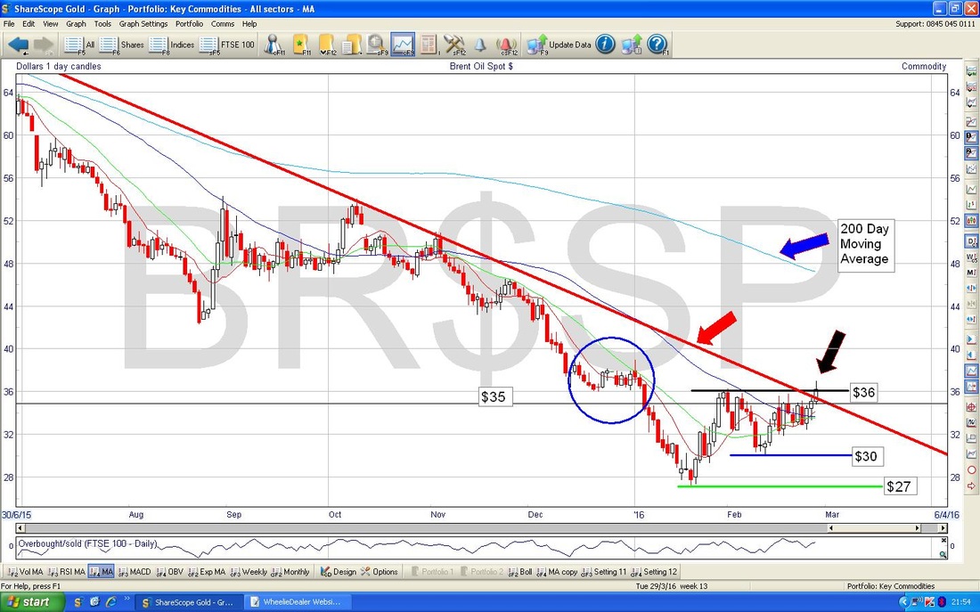
Gold
The Chart below has Gold over the last few months - note all the Support and Resistance Levels I have marked. The key thing here is that my Black Arrow is marking a 50 / 200 day Moving Average Golden Cross - good news that - however, the Price could still drop a little short term and this seems very possible to me. 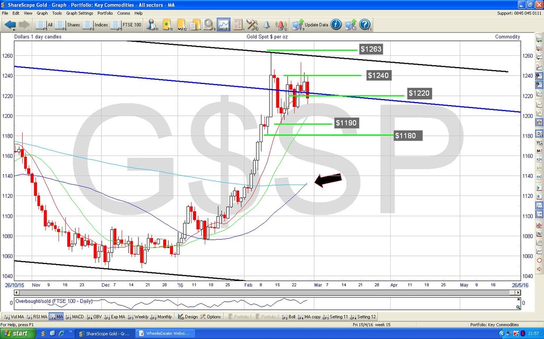
The Chart below has the MACD (Moving Average Convergence Divergence) in the bottom Window - my Blue Arrow shows how the Histogram representation of the MACD has just gone Red - bearish and my Black Arrow shows the Bearish Cross in the Line form.
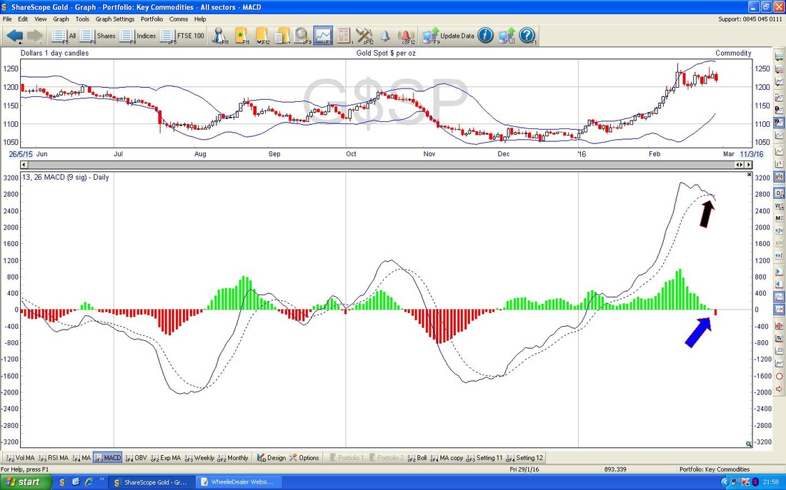
The bottom window on the Gold Chart below has the Relative Strength Index RSI. I have drawn in a downwards sloping Blue Line and marked this with my Blue Arrow - note how this is in contrast to how the Price has been moving which is in the Top Window - this difference is called a ‘Bearish Divergence’ and suggests that the Price could fall now.
Well, that didn’t take long - better proof read it and shove it into the system - hope you all have a good week and no stress !! See ya, WD 
7 Comments
catflap
29/2/2016 02:03:43 pm
Thanks for the very informative post.
WheelieDealer
29/2/2016 09:39:30 pm
Hi catflap, glad you liked the blog - I was quite taken by them V shapes. As per the 4th Chart down, I would need to see a clear Breach of the Red Downtrend Line with appropriate force like maybe a couple of strong Up Candles and MACD crosses and rising RSI etc. I think that would be the first Signal and it would most likely be safe to Buy on that but for safety we could add in the 50/200 day MA Golden Cross as Belt and Braces - that should give high confidence.
Ben
29/2/2016 05:05:26 pm
Hi WD,
WheelieDealer
29/2/2016 09:48:30 pm
Hi Ben, thanks for the comments. I see what you mean with regards to 2011 - my view is that 2011 was more of a Correction in a Major Uptrend whereas this time we are in a proper Bear Market selloff - although maybe the 'experts' would argue about whether it complies with the 20% definition - which I find utterly spurious.
Ben
29/2/2016 11:22:33 pm
Thanks WD.
Zyg Suzin
1/3/2016 01:11:10 am
Hi WD
WheelieDealer
2/3/2016 11:37:33 pm
Hi Zyg, thanks for the feedback on the blogs - great that you are finding them useful. I thought the V shapes were really useful - it is something I will be very alert for and should give us a good Signal of when things really are on the mend - I guess we will have to wait a while yet. Leave a Reply. |
'Educational' WheelieBlogsWelcome to my Educational Blog Page - I have another 'Stocks & Markets' Blog Page which you can access via a Button on the top of the Homepage. Archives
January 2021
Categories
All
Please see the Full Range of Book Ideas in Wheelie's Bookshop.
|
