

|
educational blogs |
|
There is a bit of common Folklore that goes along the lines that the moves of a Share Price can indicate what is going on within a Business and that this should be a major factor in our Buy, Sell or Hold Decisions. I guess it is an extension of the Efficient Market Hypothesis (EMH) which is more of a Macro concept whereby Economists make the claim that a Share Price, Asset Price or Index Level is merely the Market reflecting all known information about a Share or Economy or whatever and it purports the idea that “The Market is always right”.
Or is it? Well, perhaps there is some validity here but overall I would say the EMH is utter garbage - it is perhaps a wonderful Academic Exercise (and regular Readers will be aware most likely of how much I see little use for such Trash and I only respect such Theories if I have seen them to be true in my immersed experience of Markets over many years) but in truth it probably would only apply to a ‘Perfect’ Market where all Information available at a Point in Time is known to all the Participants in that Market and they react rationally and with 100% accuracy in an instant. I guess the flaws here are rather obvious apart from the simple fact that in The Real World (ah, the WD strapline !!) there is no such thing as a Perfect Market. It is a theoretical construct to help explain how Economies and Markets work but it is of little value to us as Investors (or Traders).
I didn’t want this Blog to become a treatise (whatever that is) on the EMH but hey, we drifted that way as I punched Keyboard with digits. I will concede that the Movement of Prices can have some Predictive effect because I see it every day - although that is of course very different to the idea that a Price represents the Value of a Stock accurately at a point in time. If anything, I am saying something quite different - it is more like a Movement of a Share Price over a Short Period actually can predict where a Share Price is going to move to - hopefully you can see the difference. The EMH is saying the Price is the Value whereas I am saying the Price Movement can point you to the future Price which might be a better reflection of the Value (although it will never be 100% right really - ok, maybe for a fraction of a second !!).
The examples of such Short Term Price Predictions in The Real World (ooooh, I am loving this…) are plentiful - and because I feel a need for Bullet Points, you are going to get some of those little Weapons of Bulky Text Destruction:
I’m really struggling with the scribbling of this Blog cos I had a Documentary on the final days of The Clash (Joe Strummer and all that) in the background which was taking more than half of my attention and now I have turned to the Sky News ‘Paper Review’ and as always the Brexit Chatter is sucking me in as well - it’s a challenging way to write a WheelieBlog and I would not recommend it. Where was I? Well, I think that sort of explains the principle behind this Blog so now I can move on to the next section. Actually, hold on a minute, before that, I would just add that perhaps Share Price movements and the Chart are better at predicting problems or Good News within a Business when we are talking about really small Stocks and the sort of Junk we often see on AIM in the Mining and Biotech Sectors etc. It is perhaps from this particular part of the Market where the idea that the Share Price can predict developments comes about and in my experience I would say that is largely true - but not always. So what got me thinking about this Subject for a WheelieBlog? Well, with my obsession for ‘The Real World’ (and again, in the back of the net !!) I noticed a few Shares from my Portfolio in recent Weeks that have demonstrated exactly this kind of issue. First off I will start with 2 examples where a sustained Downwards Move seemed to be predicting trouble ahead but was incorrect, and another where such a move was actually predictive and did foresee a bad Future. On Patisserie Holdings CAKE, there was a slow period of time from about the end of May 2017 where the Price continually failed to make New Highs and made successively ‘Lower Highs’ and this is shown with the Black Line (pointed at with my Black Arrow) on my Chart ScreenShot below which is captured from the impeccable ShareScope Software that I use. My Blue Arrow is pointing to a Bearish ‘Death Cross’ between the Darker Blue Wiggling Line which is the 50 Day Moving Average and the Lighter Blue Wavy Line which is the 200 Day Moving Average. Note also that just before and below my Blue Arrow the Price accelerated to the downside and things were looking pretty negative. The psychology of such a move in the Share Price is something to really take note of - in my case here I was getting a bit worried that there was trouble afoot and I recall at the time many People on Twitter were showing similar concerns if they were holding the Stock and for Non-Holders, the comments were usually around “The Consumer is screwed and Coffee Shops will struggle” and suchlike. Of course such comments are no big surprise and it might just be that I was more attuned to them and noticing them (Availability Bias) but I suspect what really happens is that the malaise in the Share Price triggers such comments and concerns and in a way this all becomes a ‘Self-Fulfilling Prophecy’ - Weak Holders would be seeing their Shares slide and then seeing all these scary comments and this would induce them to sell - which puts more downwards pressure on the Share Price and leads to further Selling etc. This effect would be particularly pronounced over the Summer when Volumes are lighter and Stocks are more choppy. 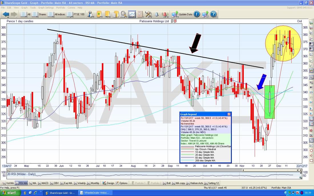
This brings me to a bit of an aside which I wanted to chuck in but it is sort of relevant. Some time ago I remember sending out a Tweet saying that Wizz Air Holding PLC WIZZ looked pretty promising and seemed to be growing well so might be worth considering as a buy. In response to that, someone sent out a reply saying that the Directors had a very greedy Incentives Package and this stuck in my mind to the extent that I did not buy them (I was pretty serious about them at the time). Anyway, as the Chart below shows, the Price just kept going up and I missed out hugely - so the moral of the tale is that we need to be open-minded and to take note of what other People say but we need to be sceptical at all times and to trust our own judgement more than that of People who you know very little (if anything) about. The Tweeterer in this case is a very sensible person so it has some credence but the simple fact is rather than totally avoiding Buying a Stock I really liked, a better reaction from me would have been to perhaps be a little more cautious with my Position Sizing and/or I could use a Stoploss just in case things went wrong. Risk Management and all that.
I have also taken the opportunity to point out a Horizontal Line Breakout where my Black Arrow is - a beauty and look how it predicted the rise. I could have had some of that if I was better at ‘Cutting out the Noise’…….. 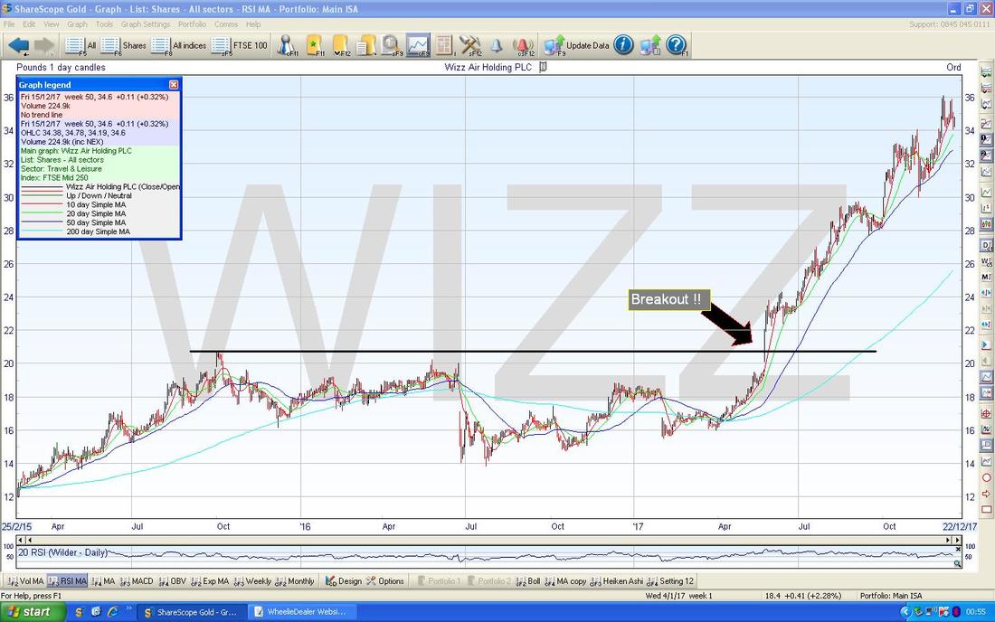
Anyway, back on the subject of CAKE, after the move down and all the negativity and worry, on the 27th November (where my Green Rectangle is on the Chart) we got a Trading Update of some sort and it was very good and showed that CAKE are doing rather well - so the predictive power of the move down was entirely wrong and the worries were unfounded and just more ‘Noise’.
And as an added bonus, I have put in a Yellow Circle on my Chart and I reckon this is pointing out another predictive set of Chart movements - this time we might have a ‘Bull Flag’. These are formed where you get a sharp move up in the Price and then the Price goes sideways for a period of time (it ‘Consolidates’) and usually this leads to a Breakout Higher and the Chart Theory is that we get a move up that is the Height of the ‘Pole’ of the Flag Pattern - this would be about 40p to 50p higher - so we might see as much as 430p if we get the Breakout. My next example is around On The Beach OTB - with this one it was a similar story where the Price got into a bit of a drift downwards over several months and I was starting to wonder if there was trouble on the way - however, as you will see from the Chart, the Price Action was utterly misleading this time. The first Chart below is the ‘Long Term Picture’ which shows all the History for OTB since it floated back at the rear end of 2015. The more recent story here is about the Uptrend which formed where my Black Support Line is (Black Arrow) but since that the Price has been going in a Sideways Range which is caught in my Pink Rectangle. My Green Line is marking the Resistance at the All Time High which is roughly 483p - if it can Breakout over this, that will be superb for Holders and could also be a good Buy Signal for people who are not currently holders (as always, check the Fundamentals before buying - they must align with the Technical picture). My Blue Arrow is pointing to the Light Blue Wavy Line which is the 200 Day Moving Average which is clearly showing an Uptrend. 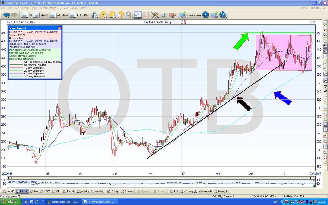
On the Chart below I have gone to a much shorter timescale and this is more ‘on message’ (sorry, had to throw that in - I am watching the Apprentice Final and that sort of Bizspeak comes up a lot !!) - my Yellow Rectangle shows where the Price started to go ‘soggy’ from early August and we then got a bit of a bounce but then where my sort of Turquoise/Aqua (whenever I come across ‘Aqua’ it reminds me of an Austin 1100 Car my Dad had when I was a kid - FCC 840F - how on earth do I remember that?) Rectangle is, the Price was dropping again and even fell below the Black Support Line from the previous Chart (I have extended it a bit on this Chart to make the point more clearly).
Obviously this drop was getting me a bit twitchy but then on Thursday 30th November OTB put out a really good set of Results and we got the big White Up Candle which I have marked with my Red Arrow. So clearly the Chart and Price Action was misleading here again and anyone who took the Chart moves as a Sell Signal would have been chucked out of a great Stock for no valid reason. My Yellow Arrow is pointing to the Blue Wiggly 50 Day Moving Average Line and note how since the soggy period, it has turned upwards again and this is a good sign. 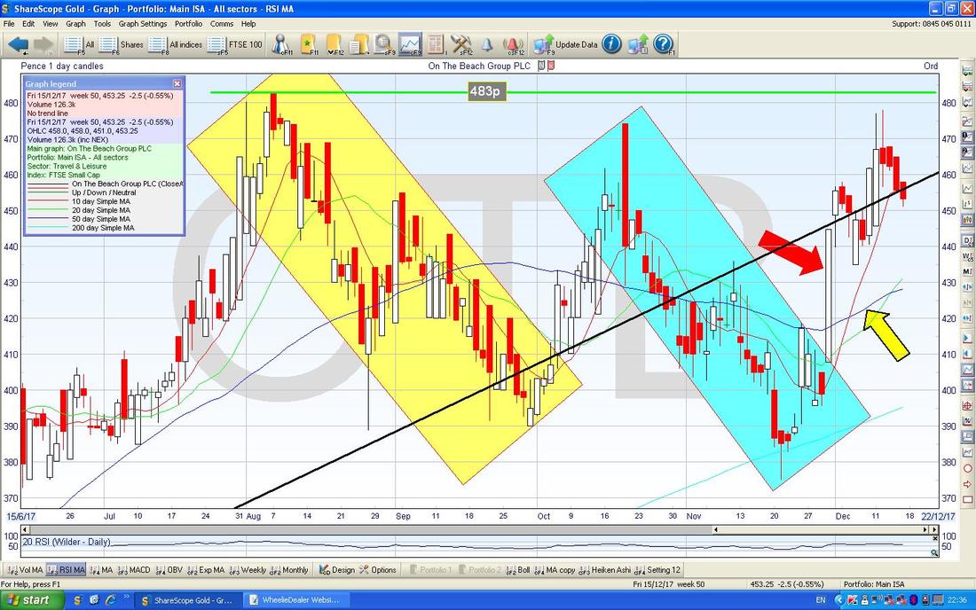
And the final example is that of Recruiter Empresaria EMR - on this one we got the different Story - the Chart was warning of a future problem although in this case the fall in the Share Price is utterly overdone in my view. The Chart below goes back to early 2012 and you should be able to see how there was a tight steady Uptrend marked by my Black Line at the bottom (Black Arrow) and the slightly higher Red Line (Red Arrow) at the top.
In mid 2015 the Price broke up out of the Uptrend and then some time later we got the sharp move up which is caught in my Yellow Rectangle. The Price then started to go off the boil which got me worried and then Thursday 21st November 2017 we got a Profit Warning which caused a big move down. So in this case the Price Action and Chart was a warning of trouble further down the Track. Note the Red Line and the Black Line do offer some Support around 90p and 70p in case the Price keeps drifting. However, on a Fundamentals basis the actual Trading Update which caused the big fall was quite mixed - they had some issues in Germany and the Middle East but are taking action on both and although they will miss the Expectations of Analysts, they still will manage the highest level of Results ever in the history of EMR - so I can’t help thinking the Stock has sold of too much. In terms of valuation, EMR is now on a Forward P/E of 7.4 on the revised down Forecasts, so it certainly couldn’t be called expensive. Of course the Risk is around more trouble coming - this is hard to foresee but with a buoyant Global Economy I suspect they will be ok. 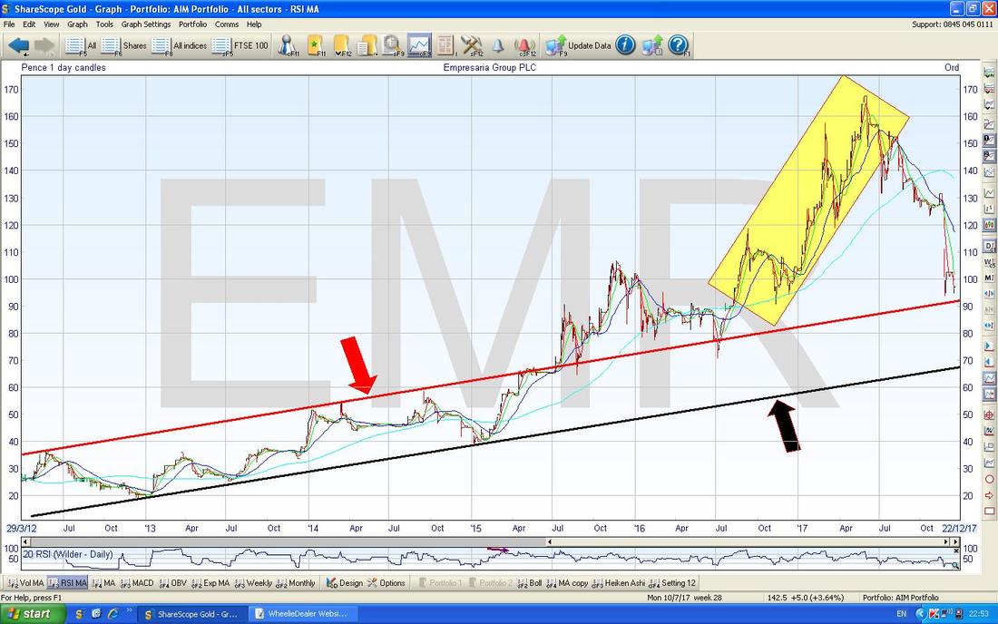
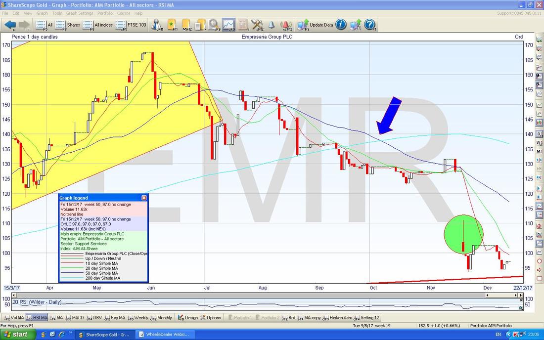
I have chucked in the next Chart just to show a closer view of the more troubled period EMR recently went through. You should be able to see how the Price has fallen since the Yellow Box and then my Green Circle highlights the drop on the day of the Profit Warning. My Blue Arrow is pointing to a Bearish ‘Death Cross’ between the 50 Day and 200 Day Moving Averages - this tends to be quite predictive and it of course means EMR could spend quite a while in the doldrums before picking up again - even if no further problems emerge.
What Conclusions can be drawn from the above examples?
Well, I am probably going to disappoint many Readers now - and I have to face up to the fact that having gone through this experience and the exercise of examining it, I do not think there are any firm ‘Holy Grail’ type implications that can be learnt. Rather than that, I think there are a few Principles which will help but as with all things to do with the Stockmarket it is very much a ‘Fuzzy’ Social Science if anything and no precise and exact Outcomes of a particular course of Action ever seem to be foreseeable. I guess it can be seen in the context of the Pareto Rule - 80% of the time such Principles will help you but for 20% of the time they are useless. First off I think it is vital to always give the Fundamentals of a Stock/Business your priority - the Charting and Technical Analysis stuff should come second and be more about Timing rather than whether or not you should buy. There are people who purely use Technical Analysis but they tend to have a very systematic approach and of course there will be many who are unsuccessful. A Technicals only Approach might work better as part of a System for Short Term Trading but it is certainly not a way to do ‘Investment’ for the Long Term. In other words, use Fundamentals to figure out whether or not you want to Buy, Sell or Hold a particular Stock and then use Charts/Technicals to help with the fine tuning of individual Buying or Selling Decisions. There is a School of Thought which goes along the lines of “if in doubt, do nothing” - studied inaction. I remember this phrase because Steve Markus (@smarkus on Twitter) mentioned it some time ago and it stuck in my mind. Steve is a superb Long Term Investor and I heard him say this on a Podcast or something and it really chimed with me. I think sometimes we are too predisposed to ‘Action’ and as Humans we ‘must do something’ whereas in the Stockmarket it is often better to fight off our Fears and Worries (often they are utterly irrational and unfounded and merely our ‘Fast Brains’ trying to trick us into a mistake). I have said many a time that I think my biggest Error in the past has been to sell excellent Stocks too early - this arises from Acting on Fears and I now try hard to suppress this aching to take Action. When you get a Stock which goes through a Soggy Period like all my examples did, it is often best to stay calm and remember to think Long Term and to revisit why you bought the Stock in the first place. What attracted you to the Stock? Why did you think it offered good Long Term Upside? Is it still good Value? Etc. etc. and you need to rationally and objectively review recent Trading Updates and the surrounding Economic Environment etc. and take a considered and thoughtful Decision with regard to whether or not the dropping Share Price is actually telling you something useful or whether it is a misleading Signal. I firmly believe that any Buy/Sell Decision should not be taken swiftly in a knee-jerk manner and without proper consideration - if you are rushing to do something you are probably making a mistake. As always, the other Great Principle to help here is that of having a Diversified and appropriately sized Portfolio of Stocks. I know I bleat on and on ad infinitum about this but it just helps so much with all situations - there is arguably no aspect of Share Investing that is more important or useful. Diversity in your Portfolio quite simply endows it with a capability to deal with Problems and to shrug them off - ok, the downside is that perhaps your Peak Returns in Good Years are somewhat reduced but in the Bad Years the ability to sleep at night will be much prized. If you want a Holy Grail, then perhaps Diversification is the closest you will get to it. And related to Portfolio Diversification we have the concept of Risk Management. To me Diversification is a subset of Risk Management and it goes with things like Risk/ Volatility linked Position Sizing and the use of Stoplosses and TopChopping and suchlike - all these things can help a Portfolio be successful even with many Problems on individual Stocks over a given time period. OK, that’s it for now - I have been really late on this one as I watched the Apprentice Final (why on earth did he pick the Recruitment Guy?) and I am still overjoyed that Johnny Rea got second in BBC Sports Personality of the Year - it is about time he got some recognition for his World Superbike Wins especially after many years on a useless outdated Honda Fireblade which utterly wasted his talent. Put him on a quality bike and lo and behold he wins all the time. Big shame as I really think he could have been a successful MotoGP Rider had things gone his way when he was younger - but its probably more fun winning Superbikes than trying to fight for 10th Place in the top class. Anyway, I hope this Blog gives you something to tie your Brain Cells (or ‘Cell’ in some cases maybe ;-)…) up over Xmas and I wish you all luck with Santa’s Rally……. Happy Chrimbo !! WD.
0 Comments
Leave a Reply. |
'Educational' WheelieBlogsWelcome to my Educational Blog Page - I have another 'Stocks & Markets' Blog Page which you can access via a Button on the top of the Homepage. Archives
January 2021
Categories
All
Please see the Full Range of Book Ideas in Wheelie's Bookshop.
|
