

|
educational blogs |
|
Well, I have been pretty useless at forecasting the Markets this year so I won’t even try to attempt Weather forecasting - but I can without doubt say that Last Week was fippin’ hot. We are getting into the final leg of July and slowly approaching that nearly always eventful period around Autumn - Markets have certainly been ‘melting up’ with hopes of more Central Bank QE (Quantitative Easing - Money Printing) and even increased Government Spending in the UK but it is clear that Economic Storm Clouds are on the Horizon and how long can the Bulls keep pushing things higher?
As ever, let’s hit the Almanac first………
According to the UK Stockmarket Almanac 2016, for the coming week (w/c 25th July 2016) the FTSE100 is Up for 45% of Weeks with an Average Return of MINUS 0.2% - so the historical precedents are ugly.
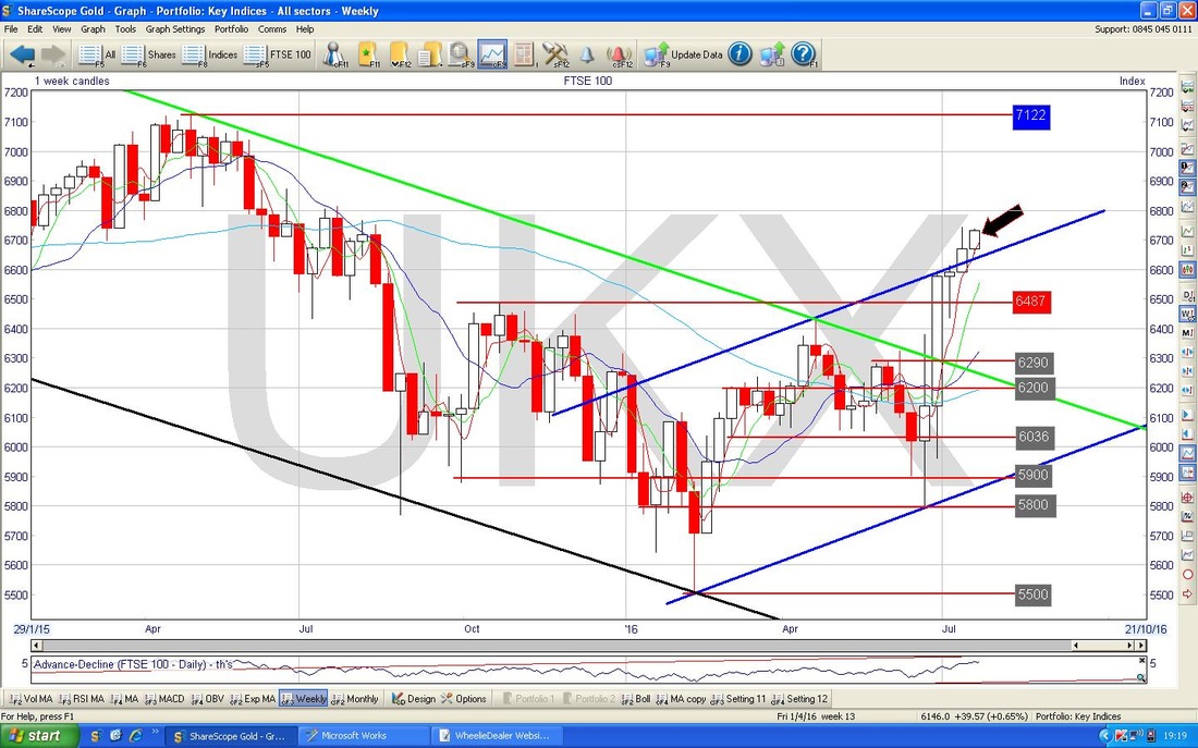
August We are almost in August, so I have turned the page to give the info on that. Historically, August is the 7th Strongest Month so it is pretty average (which is no bad thing as on average the FTSE100 rises each Year and by definition the average month is therefore a small gain). August tends to be Positive for 58% of years and the Average Return for August is 0.5%. In a typical August, the FTSE100 drifts down for the first 2 weeks and then increases for the last 2 weeks. August is the biggest Month for Interim Results with 43 Companies in the FTSE100 reporting and 93 Companies in the FTSE250. Right, on with the Charts……….. FTSE100 As with most times I write these Blogs, I will start with the FTSE100. I wanted to look at the ‘Big Picture’ so here is the Daily Chart going back to the 2009 Lows - I showed a similar Chart (all ScreenShots are from ShareScope as usual) either last week or the week before and I wanted to see how it was developing. My little Blue Arrow shows roughly where the Price is now and you should be able to see it is below the Bottom Uptrend Channel Line that was in place for pretty much 6 years. You may remember that I pointed out it was important for the Price to get back up over this Line and back into the Uptrend Channel - we are still some way off this at 6730 and it is highly likely that the Price will find Strong Resistance at the Bottom Uptrend Channel Line at about 6900 to 7000 ish. These Levels are also up near the All Time High (ATH) for the FTSE100 at about 7122. If we can get above these levels, that will be extremely bullish behaviour. 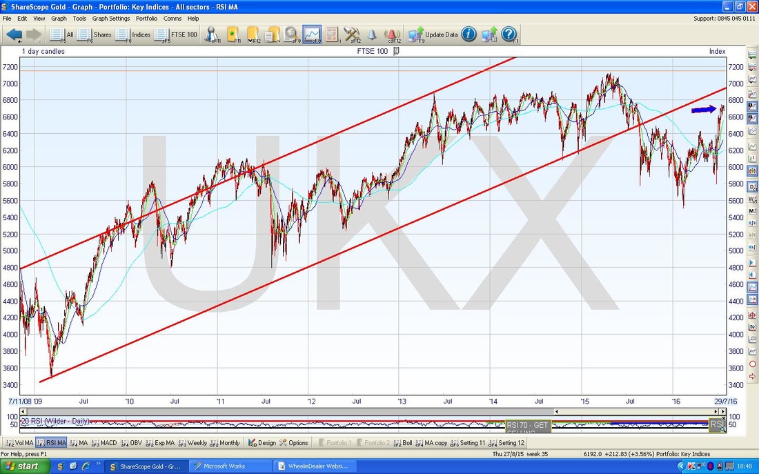
On the chart below I have zoomed in to about the last 5 Months to show the FTSE100 Daily Candles in a closer view and focusing on the Uptrend Channel that has been running for most of that time. My Yellow Arrow points to an Up Candle that was produced on Friday 22nd July 2016 (yesterday at the time of writing this) and it is notable that we got a Bullish Candle after the setup from the day before was looking a bit weak - that shows Bulls are coming in even when the Market Dips a bit which is pretty eager action. Note in this case that Support came in at 6663. Of course we need to appreciate that Fridays can be a bit ‘funny’.
However, something to watch is that the Inverted Hammer Candle from back on Thursday 14th July (I have pointed at this with the Green Arrow) is still dominating things and the FTSE100 must get over the Top of this Hammer at 6743 if we are going to see more Upside in the Short Term. 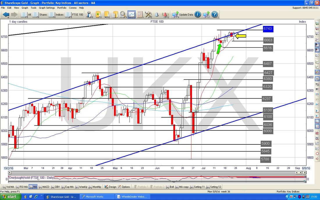
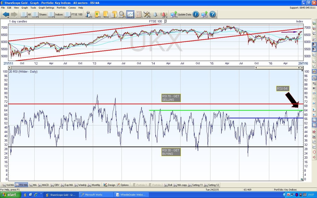
On the Screen below in the bottom window we have the RSI (Relative Strength Index) for the FTSE100 Daily. My Black Arrow is pointing to the current reading at RSI 64 and the thing to note here is that we are back up at the Green Horizontal Line where the FTSE100 has faltered for all of the last 2.5 years - it is possible that it can go higher (and it well might) but the probabilities are against this. Even if it can break higher than RSI 64, the upside from here is quite limited.
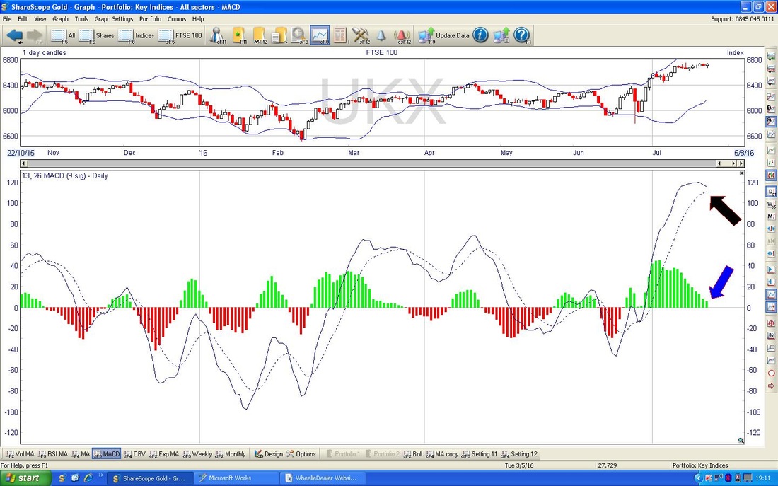
In the bottom window on the Chart below we have the MACD (Moving Average Convergence Divergence) for the FTSE100 Daily. My Black Arrow is pointing to where the ‘Signal Lines’ are looking like doing a Bearish Cross soon and the Blue Arrow points to a very similar thing (as it should) where the Histograms are suggesting we will turn from Green to Red very soon. However, it is possible that we avoid such ‘Bearish MACD Crosses’ but that is unlikely. It is however possible that we get the Bearish Crosses but the FTSE100 Price Line just goes sideways - that might actually be more likely as there seems amazing Bullishness around at the moment (this is most likely due to the Big Megacaps that have huge weightings in the FTSE100 being Dollar Earning Defensives - although of course that doesn’t explain why US Indexes are so strong). On the flipside, Oil looks very weak and this could hit a few FTSE100 Mega caps (RDSB Shell is the largest Stock in the Index) and the historical precedents for the next 3 weeks are not good.
On the Chart below we have the Weekly Candles for the FTSE100, going back about 1.5 Years. My Black Arrow points to a small Up Candle that was produced last week - this looks pretty bullish and is a Continuation Candle - that does not mean the FTSE100 cannot turn down very soon, but it suggests that there is no sign of it in the Weekly Candles. This is interesting because I mentioned in my ‘Technical View’ on Thursday Night that the Weekly Candles for many Indexes were shaping up for a Bearish looking Pattern (Inverted Hammer) - in the event, enough was done on the FTSE100 on Friday to save the Week.
FTSE250
Following on from the Weekly Candles for the FTSE100, I thought the Weeklies for the FTSE250 were quite interesting. Here is the Chart going back about just over 1.5 years and a ‘Triangle’ should be very discernible between the Bottom Blue Line and the Upper Green Line. My Black Arrow points to the Candle which was bashed out last week and the thing to notice is that it has quite a long ‘Wick’ which of course is now a Resistance Level at 17092 which must be got over - this is something to watch and the Candle suggests that the FTSE250 is finding things a bit tough. 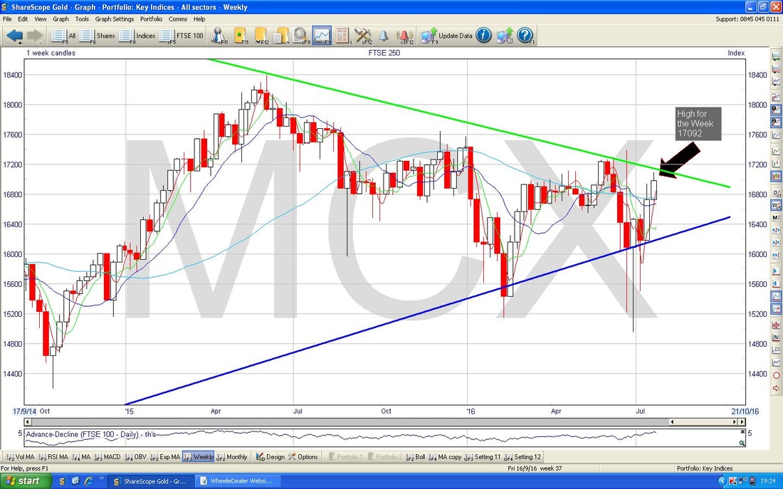
This Chart is quite interesting - I have zoomed in on the Daily Candles for the FTSE250 to show how the Bearish Setup from Thursday was actually ‘followed through’ in this case. My Black Arrow is pointing to a Hammer Candle which was produced on Thursday 21st July 2016 and in the context of the recent run up, this Hammer is Bearish. Then on Friday, we got the Down Candle (pointed at with the Green Arrow) that shows the Price turning down as the Hammer indicated. This Reversal may fail, but perhaps it will be built on in the coming week.

DAX (Germany)
The Chart below has the Weekly Candles for the DAX going back just over a year. My Green Arrow points to a Hammer Candle which was created last week and in the context of the run up in recent weeks, this has to be Bearish. Note also we are getting very near the Blue Downtrend Line which has been pretty dominant for some time. It is of course not guaranteed that we drop from here, but the chances of upside look limited to me. 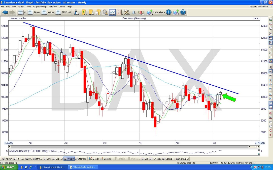
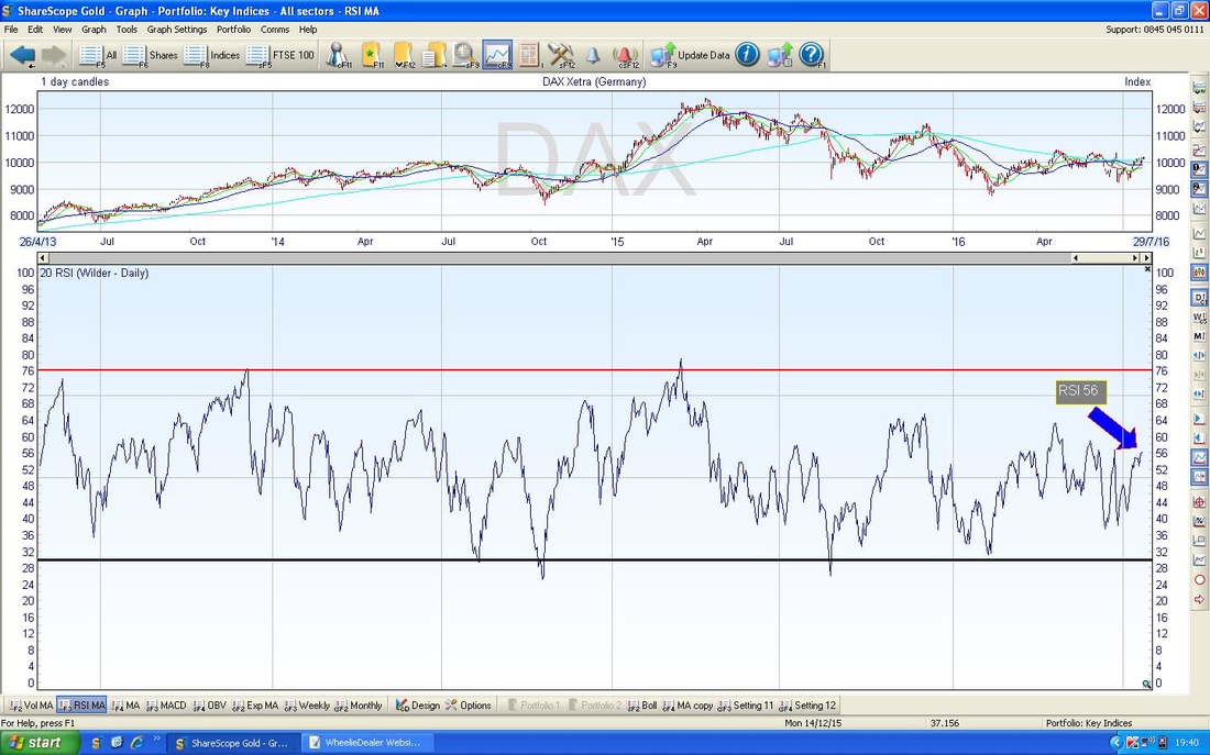
In the bottom Window of the Screen below we have the RSI for the DAX Daily. I have included this because it sort of contradicts what I said about the Weekly Candles above - in this case we have a reading of about RSI 56 which is remarkably low for the Index to look so weak. It is of course not impossible for an Index to fall from such a low reading, but it is unusual. If it does fall, it just shows profound weakness in the DAX.
With the contradiction of the RSI, I wanted to look closer at the Daily for the DAX. Here are the Daily Candles going back just a few Months - I wanted a close look. My Black Arrow points to a Red Hammer Candle from Thursday which in the context of recent gains is Bearish. This was confirmed in part by the Doji Candle from Friday (marked with the Green Arrow) but really the Doji just suggests more uncertainty. A ‘cleaner’ confirmation of the Bearish Hammer would have been a proper Down Day on Friday (a Big Red Down Candle).
DOW
The Chart below has the Weekly Candles going back a about a year and a half. My Yellow Circle is encapsulating a ‘Doji’ Candle which was produced last week and in the context of the recent strong gains, this could mark that a Reversal is about to take place. However, Dojis like this are not really Reversal Signals (like in the way an Inverted Hammer would be) but they do indicate that the power of the move up is waning - so expect things to top out in coming weeks if not sooner (this would be consistent with the usual Autumn malaise). 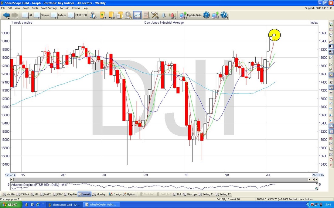
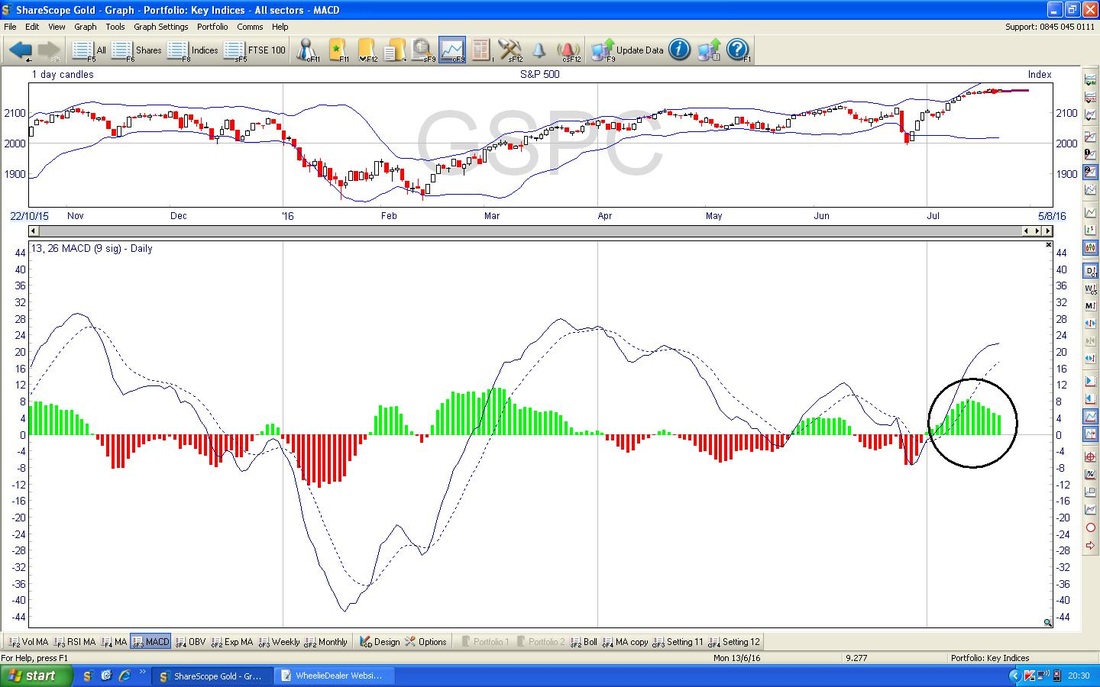
S&P500
The Dow is only 30 very Large Stocks so it is not all that representative of what the US Stockmarket is doing. The S&P500 has 500 Stocks - so it much better at really showing what is going on. My Chart below has the Weekly Candles for the S&P500 going back about 1.5 years. My Green Arrow is pointing to a small Up Candle which was bashed out last week - if anything, this looks quite bullish - but of course the key thing here is the New All Time High at 2176 which needs to be got over. 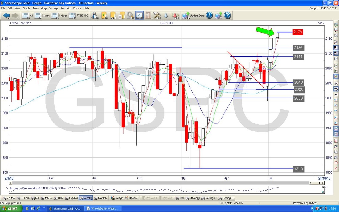
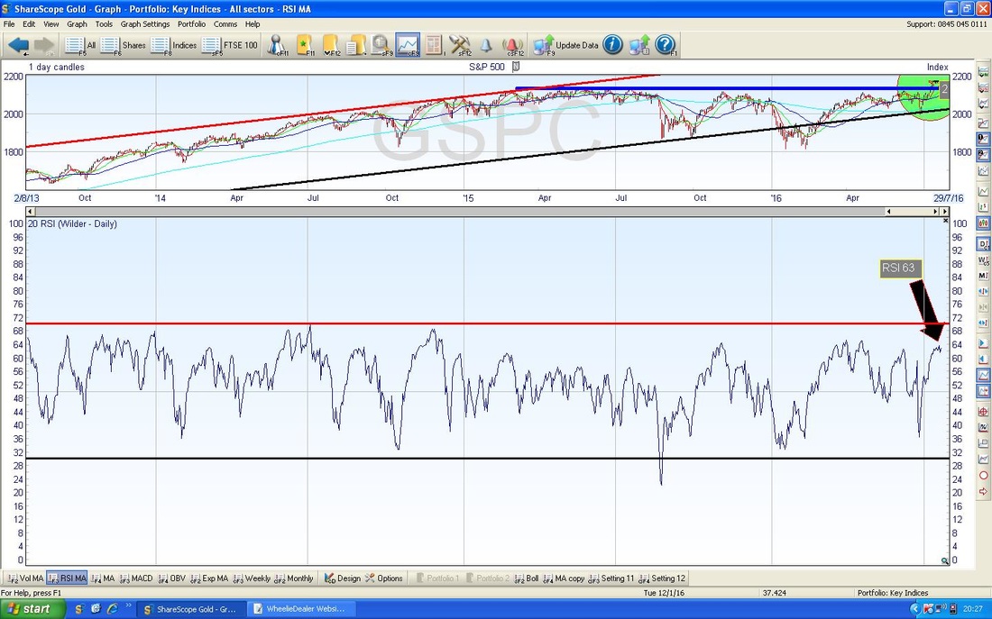
In the bottom window of the screen below we have the RSI for the S&P500 Daily. With a current Reading of RSI 63 it is quite high but can go a fair bit higher - although it you look closely (you may not be able to see it on this Chart) it does seem to have turned down slightly or at least gone a bit flat. It is clearly quite toppy.
The bottom window on the Screen below has the MACD for the S&P500 Daily - my Black Rimmed Circle is supposed to be highlighting the Green MACD ‘Hump’ which is looking like rolling over. Of course, even if it does roll right over and go Bearish, then we cannot know the depth of any Bearishness and it could easily do a small Red Hump and then go Positive again. However, keep in mind that the weakest Month of the Year (September) is not far away.
Nasdaq 100
This is particularly interesting for me as I have a small Short on this Index. The Chart below has the Weekly Candles going back about 1.5 years and my Black Arrow is pointing to a nice Up Candle that was generated last Week - this looks pretty Bullish. The real test here is the All Time High at 4740 - this should be fairly strong Resistance but of course if it can break-out then that would be bullish behaviour. With a Short on, I really don’t want to see this happen and I am very tempted to close the Short if it breaks out and to take a Loss on it. On the flipside, with Autumn very close, I want the Protection from Market falls that Shorts can give me - it’s a bit of a dilemma. In terms of MACD and RSI etc., the Nasdaq 100 is very similar to the S&P500. 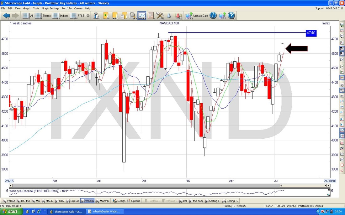
NIKKEI (Japan)
I won’t do loads on this but early Friday morning I tweeted out that NIKKEI had done a ‘Gap Island Reversal’ - it’s not the best you will see as it is nicer if the ‘Island’ is made up of several Candles but they are extremely rare and I wanted to highlight it. I am killing a couple of Birds with one chuck here - the Screen below has the Daily Candles for the NIKKEI going back about 4 months. If you look above and below the Candles you should see the Blue Bollinger Bands - note how the Price Line touched the Upper Band on Thursday 21st July (marked with the Green Arrow) and then it fell away from the Band on the Friday. The Green Arrow marks the ‘Island’ bit of the Gap Island Reversal. I have hopefully shown the ‘Gap’ bit on the Chart. Arguably, when you have just one Candle forming the Island like this, I think it can be called an ‘Abandoned Baby’ - anyway, they are pretty rare and in this case it is Bearish (maybe it’s an Abandoned Baby Bear?) 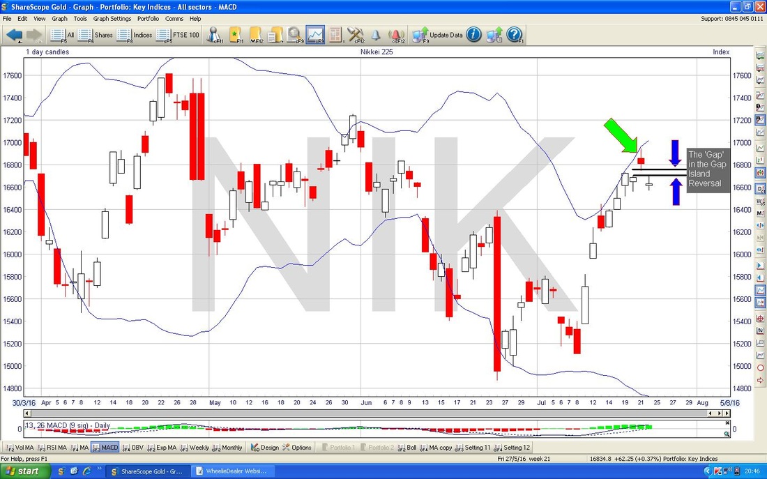
Brent Crude Oil
It has to be said that Brent Oil has got decidedly more Bearish in recent Days - I must add I am really surprised to have seen this Chart as it is - I had not realised that Oil had dropped on Friday. The key thing here is the Down Candle shown by my Yellow Circle on the Daily Candles below - the worrying thing is that Support at $46 failed and the Price looks very weak. 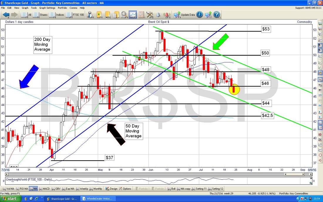
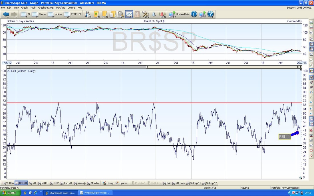
In the bottom window of the Screen below we have the RSI for Brent Oil Daily going back about 3 years. With a current reading about RSI 44, it is clear it can go a lot lower and has done many times in the past. On this basis, expect more downside before it turns up again.
GOLD
The Chart below has the Daily Candles for Gold going back about 5 months. I was quite surprised by what happened on Friday (yesterday as I write this) - my Black Arrow is pointing to a nice Up Candle from Thursday and I thought Gold was going to reverse up after recent weakness for a couple of weeks. However, as you can see on the Chart, on Friday we got a Down Candle and the up move attempt failed. I think for Bulls to make some headway, we need to see a Close above $1340 - I have marked this with a Red Text Box on the Chart. 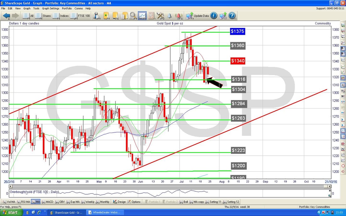
On the Screen below we have the Bollinger Bands around the Daily Candles for Gold. My Black Arrow points to where the Price is nearly at the bottom Bollinger Band - this supports my view that a move up is likely quite soon - maybe Friday was a blip……….
Anyway, that’s enough charty waffling, I hope everyone has a great week, Cheers, WD. 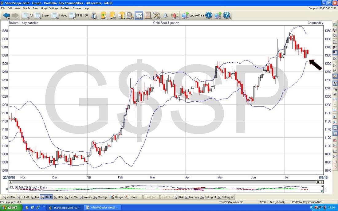
0 Comments
Leave a Reply. |
'Educational' WheelieBlogsWelcome to my Educational Blog Page - I have another 'Stocks & Markets' Blog Page which you can access via a Button on the top of the Homepage. Archives
January 2021
Categories
All
Please see the Full Range of Book Ideas in Wheelie's Bookshop.
|
