

|
educational blogs |
|
These Markets are still all over the place despite me managing to squeeze out a tiny gain last Week of 0.4% on my Portfolio - after so many poor Weeks this was a welcome respite but I am really not convinced it is part of a trend of gains and after big falls in the US on Friday, I wonder if it was just a short relief from the ‘Death by a Thousand Cuts’ Market we have had to endure since the start of 2018. I mentioned this on a Tweet a few Days ago and I might even have misheard it but Bloomberg TV one night were saying that this was the worst start to a Year since 1929 - and that was the year of the Wall Street Crash !! (I am assuming they mean the US Markets).
In due course I will look at the Index Charts and try to make sense of what is happening but my overall stance remains the same that I am in no rush to buy much and am just happy to maintain my current Portfolio as it is with the odd few things that I wouldn’t mind dumping if the opportunity arises - what I mean by this is that if something unexpectedly jumps up then I will be looking to sell into the move. I utterly hate selling things ‘at the bottom’ and I find with patience if you hold Quality Stocks then your time will come. Needless to say I will be monitoring the Charts very closely and if I see a need to Short an Index or two in order to Hedge my Portfolio then that is where my focus will be.
At the moment I have a small Long Position on the S&P500 and I am not overly happy with how it has gone so far - I might chop this soon but I will see what the Charts are telling me before doing so. I get the distinct sense that going Short needs to be my default stance.
Another New Video !! I am sure many Readers will have seen the Interview that Tamzin and Tim from piworld recorded with me some Weeks back but what I sneakily kept from you was that we actually recorded two Videos on that day !! This Week Tamzin put out the latest Video (it is 30 minutes long) and you can see it here on YouTube etc. When I get a minute I will put a Link to it on the Homepage of this Website so you know where to find it if you get the urge to watch it again in the future - I have not watched it yet but from my memories of the Day I am sure this was the better Video and so far the response on Twitter has been very positive: http://www.piworld.co.uk/2018/04/05/coping-with-the-ups-downs-with-wheeliedealer-interviewed-by-tamzin-freeman/ Once again huge THANKS to Tamzin and Tim for making the effort to come to me and do these recordings - it was a fun day and I know WD Readers will appreciate getting more insights into how I do things. Duxford Meet-up For the last couple of Years we have been holding the ‘Wheelie Bash’ in the vicinity of Windsor and it tends to be later in the Summer around September time for various logistical reasons. This has been a huge success and a really fun Day for all concerned and it looks set to become a regular feature of the UK Social Calendar (up with things like Trooping of the Colour, Wimbledon and the Boat Race), but the drawback is that we have plenty of Summer Months before to exploit and for more Northern based Readers it is not so easy to get to. With that in mind, I have been thinking about arranging some sort of other informal event in the Summer and those of you with extra pinsharp memories may recall that last year during the Summer I met up with a couple of mates Steve and David (@LairdElmski and @aimprospector on the Tweet machine) at Duxford Aerodrome (or is it an Airfield?) just off the M11 outside Cambridge and it struck me as a very cool place to meet people who are based up around there and at the same time the Museum bits are superb. Therefore, I can now officially announce that we will be doing a ‘Meet-up’ at Duxford Airfield/Dromey thing on Monday 25th June and I am expecting to get there myself around 12 Noon ish but because it is a proper full on Museum, anyone who is coming to join us can just turn up when they like and if you are early then take the chance to have a browse around the Planes etc. There is an Admission Price (not much) to get in but it stays open to about 6pm I think and there is a huge Car Park if you are driving there. Once I get through the Turnstile I will head for the Canteen/Restaurant bit and hopefully if the weather is nice we will be able to sit outside. Here is a link to the place: https://www.iwm.org.uk/visits/iwm-duxford As always everyone is invited and it would be brilliant to see you there - the more the merrier and all that !! Don’t worry if you have only been doing Shares for a short time - everyone is welcome and these kind of events are just a great chance to meet other like minded lunatics and to build relationships which can help you hugely. This date was not chosen entirely at random - it happens to be the day before David from www.aimprospector.co.uk is arranging an Investor Event in Cambridge with several Companies presenting including:
A few of these I know nothing about but I have to say that BYG, GHH, NAH and LTG are all decent businesses and could be worth knowing more about. Sadly I will not be at that Event myself because I cannot do 2 days on the trot due to Health complications !! You can see details of the Event here: http://blackthornfocus.com/events/alpha-investor-forum/june-2018/bf-pref The Charge for the Event is normally £159 but if you use this Link then you can attend for £124.99. Blast from the Past I keep meaning to add a Section like this into my Weekend Charts Blogs and forgetting to actually do it !! My thinking is that the whole WD thing has been going for well over 3 years now (strewth, time flies or what !!??), and many Readers have probably only discovered the Website etc. in recent times, and as a result may not realise the vast riches contained within the Blog Archive. In order to address this situation and to enable Long Term Readers to revisit some old ‘Classics’, I will try and put in Links to an ancient WheelieBlog that might be worth reading in my Charts Blogs. So here is this Week’s: http://wheeliedealer.weebly.com/blog/the-danger-in-bond-unit-trusts Blog Slate During the past Week I published the Second Part of the ‘Index Trading System’ Blogs and I really want to get this Series finished so Readers can read the whole thing in its entirety and properly make sense of it all. I need to create some Chart-based Examples of the various Trade Types but on Friday Night I spent a lot of time writing a Conclusion which in essence contains Bullet Points on many Key Points of the System and I think this is a really valuable addition to what I have written so far. In an ideal world I would issue the Examples and the Conclusion in one Blog but there is a chance that I will end up publishing the Conclusion bit first and then the Examples will follow - it really depends on how much progress I can make in the coming Week. Anyway, whatever happens on the Index Trading System Blogs I have a few other Blog Drafts in reserve so something will appear this coming Week of some description. OK, that’s enough text stuff, let’s look at how scary these Charts are……. DOW This is probably the Chart that has me most concerned as a Bull. I noticed on my tiny ADVFN App Fone Chart that a Triangle had formed up on the DOW and my worry is that this is a ‘Downwards Pointing Triangle’ where the successively Lower Highs are squeezing the Bottom Support Line - if that Support fails we could be in serious doo doo. As always the Charts are from the excellent ShareScope Software that I use and if you click on them they should get bigger so you can see more detail. On the Chart below my Black Line (Black Arrow) is the crucial Support Line which I spoke about above and if this Line fails then it is quite a big drop until we find Support from where my Yellow Box is between about 22500 down to 21500 - that is quite a long way down but that is the first Zone we come to that has many ‘Touch Points’ and Price Congestion. As my Chart says, if the Price can breakout of my Green Line (Green Arrow) and go higher then that is very good for Bulls, but if it keeps squeezing down and pushing through the Black Line (23344 is the Level) then we are in trouble. This is the Triangle I am on about. My Blue Arrow is pointing at the 200 Day Moving Average Line and this should be a good Area of Support - so where we are now is pretty much on this and perhaps Bulls will survive this test. My Red Arrow is pointing to a Big Red Down Candle from Friday and note that despite this not being a good sign, the Candle actually has quite a ‘Tail’ or ‘Wick’ pointing downwards that shows the DOW managed to close up off the Intraday High - that is some hope for Bulls. Note the Darker Blue Wavy Line that I have not ‘Arrowed’ - this is the 50 Day Moving Average and look at how it has turned down sharply and is heading towards the 200 Day Moving Average (Blue Arrow) - if the Triangle Breaks to the Downside then it seems highly likely we will get a 50/200 Day MA ‘Death Cross’ and that would imply months of weakness ahead - this would obviously be very Bad News. 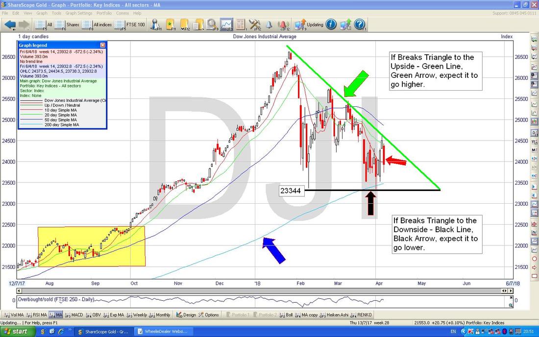
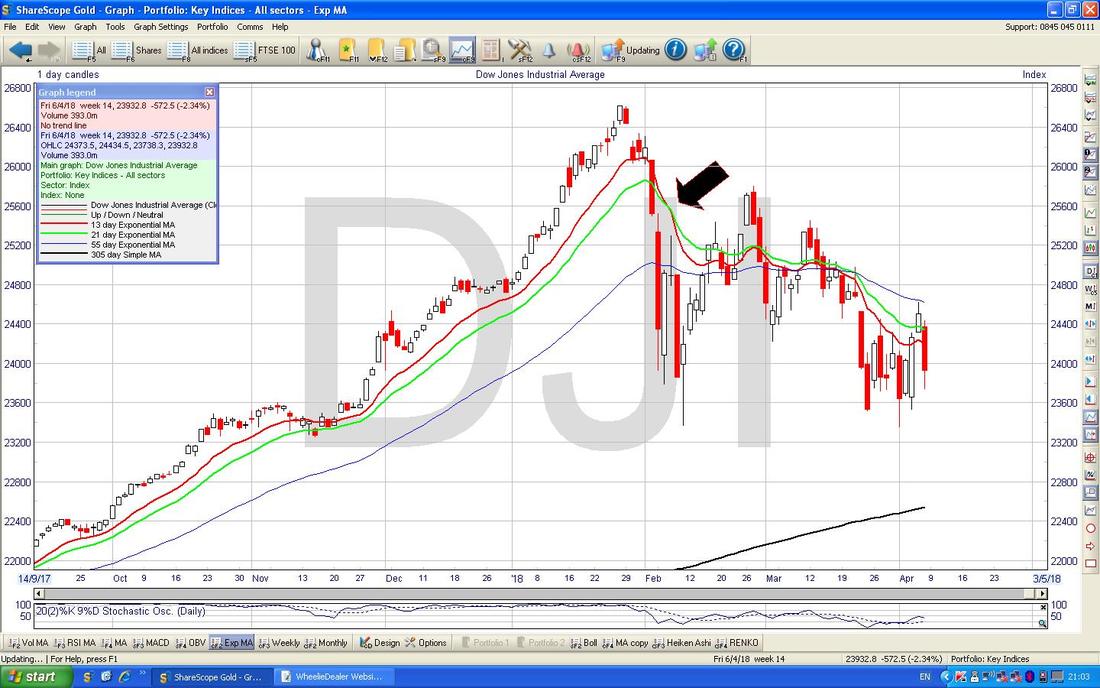
Below we have one of my Favourite Indicators - my Black Arrow is pointing to a ‘Death Cross’ between the Red Line which is the 13 Day Exponential Moving Average and the Green Line which is the 21 Day EMA - note how after this Death Cross we have not had a Bullish Golden Cross (the opposite move) and such a Golden Cross would be the first sign that things are improving for DOW Bulls - but the Triangle from the earlier Chart will probably signal such a change first.
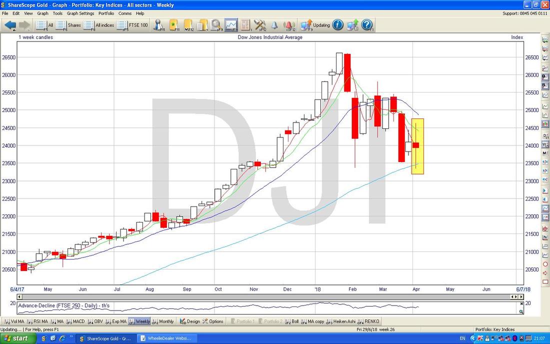
The Candlesticks below are of the Weekly variety - my Yellow Box is highlighting a ‘Long Tails Doji’ or ‘Spinning Top’ (my name !!) and in the context of previous Weeks of falls this could be a sign that neither the Bulls nor the Bears have the upper hand and this could be a Turning Point back up. We shall see.
S&P500
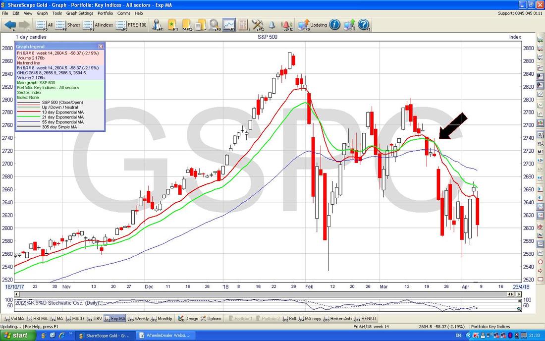
I am particularly interested in this one because I have a Small Long Spreadbet running on it (see my ’Trades’ page) - my Stoploss nearly got triggered but then it moved up nicely before plunging again on Friday - let’s see what the Chart is saying. Apologies for a rather busy Chart. This is my actual ‘Working’ Screen that I use to manage my Trades and let’s start off with looking at the Blue Arrow which marks the 2659 Level where I Opened my Small Long Spreadbet. Down below we have the sort of Pink Arrow that is pointing to the Pink Line which is my Stoploss Level at 2575 - note this is an ‘End of Day’ (EOD) Close Stoploss and I will only Close the position if it closes the Day below that Level. Of course I could choose to Close it at any time but what I mean is that the Stoploss only Triggers if it Closes at the EOD below that Level. The next thing to mention is that the Price could be in a bit of a Sideways Range now between about 2573 and 2675 and my Yellow Circle is trying to highlight where there is quite a bit of Support. If this Support fails, then just below we have 2532 and this is the really critical Support - if that fails then we are in trouble. Note also that the Yellow Circle encapsulates the 200 Day Moving Average Line - this is clearly an important Support Zone. My Green Line (Green Arrow) is not a great Resistance Line because it only has two ’Touch Points’ but this is perhaps the equivalent of the Green Line I showed on the DOW. Obviously if the S&P500 can break above this Green Line that would be pretty Bullish. My Black Arrow is pointing to the Blue 50 Day Moving Average Line and just like the DOW note how it is dropping down and heading towards a ‘Death Cross’ with the 200 Day Moving Average - obviously this would be Bad News. My Red Arrow is pointing to the Big Red Down Candle from Friday, and in a similar way to the DOW, note how it managed to Close up off the Low of the Day - and of course there is the old ‘Monday reverses Friday’ thing which might come into play and help improve the picture for the Bulls. 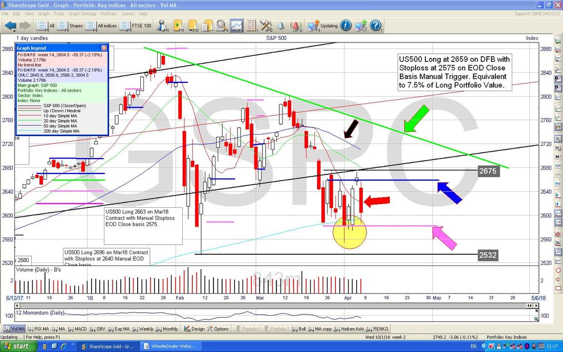
In the Bottom Screen below we have the MACD (Moving Average Convergence Divergence) for the S&P500 Daily. My Blue Arrow and Black Arrow are pointing to where we nearly got a Bullish MACD Cross but note that from Friday it dipped down again - in other words we might ‘Glance off’ or ‘Skim off’ and miss the Bullish Cross and that would obviously be bad.
These MACD things are different representations of the same phenomenon - the Histogram Bars and the Signal Lines formats. 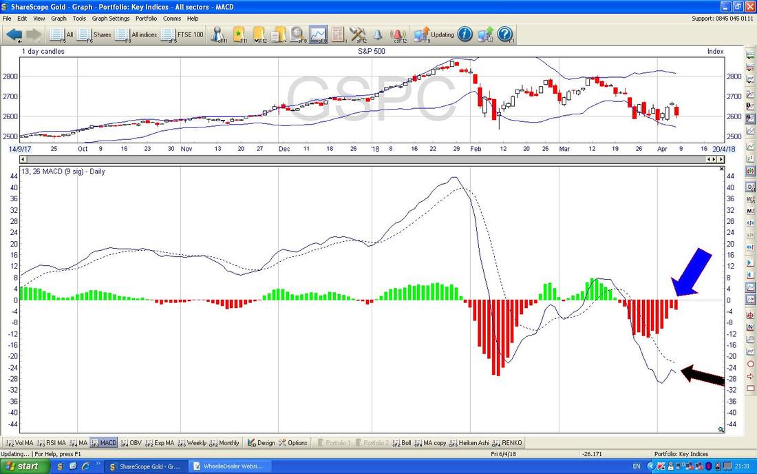
Like with the DOW, my Black Arrow on the Chart below is pointing to a ‘Death Cross’ between the 13/21 Day EMAs and note this is still in force.
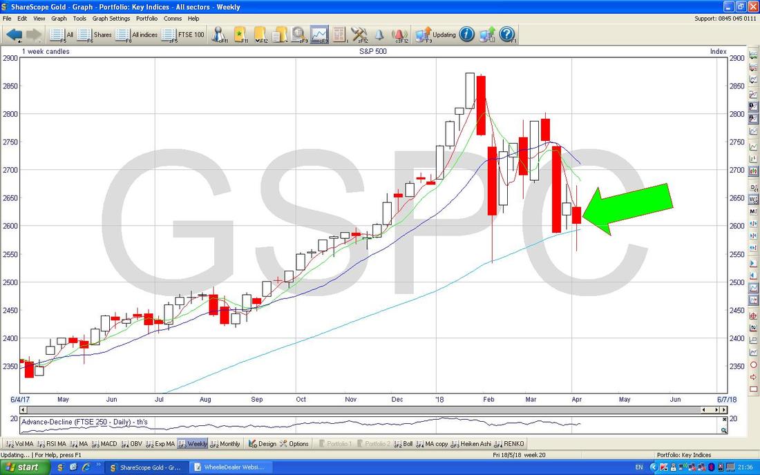
Again on the Weekly Candles below we have a Long Tails Doji Candle (pointed at by my Green Arrow) and this could be a Turning Point from which we can move up again.
Nasdaq Composite
Much of the Sell-off in the S&P500 and to a lesser extent the DOW has been driven by US Tech Stocks getting hit hard. The Chart below shows the Daily Candles for the Nasdaq Comp and as before we have the Green Resistance Line (Green Arrow) which needs to be broken over to the Upside and then we have Support around the 200 Day Moving Average marked by my Blue Arrow. As you should be able to see on my Chart, Support at 6806 is next up and if this fails then we could go down to what looks like very important Support at 6630. Most of the other Charts are similar to the DOW and S&P500 so I won’t waste time showing them. 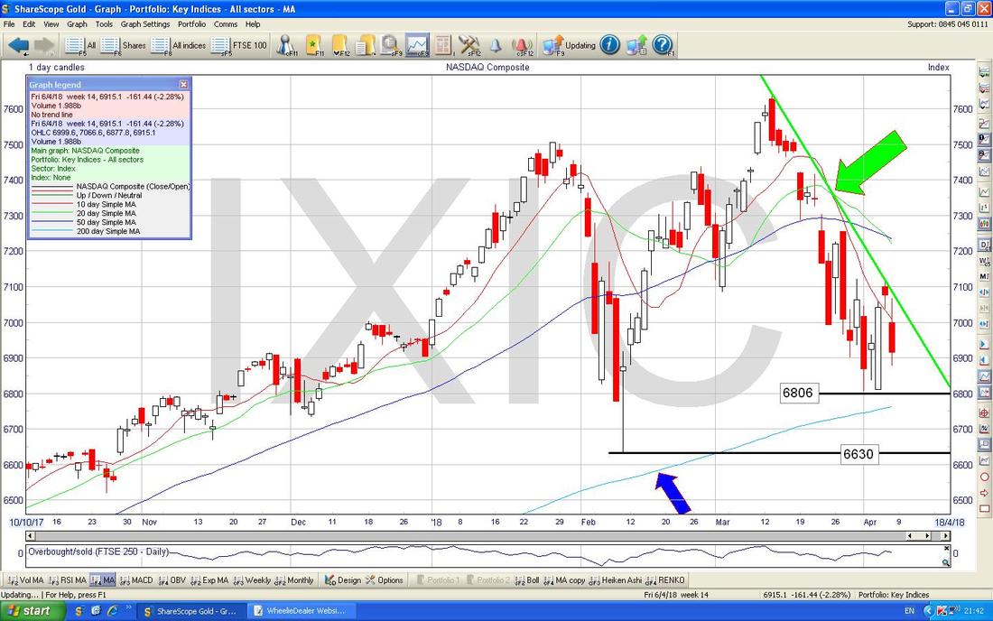
DAX
I’ll just throw the main German Index in for completeness. The Chart below has the Daily Candles for the DAX and first off note my Red Line (Red Arrow) and my Green Line (Green Arrow) which seem to be forming a Downtrend Channel. Clearly we need the Price to Breakout above the Red Resistance Line at the Top in order to avoid the Price driving lower. If it does fall, then there is a Zone of Support between about 12100 to 11800 but the Critical Support which must hold is at 11726. My Yellow Circle is highlighting a Big White Up Candle from Thursday and this is followed by a ‘Star’ Doji which is ‘Inside’ the Candle from Thursday - we need a third Candle to complete the Pattern and whatever we get on Monday at the Close will dictate whether the DAX is likely to go up or down (we will get a ‘3 Inside Up’ pattern or a ‘3 Inside Down’ pattern). My Blue Arrow is pointing to a 50/200 Day MA ‘Death Cross’ - obviously not good and note that the Darker Blue Wavy Line which is the 50 Day MA is dropping like on the US Indexes - we need this to level out and then start turning up if things are going to improve. 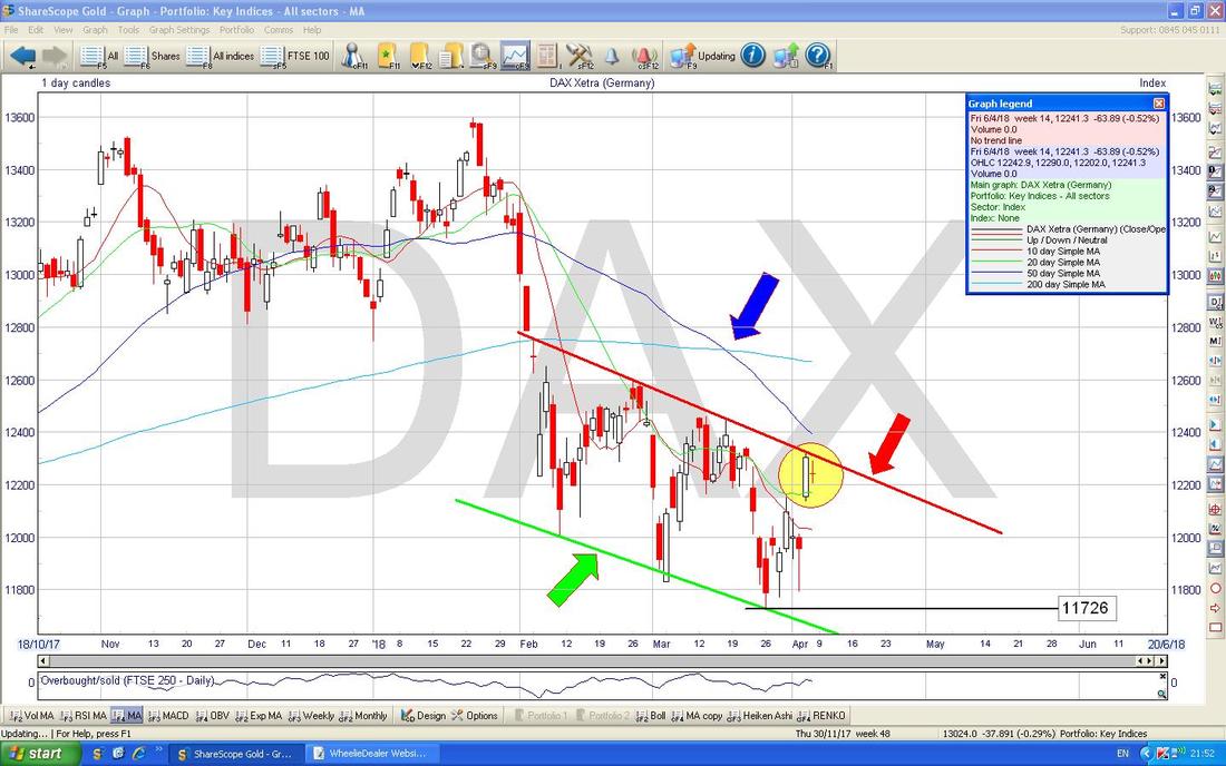
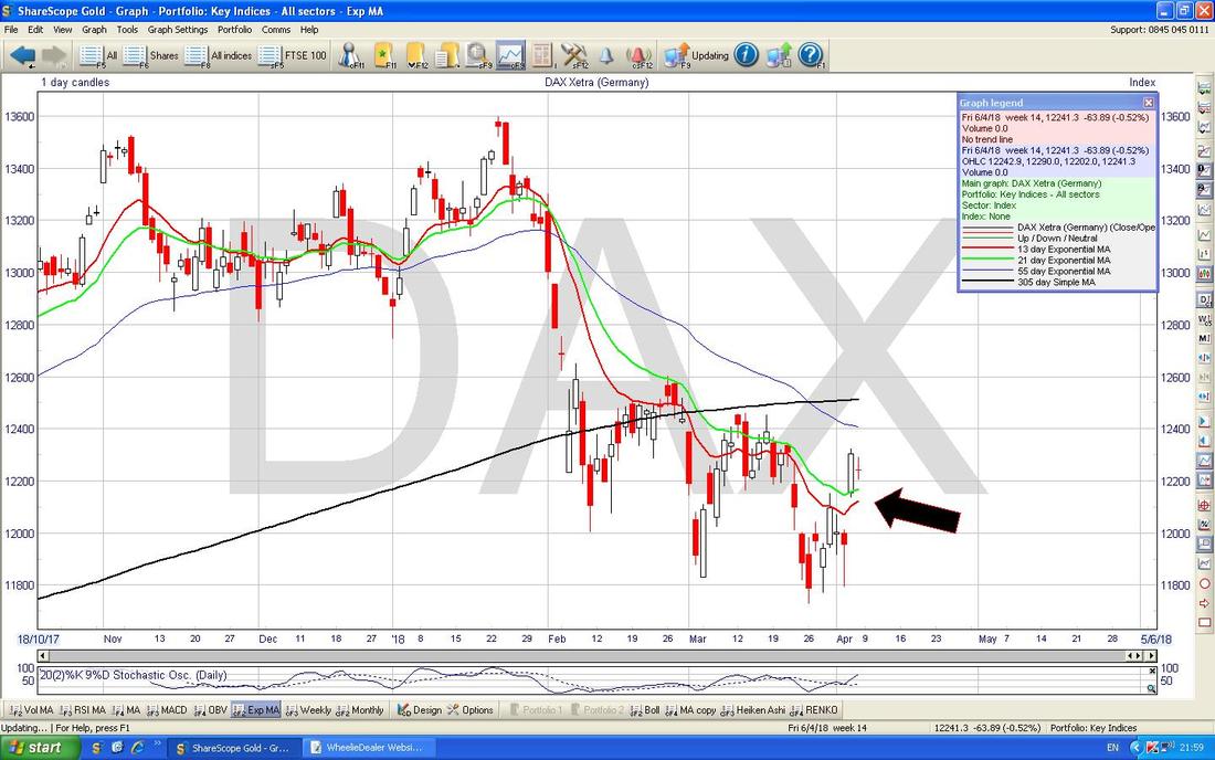
The Chart below has something to watch in the next few Days - if we can see some positivity, then my Black Arrow below is pointing to where we might be setting up a 13/21 Day EMA ‘Golden Cross’ where the Red 13 Day EMA Line crosses the Green 21 Day EMA from underneath - however, it has missed these in the recent past as you might notice.
FTSE100
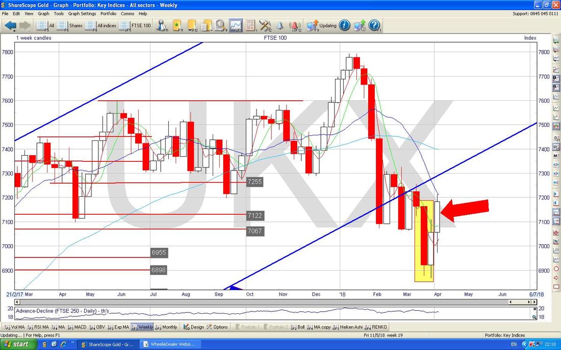
It’s a similar story here to the Charts we have already seen. First off note where my Blue Arrow is that we had a 50/200 Day MA ‘Death Cross’ and note also that like on the previous Charts, the 50 Day MA is still falling. Next look at my Green Line (Green Arrow) and although this only has 2 ‘Touch Points‘, it could be a valid Resistance Line and whatever happens we need to get above it. My Yellow Circle is highlighting how we had a Big White Up Candle on Thursday and this was then followed by a tiny ‘Cotton Reel’ Doji (my name !!) - this looks to me like it could predict a move down tomorrow (Monday) - look back to where my Green Circle is where a similar pattern was created but in that case the Price fell but then recovered soon afterwards. If the Price falls from where we are now, there is important Support at 7100 down to 6971 and if this fails, then 6866 is extremely important Support which must hold or we could see as low as 6500. 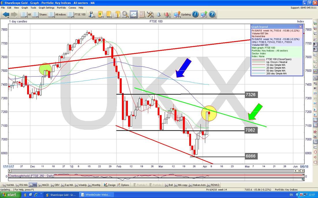
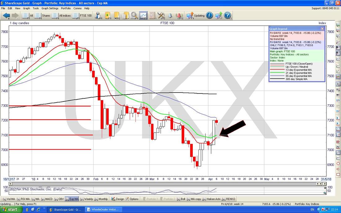
There is a sniff of hope here for Bulls - but we need some positivity straightaway next week if we are to benefit from it. My Chart below where the Black Arrow is should be pointing out how we are close to a Bullish 13/21 Day EMA ‘Golden Cross’ - if it happens, it often means a few Weeks of gains to come.
There is more hope for Bulls here. The Chart below has the Weekly Candles for the FTSE100 and my Yellow Box is trying to show a 2-Week ‘Bullish Harami’ (the Lady with an Oven full of Buns one) from two and three Weeks ago and this suggested a Turning Point up and then Last Week (where my Red Arrow is) we got a Bullish White Up Candle - this suggests the Harami predicted a Turn.
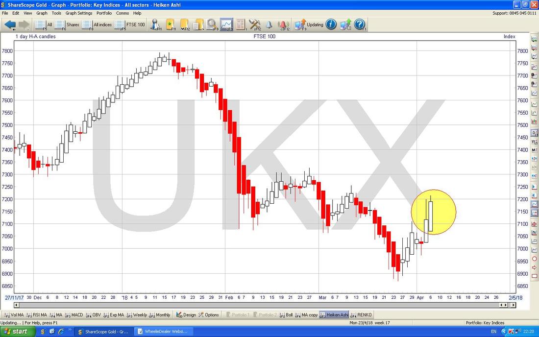
On the Chart below we have the Daily Heiken Ashi Candles for the FTSE100 - remember these things are totally different to ‘Normal’ Candlesticks. My Yellow Circle is highlighting nice Big White Up Candles and this is Bullish.
I’m still struggling to really make sense of these, but the Chart below is the Renko jobbies for the FTSE100 and with it going up and with Black Spots that is Bullish.
Note the Renko and the Heiken Ashis are ‘slow’ compared to Normal Candles - therefore we could get a turn down but it would not show on the Renko and HA until tomorrow after the Close. 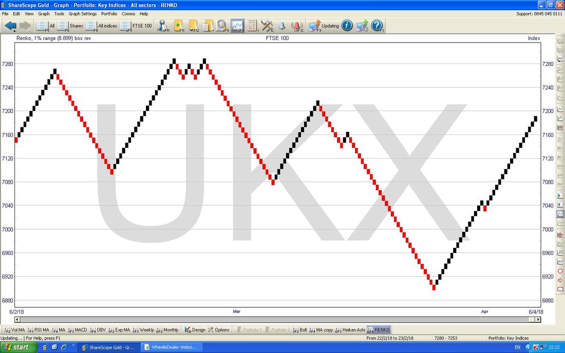
AIM All-Share
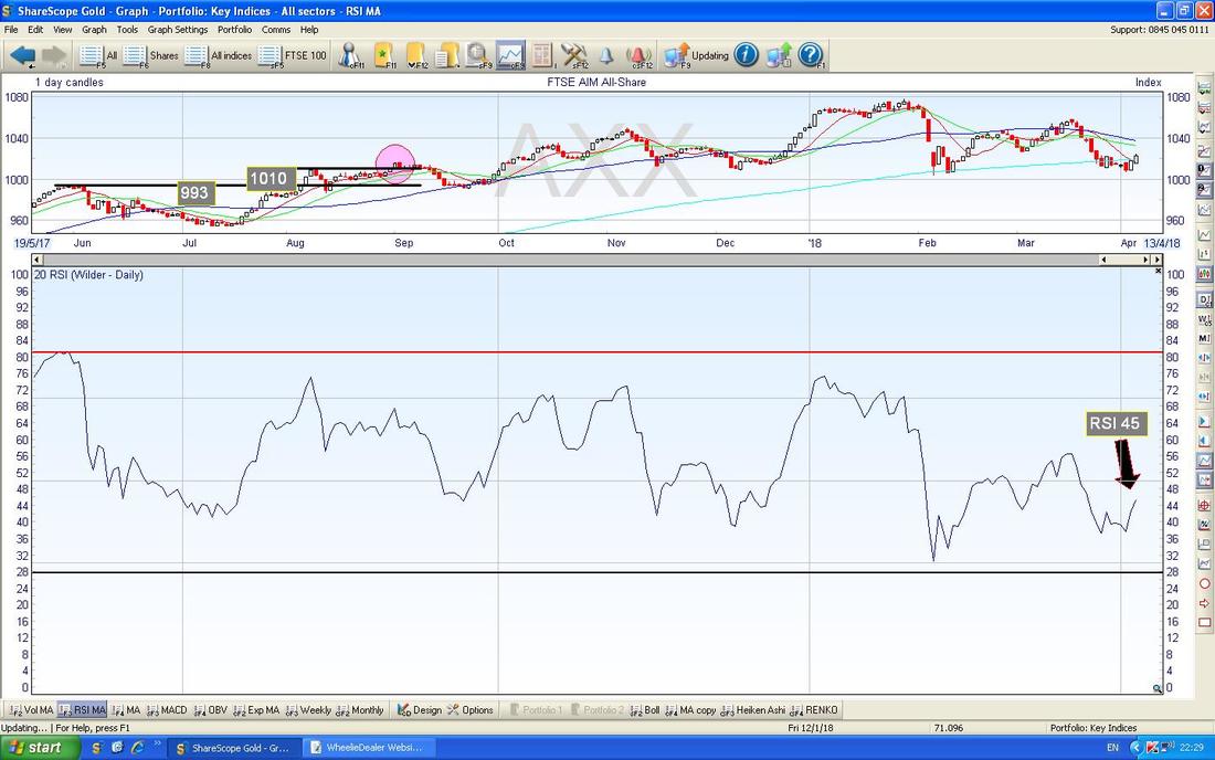
I want to wrap this up so I will just look at anything I spot that is different to the FTSE100. The FTSE250 is almost the same but on the FTSE AIM All-Share there is a more Bullish looking picture. My Chart below has the Daily Candles and my Black Arrow is pointing to a nice White Up Candle from Friday and note this follows a nice White Up Candle from Thursday and that Candle was a ‘Bullish Engulfing Candle’ where it ‘engulfed’ the Candle from Wednesday - that is all positive and it does look like these Candles are turning up. 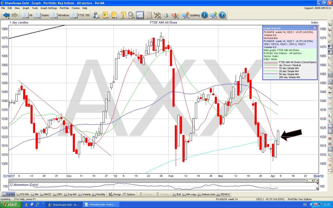
In the Bottom Window on the Screen below we have the RSI (Relative Strength Index) for the AIM All-Share. Note how it is moving up and on a Reading of RSI 45 it can clearly go a lot higher.
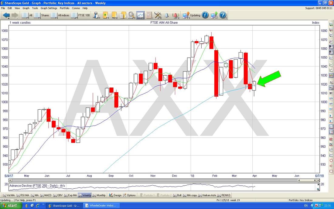
My Chart below has the Weekly Candles for the FTSE AIM All-Share - my Green Arrow is pointing to last Week’s White Up Candle and this is a Bullish Engulfing Candle which smothered the Candle from the Week before - that’s good. Note it is around the 200 Day MA as well which should be an Area of Support.
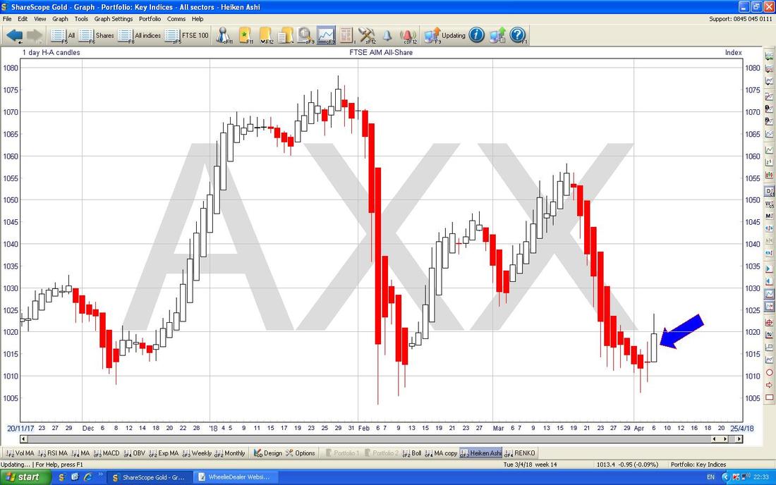
This is sweet. The Chart below has the Daily HA Candles for the AIM All-Share and my Blue Arrow is pointing to a Big White Up Candle and note how just before we had a string of Red Down Candles which then went Narrow and have now turned White - that is textbook and suggests more gains ahead.
OK, I am going to end here but before I go, here is the FTSE SmallCap Daily Candles and my Green Arrow is pointing to a very similar picture to the AIM All-Share - so maybe even with the FTSE100 and other Major Indexes looking a bit ropey, the Smaller UK Stocks might be able to rise. I am sure many Readers have Small Stocks (I certainly have a few) so this would clearly be welcome to us.
Anyway, have a good week everyone and don’t forget to watch the Video and arrange your Diary so you can attend the Meet-up on 25th June. Cheers, WD. 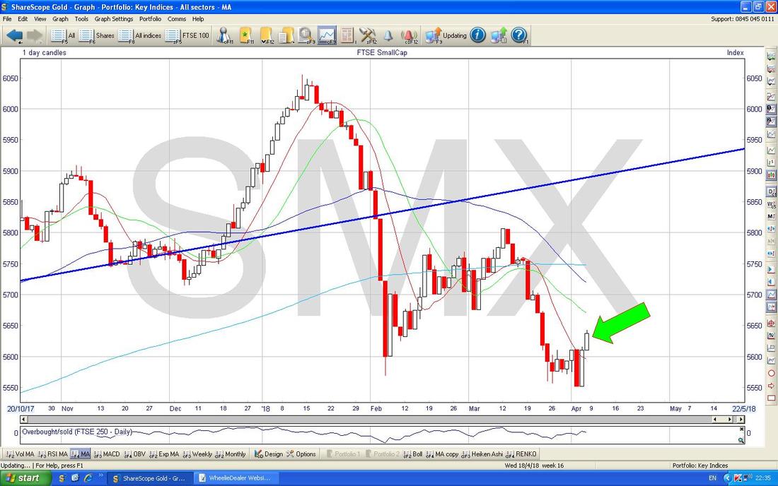
0 Comments
Leave a Reply. |
'Educational' WheelieBlogsWelcome to my Educational Blog Page - I have another 'Stocks & Markets' Blog Page which you can access via a Button on the top of the Homepage. Archives
January 2021
Categories
All
Please see the Full Range of Book Ideas in Wheelie's Bookshop.
|
