

|
educational blogs |
|
After the big kick in the goolies that European and US Indexes received on Friday it really looks like we might be at the start of some sort of Pullback in the Bull Run that has been rampant since the Brexit Vote. I hope the Charts can enlighten us a bit more with regard to whether or not this is ‘The Big One’ and with September being notorious for being the worst month, a fairly overvalued Market and a US Presidential Election where both Candidates aspire to being mediocre, it seems highly likely that this is the time to break out the Tin Helmets.
I have Big Shorts on the FTSE100 and Nasdaq 100 as well as a small bit of Cash - so I feel quite well positioned if we do get a Drop.
Historical Background
As I have made clear in many many Blogs, Podcasts, Tweets, Telegrams, Stone Tablets etc., September is notorious as being the worst Month and according to the UK Stockmarket Almanac 2016, a typical average September tends to have 4 Weeks of Drops - and it certainly looks like we might be copying that historical pattern. For the coming week (w/c 12th September 2016) the FTSE100 tends to be Up on average for 48% of years and the Average Return is MINUS 0.3% - so the background checks on this particular Villain suggest more misdemeanours to come. FTSE100 An important thing to note here is that after the Close of the UK Markets at 4.30pm on Friday, the US Markets continued a relentless fall - so it seems highly likely that our Markets will drop tomorrow to play ‘Catch up’. It will also be very important to see if the Bulls (if there are any remaining) can step in and get buying - if they fail to do so, then I think we can only expect more Selling Pressure as the week continues. Apologies for labouring the point and repeating something I have mentioned week after week but this is extremely important. My Chart below shows the Daily Candles for the FTSE100 going back to just before the Credit Crunch Lows in 2008 and you should be able to see the 2 Red Lines which mark the Uptrend Channel which was in place for much of this time. We are now at a very important occurrence - my Yellow Circle is showing where the Price recovered from the Brexit Vote Lows and then rallied with immense power up to the Bottom Line of the Major 7 year Uptrend Channel but has now bounced down off it and most importantly, IT LOOKS LIKE IT MIGHT BE FORMING A DOWNTREND AGAIN NOW - I will zoom in and show this in a tad. This is of utmost significance because it suggests to me that if we do get an Autumn Selloff and drop several Hundred Points on the FTSE100, then it could well be the case that even in a subsequent Rally off any Low Point, we might only be able to get back up to near that Bottom of the Major Uptrend again and perhaps we could settle into a Sideways Range with the Upper End being around these 6900 Levels ish - and maybe the Bottom End could be 6400 ish as I will show in a mo. I guess many Readers would now welcome a Pigeon of Hope (shouldn’t that be ‘Smidgeon’?) and there is possibly some Good News hidden away here. Back at the start of 2016 we had a really nasty Rout in the Markets which dragged the FTSE100 down as low as 5500 - but the recovery since has been quite stunning really. The Good News here is that even if we do get an Autumn Drop and we can only recover to maybe 6900 tops, at least there is a Very Strong base of Support down around 5500 up to 6000 - I think this will create a decent level of ‘Downside Protection’ for us which could well help in 2017 as well. There is of course a big Risk that even if we can rally later in 2016 (November and particularly December are normally extremely strong months) we might be at the start of a Downtrend which could last for a long period of time - perhaps going well into 2017 / 2018. This is mere speculation by me at this moment - but it is something that I will be watching for developments on in the coming Months and we must always think ahead and plan for various Scenarios. My current thoughts are that the Sideways Range is most likely over the next few Months (but I expect an Autumn Drop) but one thing I think is extremely unlikely is a Rally above 7000 and certainly I think the chances of going over the All Time High (ATH) at 7122 is almost Zero this year. 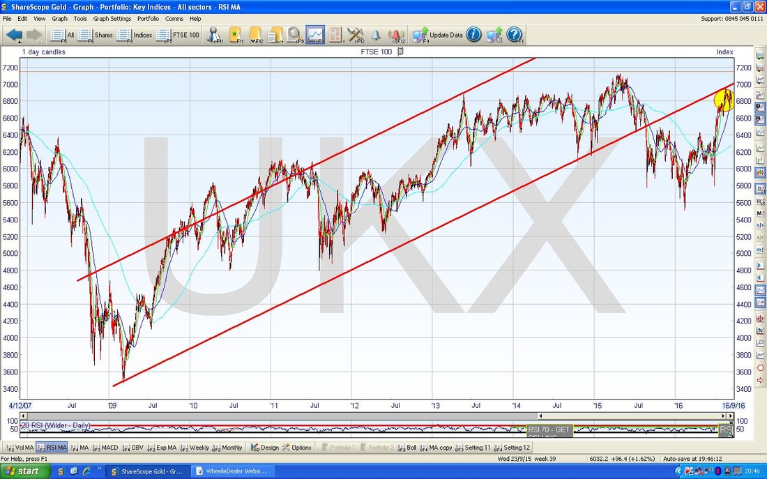
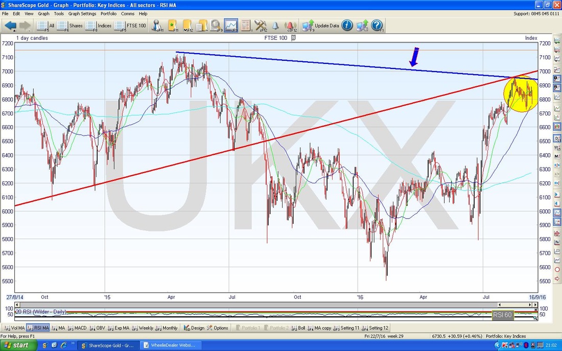
The Chart below illustrates some of what I have typed above in a very simple way with just 1 powerful and important line. I have Zoomed in on the above Chart to just the last 2 years roughly and I have added a Resistance Line in Blue (marked with the Blue Arrow). This shows how we have done some ‘Lower Highs’ after the Peak at 7122 back in April 2015 and this Blue Line could dominate this Chart going forward.
Sorry about the Chart below - it has got a bit ‘busy’. This zooms in to about most of 2016 on the Daily Candles for the FTSE100 and the key thing here is that in addition to the Downtrend Resistance Line I showed on the previous Chart, we also have a Shorter Term and steeper Line of Resistance which I have marked with the ridiculously wide Red Line and the far more sensibly sized Red Arrow. Again we have made ’Lower Highs’ and this Red Line could dominate the Short Term Price Action here.
My Black Arrow is pointing to the ugly Red Down Candle which was bashed out on Friday 9th September and as I mentioned above, the US Markets fell further after our Close so it is likely we will see more Downside on Monday - the Key Support Level now is really that 6616 Level (check out the Green Box). Of course, if this is the start of a Major Autumn Selloff, then it doesn’t have to tank straightaway - it is quite possible that we see some moves down to around the 6600 Level and then Rally back up but only to then move down again and go lower - it is hard to know but I think the key is that Big Red Line which could limit any attempts to Rally. It is worth appreciating that although September is the Worst Month, October can be dodgy as well. To cheer the Bulls up, the better News here is that I think the Uptrend Channel shown by the Parallel Blue Lines could hold in place for 2016 at least - this would mean that any Selloff over Autumn is just a Retracement within the Uptrend Channel and maybe it will find Support down at the Bottom Blue Line around the 6350 / 6400 Levels. Note the very faint Blue Wiggly Line which is the 200 Day Moving Average - this often acts as a good Level of Support - however, it is down around 6300 so that is still a fairly chunky drop - but of course a Selloff will give the shrewd Punters sitting on Cash an opportunity to buy some Bargains. 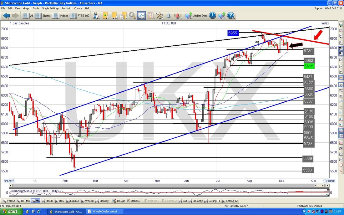
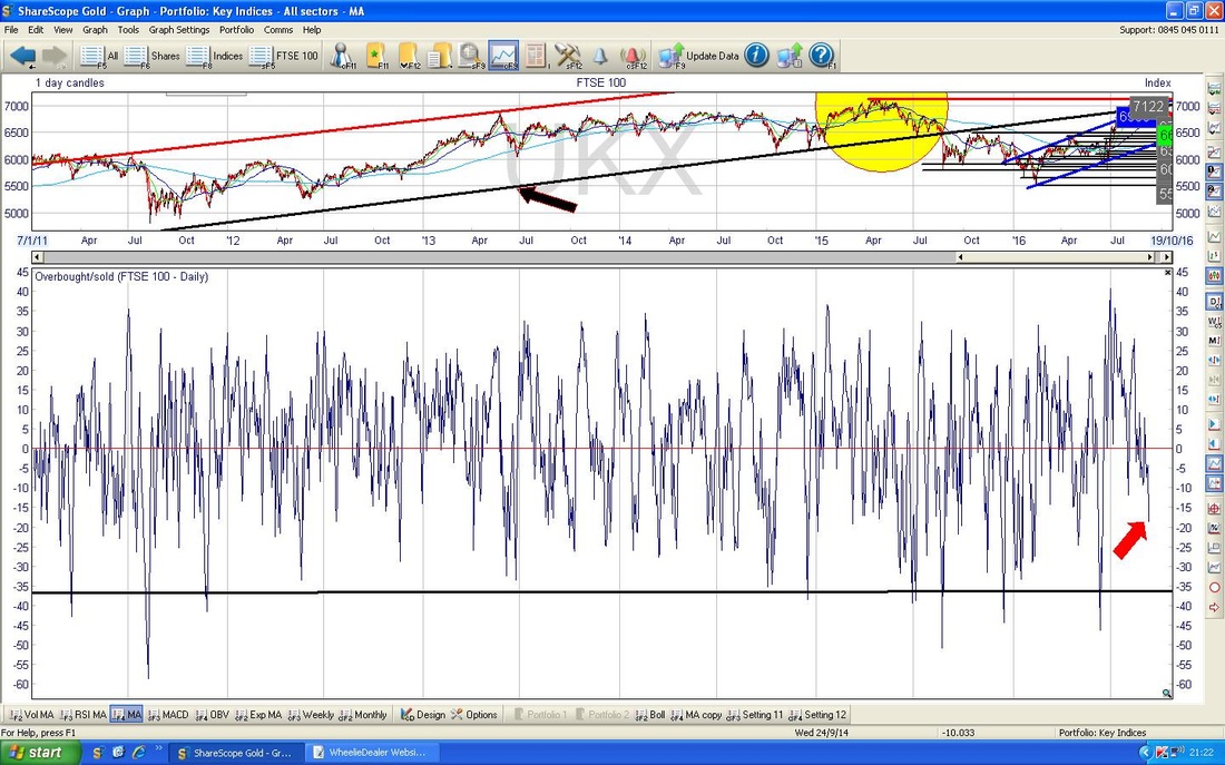
The Bottom Window on the Chart below has the ‘Overbought/Oversold’ Indicator thing for the FTSE100 Daily - my Red Arrow shows where it is now and this suggests that in the very Short Term we might not get too much more downside - this is consistent with what I mentioned earlier about a bit more Down followed by an attempt to Rally that then fizzles out.
In the bottom window on the Chart below (all Charts from the truly awesome ShareScope Software that I use), we have the RSI (Relative Strength Index) for the FTSE100 Daily. My Titchy Blue Arrow points to a reading of RSI 52 which is still rather on the high side and clearly this can go a lot lower. Again, this is consistent with the extremely Short Term Overbought/Oversold Indicator and what I said about a possible Down move followed by a Rally that fizzles out.
I wanted to point something out for doubters of Technical Analysis and the RSI in particular (I am a huge lover of the RSI - I think its predictive powers on liquid assets are immense when it is at extreme Highs or extreme Lows). If you look at my Huge Black Arrow, this is pointing to where the RSI touched a reading of RSI 70 which is a very good Signal that it is time to Sell the FTSE100 - look how precise this was !! 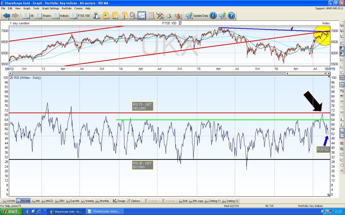
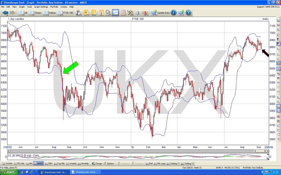
The ScreenScrape below has the Daily Candles for the FTSE100 surrounded by the Bollinger Bands. My Black Arrow is pointing to how we are now very near the Bottom BB and this might act as Support - but there are no guarantees. If you look back to where my Green Arrow is, you should see that a similar thing happened but the Price then ‘hugged’ the BB and it carried on down. As with all TA stuff, things like this are probabilistic and we might get a bounce soon off this Bottom BB.
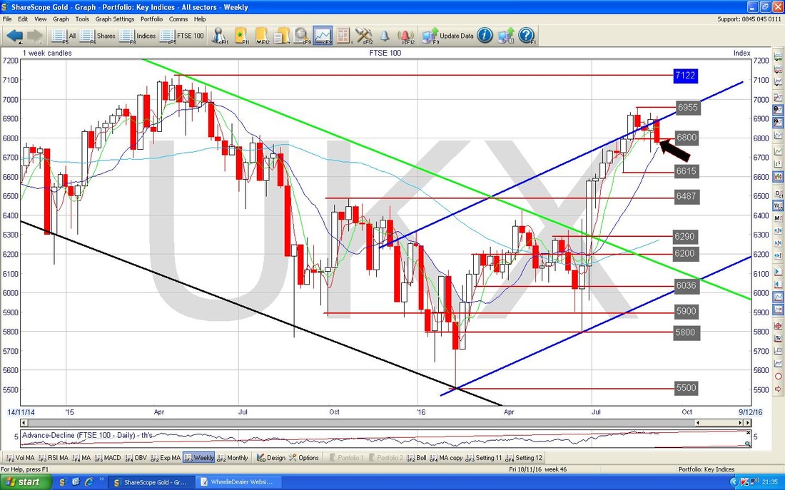
The screen below has the Weekly Candles for the FTSE100. My Black Arrow is pointing out a Big Fugly Red Down Candle - this is clearly not good and suggests we might get some more Down weeks.
DAX (German)
For reasons of time and space (sounds like Star Trek LOL), I will not show much on the DAX but I wanted to just point out a few things before I boldly go onto the next Indexes…... The Chart below goes back a few months and the interesting thing here is how the Inverted Hammer Candle which is highlighted in my Yellow Circle is still dominating the Chart. Until the Price can get over 10800 the DAX will stay under pressure. My Black Arrow shows the Red Down Candle from Friday but it is likely that the DAX will play ‘catch-up’ with the US so it is likely to drop on Monday - the important near term Support here is 10441 - if this fails then expect more downside. 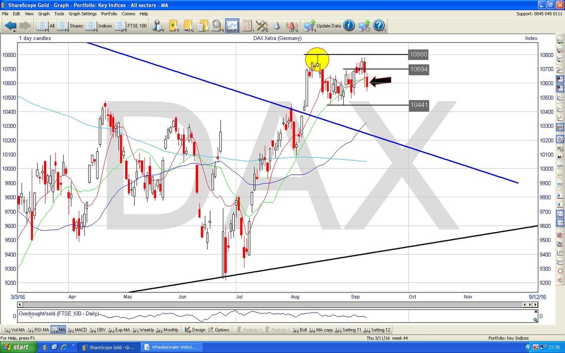
S&P500 (US)
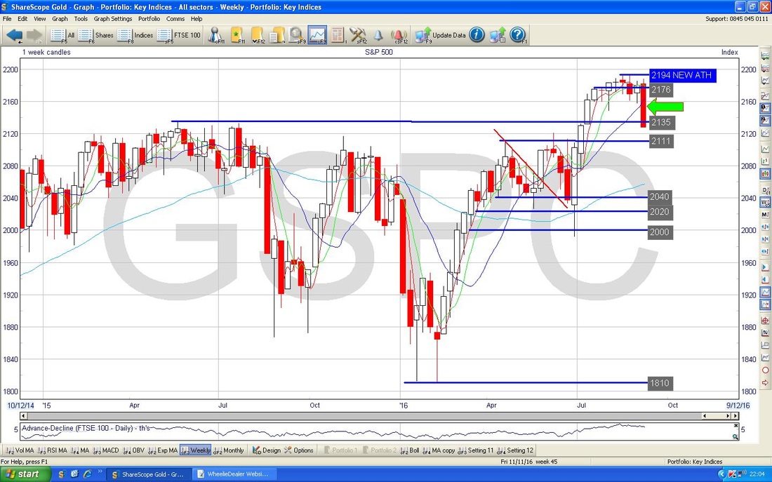
This is a very concerning Chart - it shows the Daily Candles for the S&P500 going back about 1.5 years or so. The issue I am highlighting here is that the Thick Blue Line marked with the Blue Arrow which was a Resistance Line at the previous All Time Highs and was broken above in July this year, has now been BROKEN BELOW as per my Green Arrow pointing at the huge Down Candle which was created on Friday. This is problematic because Classic Charting Theory is that “former Resistance becomes Support” and vice-versa - as you can see, the former Resistance of the Blue Line has failed to act as Support and this is very poor Price Behaviour and suggests weakness. OK, it is only a small Undershoot at this point in time, but if we build on it, then it is very concerning and suggests that the Breakout over the Blue Line was in fact a ‘False Breakout’ and this would put a negative cloud over the Market for some time I suspect. 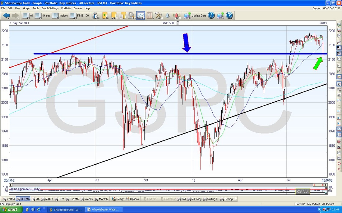
In the bottom window below we have the RSI for the S&P500 Daily - my Black Arrow is pointing to where we are now at RSI 40 - this is quite a low reading and maybe we can bounce in the Short Term - although I would not rule out a little more Downside before a bounce (whether any such bounce can be sustained remains to play out though). Something that hits me is the force of the move Down on Friday - it really did Drop off a Cliff.
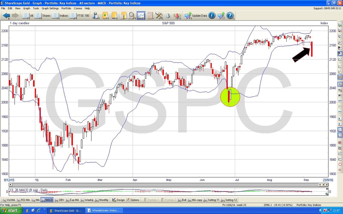
This is an interesting Chart - again we have the Daily Candles for the S&P500 surrounded by the Bollinger Bands - my Black Arrow is pointing to how the Candle from Friday dropped down through the Lower BB - if you look back to where my Green Circle is, you can see a similar sort of thing happened here. This and the RSI suggest to me that the S&P500 might attempt a rebound early next week - I doubt it will be sustained though.
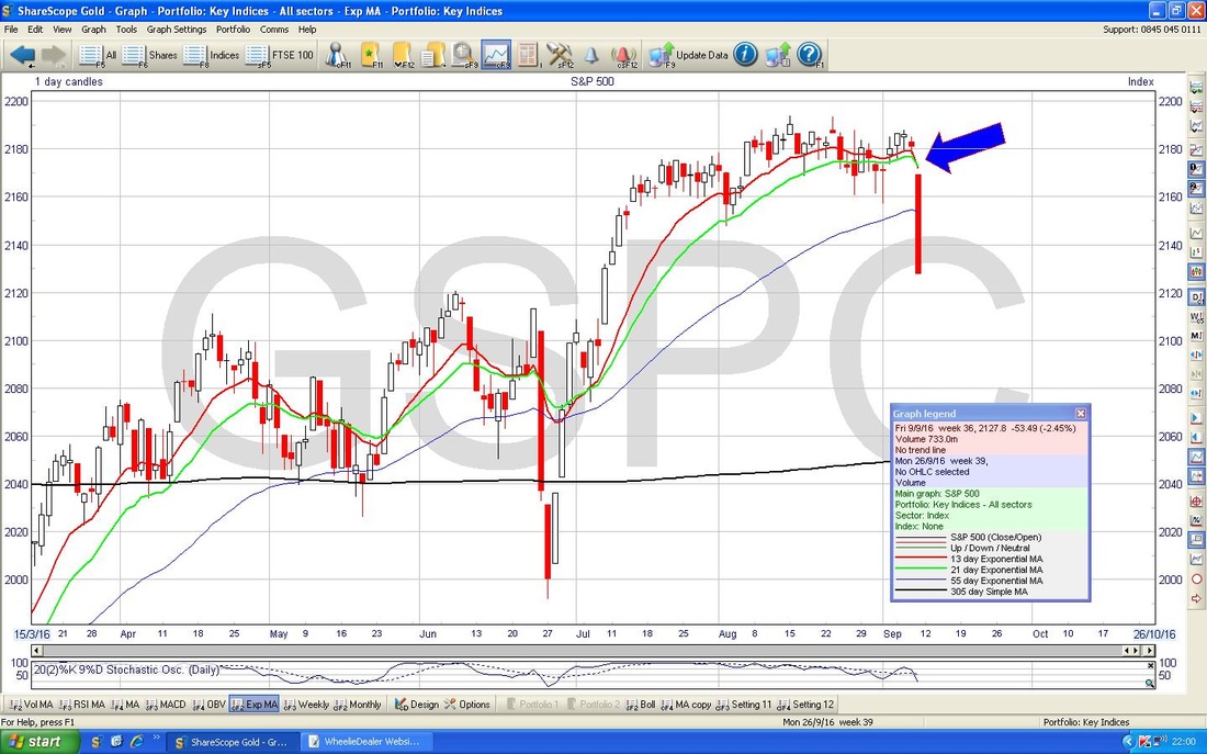
My Blue Arrow on the Screen below is pointing to how the Red 13 Day EMA (Exponential Moving Average) Line has crossed down through the Green 21 Day EMA Line. Such ‘Death Crosses’ tend to mean we will see some weakness for the next few weeks.
The Chart below has the Weekly Candles. My Green Arrow (if you can see it as it is well hidden) points to the Big Down Candle from last week - not pretty at all and suggests more downside to come in the next few weeks.
Even though I have a Short on the Nasdaq 100, I am not going to waste your time or my time on it here because the Charts are remarkably similar to the S&P500.
Brent Oil (Spot) The Chart below has the Daily Candles for Brent going back about 6 months. First thing to note is the Thick Red Line (marked with the Red Arrow) that I have drawn in which is clearly a Downwards Sloping Resistance Line. As with the FTSE100 (bear in mind that Oil has a very big impact on how the FTSE100 moves - mainly because RDSB and BP. Are huge Weightings within the Index) this could dominate this Chart going forwards. My Yellow Circle highlights what looks like a ‘Dark Cloud Cover’ 2-day Candle pattern - this makes me think the Price will fall and note there is a lot of Support down around $45 / $46 and if this fails, then we could visit perhaps as low as $42. To the Upside, $51 is clearly going to be hard to get over and if that is cracked, then $53 will be very difficult to get over. 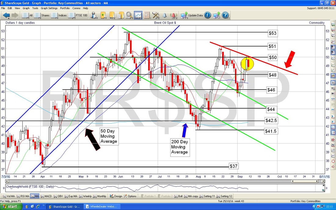
I quite often find with less volatile stuff like the Major Stock Indexes that TA Indicators and Patterns etc. tend to line up and show similar Signals and/or likely direction of travel. However, sometimes you get contradictions and there are a few with regards to Brent Oil. On the Screen below in the bottom window we have the MACD (Moving Average Convergence Divergence) for the Daily Charts. My Blue Arrow and Black Arrow are pointing to the same thing but in different formats - one is the Lines and one is the Histograms. What they are showing is that a Bullish MACD Cross could be on the cards as early as tomorrow - and of course this contradicts much of the more Bearish stuff I am seeing on the Candle Charts.
However, if we do not get a Bullish MACD Cross and instead it ‘skims-off’ to the downside, then that would be very bad. On the subject of Contradictory Signals, on the Weekly Candles there is possibly a Bullish Harami 2 Week Candle Pattern - I am not including it for time reasons. 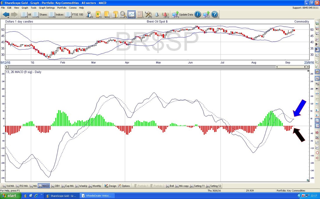
Gold (Spot)
The Chart below has the Daily Candles for Gold Spot going back about all of 2016. My Black Arrow is pointing to a Black Line which like on Oil and FTSE100 seems to be creating Resistance and is an important Line for the Bulls to drag the Price over. The Good News here is that we are still within the Uptrend Channel marked by the Parallel Red Lines and the bottom of this Channel is down at around $1270 ish - I would only get concerned that this Uptrend was failing if we saw the Price down at maybe $1250 (this allows for some overshoot). My Yellow Circle is highlighting an Area of Support down near $1300 which may help us in the very Short Term. That’s it for now, Fingers Crossed for everyone next week, Ciao, WD (Bit of Italian there in honour of the MotoGP at Misano today and their ultimate Religious Icon, Valentino Rossi. There‘s a joke doing the rounds that Rossi‘s status in Italian Society is just above the Pope and slightly lower than God………I won‘t give away the Result but you can catch the Race at 8pm on ITV4 Monday night usually and, as with so many Races this Season, it is entirely unpredictable.) 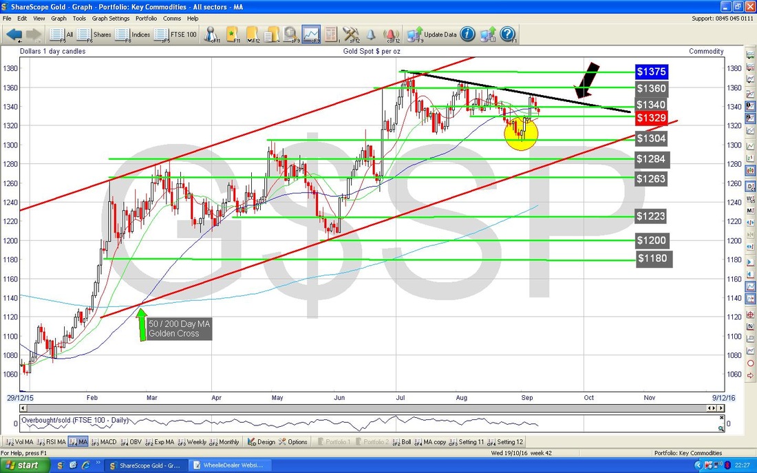
0 Comments
Leave a Reply. |
'Educational' WheelieBlogsWelcome to my Educational Blog Page - I have another 'Stocks & Markets' Blog Page which you can access via a Button on the top of the Homepage. Archives
January 2021
Categories
All
Please see the Full Range of Book Ideas in Wheelie's Bookshop.
|
