

|
educational blogs |
|
Oh no, it’s that time again, when I grab a Coffee and stare at my screen in utter bewilderment trying to figure out what a chart from a couple of weeks ago is trying to tell me…..and that time when you grab a Coffee and think “oh no, Wheelie is gonna make my brain hurt again.” Today I am going to subject you to the next Indicator I looked at the other week prior to buying into OPAY (remember these charts are from a couple of weeks back and the current chart is radically different - it is probably a good idea to read Parts 1 and 2 of the Series before bothering with this.) Momentum The Chart below should be fairly quick and easy to explain. What I am trying to show you hear is the Bottom Window marked “12 momentum (Daily)” - I have no idea how this Indicator is created (they are all mathematical derivations - ShareScope Help has a glossary of how these things are created but I never look - irrelevant to me; what matters to me is their predictive power). You can pretty much Ignore the Upper Window for now, although you can look at how the Momentum Indicator moves in relation to how the Price Line moves if you want to. Apologies for all the lines marked on the chart in the Upper Window - it is the same chart as I showed you in Part 1 and I have just squeezed it up to show you the Momentum window. In the Lower Window, you will notice that the Blue Wiggly Line oscillates from a peak to a trough over and over as you go across the chart from left to right. I have put in a Black Line at the bottom which the Blue Wiggly Line tends to touch and move up from and a Red Line at the top which the Blue Wiggly tends to touch and move down from. 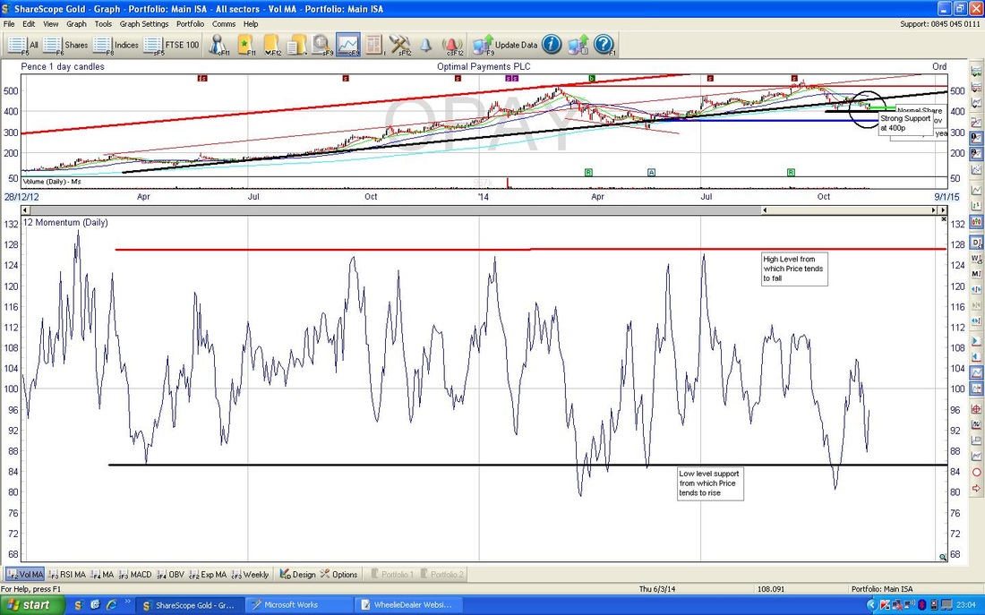
When the Share Price has been in a Down Move (as discussed in Parts 1 and 2, I like to think of these as Waves - but not those flippin’ Elliott jobbies), the Blue Wiggly Line tends to move downwards and when the Blue Wiggly hit’s the Black Line at the bottom, it reverses and moves up. The Logic here is that it is a good time to buy when the Blue Wiggly kisses the Black Line and then turns upwards. With this in mind, you can see that when I entered my Buy Trade, the Blue Wiggly had almost touched the Black Line and was starting to move up. In other words, the Momentum Indicator was telling me to Buy.
At the other end of the scale, when the Blue Wiggly Line hits the Upper Red Horizontal Line and turns downwards, it is usually a Sell Indicator. The Momentum Indicator I show you here is very Short Term - it gives a sense of where the market is going in the next few days. You will find that all these Indicators I use (we have essentially had the Candles from Part 2 and this Momentum Indicator so far, but the rest of the Series will introduce a few more) have a sort of ‘hierarchy’ with regard to how early they signal to you to Buy or Sell. For instance, my experience suggests that Candles are your first Indication of where the Price will probably move on the next day. The Momentum Indicator is a little bit later to give a Signal I find. Some of the Indicators I will show you in the next Parts of the Series are even more delayed - some take a few days to ‘Flash’ a Signal. It is worth appreciating this and I will try to draw together a ‘Hierarchy of Timeliness’ at the end of the Series. A short one today. Get some rest, in the next Part we do Relative Strength Index (RSI) - and you will need relatively a lot of mental strength for that one !! See ya, wd
0 Comments
Leave a Reply. |
'Educational' WheelieBlogsWelcome to my Educational Blog Page - I have another 'Stocks & Markets' Blog Page which you can access via a Button on the top of the Homepage. Archives
January 2021
Categories
All
Please see the Full Range of Book Ideas in Wheelie's Bookshop.
|
