

|
educational blogs |
|
Quite an exciting Week just gone with the Pound ‘Flash Crash’ and a disappointingly low Non Farm Payrolls Jobs Number on Friday. If you read my Charts Blog from last week, you may remember comments about October having a reputation for volatility - with Gold and the Pound making some dramatic moves I wonder if such an affliction will hit Stock Indexes over the next few weeks. With the US Presidential Race ongoing, it is hard to see the US Indexes making much headway to the upside before the Result is known - although clearly Clinton looks pretty well placed after the shocking comments by Trump recorded 10 years ago when meeting a soap opera starlet.
It is the second of the Televised Debates tonight and it will be interesting to see how Trump performs here - his last Debate started well but then he just became totally bonkers - if he stays on the Policy Issues and avoids Clinton baiting him about all the craziness whenever he opens his mouth, there is a chance he could recover some lost ground in the Race. A poor performance tonight and it must hugely increase Clinton’s chances of winning. I suspect Trump may be much more attacking of Clinton (and her Husband) this time - it seems that in the last Debate he was trying to hold the ‘Moral High Ground’ (yes, I know that is hard to believe !!) and avoid the Personal Attacks but Clinton attacked him so it seems likely that this time he will go for her. With his Campaign in such trouble, he has little to lose (although it is worth bearing in mind that US Voters probably are barely swayed by the Scandalous Comments and are just keen to stick it to the Washington Elites).
The History According to the UK Stockmarket Almanac 2016, the coming week (w/c 10th October 2016) is historically Up for 55% of Years with an Average Return of MINUS 0.7 - so this suggests to me that rises are pretty likely but when you get a fall, it is quite painful. There are Public Holidays in Hong Kong and Japan tomorrow and I heard that it is ‘Columbus Day’ in the US and the US Bond Market is closed but the US Stockmarket is open - very weird. The Stockmarket Almanac has nothing about Columbus Day. OK, let’s get onto the Charts. S&P500 I want to start with the US S&P500 because I have been watching the ‘Triangle’ that is shown in a ‘Big Picture’ view on my Chart below (as usual, all charts are from the outstandingly brilliant ShareScope Software that I use). If you read my Update from last week, you will have seen this Triangle before - it is formed by the Blue Lines I drew and the key is to how the Price ‘Breaks out’ of the confines of the Triangle - if it breaks upwards then expect more gains and if it breaks downwards, then there is trouble ahead. The next Chart will zoom in. 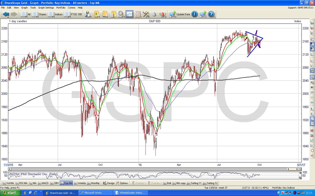
As promised, this Chart shows the Triangle close up. My Green Arrow is pointing to the Red Down Candle that was generated on Friday - note how it recovered during the Day (there is a long down ‘Tail’ which shows how the Price moved during the Day before closing where my Green Arrow is pointing). The key thing here is that the ‘Close’ of the Day was outside of the Bottom Blue Line of the Triangle - this suggests to me that it has broken to the Downside - this could mean more down moves next week.
Note on Thursday 6th October there was a White sort of Hammer Candle where it closed inside the Triangle after being outside for most of the Day - this you can see because the ‘Tail’ of that Candle is outside the Triangle. Maybe this was telling us that Bears were trying hard on Thursday to take it outside the Triangle and it was only on Friday that they finally managed it. There is a possibility that this is a ‘false’ Breakout and the Price can get back inside the Triangle - this is something to watch for in the next few days and a Close below the Support around 2144 that I have indicated on the Chart would confirm that the Triangle is well and truly broken to the Downside and there could be more falls. Of course there is good Support down at 2120 and this could be an important Level to watch. Note on this Chart that the Black Arrow from last week’s blog is still of use - it marks where we had a 13 / 21 Day EMA (Exponential Moving Average) ‘Death Cross’ and the Red 13 Day EMA is still below the Green 21 Day EMA line. 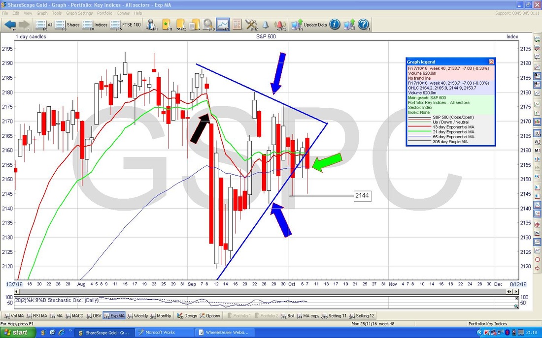
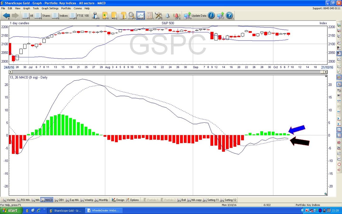
In the bottom window of the ScreenShot below we have the MACD (Moving Average Convergence Divergence) for the S&P500 Daily Candles. My Blue Arrow is pointing to how the MACD Histogram Bars are ‘humping’ over and look like moving towards having Red ‘Negative’ Humps and my Black Arrow is pointing to exactly the same phenomenon where the MACD ‘Signal Lines’ are looking like crossing in a Bearish way.
Dow Jones Industrial Index
I don’t usually show this US Index, mainly because although it is one of the most widely watched in the Media and stuff, it is not all that useful because the Dow only has 30 Stocks in it - so it is pretty unrepresentative of anything really. However, it is interesting at the moment because we have a similar Triangle going on with the Daily Candles as with the S&P500 - but in this case the Price has not yet broken out to the Downside. This is something to watch in coming days. 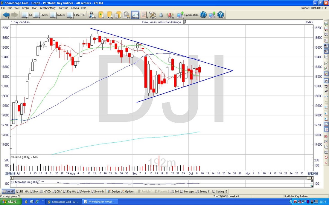
Nasdaq 100
This Index is of particular interest to me because I have a Short Position on it as part of my attempts to Hedge my Long Portfolio. Sadly the Nasdaq has been pretty strong recently despite the S&P500 and Dow being weak - my thinking is that the Nasdaq is extremely overvalued and will fall into line with the other Major US Indexes - so far I have got that very wrong !! The Chart below has the Daily Candles for the Nasdaq 100 going back about 3 months - I just want to show some detail about what happened last week. My Black Arrow from last Wednesday (5th October 2016) shows a Hammer Candle that was created which was then followed by a Doji Candle on Thursday and then the Red Down Candle which was a result of Friday’s fun - this is shown with my Blue Arrow. Note the recovery Intraday on Friday (the Long Tail below shows this) and clearly there is good Support at around 4840. 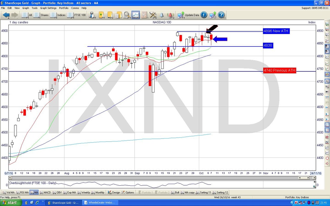
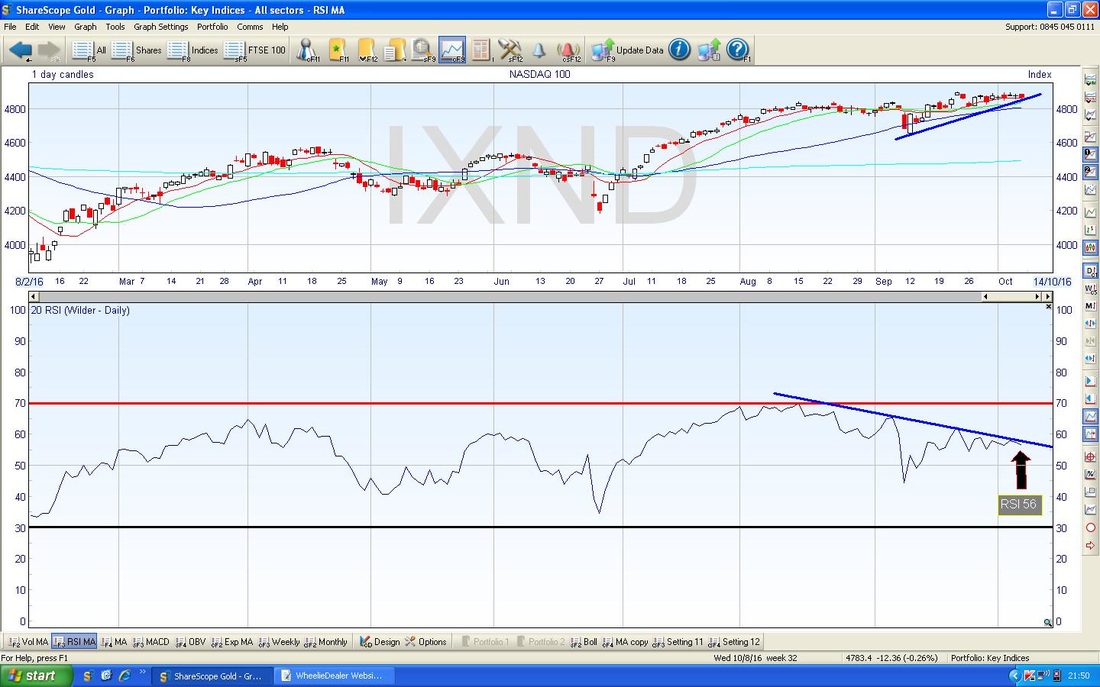
This is very interesting - the bottom window in the Chart below shows the RSI (Relative Strength Index) for the Nasdaq 100 Daily Candles. The current reading is RSI 56 which is just above the Neutral 50 level and obviously it has space to go up or down quite a bit. Anyway, of much more importance is how we have a ‘Bearish RSI Divergence’ between the RSI and the Price Line - note the downwards sloping Blue Line on the RSI window but in the Price Line we have an upwards sloping Blue Line. This suggests the Price will fall.
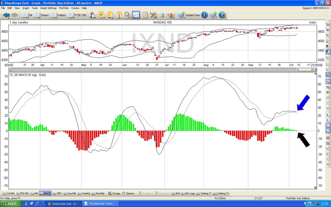
More interesting discoveries - look at the bottom window on the Screen below - this has the MACD for the Nasdaq 100 Daily - my Blue Arrow is showing a Bearish Cross on the Signal Lines and my Black Arrow is showing the same thing on the Histograms - it is difficult to see, but believe me it is there.
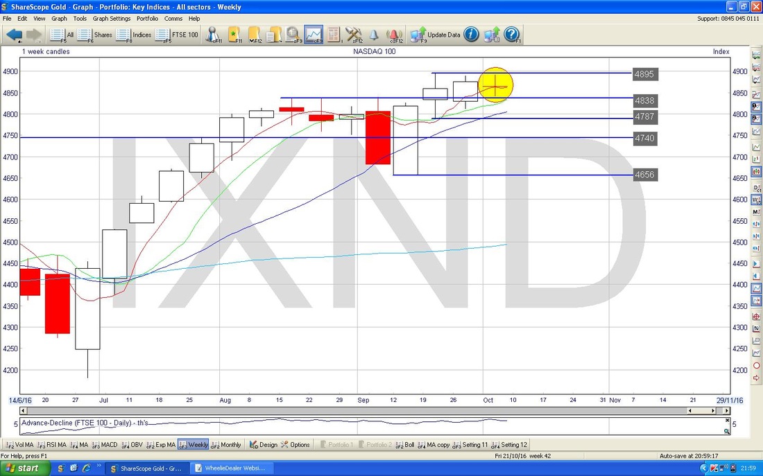
The Screen below has the Weekly Candles for the Nasdaq 100. Note the Yellow Circle which is showing a beautiful Doji Candle with a very narrow body - this could easily be marking a Turning Point from which we start to move downwards. However, this is not guaranteed but whatever happens it suggests that the force of the Up Move is waning and a turn is coming soon. When you mix it in with the Bearish RSI Divergence we saw earlier and the Bearish MACD Cross, it seems very likely we will go lower from here.
FTSE100
Despite the weakness we have seen in the US Indexes, the FTSE100 has been very strong as the Pound Sterling has weakened and Oil has been strong. It will be interesting to see if this can continue in coming Weeks - especially if the US Indexes fall off more - it is most unusual for UK and European Indexes to disconnect in this way (although European Indexes are much weaker than the FTSE100). As usual, I want to just set the scene and the Screen below shows the FTSE100 with the Uptrend Channel from the 2009 Lows marked with the Parallel Red Lines. The key thing here, which we will look closer at in a minute, is how the Bottom Red Line of the Uptrend Channel has been broken through in recent Days - this is a very positive development. 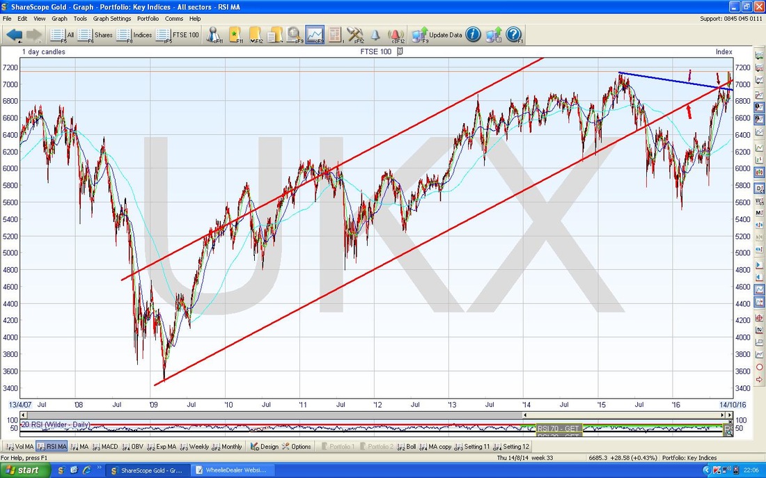
On the Screen below we have the Daily Candles for the FTSE100 going back about 3 months. The Red Line and the Blue Line are both from the previous Chart and the key thing is how the 4 Candles (Fork Handles?) from last week were all above the Red Line and showed how the Price broke back into that Long Term Uptrend Channel from the previous Chart. It could of course be a false Breakout and this will be clear early next week I suspect if we see the Price fall back. The important level here is the All Time High at 7122 - this was first hit back in April 2015 and we hit it again last week but we then fell back. A Breakout over 7122 would be really bullish.
Note that further on I cover Oil and the Quid - it looks to me like Oil will drop soon and the Quid will rise - this could be bad for the FTSE100. 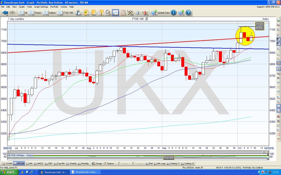
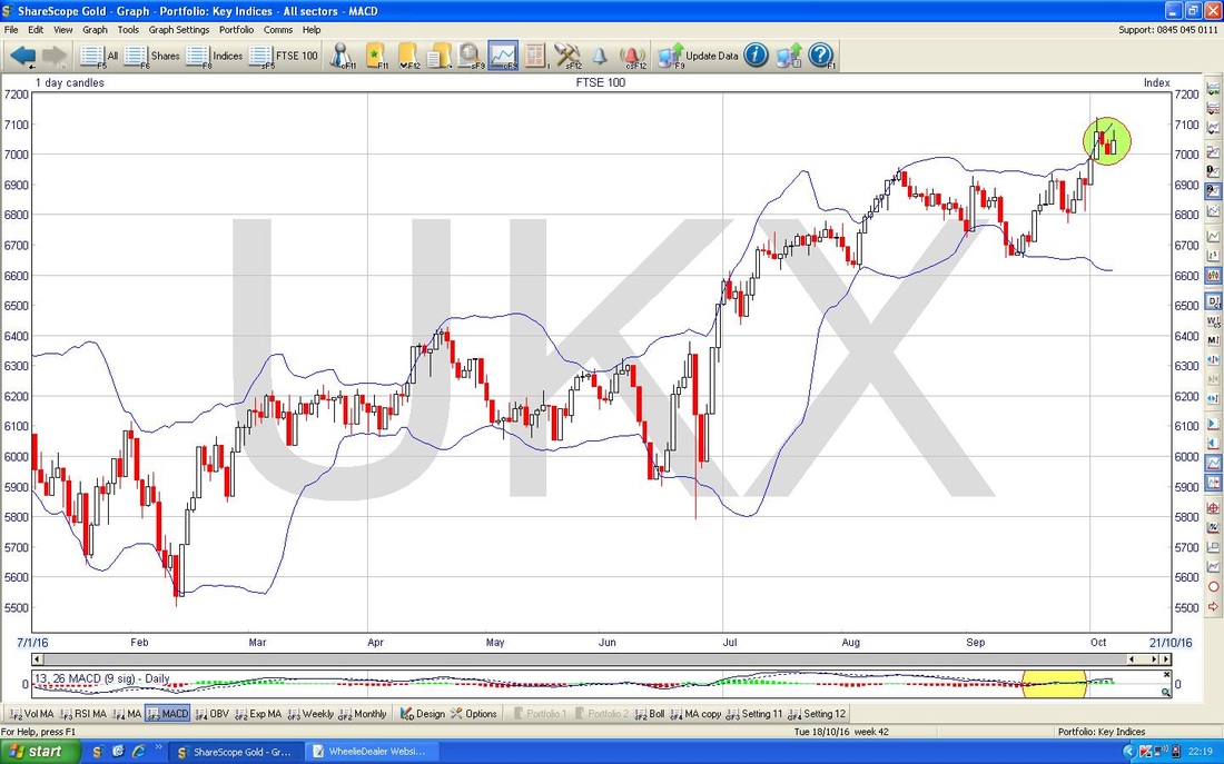
The Chart below has the Daily Candles going back about most of 2016 with the Blue Wiggly Lines above and below being the Bollinger Bands. My Green Circle is highlighting how we broke above the Upper BB on Tuesday last week but then the Price fell back inside the Bands and we are currently away from the Upper Band - it may fall more from here or perhaps go sideways.
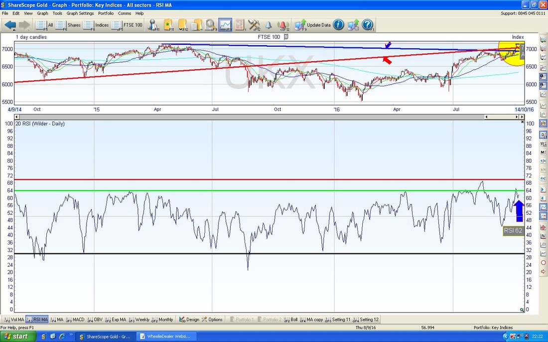
In the bottom window below we have the RSI for the FTSE100 Daily Candles. The current reading is about RSI 62 and although by the standards of many Assets this is not particularly high, for the FTSE100 this is quite a high level. Note how it often turns down at the Green Horizontal Line which is at about RSI 64 and it very rarely goes above the RSI 70 Level marked by the Horizontal Red Line. It can go higher, but of course space is limited.
Quid vs. Dollar
I don’t usually cover this but it is doing some interesting stuff and with its impact on the FTSE100 (which I have a big Short Position on) it is of particular interest to me. The Chart below has the Daily Candles for the £/$ going back for 2016 so far. My Green Parallel Horizontal Lines mark a Range that was holding for about 3 months after the Brexit Vote but last week we broke down below this range and the ’Flash Crash’ on Thursday hit a Low of 1.1947 which I suspect will be pretty Strong Support for a while. We recovered from this Flash Low and 1.24 looks like immediate Support. Any Rally I suspect will get capped at the bottom of the previous Range - in other words at about 1.28. Note that if I am correct, then a New Sideways Range might form between about 1.2227 and 1.28 which would be of a similar width to the previous Range at 1.28 to 1.35 - some nice symmetry which is often the case with Charting stuff. Note the Wiggly Blue Lines which mark the 50 and 200 Day Moving Averages (the Faint one is the 200) are both falling and these suggest the Quid will be under pressure for a good while yet. 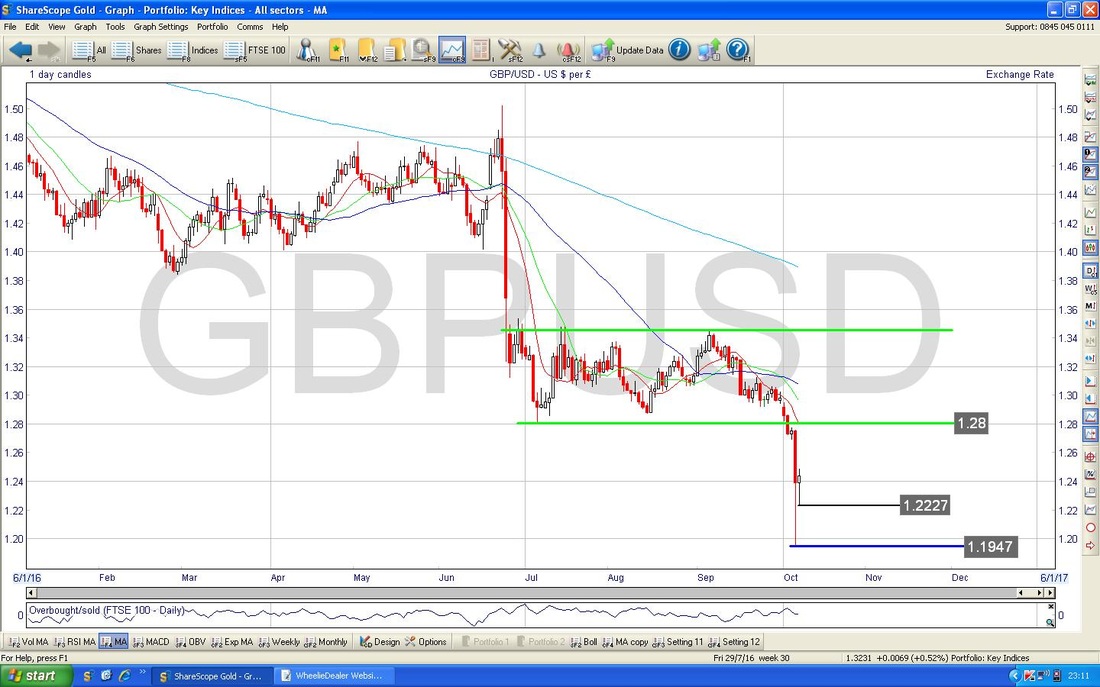
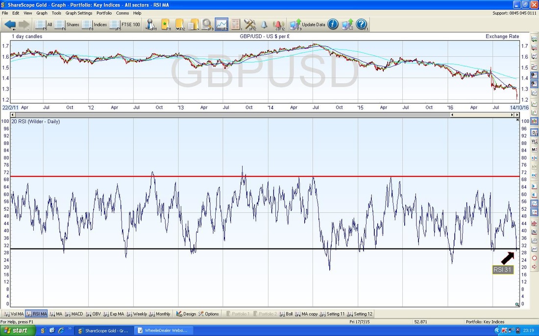
In the bottom window on the Chart below we have the RSI for the £/$ - note it is at RSI 31 and just flicked up - it seems likely it will rise from here. In other words, the Quid will recover some strength.
The Chart below has the Daily Candles for £/$ going back for 2016 so far with the Blue Wiggly Bollinger Bands above and below the Price Line. Note my Green Circle which shows how the Price is currently outside the Bands - this is not stable and it is likely the Price will move back inside the Bands - either by rising or at least by going sideways.
Note also that the 2 Candles formed on Thursday and Friday within my Green Circle form a Bullish Harami (there you are, a Woman with Child viewed from the side) - this suggests a rise to me especially because Friday’s Candle is also a bit Hammery - which looks bullish in the context of the strong moves down. 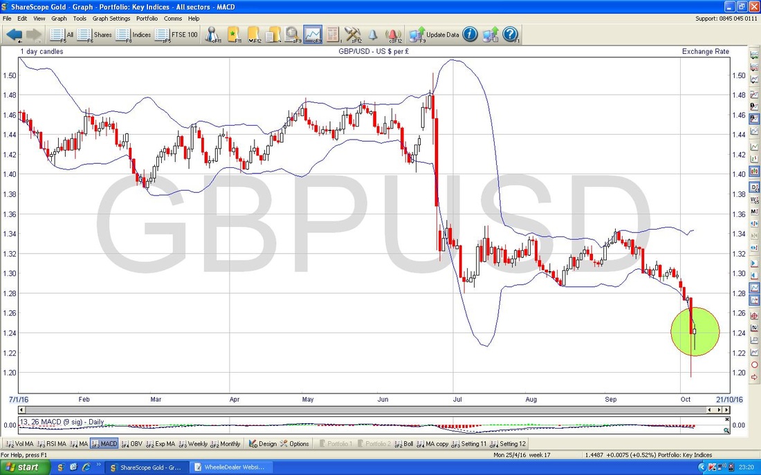
Brent Oil (Spot)
The Chart below has the Daily Candles for Brent Oil (Spot) going back about 5 Months or so. My Yellow Circle is showing where we have a 2-Day Candle Pattern which looks like a ‘Dark Cloud Cover’ which is sort of the opposite of a Bullish Harami pattern (you know, the Preggers Woman one) - so this is Bearish and probably marks a turning point after such a strong run up. $53 looks like a Strong Resistance level and £51 could act as Support and if that fails, then the next Support is at $50 and $49. The Oil Price rallied strongly on the OPEC production cut news but it is pretty obvious that saying they will cut is one thing but actually getting Member Countries to scale back production is an entirely different thing. My Red Arrow is pointing to a downwards sloping Red Line which was previously Resistance to the Price - this should now act as Support around the $49/$50 levels. 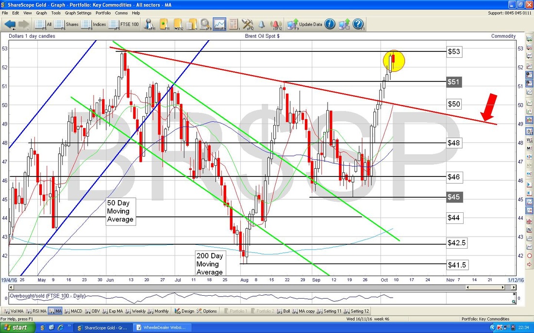
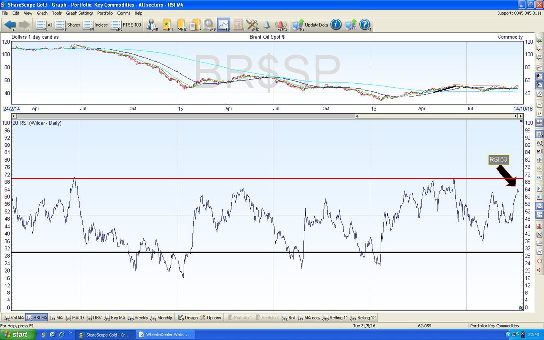
The bottom window in the screen below has the RSI for Brent Oil (Spot) Daily Candles. The current reading is RSI 63 and it has just flicked down - this might be topping out which is consistent with the ‘Dark Cloud Cover’ Candle pattern we saw in the Chart above. RSI 63 is not particularly high but Brent has been struggling to get into really high RSI levels for a long time.
Gold (Spot)
First off my humble apologies for the messy Chart below - but there is an important point I want to get across and I want to look closer in the next Chart. The thing I want to point out here is that in recent weeks I have been showing the Gold Chart in my Blogs and I have shown the Uptrend Channel marked by my 2 Parallel Red Lines. Last Week the Price fell out below the Red Lines Uptrend Channel and this looks like a very Bearish development - however, there is a chance that my Red Lines were not ideal and I have drawn in on the Chart another possible Bottom Line to an Uptrend Channel with my Blue Line marked by the Blue Arrow. This Blue Line is quite near the 200 Day Moving Average (the faint Blue Wiggly Line) and maybe it will hold as Support and show a wider Uptrend Channel. We shall see in coming Days/Weeks no doubt. My Yellow Circle is showing where the Price is now. 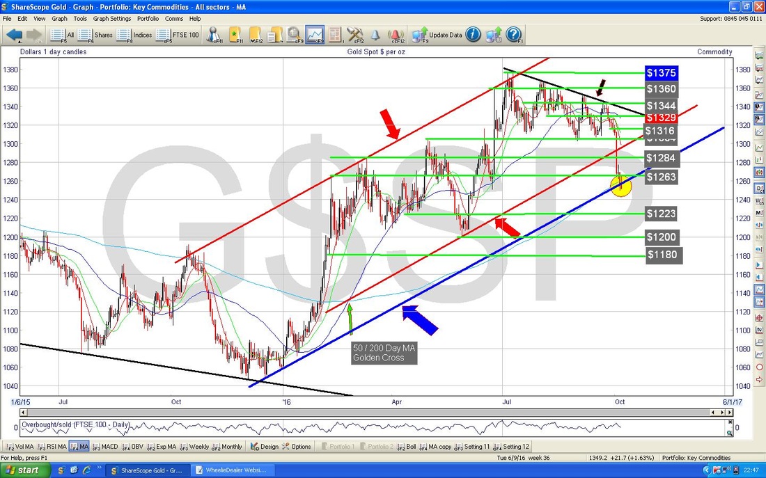
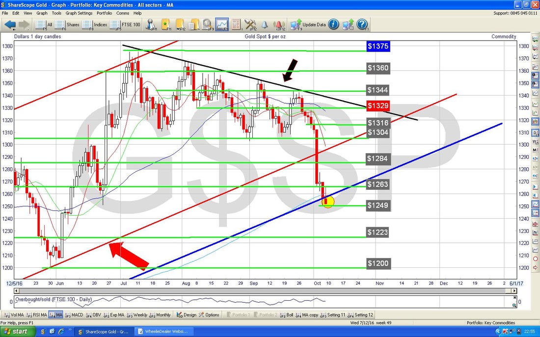
The Chart below zooms in on the Gold (Spot) Daily Candles from the Chart above to about the last 4 Months. My small Yellow Circle is pointing out an ‘Inverted Hammer’ which was produced on Friday and in this context it might well mark a Turning Point from which Gold can rally. You can just see the very faint Blue Wiggly Line which is the 200 Day Moving Average just near where the Price is now and my Blue Upwards Sloping Line.
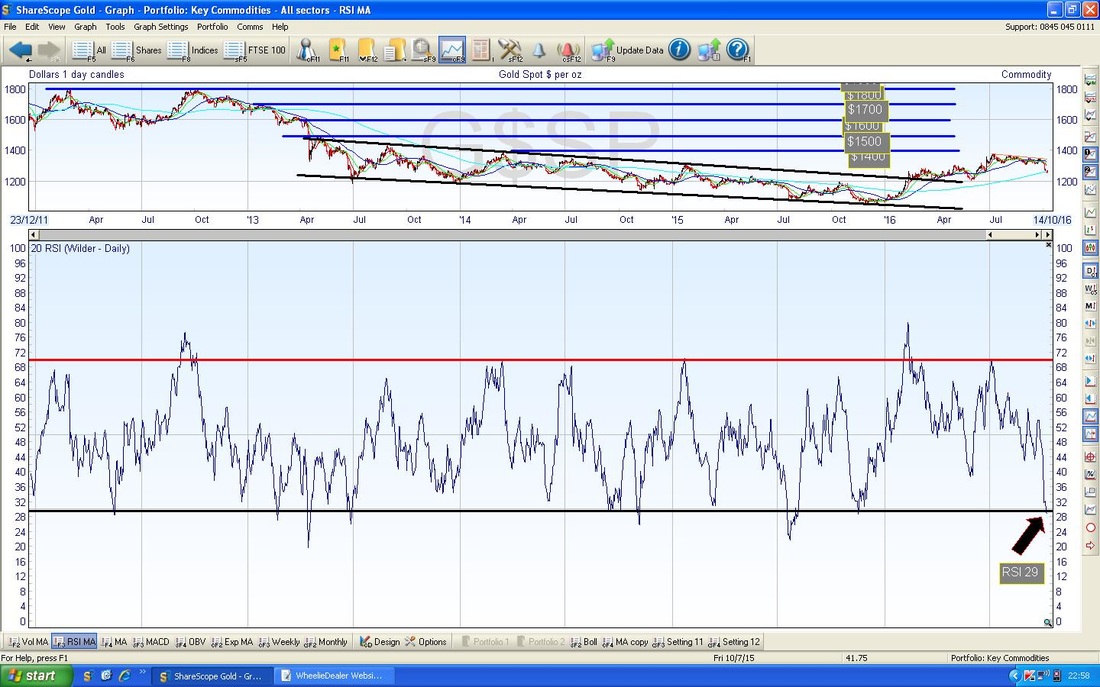
The bottom window of my Screen below has the RSI for Gold (Spot) Daily and currently is reading RSI 29 which is extremely low and it is highly likely we will see a bounce here very soon - within Days.
The screen below has the Daily Candles for Gold (Spot) going back about 6 Months with the Blue Wiggly Bollinger Bands both above and below. My Green Circle is highlighting the last 4 Days where the Price is below and outside the Lower Bollie Band - this is an unstable condition and it is highly likely that the Price will move up or at least go sideways in coming days to get back within the Bands.
That’s it for this week, fingers crossed for everyone !! Cheers, WD. 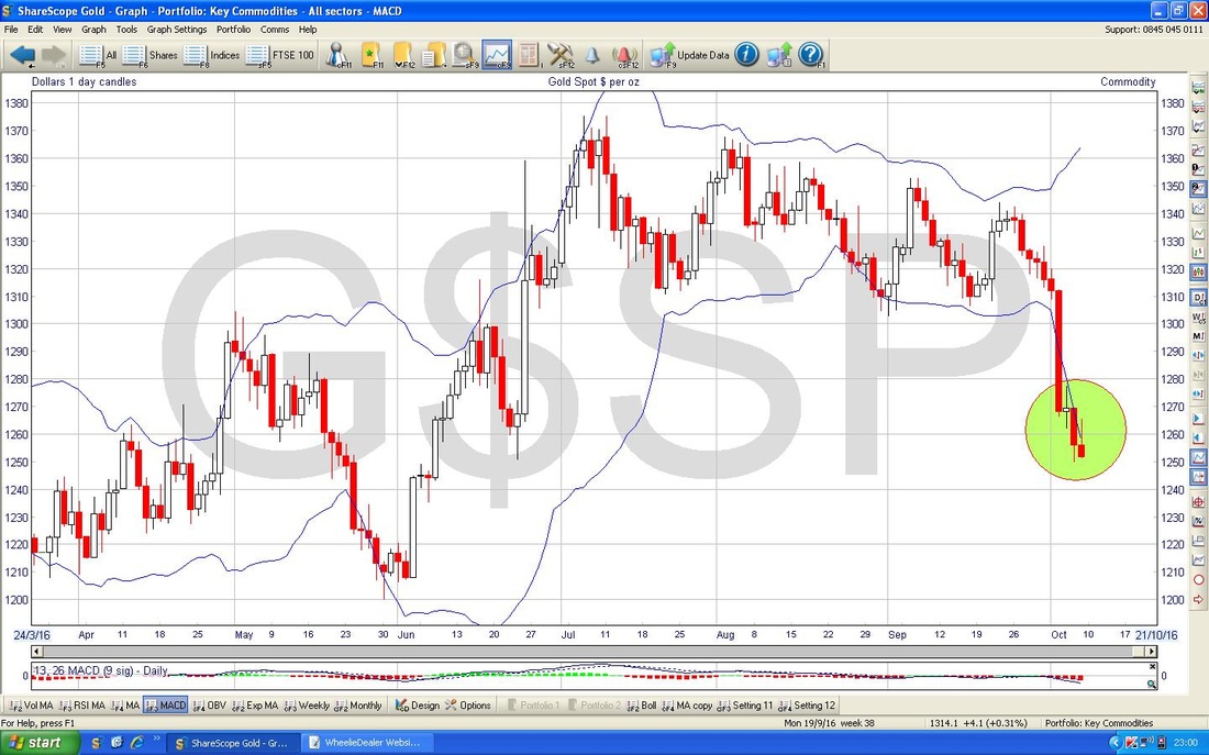
4 Comments
catflap
10/10/2016 12:32:44 pm
Thanks WD. Cant quite remember so many charts pushing the outsides of Bollinger Bands and at key supports and resistance lines.
WheelieDealer
10/10/2016 09:47:38 pm
Hi catflap, I felt very much the same while writing that Blog. It often strikes me that some weeks there is not much happening on the Charts and things are sort of 'sideways' or maybe in the 'middle' of a move - but this Week lots of Stocks, Forex, Gold etc. seem to be at or near what is probably a Turning Point - this could be a fun week !!
Ed
10/10/2016 09:10:33 pm
Golden week (national holiday) has just finished in China and gold prices generally fall at that time then rise afterwards so we ought to see gold rising this week. The markets being what they are – anything is possible. Does seem like people are prepared to overpay for dividend and export stocks in the UK but some of that may be down to foreign buying as the GBP continues to fall.
WheelieDealer
10/10/2016 09:49:58 pm
Hi Ed, thanks for that information on Gold - it certainly looks like it is due a bounce. Like you I am a bit mystified with why people are so happy to pay up for Stocks at the moment - I suspect it is more Traders jumping on a Momentum Bandwagon than proper Long Term Investors. Leave a Reply. |
'Educational' WheelieBlogsWelcome to my Educational Blog Page - I have another 'Stocks & Markets' Blog Page which you can access via a Button on the top of the Homepage. Archives
January 2021
Categories
All
Please see the Full Range of Book Ideas in Wheelie's Bookshop.
|
