

|
educational blogs |
|
Just a few Charts to clearly highlight the challenges facing the FTSE100 and S&P500. Developments here over the next week or so will tell us a lot about what is likely to happen in early 2016.
FTSE100 Triangle If you follow my Tweets you may have heard me mention a Triangle on the FTSE100. The Chart below from the wonderful ShareScope shows this Triangle with the Topline being the Red Downward Sloping Line from around the 7100 Peak last year and the Bottom Line is the Red Horizontal Line at 5900.
The problem is that these Triangles have quite astonishing predictive powers - they are clearly very talented at Mystic Meg stuff. What has been happening is that the Top Red Line has capped any Rallies for at least 7 attempts and it is sort of ‘squeezing’ the Price downwards. Anyway, it gets worse because the Price popped out of the Triangle by breaking down below the Bottom Line at 5900 - and this is where the predictive bit comes in because where the Triangle Breaks out determines the direction in future. So we broke down, meaning that the Price will likely fall now.
If you think that’s bad, it gets worse. The theory is that the Price will fall by the equivalent distance to the ‘Height’ of the Triangle. Now of course this depends on where you measure from but if we take it from around 6800 from last August, this means the Height is about 900 Points (6800 minus 5900). If we now project this down, it means that the FTSE100 might be heading for 5000 (5900 minus 900 points). So you can probably see why I am a bit nervous and moving into ‘Capital Preservation’ mode. There is an alternative interpretation where the Height of the Triangle is 7100 minus 5900 - this would be 1200 Points which implies a Downside Target of 4700. Yikes. In addition, the 200 day and 50 day Moving Averages are pointing down - the 200 day is particularly worrying as this signals a Downtrend. For the Bulls to take control, we would need to see the Price up above 6500 - I will be stunned if this happens. It is a classic Chart Pattern where we get a big fall, followed by a Sideways Range and then a break to the downside - this is exactly what seems to be happening on the FTSE100 now. I am expecting a bit of a bounce in the short term and I will use this to reduce my Exposure if it happens. 
On the Chart below, I have shoved a Blue Arrow in which points to where the Overbought / Oversold Indicator is very low - this makes me think we will bounce soon - but I don’t expect much upside - it might not even get over 6150 and even 6000 will be tough for it. If you look close on the previous Chart, you might see that we put in an Inverted Hammer Candle today which is Bullish in the context of the recent downmoves.

S&P500
The Chart below shows the Long Term Uptrend on the S&P500 and my Blue Arrow points to where the price has fallen out of this Channel - that’s a bearish development. 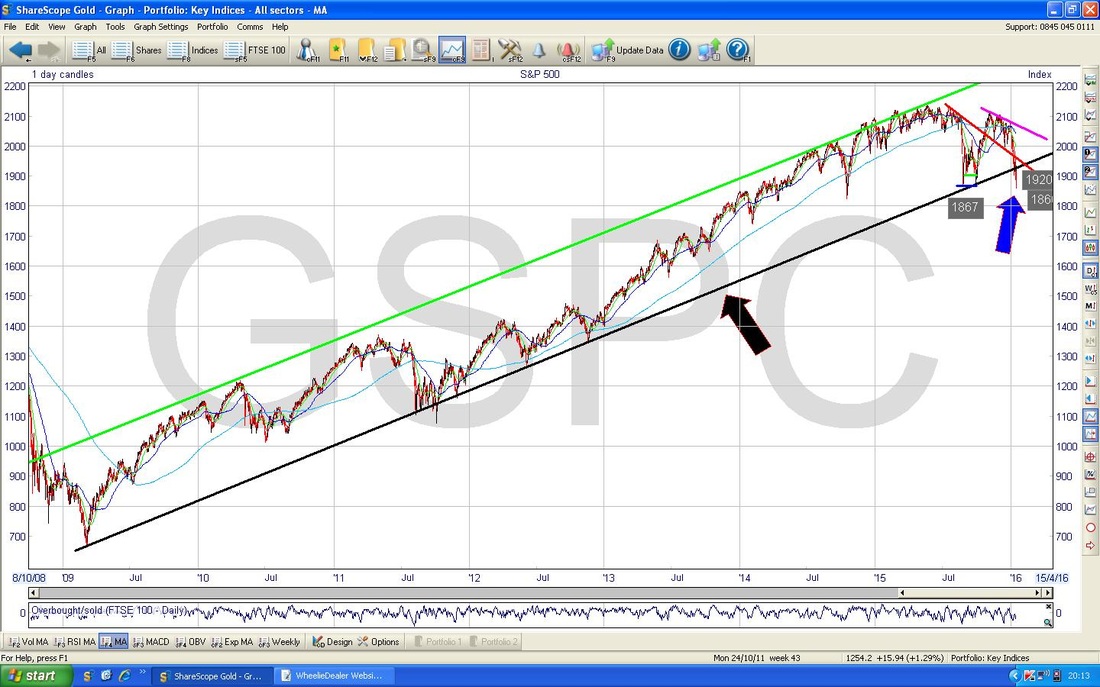
On the Chart below I have zoomed in to show the failure of the Bottom Uptrend Line to act as Support - the Blue Arrow shows this breakdown. There is a likelihood we can bounce a bit in the Short Term but I am not expecting it to have legs and there is a lot of Resistance up above which will probably cap any gains.
Right, that’s shallots - as per my scribbles, I am very cautious now and I have my eye on the bigger picture of the Brexit Vote later in the year and it is hard to see much upside now. If you look on my Homepage at the ‘Weekly Performance’ bit, I have written more on my Strategy. Be careful people, this is no time for heroics, cheers, WD. 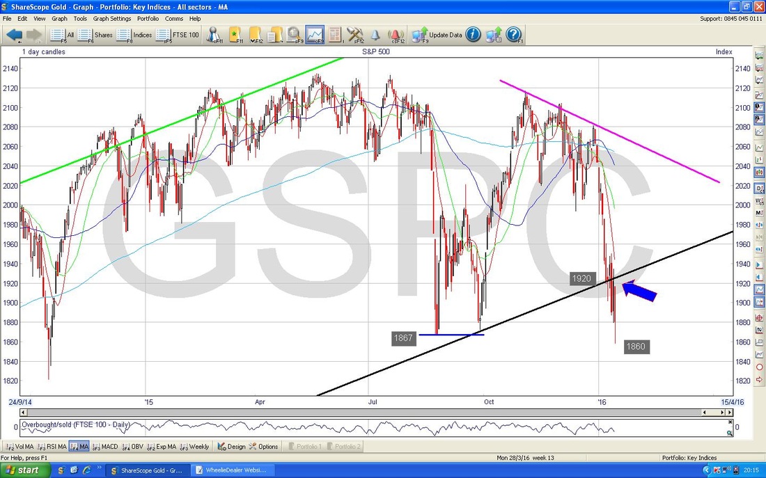
1 Comment
Jon H
20/1/2016 10:14:51 pm
Spot on even with the dead cat bounce of yesterday. Look forward to next blog to see what the charts are saying from here Leave a Reply. |
'Educational' WheelieBlogsWelcome to my Educational Blog Page - I have another 'Stocks & Markets' Blog Page which you can access via a Button on the top of the Homepage. Archives
January 2021
Categories
All
Please see the Full Range of Book Ideas in Wheelie's Bookshop.
|
