

|
educational blogs |
|
Wow, what a change to have glorious Sunshine all Weekend, especially on a Bank Holiday one. I have been out in the Sun mucking about in the Garden and pretending to ‘work’ on it but really just doing as little as I can get away with so that I don’t get over exerted and it is mainly focused on easy tidying up stuff. I am knocking out this Blog tonight as I have been invited to a Barbeque tomorrow which should be a laugh and a good distraction from the Markets etc.
I am so so happy that Summer has finally arrived. I detest the Winter (if I wasn’t so dependent on the Comfort Blanket of Stoke Mandeville Hospital I could quite easily depart for Spain or something during the miserable Months. The crazy thing is that I rarely go to Stock Mandeville but it is just nice to know that at the drop of a hat they will always deal with me if I have issues) and with the wonders of modern technology I really could do my ‘job’ from anywhere and the Time Zones aren’t massively different in Southern Europe etc. With this in mind and after a shocking Winter that seemed never-ending I fully intend to engage with the Summer Months with a gusto and to minimise my Investing Activities to the bare minimum I can get away with - I will not be surprised one bit if this means that my Returns actually improve !!
Along those lines, I did some solid work on a Draft Blog last night about the important of Patience and how it is a very undervalued and underappreciated ‘Skill’ and how it can give an Investor a sustainable ‘Edge‘. I have had the Subject of this Blog in my mind for quite some time but it was only when I positioned myself with a Cup of Tea, a Pen and a blank Sheet of Paper last night that my ‘Plan’ made me realise that this was actually a much larger topic than I had at first thought. In simple terms Patience is critical when Holding a Quality Stock and letting it run but it is also important for ‘Stalking’ an Entry and taking a relaxed and profitable stance towards dealing with the Rises and Falls of the Markets. I am not sure when this Blog will emerge but it looks like it has grown into 2 parts and I might be able to get Part 1 out this coming Week although I have other Blog Irons in the Fire.
I see it as extremely important to ‘take time out’ and to make the most of Bank Holiday Weekends and suchlike when the Markets are shut to do things that are not related to Stocks and to get out and de-stress. Time away from the Markets gives your Brain the opportunity to calm down and to think about other things - in the Bigger Picture taking advantage of time away from the Markets will make you a better and more relaxed Investor. And of course if you have a Family it is important to spend time with them and to show you are not someone who spends their life glued to a Screen and obsessed with making Money from thin air. Last Week Not a lot happened on my Portfolio Last Week - it was down 0.1% overall which is just ‘Noise’. With a 4-Day Week ahead my expectations are pretty low for the coming Week and I note that on Thursday loads of my Stocks are due to go Ex-Dividend - AA., DGOC, GSK, HSW, MOSB, RDSB. I see there is a Bank of England Rate Decision due but the expectations seem to be that they won’t raise Rates and even if they did it would just be a Quarter Point - I can’t see this causing huge drama. Perhaps the spiel that goes along with the Decision will move things about a bit but for a Long Term Investor I really can’t get excited about it all. I updated the ‘Weekly Performance’ bit on the Homepage a few Days ago with the Breakdown for April. Along with that I wrote about my Strategy and in essence it is to do as little as possible and to be mindful of the Risks that are about, particularly from the US Markets as I will address in a bit. So I can’t see myself doing many Buys and Sells for a while although I am seriously thinking about Selling Sainsburys SBRY from my Income Portfolio after they jumped up on the Asda Merger news. I have not been happy with SBRY since the Argos Deal (to be fair that seems to be going ok, but buying Asda strikes me as very desperate and I fear they are taking on yet more Risk) and the Jump up gives me the chance to get out with a Small Profit and of course I can then redeploy the Funds into something else. My Income Portfolio is fully intended to be extremely low activity and I have been thinking about ditching SBRY for some time. It is forecast to have a Dividend Yield of 3.6% next Year and with a Target of a blended 5% on the overall Portfolio it arguably makes sense to move my Cash into something else that has a Higher Yield. I like the Defensive nature of Food Retail but with the challenge of the Discounters (Lidl, Aldi) and fears of Amazon muscling in, I think there are better Defensive Stocks like the Water Companies perhaps and certainly Primary Health Properties PHP has a lot of appeal and might be a decent replacement. We shall see. That’s enough ‘Admin’ stuff but I must just mention the Duxford Aerodrome Meet-up on Monday 25th June - if you pop over to the Homepage the details are on there and everyone is welcome to come along and join us - don’t worry about how experienced you are etc., the more the merrier !! Time for Charts then……… Nasdaq Composite I have been saying pretty much every Weekend for ages now that the US Indexes have big nasty-looking Triangles and that is my biggest concern at the moment (if the US Markets collapse then I cannot see how we in the UK escape such a scenario). However, there was a small glimmer of hope that appeared on Friday when the Nasdaq had a Strong Up Day and we got the Chart which I have shown below. As always, the Charts I use are ScreenGrabs from the brill ShareScope Software that I subscribe to (if you use SharePad you will find that all of the Charts I show here can be created on that Tool also) and if you click on them they should get larger so you can see more detail. On my Chart below we have the Daily Candlesticks for the Nasdaq Comp (the US Tech Index) and my Black Line (marked by my Black Arrow) and my Red Line (marked by my Red Arrow) are 2 Sides of the Triangle I was going on about. The play here is that if the Price breaks-down below the Black Support Line then that is Bad News and if it breaks-out above the Red Resistance Line then that is Good News for Bulls. My Yellow Circle is highlighting where the Candle from Friday broke-out above the Red Line and this could be very Good News - however, there is a big Risk that this is a ‘False’ Breakout and we need the Bulls to build on this and push the Price up more ASAP so that we can be sure the Breakout has occurred. Note how the Candle stopped at the Blue Wavy Line which is the 50 Day Moving Average and this might prevent further Gains. Something to watch is that Horizontal Resistance at 7320 which I have highlighted with the Green Text Box and if the Price gets up over this Level then I think the Bulls are in charge and we can all relax. Something to be aware of is that the Big Up Candle from Friday was partly driven by the reaction to Results from Apple AAPL which has an enormous Weighting within the Nasdaq Comp and this could be skewing things a bit. Note also my Blue Arrow which is pointing at the 200 Day Moving Average - this is currently still rising nicely and this is a Bullish thing because a rising 200 Day MA is a signal of an Uptrend. 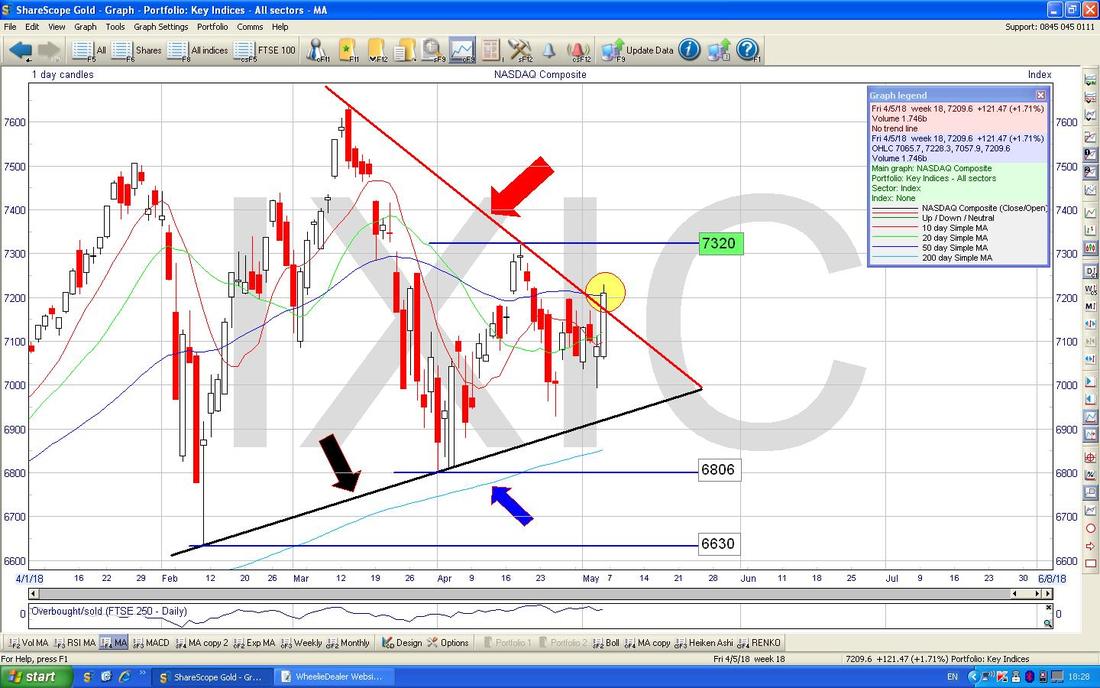
Dow Jones Industrials Index
The DOW also has a Triangle but this is more worrying because it is a ‘Downwards Pointing Triangle’ and the Red Line (Red Arrow) is squeezing the Price down towards the Black Support Line at the bottom (Black Arrow) and if this Black Line fails then we are in the doggy-do. My Green Arrow is pointing to a White Up Candle from Friday like on the Nasdaq Comp but clearly it has more work to do in order to Breakout to the Upside through the Red Resistance Line. If the Black Line fails, then where my Yellow Box is down in the Bottom Left Hand Corner shows an Area of Support which might save us if the Nasty Scenario does arise. My Blue Arrow is pointing to the Blue Wiggly Line which is the 50 Day Moving Average. Note how it is falling towards the Lighter Blue Wavy Line which is the 200 Day Moving Average - if it falls through it, then we have a ‘Death Cross’ and this could imply Months ahead of at best a Sideways Market but it could easily fall more. We need the 50 Day MA to turn up sharpish in order to avoid such trouble. 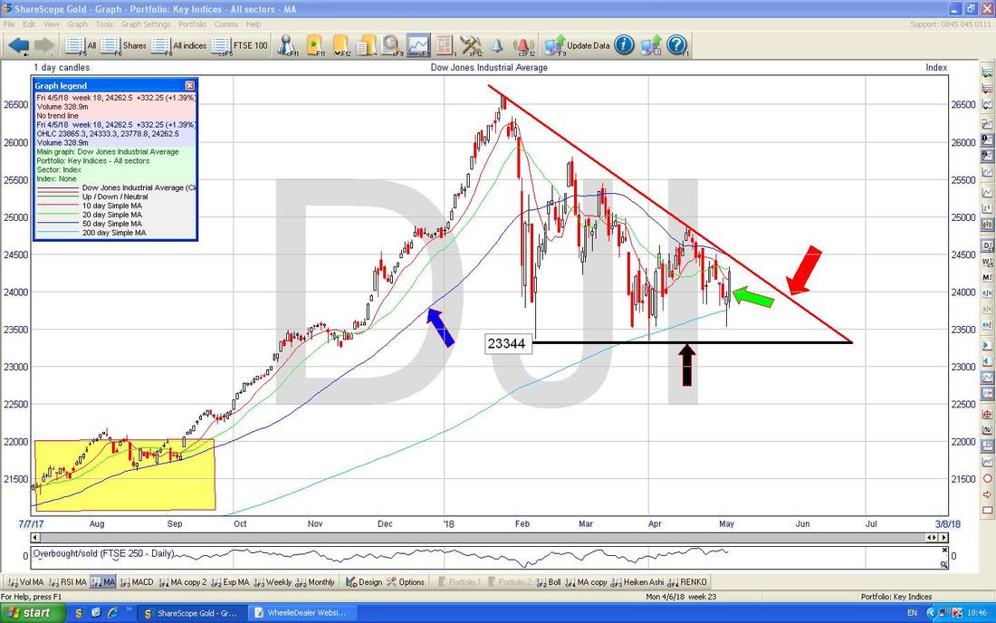
I won’t show the S&P500 because it is pretty much identical to the DOW.
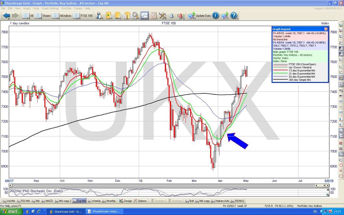
FTSE100 Unlike the US Charts this one looks pretty Bullish. My Red Arrow is marking a Big White Up Candle from Friday and this looks Bullish although I do get the sense that the run up recently has been pretty ‘Vertical’ and those kinds of moves often ‘Mean Revert’ fairly soon. However, if the Price does drop back at any point soon, the chances are that Support down at 7326 (marked by my Black Arrow - note this was the Former Resistance Level which got broken-out of and now becomes Support) will cut in. My Blue Arrow is pointing to the Darker Blue Wavy Line which is the 50 Day MA and this is now moving up towards the Lighter Blue 200 Day MA - it looks very possible that we will get a ‘Golden Cross’ - this would imply Gains to come in the months ahead. Up above we have my Green Horizontal Line which is the All Time High (ATH) at 7793 - if the Market can Break through this Resistance then that would be Bullish and it would suggest that 8000 is going to happen. Note, Royal Dutch Shell RDSB did very well Last Week and as with Apple in the Nasdaq, RDSB has a very big Weighting and skews the FTSE100. Of course the moves of Sterling can impact the FTSE100 and if we get some sort of Rate Decision on Thursday from the BoE then that might cause some action. 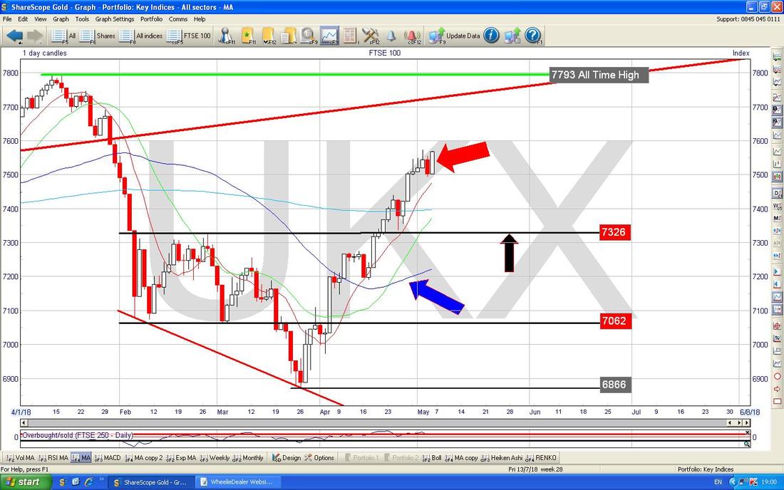
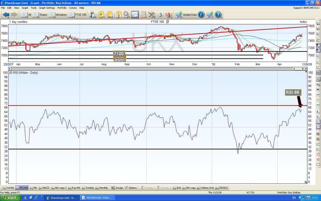
In the Window at the Bottom on the next Chart we have the Relative Strength Index for the FTSE100 Daily and this gives an idea of how ‘Overbought’ the Index is. On a Reading of RSI 66 it is high but can go higher.
I am just throwing in the Chart below to make the point that where my Blue Arrow is we had a ‘Golden Cross’ between the Red 13 Day EMA and the Green 21 Day EMA (Exponential Moving Average) - look how this predicted the subsequent rise and of course when we get the opposite Cross (a ‘Death Cross’) we should expect a move downwards.
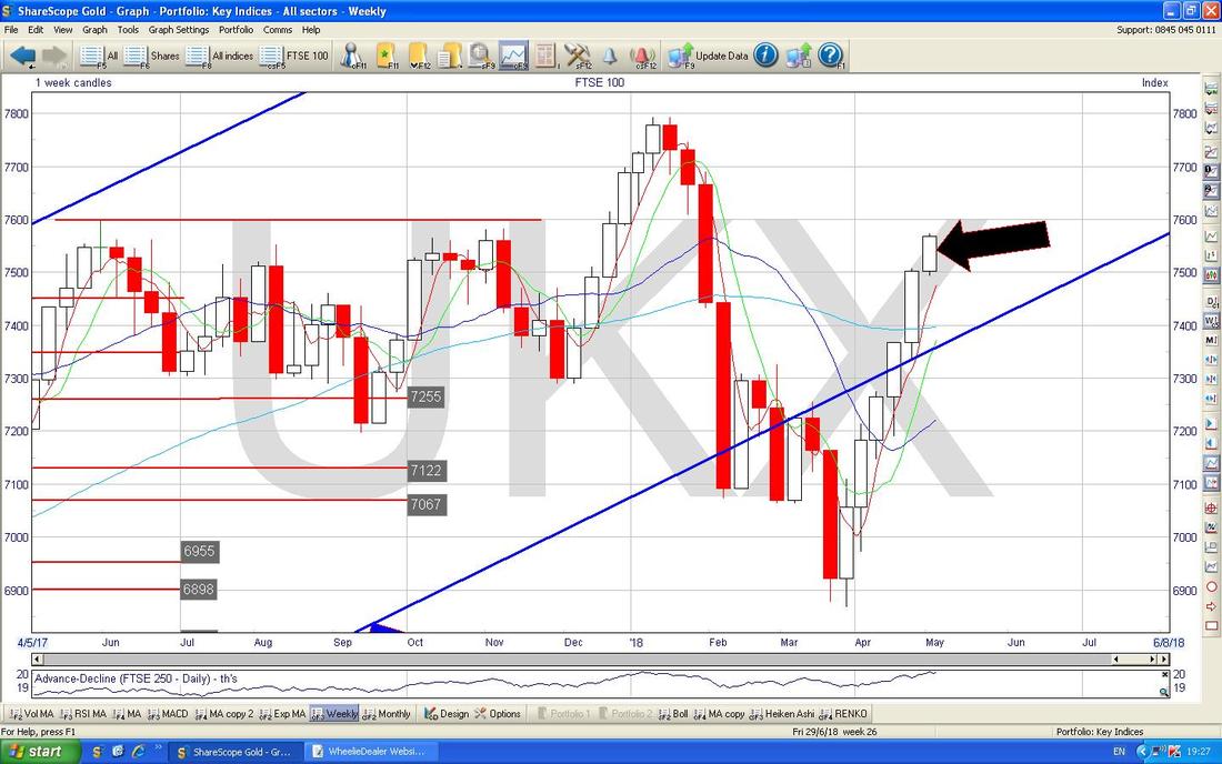
My Chart below has the Weekly Candles - my Black Arrow is pointing to a nice White Up Candle from Last Week and this looks bullish.
My Chart below has the Daily Heiken Ashi Candles for the FTSE100 and my Yellow Circle is highlighting how the White Up Candles have narrowed in the last 2 Days - this does not necessarily mean the FTSE100 is going to turn down but it is something to watch in the next few Days (remember the Heiken Ashi Candles are totally different to the ‘Normal’ Candles and are a bit ‘slower‘).
I won’t show the FTSE250 as it is largely similar to the FTSE100 although the Heiken Ashi Candles have narrowed and the Weekly Candle is less Bullish looking than the one on the FTSE100. 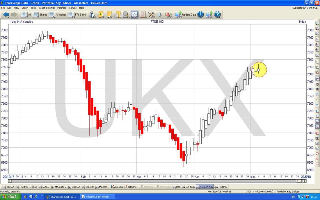
FTSE AIM All-Share
This one is interesting because as my Daily Candlesticks on the Chart below show, the AIM All-Share has had a stellar run up recently but where my Black Arrow is we got a ‘Spinning Top’ Doji Candle (my name, don’t bother looking it up in the book !!) and although these can sometimes be a Reversal Signal for the Market to turn down, they are more often a warning that the force of the move up is weakening and a Turn Down is on the way soon. 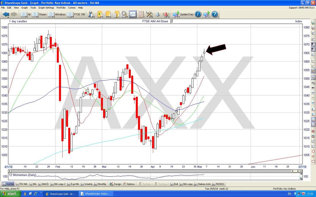
Gold Spot
Gold drives me insane but I am gritting my teeth and looking at the Chart this Weekend !! The Chart below has the Daily Candles and note how there was a Downtrend Channel for about 5 Years which was marked by my Green Lines and then the Price Broke higher and we have been in a more positive move since and my Black Line at the bottom and my Red Line at the Top mark an ‘Upwards Pointing Triangle’ and this is actually suggesting that the Price of Gold might pop out of the Top of the Triangle at some point but of course that Black Support Line must hold. 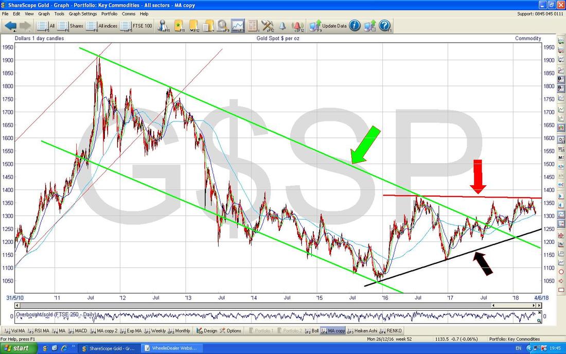
Entertainment One (ETO)
I have a big Position in these and have felt for ages that it is very undervalued with the valuation of the Content Library alone being higher than the Market Capitalisation - and of course that takes no account of the future potential here which is clearly significant and with the ongoing demand for ‘Content’ on all the Digital Channels, it seems highly likely that ETO will get taken-over at some point. First off I am ‘setting the scene’ with the Long Term Chart for ETO below - I have used the ‘Toggle the Trendlines’ button on ShareScope to put those Blue Lines in as this is a quick and lazy way of showing a Trend - clearly this is Up. 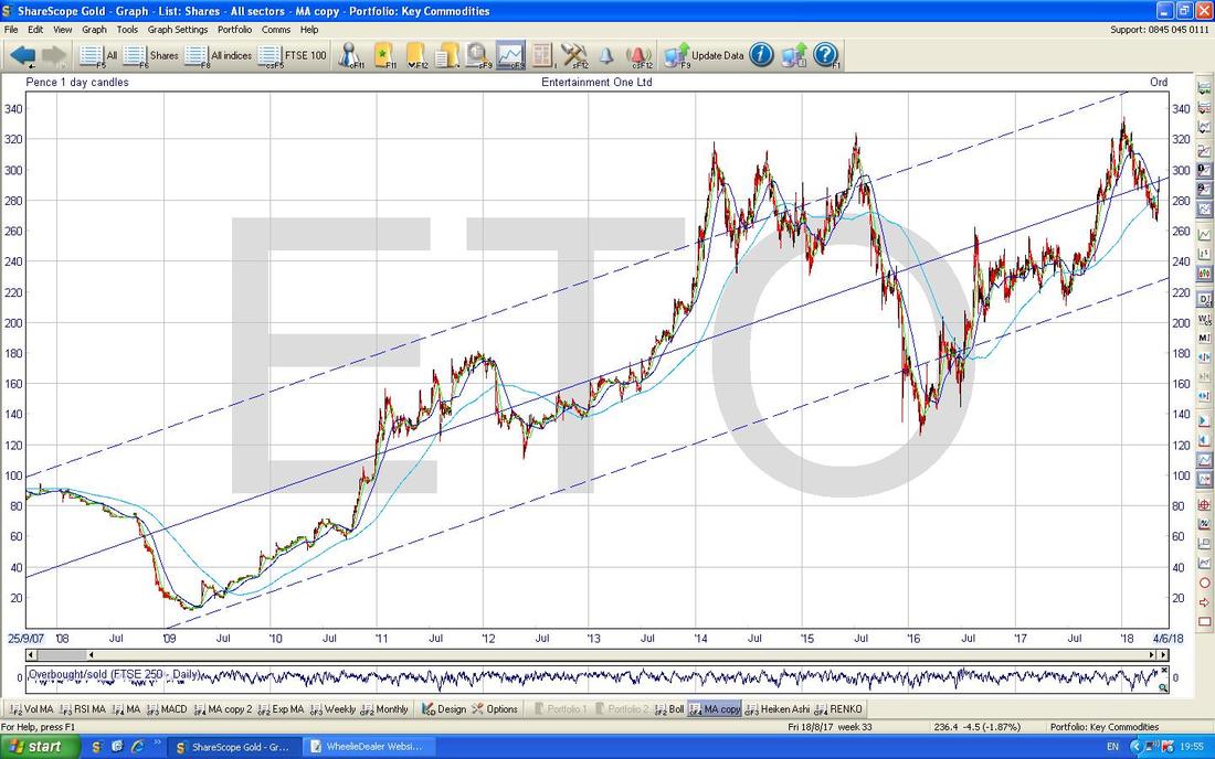
On my Chart below I have zoomed right in on the Daily Candles and note how we had a Downtrend Channel for pretty much all of 2018 so far but where my Yellow Circle is note how the Price has broken-out of the Upper Black Line (marked by my Black Arrow) of the Downtrend Channel. However, look how the Candlestick from Friday has got a bit of a ‘Wick’ or ‘Tail’ on it and this shows that the Price fell back during the Day. It is possible this is an Overshoot and a False Breakout but we should have more clarity pretty soon in the coming Week. A move above 300p would be a good sign that the Bulls are back in town and mixing with the Pigs (of the Peppa variety).
My Blue Arrow is pointing to the Darker Blue Wiggly Line which is the 50 Day Moving Average - note how it has nearly done a ‘Death Cross’ with the Lighter Blue Wavy Line which is the 200 Day Moving Average - if we get this Cross it could mean weakness ahead but if the Price can move up really fast now we might avoid this scenario and it often happens that we get a Death Cross but that quickly reverses and does a Bullish ‘Golden Cross’. 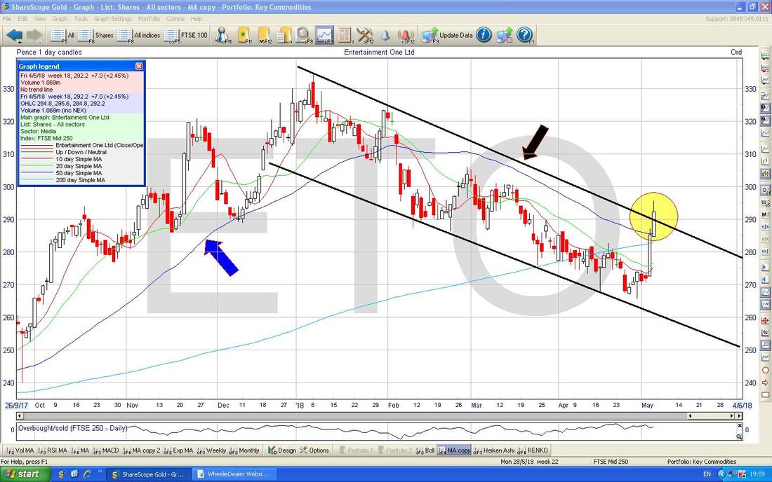
Royal Dutch Shell RDSB
Again I am cheating and using the ‘Toggle the Trendlines’ Button and I get the Long Term Chart below for RDSB. It is clearly in an Uptrend but note how over the years it has had enormous swings. I hold a fair bit of RDSB. 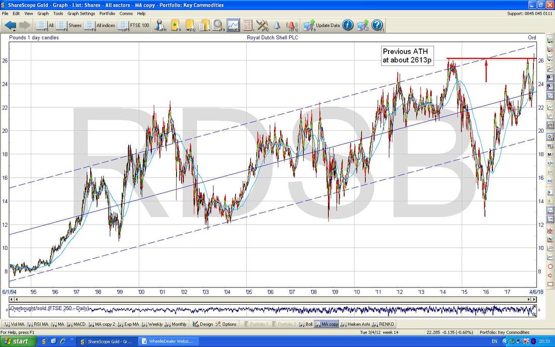
On the Chart below I have gone back about 4 Years to enable me to highlight with my Small Yellow Circle how we have Broken-out of the Previous All Time High - this is very bullish behaviour.
RDSB has a Forecast Dividend Yield of 5.2% and it seems highly likely to me that if the Oil Price can stay pretty buoyant, then RDSB has room to go even higher as Income Buyers will still be tempted and the higher the Oil Price goes the safer that Dividend becomes (but bear in mind that RDSB has not cut their Dividend since WW2 which is a stunning record and even when Oil Prices dropped back a lot a couple of years ago they still held the Divvy). At some point in the future it is obvious that demand for Petrol and Diesel for Cars will fall away as Electric Vehicles get more dominant - however, I suspect we are still some way off this happening and it is highly likely that RDSB and the other Oil Majors will move more of their focus onto providing the Infrastructure and Consumables required in this Lower Carbon Future. At some point it might be wise to reduce exposure to ‘Big Oil’ but at the moment things look very Bullish here so I am happy to ride it higher. As I mentioned earlier RDSB goes ExDiv on Thursday. 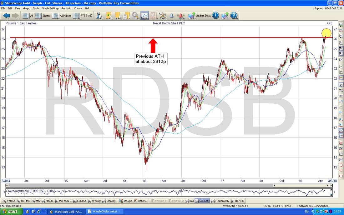
Barclays Bank BARC
I don’t hold BARC myself but I suspect many Readers do. I was thumbing through Investors Chronicle this Week and somewhere in there I noticed a Chart of BARC and it struck me that there was a Triangle going on since the Credit Crunch and on my Chart below I have attempted to show this with my Red Line at the Top (Red Arrow) and my Green Line at the Bottom (Green Arrow). Bulls need the Price to Breakout above that Red Line which means a move over about 300p really to be sure the Bulls are back in command. If the Price falls back then that Green Support Line must hold and therefore 150p is an important Support Level that must hold in the Shorter Term. 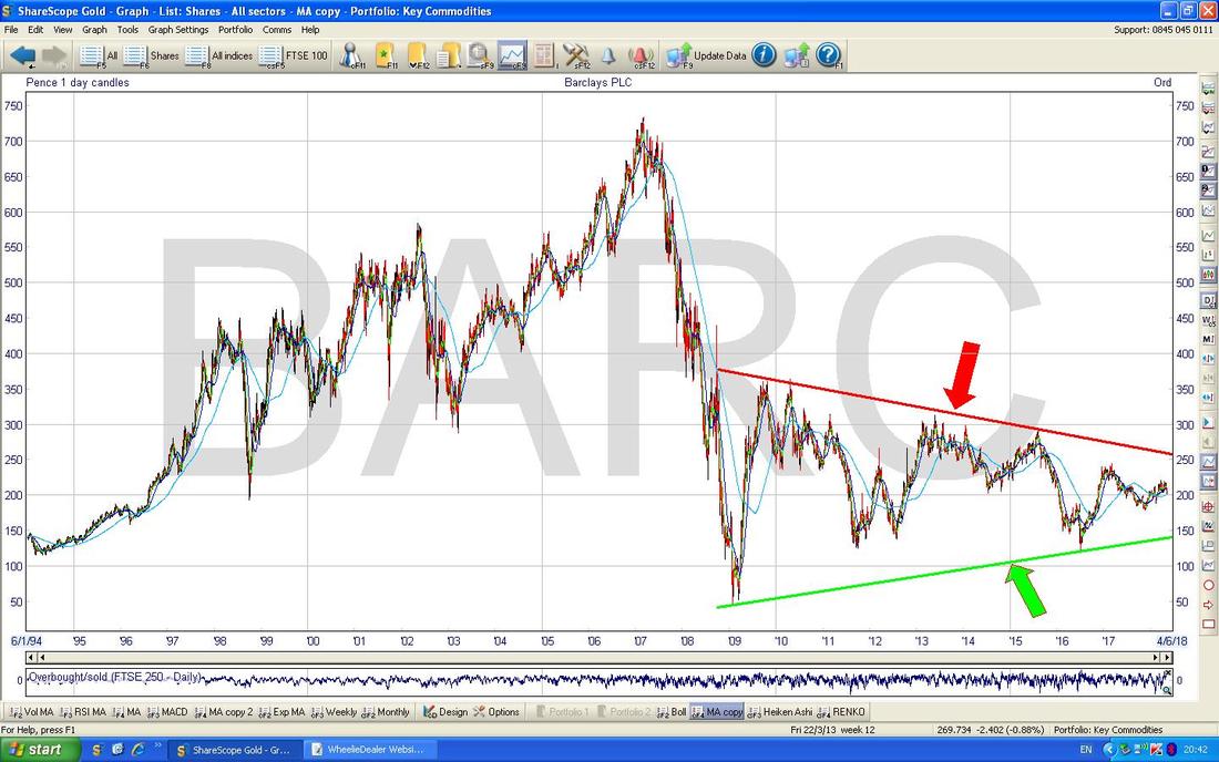
Diversified Gas & Oil DGOC
This is a Stock I have held for a while and with Oil a bit more perky (although it is worth appreciating that DGOC has more exposure to Natural Gas) and following on from a decent set of Results Last Week I am very happy with how things are going. The Chart below has all the history for DGOC so far and clearly it has a nice Uptrend. Like RDSB it goes Ex-Div on Thursday this coming Week. 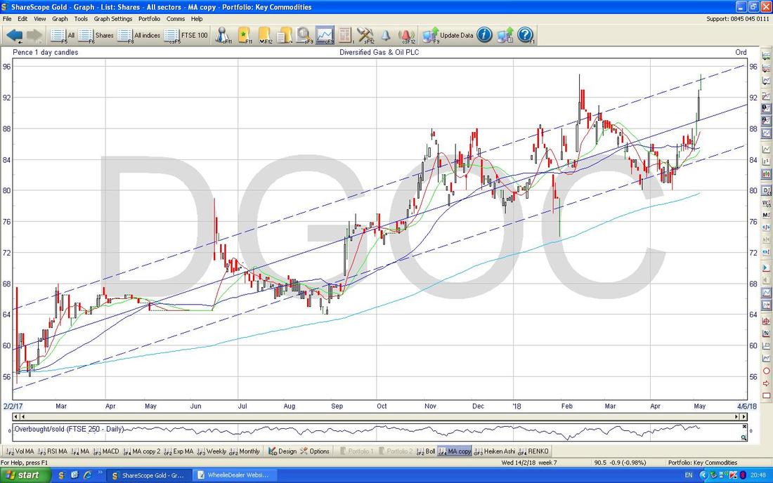
However, on my Chart below the Yellow Circle is pointing out how we had a ‘Gravestone Doji’ and it doesn’t take an IQ higher than Albert Einstein to realise that this might not be a good thing for Bulls. Having said that, DGOC is a small and Choppy Stock so the impact of such a Candle might not be as profound as it would be on a more Liquid Stock. Perhaps we will pull back a bit now but overall the Trend is clearly up and the imminent Ex-Div Day might help.
OK, I will leave it there - I need to get this Proof Read and Uploaded to the Website. I hope you all have a great Bank Holiday Monday and good luck for the coming Week. Cheers, WD 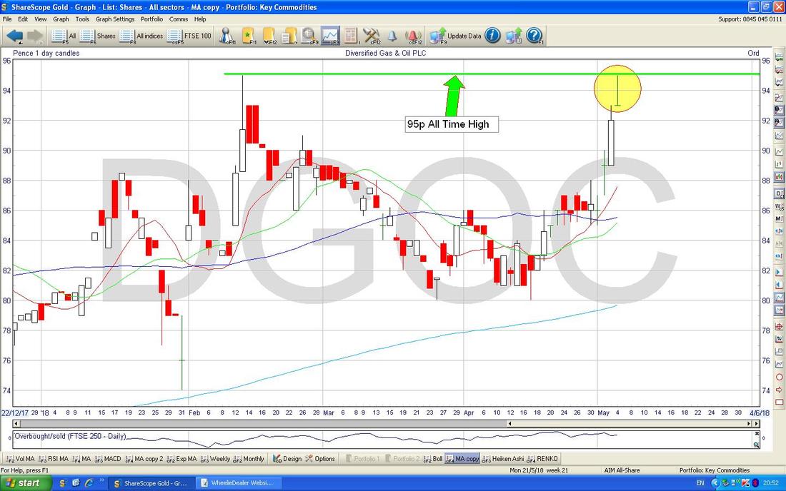
2 Comments
Jean black
6/5/2018 10:41:26 pm
Pleased ETO covered as was concerned over big sells0
WheelieDealer
9/5/2018 09:58:31 pm
Hi Jean, Leave a Reply. |
'Educational' WheelieBlogsWelcome to my Educational Blog Page - I have another 'Stocks & Markets' Blog Page which you can access via a Button on the top of the Homepage. Archives
January 2021
Categories
All
Please see the Full Range of Book Ideas in Wheelie's Bookshop.
|
