

|
educational blogs |
|
Unusually for me this year, I actually bought some Stocks earlier this week - I topped up on McCarthy & Stone MCS because it looks very good value to me as a Long Term play on the demand for Retirement Homes from an aging population; and I bought more Golden Prospect GPM which is a play on Gold and if anything says a lot more about how I feel about the Markets at the moment.
Gold can be very much viewed as a Hedge and a ‘safe haven’ type play and that is exactly what I feel is needed with the Markets like they are. We have had extended rises across pretty much all Indexes since the Brexit Vote and it looks very toppy now and it is simply a matter of time before we get a Pullback - and I want to increase my Shorts to capitalise on the Drop and to protect my Long Portfolio to some extent. I already have a fair chunk of Shorts which are very underwater at the moment and ideally I would like to ‘Average Up’ by opening more Shorts at these Higher Levels so that I can get back to breakeven or perhaps even Profit if I can get my timing right. However, so far in 2016 my timing has been abysmal so I will have my work cut out !!
As usual, let’s start with the UK Stockmarket Almanac 2016 and see how the coming Week shapes up.
Historical Undercurrents For the coming week (w/c Monday 1st August 2016), the FTSE100 is up for 71% of years and gives an Average Return of Positive 0.3% - so based on this we should have a reasonable week. Right, now let’s go through a few of the key Indexes and Oil and Gold as per normal: FTSE100 As is usual ‘Best Practice’ I want to look at the Big Picture first - the Chart below has the Daily Candlesticks for the FTSE100 going back for most of the Bull Market off the Credit Crunch Lows in 2009. I am showing this Chart because it has a very important Technical Principle which I have shown in previous weeks but I want to see where we are now and re-iterate what we need to watch out for. You should be able to see the 2 Parallel Red Lines that mark the Uptrend Channel of the Bull Market and notice how halfway through 2015 the Price fell out of the Uptrend Channel and we had the plunge which culminated with a visit down to 5499 in February 2016 - since that we have rallied strongly and my Black Arrow points to where we are now. The Key Thing here is that we have not yet got back up inside the Uptrend Channel (although of course it is still very possible that we can do this) and the Risk is that we keep rising up to the Bottom Red Line (marked with my Red Arrow) and rather than breaking through and getting back in the Uptrend Channel, we bounce down off the Red Line and the Price moves downwards again. Bearing in mind that we have had a strong run up since the Brexit Vote and that we are towards the tail end of Summer with the difficult Autumn months of September and October on the way, it seems likely to me that we will struggle to get back inside the Uptrend Channel. If we do not get a Pullback in the next few weeks, then maybe we will keep going slowly up through August but then hit the Bottom Line and bounce down in September (historically the worst month of the year). In terms of numbers, I think we can only be confident that the Downside Pressure is removed if we see the FTSE100 over the All Time High from 2015 which is 7122. Note, Oil has been weak recently but looks due a bounce - if we get this, it might support the FTSE100 due to its heavy weight to the Oil Stocks. 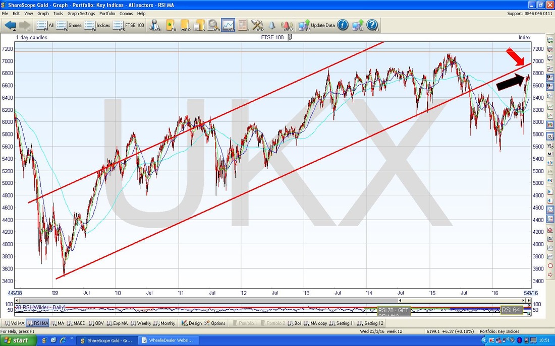
The Chart below zooms in to pretty much all of 2016 so far - note my Blue Uptrend Channel Lines which seem to be capturing the Uptrend since Feb pretty well - although I must admit that I slightly moved the Top Line upwards from where I had it in recent Weeks - but my amendment looks a fair change to make in my view (there is a risk of ‘line fitting’ when doing this sort of thing - i.e. a form of psychological Confirmation Bias - but my change is pretty slight).
It should be clear that the Price is hugging my Top Blue Line and if this Channel is to dominate the Price Action, they you would expect the Price to fall back a bit or perhaps to go Sideways for a while to enable it to come away from the Top Line and move more towards the Bottom Line of the Uptrend Channel. My Blue Text box marks the High from last week at 6780 which obviously needs to be taken out for the Price to go higher in the short term. 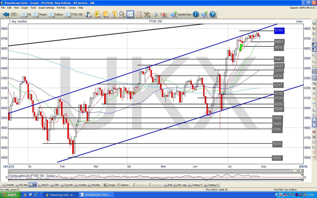
In the bottom window on the Chart below (as ever, all ScreenShots are captured from the wicked ShareScope Software which I use as my ‘Workbench’), we have the Relative Strength Index (RSI) for the FTSE100 Daily. We are currently reading about RSI 62 which is slightly down from the recent High but is still at quite an elevated level for the FTSE100. For many Assets the RSI often gets to RSI 70 or higher but the FTSE100 has been very constrained by the RSI 64 Level which I have marked with the Green Horizontal Line - this has capped gains for well over 2 years now. It is not impossible for the RSI to go up over 64, but this game is all about Probabilities and the strongest likelihood here now is that the RSI falls down from where it is now.
However, there is something important to understand here. The RSI can fall but the Price Line does not necessarily need to fall with it. We can get the RSI falling but the Price Line might just go Sideways to unwind the ‘Overbought’ condition - this is something to watch for. 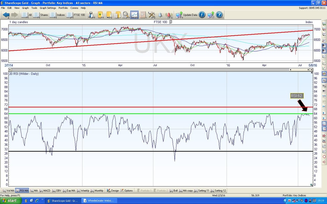
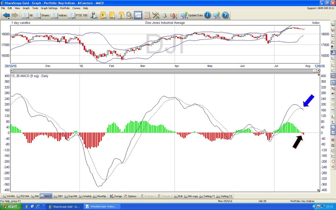
The Screen below in the bottom window has the MACD (Moving Average Convergence Divergence) for the FTSE100 Daily. Note how early last week we got treated to a Bearish MACD Cross - I have marked this with the Black Arrow on the ‘Signal Lines’ and I have pointed to the Red Histogram ‘hump’ which is starting to form up with my Blue Arrow. This suggests that we will see weakness in the FTSE100 Price Line although as with the RSI it is possible that we could go Sideways.

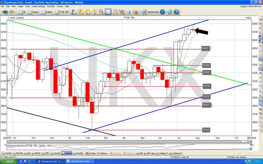
The Chart below has the Weekly Candles for the FTSE100. My Black Arrow is pointing to a Doji Candle which was generated last week and if anything this looks a bit like a ‘Shooting Star’ where the Body of the Candle is towards the bottom of the Range of the Week - if so, this is quite a Bearish looking Candle as these are a common Reversal Signal.
With July now complete, the Chart below has the Monthly Candlesticks for the FTSE100. My Yellow Circle highlights the July Candle and if anything, this looks pretty bullish and suggests to me that even if we get some wiggling around in August, the Trend is still upwards. Obviously you can see on this Chart how the All Time Highs up around 7122 are coming into play - this could be a difficult Resistance Area to get through. Maybe we can make more upwards progress in August but then face challenges in September and October. We shall see but for the August Candle we shouldn’t be surprised if we get a Reversal Signal.
As an aside, this Chart demonstrates one of the key powers of Candlesticks - they can work on any timeframe - Minutes, Hours, Days, Weeks, Months, Quarters, Years etc. 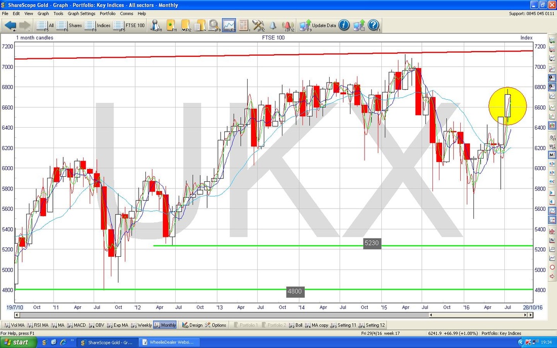
DAX (German)
I don’t always show the DAX on my Weekly trek around the Charts, but the DAX is doing some interesting Technical things that are worth being aware of and monitoring how it all progresses from here. My Chart below has the Long Term view and you should be able to see the Uptrend Channel between my Red and Black Lines (the lower Black Line being marked with my Black Arrow) and then I have put in a Blue Downtrend Line which I have marked with my Blue Arrow. The Price seems to be stuck inside the Triangle formed between the Blue Line and the Black Line - will it break to the upside and escape the Blue Line or will it break downwards and escape the Black Line? Only time will tell, but obviously if it breaks downwards this is very bad. 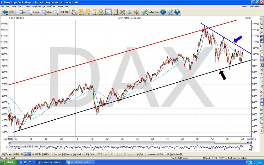
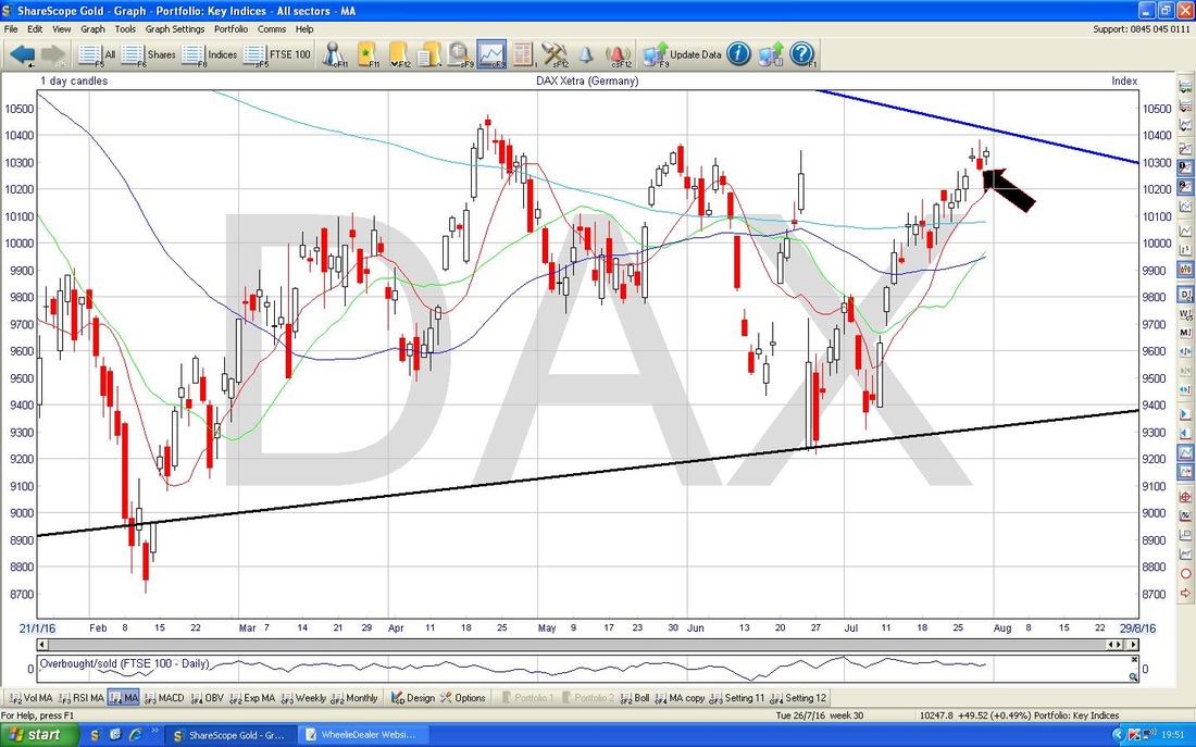
The Chart below has the Daily Candles for the DAX and I have zoomed in so we can clearly see what was going on last week. My Black Arrow points to an Inverted Hammer which was created on Thursday 28th July 2016 and it is possible that this is a Reversal Candle from which the Price will now move. The key is the Resistance Level at 10400 - to avoid the Price falling, we need to get over 10400. Note how we are very close to the Blue Downtrend Line from the previous Chart.
The bottom window in the Screen below has the MACD for the DAX Dailys - my Black Circle (first time I have used that - lovely ain’t it?) shows how the Green MACD ‘Hump’ is sort of curving down - these things are not conclusive, but as you can see from previous Humps, when they start turning like this, they tend to continue and go towards Red.
I haven’t included them here, but the Weekly and Monthly Candles for the DAX look pretty good - so maybe any pullback will only be very short term. 
DOW
The DOW has been doing interesting things - it seems to have turned down while the Nasdaq and S&P500 have kept rising or gone Sideways. This is unusual - normally all these Indexes are closely correlated but the DOW has only got 30 huge Companies so it is quite unrepresentative of US Companies or anything else for that matter. My Chart below has the Daily Candles for the DOW going back about 5 months ish. My Green Circle captures a ‘Narrow Body Doji’ from which the Price clearly turned down. The Black Horizontal Line at 18351 was the previous All Time High which was recently Broken-out over - it is likely that this acts as Support now - note how the Candles from the last 2 days both found Support at near this level intraday. 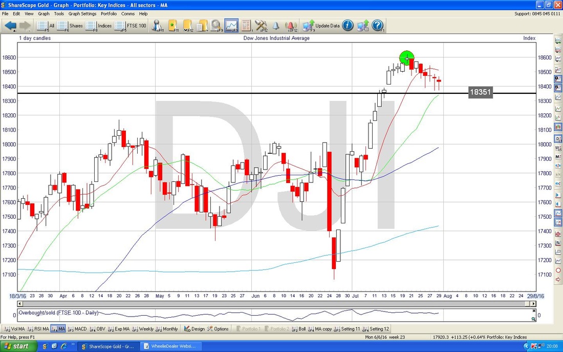
In the bottom window on the Chart below we have the MACD for the DOW. Note the Bearish MACD Crosses marked on the Signal Lines with my Blue Arrow and on the Humps with my Black Arrow.
The Screen below has the Weekly Candles for the DOW - if you saw my Update last week, you may remember the Yellow Circle which I suggested might mark a Doji which could be a Reversal Signal - in the event, it was such a thing and my Blue Arrow points to where we got a Down Candle last week. This Doji might now be a Pivot Point from which we see more falls.

S&P500
My Chart below has the Daily Candles for the S&P500 going back about 4 months. The things to note here are that the Price has broken out of the previous All Time High (ATH) at 2135 which should now act as Support if we do get a Pullback and also that the Price in recent Days has just gone Sideways - my Black Circle highlights this. 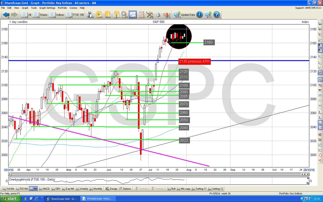
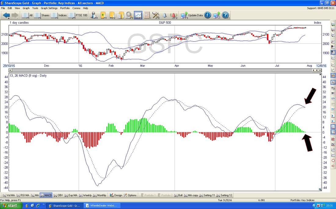
In the bottom window on the Screen below we have the MACD for the S&P500 - note how my Black Arrows are showing we are on the verge of a Bearish MACD Cross on both the Humps and the Signal Lines.
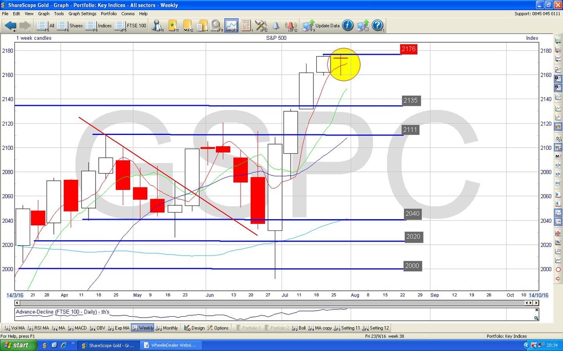
The Chart below has the Weekly Candles for the S&P500. Note my Yellow Circle which is showing a ‘Dragonfly’ type sort of Doji thing which could well be a Reversal Signal in the context of the recent run up.
Nasdaq 100
This is of particular interest to me because I have a small Short on it and I want to add more. On the screen below we have the Daily Candles for the Nasdaq 100 going back about 3 months ish. My Yellow Circle highlights a Doji Candle from Friday 29th July which might be a Reversal Signal after such a strong run up - at least it might just be showing that the power of the move up is waning. Note the previous All Time High at 4740 - on Friday it got just over this at 4743 intraday but couldn’t hold to the Close. 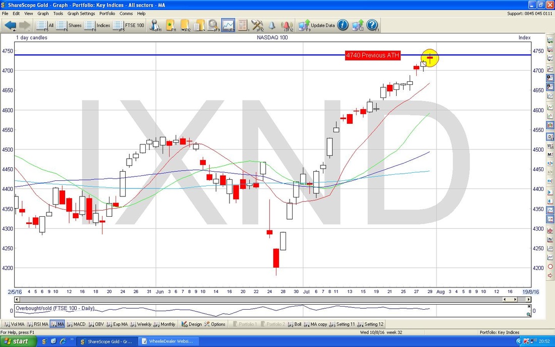
In the bottom window on the Screen below, we have the RSI for the Nasdaq 100 Daily - note it is up at RSI 67 which is a pretty high level and a Reversal is likely very soon on the Price Line. My Red Horizontal Line marks the RSI 70 level which is usually seen as ‘Overbought’ for most Assets.

VIX Volatility Index
In the bottom window of the Screen below we have the MACD for the VIX - note how my Blue Arrows are pointing to Bullish MACD Crosses - this suggests the VIX could move up now which would be negative for US Indexes (remember they have an Inverse Correlation), although the VIX could just go Sideways for a bit. However, we cut it, the VIX is very low - which usually predicts a rising VIX and trouble ahead. 
Brent Crude Oil
My Chart below has the Daily Candle for Brent going back about 5 months. The key things to appreciate here are how we were in an Uptrend for a while as marked by my Blue Parallel Lines and now we have gone into a Downtrend as marked by the Green Parallel Lines. My Yellow Circle has encapsulated 2 very interesting Candles which were produced at the end of last week. Firstly we were treated to a Hammer Candle which found Support at about $42.5 and then on Friday we got a normal Doji which found Support at about $42.5 also. It is highly likely that these 2 Candles are marking a Reversal and we could see a move up now. However, there is a lot of Resistance up above and even with a strong rebound I suspect we will struggle to see Brent Oil back up above my Upper Green Downtrend Channel Line which I have marked with the Green Arrow. Note also that the Support around $42.5 also coincides with the 200 Day Moving Average. 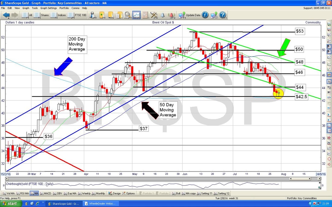
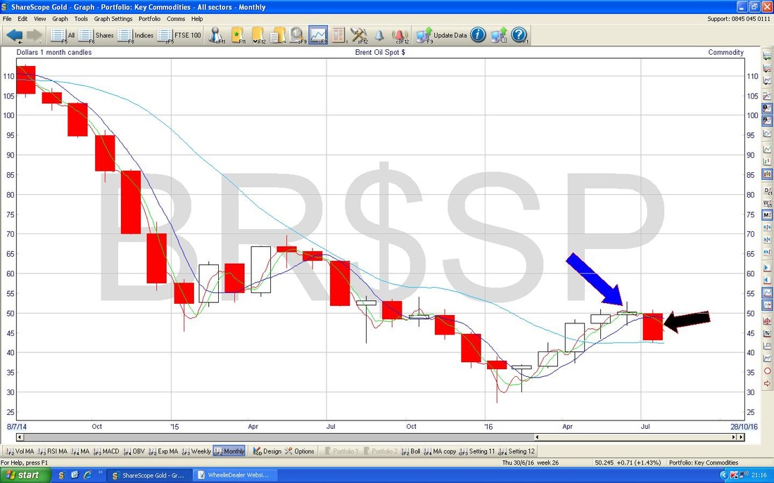
The screen below has the Monthly Candles for Brent Oil. In a recent Blog Update I pointed out with my Blue Arrow the Doji Candle which could have marked a Reversal Candle after the run up at that point. As it happens, my Black Arrow marks the Monthly Candle for July and we have a big Red Down Candle so clearly it has reversed downwards. This looks quite negative so don’t be surprised if we see more downside in August even if we get a Bounce in the short term.
Gold
Below we have the Daily Candles on Gold Spot (note the Gold Futures Charts are slightly different to this) going back for most of 2016. My Blue Arrow is pointing to an Up Candle from Friday and this looks pretty Bullish - particularly because it got over the Resistance around $1340. We need to crack $1375 to really see this thing fly. 
The bottom window on the screen below has the MACD for Gold Spot Daily - my Black Circle is pointing out how the Red MACD ‘Hump’ is heading towards Positive - this is very promising.
Right, let’s end on a high note !! Have a great week everyone, Cheers, WD. 
0 Comments
Leave a Reply. |
'Educational' WheelieBlogsWelcome to my Educational Blog Page - I have another 'Stocks & Markets' Blog Page which you can access via a Button on the top of the Homepage. Archives
January 2021
Categories
All
Please see the Full Range of Book Ideas in Wheelie's Bookshop.
|
