

|
educational blogs |
|
It is Saturday night and I am running really late after spending far too much time out in the Jardin De Wheelie clearly up the remains of my Vegetable production and with a particularly tedious emphasis on sorting out deceased Tomato Plants and their Pots - I am of course getting a bit twitchy that Winter Frosts are not far away and the last thing someone as stingy as myself wants to do is spend hard earned Quids on new Plastic Pots.
I am out socialising for most of tomorrow (Readers will be stunned to hear I am not expecting to be visiting a PUB) so it is a Saturday Night Special and I will try to rip through it quite quickly. There are some Stock Charts I want to visit and the Indexes strike me as being near some sort of Turning Point and I want to dig into this.
Last week was an absolute belter for me - I am over the Moon !! My Portfolio was up 2.0% which is massive for my fairly low risk and low activity motley collection of Stocks and I am particularly cheered by the fact I am just a shade off the High Point for 2017 which was where I was just at the start of Summer - so I really have got nowhere in particular since the Sun has been shining (although I did visit the PUB a few times).
On the Economic Front I don’t see much coming in the Week Ahead with various bits of the usual Economic Data being put out - if anything it is likely to show that the US and European Economies are growing fairly well and that the UK is faltering with the concerns around Brexit - obviously not helped by a chaotic Government and an intransigent and typically unreasonable EU. We can throw in concerns over Catalunya although I can’t see that coming to much seeing as only a small number of people took part in the ‘illegal’ Independence Vote and it is hard to see how the Leader of the Catalan Parliament can call a ‘Declaration of Independence’ that has any meaning if most of his Population don’t agree with it anyway. It seems likely there will be talks between the Catalans and the Madrid Spanish Government - this is unlikely to cause much trouble for Stocks. The US Non-Farm Payroll numbers from Friday were very weak but apparently this is down to the Hurricanes - however, we cut it, I suspect The Fed is unlikely to be raising Interest Rates fast and the current benign backdrop can continue. October can of course be a choppy and unpredictable month so we need to stay alert and I won’t be taking any chances - I am happy with the Long Positioning I have and although there are several Stocks that I would like to Buy, I am in no rush to do so. If anything, I am keeping an eye in particular on the S&P500 and I would probably Short it in a small way if I get the sense that we might be about to turn down. I will look at this Chart in a bit as it does seem very toppy. As I have mentioned many times before, I am probably a bit heavier on Spreadbet Exposure than I want to be and I will be looking to TopChop some Positions a little if I see the need to do so. I managed to do a fair bit on the Income Portfolio Blogs last night but there is still a lot of work to do. I am pretty sure it will be released in 4 Parts (at a stretch it might become 5) and I have 3 of them in good shape as Drafts but I want to do a decent Draft of the final Part before reading the whole lot together and doing any tweaks and adding bits I have missed out. I don’t think I will be able to start issuing it this Week but the Week after I expect to put Part 1 out. I am sure Readers will agree with me that it is better to do a complete and comprehensive job than to rush it and miss important bits out. I have several Blogs in various Draft states along with one I have been doing on a particular Stock. Needless to say since starting that one I have got very interested in a different Stock and I might end up writing a Blog on that one as well - we shall see. My expectation is that I will issue some sort of Blog during the Week ahead and I am aware that I have not updated the ‘Weekly Performance’ on the Homepage for a while. Sainsburys SBRY You might have noticed that I bought a Long Spreadbet on SBRY earlier in the Week in order to ‘Play the Range’. I already hold SBRY in my tedious Income Portfolio for the Dividend Yield and defensive nature of Supermarkets but I must say it is not a Stock I am hugely enamoured by - at some point I might kick it out of the Income Portfolio and replace it with something else but I never rush such momentous decisions. As always with my Income Portfolio Stocks, I like to sometimes use Spreadbets to put on Tactical Trades to take advantage of times when I think they might rise - because I hold 12 mainly Big Stocks in my Income Portfolio I am always looking at these every night on my ShareScope setup and I also look at them on my ADVFN app in line with the Blog I released during the Week (‘Reporting End of Day Numbers and the ADVFN App’), so I am pretty switched on to what the Charts are doing and I had noticed a while back that SBRY might be setting up for a nice little Long Trade. The Chart below shows SBRY Daily Candles over about the last 3 years - the obviously inference from this Chart is that it has been trading in a very disciplined and well behaved manner within a Sideways Range - which roughly runs between about 225p at the bottom and 280p at the top - as per my Parallel Black Lines. 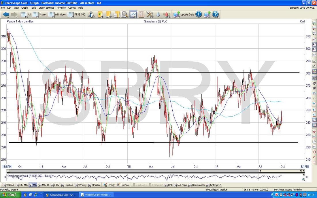
On the Chart below I have zoomed in to about the last 9 Months and the key thing to note here is the Red Line marked by my Red Arrow which was the Short Term Downtrend where the Price was dropping from the Top of the Range in the previous Chart down to the Bottom of the Range. My Yellow Circle highlights where the Price ‘walked out’ of the Red Line and this is the first hint that the Trend could be changing in the Short Term.
This is my ‘working’ screen and where it says “Tactical Short Term Spreadbet to trade the Range”, the Blue Horizontal Line just below marks the Level at which I opened my Spreadbet - so at the moment I am a bit underwater but I am not worried about this because I think it is just a small pullback before moving on up again. Note also that the Price at which I marked my Spreadbet Buy is slightly inaccurate because I used a Quarterly Spreadbet which has a Higher Price to Buy than the underlying Price in the real Cash Market - but I find this is a sensible way of recording things and tracking the Trade (obviously I have a Spreadsheet as well with all my Trades recorded on it - no doubt I will blog about this at some point in the future - but don’t hold your breath !! Thinking about it, if you want a Blank Template of my Spreadsheet then email me and I can send you a copy quite easily). When I draw the Blue Line which marks the Opening Level of my Trade, I tick the Box which says ‘Extend Forwards’ when I right click on the Line and choose the ‘Colour, Style and Settings Menu’ - then once I close the Trade, I will unclick this Box and draw the Line the appropriate length to when I closed it. Sometimes if I have a Target in mind and a Stoploss Level, I will draw these in as well with different Colours. The Pinky/Mauve sort of Horizontal Line just below at about 243p is where my Income Portfolio Holding was Opened - I have held this for years. In the Bottom Right Hand Corner you might notice that Interim Results are due on Wednesday 8th November - it is very possible that the Price moves up in advance of these and I think there is a yearly pattern for Supermarket Stocks to do quite well leading up to Xmas - so those more Fundamental elements might back up a nice looking Chart situation. 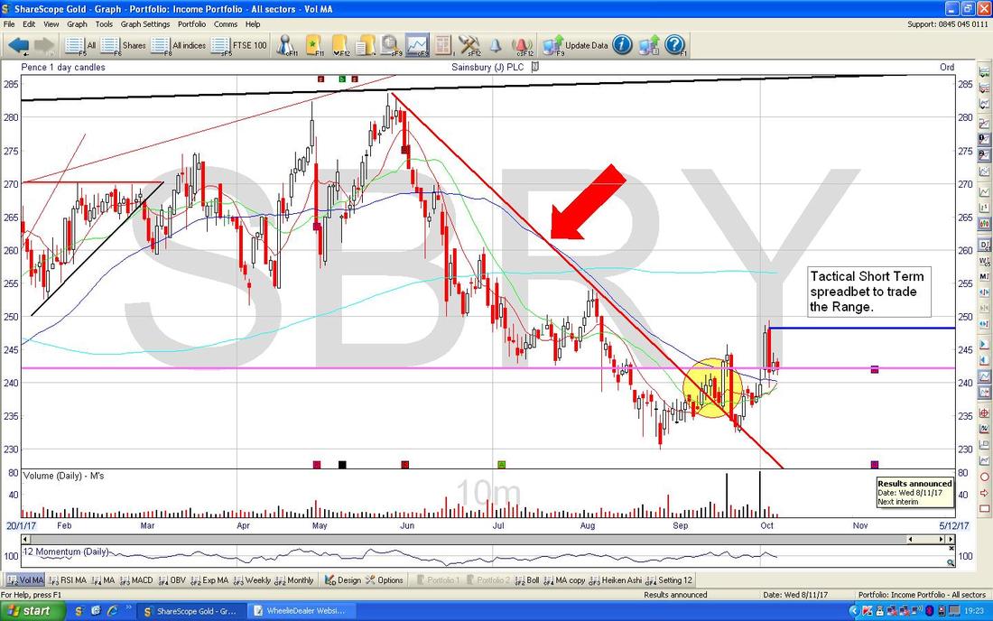
My Black Arrow on the Chart below is showing a lovely ‘Golden Cross’ where the Red Wavy Line 13 Day Exponential Moving Average has crossed over and above the Red 21 Day EMA Line - this is good news and usually implies a few Weeks of gains to come unless the instrument you are Charting is a choppy little b*gger.
Motif Bio MTFB
I don’t hold this Stock myself (far too exciting !!) but I know a lot of People on the Tweets do and there was much frivolity this week when they announced some good news on the Approval side for some concoction they have knocked up. I had a look at the Chart on my tiny Fone screen and I thought it looked quite interesting so I decided to chuck it in with the Weekend Charts. First off we will look at the ‘Big Picture’ which is always the way we should start ‘analysing’ (if you can call it that LOL) any Chart that we are new to, and the ScreenShot below has the Full History of MTFB going back around 2 Years since the IPO. First off note the Red Line at the Top marked by my Red Arrow - this is obvious Resistance and the Price needs to Breakout through this Line if Bulls are going to have reason to get really excited. Next up look at the Big Pink Rectangle in the Top Left Hand Corner of the Chart - this marks a Zone of Resistance from about 55p up to 75p - and this needs to be waded through for the Price to be able to Breakout to new All Time Highs up above 75p - this is what Bulls really want, as once it can Breakout into ‘Blue Sky’ territory there is nothing to hold it back. With the current Chart situation, there are a lot of Levels above where Bears and Weak Holders will be selling. Down in the Bottom Right Hand Corner of the Screen we have a Black Line (marked by my Black Arrow) which is a nice Uptrend Support Line that is quite well established - if the Price falls, this should be a Level that kicks in to halt the slide and it could be a good Level to be Buying at for People who want to go Long. 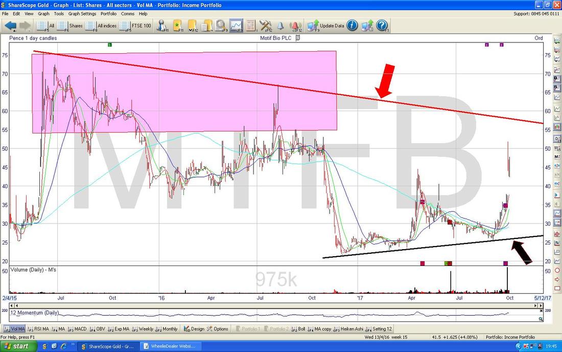
On the Chart below I have zoomed in and now we have the last 8 months or so. The Black Line (with the Black Arrow) is the same line as from the previous Chart. My Huge Green Arrow is pointing to a ‘Shooting Star’/’Inverted Hammer’ type of Daily Candle which was produced on Wednesday 4th October when the Good News on the Approvals was announced - note the Price was unable to hold the Intraday High up at nearly 52p and this is not a good sign; the 52p Level will now hang over this Chart as Resistance and that will be a key Level for the Bulls to get the Price up above.
On Thursday and Friday after this the Price moved around in a Sideways manner which shows neither the Bulls nor the Bears were really in charge. However, the thing to note here is the ‘Gap’ marked by my Red Arrows - “Nature considerably takes a dislike to a Vacuum cleaner” and all that and it is highly likely that the Price drops back to fill the Gap - down to about 37p ish. This will be more than likely if there is no more Good News in coming Weeks - People are incredibly impatient and they get bored so easily and will probably sell out if nothing much happens soon. Yes, this is remarkably silly behaviour if the Stock is a good one and I have no doubt that taking a Long Term View on Quality Stocks and having immense Patience is a simple way to get an effective and enduring ‘Edge’. Having said that, I do not know enough about MTFB to know whether or not it would qualify as a ‘Quality Stock’ and this is not the kind of thing I buy as I see it as very high risk. In the middle of the Chart you might see a Yellow Circle - this is marking a ‘Golden Cross’ between the Darker Blue 50 Day Moving Average and the Lighter Blue 200 Day Moving Average - these are my favourite Crosses and when you get these it is usually good news (having said that, in this particular instance the Price continued to fall for a long time after the Golden Cross). Where my Blue Arrow is note that the Darker Blue 50 Day MA has narrowly missed crossing Down and Below the Lighter Blue 200 Day MA and doing a ‘Death Cross’ - it is obviously very positive to have avoided this. 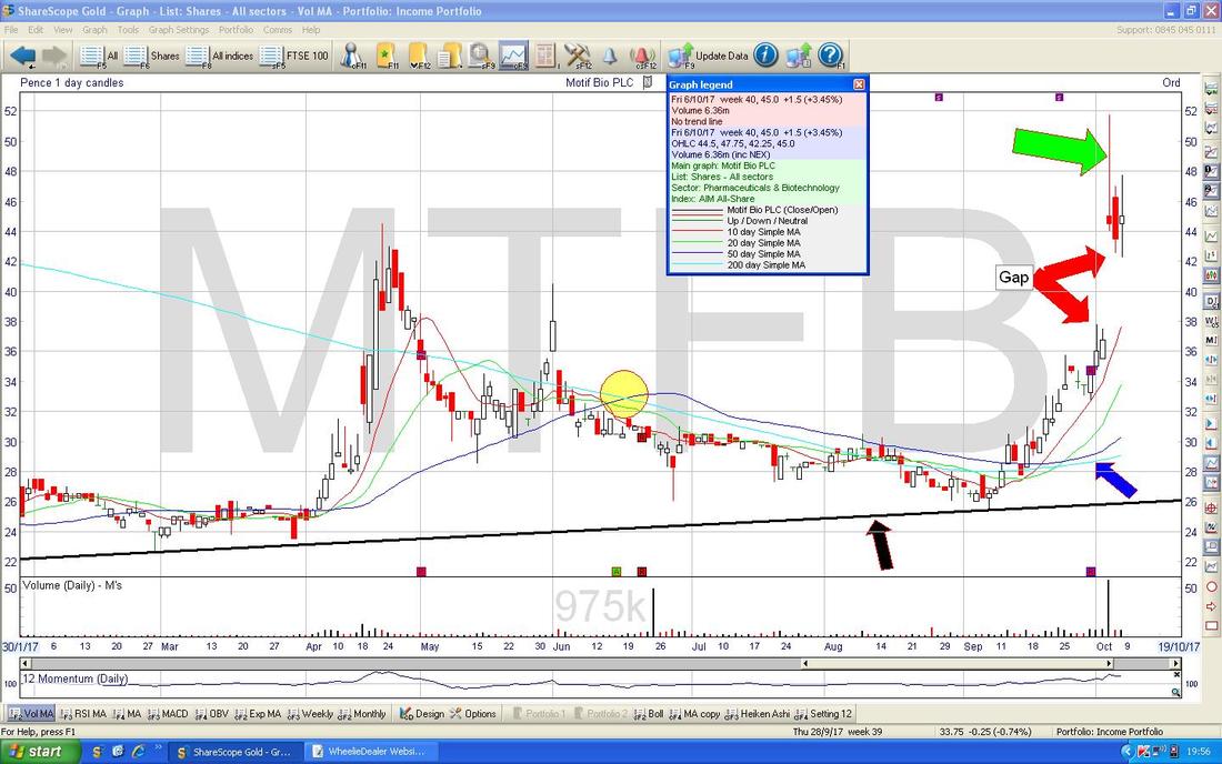
NAHL Group NAH
This one looks an interesting Chart so I thought I would lob it in. I don’t know a huge amount about the Business but I know they do the ‘National Accident Helpline’ thing and are to do with Insurance Services like Car Lending etc. Anyway, it might be worth investigating because it is on a Forward P/E of 7.8 and a Forward Divvy Yield of 8.7% - which are very attractive Metrics if the Quality of the Business stacks up. As usual, here is the ‘Big Picture’. This goes back about 3.5 Years and the Key thing here is the Red Downtrend Line marked by my Red Arrow and note how the Price has walked out of this Line where my Yellow Circle is - that’s good. Note also the Box at the Top of the Screen which talks about ‘Director Purchases’ - it says “and other director purchases” - seeing as these were at about 140p it might be worth looking closer at the details of these transactions. 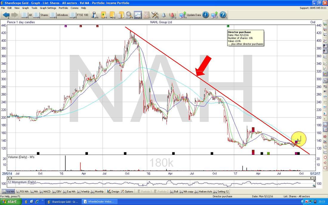
On the Chart below I have zoomed in and you should still be able to see the Red Downtrend Line (Red Arrow) and clearly where it broke out. Next look at the Blue Arrows - these are marking the 50 and 200 Day Moving Averages and look at how they are converging - I expect this will do a Bullish ‘Golden Cross’ at some point during the next few weeks.
My Narrow Green Rectangle is capturing a Big White Up Candle from Friday - this is obviously Bullish although note there was not much Volume (bottom of Screen) so chances are it might ease back a bit which would mean Buyers can get a more attractive Price - but the Stock looks very good here - so there is a danger that if Buyers hesitate they will miss out and it could run away from them. 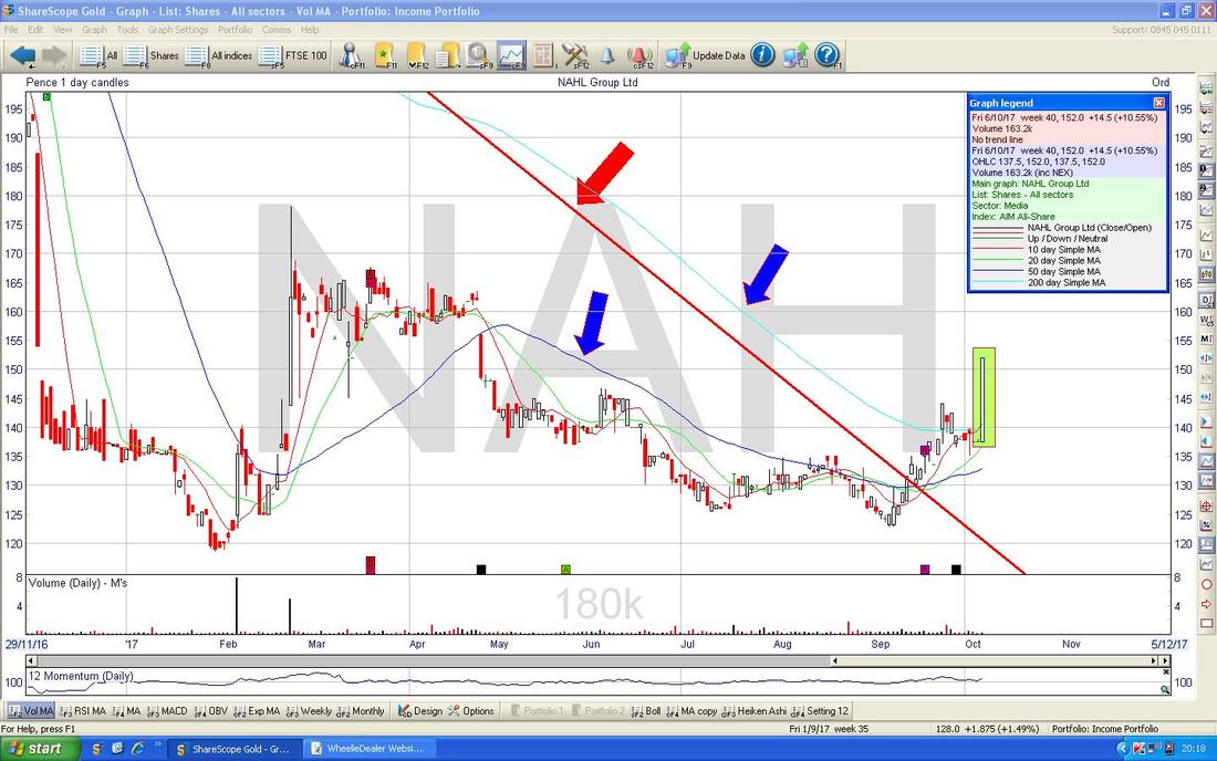
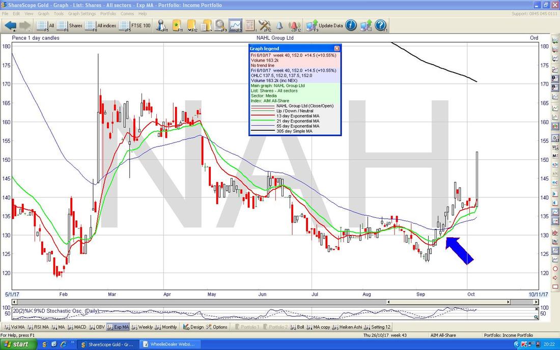
Where my Blue Arrow is on the Screen below, note the 13/21 Day EMA Golden Cross between the Red and Green Lines - nice.
Oh dear, I got rather waylaid - time was short and I just spent 1.5 Hours watching a Documentary on XTC on Sky Arts - being a Swindon Boy this was fascinating !! Quite surprised how little I know about them - although not a huge surprise cos they only had a few Hits (‘Making Plans for Nigel’ and ‘Senses working overtime’ particularly) - but it looks like within the Music Industry they were really influential - arguably leading the way for Brit Pop with ‘The Dukes of Stratospheare’.
S&P500 Last week the US Indexes were continually making new All Time Highs and this is the real story here - such behaviour is really bullish. The Chart below is actually one of my ‘working’ screens and the Yellow Circle is marking where I had placed a Short Position (the Blue Line) which had got ‘Stopped Out’ (in fact it didn’t quite hit my Stop and I closed it out early because I thought the move down was turning very quickly) - the Stop was the Horizontal sort of Mauve/Pink Line. Up above that my Pink Circle is capturing a White Up Candle from Thursday which was then followed by a smaller Candle on Friday ‘Inside’ the Candle from Thursday. This is an ‘Inside Day’ setup and we need a 3rd Candle to get the completed pattern - if we get a Down Day then there is likely to be more falls and if we get an Up Day, then it should keep rising. 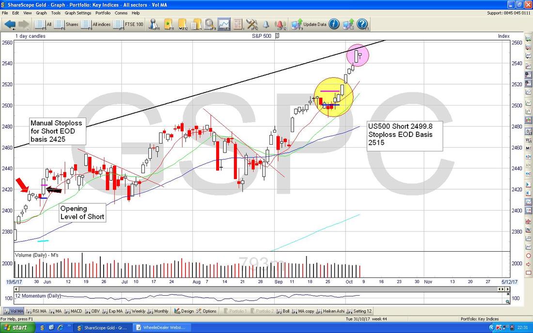
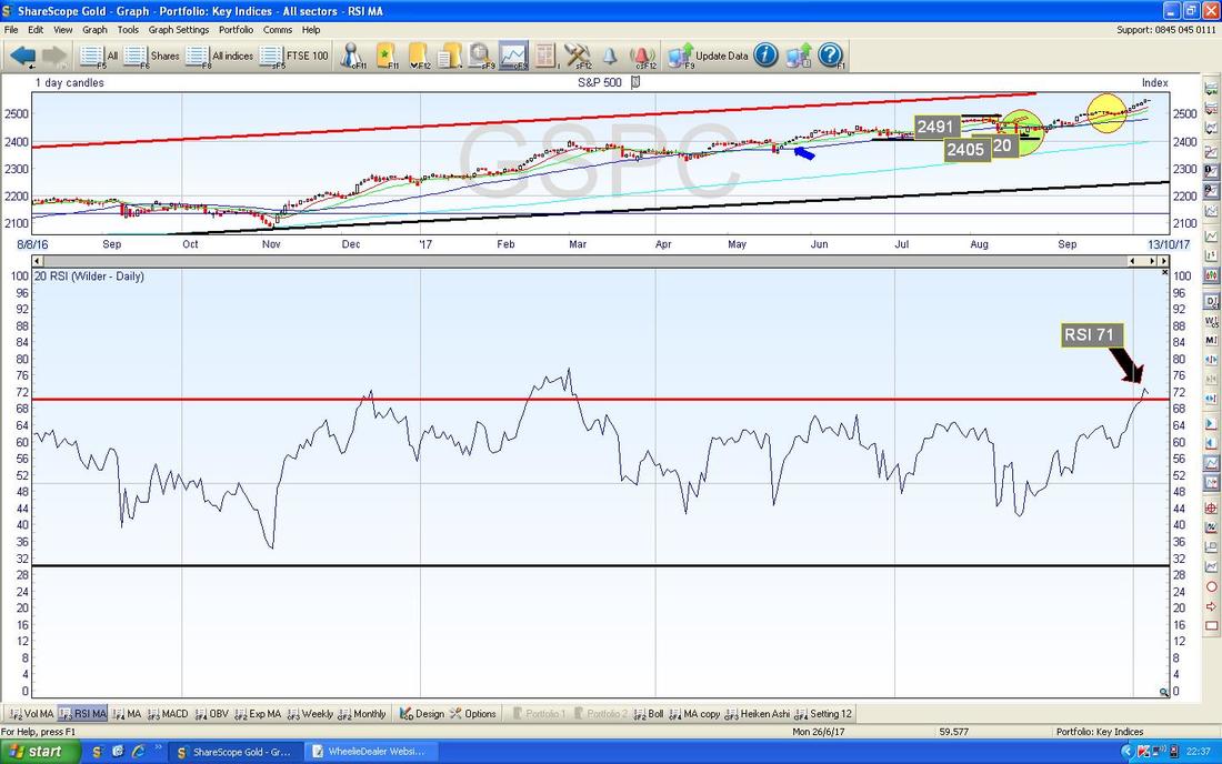
The Screen below is one which suggests falls are likely now - the RSI (Relative Strength Index) in the bottom window on a Reading of RSI 71 is very high and it looks like turning down.
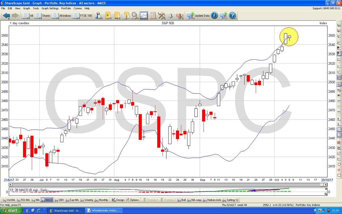
On the screen below my Yellow Circle is highlighting where the Candles of the last 2 days are right up at the Top Bollinger Band (the Blue Wiggly Line) and this looks pretty high. Of course the Price could continue to rise and keep ‘hugging’ the Band but it seems likely to me that we will see some sort of Pullback or at best go sideways.
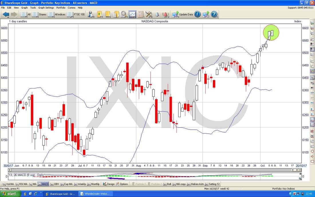
Nasdaq Composite (US Tech)
With the S&P500 looking pretty Overbought on the RSI Reading, I am quite surprised that the Nasdaq Comp is not quite as bad. On a reading of RSI 67 as per the Chart below, there is certainly scope for the Nasdaq to rise a bit more before turning down. Tech has been super-strong this Year so it would not surprise me if it does go higher. 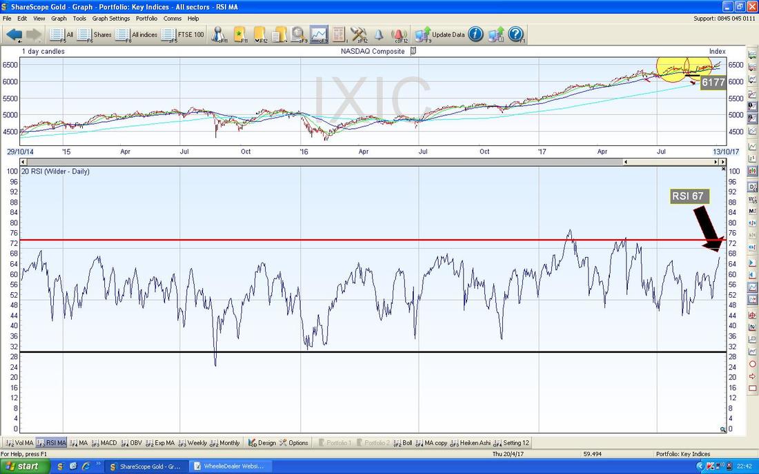
However, despite the RSI not looking too stretched, when we look at the Bollinger Bands below for the Nasdaq Comp on the Daily, my Green Circle is pointing out how the Candles from the last 2 days are ‘Outside’ the Upper Band - this is unstable and the Price needs to get back inside the Bands - that means a drop or sideways.
Dow Jones Industrials Index (The DOW)
It’s quite a similar picture to the S&P500 but more Overbought - as you can see on a Reading of RSI 74 this is very high. 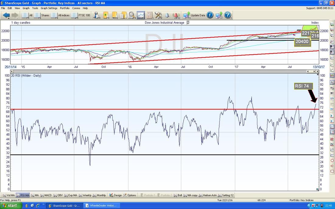
DAX 30 (Germany)
The DAX broke through the Previous All Time High at 12952 last week but clearly it didn’t push through with any welly and was a bit more like a feeble trip over the line. My Black Arrow is pointing at a Small Red Down Candle from Friday and this suggests to me that it might drop back soon. I would like a proper and forceful ‘Breakout’ here which would be a good Long Buy Signal but I am not seeing it yet. With a pretty amazing run of Up Days in the last couple of Weeks (this is a factor in the US also), this looks rather too ‘Hot’ in the Short Term and it probably needs to calm down a bit. 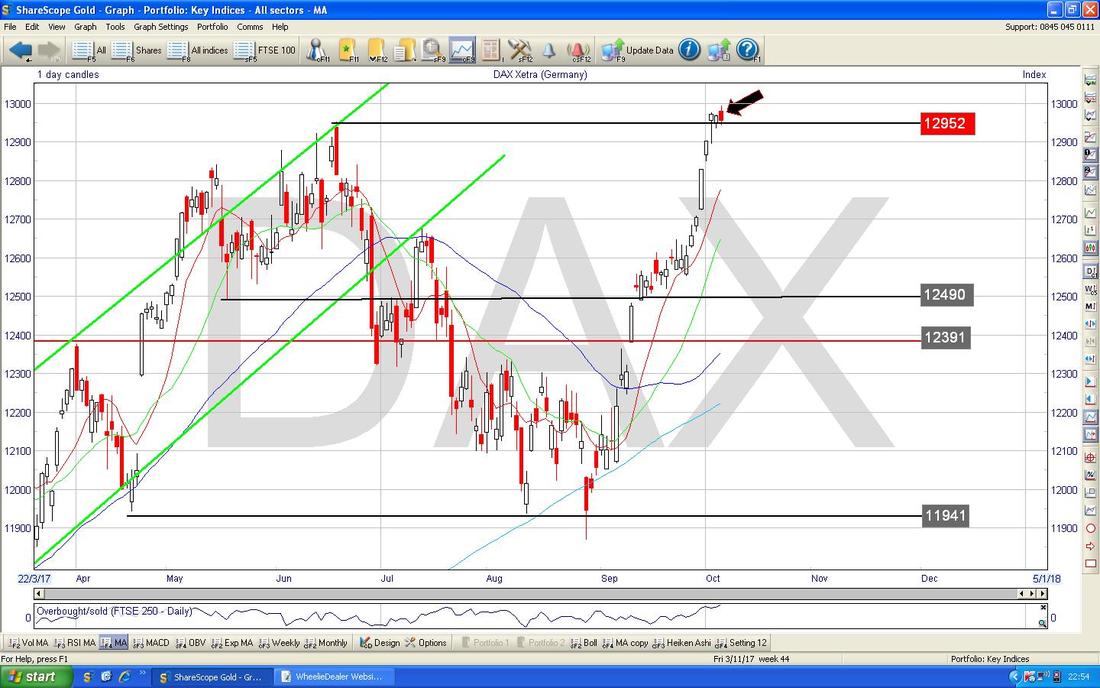
The RSI in the bottom window below backs up what I just said above. On a Reading of RSI 73 and looking to have turned down, this seems to suggest more falls to come now.
Note - as always, if you click on the Chart it should get bigger in your Browser and be more visible. 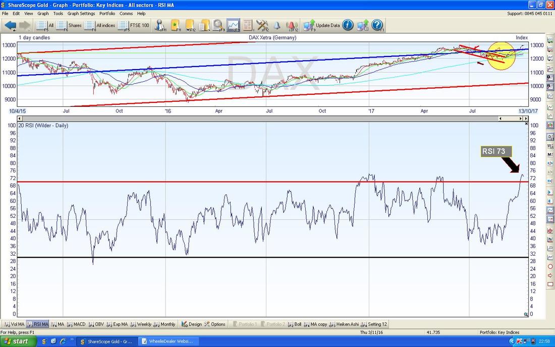
FTSE100
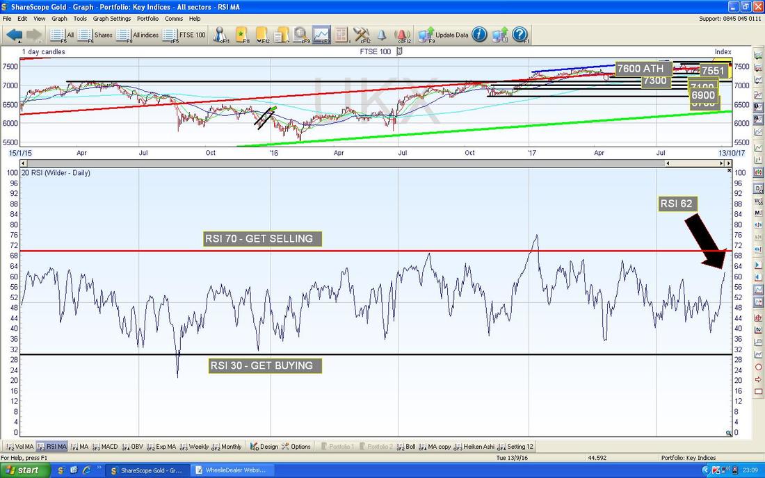
My Yellow Circle on the Chart below is highlighting a Small White Up Candle from Friday - note how we had a strong run of Up Days last week - this looks difficult to sustain. Up above there is immediate Resistance at 7551 and if this level can be cracked, then we move on to the All Time High at 7600 - that will probably be difficult but a Breakout over this with some oomph would be Bullish (and just imagine, this might bring 8000 into our Sights !!). Note that the Candle is now up above my Long Term Uptrend Channel Bottom Line which is marked with the Red Arrow. That is a positive development but it needs to stay above this line or otherwise we will keep grinding Sideways or drop back. Note the Blue Line marked by my Blue Arrow which is the 50 Day Moving Average got quite near to crossing down through the Lighter Blue Line which is the 200 Day Moving Average (marked by my Black Arrow). Such a Cross would be a Bearish ‘Death Cross’ and it is very important for Bulls that we avoid this - so far it looks like it might be avoided. On another positive note, there is a lot of Support down below now which could make a sharp drop quite unlikely because Buyers are likely to come in at various Levels not far below. 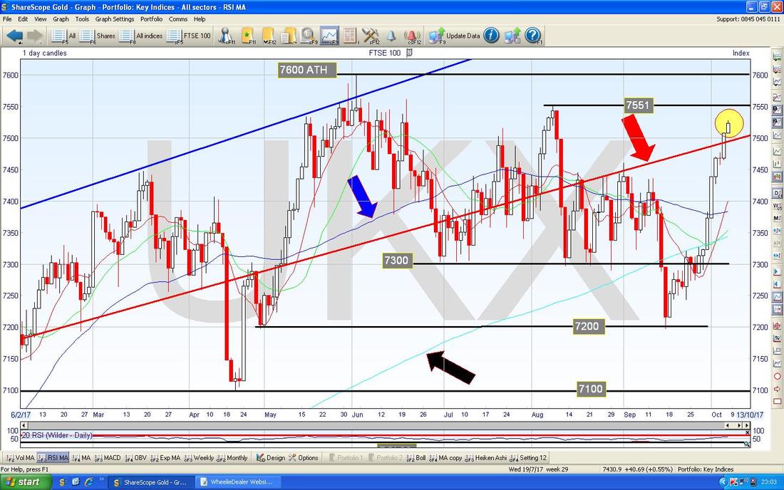
I am quite surprised by this one. With such a strong run up on the previous Chart, I thought the RSI would be very high. However, on a Reading of RSI 62 it is not all that bad and I wouldn’t say this was Overbought at all.
FTSE250
The 2 Pink Circles on the Chart below are trying to show where there was a bit of a Bearish ‘Double Top’ going on with the FTSE250. My Green Circle however is showing where the White Up Candles of last week broke above these Pink Circles - that’s bullish (although it does look a bit ‘stretched’). 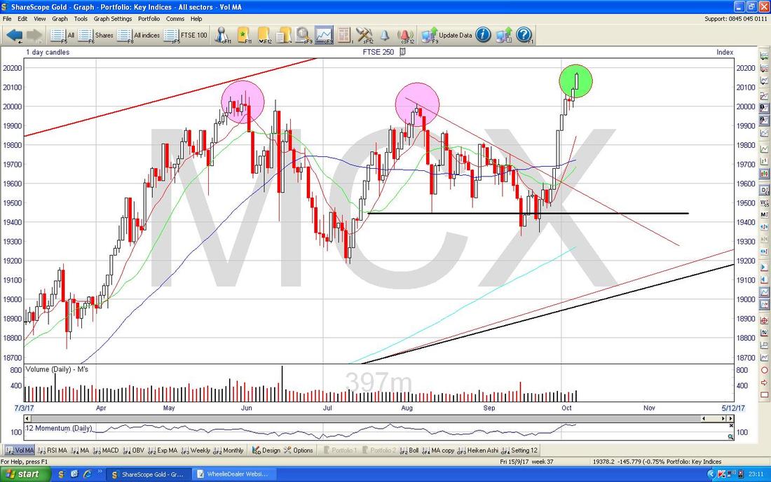
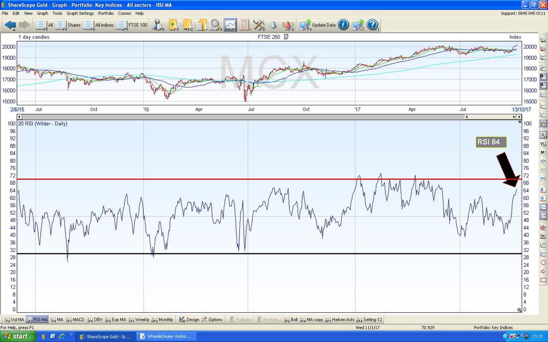
A reading of RSI 64 for the FTSE250 doesn’t look particularly overbought though - look to the Left and see how it has often been quite a bit higher than this.
Gold (Spot)
After the recent Breakout of the Long Term Downtrend Line, Gold Spot managed to move up to a peak at $1358 but since then it has just been relentlessly falling - as per my Pink Rectangle below. Where my Yellow Circle is there is a bit of a Hammer Candle from Friday so maybe this is a Reversal and we can now see some improvement. Support at $1260 is obviously very important now. 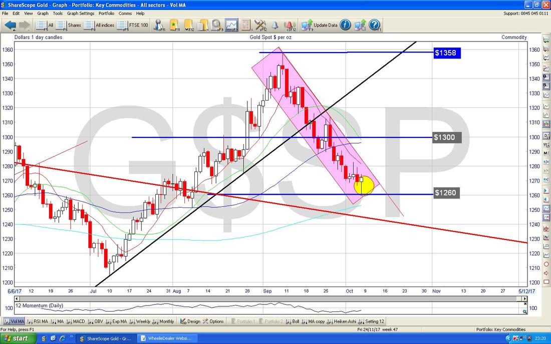
This is quite interesting - Gold Spot on the Daily is now on an RSI of 43 which is quite Low but what I notice here is that the RSI Line has sort of started to turn up - maybe that is showing the falls are ending.
OK, I have timed out. Need to proof check and do the Upload to the Website. Good Luck for the week ahead, Cheers, WD. 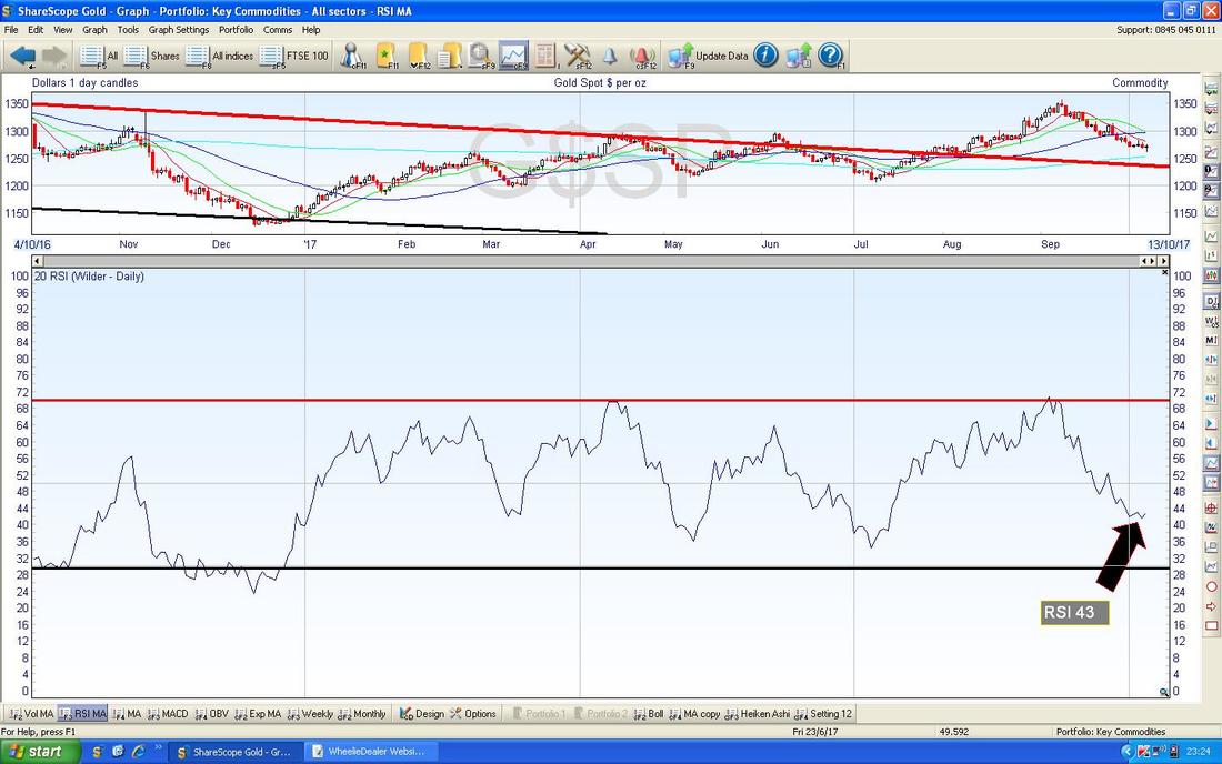
4 Comments
Damo
8/10/2017 01:37:17 pm
Nice one Pete , Got out of SBRY a while ago ( bored ) but seeing from your chart perspective I might revisit. Also liking the gold chart for a dabble too.
WheelieDealer
10/10/2017 12:20:36 am
Hi Damo,
Mr catflap
8/10/2017 09:05:06 pm
Thanks for the update and charts. I had SBRY pop up on my radar too this week; I thought it was looking perky. However im a little spooked by Short Interest suddenly spiking from 6% to almost 11%. Not sure what to make of that!
WheelieDealer
10/10/2017 12:23:17 am
Hi Mr catflap, Leave a Reply. |
'Educational' WheelieBlogsWelcome to my Educational Blog Page - I have another 'Stocks & Markets' Blog Page which you can access via a Button on the top of the Homepage. Archives
January 2021
Categories
All
Please see the Full Range of Book Ideas in Wheelie's Bookshop.
|
