

|
educational blogs |
|
The sharp-eyed among Readers may have spotted I bought more GlaxoSmithkline GSK this morning via a Spreadbet at 1488p adding to a Position I already hold in my Income Portfolio as normal Shares. My intention at the moment is that if the Buy goes ok, I will probably close out the Spreadbet once I am happy with any gain and I feel that it is likely to drop but I will give it time and I will keep the Shares in the Income Portfolio.
This won’t be a long blog, I just want to point out the Triggers that made me decide to buy more GSK - I have been watching this drop for Weeks and I have been looking for decent Technical Signals that it is time to make a move on them.
Fundamentals
I won’t go into what GSK does - I am sure most Readers have come across them before (they are one of the biggest Companies in the FTSE100) and as a Major Pharmaceutical Business I see them as pretty solid and steady and therefore relatively low risk. If you look in the Top Right Hand Corner of the ShareScope ‘Details’ Screenshot below, you should see ‘Norm EPS (p)’ for ‘Dec 2017 Forecast’ of 102.30. Note, all Screens I show in this Blog are exactly as they confronted me on the Night of Tuesday 13th December which is when I made my Decision to buy more GSK. Regular Readers will most likely be aware that I like to make all my Trading Decisions out of Market Hours because I find that during the day when Markets are whizzing around, my emotions and therefore the quality of my Decision making can be badly affected - so I make the Decision at Night and I write myself ‘Buy or Sell Instructions’ which I then execute the next day - usually fairly early in the morning because I just want to get them done. On this Forecast EPS figure, this gives a Forward P/E Ratio of 14.5 on my Buy Price of 1488p (1488 divided by 102.3). That seems a reasonable Valuation for such quality. If you look further down on the ShareScope ‘Details’ screen below, you can see the ‘Div yield (ye)’ is 5.33% for each of 2016, 2017, 2018 at Tuesday’s Price of 1500p - at my Buy Price of 1488p the Divvy Yield will be a fraction higher. This chunky and reliable Divvy Yield is a key part of my Rationale for Buying more GSK - with a Yield so high it is very likely that this will help put a Floor under the Price and this is backed up by the Charts which are coming further down regarding the technicals. People talk about Support Levels all of the time, but I also like to think of a certain level of Divvy giving an element of Support to a price - at such a level Income Buyers are keen to snap them up - it is ‘Dividend Support’ in my view. With Interest Rates rising most likely in 2017 all around the World (but probably at a slow pace), Investors will be demanding higher Yields from Stocks but I think 5.33% will be high enough to attract Buyers - it is still way higher than most other Assets will deliver. 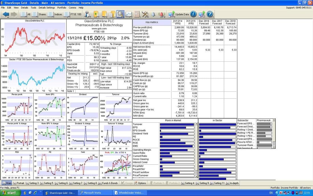
Chart stuff
The Chart below has the Daily Candles for GSK going back about 5 months ish. Note my Blue Parallel Lines which are showing a Downtrend Channel which has been in force on GSK for about 2.5 months now - so it is quite long in the tooth. My Black Arrow right at the bottom is showing a Hammer Candle which was generated about 5 days ago - it looks like the Price has turned up off this Hammer as you would expect. My Green Arrow is pointing to a Strong Up Candle which was produced on Tuesday 13th December and it looks very near breaking out of the Downtrend Channel - really patient Investors would wait for a cleaner ‘Breakout’ but I was happy to go early because other Technical Signs look good as we will see in a bit. My Blue Arrows are pointing at the Darker Blue Wavy Line 50 Day Moving Average and the Lighter Blue Wavy Line 200 Day Moving Average - these look like setting up a Bearish ‘Death Cross’ which is not so good - however, I have seen on many Charts how you can get such a Cross but it lags what is happening to the Price - so we could get a good move up before perhaps dropping back again. 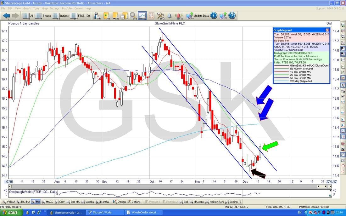
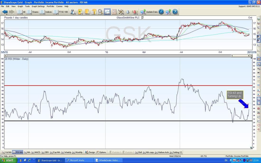
In the bottom window below we have the RSI (Relative Strength Index) for GSK Daily Chart - with a reading of RSI 43 and moving up from as low as RSI 30 this looks pretty good.
The screen below has the Bollinger Bands for GSK around the Daily Candles going back for most of 2016. My Yellow Circle is highlighting how the Price is moving up off the Bottom Band and it looks like it can go a bit higher before reaching the Upper Band.
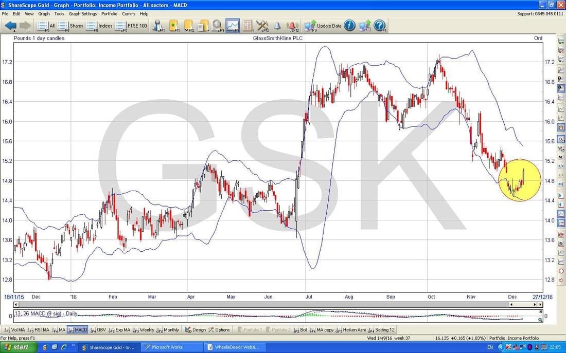
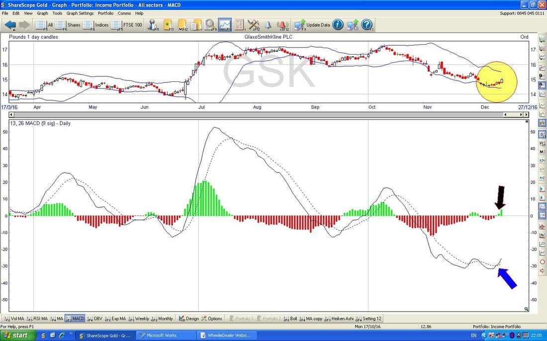
In the bottom window below we have the MACD (Moving Average Convergence Divergence) and there has been a Bullish MACD Cross about 3 days ago - this is shown in the Signal Lines format with my Blue Arrow and as the Histograms with my Black Arrow.
Ooooooo look !! We got them Heiken Ashi Candle things again. My Green Arrow is showing a Bullish looking Candle which follows the smaller Candles which were hinting at the end of the move Down with all those Red Candles and my Blue Arrow is pointing to where this change from Red to White Candles was taking place (note how the Candles went narrow and then widened out again). Note, on the Candle my Green Arrow is pointing to we have a long ‘Wick’ up above - with normal Candlesticks this would be perhaps a bad sign but with Heiken Ashi Candles this is good and suggests more gains to come.
Right, that’s it - I said it was short. Just for an idea of my current thoughts, from looking at the Charts I would expect we can see 1600p fairly soon and perhaps we can get as high as 1700p over time - so plenty to go for. Cheers, WD. 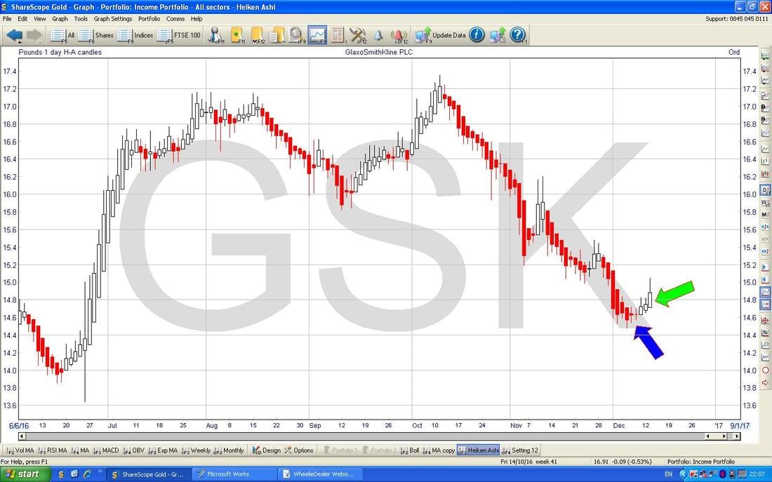
0 Comments
Leave a Reply. |
'Educational' WheelieBlogsWelcome to my Educational Blog Page - I have another 'Stocks & Markets' Blog Page which you can access via a Button on the top of the Homepage. Archives
January 2021
Categories
All
Please see the Full Range of Book Ideas in Wheelie's Bookshop.
|
