

|
educational blogs |
|
I’ve got Robin Gibb on in the background so this Blog could be a bit funky. Lucky I didn’t do it last night when the Foos were on is it could well have got rather rocky. So far I have not seen much that really grabbed me from Glasto but of course the Foos were outstanding - I have seen them 6 times and I think it is difficult (or impossible) to find a better live Band.
It really feels to me like we are in the Dog Days of Summer - for the last couple of weeks there has not been much Company News around and there just seems to be no ‘buzz’ around the Markets; the old saying “Sell in May and go away………” has certainly played out so far this year and it is worth noting that 2017 has been a ‘Textbook’ year in that so far it has exactly followed the usual Seasonal and Monthly patterns - despite all the Political shenanigans.
On that vein, June has felt quite painful to me but to keep things in context the Indexes are barely off their All Time Highs and my own Portfolio despite going nowhere through June is only down about 1.5% if that from its High Point - and that sort of move can occur in just a few days anyway. We are right at the tail end of June so hopefully we will soon be in a more favourable Market as July tends to be better and August does also - but September is the one that often causes trouble and is officially the ‘Worst Month of the Year’.
Next week we have got the Queen’s Speech Vote - I think it is Thursday. It is highly unlikely that the Tories lose and Jezza ‘Glasto’ Corbyn gets asked my The Queen to try to form a government, but it is something that would terrify the Markets I suspect. A couple of Housekeeping things - firstly don’t forget ‘Wheelie’s Summer Bash’ which is taking place on Saturday 23rd September in the Windsor area (Venue to be confirmed) and there are more details on the Homepage - if you want to come along (and EVERYONE is invited), then please Email me, Tweet me, or DM me or whatever just so I know a rough idea of the numbers. The next thing is a reminder about the Video Interviews I recorded with www.financial-spread-betting.com which went live last week - they are all on YouTube and the clever chaps (and chapesses) there edited the 3 hours of recording we did into loads and loads of short 6 minute or so Videos - I am sure you will like it - the feedback so far has been immensely positive and I am really pleased with the results because I extol a lot of the Concepts I have written about over and over but in this format it seems to get the emphasis across very well. If you go to the Homepage there is a Link to where you can find the Videos - enjoy !! Let’s start with some Stocks……… Utilitywise UTW I hold UTW and it has been immensely frustrating - particularly after the last Trading Update where I was expecting more good news with the new CEO being well established but in the event they put out a Profit Warning which has hung over the Stock ever since. UTW has had Accounting Issues for years and part of the Warning was because they are moving to a model that should help sort out these issues but at the moment the Market just totally hates UTW - so much so that many ‘Bargain Hunters’ are starting to sniff around the Stock - so I thought it would be a good one to check the Charts on. As always my Charts are ScreenScrapes from the maestro of Investing Software which is ShareScope and the one below shows the Daily Candlesticks going back for most of 2017. The first thing to notice is my Black Arrow which marks a 50/200 Day Moving Average ‘Death Cross’ (where the two Wavy Blue Lines have crossed) which was remarkably predictive and the Price fell a lot after this Death Cross. Note the Darker Blue Wavy Line which just so happens to be the 50 Day Moving Average is still falling - we need this to level out and then turn upwards if UTW is ever going to make real headway - and of course at some point we want to see a ‘Golden Cross’ which is the opposite of the Death Cross. Next look at my Green Downtrend Line marked with the Green Arrow - we need the Price to Breakout over this Line to the Upside if UTW is going to improve in the Short Term - indeed, I would argue that such a Breakout of this Green Line would be a decent Buy Signal. My Yellow Rectangle is capturing a Hammer Candle from Tuesday 13th June 2017 where the Intraday Low Point was at 107p as I have marked - this Level must hold if we are to avoid UTW dropping down even more. However, such Hammers do have a habit of ‘Dominating’ a Chart and it could well be that this marks a Reversal Point for UTW and it could be 107p is the Low before it turns up again - we need some more Days to play out to see if that is really the case. 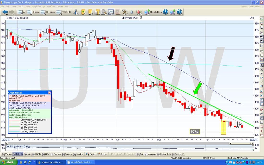
This one is interesting - this shows the Weekly Candles for UTW and note how in my Yellow Circle we have a sort of ‘Gravestone Doji’ but in the Context of the moves down prior to this, rather than such a Doji being a negative thing, it could well be that this marks a Reversal Point and in coming Weeks we will see UTW rise from this.
For a Gravestone Doji to be truly negative, they need to occur in the Context of a strong move upwards. 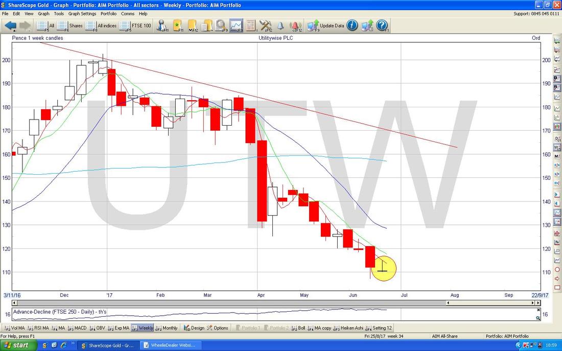
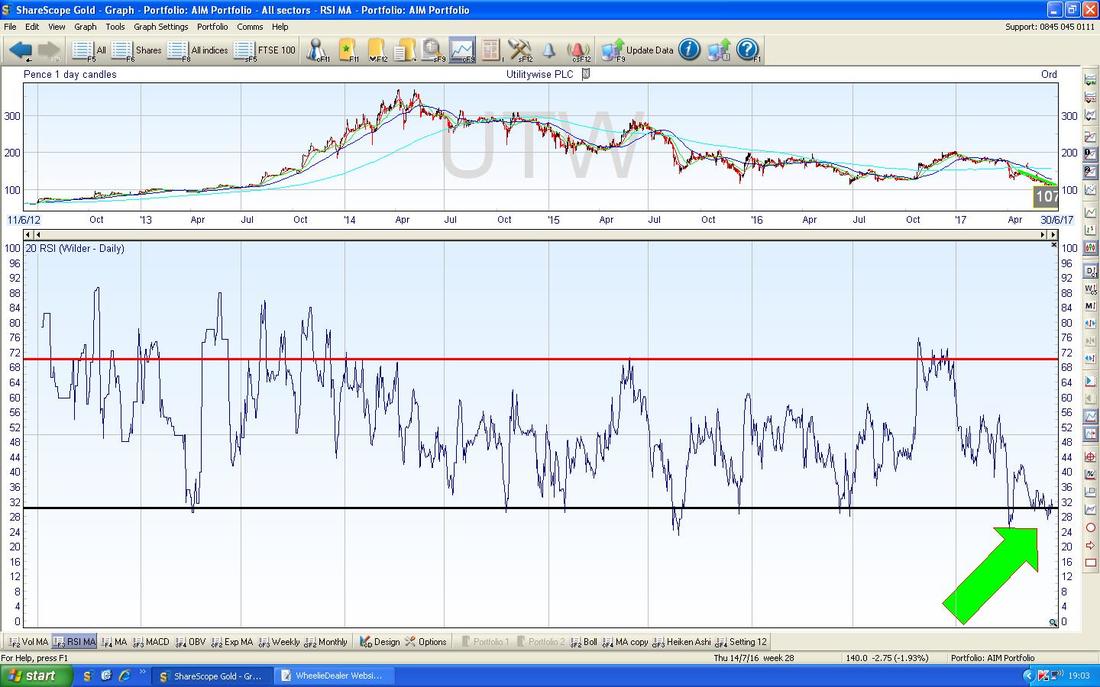
In the bottom window below we have the Relative Strength Index (RSI) for UTW on the Daily and I have shown the full history of the Stock here. The key thing is note how the RSI is right down at the bottom of the Range as per my absurdly large Green Arrow - it could be that UTW is doomed and there is a reason for RSI being so low, but my view is that this is telling me UTW is very oversold.
Persimmon PSN
There has been some discussion on Twitter recently about how Housebuilders seem out of favour and perhaps there is an opportunity to buy so I thought it might be useful to look at a few. The Chart below has PSN Daily Candles going back about a Year and I have marked two Parallel Lines which show an Uptrend Channel which has been running over that time period. Currently the Price has fallen back from its High and is roughly halfway down (or halfway up !!) the Channel. A slight concern here is that if the Price falls back within the Channel, it could go down below 2100p. My Blue Arrow is pointing out where there was a Bullish 50/200 Day Moving Average ‘Golden Cross’ - note how that predicted the further gains here. By the way, I don’t hold PSN. 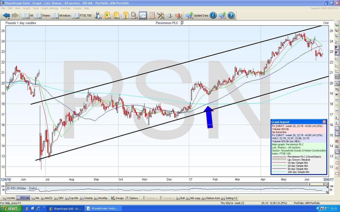
On the Chart below I have zoomed in to about the last 5 Months. First off note my Green Line (marked with the Green Arrow) which is an attempt to show the Downtrend in a similar way to how I did with UTW - however, this is not a great ‘Fit’ and note how there is one Candle that is an ‘Outlier’ from this Line. If my Line is roughly right, then a Breakout over this in coming Days would be a sign that things are improving for PSN.
My Yellow Rectangle highlights a Candle with a Long Down ‘Tail’ which went as Low as 2214p on Thursday 15th June 2017. It is important now for Bulls of PSN that this 2214p Level holds - if it fails, then expect PSN to fall a lot lower. 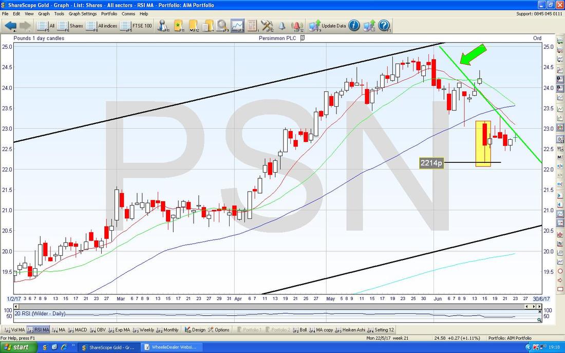
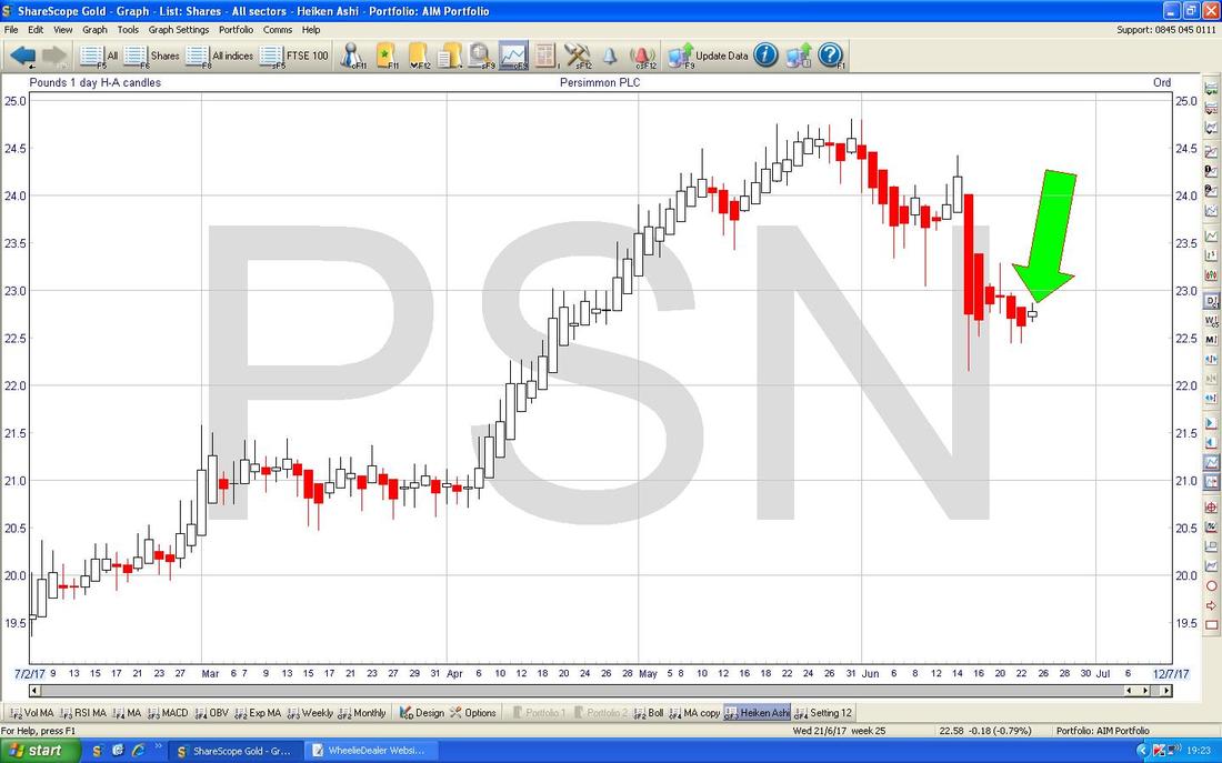
The Chart below has the Heiken Ashi Candles for PSN Daily - note where my Huge Green Arrow is that there is a little tiny White Candle - after all the Red Candles, this is a bit of hope for Bulls that PSN might be turning up now.
Galliford Try GFRD
I do hold Shares in GFRD (and a Spreadbet) and on the Chart below we have the Price Line in Candle form in the Top Window and in the Bottom Window we have the RSI. The thing that I want to point out here is a ‘Bullish RSI Divergence’ - these are superbly predictive phenomenon and this looks very good for GFRD. Note my Black Line (marked with Black Arrow) in the Top Window is sloping Downwards but that the Blue Line (Blue Arrow) in the Bottom Window is pointing Upwards - this is the ‘Divergence’ and this suggests GFRD will rise soon - which makes sense, because it looks hugely oversold. 
On the Chart below we have the Daily Candles for GFRD going back about 7 Months. First off look at the Red Wiggly Line which is the 13 Day Exponential Moving Average and the Green Wiggly Line which is the 21 Day EMA - what we are looking for here is the Red Line to Cross the Green Line from underneath and give a Bullish 31/21 Day EMA ‘Golden Cross’.
Next look at my Blue Line marked with the Blue Arrow at 1190p - I think this would be a cracking Buy Signal if we see the Candles Close up above this level - if you want to be really sure, then use an End of Day Breakout over 1200p as a Signal to Buy on the next Trading Day. 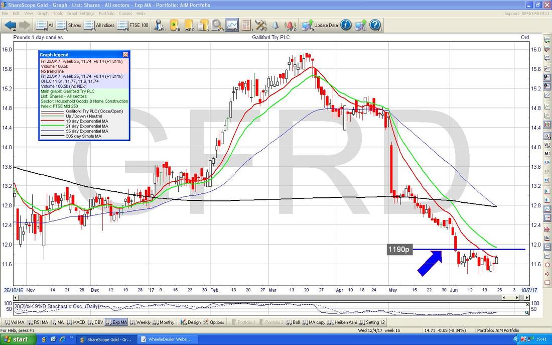
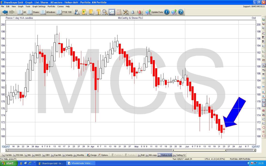
McCarthy & Stone MCS
This is another one I have a Position in. On the Chart below we have the ‘Big Picture’ as far as it goes - MCS only returned to the Stockmarket back in Late 2015. The first thing to note is the Black Downtrend Line (marked with Black Arrow) and of course we need to see the Price Breakout over this Line if some positivity is going to come back here on a Medium Term basis. My Green Line (marked with Green Arrow) shows an Uptrend Line which has been in place since July 2016 but note how the recent Price Action is below this Line - this could be that the Green Line has failed to act as Support or it could be that it is just an ‘Overshoot’ of my badly drawn Lines and nothing to worry about. My Blue Arrow marks a Bullish Golden Cross between the 50 and 200 Day Moving Averages - this is a good sign. Note here is a bit of a Triangle going on here between the Black and Green lines and the Price is very near the ‘Point’. 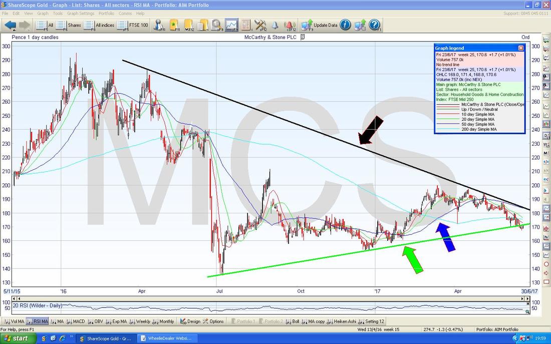
The Screen below has the Daily HA Candles going back 5 months ish. My Blue Arrow is pointing to where the Red Down Candles have produced a Narrow Red one on Friday 23rd June - it is too early to be definitive, but this suggests that the Trend might be about to turn Up again - we need some White Candles now.
Kromek KMK
I don’t hold KMK but I know a lot of Peeps who do - it is currently Loss-making which is never something I like but it does appear that the Business (remember, if we are ‘Investors’ then we are buying a Stake in a Business, we are not buying a Share Price [that is for ‘Traders’]) is making traction now and the point of making Profit is drawing nearer. The Chart below has the Daily Candles for KMK going back a few years - note the Downtrend Channel as marked by my Parallel Black Lines but it must be appreciated that I have used my flawed judgement to draw the Upper Black Line as a ‘Line of Best Fit’ and you could easily draw this line higher. Assuming my Lines are roughly right, then where my partly obscured Yellow Circle is, the Price has broken-out over the Upper Channel Line and this is a positive development. Note also where my Blue Arrow is that there has been a recent 50/200 Day MA Golden Cross. Also note how ‘spiky’ this Price Chart is - this suggests a Choppy, Illiquid and Volatile Stock. 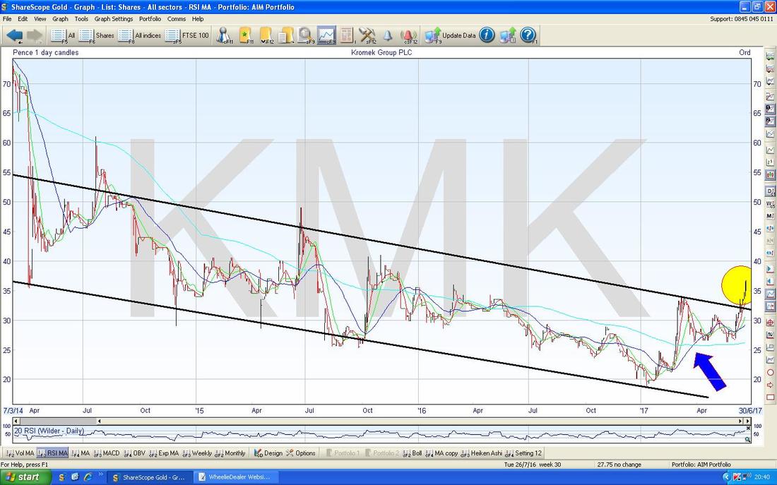
The Bottom Window in the Screen below has the RSI for KMK - note where my Green Arrow is that the RSI is up around RSI 72 which is quite a high level by KMK’s previous standards, and it suggests it is Overbought at the moment. However, on Small Choppy Stocks, the RSI can stay up at elevated Levels for a long time and the Price can keep rising.
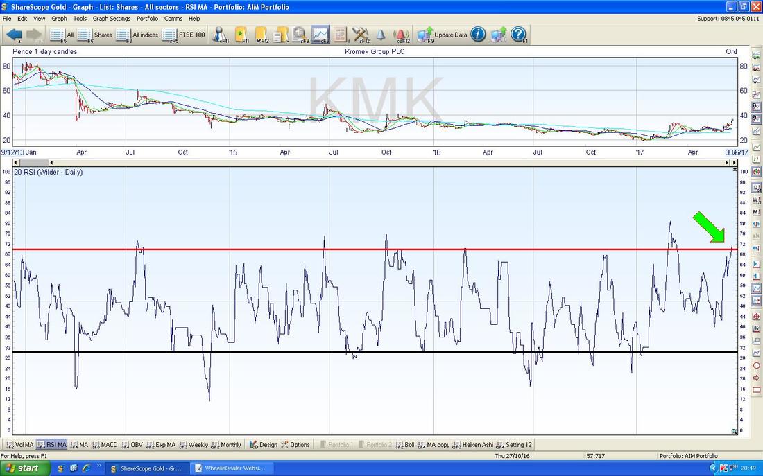
The screen below has the Daily HA Candles for KMK. Note where my Green Circle is that the HA Candles are Big and White and there has been a strong move up. Now look at where my Yellow Circle is at how the White Up Candles changed to Down Red Candles - note the Transition, with the White Candles first narrowing and then turning Red. In the very Short Term, I would expect to see a similar thing again on KMK soon because the move up has been quite strong and it unlikely to keep going without some sort of Pullback - although it could !!

OK, time is running out, let’s do some Indexes………
DAX (German) This one is particularly of interest to me because I have a Long Spreadbet running on it. The Screen below has the Daily Candles and this screen is actually my ‘working’ Chart so it has some previous information marked on there that is not relevant to our discussions here. Anyway, my Green Arrow is pointing to a White Up Candle that was formed back on Monday 19th June and it was after this that I put my Long Spreadbet Position on at 12901 - the Horizontal Blue Line (marked by Blue Arrow) marks this as the Level at which my Bet was placed. The Horizontal Line in Purple/Mauve (look for a similarly coloured Arrow) marks my End of Day (EOD) Stoploss Level which is at 12590 - note I chose this level based on the Low of the Candle which was formed on Thursday 15th June and this is pointed at with my Black Arrow. Note the Low of that Day was 12620 and I could have put my Stoploss a bit lower, at say, 12615 but I felt that 12600 was an important Psychological Level and it would be better to place my Stoploss just below that - hence 12590. If you look where my Red Arrow is, there is a sort of Hammer Candle from 18th May 2017 and I considered this as a Level to put my Stoploss under (the Low that day was 12490) but I decided it was too wide a Stoploss and would cost me too much money if I waited until then for it to trigger - but of course there would be much less likelihood of it triggering that far down. Anyway, as things stand, we had a bit of a Hammer Candle from Friday 23rd June (spot lit by my Yellow Circle) which is good in that it could not hold the Lows of the Day at 12677, but it is by no means a great Reversal Signal or anything - this could easily fall more which is a bit worrying because it means my Stoploss might get triggered. Note the Blue Wavy Line 50 Day Moving Average is not far below here and that might act as Support. I have to say I am in a bit of a quandary about this Trade. I have felt for some time that the best way to use Stoplosses is to keep them really tight (so that you don’t lose much Money if they Trigger) and to concentrate on getting really good Entries so that you would almost expect the Price to move in my Direction straightaway. For example, on my Recent Long Trade on the DAX, I might have jumped the gun with my Long Trade as it had not properly Broken Out of the All Time High - so perhaps I should have waited and only once there was a proper Breakout should I have put the Trade on. Had this occurred, my Stoploss could have been up around 12880 or something and very close to the Breakout Level - so it would have soon triggered the Stoploss if it fell instead of rising as I would want the Trade to do. This is something I need to work on more but those are my current thoughts and for now I will let this Trade run and see how it plays out. 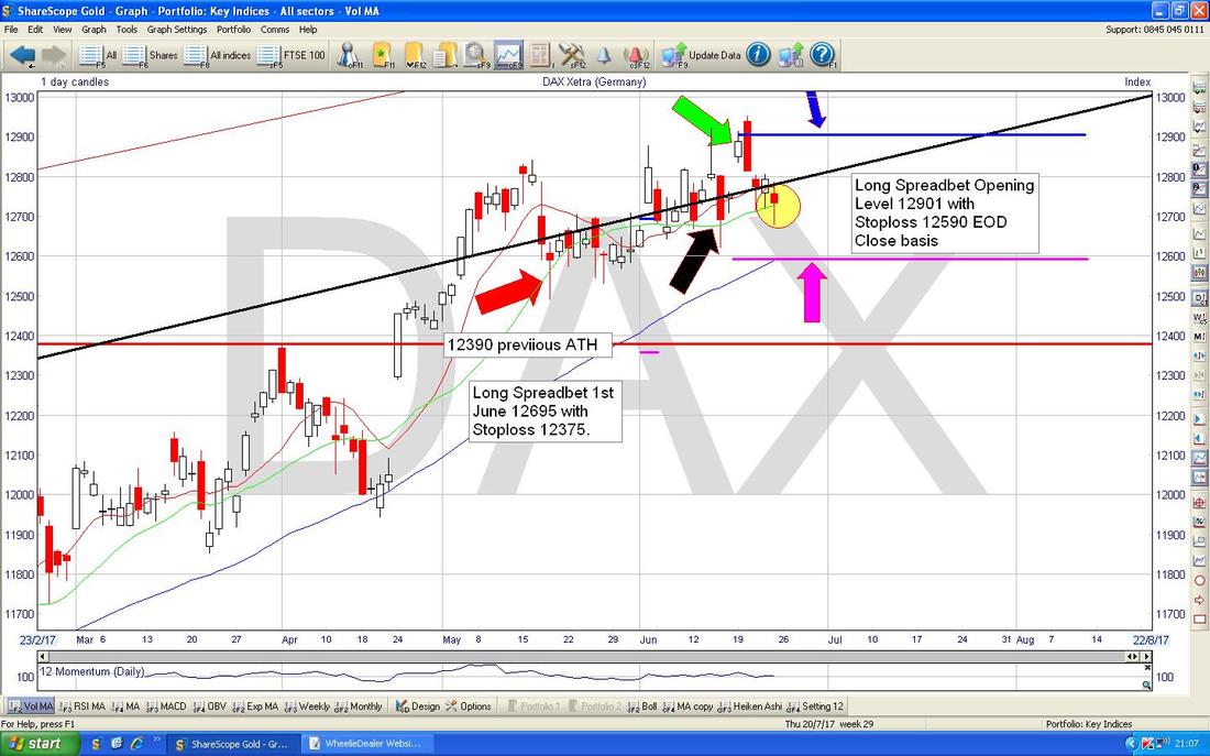
Just found Goldfrapp on the Blue Button - liking that ………Ooh La La
FTSE100 Don’t dwell on this one - this is just the usual ‘scene setter’ which shows the Long Term Uptrend Channel and my Red Arrow is pointing to the Bottom Line of that Uptrend Channel - please ignore the rest. 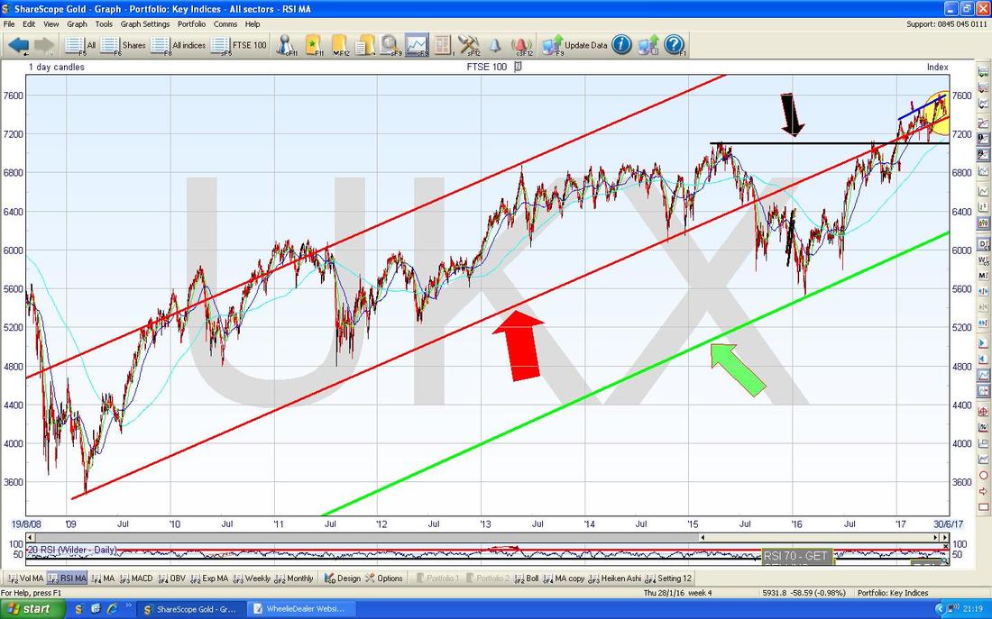
The Chart below has the FTSE100 Daily Candles going back about all of 2017 so far. Note my Red Arrow and the Red Line which is the Bottom Uptrend Channel Line from my previous Chart - and this is therefore a very important Support Line which must hold if we are to avoid more drops. However, even if we do get a failure of this line, there is good Support where the Black Horizontal Line is (Black Arrow) at around 7100 and then below at 7000 and 6900. The significant thing to appreciate about this is that even if we get a serious meltdown in the Markets, these Support Areas could easily save us.
My Yellow Circle is highlighting 2 sort of Hammer Candles which show Intraday Recoveries on both Thursday and Friday last week - note they both found Support at about 7400 and this is also where the 50 Day Moving Average happens to be (the Darker Blue Wavy Line marked by my Green Arrow). It would not surprise me at all if the Price starts to move up off these Candles and this Support from the 50 Day MA. 
On my Screen below, look at the Red and Green Wavy Lines which are the 13 and 21 Day EMAs - note the Red Line is millimetres away from crossing the Green Line to the Downside (where my Blue Arrow is) - if this happens, it would be a ‘Death Cross’ and bad news as it often means the FTSE100 could fall for a few Weeks - we need to avoid this now and this really means we need an Up Day on Monday - it does sometimes happen though that we get a ‘Death Cross’ but then the FTSE100 rises and quickly reverses it.
I’ve now got Emelie Sande on the Box and she is singing about the “Highs and the Lows” - see, I always said she was a Chartist !!
The Heiken Ashi Candles for FTSE100 on the Daily still look weak - my Yellow Circle is highlighting Big Red Down Candles and this suggests more falls although it needs to be appreciated that the HA Candles are slightly ‘slower’ Indicators than some of the others. In other words, you can get a Reversal of Direction but it does not show up on the HA Candles for perhaps one more day. It is always a trade-off - you get Slower Signals with HA but they are much clearer and less ‘noisy’. I won’t show it this week but the FTSE250 is very similar to the FTSE100. 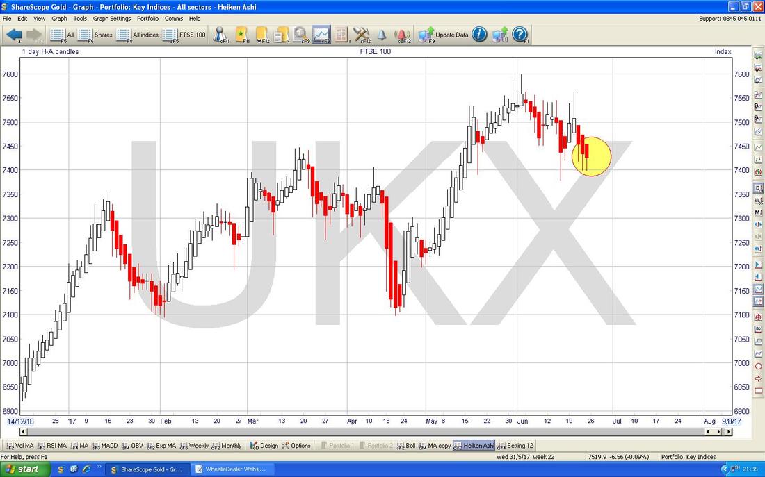
Dow Jones Industrials Index (the DOW, US)
I am just bunging in this scene setter like on the FTSE100 - note the extremely well behaved Uptrend Channel over 8 years and note the Upper Line. 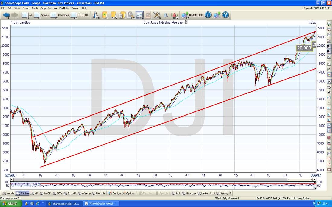
The Chart below has the Daily Candles for the DOW going back just a few months. First off note the Red Line (marked by my Red Arrow) which is the Upper Line of the Long Term Uptrend Channel from my previous Chart - note how in recent Days the Price moved up and touched this line and then fell back - this is pretty normal and shows the Uptrend Channel is still making the Rules here and corralling the Price.
My Yellow Circle is marking a ‘Spinning Top’ Doji from Friday 23rd June - this is not a Textbook term but what I use for a Small Doji like this with a Narrow Body and fairly long Tails - these can often mark a Reversal or their sheer presence hints that a Reversal is due soon. There is another interesting feature here - note where my Black Arrow is that there was a ‘Gap’ when the Price jumped up and made a Hole in the Chart - the important thing here is that such Gaps usually get ‘Filled’ - “Nature abhors a Vacuum” and exactly such a ‘filling’ happened here with the Price falling back in recent Days and filling in the Gap. Next look at my Blue Arrow pointing at the Blue Wavy Line which is the 50 Day MA - this could be decent Support at about 21000 (which is a key psychological level anyway) and give some downside cushions. 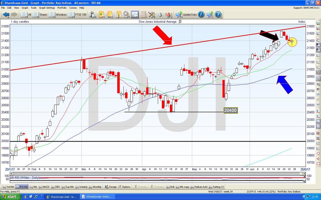
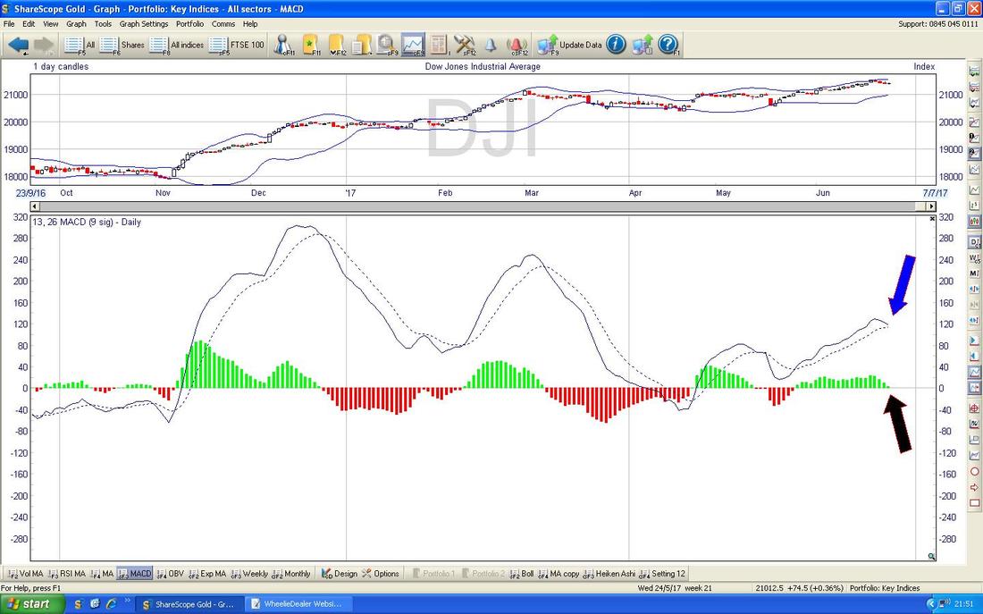
The next Chart is not so promising - in the Bottom Window we have the MACD (Moving Average Convergence Divergence) and this looks to be on the verge of a Bearish MACD Cross as shown in the ‘Signal Lines’ format by my Blue Arrow and the Black Arrow is pointing at the same thing but in the ‘Histogram bars’ format.
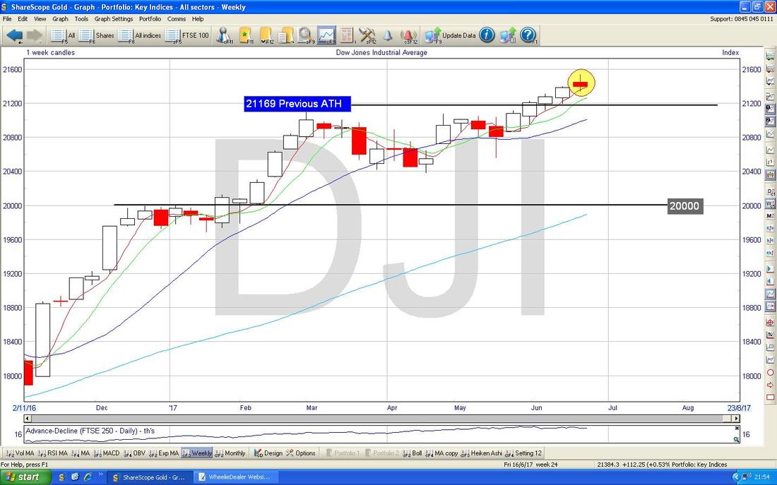
The Chart below has the Weekly Candles for the DOW. My Yellow Circle is highlighting a ‘Spinning Top’ Doji - but in this Context a Reversal would mean the DOW is likely to drop - so this Doji could be telling us that trouble might be on the way - remember, this is not definitive but it hints at the most likely possibility.
Nasdaq Composite (US Technology Index)
Whereas the DOW looks a bit iffy, the Nasdaq Comp looks really good still. My Chart below has the Daily Candles for the Nasdaq Comp going back for most of 2017 and there is a beautiful Uptrend and despite the recent drop back, it looks like it is turning up again. My Black Arrow is pointing to a nice White Up Candle from Friday 23rd July and it is likely to keep rising off this. My Blue Arrow is pointing to the 50 Day Moving Average and this could be good Support down around 6125 ish. 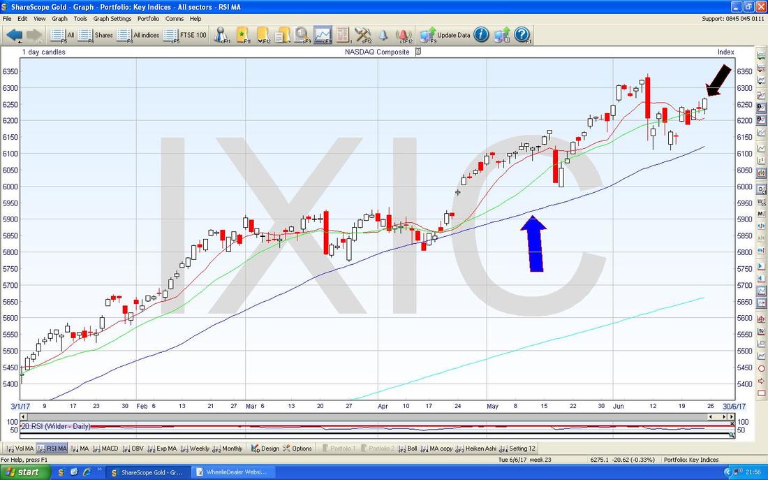
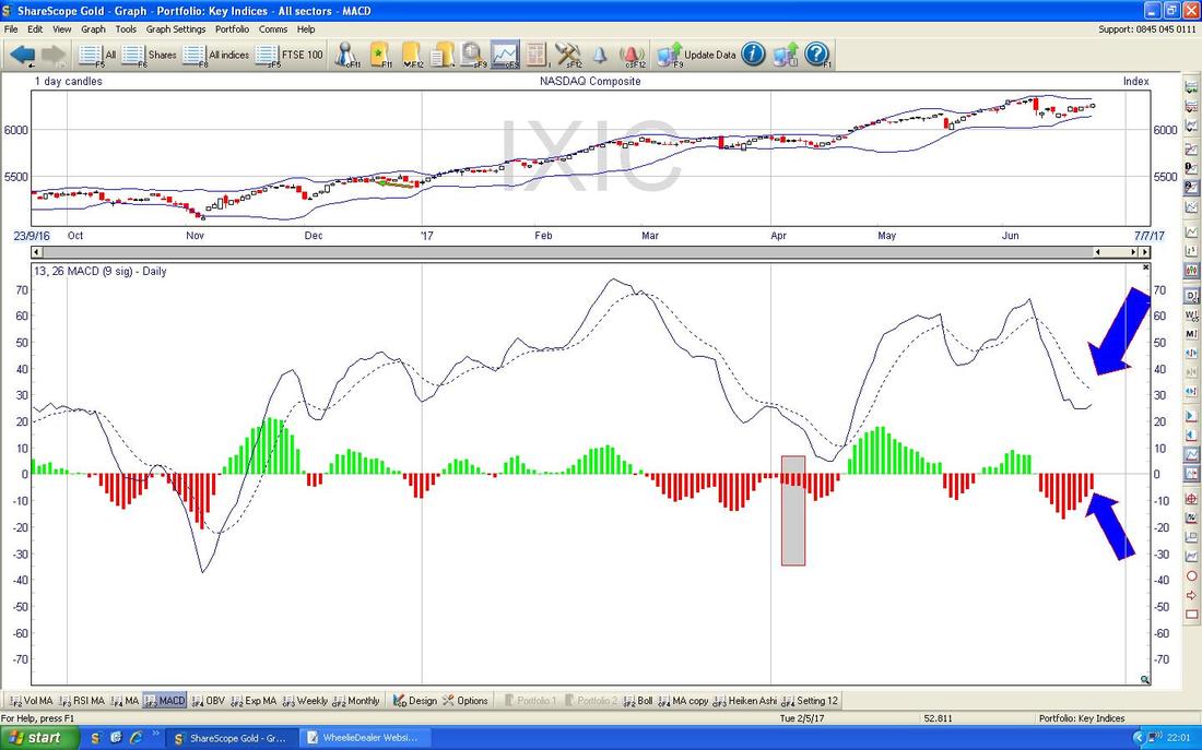
The bottom Window on the Screen below shows where we are nearing a Bullish MACD Cross on the Nasdaq Comp Daily - my Blue Arrows are pointing at the various formats of showing this.
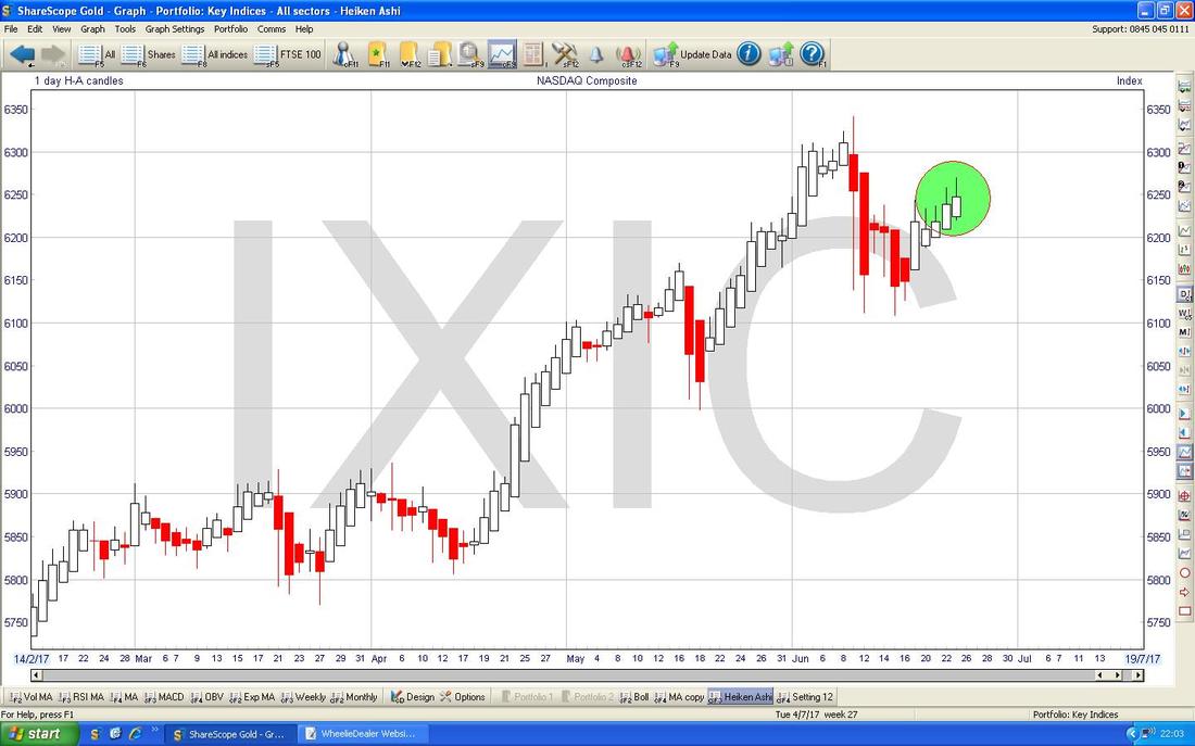
The Screen below has the HA Candles for the Nasdaq Comp Daily and my Green Circles are highlighting how it is bashing out nice Big White Up Candles at the moment which suggests more gains.
Gotta be impressed by Ed Sheeran’s business skills - he has almost zero Costs - it is just him and some Pedals and a Guitar - all these huge Bands are all well and good but by the time you divide the money up between them and pay for all the flashy equipment, they get barely anything each. Sheeran must have an Accountant’s brain………
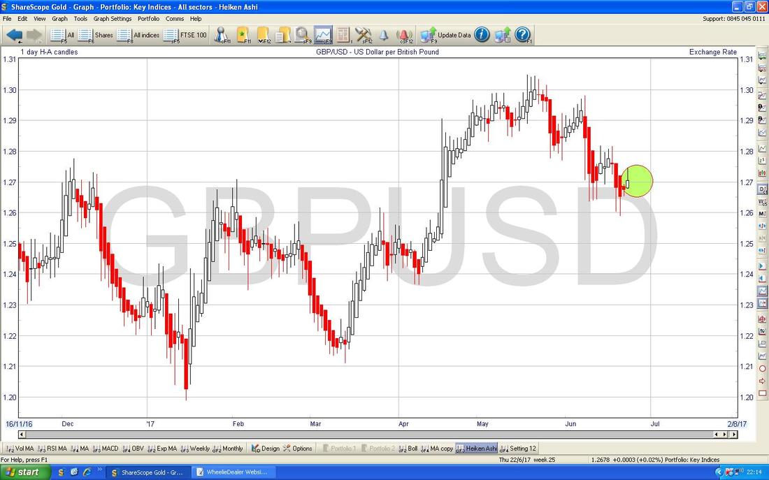
Pound vs. Dollar The Pound has fallen back lately with all the silliness around the General Election and general government chaos but note how it has found Support at 1.26 as per my Chart below (where the Black Line and Black Arrow are). I suspect we are in a Range now between 1.26 at the bottom and just over 1.30 at the top. My Yellow Circle highlights a Bullish Golden Cross between the 50 and 200 Day Moving Averages and if the predictive power of this is to hold sway, then we need to see the Price move back up pronto. Note the Dark Blue Wavy Line 50 Day Moving Average (marked with my Blue Arrow) could act as Resistance now up around 1.2850. Remember, the current pattern is that if the Pound goes up, then the FTSE100 tends to drop back although this is by no means an exact correlation. 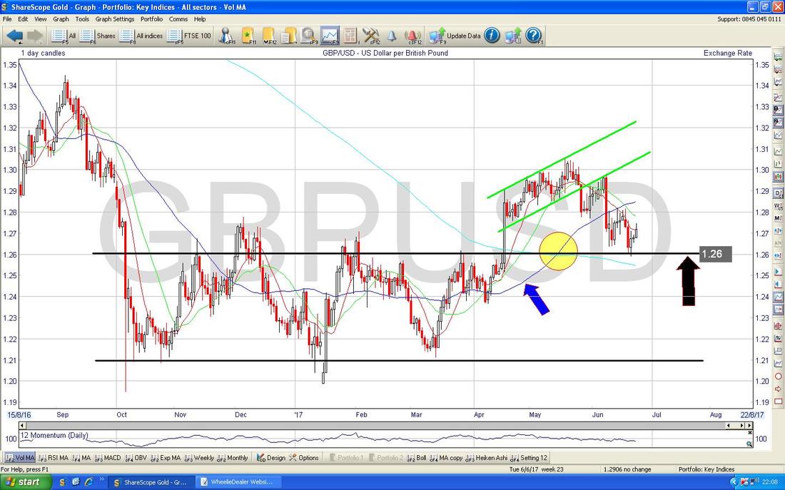
The Screen below has the HA Candles for £/$ - note where my Green Circle is that we got a White Up Candle - this could be a Reversal in the offing.
Brent Crude Oil (Spot)
My Chart below has the Daily Candles for Brent and note where my big Green Rectangle is just what a sustained move down we have been treated to recently. Of course this could keep falling but after such a fall you would expect some sort of bounce to appear. I note we have had 2 Up Days on Thursday and Friday and perhaps we can build on this but it is hard to know if a sustainable Recovery can be mounted from here. Even if we do bounce, there is a lot of Resistance just up above that will be hard to get through. 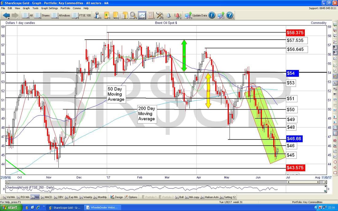
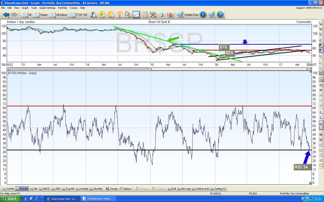
In the bottom window on the Screen below we have the RSI for Brent Oil. On a Reading of RSI 34 this is very low and a Recovery could come from here. However, in the past the RSI has been much lower and therefore we could see more falls. Whatever, the simple fact is that Brent Oil is due a Bounce.
The Screen below has the Daily HA Candles for Brent Oil. My Blue Arrow is pointing to where the Candles have narrowed but are still Red - we now need a Colour Change to White and ideally big White Up Candles. Note the length of the move down in Red Candles - this is clearly unusual.
If Oil can recover a bit, then this might be good for the FTSE100 particularly because RDSB and BP. are such big constituents. 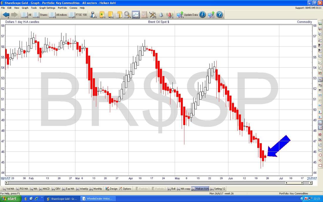
Gold (Spot)
A Scene Setter - note the Red Line (marked by my Red Arrow) which is the Downtrend Line from the Highs back in 2011 - if Gold is ever going to really get anywhere, then this Red Line must be broken-out of to the Upside. 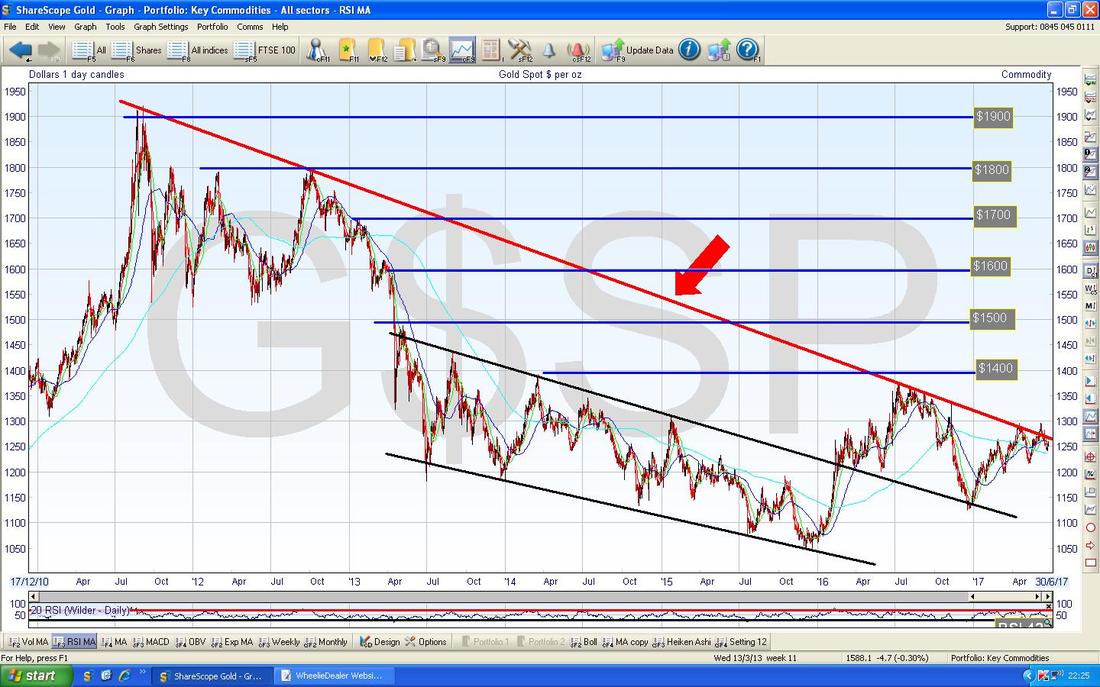
The rather busy Chart below has the Daily Candles for Spotty Gold going back about 7 Months. Note my Red Arrow and the Red Line which are from the previous Chart and this is the critical line that the Gold Price must clearly breakout over. The Yellow Circle marks where the Price did a ‘False Breakout’ just recently and fell back inside the Red Line.
Next look at the Uptrend Channel which is shown by my Black Parallel Lines and the Black Arrows - this seems to be well disciplined and there will soon be a fight between this Black Lines Uptrend Channel and the Red Line Downtrend - one of these will win the fight….. In the short term, Gold seems to be moving up off the bottom Line of the Uptrend Channel. To be really sure we have properly broken-out, I would want to see Gold up above $1300. Right, that’s it for this week, gonna take me forever to upload this one to the Website !! Cheers, WD. 
0 Comments
Leave a Reply. |
'Educational' WheelieBlogsWelcome to my Educational Blog Page - I have another 'Stocks & Markets' Blog Page which you can access via a Button on the top of the Homepage. Archives
January 2021
Categories
All
Please see the Full Range of Book Ideas in Wheelie's Bookshop.
|
