

|
educational blogs |
|
The US Markets close at 1pm their time tomorrow (Monday) and are closed all day for the 4th of July stuff they do (I have no idea what it is for - I think it is to celebrate Tom Cruise or something - after all, he did do ‘Top Gun‘…..) So the chances are we will get a fairly dull start to the week and with Fridays usually being a bit ropey anyway, it might end up being a pretty tedious week. There are US Non Farm Payrolls on Friday (usually around 1.30pm our time) which might cause a spark of fun for the Traders.
I had a right ropey week last week - I screwed up on a Long DAX Trade and I got a swift kick in the goolies from Utilitywise UTW - I will look at those in a mo. June had up until then been a sort of ok month for me but then things went rapidly downhill and my Portfolio got spanked 2.7% on the week which is most definitely the worst Week I have had so far in 2017. Ah well, these things happen and at times like this I find it is best to keep the bigger picture in mind and I am still up nicely over 2017 so far so I am not going to get too stressed about it.
Hopefully we are now heading into a better Month - historically June is the 2nd Worst Month of the Year but the precedents are more on our side for July with it being the 4th Best Month and the FTSE100 has averaged a 1.0% gain (since 1984 I think). A strange stat in my copy of the UK Stockmarket Almanac ( I am looking at the 2016 copy so it is slightly out of date) has the First Trading Day of July as the historically strongest First Day of any month. A typical July seems to start well and then go soggy mid month and then perk up at the end.
Utilitywise UTW This one has been a constant source of Bad News but it is not all that surprising because they have clearly lacked a lot of Control in the past and the new CFO and CEO are cleaning up the mess and trying to turn it into a solid Business to enable the next stage of growth. I am happy to hold UTW although it is rather frustrating that they keep finding more problems - however, they are due to put out a Trading Statement in July so I suspect this will be ok as they have got the Bad News out before - if there was more Bad News, it would make sense for them to put it all out together and with the recent record they must be running out of things to screw up !! I am working on a Blog about how I see UTW now and I am hoping to get this out later in the Week - I am pretty busy though and off to a Wedding on Friday so it might get delayed. Anyway, in essence I think the Dividend will be maintained (I have seen some snippets from Broker Reports that support this and look plausible) and this means at the current Price the Dividend Yield is about 9.4% rising to 10% in 2018 and the Forecast P/E (based on Adjusted EPS which excludes the latest problems as a ‘one-off’) is 4.9 falling to 3.5 in 2018. If the next Update is acceptable, this will look very cheap and we could easily see a powerful bounce. On the Chart below (which shows the Daily Candles for UTW over recent months) my Black Arrow is pointing to a sort of Hammer Candle that was produced on Thursday when the Bad News came out and it you look below where my Yellow Circle is, note the big spike in volume - this looks like a classic ‘Capitulation’ where Bulls have finally had enough and dumped the Stock in disgust (I imagine a lot of Stoplosses got triggered as well). On Friday we got a Big Ugly Red Down Candle - on the face of it this suggests more falls but I suspect that things will calm down next week and we should see UTW find some buyers - the obvious Trade here is to go Long and place a Stoploss just below the bottom of the Hammer Candle at around 60p. This is obviously a High Risk situation due to the appalling Track Record of UTW but some decent news from a Trading Update later this month could drive the Price up and there is a nice ‘Gap’ up above to fill. 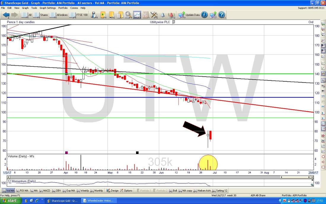
DAX30 (Germany)
I have really managed to get myself in a pickle on this one with a Bad Entry to a Long Trade and then not obeying my own Rules and not activating a Stoploss that I was supposed to use. Anyway, the essential truth here is that I have come to the conclusion that my ‘Rules’ are fatally flawed and this is to be the subject of another Blog which I have partly written but have not got round to finishing. In essence it is about having very well defined Entries into a Trade and then having extremely tight Stoplosses that get me out very fast if a Trade goes against me. In this case I ‘jumped the gun’ and put on a Long Trade that I should not have. The Chart below (as always these are from the superdoops ShareScope Software that I subscribe to and use as my ‘Workbench’) is similar to one I showed last Weekend and the Blue Line marked by my Blue Arrow shows where I opened my Long Trade (don’t ask - I know it looks ridiculous now !!) and the sort of Purple/Mauve/Pink line was supposed to be my Stoploss Level (this is marked by a similar coloured Arrow). The really important Level here is the Previous All Time High at 12390 and it is rather surprising that this has not held as Support - although this could be an ‘Overshoot’. However, note my Big Green Circle which is highlighting that there is a lot of Support between where we are now and down to around 12000 - so I would expect that Support to kick in soon and cause some sort of Bounce. Luckily this is quite a Small Position for me (that is about the only thing I did right !!) and it is quite manageable. My Black Arrow points to a Huge Red Down Candle from Thursday where the DAX smashed down through my Stoploss Line and when I looked at it on Thursday Night I came to the conclusion that rather than Selling my Long Position and taking a Loss, this was more likely to be nearing a time to be Buying - so I have let the Trade run even though it made me squirm a bit more on Friday !! 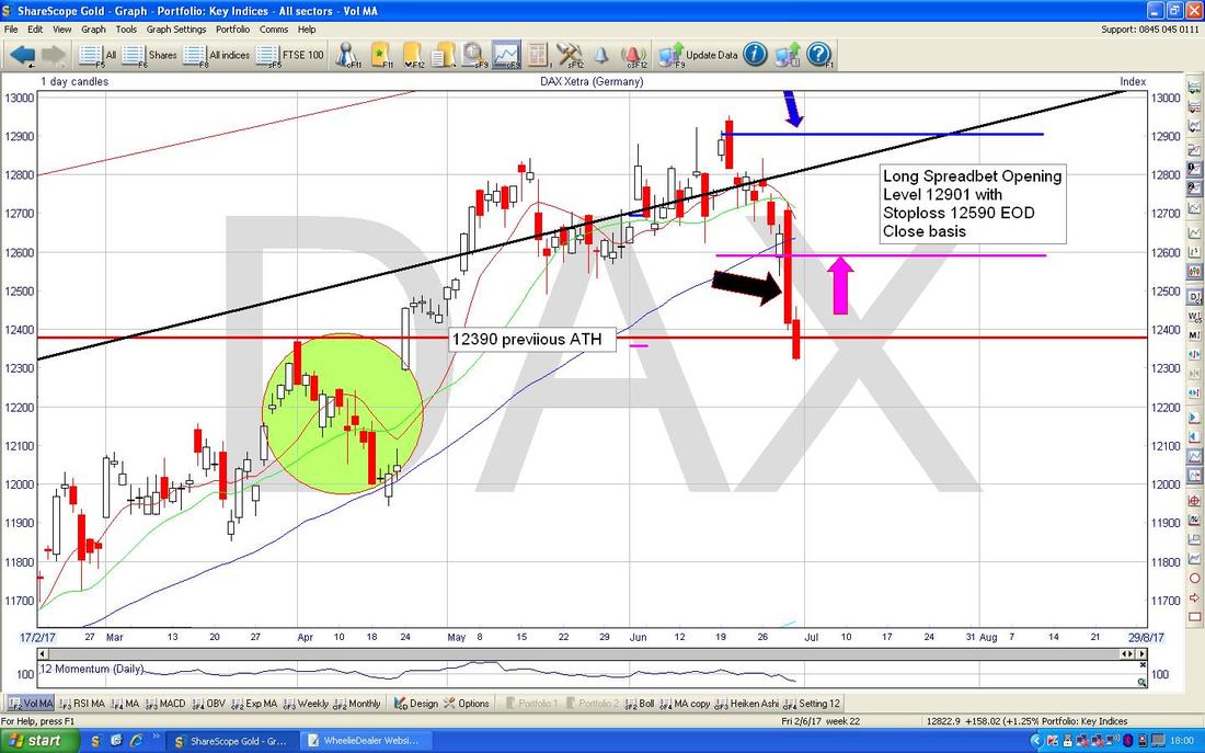
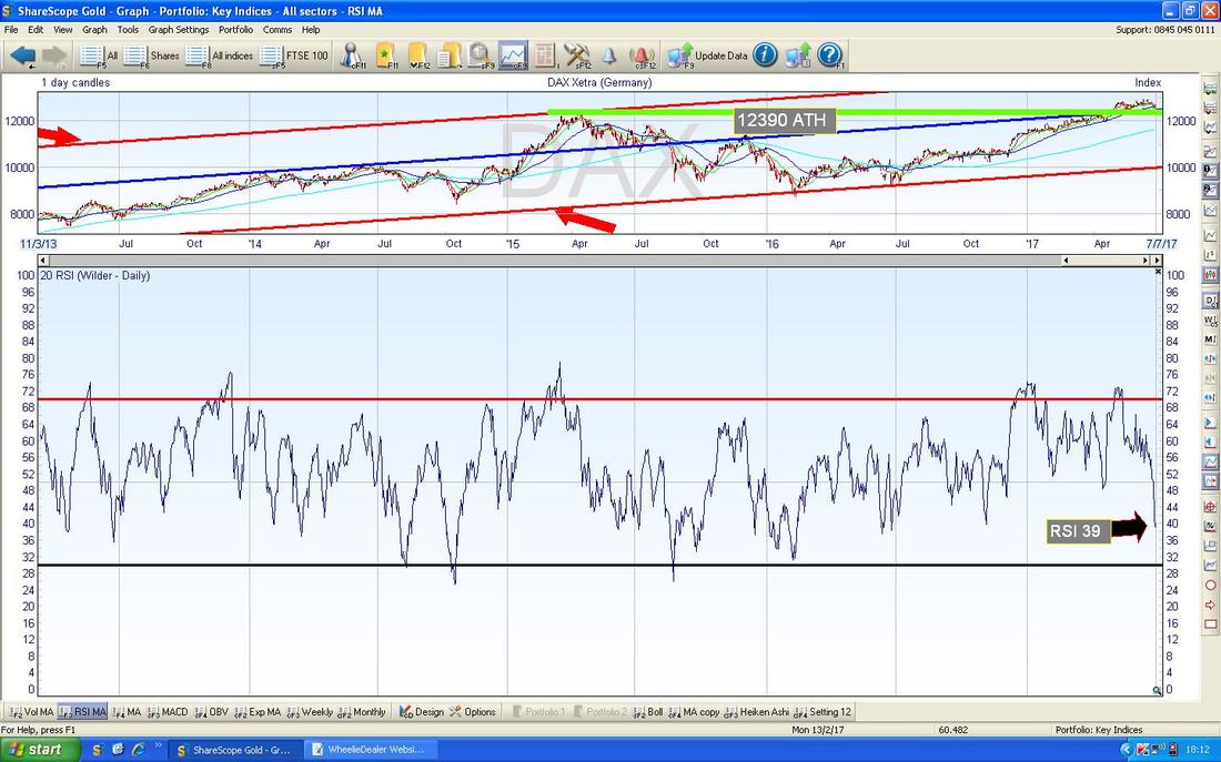
In the bottom Window on the ScreenShot below we have the Relative Strength Index (RSI) for the DAX Daily - on a reading of RSI 39 it is getting quite low but of course can drop a lot more, but we are getting to the kind of levels where it often turns up from.
The Screen below has the Daily Candles for the DAX for pretty much all of 2017 with the Blue Wiggly Bollinger Bands above and below. My Yellow Circle is capturing a Red Down Candle from Friday and note how it is ‘outside’ of the Bottom Bollinger Band - this is an unstable situation and usually means the Price will go sideways or upwards to get the Candles back inside the Bands.

The Chart below is not so good from the Long Side - my Black Arrow is pointing to where there has been a 13/21 Day Exponential Moving Average (EMA) ‘Death Cross’ - it is hard to see on the Chart but suggests we will see more falls on the DAX in coming Weeks.
There are plenty of negative Signs around on the DAX - I am relaxed about ‘managing’ my Long Position for the time being as it is quite small but if we get some sort of Bounce soon, it might be worth me closing it if I can. 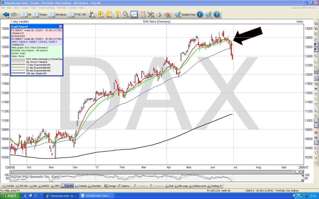
Harvey Nash HVN (IT Recruitment)
I don’t hold HVN but I remembered they got mentioned on Twitter a lot last week after Results or something and they look quite cheap on a Forward P/E less than 10 (and even less if you strip out Cash) and a near 5% Divvy. If I remember right, they are looking for Bolt-on Acquisitions which could fire up some growth. Anyway, the Chart looks good which is what I wanted to show. My Red Line and Red Arrow marks a Downtrend which was broken out of recently where my Yellow Circle is - this looks good. My Green Lines and Green Arrows are showing an Uptrend Channel which now seems to be in place and my Big Black Arrow is pointing to a ‘Golden Cross’ between the Blue Lines which are the 50 Day Moving Average and the 200 Day Moving Average - it all looks good for more gains. 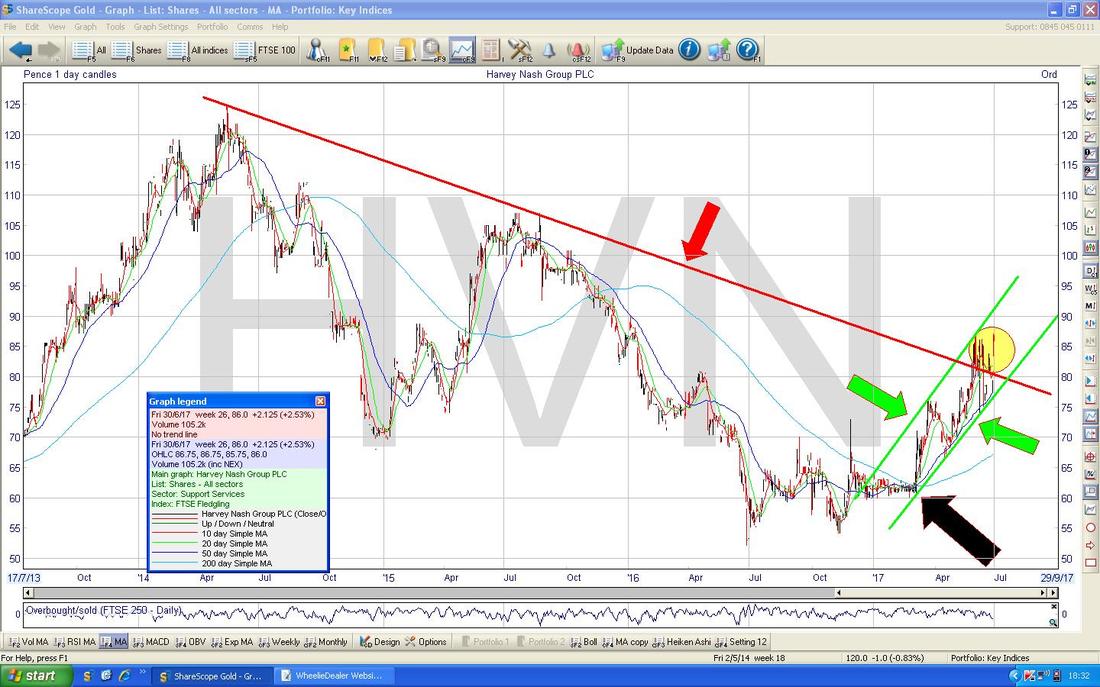
FTSE100
First off the usual ‘Big Picture’ reminder of the Uptrend Channel since 2009 which is marked by the Red Lines and Red Arrows on my Chart below - please ignore everything else here. 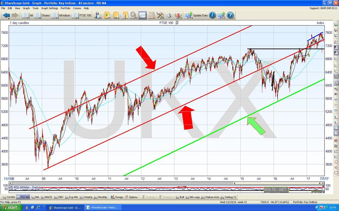
The Chart below zooms in on the FTSE100 to most of 2017 so far and shows the Daily Candles. My Yellow Circle is capturing a Down Red Candle from Friday and note how this has broken below the Long Term Uptrend Channel Bottom Line in Red and pointed at with the Red Arrow (this is the Uptrend Channel from the Chart above).
There is a lot of Support below though - my Green Circle is showing an area of Support between 7200 to 7300 and the Black Line marked with my Black Arrow at 7100 is a strong Support Line because it is a previous All Time High (“Previous Resistance becomes Support” and all that). Note the Blue Wiggly Line which is the 50 Day Moving Average (pointed at with Green Arrow) has been where a lot of the Price Action has happened recently and the Current Price is a fair bit below this - it may ‘Mean Revert’. 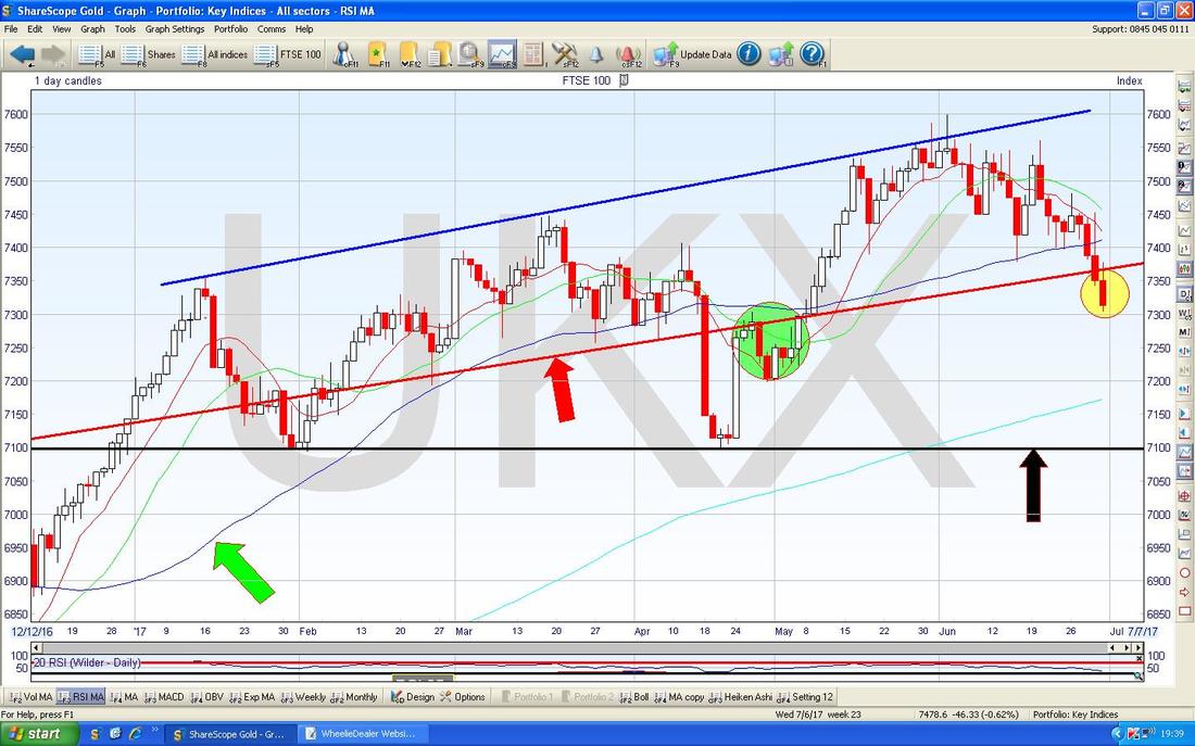
In the bottom window on the Screen below we have the RSI for the FTSE100 Daily. On a Reading of RSI 40 it is quite low but can go a fair bit lower before turning up.

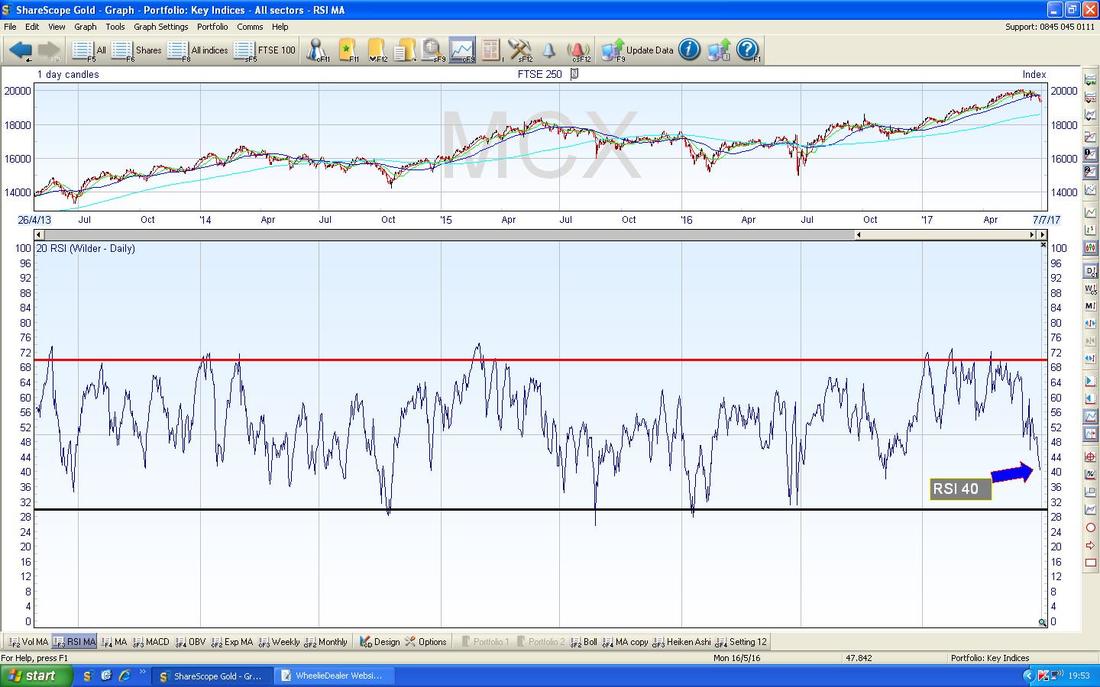
FTSE250
The Chart below has the Daily Candles for the FTSE250 - my Green Arrow is pointing to a ‘Long Tails Doji’ Candle from Friday - in the context of the recent drops, this hints that we might be nearing a Reversal Upwards soon - it is not necessarily a Turning Point in itself, although it could be. 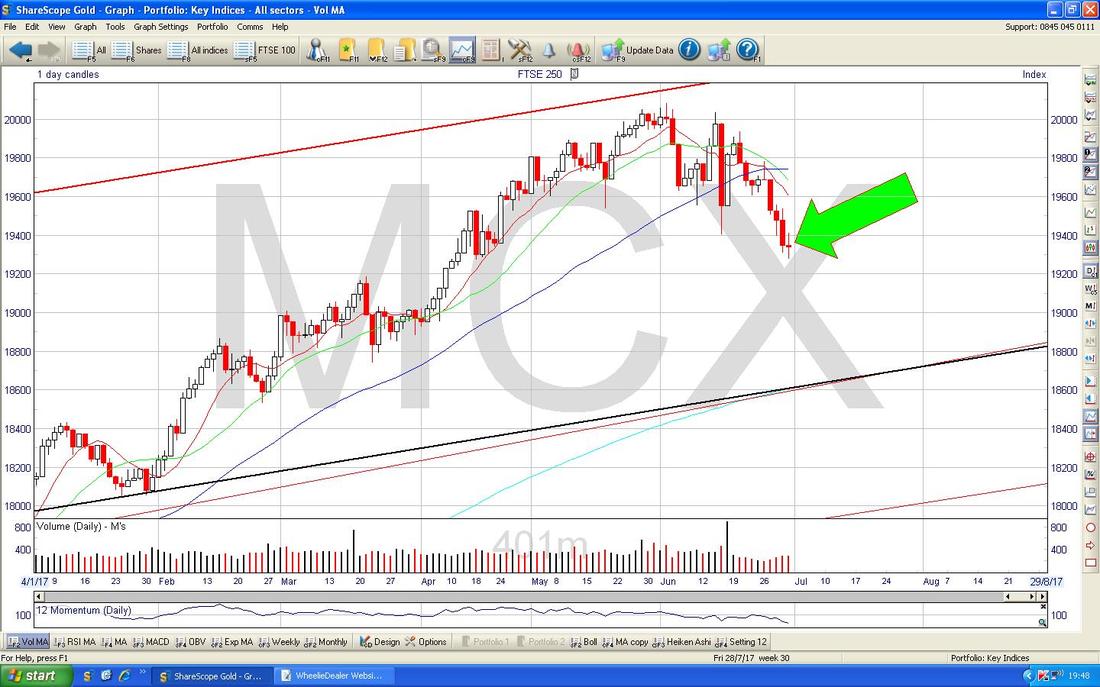
In the bottom window on the Screen below we have the RSI for the FTSE250 - with a Reading of RSI 40 it is quite low and combined with the Long Tails Doji from above, we might be nearing a bounce.
Dow Jones Industrials Index (US)
The obvious thing here is that the DOW is still pretty near its All Time Highs and despite dropping off a little bit in recent Days, it is not looking disastrous by any means. My Green Arrow on the Chart below is pointing to a ‘Doji’ Candle from Friday and note how it is ‘Inside’ the Big Red Down Candle from the day before (Thursday). This sets up a 3-Day Candle Pattern - will we get a ‘3 Inside Up’ or a ‘3 Inside Down’ - the name gives a clue as to where the Index will probably go next and we should know after the Market shuts on Monday 3rd July. Note on Thursday the Candle dropped down to 21200 Intraday and then recovered a bit - this Level is now a Support Line. Just below that we have the Wiggly Blue Line (pointed at with my Blue Arrow) which is the 50 Day Moving Average and this could act as Support around 21100. There is then a Band of Support between about 20800 and 21000. 
Nasdaq Composite
This is the US Technology Index. We have had a good run here this Year and it is pretty obvious that Valuations are getting very stretched (if not downright crazy on some Stocks) and I am mulling over a trim of my Henderson Global Technology Unit Trust - I might sell a third of my Holding. In addition, much of the Gains have come from the Pound being weak against the Dollar, but as we will see from the £/$ Chart in a bit, if anything the Pound is likely to strengthen more - so this could be a good time to reduce my Exposure. I was weighing it up and I came to the conclusion that I have a fair bit of Tech Exposure in addition to this Unit Trust from stocks such as IOM, PYPL, TCM etc. Like most Indexes, this has been really Bullish this year and the Chart below shows how the Price is pretty much around the Blue Wiggly Line which is the 50 Day Moving Average - it looks like it is trying to find Support here but it is probably as good a time as any for me to trim my holding a bit. With the 4th of July Holiday mucking things about, I will probably do the Transaction on Wednesday or Thursday if things look favourable. 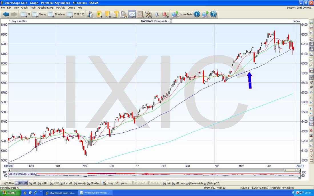
Pound vs. Dollar
The Chart below has the Daily Candles for £/$. First off note the Yellow Circle which marks a Bullish ‘Golden Cross’ between the Blue Lines which are the 50 Day Moving Average and the 200 Day Moving Average (the 200 is very faint on this Graph so I have pointed at it with my Blue Arrow) - this suggests more gains to come for the Pound - contrary to what the Brexit hating Media will be telling you !! The Pound moved up strongly last week but now is up at Resistance around 1.315 - this could be difficult to get over and if it fails, then perhaps we will see a Pullback within the Range between 1.26 at the bottom and 1.315 at the top. Having said that, there seems to be pretty good Support around 1.28. If the Price can break higher over 1.315 then there is a fair bit of Resistance up above up to about 1.35 - it will be fun watching this in coming weeks. Of course a Strengthening Pound might hurt the FTSE100 which has tended to like a Weak Pound although the correlation is certainly not perfect. 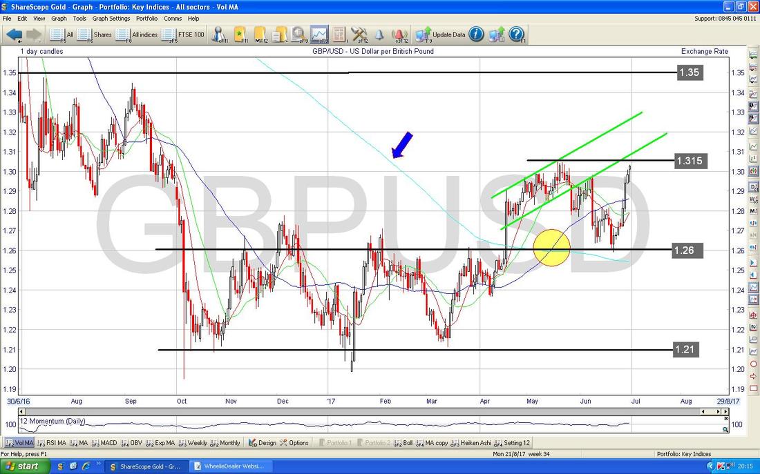
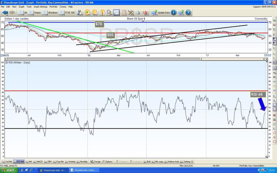
Brent Crude Oil (Spot)
The Chart below has the Daily Candles for Brent Oil (Spot) - first off note the Yellow Circle which is marking a 50/200 Day Moving Average ‘Death Cross’ - this tells the story of this Chart really and suggests Oil will be weak for a while. My Big Rectangle captures the Downtrend of Recent Weeks but since that the Price turned up from $44.37 and has been moving up nicely last week. However, note we are approaching $50 and the 50 Day Moving Average which my Blue Arrow is pointing at - this could be Resistance. We could easily be in a Range between £44.37 at the bottom and $50 at the top for a while. 
The bottom window below has the RSI for Brent Oil (Spot) Daily - on a Reading of RSI 46 there is still room for this to go higher in the short term, despite the good run in recent days.
I knew something was missing from this Blog - we need Heiken Ashis and the Crowd are clamouring for them…….
The Chart below has the Daily HA Candles for Brent Oil (Spot) - my Blue Arrow is pointing to nice Big White Up Candles which suggests more gains. If we get more strength in the Oil Price, this could help the FTSE100. 
Gold (Spot)
The Chart below has the Daily Candles for Gold (Spot). The key thing here is the Red Line marked with the Red Arrow which is the Long Term Downtrend Line from back in 2015 - it is critical that the Gold Price breaks-out over this if it is to go properly higher. Note my Yellow Circle where it did a ‘False Breakout’ and fell back inside the Downtrend Line. My Green Arrow is pointing to a Bullish 50/200 Day MA Golden Cross - this is an important element here and suggests we will eventually breakout of the Downtrend Line but we are certainly having to be patient !! My Green Circle is capturing a succession of Doji Candles from last week and after the moves down, it looks like the Gold Price is trying to find Support so it can turn up again off of the Black Bottom Line of the Uptrend Channel which is shown by my Parallel Black Lines (marked with my Black Arrows). If this Uptrend Channel can hold sway, then it is just a matter of time before the Price pops out of the Red Downtrend Line. That’s it for this Week, I hope everyone has a prosperous Week ahead (and I wouldn’t mind one for myself either if that is ok with you lot !!). Regards, WD. 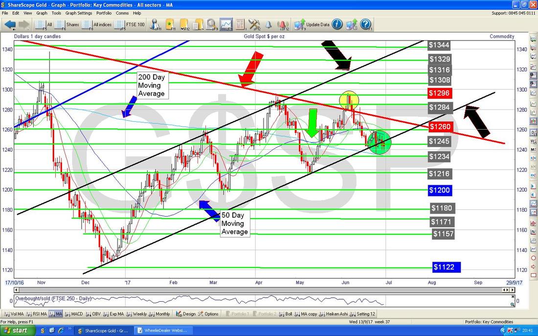
0 Comments
Leave a Reply. |
'Educational' WheelieBlogsWelcome to my Educational Blog Page - I have another 'Stocks & Markets' Blog Page which you can access via a Button on the top of the Homepage. Archives
January 2021
Categories
All
Please see the Full Range of Book Ideas in Wheelie's Bookshop.
|
